Back to blog
12 Best Simple Website Design Examples [Ultimate List]
Discover the best simple website design examples that prove clean layouts and minimal visuals can create powerful, high-converting experiences.
Jun 12 2025
![12 Best Simple Website Design Examples [Ultimate List]](https://codesi.ai/admin/static/Cover_cc23c9c96f.webp)
Studies show users form an opinion about a site in just 0.05 seconds, and roughly 60% of people prefer a simple site over a complex one.
In practical terms, that means a clear layout and fast-loading pages are the winners. Yet, there is a common misconception that "simple design" means lazy or dull. In reality, simplicity often requires more thought, not less.
We'll explore 12 of the best simple website design examples that prove that with just the right mix of clean layouts, smart navigation, and striking visuals, less really is more.
What Makes a Website "Simple"
"Simple can be harder than complex: You have to work hard to get your thinking clean to make it simple. But it's worth it in the end because once you get there, you can move mountains" ― Steve Jobs.
A "simple" site usually follows these core principles:
Clarity and Focus
Simple websites guide users toward one clear goal.

The interface shows only what's necessary, often a single call-to-action or minimal menu, so visitors immediately know what to do. Big headings, clean hero sections, and obvious buttons all help users find their way fast.
Limited Palette and Typography
Using just a few complementary colors and fonts keeps the design cohesive and visually appealing.

White space gives breathing room, improves readability, and highlights important content without overwhelming the viewer.
Easy Navigation
Menus are concise and intuitive, often hidden behind icons such as a hamburger or a dot.

This method maintains a clean layout while still being easy to explore. Clear, standout calls-to-action help users move through the site without confusion.
High-Quality Imagery (or Minimal Graphics)
Instead of messy visuals, simple sites often rely on one strong hero image or bold icons.

For product or portfolio sites, large, crisp visuals take center stage, with minimal text, allowing the images to speak for themselves.
Fast Performance
A clean design usually means faster load times – something 47% of users expect in under 2 seconds.

Fewer scripts and media elements not only improve speed but also boost SEO and overall user satisfaction.
Mobile-Responsiveness
A truly simple site works seamlessly on any device.

Responsive layouts ensure that content adapts seamlessly to phones and tablets, featuring touch-friendly buttons and readable text across various screen sizes.
Content Hierarchy
The most important content comes first. Clear subheadings, bullet points, and short paragraphs guide the eye and keep users engaged.

Clean structure matters – 38% of users leave if a site feels cluttered.
12 Impressive Examples of Simple Website Design
Let's explore standout examples of simple website design, why they work, and what lessons you can apply to your site:
1. Ink – Digital Studio

This London-based creative studio makes a striking first impression using huge type and high-contrast imagery.
Instead of a traditional nav bar, it uses a discreet dot in the top-right corner to reveal a minimal menu. The homepage is nearly textless, instead dominated by short headlines and cinematic photography.
Why it works:
The stark contrast and oversized typography demand attention. The tiny menu dot sparks curiosity, encouraging interaction.
Key takeaway:
Minimal navigation with intense visual contrast can create an immediately engaging, uncluttered user experience.
2. Ollivere – Design Consultancy

Ollivere's homepage starts with a bold statement: "Great design. No nonsense."
Surrounded by white space and clean parallax effects, the site reveals hand-drawn work samples without clutter. A dinosaur playfully "eating" letters adds charm without disrupting the minimal design.
Why it works:
The focused message, high-contrast text, and limited design elements establish instant credibility. The site's simplicity highlights its mission, while parallax effects add motion without cluttering the design.
Key takeaway:
Clear branding and brevity let the core message stand out.
3. Cocokind – E-Commerce Skincare

Cocokind's homepage is airy, featuring immense white space, soft color accents, and high-quality product imagery.
Navigation is streamlined and clean, just product categories and essential pages. Clicking "Shop" brings up products instantly without reloading the page.
Why it works:
A minimal design keeps the focus on the products. Consistent styling and quick transitions reduce friction.
Key takeaway:
On a product site, simplicity in layout and clear call-to-action (CTA) buttons guide users smoothly toward a purchase.
4. Motto – UX Agency

Motto's site delivers its message using large serif fonts over a white background.
The homepage begins with a bold mission statement, followed by client logos and a brief introductory video. They use minimal typography, just two fonts, and stick to a color palette of white, black, and gold.
Why it works:
The large typography delivers impact, while ample white space keeps the layout breathable. One idea per section maintains clarity.
Key takeaway:
Even with bold fonts and images, limiting each page to one main idea at a time prevents overwhelm.
5. Doubble – Interior Design
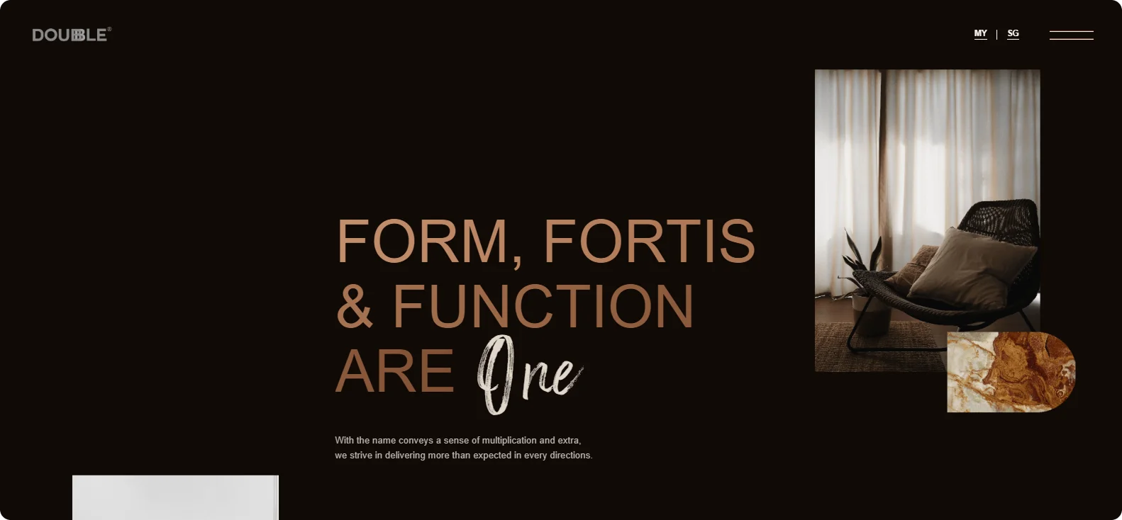
Doubble's homepage flips the script on the typical "white space = simplicity" rule.
It features a dark theme with deep greys and blacks while maintaining a minimalist layout. Large, moody images glide by slowly. Minimal text (just brief headlines and a logo) ensures the visuals do the talking.
Why it works:
The focused visual pacing makes the experience feel cinematic without being overwhelming.
Key takeaway:
Simplicity isn't limited to pastels or white – it can be achieved with dark themes and just a few contrasting elements.
6. Grounded Plants – Retail/E-commerce

Grounded's homepage is a visual delight, featuring full-screen plant photos with minimal copy and single-word CTAs, such as "Shop" or "Learn."
The layout follows a single-column design, with one image and one headline per section. Even tools like "Book a Consultation" are blended smoothly into the scrolling flow.
Why it works:
The design's simplicity stems from consistency: each block looks almost identical, with only the image and heading changing. This card-like approach makes the site feel organized.
Key takeaway:
Repetitive, spacious sections with a clear action each provide users with focus and make content easy to digest.
7. Los Feliz Engineering – One-Page Portfolio

This one-pager begins with an almost blank screen and a blinking cursor typing out site metrics.
Clicking anywhere reveals additional content via sliding animations. The site remains mostly empty until prompted.
Why it works:
The sparse beginning grabs attention and creates a sense of mystery. The sliding content is smooth and purposeful.
Key takeaway:
Start simple and reveal more as needed. Progressive disclosure keeps users engaged without overwhelming them.
8. Kobu – Hotel Getaways

Kobu's homepage feels like a digital coffee table book. It opens with retro-style type over grainy destination images.
As you scroll, cinematic visuals and short descriptions guide you through their curated properties. Navigation remains hidden behind a subtle menu.
Why it works:
The cohesive visuals and typography support a strong editorial voice.
Key takeaway:
In travel or hospitality, let stunning photos do the talking. Minimalism in text and menus lets the imagery evoke atmosphere.
9. Adrián Gubrica – Designer Portfolio

The homepage features Gubrica's name in bold, stylized text over a plain background, accompanied by a single call-to-action (CTA): "Work." Navigation is almost invisible. The rest of the site has large visuals and almost no descriptive text.
Why it works:
The font adds personality, while the rest of the design keeps attention on the work.
Key takeaway:
A portfolio can stand out with personality, but simple navigation to the work and contact info ensures no barriers to hiring the designer.
10. Luxitalia – Real Estate

Luxitalia leads with a full-screen estate photo and white logo. Scroll-triggered animations reveal more imagery and minimal copy.
Each section features a single photo or video background and a brief line or two of text. A custom cursor adds a tactile touch.
Why it works:
Luxitalia's navigation is "digestible" – users can focus on each estate photo without distractions.
Key takeaway:
High-end site designs can remain simple by layering one idea (or image) at a time and using subtle animations (like a custom cursor) for flair.
11. Plastic Design – Branding Agency

This agency site keeps content minimal and linear.
It starts with a black-on-beige tagline and then fades into a full-screen mission statement. The site shows one block of content at a time, with long pauses between transitions.
Why it works:
Controlled pacing helps users absorb each idea individually. The muted background keeps things visually calm.
Key takeaway:
Using a single-column layout and revealing one headline at a time ensures visitors can read and absorb each point without distraction.
12. Build in Amsterdam - Architecture/Design

This creative agency divides its homepage screen in half: the left side features a continuously playing, looping video of an interior, while the right side displays a simple beige panel with text.
The panel has one headline, one sentence, and a button – that's it.
Why it works:
By separating active media from text, the site strikes a balance between energy and simplicity. The right panel is minimalist (beige background, dark text), so even as the video moves, the navigation area feels stable.
Key takeaway:
You can have an engaging motion on one part of the page if you reserve space for calm, minimal navigation elsewhere.
How Codesi Helps You Build Stunningly Simple Websites
As these examples show, the correct layout, typography, and pacing can guide users effortlessly from interest to action.
But building a site that feels this clear and purposeful? That's often where teams get stuck.
With Codesi, you can bring that same clarity to your projects, without coding or design bottlenecks.
From idea to launch, Codesi helps you create fast, responsive, and brand-aligned websites built for results.
Here's what you can do with Codesi:
- AI Website Generator: Just describe your idea, and Codesi will generate a clean, responsive site customized to your goals.
- One-Page Site Templates: Choose from simple templates optimized for clarity, fast load times, and conversion.
- Drag-and-Drop Customization: Tweak colors, fonts, images, and CTAs without touching a line of code.
- Fast Load Times and SEO Built-In: Codesi sites load fast, adapt to mobile, and follow best practices by default.
- Image and Logo Generator: Need clean hero imagery or an on-brand logo? Just type your prompt – done.
Here’s how to easily generate a simple website with Codesi - step by step:
Step 1: Sign up on Codesi (it’s free).

Step 2: In the Website Builder, enter your prompt. For simple website creation, we used the following example:
“Build a landing page for a luxury real estate listing. Use one high-res hero image, brief property details, and a ‘Schedule a Viewing’ CTA.”

Step 3: Choose your color theme and style. For this example, we used:
“Use ivory, charcoal, and gold for a luxury feel. Hero image: modern home at sunset with warm lighting. Elegant serif headings, light sans-serif body text. Clean layout with white space and a gold 'Schedule a Viewing' button.”

Step 4: Click “Generate” and wait a few minutes while Codesi generates your simple website page.
You'll get a stunning, simple website page that you can fine-tune as needed.

Ready to make your website a masterclass in minimal design?
Let Codesi help you design a site that's fast, simple, and made to convert.
Create your website with AI today
Codesi is a platform where you can make a website in 3 minutes.
No coding, no designers, no hassle - just AI.
