Back to blog
14 Best Newsletter Landing Page Examples To Use in 2026
Discover the best newsletter landing pages that convert by focusing on clear value, strong CTAs, and simple design to grow your email list fast.
Jun 27 2025
Marketers continue to rely on newsletters to develop loyal and engaged communities over time. When done well, they offer real value, foster trust, and keep your brand top-of-mind.
However, skeptics argue newsletters struggle to capture attention amid endless notifications and algorithm-driven feeds.
Both sides make valid points, but the real takeaway is this: top-performing newsletters still drive results – when backed by clear, relevant landing pages that give people a reason to subscribe.
In this guide, we'll explore the 14 best newsletter landing page examples, from big brands to indie creators, and analyze the tactics that make them effective.
What Is a Newsletter Landing Page?
A newsletter landing page is a standalone page created with one goal in mind: turning visitors into subscribers. It highlights the value of subscribing, eliminates distractions, and guides users toward one clear action.
Are newsletters still relevant in 2065? Absolutely – and the statistics confirm it.
Platforms like Beehiiv saw sends jump from 402 million in 2021–22 to 15.6 billion in 2024, a nearly 39× increase.
It's not just about volume, either. In 2024, newsletters achieved an average open rate of 38.7%, with a click-through rate of 1.85% and a remarkably low bounce rate of 2.4%.
Top Newsletter Landing Page Examples for 2026
Here are the best newsletter landing page examples, each offering practical lessons you can apply to your own:
1. 3-2-1 Thursday
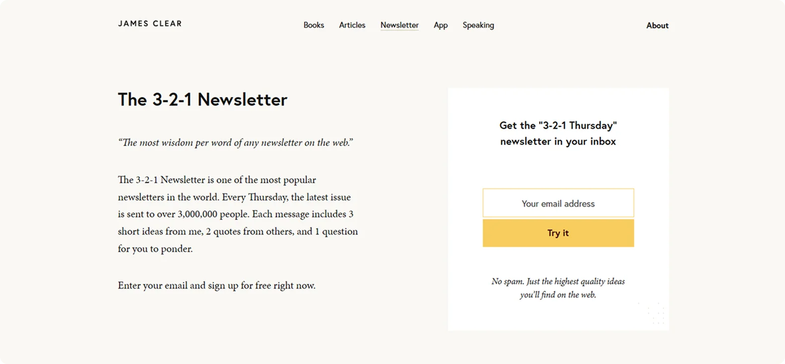
The 3-2-1 Thursday landing page mirrors the simplicity of the newsletter itself. There's no flashy design – just a clean white background, a centered headline ("Join 3-2-1 Thursday"), and a compelling one-sentence promise: "Get weekly wisdom delivered straight to your inbox."
Social proof is strong: "More than 3,000,000 people subscribe" is prominently mentioned to build trust and FOMO.
Why it works:
The landing page is crystal clear about the offer, requires minimal effort to join, and immediately proves the value with a real sample.
Takeaway:
Let the product (in this case, the newsletter itself) do the selling. If your format is strong, show it off and make signing up feel like a no-brainer.
2. Morning Brew
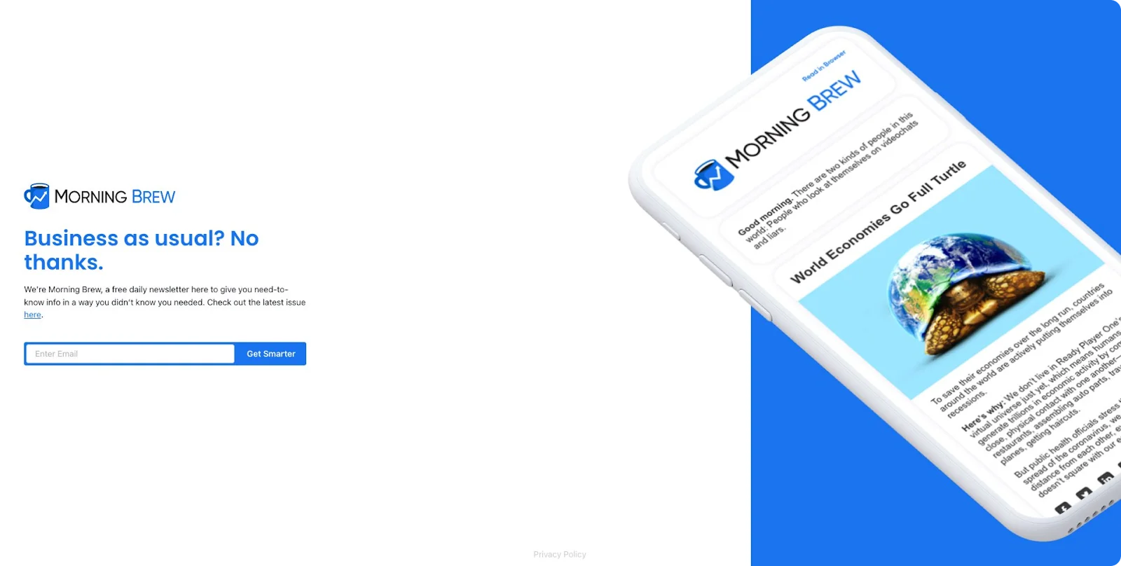
Morning Brew's landing page is bold, clean, and straight to the point.
The headline sets the tone: "Business as usual? No thanks." Followed by a short pitch that highlights the newsletter's value: smart, daily business news with personality.
A sample issue is linked for proof, and the signup form is minimal: just your email and a blue "Get Smarter" button.
Why it works:
It sells the newsletter in under 10 seconds – clear value, strong voice, and no friction.
Takeaway:
Use bold messaging, show the product, and keep the signup process simple. Let your tone do the selling.
3. Creator Wizard
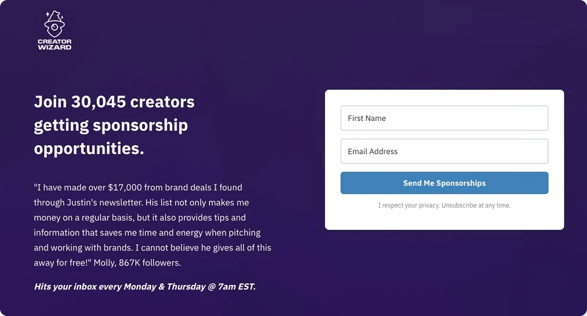
Creator Wizard's landing page is all about clarity and proof. The headline hits hard: "Join 30,045 creators getting sponsorship opportunities." Directly below, a compelling testimonial from a creator with 867,000 followers claims to have earned over $17,000 thanks to the newsletter.
On the right, a clean opt-in form asks for your name and email, with a bold CTA: "Send Me Sponsorships."
Why it works:
It speaks directly to its niche – creators looking for brand deals, and backs it up with social proof and a clear payoff.
Takeaway:
Speak your audience's language, show real results, and make your CTA action-based. "Send me sponsorships" is far more powerful than "Subscribe."
4. Amundsen Sports
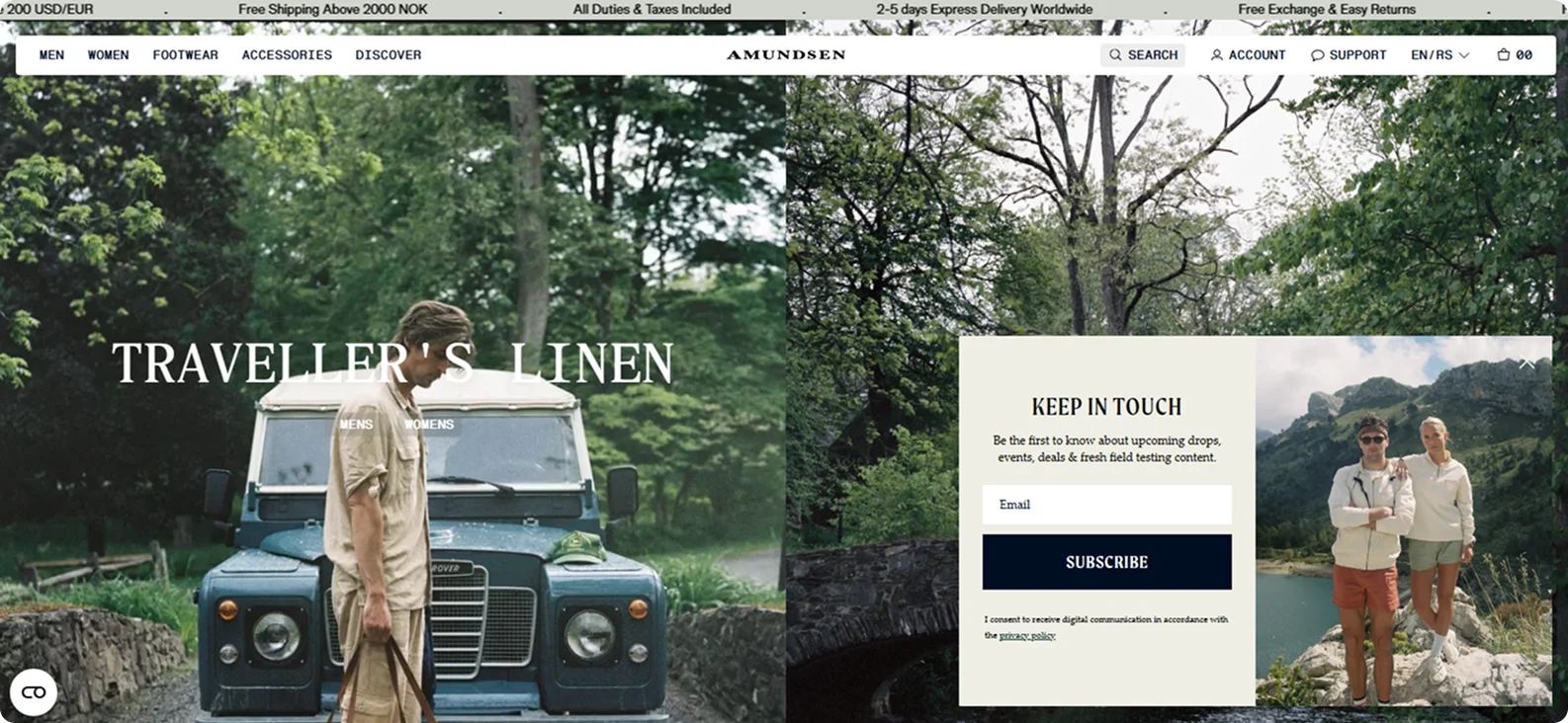
Amundsen Sports places its "Keep in Touch" newsletter sign-up across product and content pages using a consistent, minimalist approach. A lucky subscriber sees the same prompt whether browsing women's skirts, beanies, or adventure stories.
The design remains clean and product-focused – no pop-ups, no distractions.
Why it works:
By embedding the sign-up form seamlessly throughout the site, Amundsen invites users into a shared community of outdoor enthusiasts without interrupting their journey.
Takeaway:
Keep subscription forms consistent and subtle across pages.
5. LogMeIn
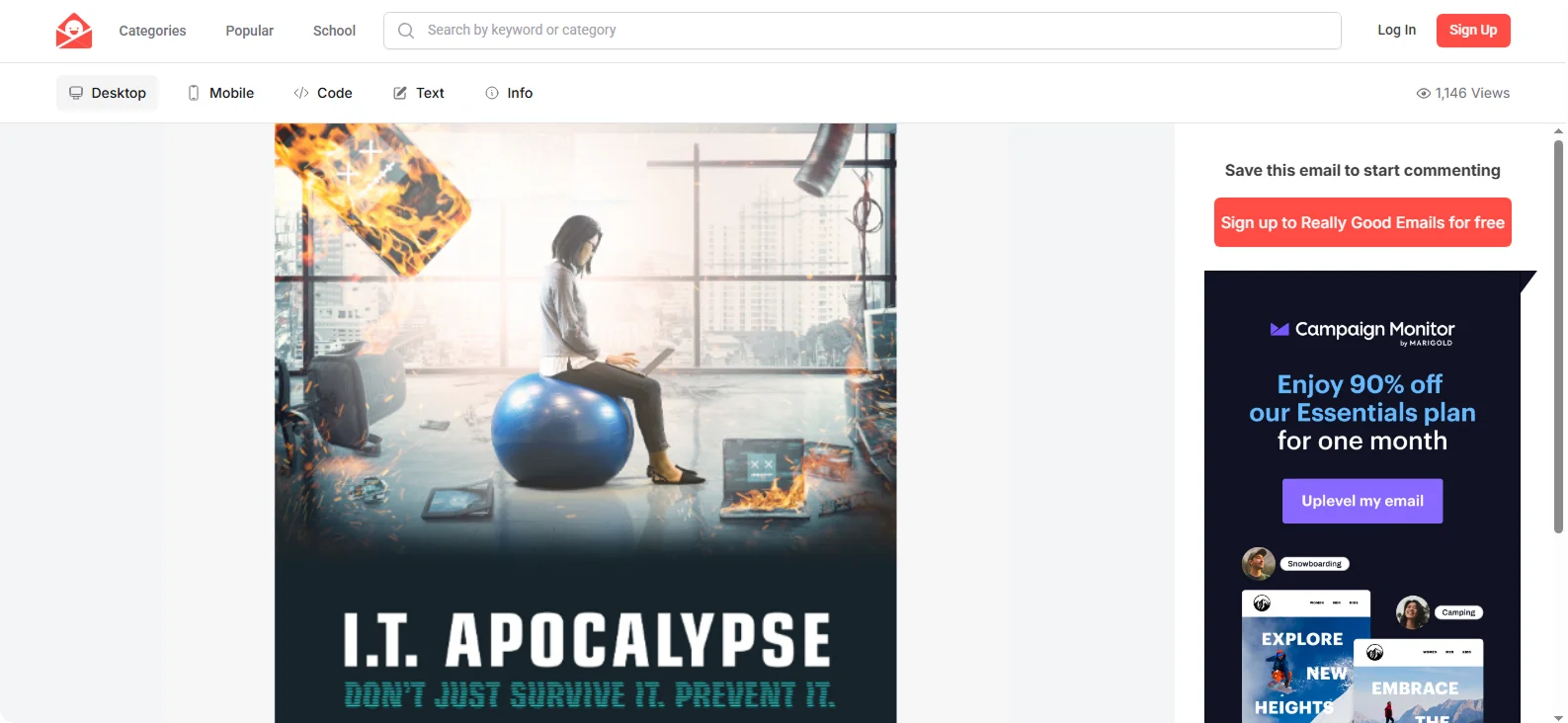
This newsletter uses dramatic copy and apocalyptic visuals to highlight cybersecurity threats in a fun and creative way.
Instead of dense text, there's a striking stat, a strong headline, and a video CTA. The humor softens the seriousness of the topic while still delivering real value.
Why it works:
B2B emails are often dry, this one isn't. LogMeIn captures attention fast and drives engagement with minimal friction.
Takeaway:
In B2B, creativity + clarity wins. Use entertainment strategically to land serious messages.
6. TLDR
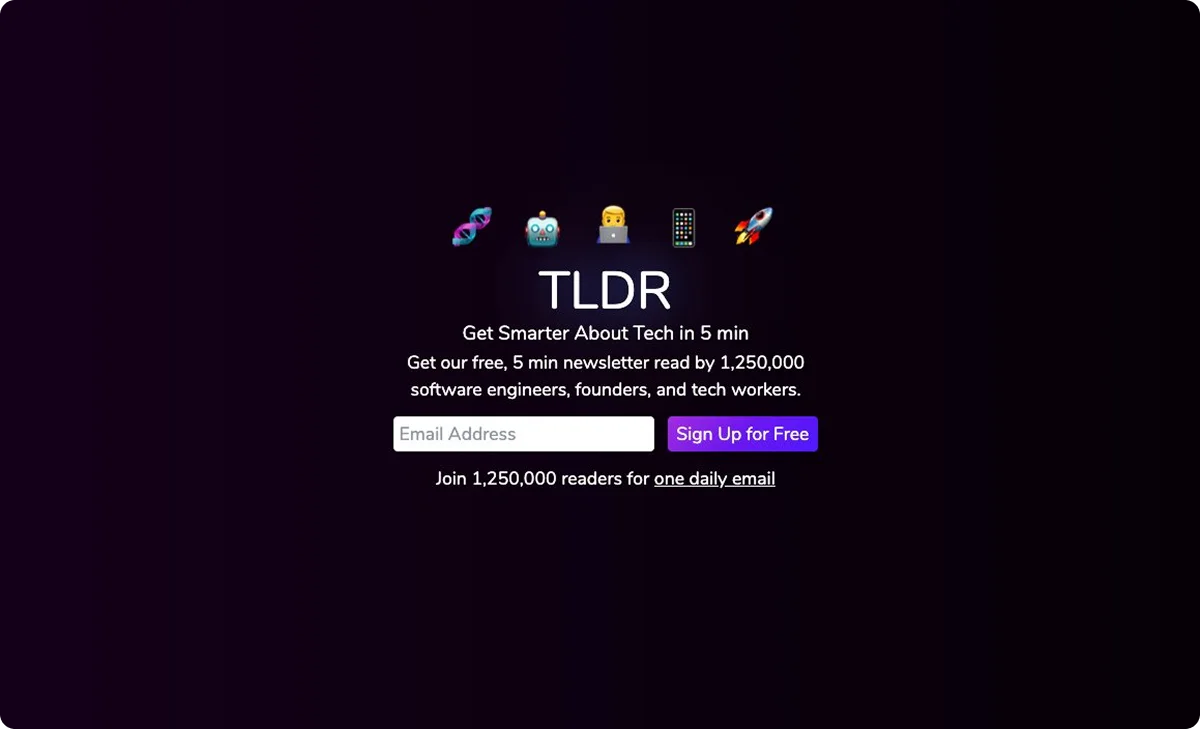
TLDR's landing page keeps things short, sharp, and highly targeted – like its newsletter. The headline promises immediate value: get smarter about tech in five minutes.
Supporting text highlights its reach – over 1.25 million readers, including engineers, founders, and tech professionals. Emojis across the top add personality, while a clean email form and vibrant purple "Sign Up for Free" button make subscribing effortless.
Why it works:
Social proof, clear benefits, and zero friction make this page a high-converting funnel for busy tech readers.
Takeaway:
If your newsletter saves people time, say so. Be precise, be direct, and back it up with social proof.
7. Minimalist Baker
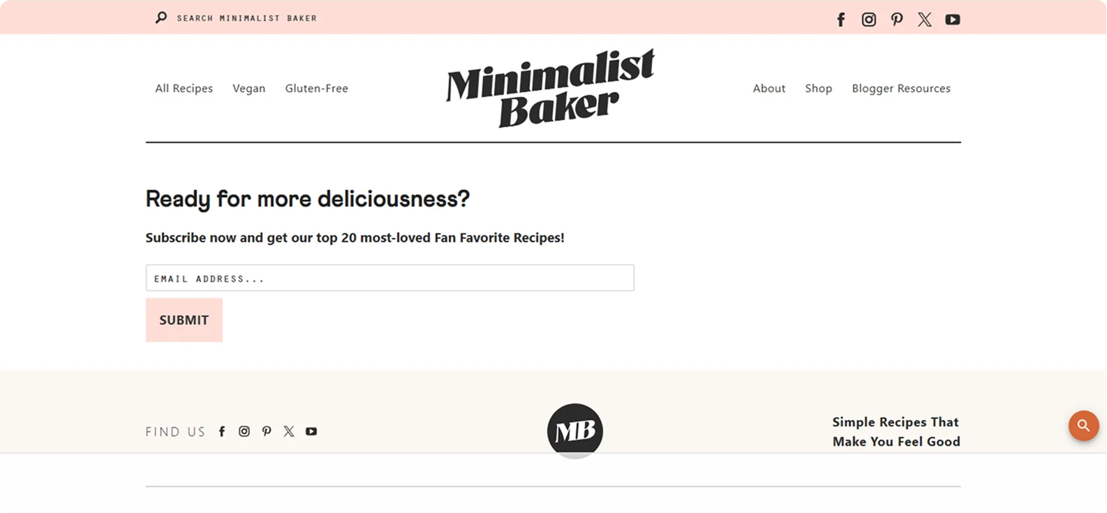
This landing page is simple and purposeful, reflecting the brand's commitment to easy, satisfying cooking.
A bold headline asks, "Ready for more deliciousness?" followed by a clear offer: "Subscribe now and get our top 20 most-loved Fan Favorite Recipes!"
Beneath, there's a single email field and a "Submit" button with no distractions.
Why it works:
The page delivers immediate value by offering the site's best recipes upfront. It directly addresses the needs of home cooks who want easy wins without having to sift through everything.
Takeaway:
Frame your newsletter as a curated shortcut – share your best content in exchange for an email.
8. Homesick
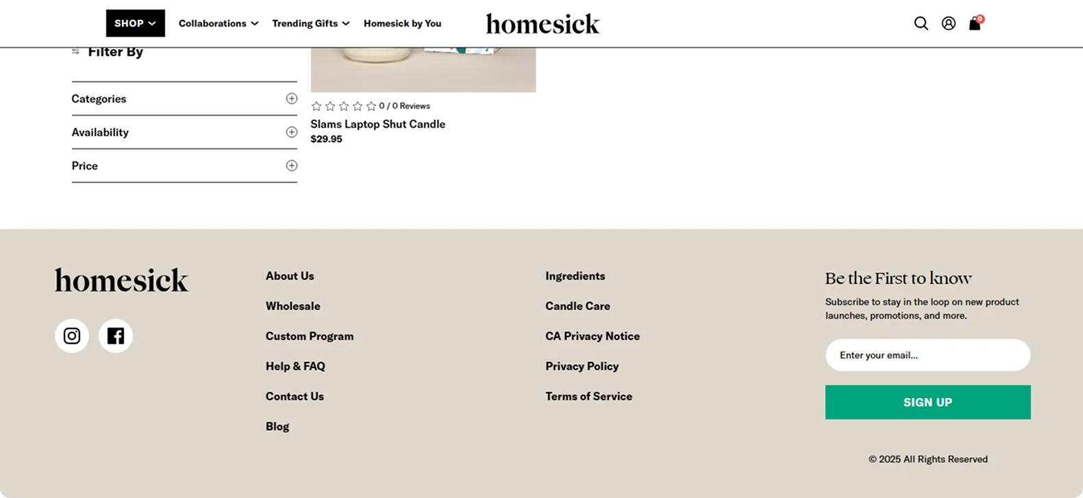
On the Homesick candles collection page, the newsletter sign-up appears at the bottom with quiet confidence. The heading reads "Be the First to Know," followed by a brief invitation to subscribe for updates on product launches, promotions, and more.
A single email field and a simple "Sign Up" button maintain a clean and consistent layout, aligning with the brand's calming, nostalgic aesthetic.
Why it works:
The placement is clever – visitors browsing products are already interested, and the invitation to stay in the loop feels like a natural next step.
Takeaway:
For lifestyle brands, a soft, well-placed prompt at the end of a browsing session can turn curious shoppers into loyal subscribers, without disrupting the flow.
9. Ella's Kitchen
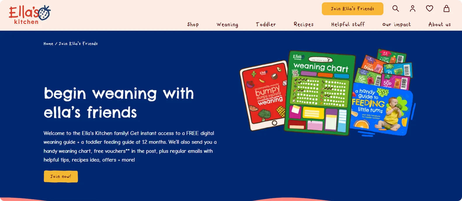
Ella's Kitchen invites parents to become part of a nurturing community through its Ella's Friends newsletter.
The landing page promises genuine value from the start: new subscribers receive a free digital weaning guide, toddler feeding tips, a printable weaning chart, and even vouchers sent by post.
Why it works:
Instead of a generic opt-in, Ella's creates a welcoming, parent-focused experience built around trust and usefulness.
Takeaway:
Lead with helpful, personalized resources and let your newsletter be the ongoing thread that supports your audience as they grow.
10. Tim Ferriss
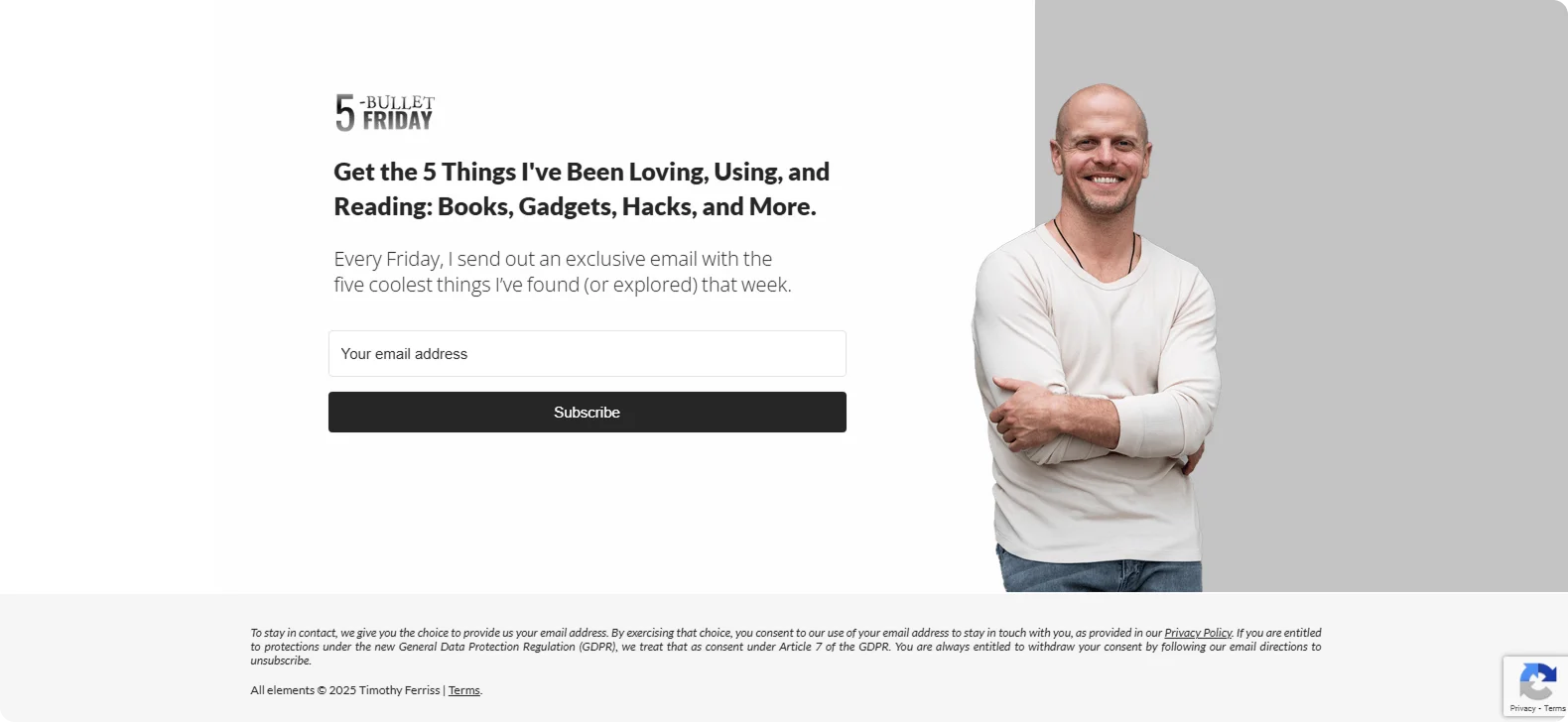
This landing page opens with a concise pitch: "Every Friday, I send out an exclusive email with the five coolest things I've found (or explored) that week." The layout centers on that promise, paired with a visual scroll of featured items – books, gadgets, and productivity hacks.
Why it works:
Tim's personal branding and curation shine through immediately, appealing to readers who value expert recommendations without fluff.
Takeaway:
When your content is highly personalized, lead with your promise, show a teaser of that curated content, and keep the signup process simple.
11. Passenger
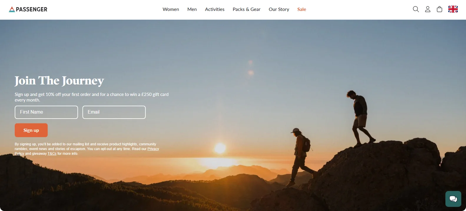
Passenger's signup banner greets visitors with an epic sunrise shot of hikers on a ridgeline, immediately evoking the brand's wander-ready spirit.
The headline invites you to "Join The Journey," while the subcopy sweetens the deal: ten percent off your first order plus a monthly chance to win a £250 gift card. A compact form asks only for a first name and email, followed by an orange "Sign up" button.
Why it works:
By spelling out the kinds of updates you'll receive, Passenger sets clear expectations and frames the newsletter as part of an ongoing community journey rather than sales pitches.
Takeaway:
When the promise feels like an invitation to a lifestyle, signing up feels like joining a tribe, not just another mailing list.
12. Adidas
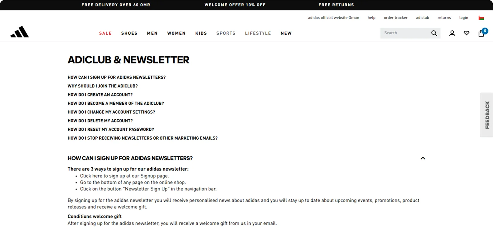
Adidas invites visitors to become adiClub members and newsletter subscribers through a unified sign-up experience. Input fields collect a first and last name, email address, and date of birth, with no password required upfront.
A single sign-up button does the rest. Below, a brief copy explains the benefits: personalized news, early access to products and events, exclusive offers, and even a welcome gift via email.
Why it works:
It combines membership and newsletter sign-up into a single, streamlined process.
Takeaway:
Combine onboarding and newsletter signup to maximize conversions.
13. Ann Handley
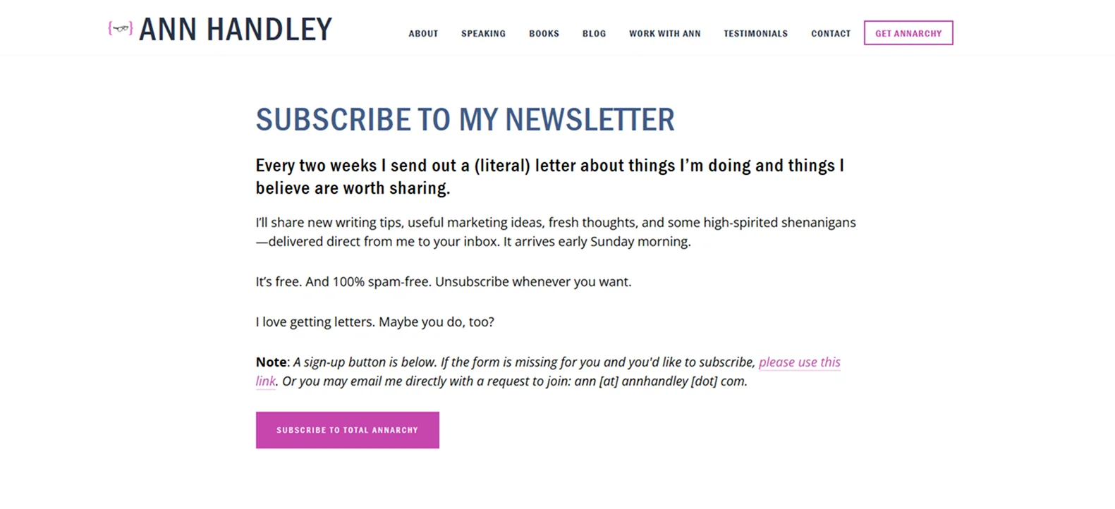
Ann Handley invites visitors to subscribe to her bi‑weekly "Total Annarchy" newsletter with a simple, no-nonsense landing page. The headline reads: "SUBSCRIBE TO MY NEWSLETTER. Every two weeks I send out a (literal) letter about things I'm doing and things I believe are worth sharing."
Below the fold, concise bullet points clarify what readers can expect – "new writing, useful ideas, fresh links, and high‑spirited shenanigans" – along with a reminder that it's delivered fortnightly.
Why it works:
The page feels personal and authentic. By setting clear expectations about cadence and content, Ann builds trust before users even hit "subscribe."
Takeaway:
Combine clarity (who, what, when) with a personality to create a newsletter signup that's both compelling and credible.
14. Lululemon
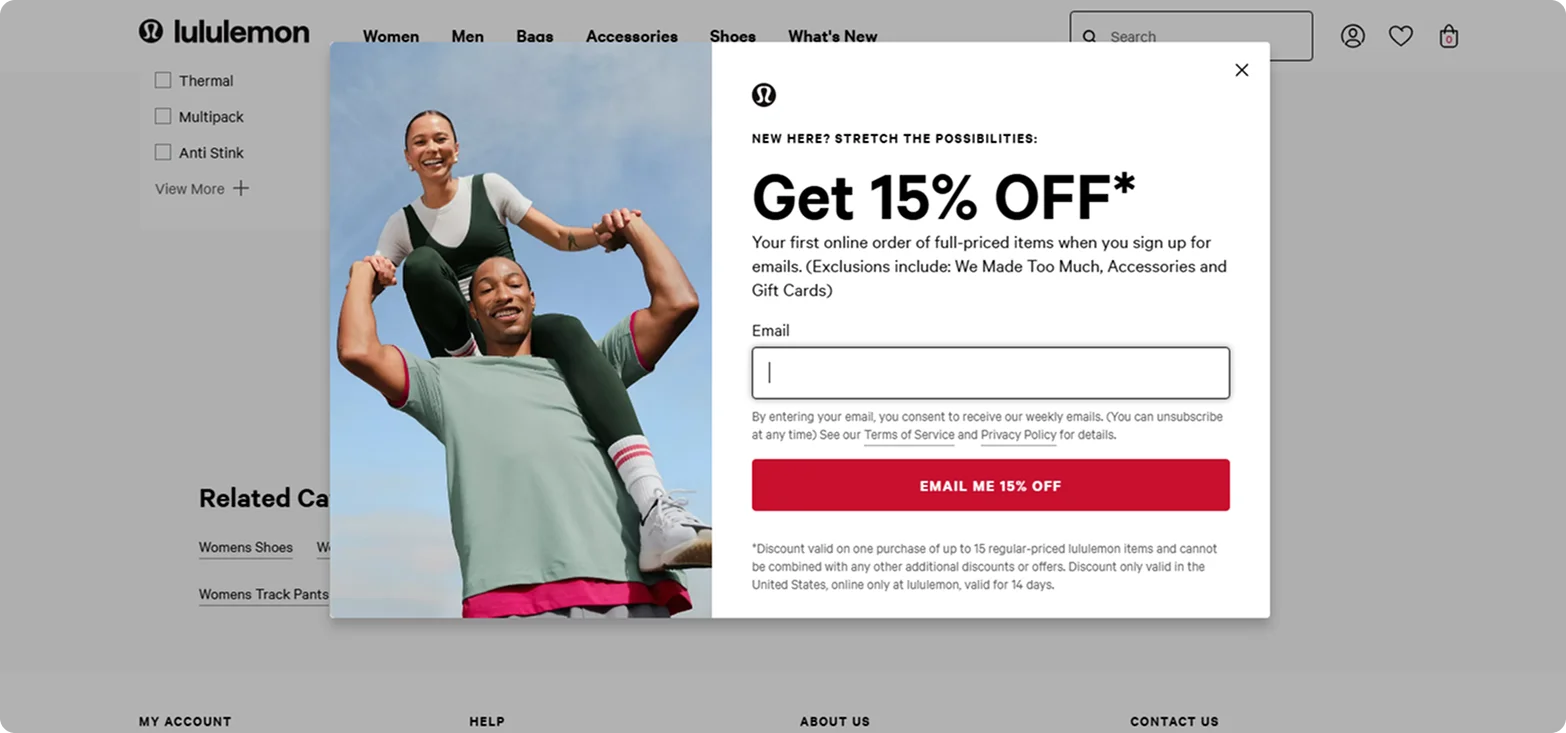
Lululemon greets new visitors with a straightforward pop-up offering 15% off their first online order when they sign up for the brand's newsletter. A bright red button labeled "Email Me 15% Off" reinforces urgency and clarity, making it stand out.
Why it works:
It encourages sign-up without derailing the shopping experience and builds the email list with a reward that aligns with purchase intent.
Takeaway:
Sometimes, all you need is a substantial discount, a clean form, and direct language.
What Makes the Best Newsletter Landing Pages Convert?
While each standout example has its personality, the highest-converting newsletter landing pages tend to follow the same core principles.
Here's what they do well and what you should build into your own:
- A headline with a hook – Great pages lead with a reason. A punchy, benefit-driven headline quickly tells visitors what they'll gain by signing up.
- A clear promise – The best pages spell out precisely what the newsletter delivers and why that's worth your email address.
- A call to action that actually calls – Instead of bland buttons, they use action phrases like "Send Me the Goods" or "Get Smarter in 5 Minutes" that feel like a continuation of the message.
- Social proof that matters – Subscriber counts, short testimonials, or mentions in trusted media outlets help build confidence and reduce hesitation.
- Focused, frictionless design – The layout centers around one thing: signing up. There is no top nav, no sidebars – just clean visuals and one clear path forward.
- Mobile-first execution – The best pages prioritize thumb taps over mouse clicks. They load quickly, read smoothly, and respond effortlessly on any device.
- Trust cues front and center – Transparent privacy messaging, opt-out language, and secure form indicators demonstrate to visitors that their data is respected.
- Smart segmentation – Some go a step further with personalized content or audience-specific messaging to make the signup feel more relevant.
- Speed that doesn't stall – Finally, every second counts. Fast-loading pages keep bounce rates low and conversion rates high.
How Codesi Can Help You Build High-Converting Newsletter Landing Pages
If you're ready to apply what these top-performing brands are doing right, Codesi makes it incredibly easy to build your own high-converting newsletter landing page – without touching a single line of code.
Here's why Codesi is the ideal tool for creating high-converting newsletter landing pages:
- AI-built in minutes: Describe your newsletter – its purpose, tone, and audience – and Codesi instantly generates a conversion-optimized landing page.
- Layouts that drive action: Codesi designs every section for performance – placing compelling headlines, social proof, benefit highlights, and a focused signup form exactly where they belong.
- Drag-and-drop customization, no coding needed: Change colors, edit copy, or move sections with ease. You're in complete control, no developer required.
- Mobile-first and lightning-fast: Your landing page loads instantly and looks sharp on every device, which is essential for keeping potential subscribers engaged on the go.
- Built-in analytics: Easily track signups and performance by connecting your favorite tools in a few clicks.
Here's how to easily generate newsletter landing pages with Codesi - step by step:
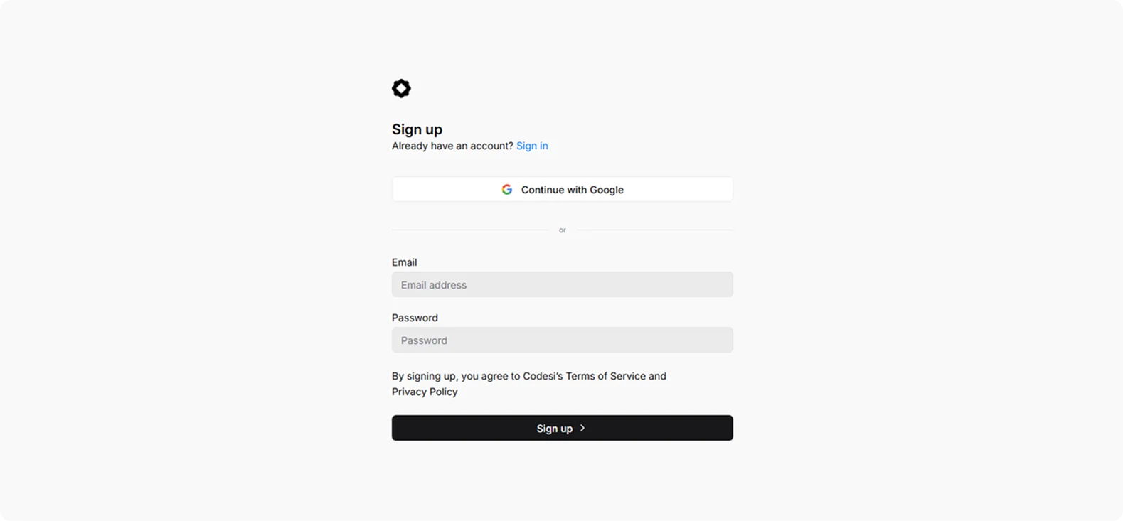
Step 1: Sign up on Codesi (it's free)
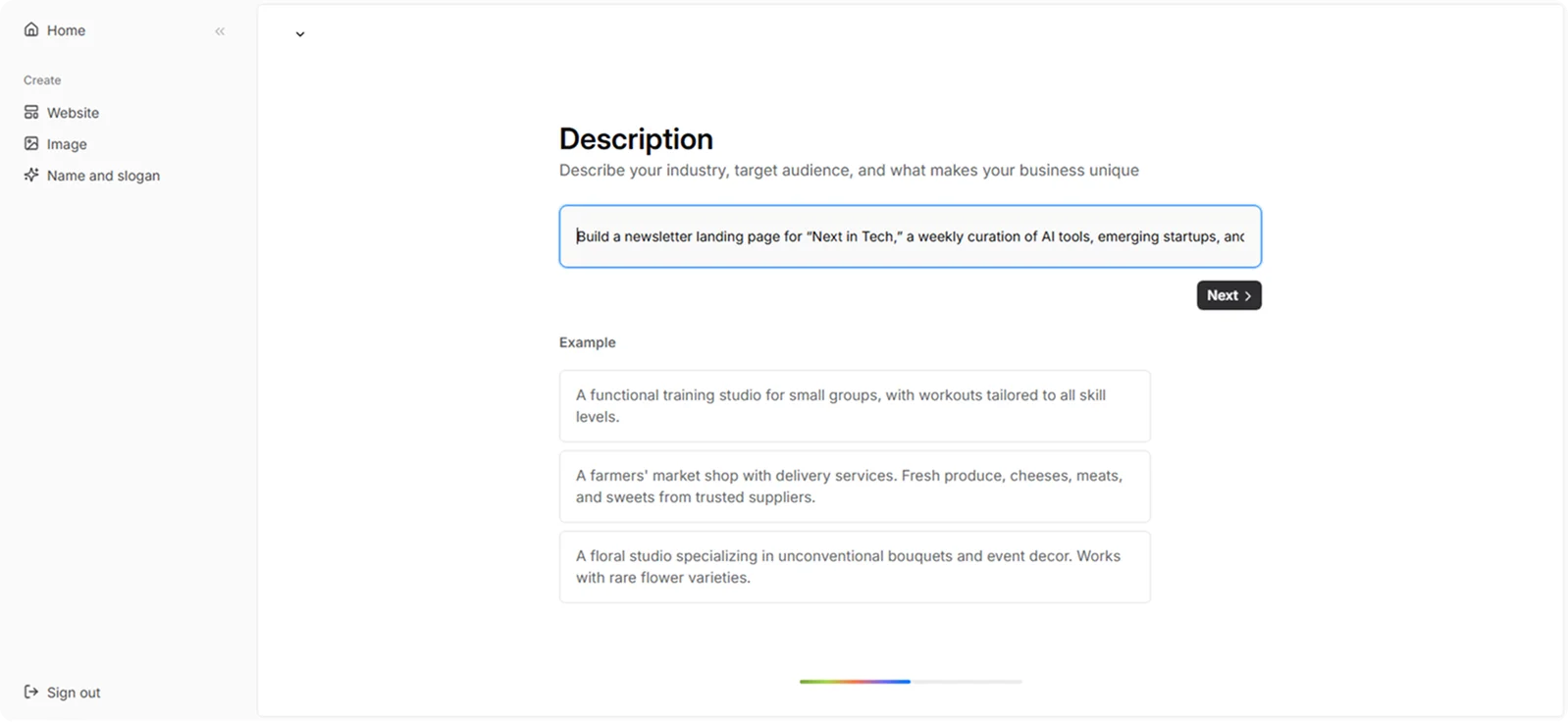
Step 2: In the Website Builder, enter your prompt. For newsletter landing page creation, we used the following example:
“Build a newsletter landing page for “Next in Tech,” a weekly curation of AI tools, emerging startups, and product updates. Use a sleek, modern layout with icons, a sample newsletter preview, and stats on subscriber count. CTA: “Stay Ahead.”
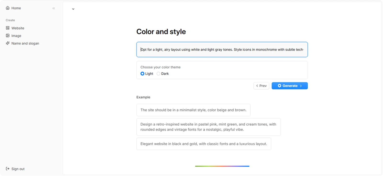
Step 3: Choose your color theme and style. For this example, we used:
“Opt for a light, airy layout using white and light gray tones. Style icons in monochrome with subtle tech-inspired line art. Add a single accent color, like orange or cobalt, for CTA buttons and links.”
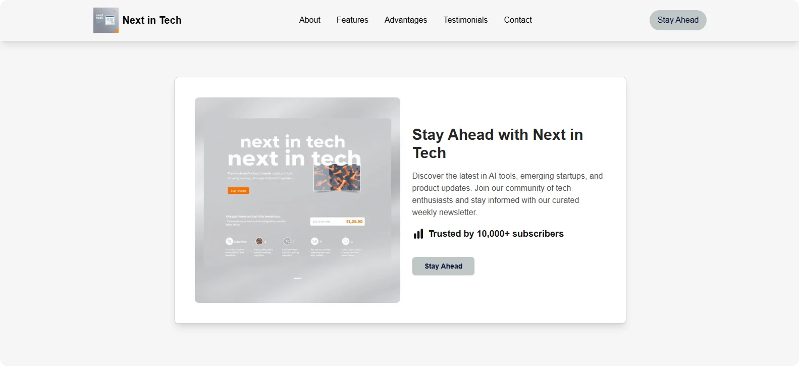
Step 4: Click "Generate" and wait a few minutes while Codesi generates your newsletter landing page.
Codesi will instantly generate a newsletter landing page you can easily customize and optimize to fit your goals.
Want to launch your own high-performing newsletter landing page today?
Let Codesi bring your newsletter to life – go from draft to live page in just a few clicks.
Create your website with AI today
Codesi is a platform where you can make a website in 3 minutes.
No coding, no designers, no hassle - just AI.
