Back to blog
12 Best Landing Page Examples To Learn From in 2026
Discover the best landing page examples, how they work, and what makes them effective to help you optimize conversions and boost sales.
Apr 3 2025
Do you want people to be instantly hooked when they open your landing page?
A great landing page is more than just design and looks. It’s about clarity, engagement, and guiding visitors toward action.
Strong headlines, striking visuals, and well-placed calls to action all play a part in making it effective.
In this article, you’ll discover the 12 best landing page ideas that stand out and why they work so well.
Let’s get started!
12 Best Landing Page Examples to Inspire You
1. Calm
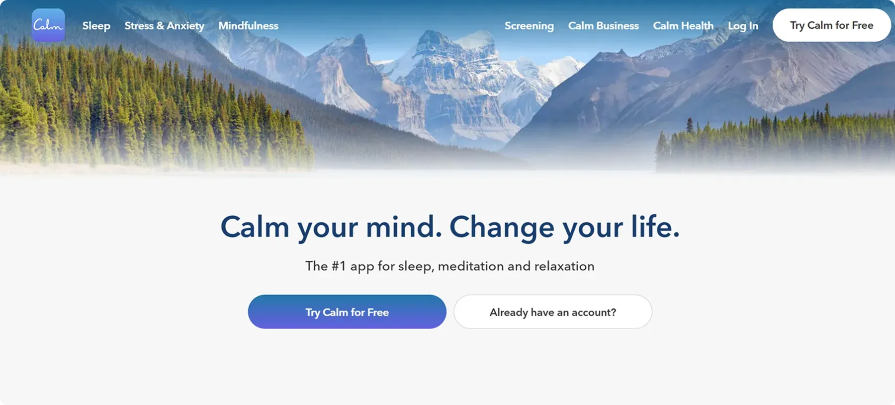
Calm’s landing page immediately creates a sense of relaxation. Soft pastel colors with tranquil blue tones set a peaceful atmosphere that reflects the brand’s identity.
The clean, minimalistic design keeps the focus on the main call-to-action – Try Calm for Free – inviting you to begin your journey toward stress relief and mindfulness.
Why we chose it:
- Straightforward value proposition – Calm’s simple yet powerful tagline (The #1 app for sleep, meditation and relaxation) instantly clarifies the benefits: better sleep, less anxiety, and a greater sense of peace.
- Engaging imagery – High-quality background images of serene nature scenes connect emotionally with you before you even read a single line of text.
- App integration – The page directs you to download the Calm app, reinforcing brand consistency and offering immediate action steps.
📌 Key Takeaway
Less is often more. A visually clean layout keeps users focused on the primary call-to-action (CTA), eliminating distractions and guiding them toward the desired action.
In fact, using a single, clear CTA can boost conversion rates by an impressive 161% compared to having multiple competing CTAs.
2. Slack
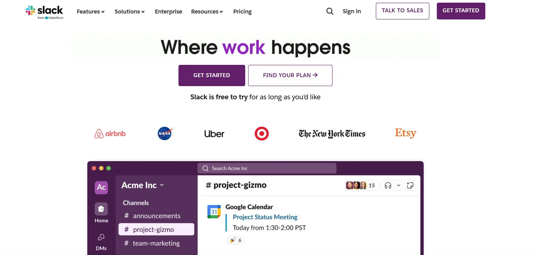
Slack’s landing page is a perfect example of clear messaging and strong brand identity.
With its bright accent colors, subtle animations, and clean white background, it effortlessly reflects Slack’s collaborative approach to team communication.
Why we chose it:
- Clear mission statement – Right below the navigation bar, Slack clearly delivers its core message: “Where work happens.” This simple message highlights Slack as a go-to platform for easy communication and better teamwork.
- Interactive elements – Slack often sprinkles subtle animations highlighting how the platform functions. Chat bubbles popping up or transitioning from one user to another demonstrate the product’s real-time communication aspect.
- Focused CTAs – Eye-catching sign-up and demo buttons make it easy for you to get started and explore the Slack ecosystem.
📌 Pro Tip from Codesi
The key is finding the right balance between being friendly and inviting while maintaining the professionalism needed to earn business users' trust.
However, you don’t need design skills or technical expertise to create a polished landing page. With pre-written text, illustrations, and an easy-to-use editor, you can build and customize your page in just a few minutes.
No blank pages, no overwhelming setup – just a simple way to choose the layout, colors, and content that fit your brand.
3. Intercom
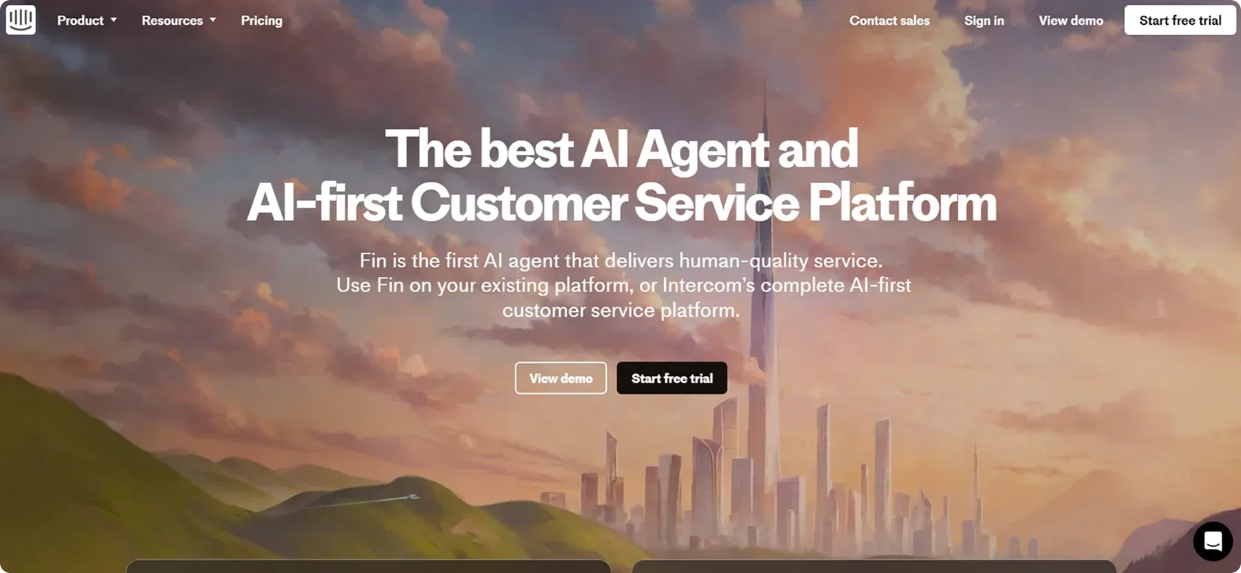
Intercom’s landing page effortlessly combines innovation and efficiency, with a futuristic cityscape that symbolizes its commitment to AI-driven customer service.
The bold typography and clear call-to-action buttons guide you toward exploring Fin, their AI agent, through a demo or free trial.
Why we chose it:
- Futuristic aesthetic – The background’s digital cityscape and warm lighting create a cutting-edge, forward-thinking feel that aligns with AI innovation.
- Strong credibility – Testimonials, G2 rankings, and an open letter from the CEO build trust and reinforce Intercom’s leadership.
- User-friendly layout – Clear CTAs, bold typography, and structured content guide visitors seamlessly toward engagement.
📌 Key Takeaway
Build trust with proven results.
In fact, incorporating social proof on landing pages can boost conversions by up to 34%.
So, display testimonials and recognizable brand logos to boost credibility and reassure visitors, making them more likely to try your service.
4. Squarespace

Squarespace’s landing page is clean, modern, and easy to use, creating a smooth experience that naturally highlights the brand.
The layout is structured, the visuals are striking, and their lifestyle imagery illustrates just how professional a Squarespace-powered site can look.
Why we chose it:
- Inspirational demos – By showing real sites built on their platform, Squarespace helps you picture what your own site could be.
- Concise copy – Headings are short but powerful. Each line clearly highlights a benefit, making the message easy to understand at a glance.
- Streamlined navigation – The top navigation bar is well-organized, allowing new or returning visitors to locate the product area they need (templates, pricing, etc.) with minimal effort.
📌 Key Takeaway
Demonstrate what users can achieve with your product by showcasing real examples that set clear expectations.
Squarespace effectively uses beautifully designed website previews to inspire users, making it easy for them to envision their own success with the platform.
5. Uber
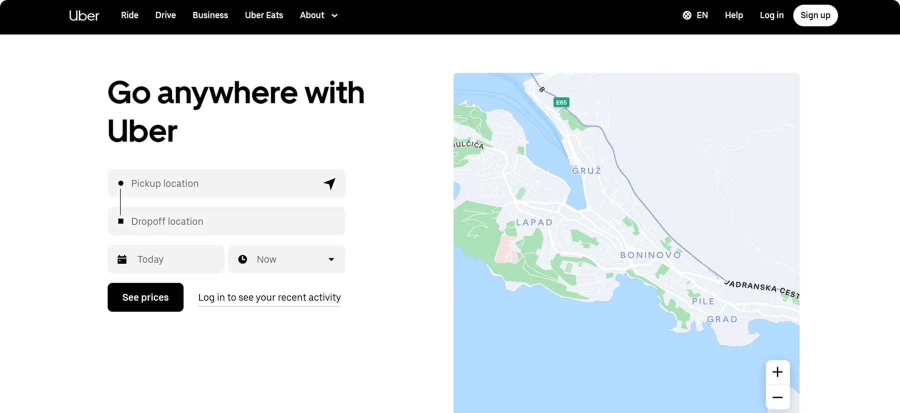
Uber’s landing page is a great example because it has a clear, action-driven layout that immediately directs you to either request a ride or sign up to drive, minimizing distractions.
It also effectively uses concise messaging, strong visuals, and simple navigation to create a seamless user experience that encourages conversions.
Why we chose it:
- Clear call-to-action – Uber's sign-up prompts are clearly designed for visibility, ensuring a seamless onboarding process for both riders and drivers.
- Personalized user experience – Uber customizes content based on your data, such as past interactions and location, showing relevant fare estimates or city-specific promotions.
- Minimalist and efficient design – The clean layout and straightforward navigation make it easy to quickly find what you need.
📌 Key Takeaway
Personalize the user experience whenever possible, as it can improve landing page conversions by 202%.
If you display local imagery and relevant offers, visitors are more likely to see the direct value of engaging with your brand.
6. HubSpot
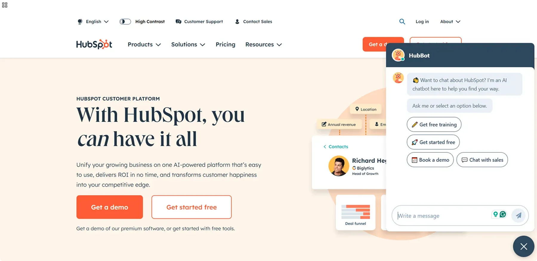
HubSpot is known for inbound marketing, and its landing pages showcase a deep understanding of conversion optimization.
You’re greeted by a spacious header, a bold orange CTA, and even an interactive chatbot (“HubBot”) for real-time assistance.
Why we chose it:
- Strong social proof – Featuring well-known brands, real customer success metrics, and industry awards builds trust and shows that HubSpot delivers proven results.
- Multi-step forms – Short forms that unfold additional questions after the user commits to the first step keep friction low.
- Free tools – HubSpot’s offering of free resources allows potential customers to explore the platform risk-free, helping them see its value and convert into paying users.
7. Mixpanel
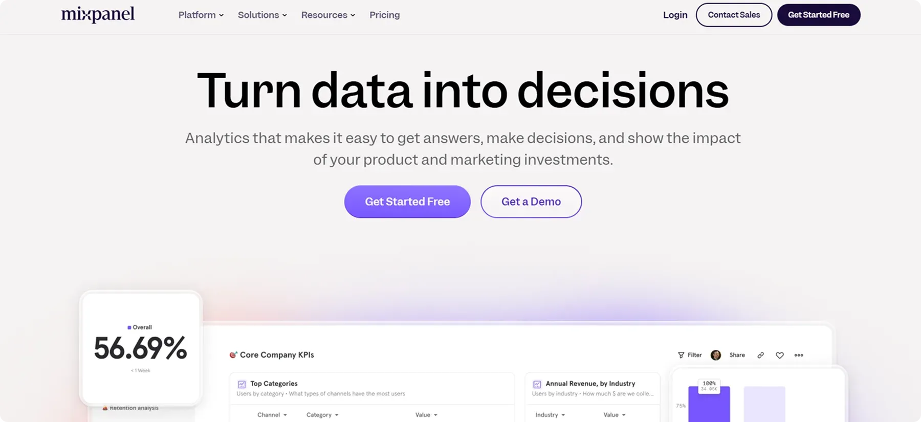
Mixpanel’s landing page excels at showcasing its advanced analytics in a digestible manner. Charts, graphs, and dashboard screenshots illustrate the tool’s capabilities without overwhelming you.
Why we chose it:
- Dynamic data visualizations – Live, animated charts, and graphs showcase Mixpanel’s real-time analytics capabilities, helping you instantly grasp the platform’s value.
- Interactive tutorials & demos – Step-by-step product walkthroughs and interactive demos let you experience Mixpanel’s features firsthand, making it easier to understand and use.
- Smooth transitions – Subtle animations, hover effects, and responsive UI elements create a seamless and engaging browsing experience that enhances user interaction.
📌 Key Takeaway
Make complex data easy to understand with clear, engaging visuals. Show your product in action to simplify features and highlight real-world benefits.
In addition to making your product easier to understand, adding videos to your landing page can boost conversions by 86%.
8. Kit
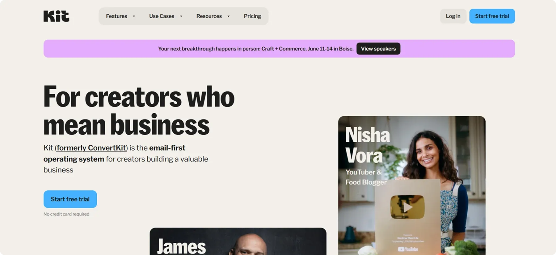
Kit’s landing page nails it when it comes to appealing to a focused audience, in this case, creators.
The design is structured to clearly highlight Features, Use Cases, Resources, and Pricing, ensuring visitors can quickly understand the platform’s value and take action without unnecessary distractions.
Why we chose it:
- Creator-centric messaging – The page repeatedly addresses “creators,” reinforcing a strong sense of community and belonging.
- Success stories & testimonials – Real-life case studies showcase how the platform has helped creators expand their reach and monetize their work, adding credibility and trust.
- Sign-up process – The landing page features an intuitive and hassle-free sign-up form, reducing friction and making it easy for new users to get started quickly.
📌 Key Takeaway
Know your audience deeply to create a landing page that immediately connects.
Kit’s entire approach, from imagery to language, is tailored to the world of creators, helping them feel at home.
9. Airbnb
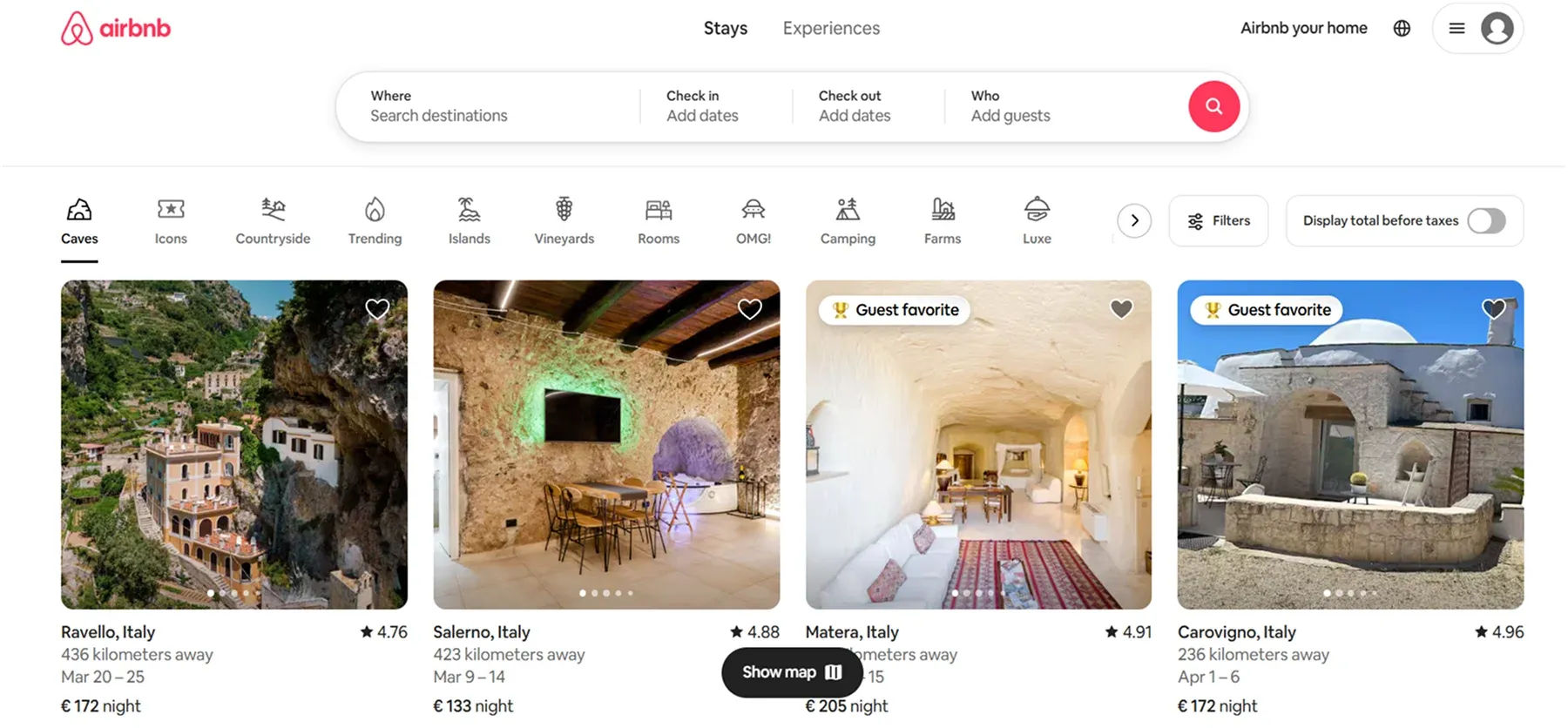
Airbnb’s homepage is all about making you feel at home, even when you’re on the other side of the world.
Large, welcoming images and straightforward navigation guide you toward finding unique places to stay.
With just a few clicks, you can discover accommodations that match your style, budget, and destination.
Why we chose it:
- Immediate user focus – A prominent search bar right up top encourages you to jump straight into looking for accommodations.
- Personal touch – Local guides, traveler stories, and host profiles add warmth and authenticity.
- Clear categories – Options for “Stays,” “Experiences,” and more let you quickly find what suits your needs.
📌 Key Takeaway
Address your visitors’ needs right away. Airbnb’s landing page instantly answers the question, “Where can I stay?” making it simple for users to find and book a place.
10. Duolingo
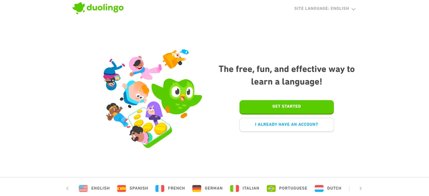
Duolingo’s landing page instantly conveys a sense of fun and engaging, gamified learning.
With quirky animations and a playful design, it reflects the app’s entertaining approach to language acquisition, making it appealing to both casual learners and those with more ambitious language goals.
Why we chose it:
- Gamification emphasis – Bright color schemes and fun illustrations drive home the idea that learning a language can be enjoyable and interactive.
- Immediate signup prompt – Clear “Get Started” buttons invite visitors to begin their first lesson right away, capitalizing on curiosity and momentum.
- Engaging microcopy – Short, lighthearted sentences explain features like streaks and XP points, keeping content approachable for all age groups.
📌 Key Takeaway
Highlight the fun aspect of your product to lower the perceived effort. When learning (or using your service) feels like a game, users are more inclined to stick with it.
11. Trello
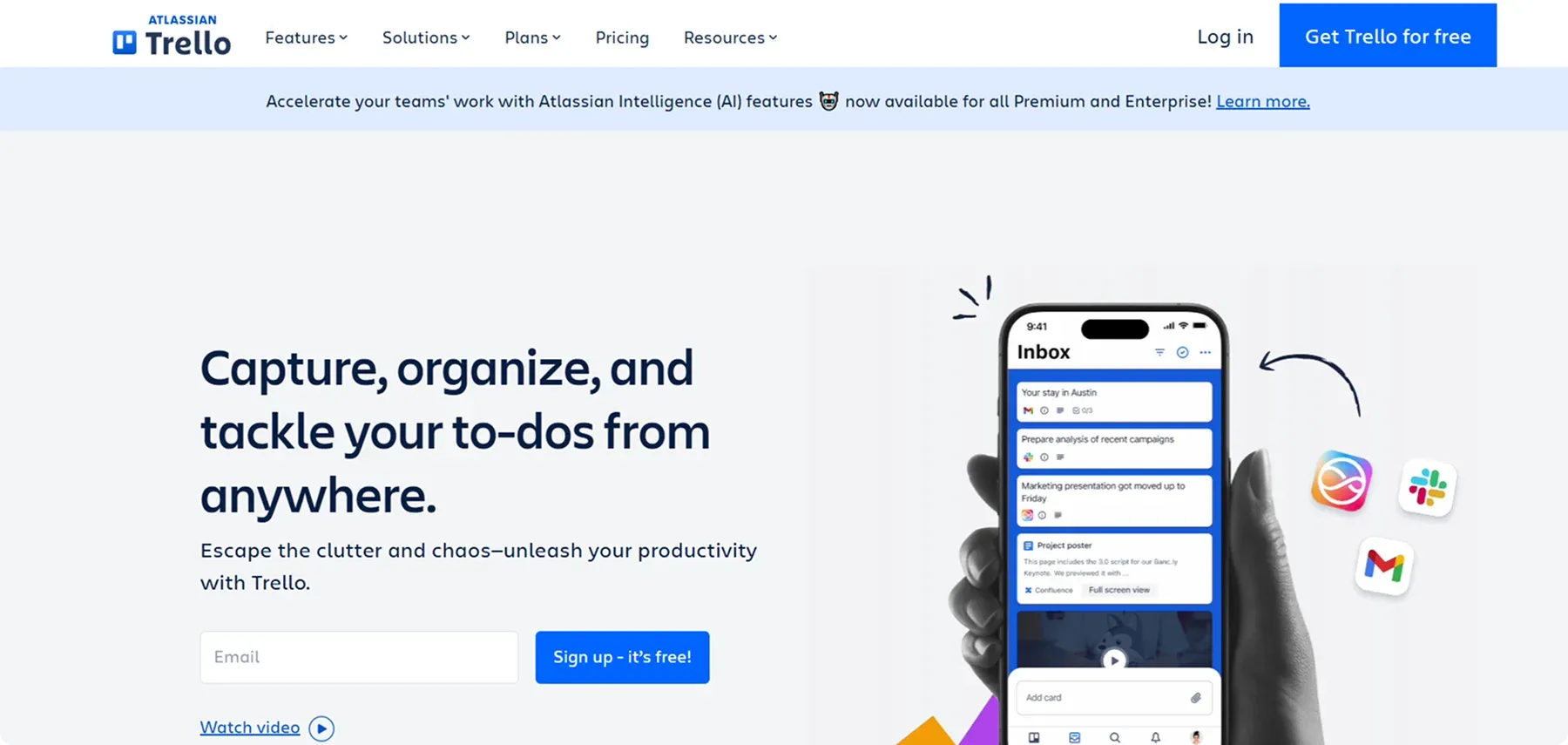
Trello’s landing page revolves around highlighting its intuitive project management boards.
A standout hero section visually explains how cards and lists function, letting you immediately see the platform’s core value proposition: effortless team organization.
Why we chose it:
- Quick onboarding – The “Sign Up–It’s Free” button removes cost concerns, enticing new users to give it a try.
- Real-time previews – Live demos of Trello boards let you envision exactly how tasks, checklists, and team collaboration come to life.
- Clear feature highlights – Each section breaks down benefits like workflow automation or integrations with popular tools, making it easy to see how Trello can fit into various work environments.
📌 Key Takeaway
Let your users “see it” before they commit. Visual previews of your product help people grasp the workflow and how it might fit into their own projects or teams.
In fact, adding interactive demos to websites can lead to a 25-35% increase in conversions.
12. Shopify
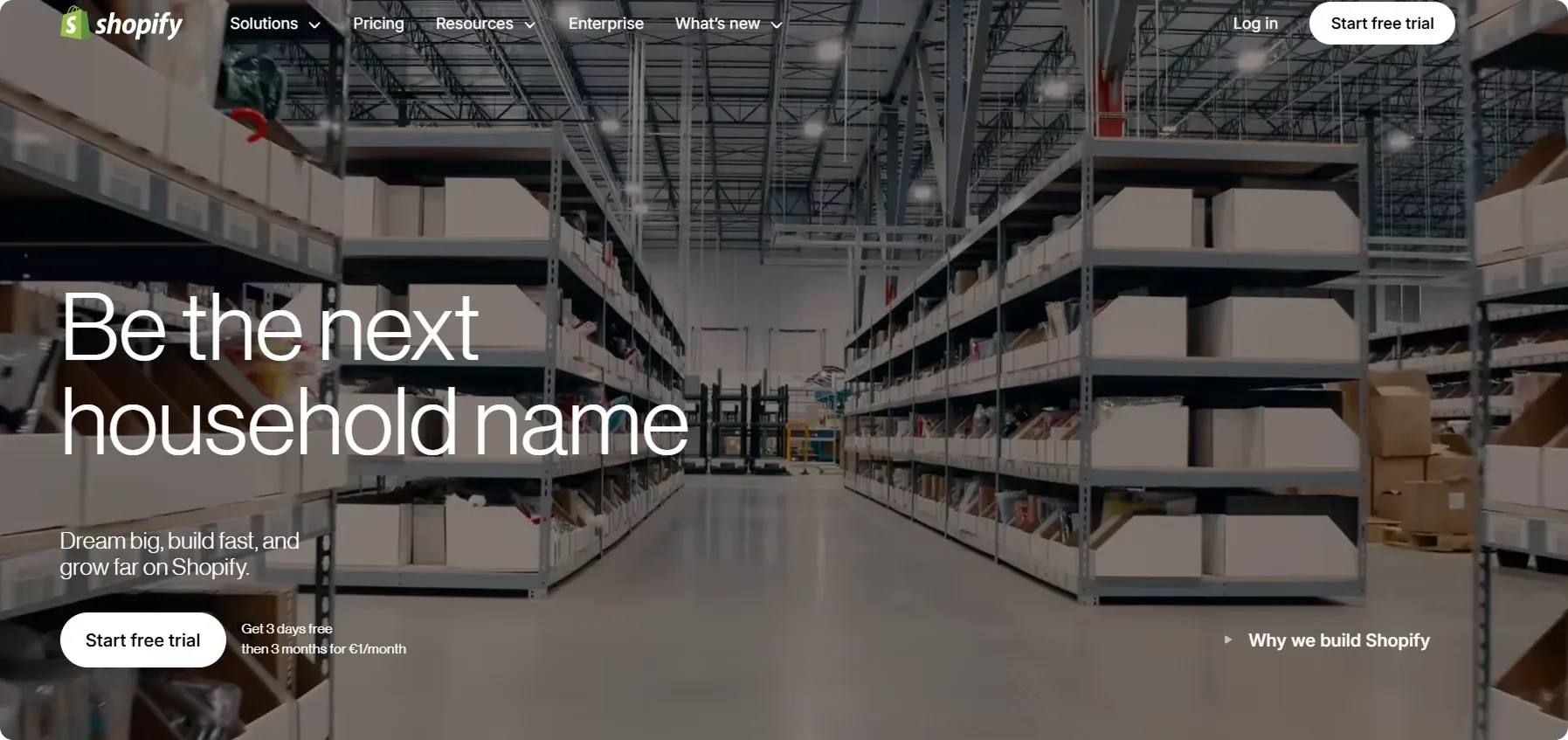
Shopify’s landing page quickly communicates its status as a leading e-commerce solution, showing how anyone can build an online store in minutes.
Bold headlines and clean visuals emphasize the platform’s ease of use, while free trial offers reduce friction for new sign-ups.
Why we chose it:
- Clear value proposition – The landing page immediately communicates what Shopify does and how it benefits users, making it easy for visitors to understand its purpose.
- Strong call-to-action – The “Start free trial” button is prominently placed, using low-commitment language to encourage sign-ups without pressure.
- Visually appealing design – The layout is clean, professional, and easy to navigate, ensuring you can quickly find key information without distractions.
Dos and Don’ts When Creating Landing Pages
✅ Dos
1️⃣ Use Strong Action Words – Start your CTAs with verbs like Get, Download, Start, or Join to encourage immediate action. These words create urgency and make it clear what users should do next.
2️⃣ Make CTAs Specific – Instead of vague phrases, use precise language that tells users exactly what they will get. For example, Download Your Free Guide is more effective than just Download.
3️⃣ Prioritize Action-Oriented Language – Studies show that CTAs using direct, engaging language can significantly boost conversions. A compelling CTA can make the difference between a visitor bouncing and taking the next step.
4️⃣ Test and Optimize – A/B testing different CTA variations can help determine which wording drives the most engagement. Small tweaks, like changing Sign Up to Start Your Free Trial Today, can lead to noticeable improvements.
❌ Don’ts
1️⃣ Avoid Passive and Generic Phrases – CTAs, like Learn More, Submit, or Click Here, lack a sense of urgency and don’t clearly convey what action the user is taking.
2️⃣ Steer Clear of Ambiguous Wording – A CTA should leave no room for confusion. Instead of Sign Up, use Create Your Free Account to set clear expectations.
4️⃣ Don’t Ignore Performance Data – If a CTA isn’t driving clicks or conversions, tweak the wording, placement, or design.
To Wrap Things Up
Now that you know these best landing page ideas, you can start thinking about how to craft your own high-converting page.
Consider incorporating feature demos, gamification elements, and clear calls to action to make your page more engaging and effective.
However, to bring your vision to life, you’ll need the right tools to build, optimize, and refine your landing page effortlessly.
This is where Codesi can help you!
How Can Codesi Help You Create an Eye-Cathcing Landing Page?
Codesi is an AI website builder that helps create a stunning, high-performing landing page that drives real results without requiring a big investment of time or money.
Unlike generic website builders that rely on stock images and templates, Codesi’s AI creates unique, personalized designs based on your inputs and prompts.
1. Landing Page Generator allows you to create your landing page in just a few minutes and publish it online with a single click!
Here is what this feature allows you to do:
✨ Instant website creation – Simply enter a prompt, and we’ll automatically generate a fully structured landing page with pre-written content and images. No need to write from scratch or design manually.
✨ Customizable design – Choose which website sections (blocks) you want to include and pick a color scheme that matches your style or brand identity.
✨ Built-in editor – Easily edit text, replace images, move website sections around, or delete anything you don’t need. You have full control over the content and layout.
✨ Domain flexibility – Deploy your website on your own custom domain (yourdomain.com) or use our free hosting with a pre-generated link (e.g., gogen.ai).
✨ Live preview – After generation, instantly view and interact with your website as if it were already live, ensuring everything looks and works as expected.
✨ Feedback forms – Easily collect responses and inquiries from visitors, with all submissions sent directly to your email.
✨ Analytics – Connect Google Analytics to track your website traffic, visitor behavior, and real-time engagement.
Here are some additional Codesi features:
2. AI Logo Generator
✨ Creating a logo is as simple as building a website! Just enter your text, and our AI will generate a unique logo tailored to your input.
✨ You can customize colors, fonts, add a brand name, and include a slogan to make it truly yours.
✨ You'll receive a pack of four logos, each with three variations:
- Text and slogan on the right
- Text and slogan on the bottom
- Logo only (no text or slogan)
3. AI Image Generator
✨ Turn your words into visuals with AI! Simply enter a text prompt, and our technology will create custom, high-quality images tailored to your needs.
Start with Codesi for free and create a professional landing page in minutes!
Create your website with AI today
Codesi is a platform where you can make a website in 3 minutes.
No coding, no designers, no hassle - just AI.
