Back to blog
What Is a Landing Page? [Examples + Why It Matters]
Discover what is a landing page for a website and learn how to design high-converting pages that drive action with clear goals and focused content.
May 9 2025
![What Is a Landing Page? [Examples + Why It Matters]](https://codesi.ai/admin/static/Cover_99f3e729c6.webp)
The digital world can sometimes be a little confusing, and we get that - so if you have ever wondered what is a landing page for a website, just sit back and read. In this article, we’ll answer all these questions:
- What is a landing page for a website?
- How does it differ from other pages?
- Why do landing pages matter in digital marketing?
- What are the types of landing pages, and when should you use them?
- What elements should be included?
- What are the key benefits of using landing pages?
- What makes a high-converting landing page?
What Is a Landing Page For a Website?
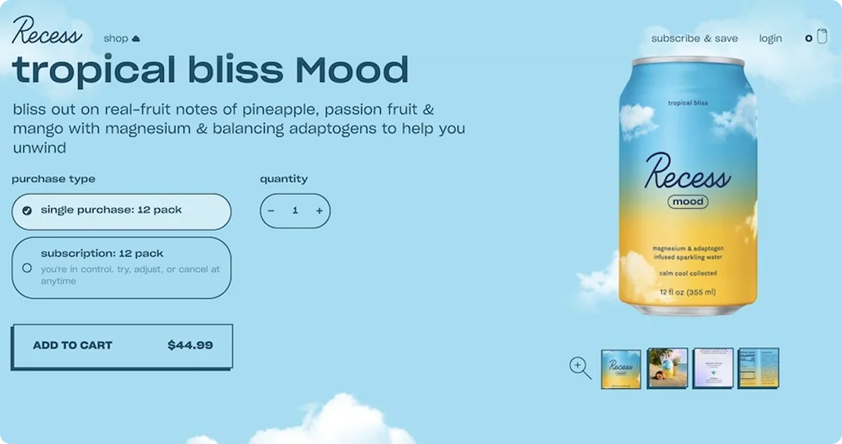
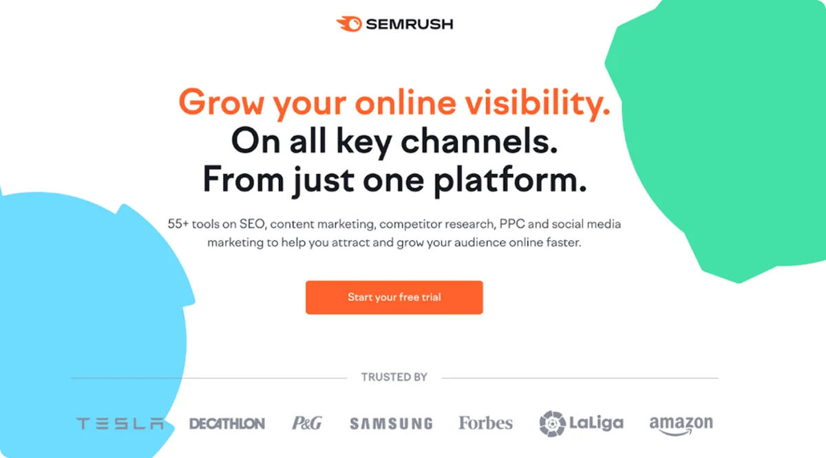
A landing page for a website is a dedicated page created with one goal: getting a visitor to take a specific action. That action might be filling out a form, clicking through to another page, signing up for a service, or downloading a resource. The critical part? It’s focused.
Unlike most pages on a website, a landing page doesn’t include a full navigation bar or multiple exit routes. Instead, it should be structured to avoid distractions and emphasize a call to action (CTA).
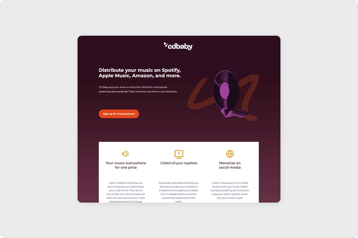
Take this as an example:
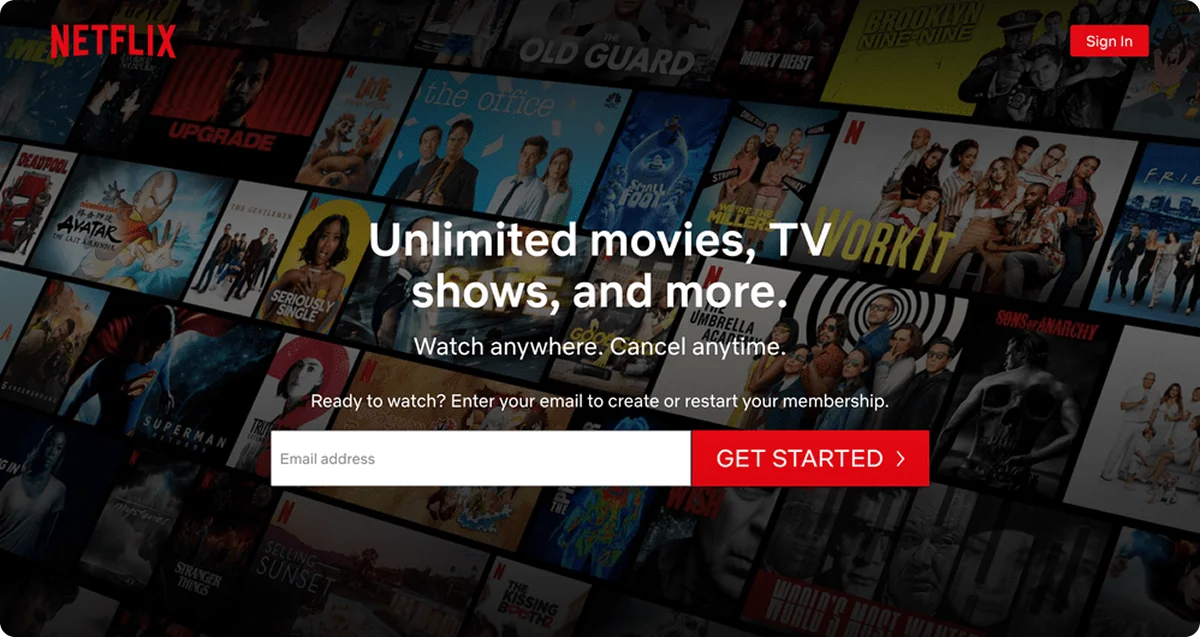
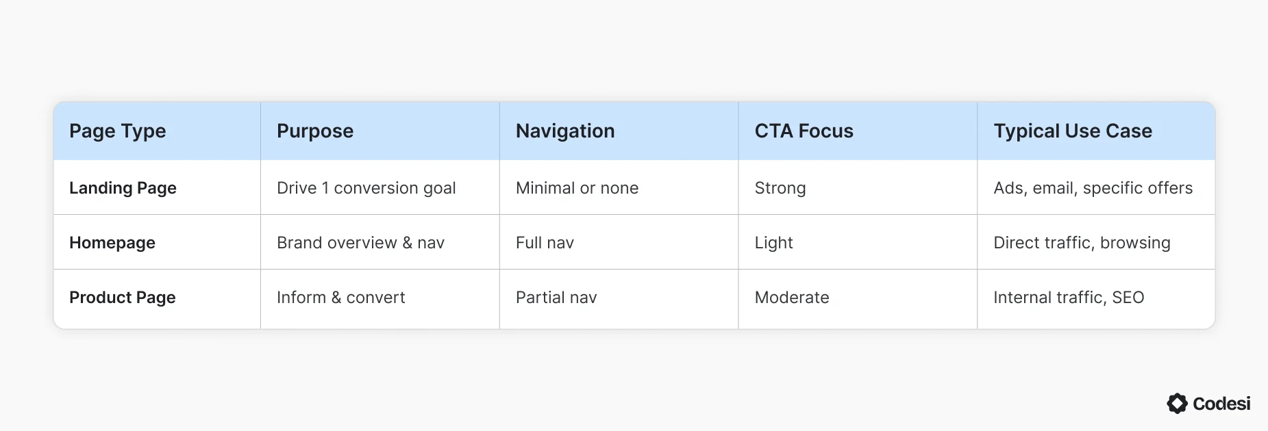
And just to keep it as clear as possible, here’s how a landing page stacks up compared to other types of website pages:
Remember, a landing page removes the clutter. It doesn't try to do too much. That's why it works.
Why Landing Pages Matter (Especially for SaaS)
Landing pages are not just helpful - they’re critical in a SaaS growth strategy. There are more than a couple of reasons why:
- Tailored Messaging Converts Better - When you run paid ads or send email campaigns, each audience segment has a different reason for clicking. A generic page won’t cut it. Landing pages let you tailor messaging to that intent, increasing the chances of conversion.
- They Power Campaign-Specific Funnels - Whether you're launching a new feature, offering a discount, or hosting a webinar, landing pages help you create standalone funnels that feel cohesive and targeted.
- Better A/B Testing and Optimization - With a single focus, it's easier to test elements like headlines, buttons, and layouts. You know exactly what to track.
- SaaS Onboarding Starts Here - Landing pages are often the first touchpoint in a SaaS onboarding experience. They set the tone. A strong first impression can make or break a trial-to-paid conversion.
The Types You Can Find?
Different campaigns call for different page structures, so it’s important to cover - at least - the most common types of landing pages:
Lead Generation Page
A Lead Generation Page is a webpage designed to collect visitor information, like email addresses or phone numbers, by offering something valuable in exchange, such as a free guide, discount, or newsletter subscription.
Click-Through Page
A click-through landing page is a web page designed to persuade visitors to click a button that takes them to another page where they can complete an action, like making a purchase or donation.
Product Launch Page
A product launch page is a specially designed webpage that introduces a new product to the market, highlighting its key features, benefits, and value while encouraging visitors to take action, like pre-ordering, purchasing, or signing up for more information.
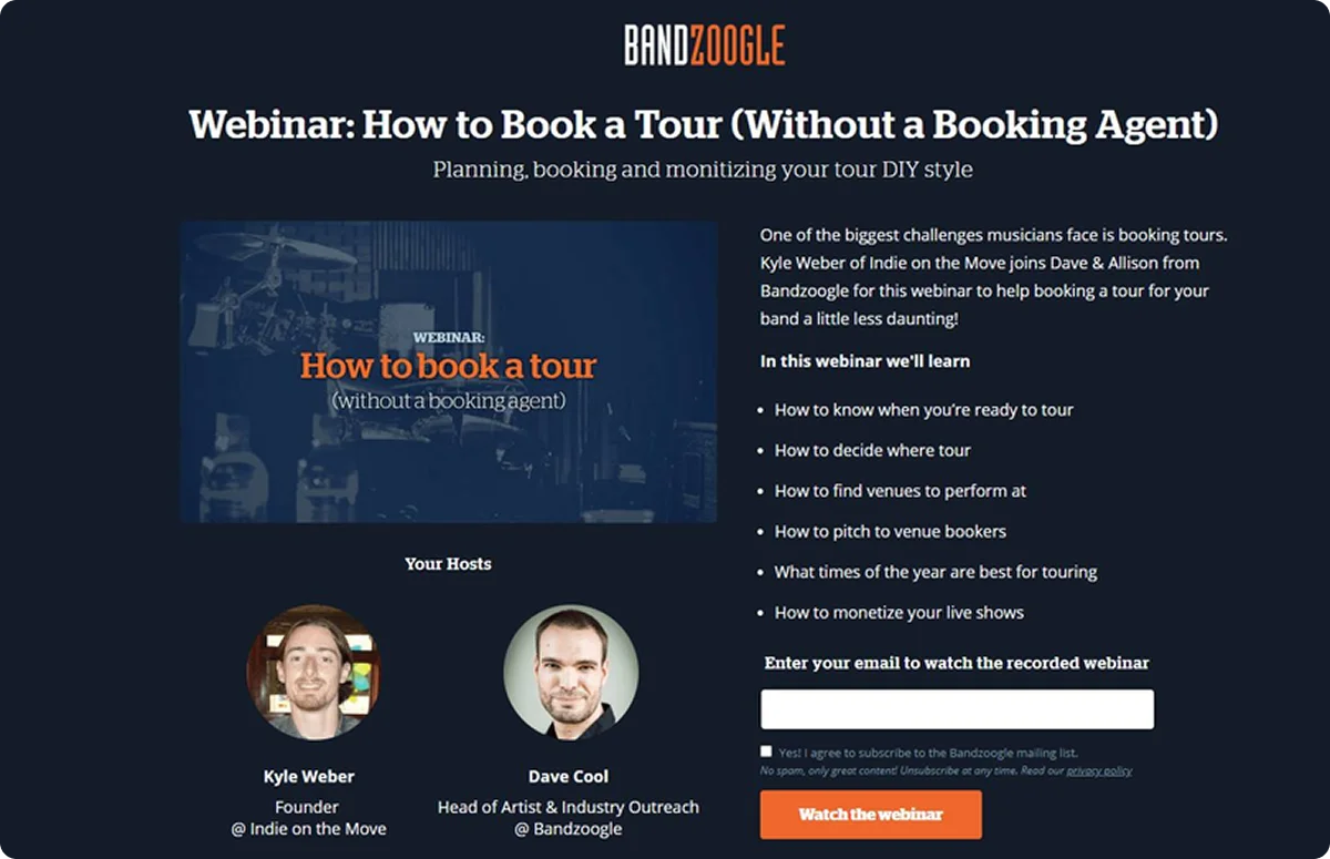
Webinar / Event Signup Page
A webinar/event signup page is a focused webpage that promotes an upcoming online or in-person event, presents key details like date, time, speakers, and topics, and features a prominent registration form to collect attendee information.
Free Trial or Demo Request Page
A Free Trial or Demo Request Page is a webpage designed to encourage visitors to test a product or service before buying by showcasing key benefits and featuring a simple form to sign up for a hands-on experience.
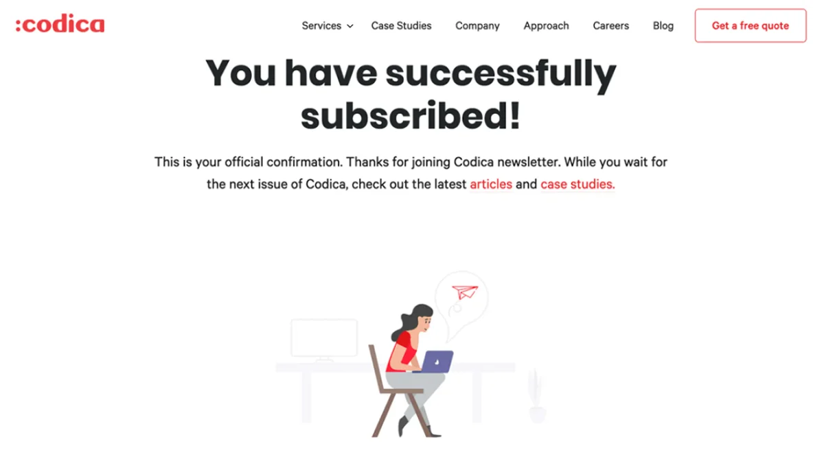
Thank You / Confirmation Page
A Thank You / Confirmation Page is the webpage that appears after someone completes an action online, acknowledging their submission, confirming their information was received, and guiding them on what to expect next.
Feature-Specific Page
A Feature-Specific Page is a webpage dedicated to showcasing one particular feature or capability of a product or service, diving deep into how it works and the specific benefits it provides to users.
Pro Insight:
High-growth SaaS companies leverage various landing pages to address different personas, funnel stages, and use cases. Understanding what a landing page for a website is and how it converts visitors is crucial to this strategy. Don’t worry, though; tools like Codesi AI enable the fast generation of these targeted variations.
Benefits of Using Landing Pages
What is a landing page for a website capable of achieving? Let's uncover the benefits it brings:
- Increased Conversions - Removing distractions and matching messaging to the source traffic consistently improves conversion rates.
- Better ROI on Ad Spend - Sending PPC or social traffic to a general page burns money. A purpose-built landing page makes every click count.
- Cleaner Analytics - You can isolate performance at the page level. That means easier tracking of what’s converting and what isn’t.
- Controlled User Experience - Unlike a homepage, you control every element on a landing page - from the headline to the CTA. That control leads to smoother, shorter journeys.
- Improved Message Match - Landing pages allow you to match the ad promise exactly. This consistency builds trust and boosts performance.
How to Create a Website Landing Page That Converts?
Remember, a high-performing landing page doesn’t allow for guesswork.
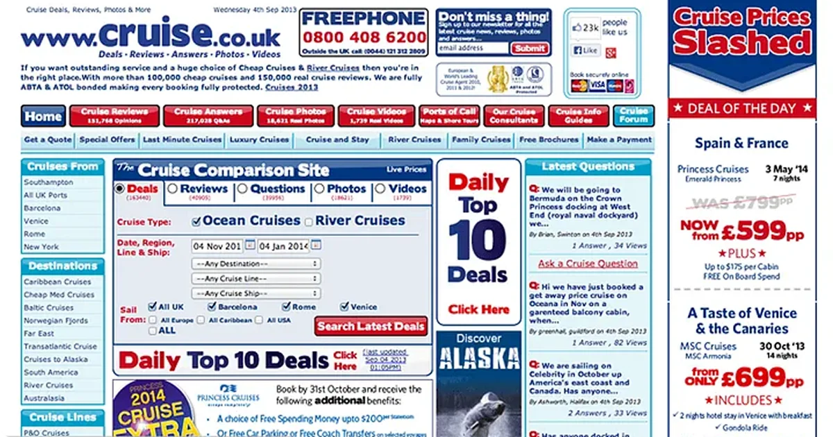
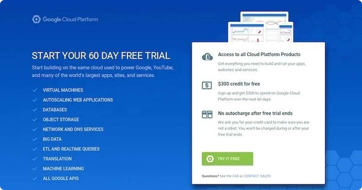
You do not want yours to look like ☝️, so make sure to:
1. Define Your Goal
Every effective landing page starts with a clearly defined goal. Before you write a single word or design a layout, ask yourself: What is the one action I want the visitor to take?
Whether it’s signing up for a newsletter, booking a product demo, downloading an ebook, starting a free trial, or making a purchase, your landing page should revolve around that single objective.
This goal will dictate the structure, content, and calls-to-action (CTAs) on the page.
A focused goal ensures you don’t overwhelm visitors with too many options, which often leads to decision fatigue and lower conversion rates.
For example:
- If your goal is to collect email addresses, your form should be front and center with a compelling reason to subscribe.
- If you’re promoting a SaaS demo, the CTA should guide users toward scheduling a time, supported by social proof and benefit-driven copy.
Note: Avoid cramming multiple offers or distractions onto the page. The more specific and narrow your goal, the easier it is to guide users toward taking action. A good landing page doesn’t try to do everything—it does one thing exceptionally well.
2. Know Your Audience
Different segments respond to different messages. Before writing, answer the following:
- Who is landing here?
- Where did they come from?
- What problem are they trying to solve?
Use this context to shape everything - from copy to visuals and CTA.
3. Choose the Right Landing Page Type
Are You Capturing Leads or Pushing Sign-Ups? Not all landing pages serve the same purpose, and the way you design them should match the goal. Let’s dive in a bit more, though:
- Lead generation pages are built to collect info, so they focus on forms. You’ll usually see things like name, email, company, sometimes more. The key is making it easy to fill out while still getting useful details.
- Click-through pages are meant to warm people up before sending them somewhere else—usually a product or pricing page. These should be clean and simple, with just enough info to get someone to click.
- Product launch or trial pages need to show value fast. This is where you highlight benefits, maybe throw in a demo or video, and make the “Start Trial” button hard to miss.
- Webinar or event sign-up pages are all about the when, where, and why. You want to build interest quickly and make registration frictionless.
Each goal needs a different setup. One format doesn’t fit all, and how you structure the page makes a big difference in whether someone bounces or takes the next step.
4. Write a Headline With Clear Value
The headline is the most important copy on the page. Make it benefit-focused, not clever.
Example:
❌ “Teamwork Made Easy”
✔️ “Plan, Track, and Launch Projects - All in One Place”
5. Support With Strong Copy and Visuals, but don’t overdo it
What users see helps reinforce what they read. A good landing page design uses subheadlines, bullets, or short paragraphs to drive the value home. Keep it tight. Pair copy with relevant images, illustrations, or short videos.
6. Design for Clarity and Speed
If you want your users to stick around, you need a clear and fast-loading landing page. No one wants to wait for these kinds of things. Here’s what to focus on:
- Use white space generously.
- Highlight the CTA visually.
- Cut any friction from form fields or navigation.
- Personalize to meet user needs
- Optimize for page speed and mobile UX - these are non-negotiable.
7. A/B Test Key Elements
You won’t know what works until you run tests - and run them long enough to reach meaningful results. Test one thing at a time:
- Headlines
- CTAs
- Visual layout
- Lead form length
8. Review Performance and Iterate
Look beyond conversions. Track:
- Time on page
- Scroll depth
- CTA click-throughs
- Drop-off points
Now that we know what makes a high-converting landing page, let’s take a look at some of the best examples you can find online here.
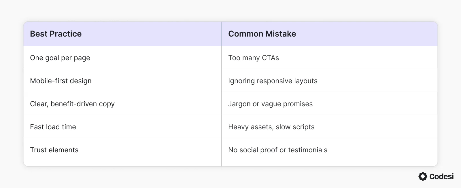
Yet, even strong campaigns can fail with small missteps. Here’s a quick-reference table to keep your strategy on point:
Behavior Data Insight: Where Users Actually Drop Off
Most landing page optimization advice talks about what should work. But here’s a practical reality based on aggregated user behavior data from multiple SaaS heatmap and scroll-tracking tools:
- Over 70% of users don’t scroll past the first CTA.
- The bounce rate increases by 25 - 30% if the headline and CTA are not aligned.
- Form fields with more than 4 required inputs reduce conversion rates by up to 50%.
So, even if your page looks good, users might still abandon it early, especially if:
- The headline is vague or “clever” instead of clear.
- The CTA is visually weak or feels like a bait-and-switch.
- There’s too much friction (like long forms or hidden pricing).
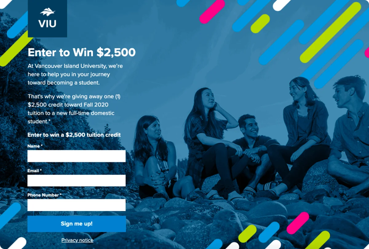
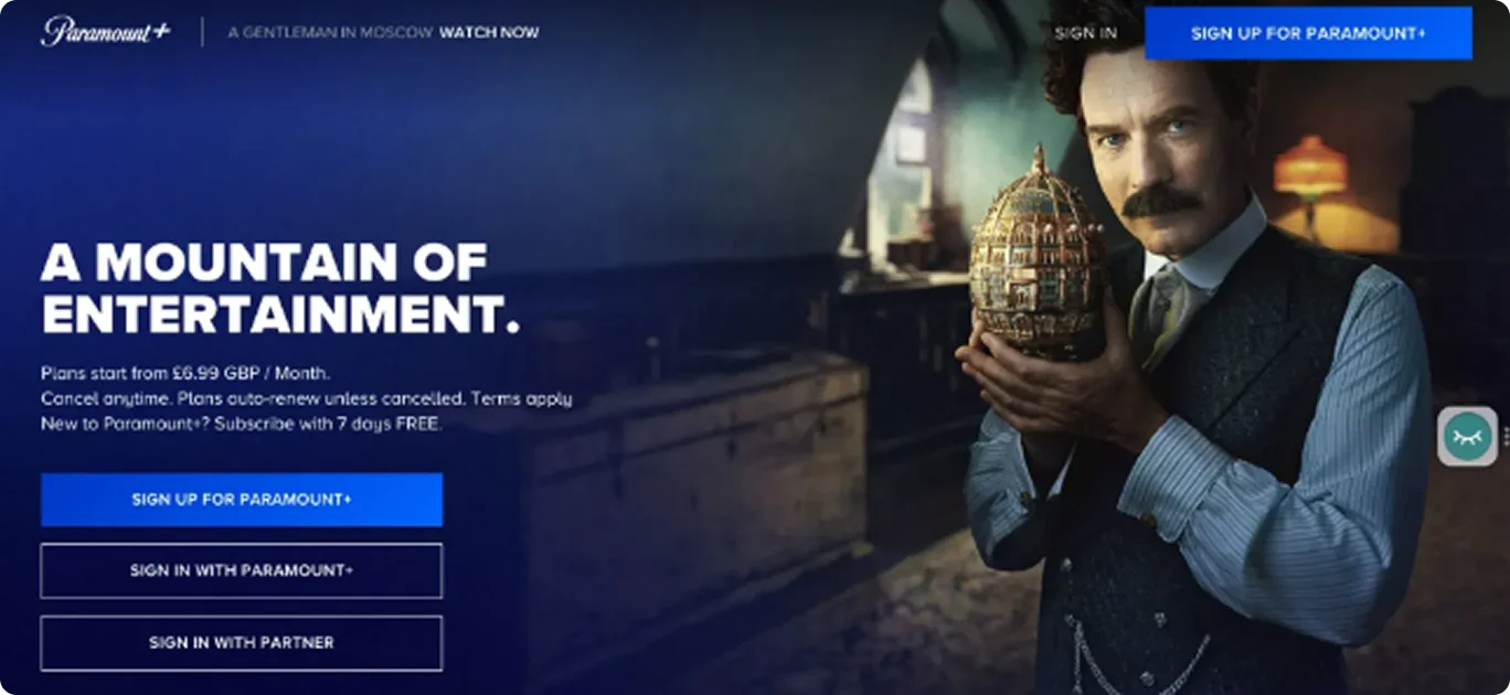
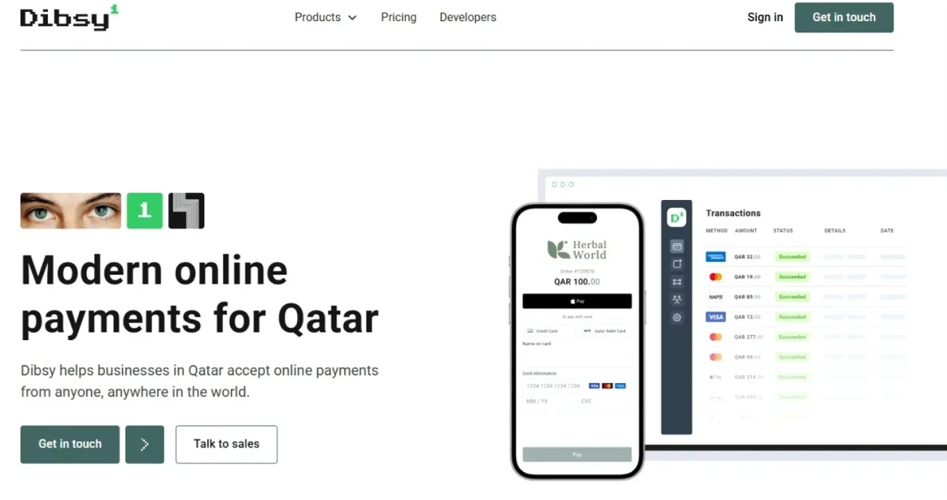
This is how a good landing page looks:
Pro tip:
Design your landing page so visitors understand what you offer and what action to take within 5 seconds - that's all the time you have before they're likely to leave and look elsewhere.
To Sum Things Up…
Landing pages are built to do one thing: get users to take action. Whether it's signing up, downloading, or making a purchase, the goal is focus. No distractions. Just clear, fast, and convincing content. Different companies use different landing pages to speak directly to specific audiences. And that’s where AI comes in - it helps take the guesswork out by using data to figure out what works and what doesn’t.
How Can Codesi Help?
Building is only half the game - optimizing is where you win. Codesi AI makes your landing pages smarter and more effective with powerful AI-driven capabilities:
- Intelligent Content Generation - Creates multiple headlines and copy variants tailored to different audience segments - cold vs. warm leads - all generated instantly based on user intent
- Data-Driven Design Optimization - Analyzes engagement patterns to recommend layout adjustments that increase click-through rates, backed by performance data from your industry.
- Advanced A/B Testing - Tests multiple variants simultaneously, automatically prioritizes high-performers, and continuously learns from results to refine your page.
- Behavior-Based Improvements - Identifies exact scroll-depth drop-off points, flags underperforming CTAs, and suggests replacements based on actual click patterns.
- Seamless Integration - Syncs insights directly into your existing CMS and analytics tools for streamlined workflow
- Expert Support - Provides outstanding customer assistance to help you maximize the platform's potential
Codesi AI delivers the most comprehensive optimization solution with proven results for increasing conversions, so make sure to join the waitlist now.
Create your website with AI today
Codesi is a platform where you can make a website in 3 minutes.
No coding, no designers, no hassle - just AI.
