Back to blog
12 Best Travel Landing Page Examples To Use in 2026 [+Tips]
Discover the best travel landing page examples that boost bookings with clear offers, bold visuals, smart design, and personalized user experiences.
Jun 10 2025
![12 Best Travel Landing Page Examples To Use in 2026 [+Tips]](https://codesi.ai/admin/static/Cover_48aaae1187.webp)
Most travelers don't have time to wander through a maze of pages. They want answers fast – where to go, what to book, and why it's worth it.
That's where an effective travel landing page makes all the difference. It builds trust, sparks curiosity, and gives just enough to help visitors take the next step.
This guide explores the best travel landing page examples in 2026, unpacking the design hooks and copy tactics that turn clicks into bookings and how to make them work for you.
What Makes a Great Travel Landing Page in 2026?
A travel landing page is a standalone page designed for a specific marketing campaign – think seasonal tour, flight deal, or downloadable guide.
In 2026, high-performing travel landing pages follow a precise formula: focused design, persuasive content, and intentional user flow. Here are the key elements that define them:
Clear Value Proposition Above the Fold
A strong headline and subheadline communicate the offer immediately.
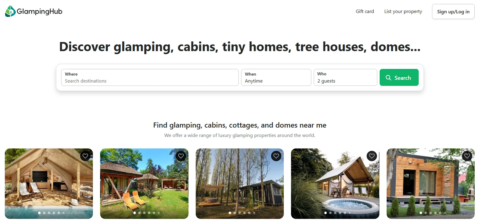
For example, a travel landing page like Glamping Hub’s might lead with “Discover glamping, cabins, tiny homes, tree houses, domes...” instantly showcasing the variety and inviting exploration.
One Primary Call-to-Action (CTA)
Every element on the page supports a single action – Book Now, Download Guide, or Start Planning.
This approach eliminates confusion and sharpens the path to conversion.
Structured, Conversion-Centered Layout
Effective pages use whitespace, contrast, and directional cues to focus attention.
Bullet points, icons, and concise paragraphs make content easy to scan and absorb.
High-Impact Visuals and Video
Professional imagery and short video loops improve engagement.
For instance, a snowy mountain timelapse on a landing page can set the mood and subtly guide users toward the CTA.
Mobile-First Responsiveness
With most bookings now beginning on mobile, fast load times, vertical layouts, and touch-friendly design are essential.
Mobile-optimized pages consistently see higher conversion rates.
Personalized User Experience
Studies show 71% of customers expect personalized experiences.
Modern landing pages increasingly incorporate personalization, greeting return visitors, recommending trips based on their behavior, or dynamically adapting content through AI.
Trust and Social Proof
User reviews, star ratings, safety certifications, and recognizable partner logos build confidence quickly and reduce hesitation.
Top 12 Travel Landing Page Examples to Inspire You in 2026
Let's explore top travel landing pages, why they work, and how to apply their best ideas to your own:
1. Her Finland – "Starter Kit" Landing Page
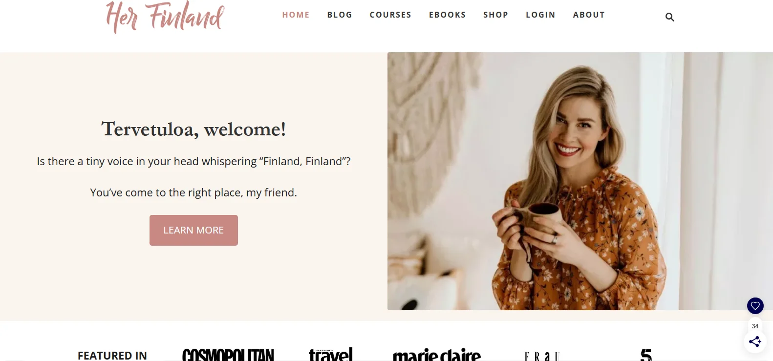
Her Finland's landing page greets visitors with a warm, personal message: "Tervetuloa, welcome! Is there a tiny voice in your head whispering 'Finland, Finland'? You've come to the right place, my friend."
It immediately sets a friendly tone that feels more like a letter than a pitch. The offer, a free "Finland Starter Kit," is prominently featured, accompanied by a calming landscape background and a brief form to access the guide.
Why it works:
The conversational intro makes the experience feel human and welcoming. A focused layout, emotional appeal, and single bright CTA guide the visitor toward action without distractions.
Takeaway:
Use warm, relatable copy to connect, and keep your layout concise by focusing on a single offer, a clear action, and minimal visual mess.
2. Travel Republic – Affordable Holiday Booking Platform
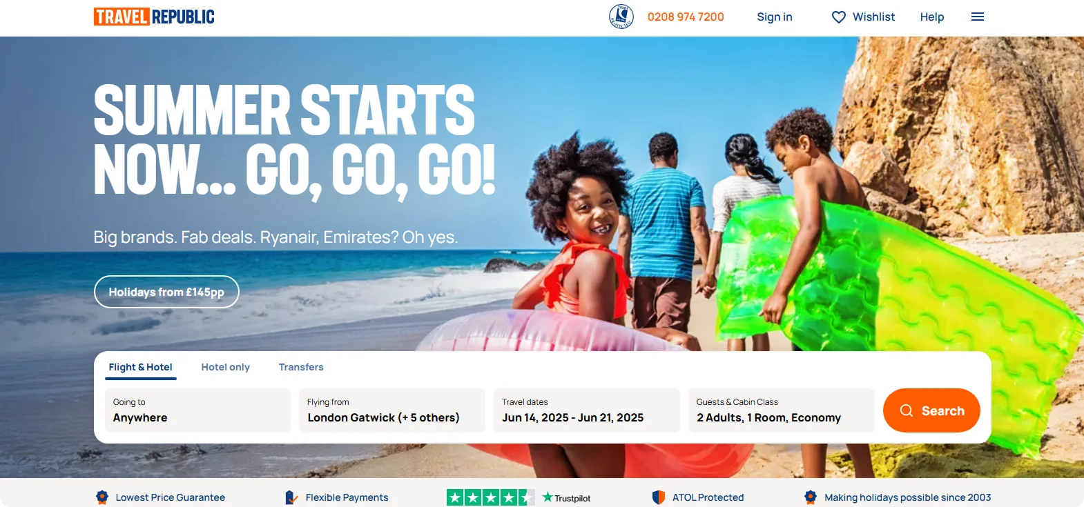
Travel Republic's landing page welcomes visitors with a clean, user-friendly interface that emphasizes affordability and flexibility.
The prominent search bar invites users to explore over 13,000 unique hotels, flights, and holiday packages, catering to a wide range of budgets and preferences.
Why it works:
By combining a straightforward layout with flexible booking options and clear value propositions, Travel Republic effectively meets the needs of budget-conscious travelers who strive for convenience and reliability.
Takeaway:
For travel platforms aiming to appeal to a broad audience, prioritizing user-friendly design, flexible planning tools and transparent pricing.
3. Expedia – Car Rental Page
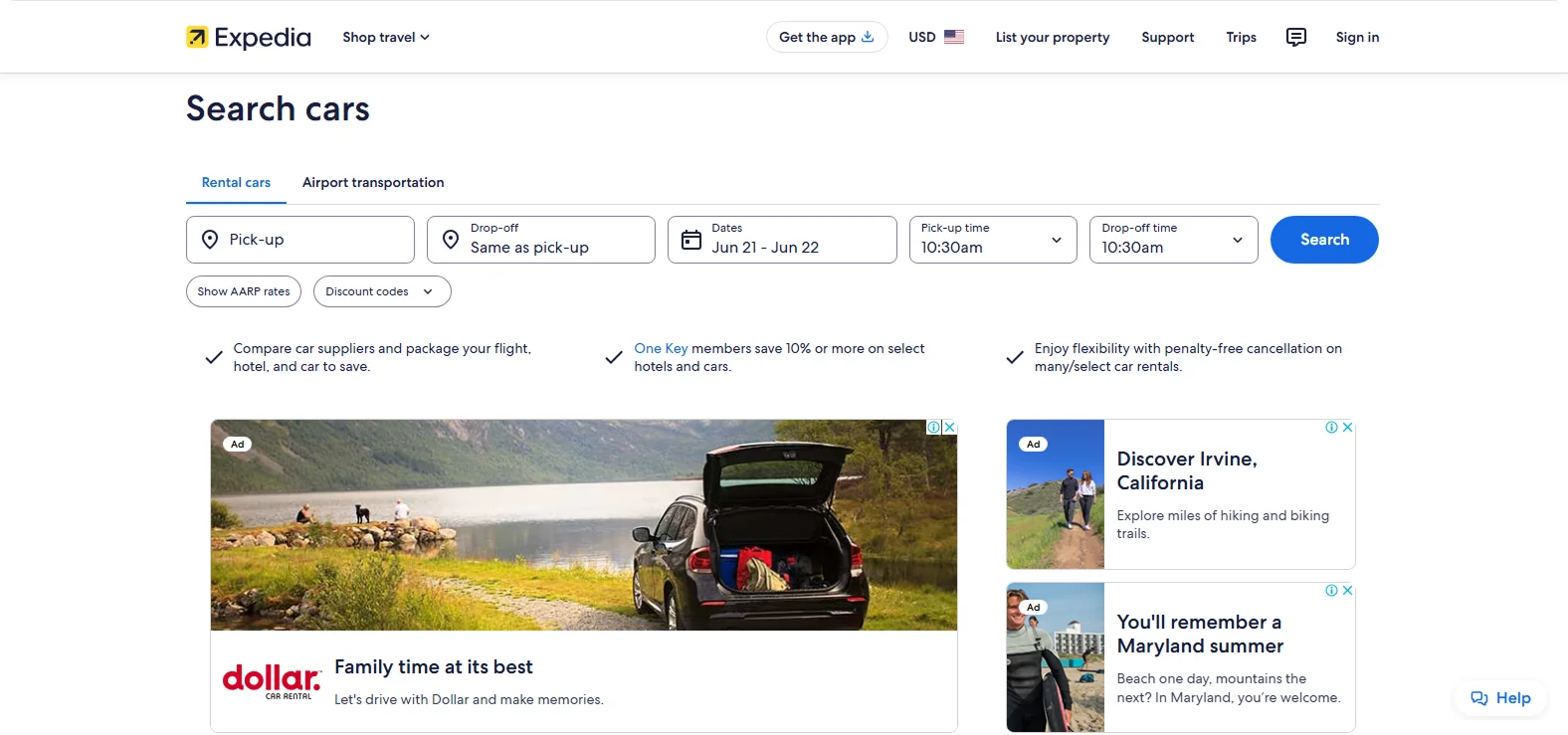
Expedia's car rental landing page is focused on one goal: booking a rental. The top section displays a clean form that requests pickup location and dates, and below is a bold "Popular Rental Car Choices" section. Partner logos and trust badges appear near the CTA.
Why it works:
Focus is razor-sharp, and placing trust signals near the conversion button boosts credibility right when it counts.
Takeaway:
Keep landing pages single-purpose. If your goal is car rentals, don't clutter with hotels or flights. Add visual trust indicators close to your form.
4. GetYourGuide – Tour Finder Page
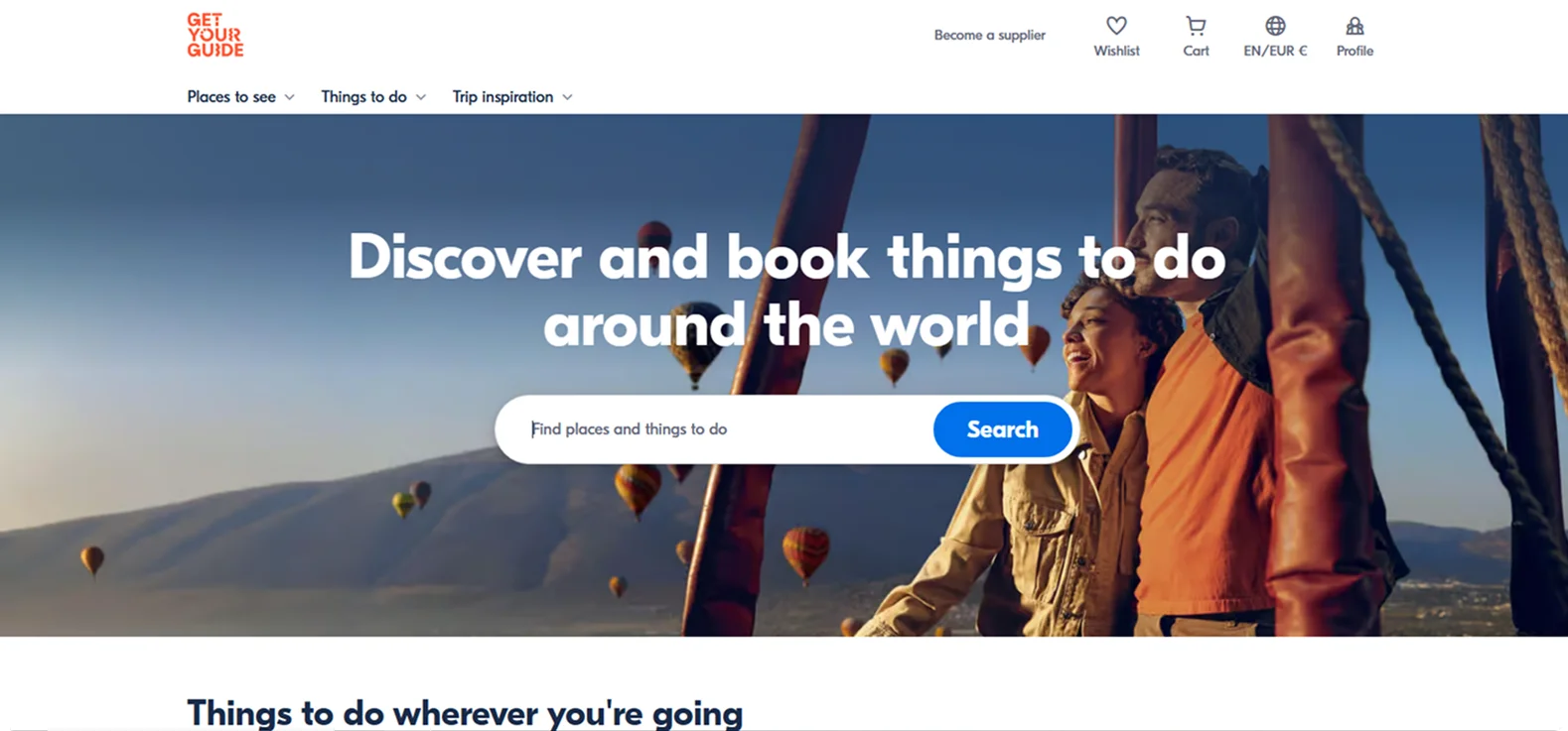
GetYourGuide uses a dynamic landing page that prompts visitors to select their interests and "find places and things to do" before presenting tailored options.
This personalized strategy ensures users feel instantly understood and valued by the site.
Why it works:
By starting with an interesting filter, it shows only relevant content, increasing both time on the page and the likelihood of booking.
Takeaway:
Guide users quickly into what matters to them. Interactive filters and quizzes can boost engagement and conversions.
5. Viator – Local Tours and Activities
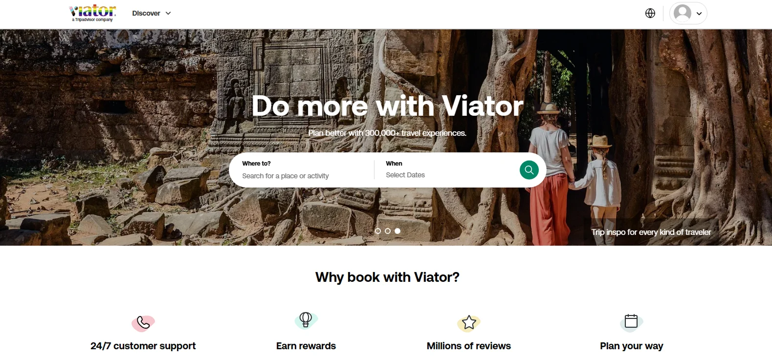
Viator organizes its landing pages by location and experience type, such as "Historical Activities in Rome."
A persistent search bar sits at the top, followed by categorized offers. Each has its own "Book Now" button, refund policy details, and ratings.
Why it works:
Even with a lot of content, the structure keeps things digestible. Trust signals (e.g., "Free Cancellation") reduce friction.
Takeaway:
For multi-offer pages, use clear sections and keep the call-to-action for each product visible. Add customer support notes or refund guarantees to build trust.
6. Mendoza Wine Tours – Lujan de Cuyo Wine Tour
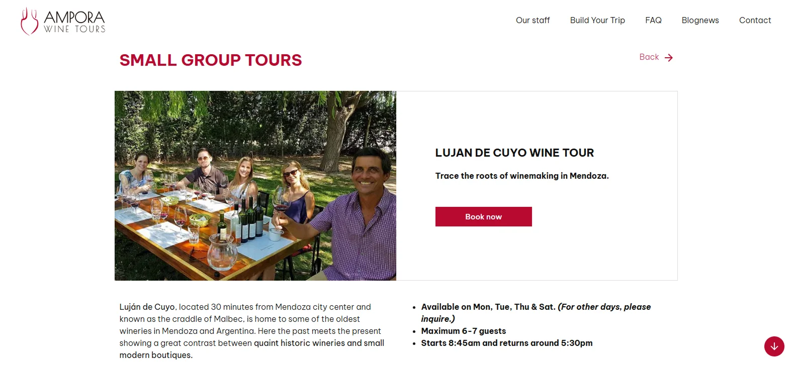
This agency's page features a full-width hero image of lush vineyards, accompanied by the bold offer text "Small Group Tours."
The page uses icons and bullet points to highlight the trip details below the fold.
Why it works:
The design leads with emotion and closes with detail. High-contrast visuals and transparent pricing keep the decision-making simple.
Takeaway:
For upscale or themed tours, use immersive visuals and a standout call-to-action (CTA) box to improve the experience.
7. Icelandic Mountain Guides – Skaftafell Ice Cave Tour
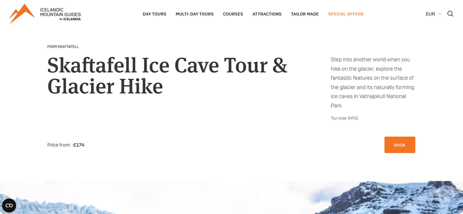
This landing page opens with a striking image of travelers entering a glowing blue ice cave, immediately setting the tone for adventure.
A clear headline and bold "Book" button keep the focus sharp, while the tour description highlights key details: a 3.5-hour guided hike, full safety gear, and the chance to explore natural ice formations in Vatnajökull National Park.
Why it works:
The immersive visual, clean layout and no-nonsense itinerary create a sense of excitement and clarity. Trust-building elements, such as expert guides and genuine reviews, reinforce confidence.
Takeaway:
For experience-driven tours, lead with atmosphere, keep the offer crystal clear, and guide users directly toward booking.
8. Halfway Anywhere – Adventure Blog and Gear Hub
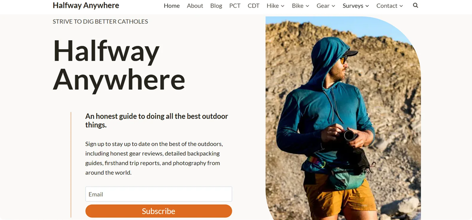
Halfway Anywhere's homepage greets visitors with a bold tagline: "An honest guide to doing all the best outdoor things."
The design is clean and content-forward, featuring a prominent email signup form inviting readers to subscribe for updates on gear reviews, backpacking guides, and trip reports.
Why it works:
The homepage strikes a balance between personality and utility, encouraging exploration without overwhelming the visitor. The clear value proposition and engaging visuals effectively draw in the target audience.
Takeaway:
Combining authentic storytelling with a straightforward layout can build trust and encourage deeper engagement.
9. De Yachting – Luxury Gulet and Motor Yacht Charters
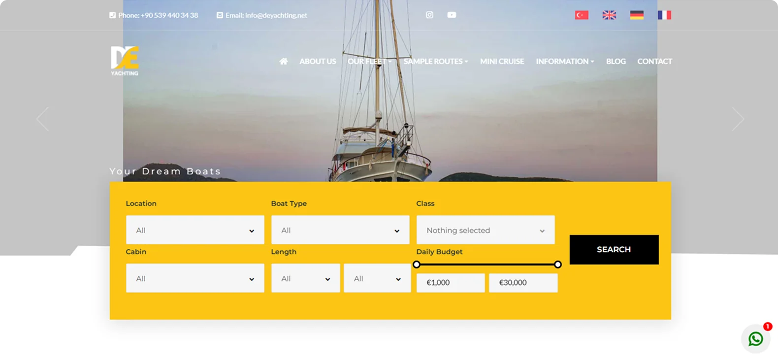
De Yachting's homepage welcomes visitors with a clean, image-rich design that immediately showcases its premium fleet of gulets and motor yachts. The headline "Your Dream Boats" sets an aspirational tone, while the prominent search filters: by location, vessel type, cabin count, and budget – make it easy for users to find the perfect charter.
Why it works:
The combination of luxurious visuals, user-friendly navigation, and personalized service options creates an inviting experience that appeals to discerning travelers seeking bespoke maritime adventures.
Takeaway:
For luxury travel services, a well-structured, visually appealing website with clear calls to action and personalized options can effectively convert interest into bookings.
10. ANA Japan Travel Planner – Flexible Travel Plans
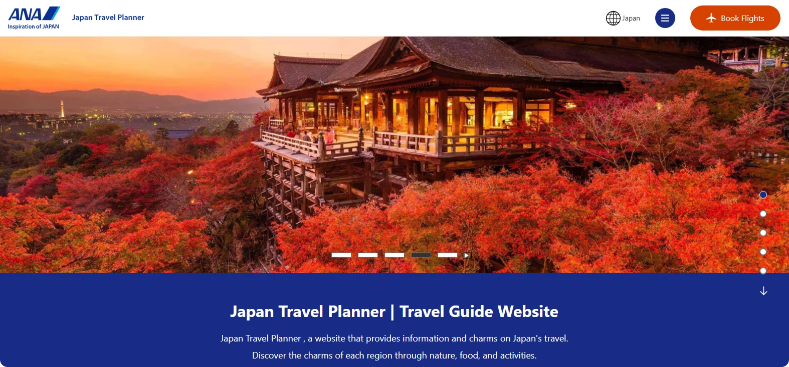
ANA's Japan Travel Planner serves as a comprehensive guide for travelers seeking to explore Japan's diverse regions and experiences.
The site highlights seasonal events, local festivals, and unique cultural experiences, offering a rich tapestry of Japan's offerings.
The platform's user-friendly design and multilingual support make it accessible to a global audience.
Why it works:
By combining detailed travel content with practical planning tools, ANA's Japan Travel Planner empowers travelers to design personalized and enriching journeys throughout Japan.
Takeaway:
Offering a blend of inspirational content and actionable planning resources can effectively engage users and ease trip planning.
11. Hopper – Smart Travel Booking App
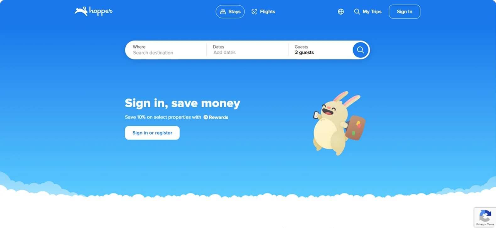
Hopper's homepage focuses on one thing: saving travelers money.
With its AI-powered price prediction tool, users can track flights, hotels, and car rentals and get alerts when prices drop. The mobile-first design emphasizes ease, with features like price freeze and flexible booking baked into the app experience.
Why it works:
Hopper combines user-friendly design with powerful predictive tools, making it easier for travelers to plan and book trips confidently.
Takeaway:
Integrating advanced analytics with intuitive interfaces can significantly improve the user experience and drive increased engagement.
12. SouthAmerica.travel – Amazon Rainforest Tours
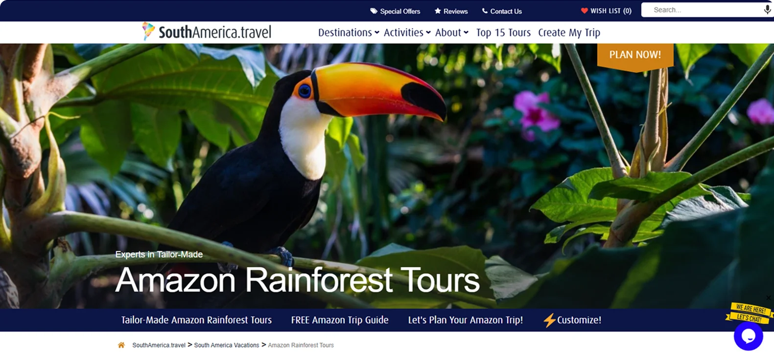
SouthAmerica.travel's Amazon Rainforest page offers a curated selection of tailor-made tours across Brazil, Peru, and Ecuador.
The platform offers comprehensive information on activities such as hiking, wildlife spotting, and canoeing, along with practical details like safety tips and packing lists. High-quality visuals and a detailed route plan improve the user experience, making it easier for travelers to envision their adventures.
Why it works:
By combining personalized itineraries with rich content and user-friendly design, SouthAmerica.travel effectively guides visitors from inspiration to booking.
Takeaway:
Offering customizable experiences alongside practical information can engage users and facilitate the planning process.
How Codesi Helps You Build Better Travel Landing Pages
The best travel landing pages in 2026 don't waste time – they guide it. Therefore, your travel landing page should act like a tour guide: welcoming, clear, and ready to lead visitors to precisely what they need.
You've seen what works: bold visuals, single CTAs, mobile-first layouts, and copy that speaks like a real person. But knowing what works is only half the challenge – building it fast and at scale is where most travel brands hit a wall.
Codesi offers a powerful suite of tools built for travel marketers who want more than just a pretty page – they want performance.
Codesi equips you with everything you need to build high-converting travel landing pages, including:
- AI One-Page Website Generator: Create a custom landing page for your tour, app, or retreat in under five minutes – no coding required.
- AI Image and Logo Generators: Generate original visuals, logos, and hero shots in seconds with a simple prompt.
- Full Customization: Edit everything from fonts and layouts to CTAs and color schemes to match your brand voice.
- Analytics and Optimization Tools: Track clicks, form submissions, and engagement heatmaps to continually improve performance.
Here’s how to easily generate travel landing pages with Codesi - step by step:
Step 1: Sign up on Codesi (it’s free).
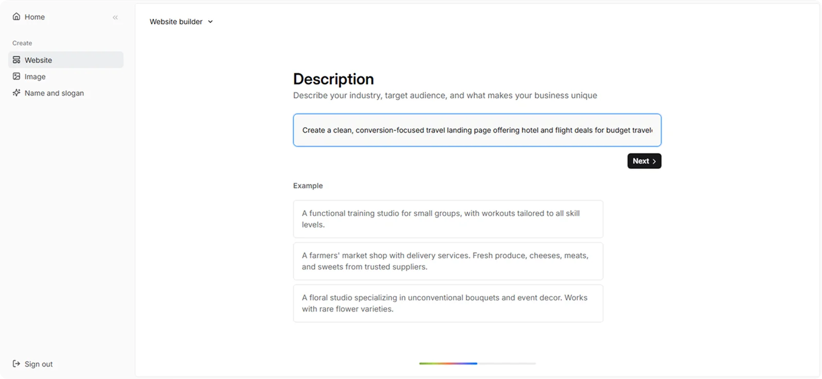
Step 2: In the Website Builder, enter your prompt. For travel landing page creation, we used the following example:
“Create a clean, conversion-focused travel landing page offering hotel and flight deals for budget travelers going to Thailand.”
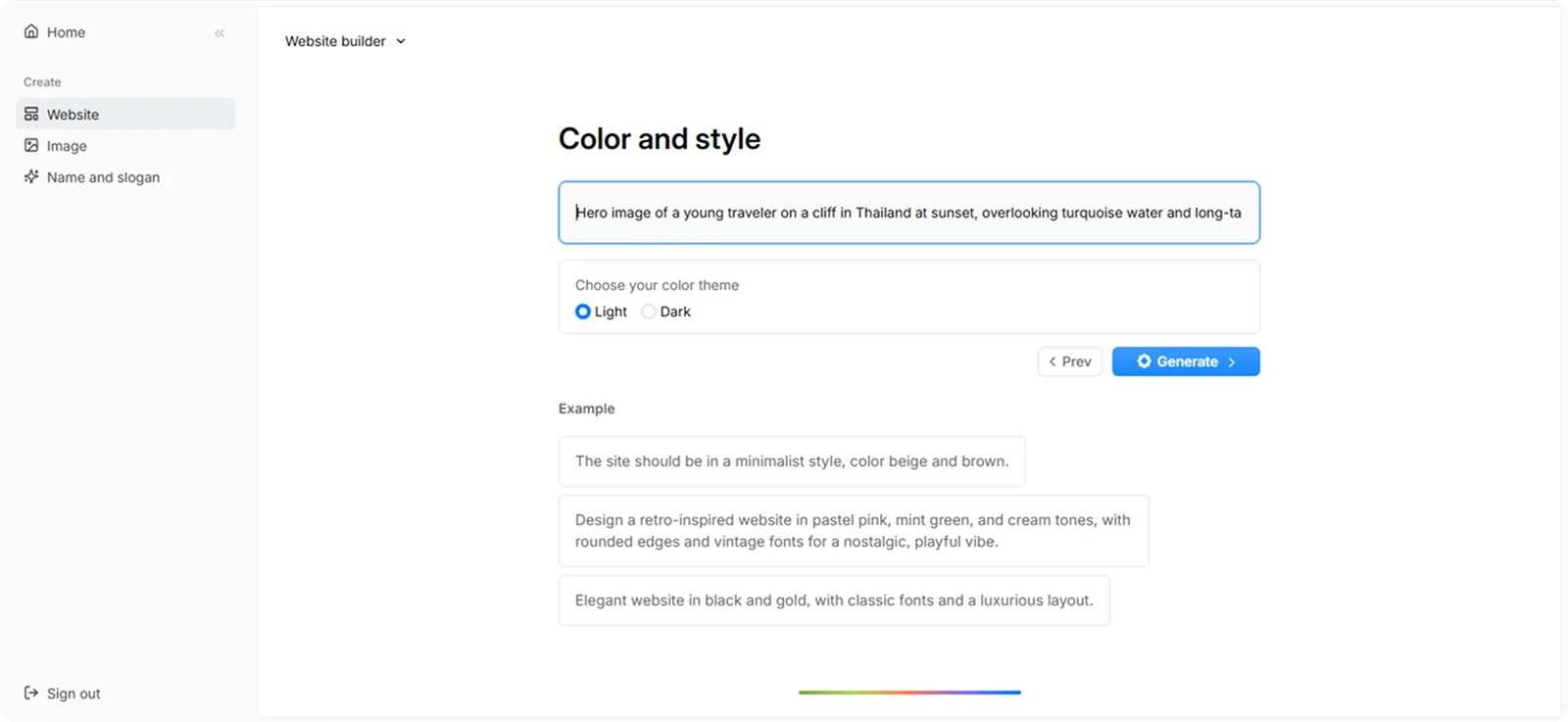
Step 3: Choose your color theme and style. For this example, we used:
“Hero image of a young traveler on a cliff in Thailand at sunset, overlooking turquoise water and long-tail boats. Warm tones, clear skies, budget-travel vibe. Overlay text: 'Thailand Awaits.' Leave space for headline and CTA."
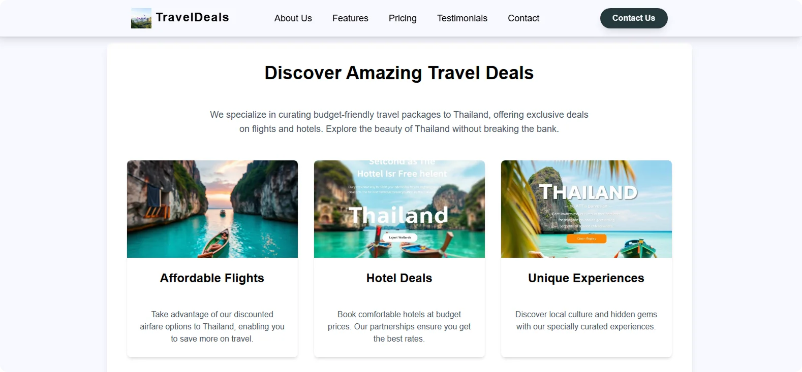
Step 4: Click “Generate” and wait a few minutes while Codesi generates your travel landing page.
You'll get a stunning travel landing page that you can fine-tune as needed.
Ready to launch your next travel campaign with confidence?
Let Codesi help you create a travel landing page that's fast, flexible, and built to convert.
Create your website with AI today
Codesi is a platform where you can make a website in 3 minutes.
No coding, no designers, no hassle - just AI.
