Back to blog
12 Best Product Launch Landing Page Examples to Inspire You
Explore the best product launch landing page examples to learn how you can guide visitors with clear messaging and calls that drive action.
Feb 3 2026
Product launch landing pages influence how visitors respond to a new product, but many fall short by failing to guide people clearly.
Research shows that around 70% of small business websites lack a clear call to action, leaving users unsure of what to do next and wasting real conversion opportunities.
This guide shares 12 best product launch landing page examples, explaining why they work and how you can apply those ideas to your own product launch.
What Is a Product Launch Landing Page?
A product launch landing page introduces a new product to potential customers with one goal: to convert visitors into early adopters, pre-orders, or sign-ups. Unlike general marketing pages, product launch pages focus entirely on a single product at a specific moment in time.
These pages typically include:
- Hero section with product imagery and core value proposition
- Key features or benefits that differentiate the product
- Social proof, like early reviews, testimonials, or media coverage
- Clear call to action for purchase, pre-order, or notification signup
- Availability information
Launch pages work best when they are straightforward, so visitors can understand what the product does, why it matters, and how to get it, without scrolling through unnecessary details.
The most effective landing pages answer these questions immediately—and then they provide supporting information for those who want to dig deeper.
12 Best Product Launch Landing Page Examples
Below are 12 best product launch landing page examples that can inspire you when creating yours.
1. Apple – iPhone 17 Pro
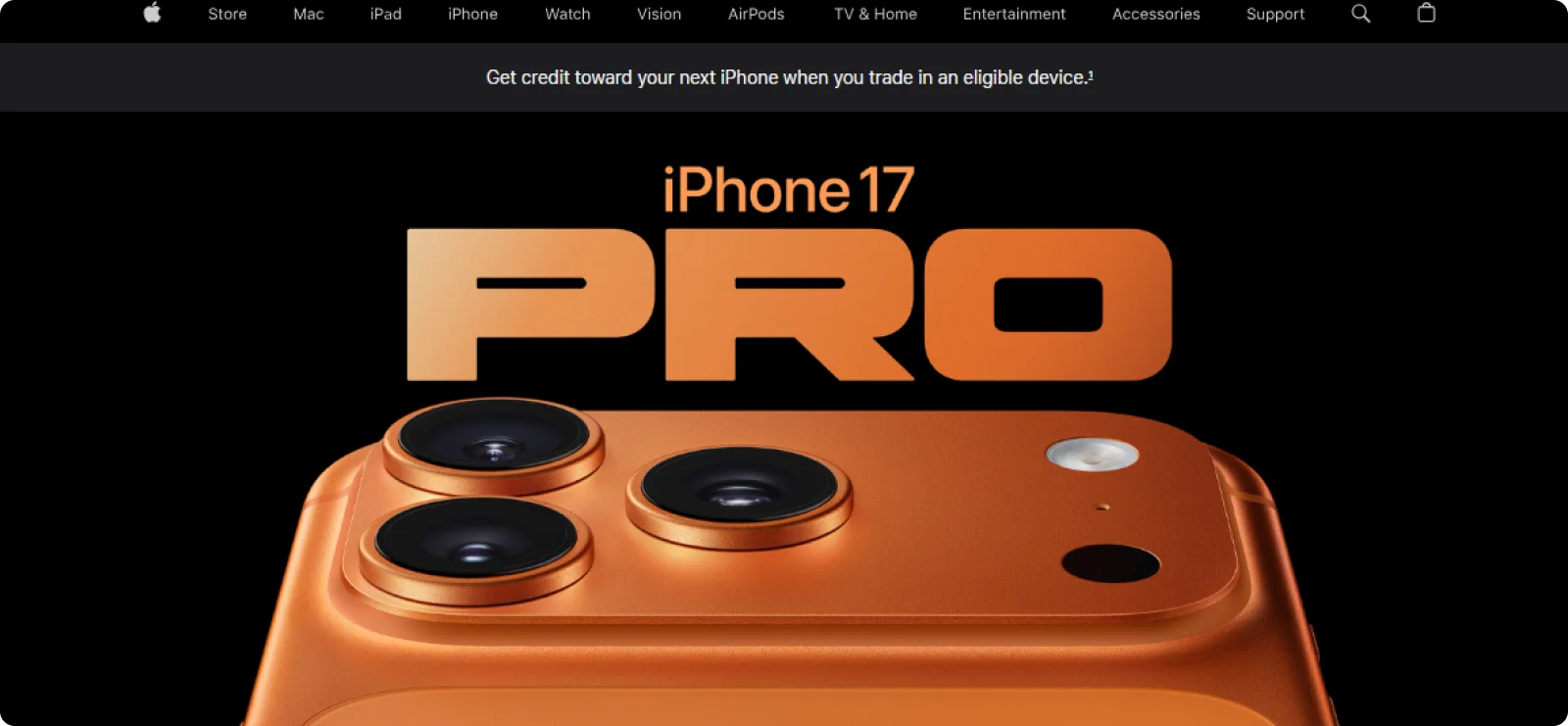
Apple launched the iPhone 17 Pro with a redesigned aluminum unibody and horizontal camera bar, targeting users who want pro-level photography and performance. The landing page uses full-width product shots against clean backgrounds to showcase the new design.
It also highlights the technical upgrades, such as the 120Hz ProMotion display and 8x optical zoom.
Why it works:
High-quality photography conveys the message, and the off-center layout draws attention to transformative features like the Center Stage camera and vapor chamber cooling.
What you can learn:
Emphasize features that users will experience in day-to-day use, and use strong product photography to support premium positioning.
2. Pokémon – Pokopia Game
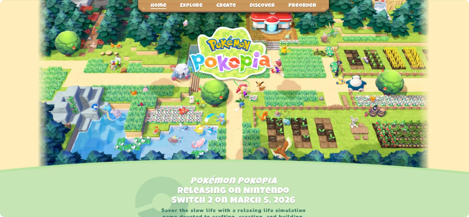
The Pokémon Pokopia launch page introduces an upcoming Pokémon experience built around exploration, creativity, and discovery. Instead of explaining gameplay systems in detail, the page invites visitors to explore the world, meet characters, and understand the tone of the game, with a clear pre-order call to action.
Why it works:
The page prioritizes world-building over features, creating anticipation by letting visuals and light interaction communicate what makes Pokopia different from previous Pokémon titles.
What you can learn:
For entertainment and experience-driven launches, focus on atmosphere and immersion. Use exploration and curiosity to drive pre-orders instead of detailed mechanics or specifications.
3. OLIPOP – Shirley Temple Prebiotic Soda
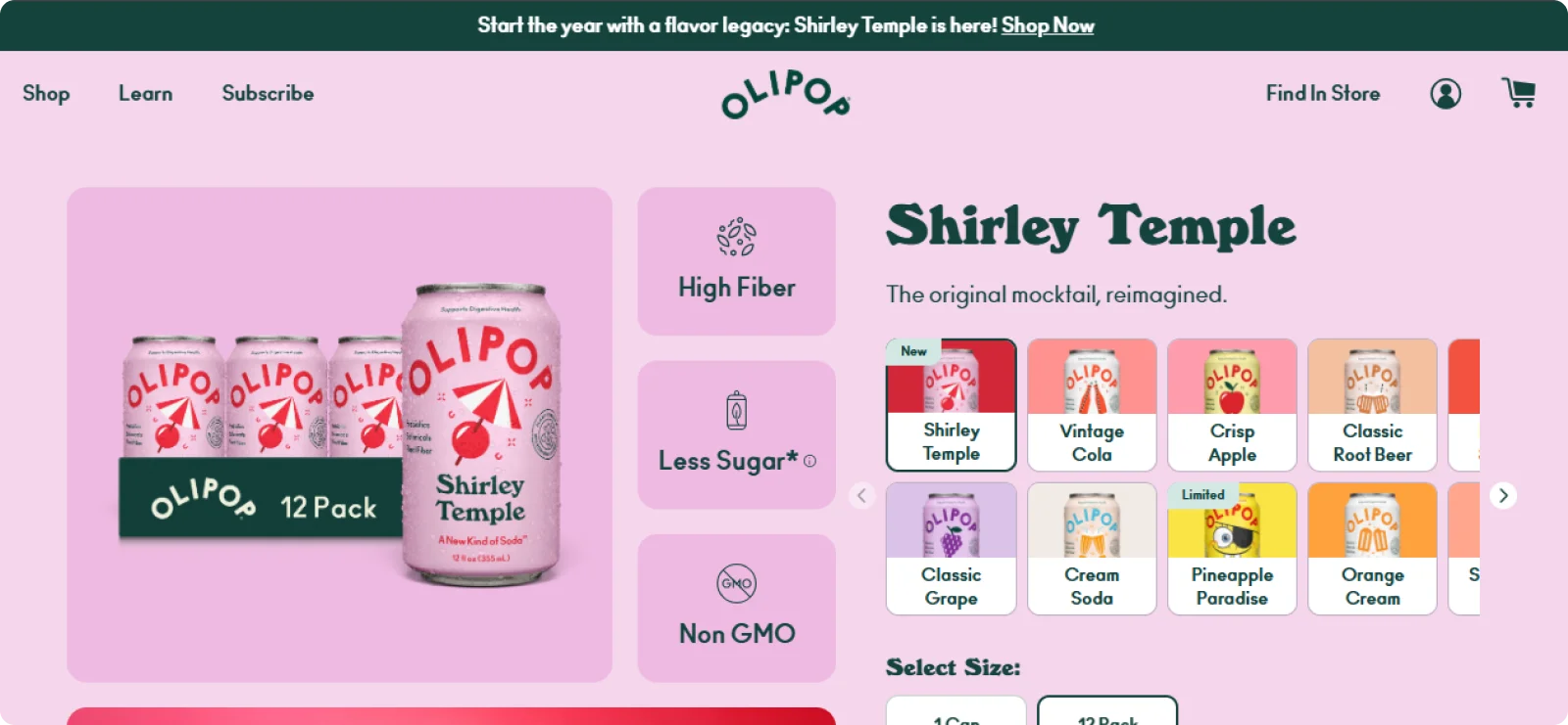
OLIPOP launched Shirley Temple as a limited-time flavor, framing the drink as a modern take on the classic 1930s mocktail with prebiotic benefits. The product page that accompanied the launch paired a cherry-forward can design with a clean layout and plain language descriptions of the flavor profile.
Why it works:
The page anchored nostalgia by connecting to a familiar classic drink, while cherry-forward visuals set clear taste expectations before purchase. Finally, the limited availability created urgency.
What you can learn:
When creating a product page that follows the launch, introduce new products through recognizable references. Rely on straightforward visuals and language to reduce hesitation before purchase.
4. Samsung – The Freestyle (2nd Gen) Projector
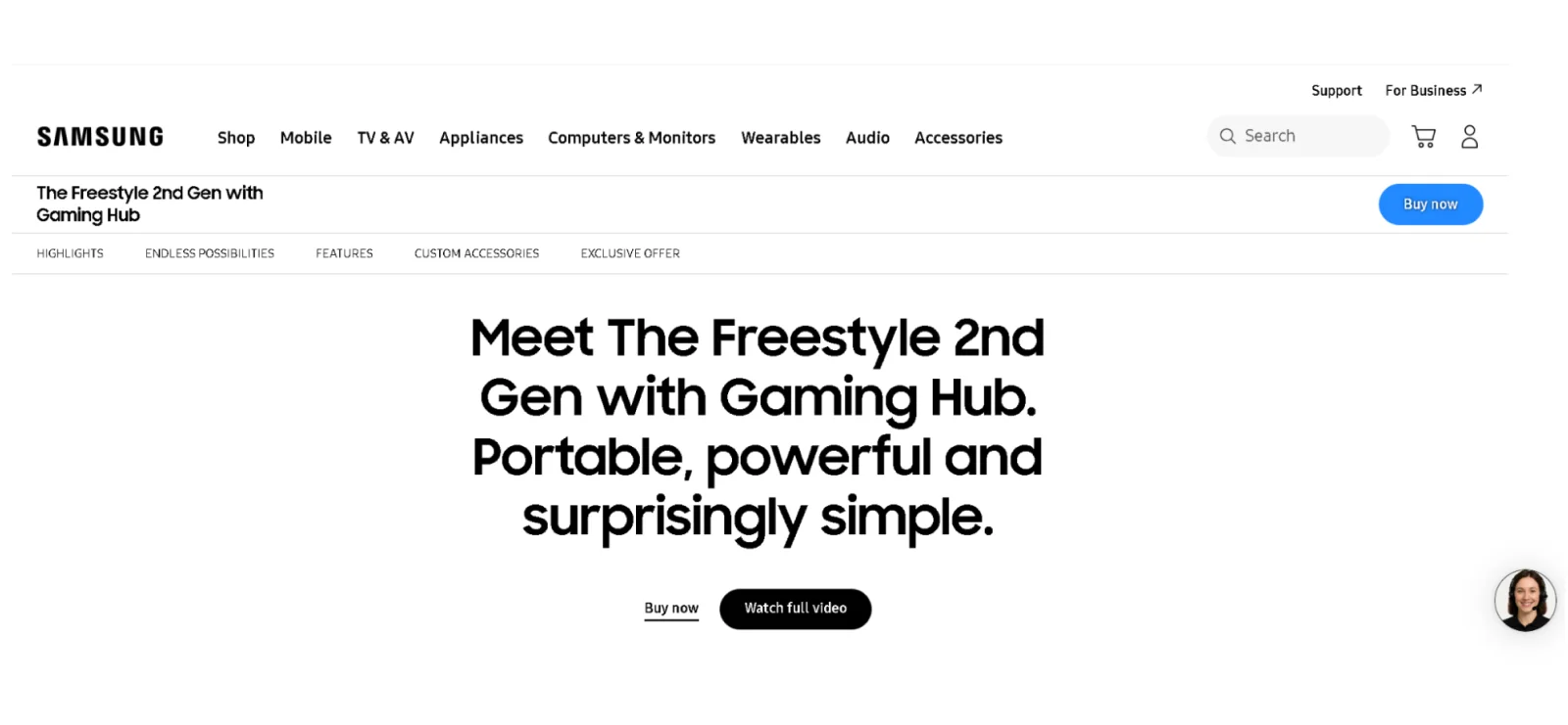
Samsung introduced the Freestyle 2nd Gen projector with a launch page focused on portability, ease of use, and flexible viewing. The page leads with a clear “Meet The Freestyle” message and highlights how the projector fits into different environments before diving into detailed features.
Why it works:
The page emphasizes positioning and use cases first, helping visitors understand why the product is different before asking them to consider specifications or purchase.
What you can learn:
Introduce new hardware by showing where and how it fits into real-world settings before detailing features. Clear use-case framing helps visitors understand the product’s role and value at launch.
5. DelicDay – Keto & Protein Vegan Cookies
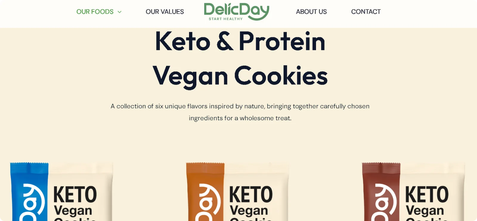
DelicDay introduces its cookie range through a launch-style page that focuses on the product lineup, flavors, and brand positioning rather than detailed purchasing flows. The page helps you understand the product category and its quality standards at a glance.
Why it works:
The page frames the cookies as a newly introduced offering by leading with visuals and brand cues before product-level details, supporting awareness during the launch phase.
What you can learn:
For food and consumer packaged goods launches, introduce the product category clearly, and use strong visuals to establish quality and appeal before directing visitors toward more product information.
6. Fenty Beauty – Arcane Hydra Vizor Mystery Box
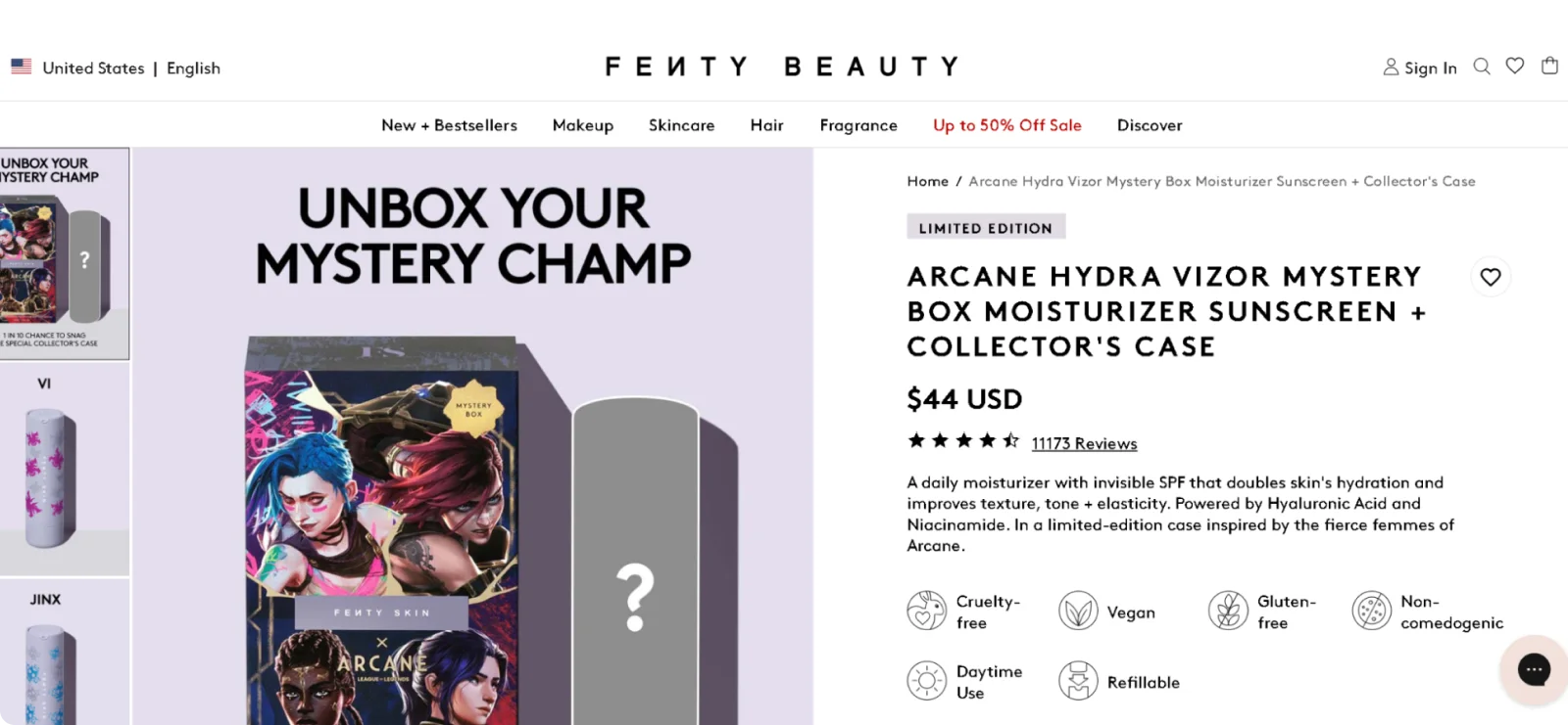
The Arcane collaboration introduces a limited-edition Hydra Vizor Mystery Box featuring character-themed refillable cases inspired by Jinx, Mel, Caitlyn, and Vi.
The product page accompanying the launch highlights the product as a new, time-bound release and includes a “Notify me” option, signaling limited availability and high demand rather than ongoing sales.
Why it works:
The mystery box format with rare collector's case creates urgency, while familiar Arcane characters give fans an emotional connection to a functional product.
What you can learn:
Turn product launches into collectibles through limited-edition packaging variations, and use mystery elements to drive purchase excitement beyond product benefits alone.
7. Nike – Mind Shoe
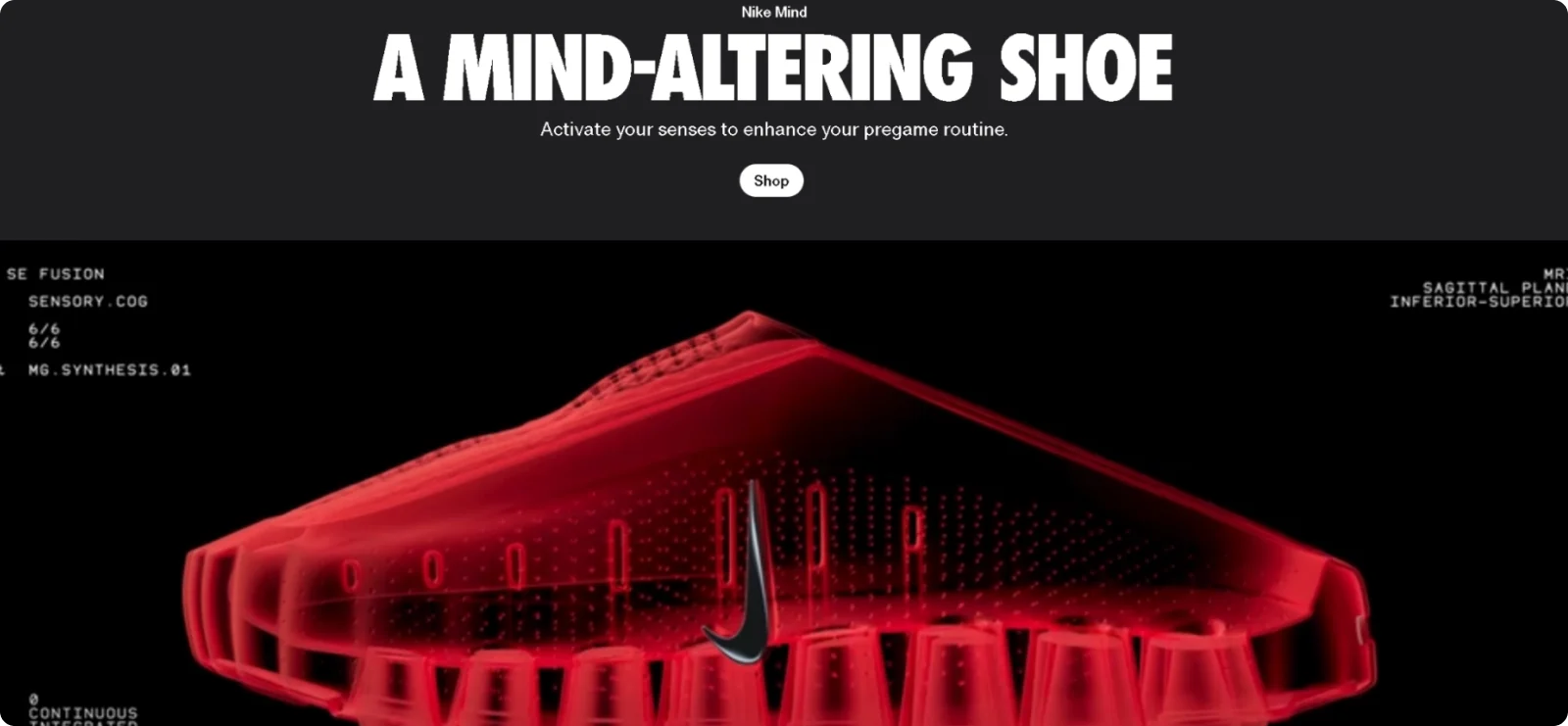
The Nike Mind launch page uses minimal copy and three scrolling visuals to introduce a new approach to athletic footwear, focusing on how movement and perception are connected.
Why it works:
By framing the product as a neurological performance upgrade rather than a traditional athletic shoe, the page immediately differentiates the launch and builds curiosity around a new product category.
What you can learn:
Reveal information in stages to spark curiosity, present new technology as a clear shift rather than a small upgrade, and keep the page simple when the concept is unfamiliar.
8. Dyson – PencilVac Vacuum
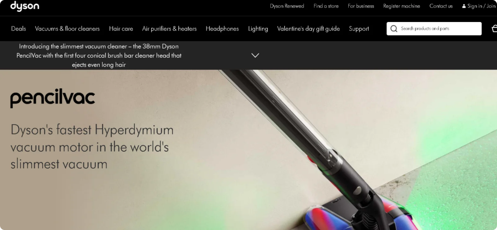
Dyson introduces the PencilVac through a launch page focused on its ultra-slim design and newly developed motor technology.
Why it works:
The page clearly links specific engineering changes to a visible product difference, helping visitors understand what makes the PencilVac new rather than simply improved.
What you can learn:
When launching innovation-led products, show how concrete technical changes result in a different form or function, rather than relying on broad performance claims.
9. GMC – Hummer EV Pickup Truck (2026)
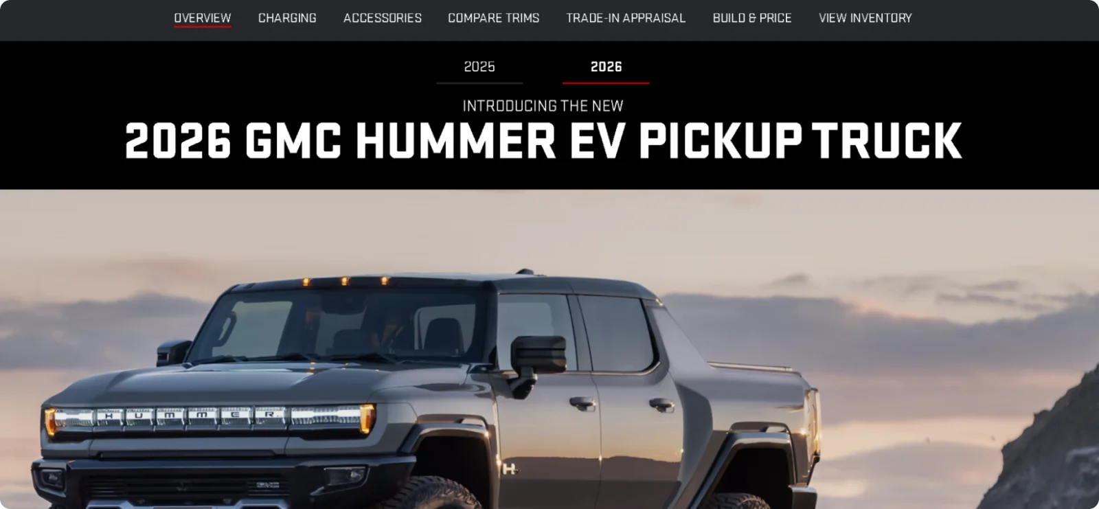
GMC introduces the 2026 Hummer EV Pickup by highlighting the new model year and its electric performance capabilities. The page highlights what’s new in the 2026 version while encouraging visitors to explore trims, compare options, and start the build-and-price process.
Why it works:
The page clearly frames the vehicle as a new model-year release, combining launch messaging with exploration tools that support early-stage decision-making.
What you can learn:
For automotive launches, anchoring the page around a new model year helps signal novelty while still allowing interested buyers to explore configurations at their own pace.
10. Meta & Ray-Ban – AI Glasses
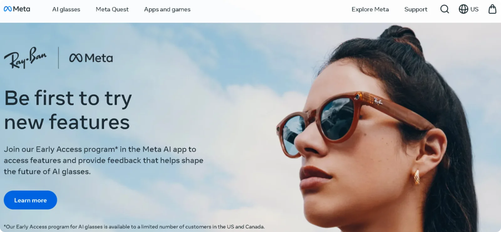
Meta introduced its next-generation Ray-Ban AI glasses through an early-access page focused on sign-ups rather than direct purchase. The page positions the product as an upcoming release, highlighting hands-free AI assistance, camera features, and voice interaction, while inviting users to join the waitlist.
Why it works:
Instead of listing full specifications or pricing, the page builds anticipation around new capabilities and limits availability to interested early adopters.
What you can learn:
For emerging tech launches, use waitlists or early-access programs to validate demand and build momentum before full availability, keeping the focus on what’s new rather than on final purchase details.
11. LEGO – Golden Retriever Puppy (Pre-Order Page)
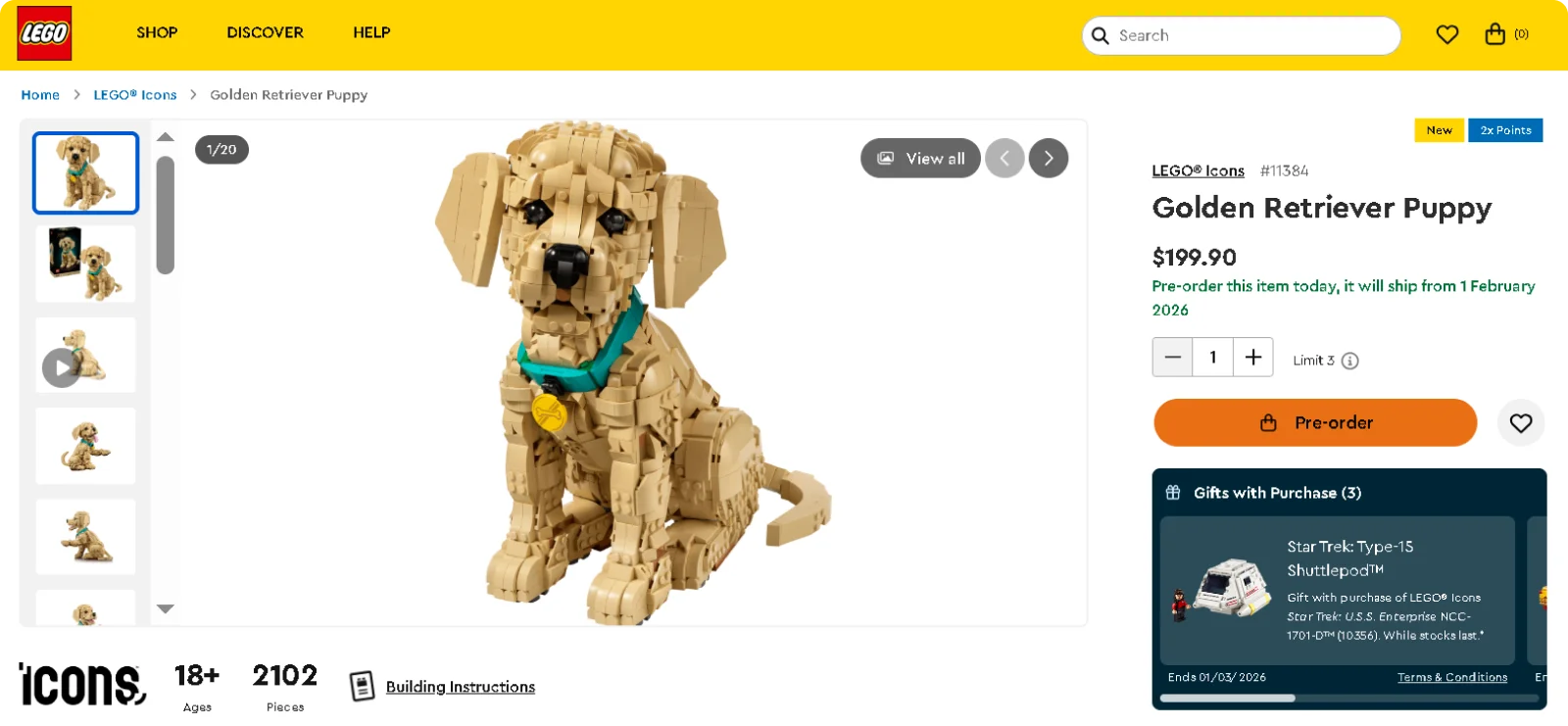
LEGO introduces the Golden Retriever Puppy set through a pre-order page that signals an upcoming release rather than an in-stock product. The page highlights the model’s design, age range, and build experience. It also allows visitors to reserve the set ahead of its official release.
Why it works:
By focusing on visuals and the finished build instead of promotional copy, the page supports the launch moment without overwhelming visitors.
What you can learn:
For physical product launches, pre-order pages can function as effective launch landing pages when they clearly signal release timing and prioritize product presentation over sales messaging.
12. Apple – Vision Pro
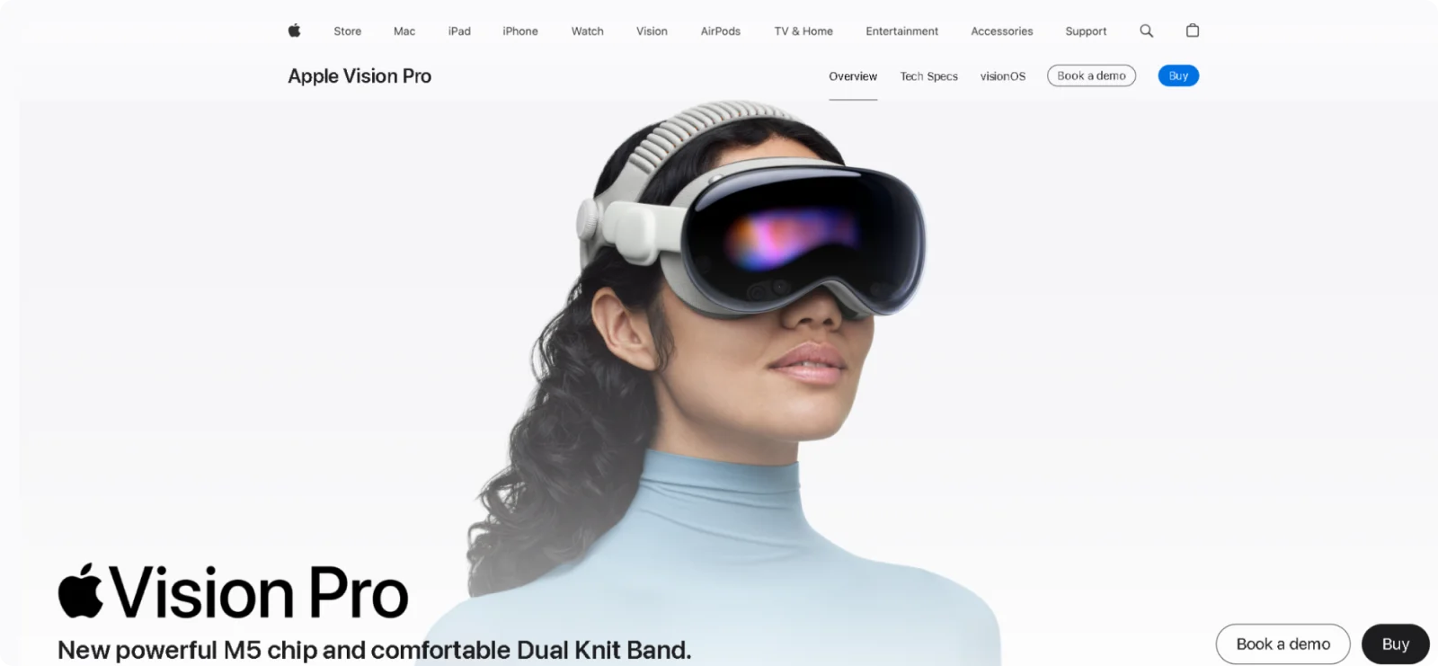
Apple introduced the Vision Pro by focusing on spatial computing and immersive experiences. The page explains how the device works, what makes it new, and how it changes interaction with digital content before guiding users toward purchase details.
Why it works:
The page prioritizes education and positioning, helping visitors understand an entirely new product category before asking them to evaluate the cost and specifications.
What you can learn:
For category-creating products, use launch pages to explain the experience and model first. Helping users understand what it is and why it exists matters more than immediate conversion.
Common Product Launch Landing Page Mistakes to Avoid
Many product launch pages fail because they overwhelm visitors or hide key information. Here are the most common mistakes to avoid:
- Overloading visuals: Limit animations and videos that distract from your core message.
- Cluttering copy: Keep text concise and specific so visitors immediately grasp your product's value.
- Ignoring mobile optimization: Ensure adequate touch spacing and responsive layouts work seamlessly on smaller screens.
- Creating a weak hierarchy: Use clear headings and distinct sections that make content easy to scan.
- Hiding CTAs: Place action buttons near relevant content.
To get a high-converting landing page, keep visuals, text, and navigation simple so visitors can focus on what matters. A clear structure with prominent CTAs guides users toward conversion without confusing them.
Build Your Product Launch Landing Page with Codesi
Product launches need responsive landing pages, and Codesi lets you build one without design skills or technical knowledge.
Describe your product details, benefits, and target audience in a text prompt, and Codesi generates a complete launch page with optimized images, focused messaging, and conversion-driven layouts.
With Codesi, you get:
- Fast-loading pages that keep mobile visitors engaged
- Clear value propositions and CTAs positioned where users expect them
- Mobile-responsive designs that convert equally well on phones and desktops
- Professional results without hiring designers or developers
- Pages optimized for both speed and visual quality
Your launch deserves a page that performs as well as it looks. Are you ready to launch your product in style?
Start with Codesi and build a product launch landing page that converts.
Create your website with AI today
Codesi is a platform where you can make a website in 3 minutes.
No coding, no designers, no hassle - just AI.
