Back to blog
10 Inspiring Portfolio Landing Page Examples [+Tips]
Explore inspiring portfolio landing page examples and learn how to showcase your best work with design choices that attract clients.
Nov 29 2025
![10 Inspiring Portfolio Landing Page Examples [+Tips]](https://codesi.ai/admin/static/cov13_0bab3a95ae.webp)
There are 1.57 billion freelancers in the world, and most of them rely on a clear online presence to attract clients.
For designers, developers, writers, and other creatives, a focused portfolio landing page can be the difference between getting noticed and being passed over. A good page shows visitors your work and helps them understand your skills and the value you bring.
This article shares ten inspiring portfolio landing pages, along with tips to help you create one for yourself.
Key Takeaway
- Visitors judge your work before they read it
Visual structure, spacing, and layout can determine how professional your work feels within the first few seconds.
- A focused selection beats an overflowing gallery
Curating 4–8 high-impact projects makes it easier for potential clients to understand your strengths.
- How you present your work reflects how you think
Clean design, short summaries, and clear navigation all signal your approach to real-world problem-solving.
- Small choices shape how you’re remembered
Typography, color use, and writing tone influence whether someone sees you as thoughtful, technical, or creative.
- You don’t have to build it all from scratch
A good portfolio doesn’t require days of coding or navigating complicated builders. Codesi helps you launch quickly without sacrificing quality.
Why Portfolio Landing Pages Matter
Your portfolio landing page often speaks before you do. Here’s what makes the landing page so important:
- It sets expectations before you speak: Clients land on your site with little to no context. A strong page answers “What do you do?” and “Who is this for?” within seconds.
- It directs how people explore: A focused structure makes it easier for visitors to move from interest to contact. Disorganized pages lose momentum fast.
- It filters the wrong leads: By clearly showing your style, process, and type of work, your page naturally repels mismatched inquiries and attracts better-fit projects.
- It reflects how you work: Clients assume your site reflects how you approach actual projects. Messy portfolios signal messy delivery.
10 Portfolio Landing Page Examples For Inspiration
The best way to build a strong portfolio is to study the ones that already do the job well. These examples come from designers, studios, and creatives who’ve made their work clear, trustworthy, and easy to explore.
1. Tobias Ahlin
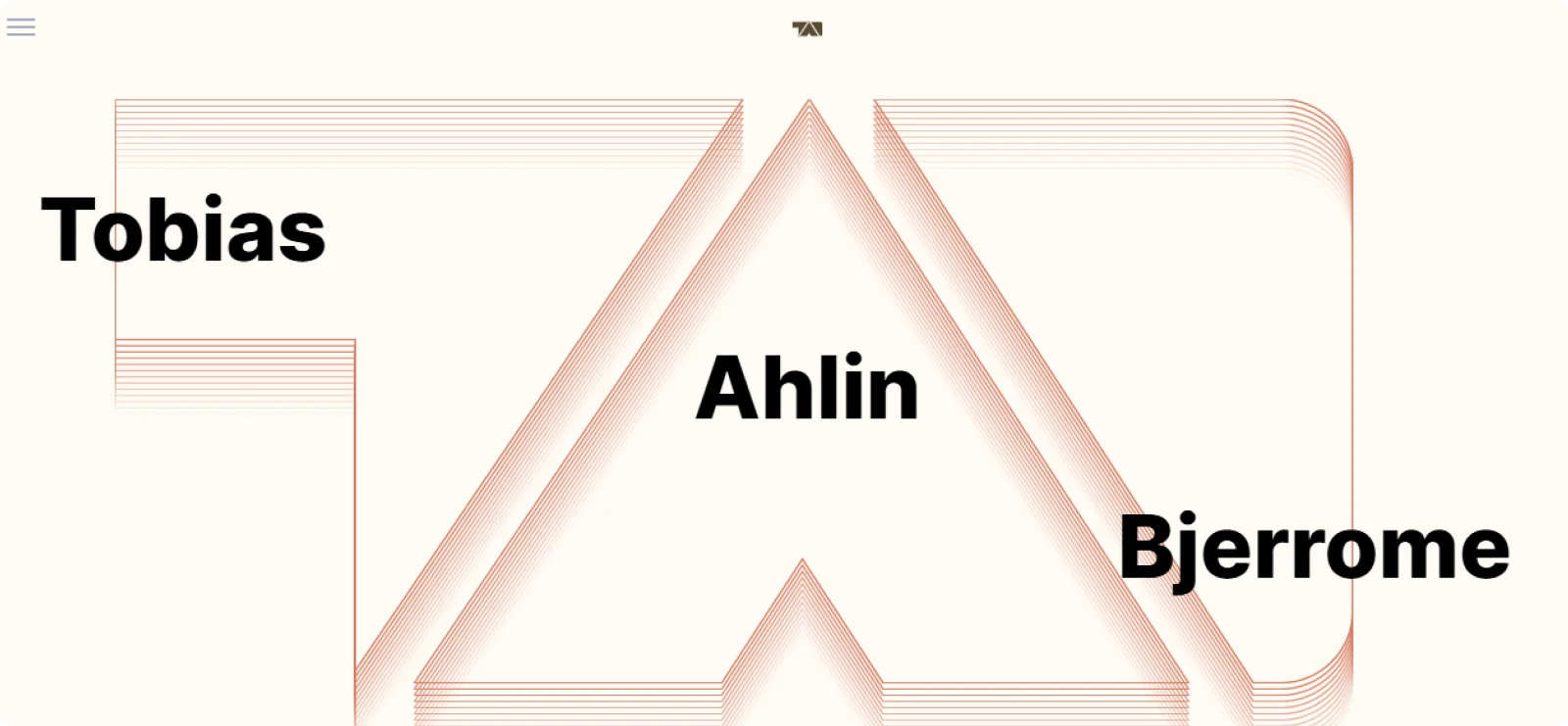
Tobias Ahlin’s portfolio stands out for its simple structure and interactive touches. The page guides visitors through his work without feeling heavy, and each section has just enough detail to communicate his thinking.
Why it works: The layout is built around clarity. Each section gives you enough to understand his role without overloading the page. Subtle animation keeps things fluid, while the visual hierarchy makes it easy to follow his work across design and development.
Hint: Structure your content in sections that flow naturally, and use interaction cues sparingly to guide without distracting.
2. Charli Marie
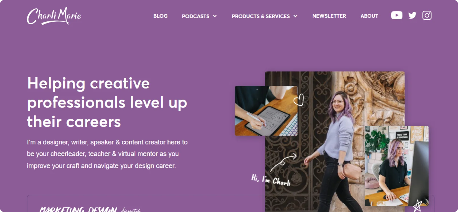
Charli Marie’s portfolio shows how a personal introduction can strengthen your connection with visitors. Instead of jumping straight into projects, she opens with a warm intro that explains who she is and what kind of work she does. This makes the page feel approachable and helps potential clients understand her style before exploring her work.
Why it works: Charli balances personality and professionalism. The conversational tone and lifestyle imagery make the page more welcoming, and her branding remains consistent across every element.
Hint: Introduce yourself with a warm tone, and make your personal branding feel intentional.
3. Calvin Sprague
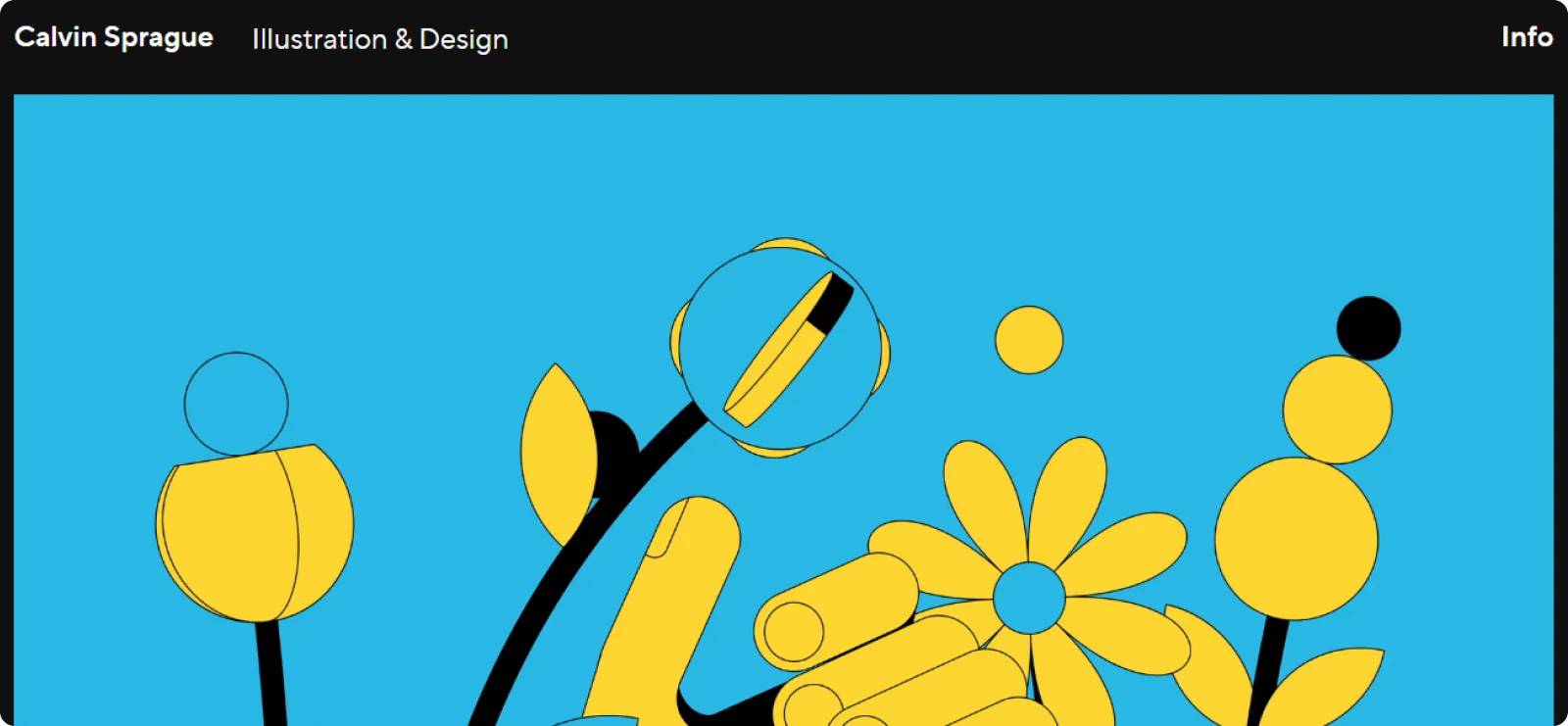
Calvin Sprague’s page is a strong example of how visuals can take the lead. His page opens with full-width illustrations that instantly communicate style and personality. The layout is simple, but the artwork effectively conveys the experience.
Why it works: Illustration takes the lead here, making the portfolio instantly recognizable. The large canvas, minimal text, and bold color palette remove distractions and let the style speak for itself.
Hint: Lead with high-impact visuals, depending on your craft, and keep everything else out of the way.
4. Michele Du
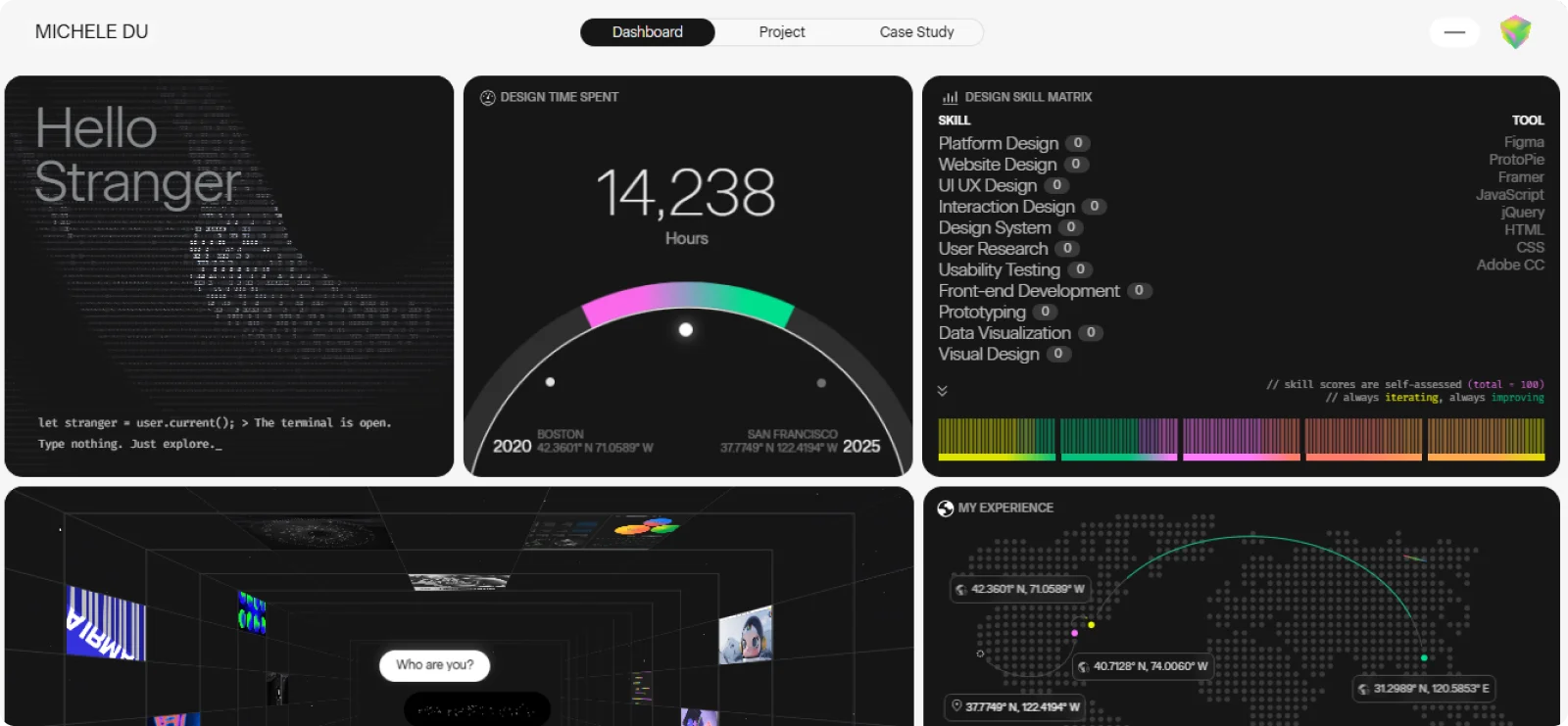
Michele Du’s portfolio is one of the best examples of clarity paired with personality. The site opens with clean typography and a warm, approachable tone that immediately tells visitors who she is and what she creates. Her work is presented in an organized grid that feels light, making it easy to browse through project highlights without feeling lost or overwhelmed.
Why it works: This portfolio feels like a dashboard, merging data-driven storytelling with personal context. Clear metrics and self-assessed skills give a peek into her working process, while interactive elements draw you in without confusion.
Hint: Integrate structure and creativity by presenting both the measurable and the emotional side of your work.
5. Valeriia Shchebetovska
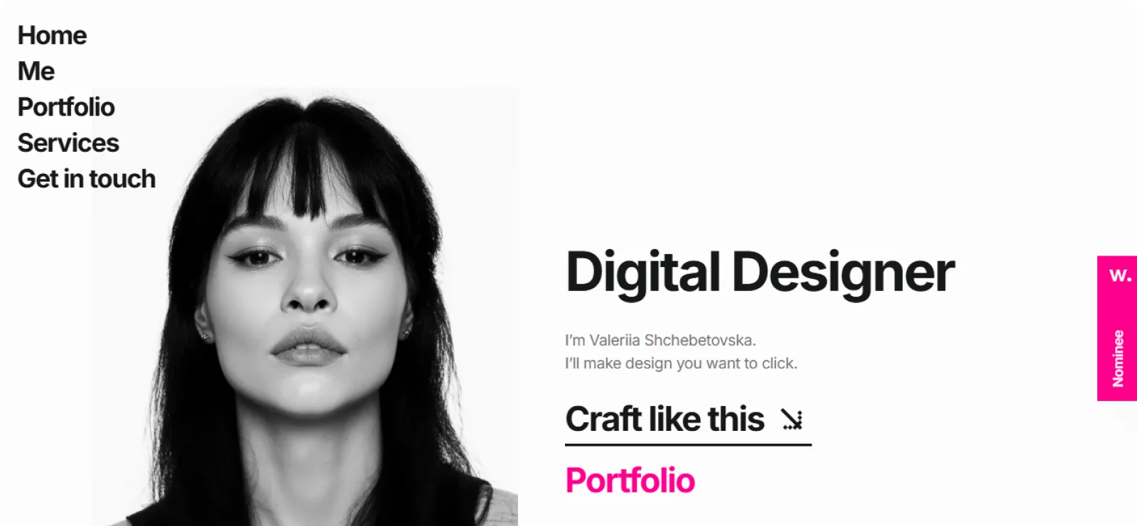
Valeriia Shchebetovska’s page is a clean, structured showcase of thoughtful product design work. The layout introduces her selected projects with clear visuals, simple headlines, and short explanations that make each case study easy to understand at a glance.
Why it works: The bold, minimal design and black-and-white aesthetic place all attention on the message. Her intro is short and confident, while the navigation keeps everything within reach. It’s a page that communicates focus.
Hint: Use minimal layouts and sharp copy to hold attention and show clarity in your design approach.
6. Tandem
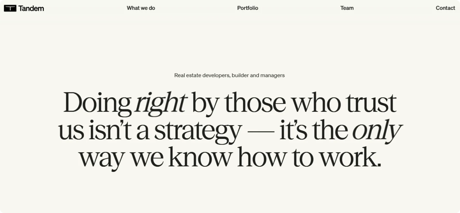
Tandem’s portfolio landing page is a good example of how a studio can effectively communicate capability through clarity and structure. The page opens with a confident introduction, supported by an organized grid of case studies that show their approach to brand, product, and digital design.
Why it works: Tandem uses confident typography and a simple layout to convey experience without any flashy visuals. The opening line sets the tone for trust and longevity, which is reflected in their clean grid of work.
Hint: Stick to clean copy and layouts if your brand equity and experience can speak for themselves.
7. Jokula
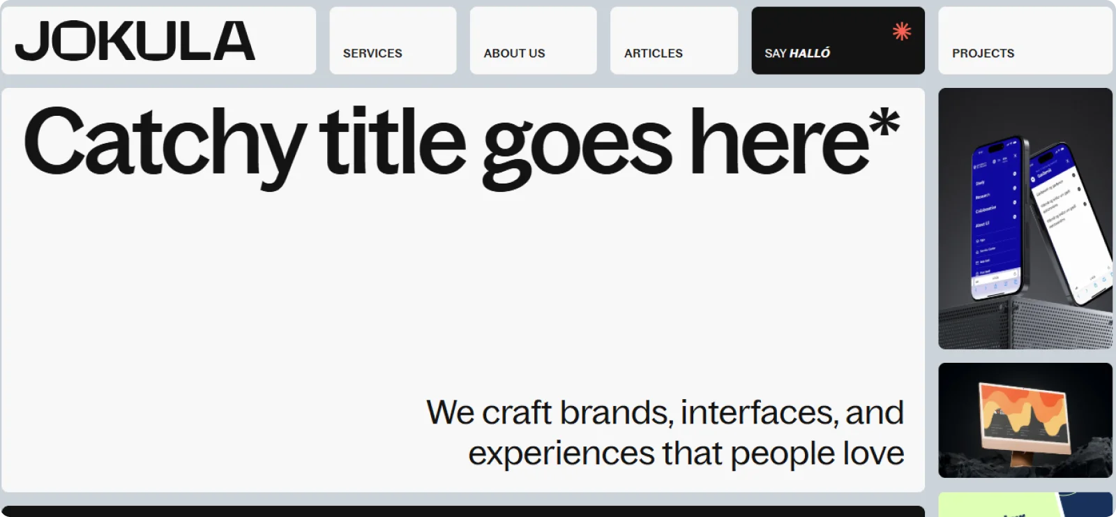
Jokula’s page combines playful visuals with a clean, structured layout that makes the work easy to explore. The homepage introduces the designer’s personality upfront, then transitions into a curated mix of branding, illustration, and digital design projects.
The use of color is intentional, and the spacing ensures that each section remains readable.
Why it works: Playful without losing structure, Jokula’s homepage captures attention using oversized type and smart grid choices. The use of whitespace keeps the bold typography balanced, and case studies are easy to navigate.
Hint: Balance personality and usability by designing bold, structured layouts that stay scannable.
8. Will Zhang

Will Zhang’s page is a great example of how clean structure and confident storytelling can work together. The page opens with a short, memorable introduction that sets the tone, followed by a well-organized lineup of product design and UX case studies.
Why it works: The casual tone and personal bio immediately humanize the experience. The vibrant colors and distinct typography reflect youth and confidence, while the grid shows real projects in a simple format.
Hint: Add personality through copy and design choices that reflect who you are, not just what you’ve done.
9. Jon Howell
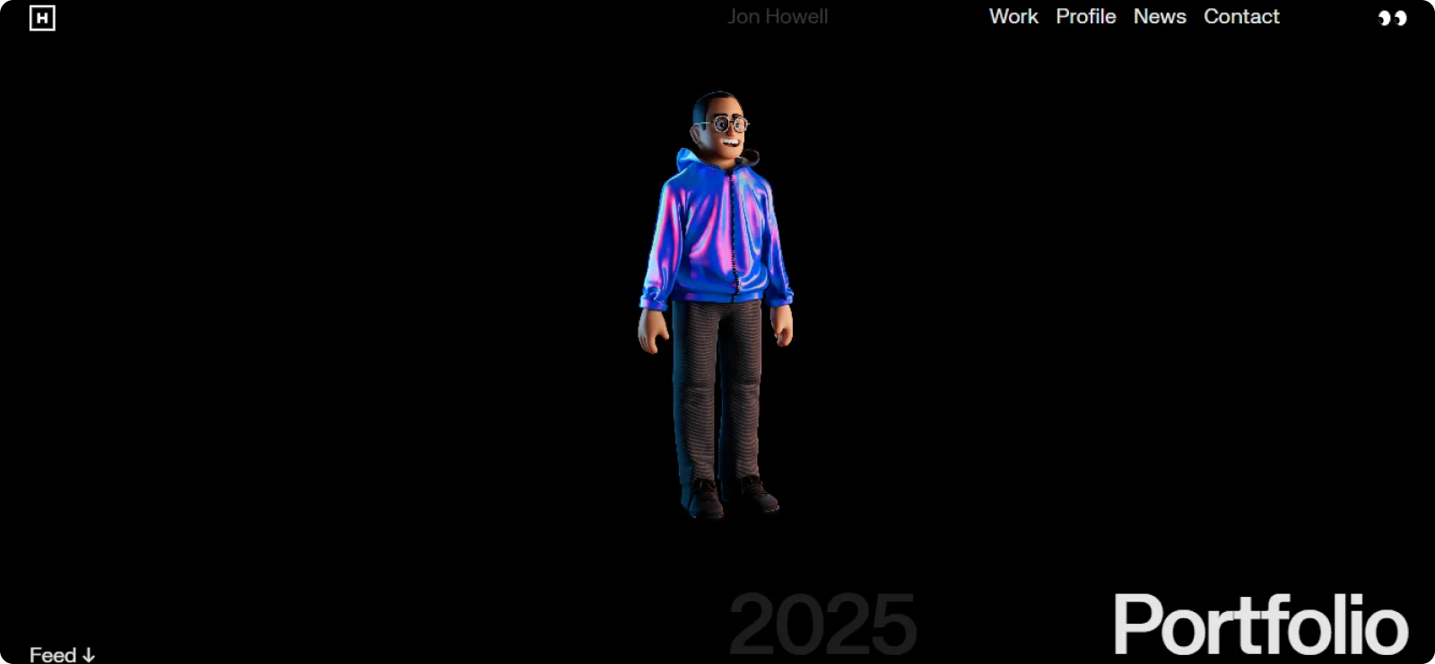
Jon Howell’s portfolio is a strong example of a focused, high-level portfolio for brand and product design. The page opens with a clean masthead and a simple navigation that keeps attention on his recent work.
The main feed presents a mix of case studies and snapshots, arranged in a structured list that highlights well-known brands.
Why it works: This portfolio doesn’t try to impress with noise. It’s understated, focused, and clearly segmented by discipline. The animated character adds a modern touch without distracting from the actual content.
Hint: Use minimal design to showcase maturity and focus, especially when you’re targeting high-level product or brand design roles.
10. Poison Studio
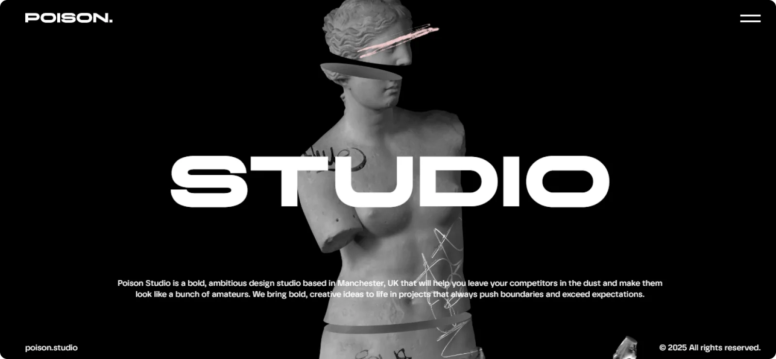
Poison Studio’s page stands out with a bold, modern presentation that centers on motion and typography at its core. The homepage opens with a high-impact headline supported by smooth scroll interactions and animated transitions that guide visitors through their work.
Why it works: Every section of this portfolio shows art direction. From the fragmented statue to the kinetic typography, everything is designed to compel. Despite the boldness, the layout stays clean, and the content is easy to follow.
Hint: Lean into a strong visual identity if you want to be remembered, but make sure the structure still supports easy navigation.
Tips for Creating a Portfolio Landing Page That Stands Out
A good portfolio landing page should be easy to navigate and focused on the projects that matter to the clients or companies you want to attract.
Below are tips to guide you when creating your portfolio:
- Start with a clear intro: Use a headline that quickly tells people who you are and what you do. Add a short subheadline if you want to highlight your niche.
- Focus on your strongest work: Choose 4–8 standout projects that reflect your style and capabilities. Avoid showing everything at once.
- Keep previews consistent: Use similar image sizes, layouts, and project titles to create a cohesive, professional look.
- Simplify navigation: Limit the number of links in your menu. If possible, use a single-page layout with clear sections.
- Add personality and credibility: Include a short “about me” section, client quotes, press mentions, or notable collaborations to build trust and personalize your landing page.
- Design for mobile first: Make sure your portfolio works smoothly on smaller screens. Test it on your phone to see how it feels.
- Finish with a clear next step: Guide visitors to contact you, book a meeting, or view more work. Keep your CTA visible and direct.
Generate a Professional Portfolio Landing Page with Codesi in Minutes
Building a portfolio landing page from scratch can take hours, and learning full HTML structure adds even more work. Codesi gives you a faster option. Instead of worrying about layout, spacing, CSS rules, and responsiveness, you can describe the kind of landing page you want and let Codesi generate a clean, ready-to-publish page in minutes.
Codesi creates a structured layout that includes a hero section, project blocks, an About section, and a contact area. You can update colors, swap images, rewrite text, or remove sections with a few clicks.
If you need visuals or a simple brand mark, the built-in AI image and logo generators help you create something original without relying on stock templates.
Do you want a portfolio that looks professional, loads fast, and clearly presents your best work without the long development process?
Try Codesi for free and build your portfolio landing page in minutes.
Create your website with AI today
Codesi is a platform where you can make a website in 3 minutes.
No coding, no designers, no hassle - just AI.
