Back to blog
20 Best Webinar Landing Page Examples To Copy [2026]
Discover the best webinar landing page examples to copy and learn how to design high-converting pages that boost sign-ups and engage your audience.

May 24 2025
![20 Best Webinar Landing Page Examples To Copy [2026]](https://codesi.ai/admin/static/Cover_71090ecb43.webp)
Just like a product landing page turns browsers into buyers, a webinar landing page has one job: get people to register.
A great webinar landing page shows why the event matters, what's in it for the audience, and who's behind it. When done right, it feels like an opportunity, not a pitch.
And when it doesn't? Even the most valuable webinar can struggle to fill virtual seats.
So, what does it take to get people excited and registered for your webinar in 2026?
This guide explores 20 of the best webinar landing page examples, explains the principles behind their success, and shows you how to apply the same strategies.
What Is a Webinar Landing Page and Why Does It Matter?
A webinar landing page is a purpose-built web page created to promote a specific webinar and convert visitors into registrants.
Unlike general landing pages, these pages are laser-focused on a single outcome: getting people to sign up. They remove distractions, spotlight the event's value, and make registration quick and seamless.
Top-performing pages can achieve conversion rates as high as 51%, and in some cases, even up to 59%, proving just how critical a well-optimized landing page is to filling seats and driving results. Here's why they matter:
- Higher Conversion Rates: With a focused message and creative design, webinar landing pages average a 22.84% conversion rate, far above the typical 7.12% for standard landing pages.
- Stronger Lead Quality: People who register are actively interested in your topic, making them ideal leads for follow-up and sales outreach.
- Professional Impression: A well-crafted page boosts your brand's credibility and positions you as a trusted voice in your space.
- Actionable Data: Every registrant adds to your CRM, giving you new insights for segmentation, retargeting, and future campaign optimization.
Essential Elements of a High-Converting Webinar Landing Page
Not all webinar landing pages get the job done. The best ones follow a clear formula balancing clarity, credibility, and urgency.
Here's what sets them apart:
1. Clear, Benefit-Focused Headline
Your headline is your hook. It needs to be specific, action-driven, and focused on the outcome. Think less "Join Our Webinar" and more "Learn How to 10x Your Lead Gen in 30 Minutes."
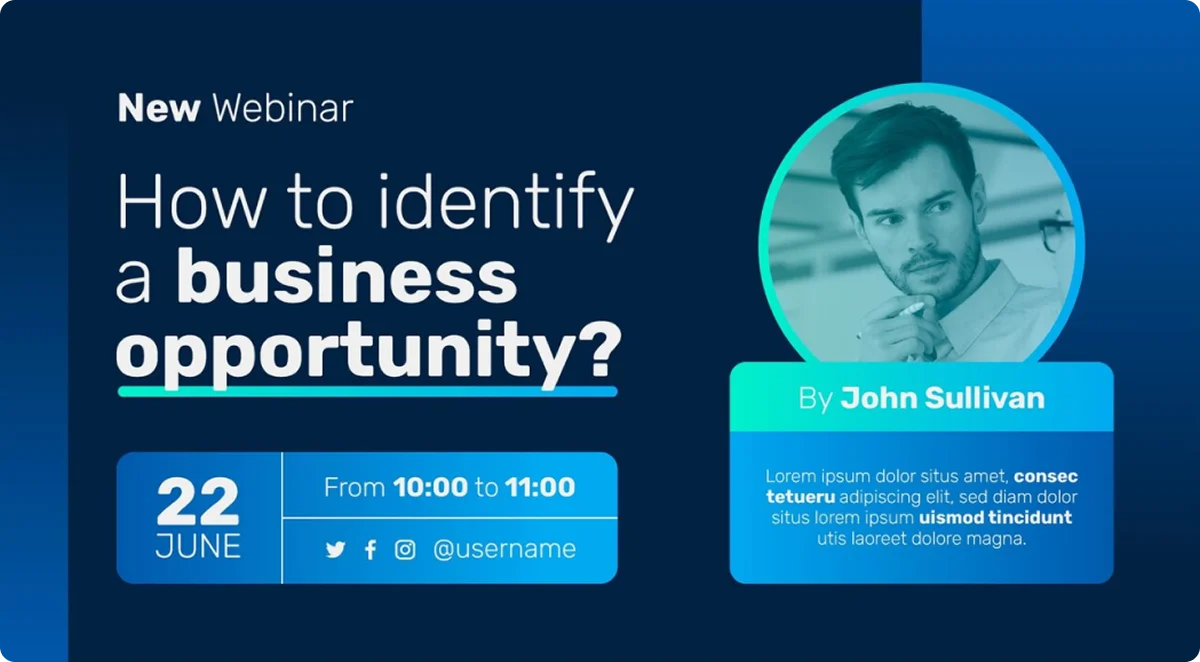
2. Strong Value Proposition
Under the headline, include a short paragraph or bullet list that explains what attendees will walk away with and why it matters. Focus on outcomes, not just topics.
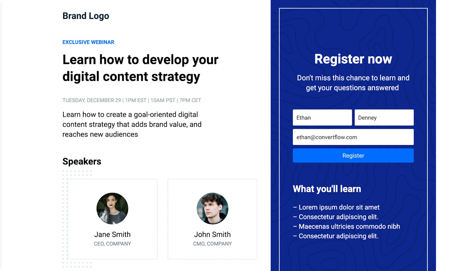
3. Engaging Visuals or Video Teasers
A bold hero image or a quick video introduction from the host can add personality and build trust. People connect with faces and voices more than text.
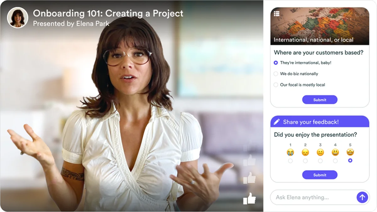
4. Speaker Spotlight
People sign up for people, not just topics. Highlight your speakers with professional photos, bios, and credentials. A strong speaker lineup builds authority and excitement.
5. Essential Event Details
Include the date, time, duration, and topic above the fold. If you're targeting a global audience, don't forget to list the time zone.
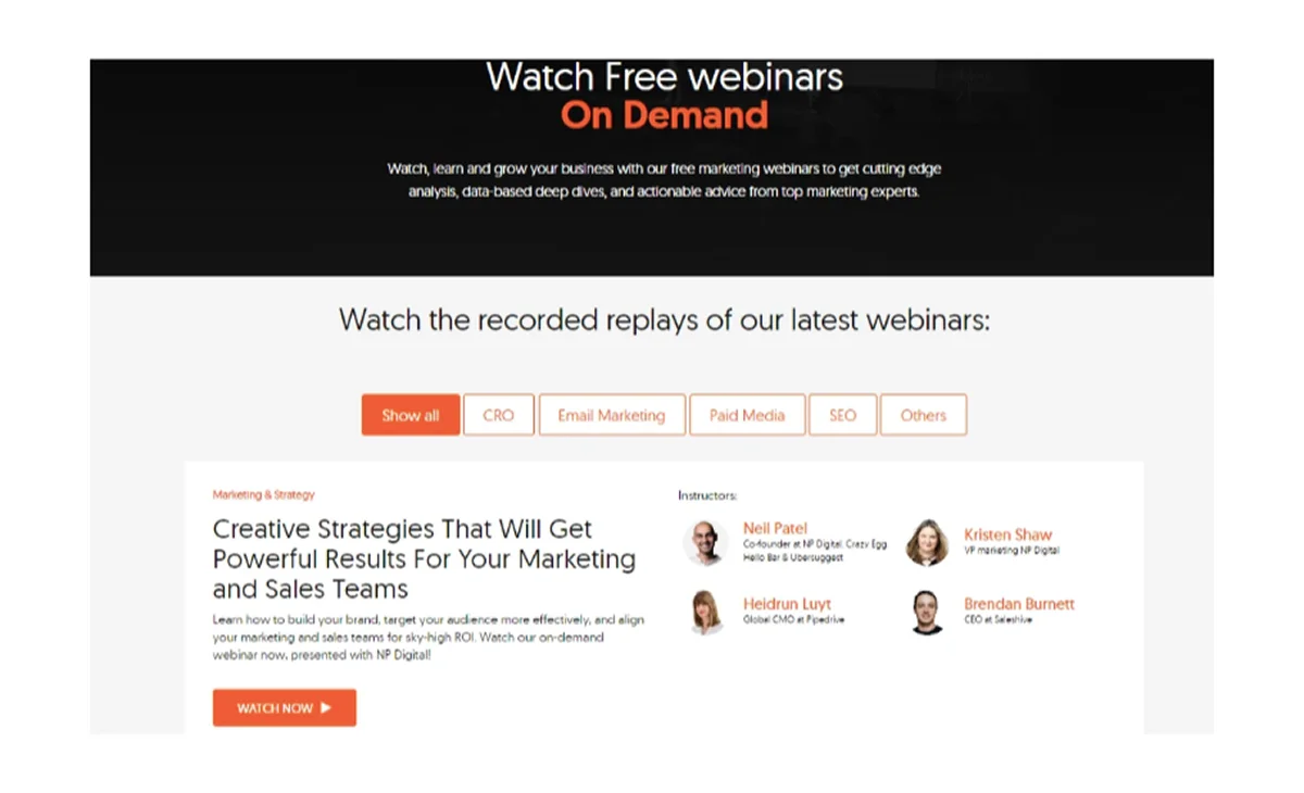
6. Clear, Compelling CTA
Your call-to-action button should stand out visually and use specific, inviting language, such as "Save Your Spot" or "Claim Your Free Seat." Place it above the fold and repeat it further down the page.
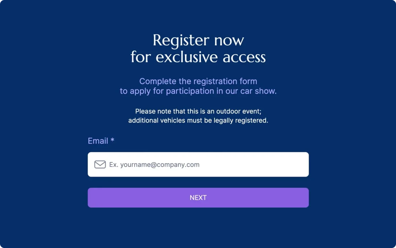
7. Simple Registration Form
Keep it short. Ask only for what you need, typically a name and email. The fewer fields, the higher the conversion rate.
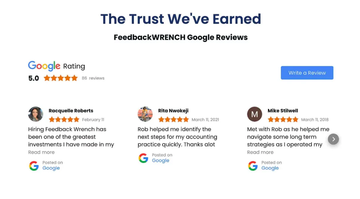
8. Social Proof
Reassure potential attendees by including testimonials from past participants, attendee numbers, or logos from companies that have joined previous webinars. Familiar names and positive feedback go a long way.
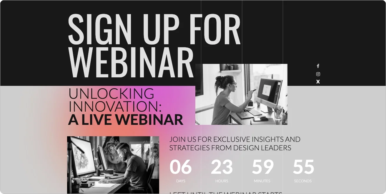
9. Urgency Triggers
Encourage quick action with countdown timers, "limited spots available" notices, or phrases like "Registration closes soon." These subtle nudges can make the difference between interest and sign-up.
10. Mobile-Optimized and Accessible Design
More people are registering on the go, so your page must load fast, look clean, and function smoothly on any screen. Accessibility best practices, like readable fonts and alt text, ensure everyone can engage.
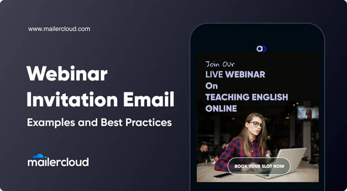
20 Best Webinar Landing Page Examples To Copy From
Here are 20 webinar landing pages, each with innovative design, effective tactics, and unique features you can use in your own:
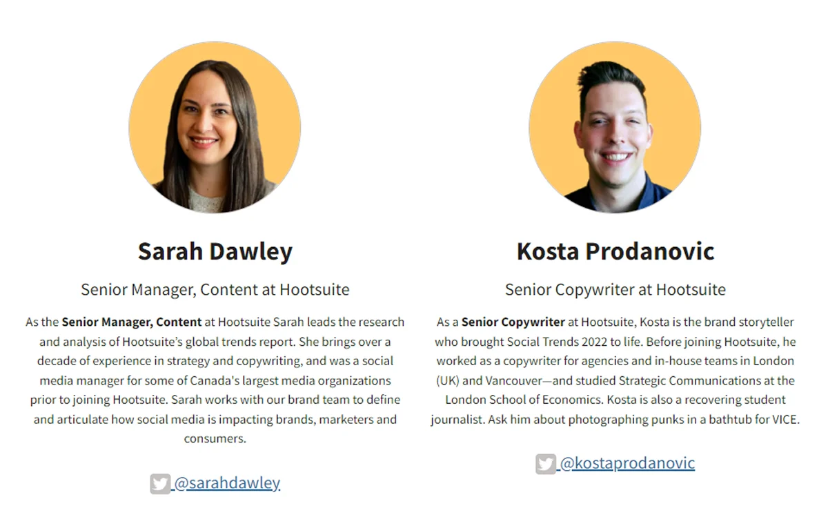
1. Hootsuite
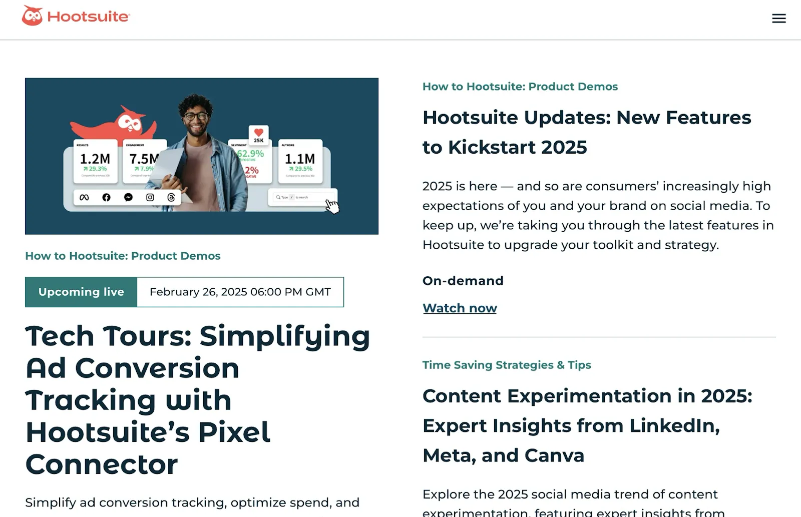
Hootsuite's landing page opens with a bold title to draw users in. Speaker bios with photos and Twitter links add credibility, while social share buttons help amplify reach.
Takeaway:
Hook visitors with bold language, list clear benefits, and humanize the event with real speaker details and social proof.
2. Salesforce
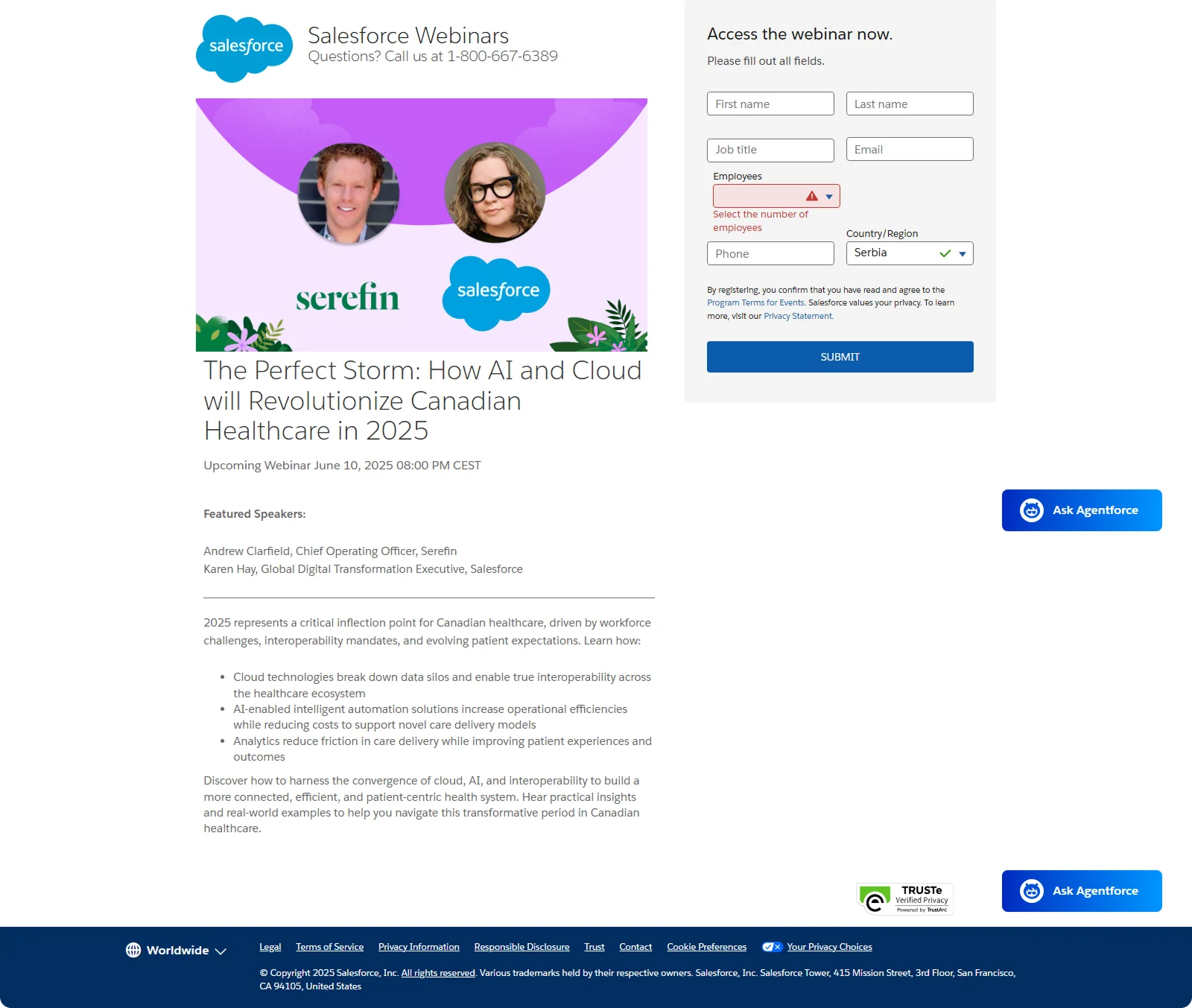
Salesforce keeps it clean and complete. A strong, outcome-driven headline (focused on AI) sits above clearly listed event details: time, date, agenda, and speaker info. The guest speakers' headshots and company titles build authority.
Takeaway:
Answer the four big questions fast:
What's the webinar? When is it? Who's hosting? Why should I care?
3. Slack
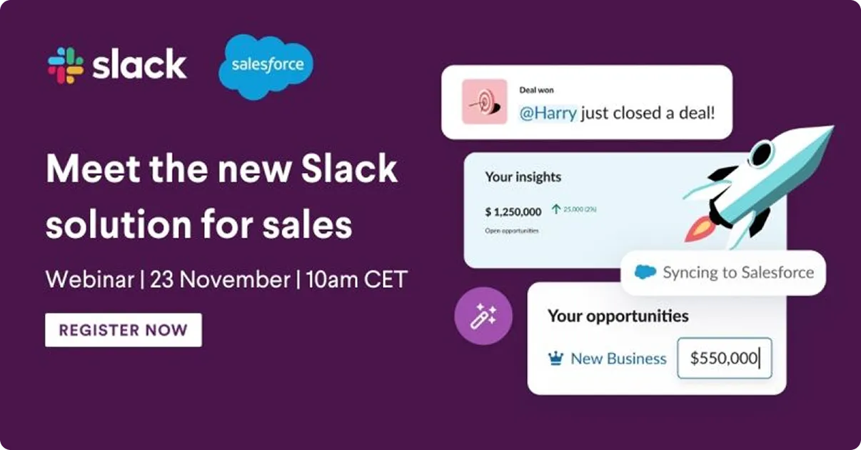
Slack's page excels in clarity and global accessibility. The headline promises a result, not just a topic: "Meet the new Slack solution for sale." A well-organized agenda is easy to review and timezone options let users choose what works best.
Takeaway:
Speak directly to your audience's needs, offer timezone flexibility, and keep your value proposition upfront and easily understood.
4. LinkedIn Learning
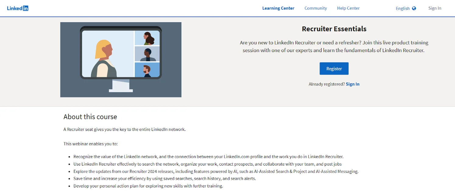
LinkedIn Learning's page focuses on clarity and educational value. It lists exactly what attendees will learn (e.g., "Recruiter Essentials," or "Machine Learning 101"), sometimes includes video previews, and connects the webinar to related learning paths or downloadable materials.
Takeaway:
List precise skills attendees will gain, and preview content to boost engagement and trust in educational value.
5. BigCommerce
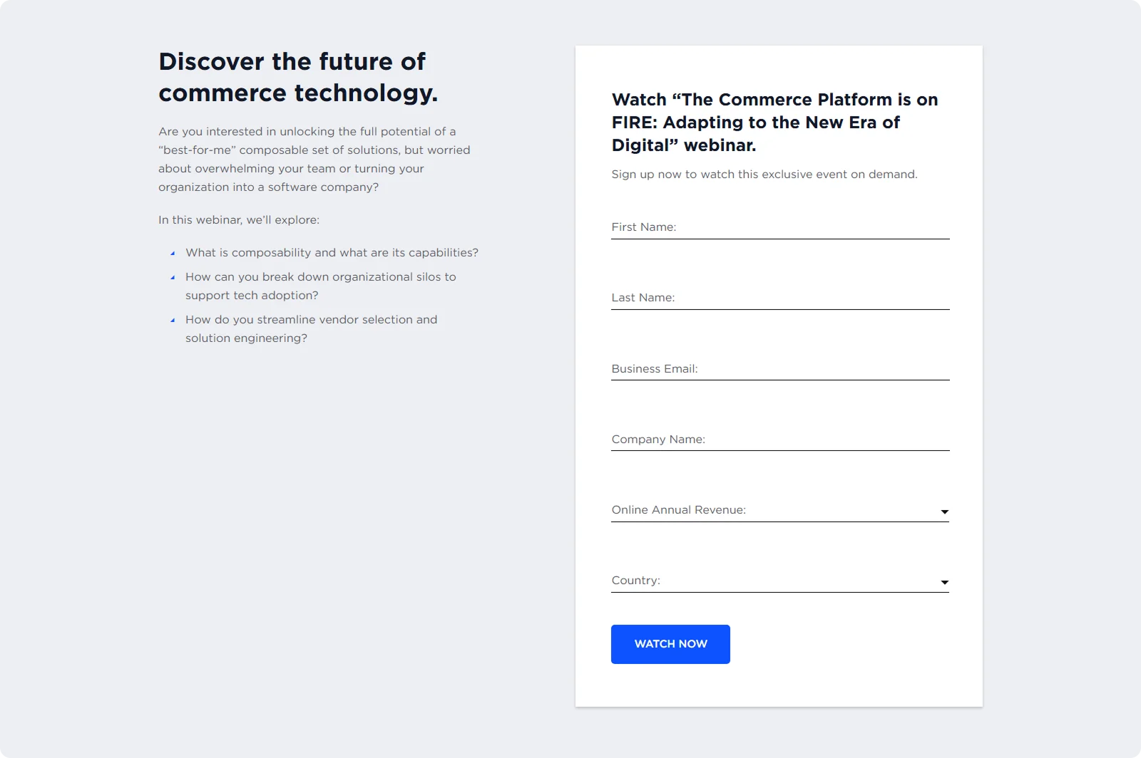
BigCommerce takes a "no-fluff" approach. Their landing page leads with a clear title and a detailed agenda as the primary focus.
Rather than persuasive copy, the bullet list speaks for itself, targeting e-commerce pros seeking actionable takeaways. The CTA stands out against the sparse design, and time/date details are placed prominently above the fold.
Takeaway:
Let the agenda talk if your topic is strong. Clarity and substance can outperform flashy design.
6. Mailchimp
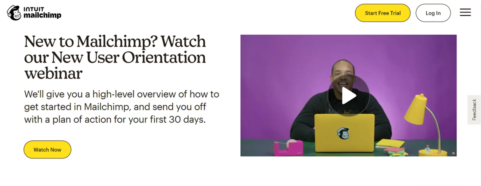
Mailchimp's page focuses on functionality and ease. While not flashy, it offers a clear webinar description and an agenda. Registration is easy, often with pre-filled forms for Mailchimp users. They also promote related webinars on the same page, increasing cross-signups.
Takeaway:
Nail the fundamentals – clear benefits, timezone convenience, and related session links can boost engagement and retention.
7. ON24
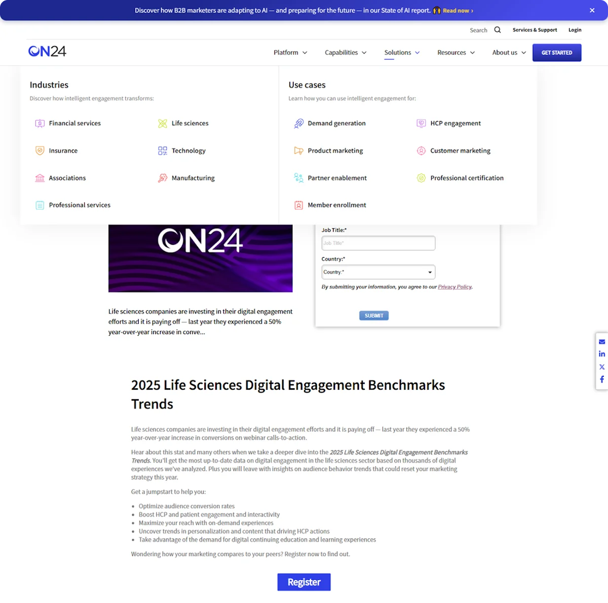
ON24's landing page makes an instant visual impact. It features multiple session times, strong iconography, and concise bullets to outline takeaways. The visual hierarchy is carefully structured, and the CTA button pops brightly.
Takeaway:
Don't be afraid to break visual norms – a bold color scheme and clear structure can help your page stand out and convert.
8. Sprout Social
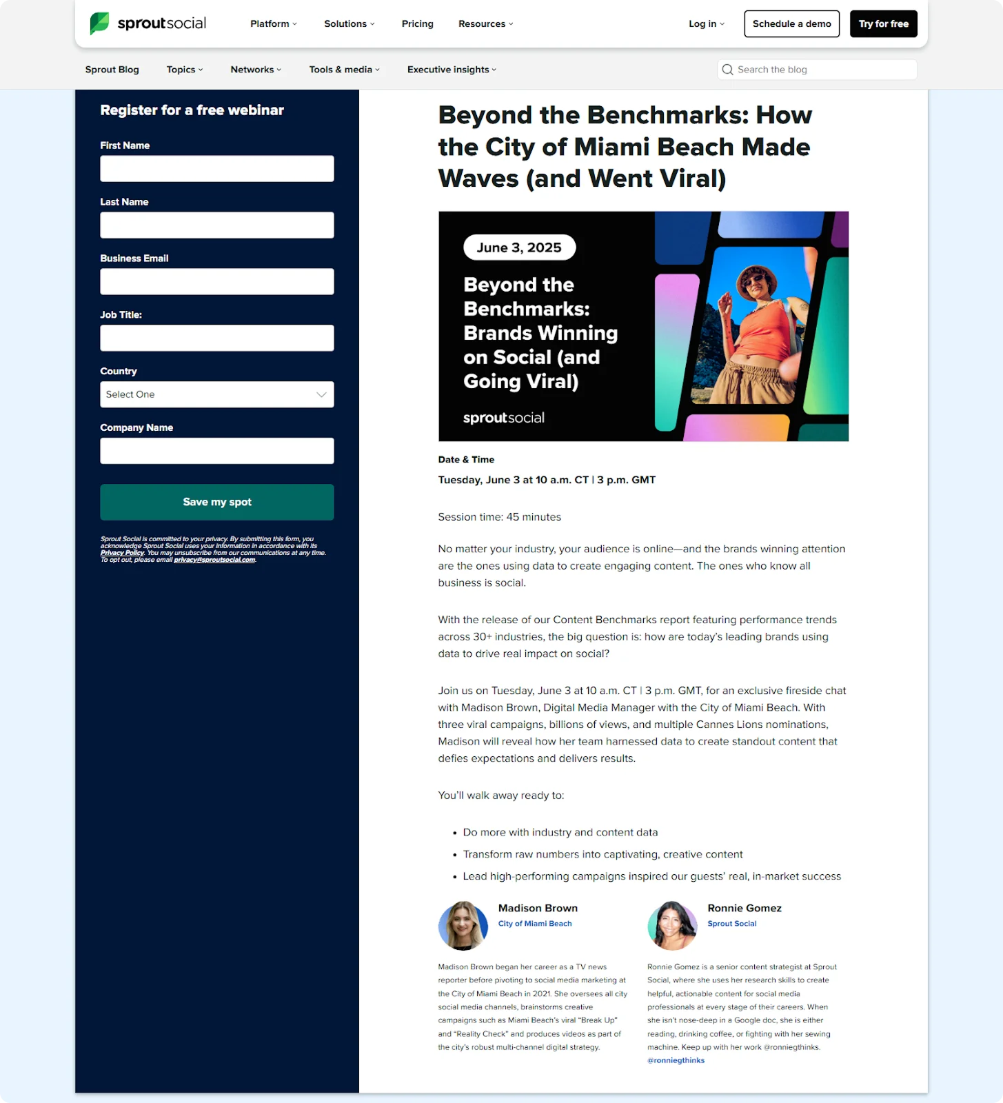
Sprout Social front-loads everything: a bold title appears as the headline and within the hero graphic, ensuring clarity. The page lists two speakers with titles and multiple time zones (including GMT), making it inclusive for global audiences. The benefits outlined under "You'll walk away ready to" set clear expectations.
Takeaway:
To reduce friction and boost clarity, use conversational copy, repeat key info visually, and keep the signup form instantly visible.
9. Airbnb
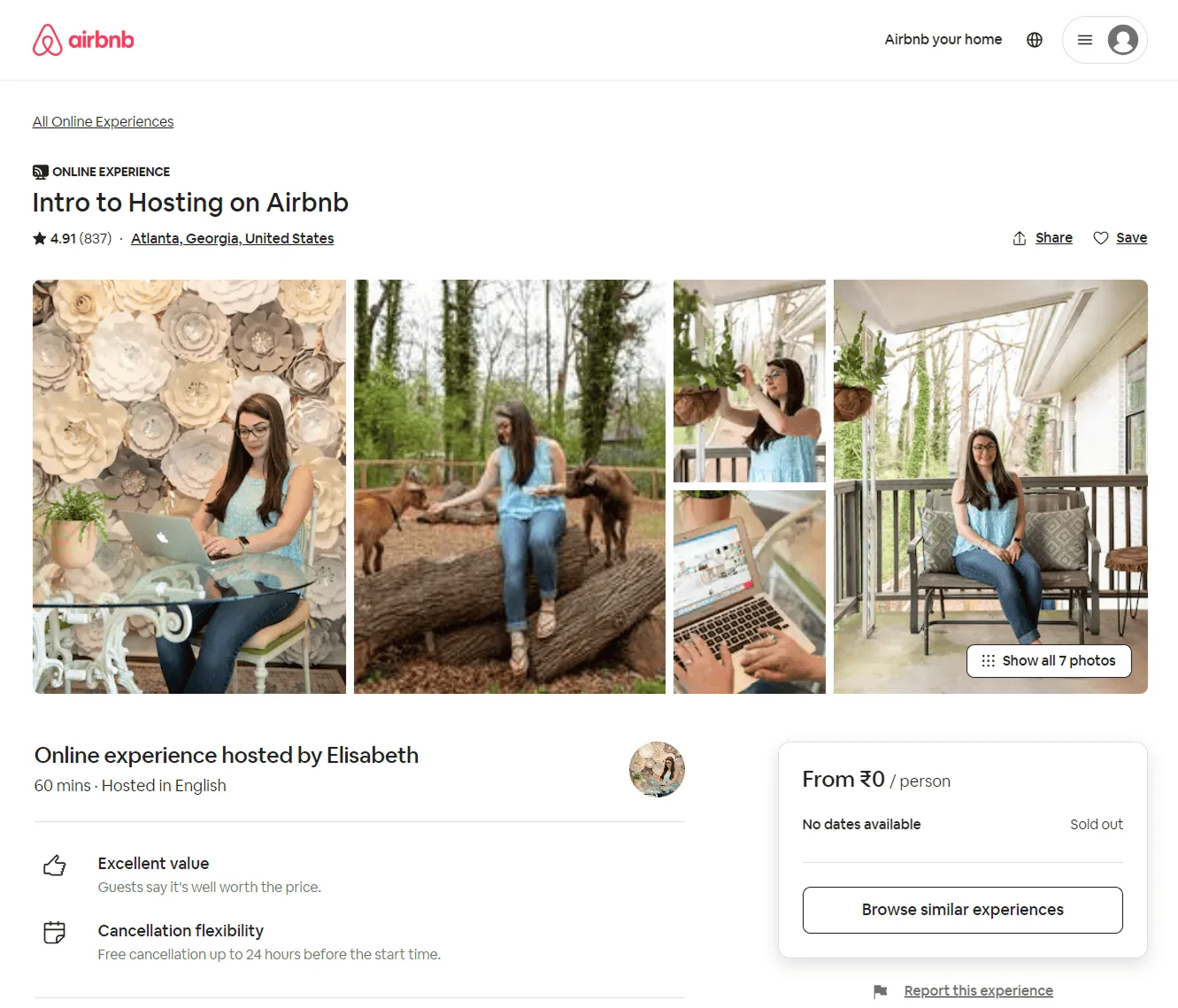
Airbnb's landing page is simple, warm, and audience-aware. A short headline like "Intro to Hosting on Airbnb" leads into a personalized intro from a Superhost or rep. Visitors choose from two options (live or on-demand), and testimonials from past attendees add strong social proof.
Takeaway:
Address your audience's doubts with simplicity, clear outcomes, and proof that "people like them" succeeded by attending.
10. DataCamp
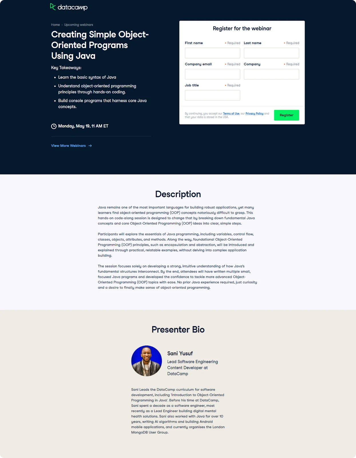
DataCamp gets straight to the good stuff. The webinar title is followed immediately by a detailed agenda with technical terms, ideal for their data-savvy audience. The form is near the top, and the page avoids fluff, opting for value-first content. The design is clean and coded with their branding in mind.
Takeaway:
Know your niche: if your audience is technical, speak their language and list specific takeaways immediately.
11. eLearning Industry
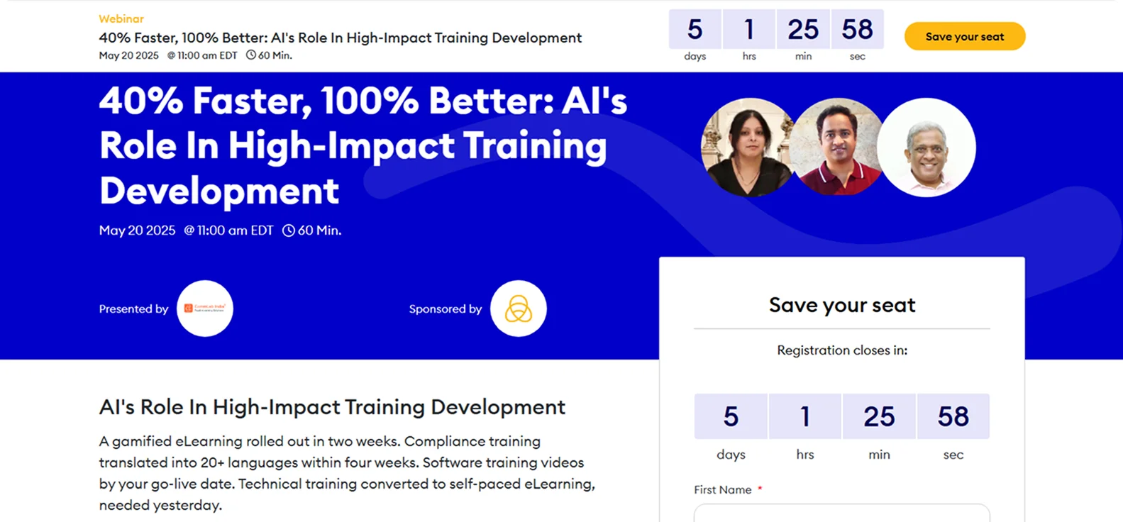
This landing page combines urgency with clarity. Key details like webinar time, length, and speaker bios appear at the top. A countdown timer adds pressure to register, while a detailed agenda appears further down.
Takeaway:
Add urgency (like a countdown) and immediately show who, when, and why.
12. LearnWorlds
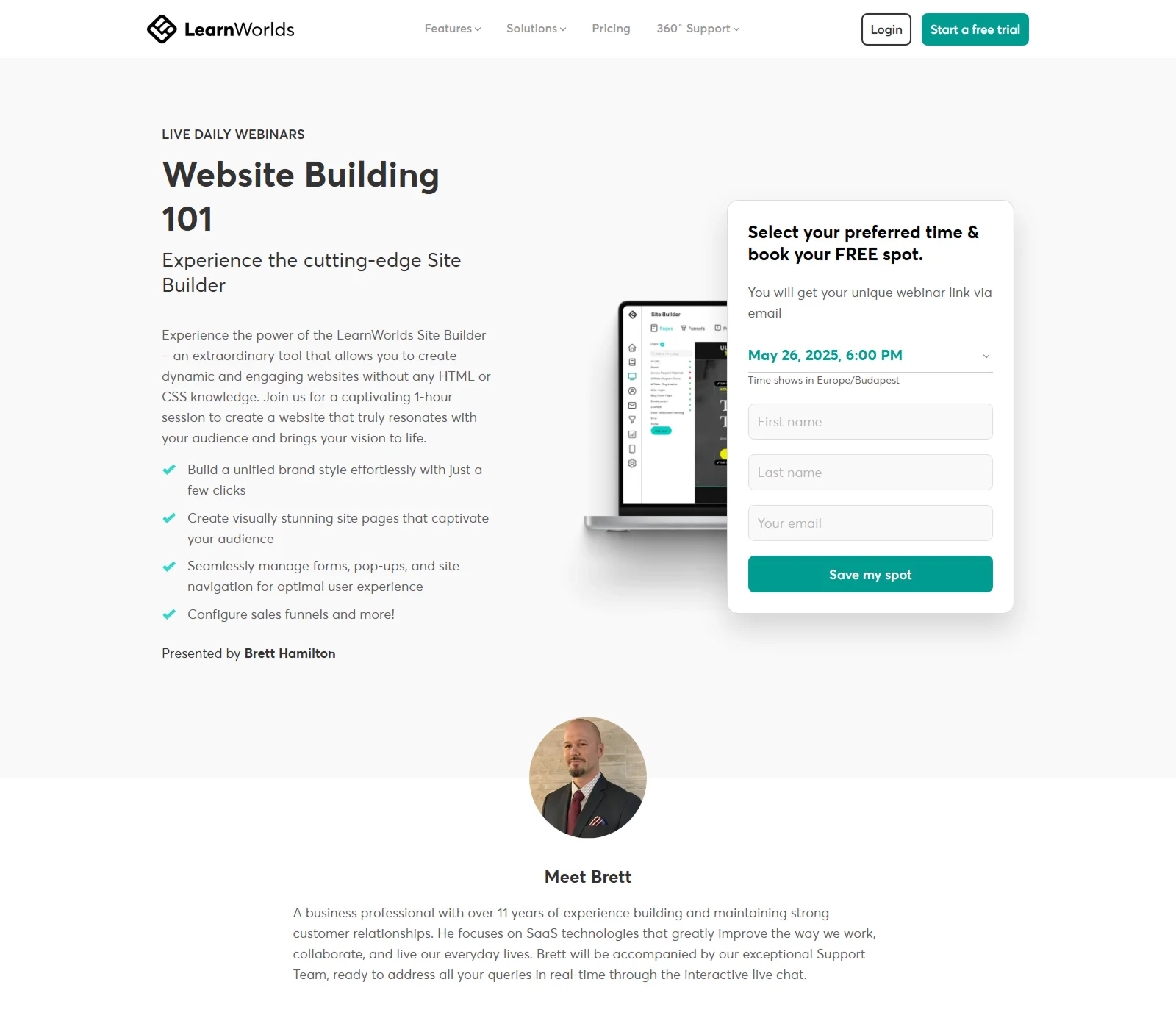
LearnWorlds flips the script by promoting availability instead of urgency. A dropdown lets users pick a convenient time, and the page lists key product benefits alongside learning takeaways.
Takeaway:
If volume matters more than scarcity, promote flexible scheduling and emphasize ease of access over hype.
13. Calendly
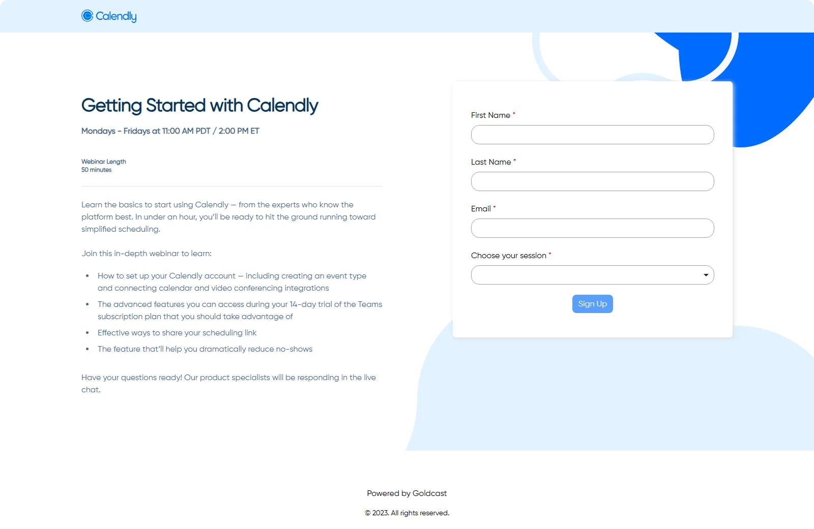
Calendly's landing page mirrors its product: simple and intuitive. It outlines exactly what users will learn - setting availability, creating event types, and using the platform effectively.
Takeaway:
Align your page with your product's purpose, focus on solving real user pain points, and make sign-up as frictionless as possible.
14. Google Digital Garage
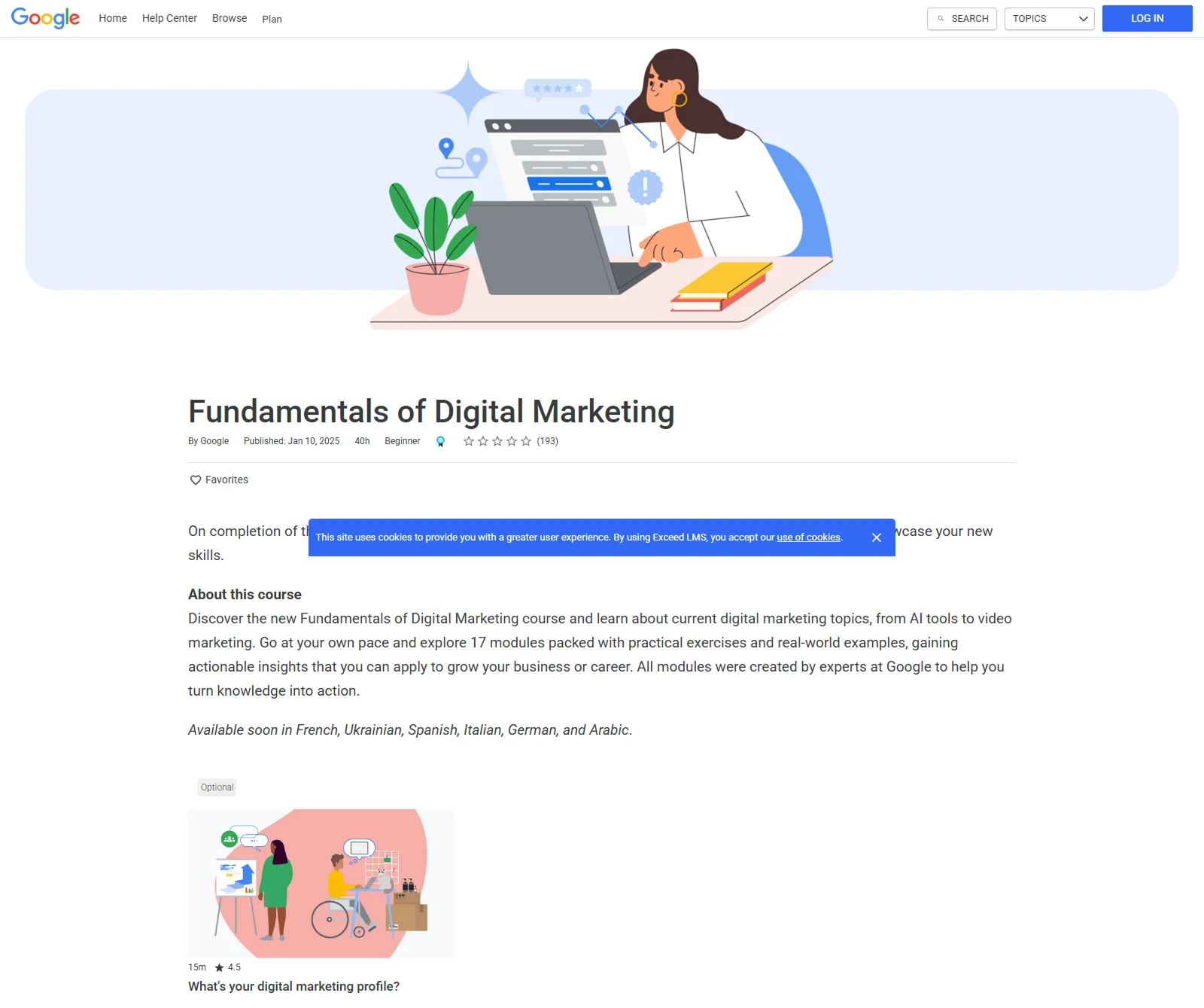
Google's page emphasizes skill-building with a clean design, a clear title/subtitle, and bullet-pointed learning outcomes. A brief video or graphic may highlight value. Logging in with Google keeps the process effortless.
Takeaway:
Combine clarity, credibility, and easy registration. A well-known brand and a clean layout lead to high trust and conversion.
15. Gartner
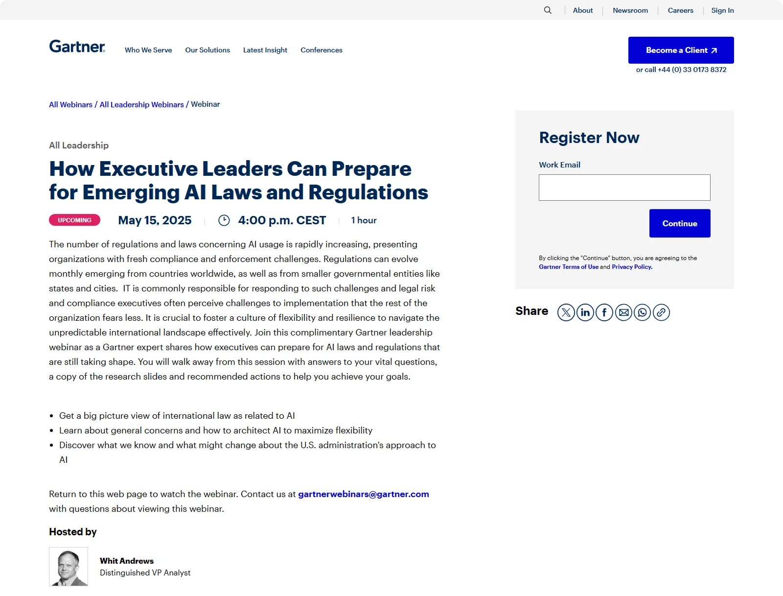
Gartner's page offers depth with a minimalistic, content-first approach. Detailed session info and value points are prominent, while the form only requires an email upfront. Social sharing buttons add virality, and the overall feel is authoritative and professional.
Takeaway:
Use micro-conversions: Start with just an email, then guide users through the rest - low friction, high follow-through.
16. Tailwind
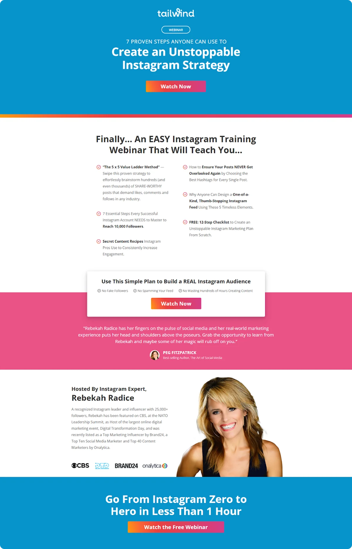
Tailwind keeps it short and focused. A bold header includes the CTA ("Join us to learn X"), and the page lists specific outcomes, like Instagram growth. The layout is basic: headline, benefits, speaker, and form. There is no product push, just pure value.
Takeaway:
Speak directly to your audience's goals and avoid overselling. Sometimes, less really is more.
17. SCORE
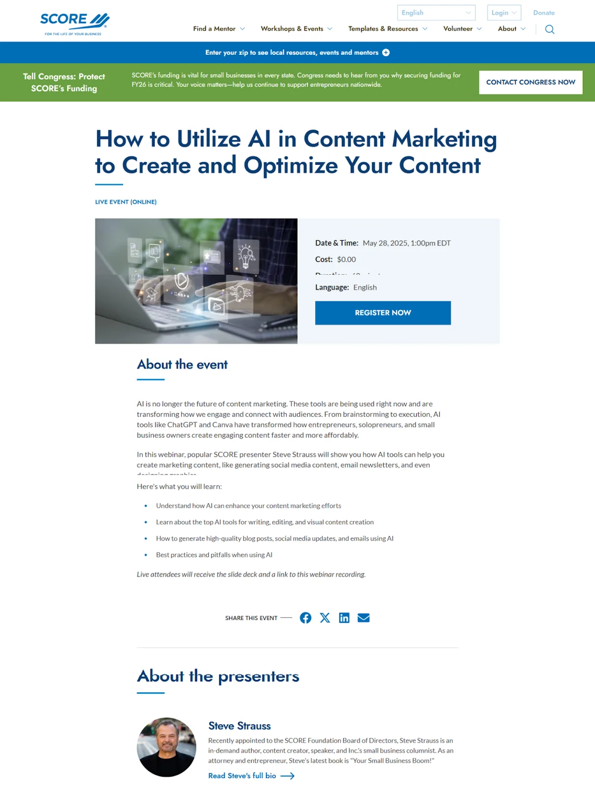
SCORE's landing page highlights value with benefit-driven headlines like "How to Utilize AI in Content Marketing to Create and Optimize Your Content." A bold CTA and strong agenda bullet list (ideally placed higher) make the value obvious. Speaker bios and nonprofit branding help build trust.
Takeaway:
Sell the benefits clearly, because convenience and credibility go hand in hand.
18. BrightTALK
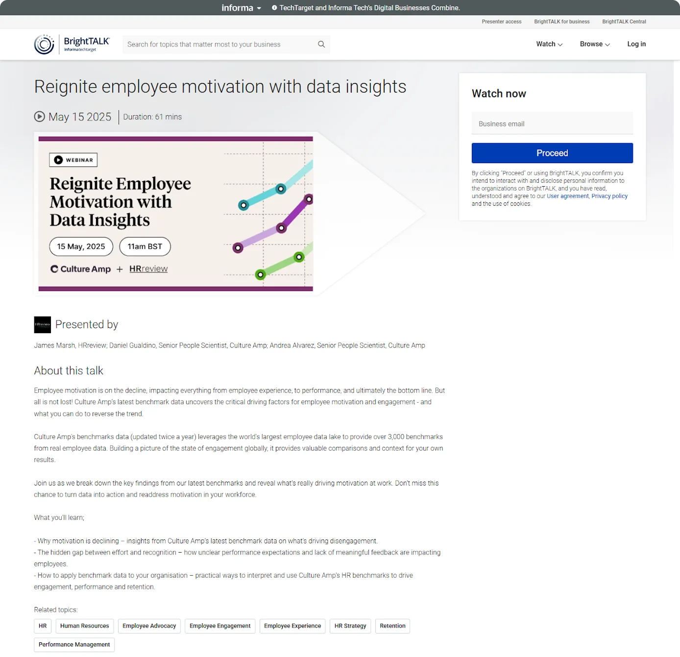
BrightTALK's landing page is optimized for straightforward sign-ups. A direct headline promises a clear benefit (e.g., reignite employee motivation), and the form only asks for an email, no long fields.
Takeaway:
Simplify everything: ask for less, show more value, and remove any barriers to registration.
19. Surreal Digital
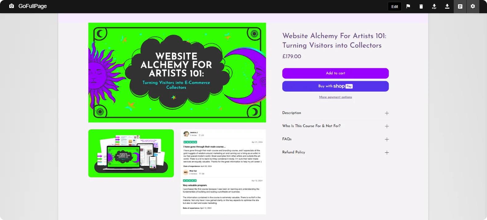
Surreal Digital grabs attention by targeting artists with a bold headline, "Website Alchemy For Artists 101: Turning Visitors into Collectors." The bullet list contains irresistible outcomes, and the CTA is visually dominant. Testimonials and bold stats build massive intrigue.
Takeaway:
Use bold numbers, aspirational outcomes, and audience-specific pain points to create urgency and high perceived value.
20. Exposure Ninja
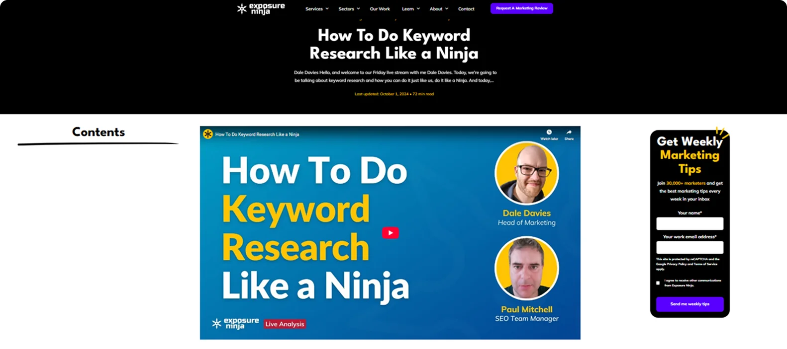
Exposure Ninja opens with a compelling question: "How to Do Keyword Research Like a Ninja?" The page highlights results, uses bolded metrics for scannability, and reinforces value with social proof.
Takeaway:
Lead with a curiosity-driving question and show off real, quantifiable results, instantly boosting credibility and click-throughs.
Build a Webinar Landing Page in Minutes with Codesi
Now that we've explained what makes a great webinar landing page, you might wonder how to create one.
Good news: you don't need to be a designer or developer to build a high-converting webinar landing page.
Codesi's AI landing page builder allows you to create fully tailored, conversion-optimized pages in just a few minutes.
Here’s how to easily generate webinar landing pages with Codesi - step by step:
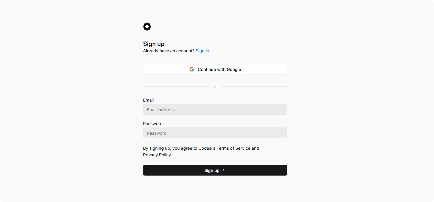
Step 1: Sign up on Codesi (it’s free).
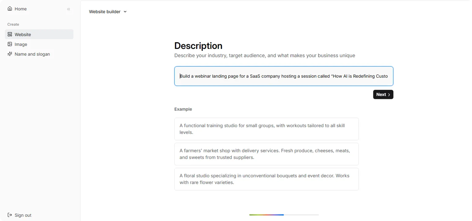
Step 2: In the Website Builder, enter your prompt. For webinar landing page creation, we used the following example:
“Build a webinar landing page for a SaaS company hosting a session called “How AI is Redefining Customer Support in 2025.” Target decision-makers at mid-sized tech companies. Include a registration form, speaker headshots, logos of past clients, bullet-point takeaways, and a CTA like “Save My Spot.” Visuals should be modern, professional, and tech-forward.”
Step 3: Choose your color theme and style. For this example, we used:
“The style should be clean and minimal, evoking trust, clarity, and intellectual focus. Use a base of cool grays and soft whites, accented by calming blues or muted teals to reflect focus and calm. Include a bold contrast color like deep navy or forest green for CTAs and important sections.”
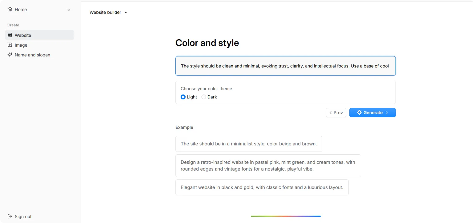
Step 4: Click “Generate” and wait a few moments while Codesi generates your webinar landing page.
You'll get a stunning webinar landing page that you can fine-tune as needed.
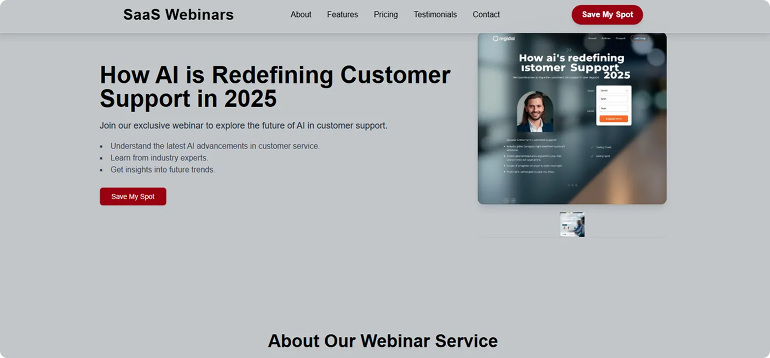
Ready to create your own high-converting webinar landing page?
Start building your webinar landing page with Codesi today, and turn every event into a growth engine.
Create your website with AI today
Codesi is a platform where you can make a website in 3 minutes.
No coding, no designers, no hassle - just AI.
