Back to blog
10 Best Personal Website Examples to Inspire You in 2026
Discover the best personal website examples to inspire your own site and learn how to build a standout online presence that truly reflects you.
Apr 30 2025
Google your name. What shows up? In 2026, that answer matters more than ever.
Whether you’re landing clients, applying for jobs, growing a business, or building an audience, your personal website is your most valuable online asset.
And if you don’t have an idea of what it should look like, don’t worry - we're here to help.
We’ve made a list of the 10 best personal websites to inspire you in 2026.
You’ll discover what works, why it works, and how to use those principles for your site.
What’s even more amazing, by the end of this article, you’ll know exactly how to build a site like that in minutes: with no code, no guesswork, and no agency bill.
What Makes a Great Personal Website in 2026
Personal websites have evolved. Some are one-page, some are huge, but in 2026, the best of the best look good and work hard.
Here’s what today’s top-tier personal websites have in common:
1. Mobile-first design
Most people will visit your site on their phone, so any website, personal or not, has to work seamlessly on small screens.
2. Clear value proposition
Within a few seconds, visitors should get what you do, who you are, and why they should care. No guessing.
3. Balanced tone
The best sites show personality without losing professionalism. Design, language, and layout should reflect who you are, but without trying too hard.
4. Thoughtful interactivity
Features like live chat, subtle animations, or smart menus can make a site feel modern without overwhelming the user.
Click here to watch the video.
Whether you’re reviewing personal branding examples or trying to improve your own online presence, the principles we have covered set the bar. So let’s get down to the real business and see some actual examples of personal websites that draw visitors in.
10 Best Personal Websites and Design Examples to Inspire You in 2026
The best personal websites in 2026 don’t follow a single formula. But the most effective ones do share a few essentials: they’re easy to use, communicate clearly, and reflect the person behind them.
Below are 10 personal website examples (across different fields) that offer practical inspiration grounded in today’s trends.
1. Bruno Simon
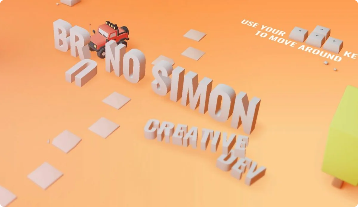
Niche: Web Developer / 3D Interactive Designer
Bruno Simon’s site redefines what a personal portfolio can be. Instead of a static gallery, it’s a playful, immersive 3D world navigated by a mini car - complete with physics, sound effects, and interactive elements. The design speaks directly to his expertise in interactive design and advanced front-end development.
Why it works?
- The interactive concept immediately captures attention. The experience itself is a demonstration of his skills.
- It keeps users engaged longer, encouraging exploration.
Key takeaways:
- The site proves that creativity doesn't have to compromise usability. Despite its unique format, it remains intuitive and fast.
- Every design choice aligns with his professional goals.
Great example for: Front-end developers, 3D animation & interactive designers.
2. Guillermo Rauch
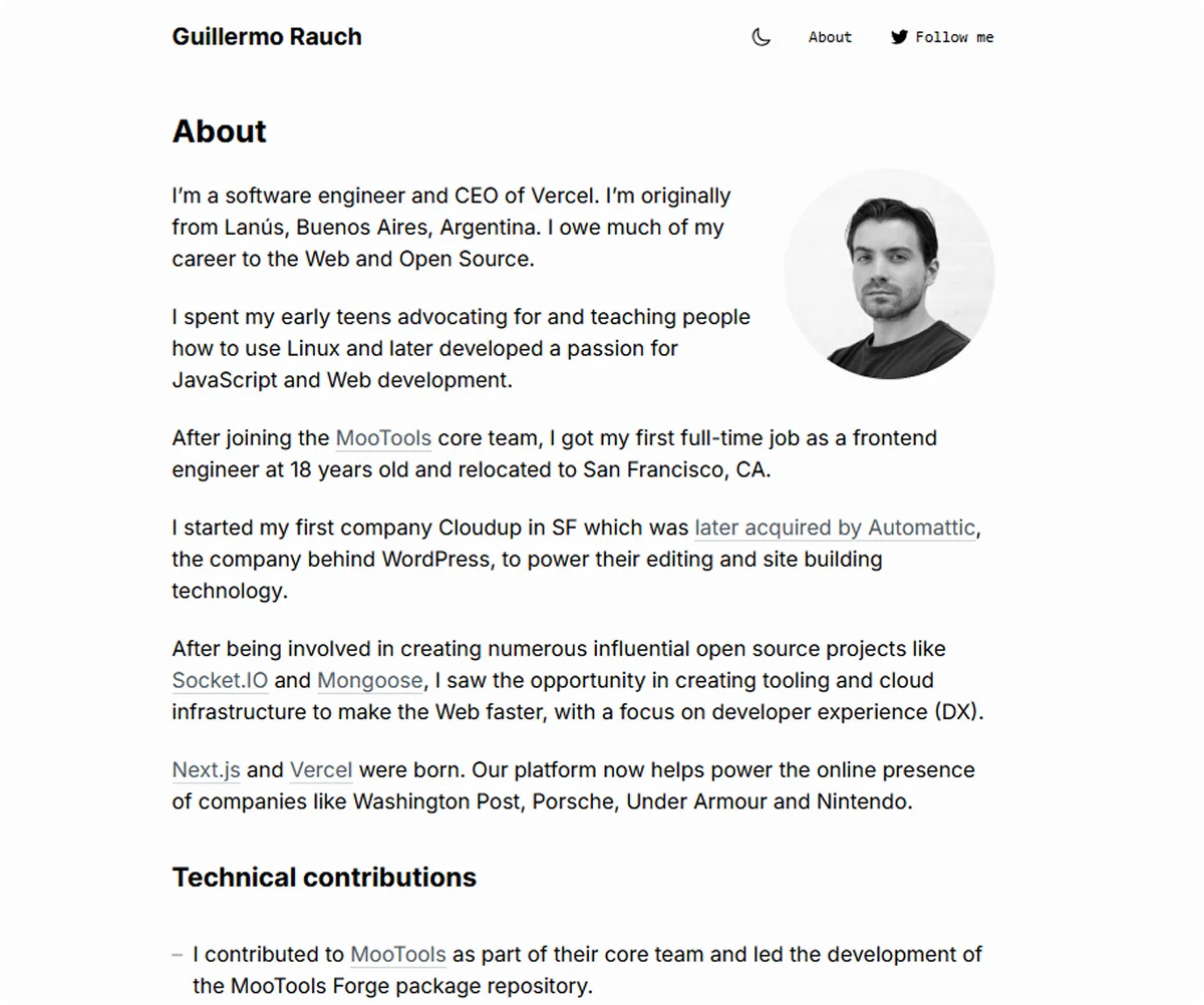
Niche: Software Engineer / CEO
Guillermo Rauch’s website reflects his role as both a hands-on technologist and a forward-thinking CEO. It’s clean, fast, and sharply organized - exactly what you’d expect from the mind behind Vercel. Instead of heavy graphics or overbuilt features, the site relies on excellent typography, smart white space, and seamless navigation to create a high-authority presence.
Why it works?
- Lightning-fast load times and lightweight design reflect technical excellence.
- Minimalist aesthetic keeps the focus on his projects, writing, and public talks.
- Strong integration with external platforms (like GitHub, Twitter, and personal essays) extends his influence beyond the homepage.
Key takeaways:
- Guillermo’s site proves that authority doesn’t come from shouting - it comes from clarity and focus. Every section supports his brand as a builder and thought leader without unnecessary flash.
- It’s a great model for those balancing technical credibility with leadership visibility.
Great example for: Software engineers, tech entrepreneurs, and startup founders looking to build personal and professional credibility online.
3. Eleanor Smith
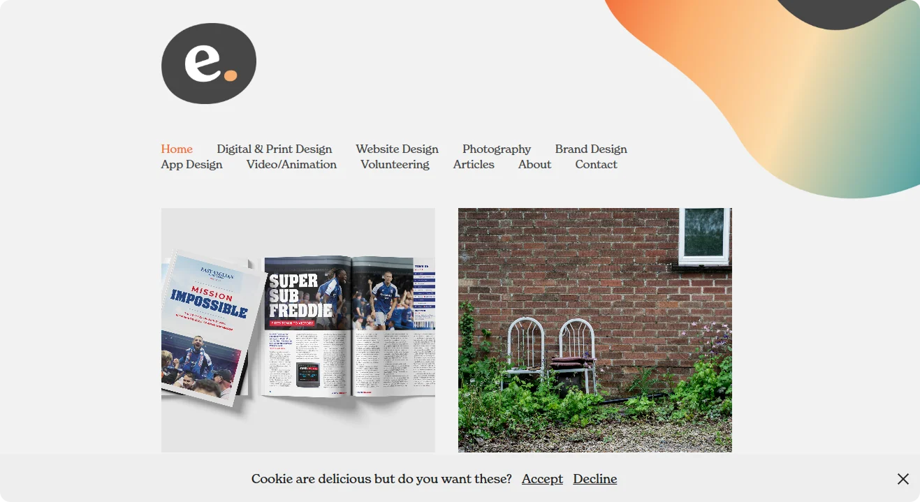
Illustrator / Visual Artist / Designer
Eleanor Smith’s site bursts with color and personality, mirroring her work across design, painting, and illustration. Using a grid-based layout with subtle animations, it turns the browsing experience into a visual playground without becoming overwhelming. On top of all, every section feels like a handcrafted landing page.
Why it works?
- The dynamic grid layout makes each visit feel fresh.
- Hover effects and transitions add interactivity without clutter.
- The color palette is bold yet balanced, reinforcing her artistic style.
Key takeaways:
- Strong personal branding is achieved through a consistent visual voice. The site is instantly recognizable.
- Micro-interactions are used with precision, just enough to impress without distracting.
Great example for: Multi-disciplinary creatives who blend traditional and digital media.
4. Fareed Haque
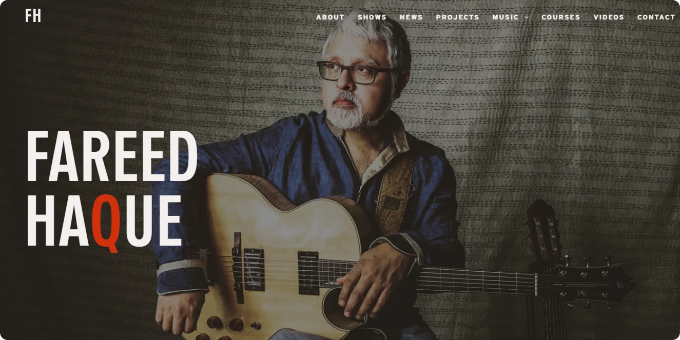
Niche: Guitar Player / Musician
Fareed Haque’s website is a strong example of how musicians can extend their artistry into the digital space. The site is welcoming, rich in content, and built around his performances, albums, and teaching. Instead of overdesigning, it uses a clean structure that feels approachable yet professional.
Why it works?
- Highlights key offerings (live shows, recordings, and lessons) without overwhelming the visitor.
- Embedded music and video players let fans experience his work immediately.
- Strong focus on user-friendly navigation ensures that fans, students, and event organizers find what they need fast.
Key takeaways:
- Fareed’s site shows that musicians don’t need flashy effects to build a strong online presence. Clear access to media, an updated event calendar, and straightforward booking info matter much more.
- A musician's site should prioritize accessibility to their sound, story, and schedule above all else.
Great example for: Professional musicians, performers, and music educators looking to create a direct, functional connection with audiences.
5. Brittany Chiang
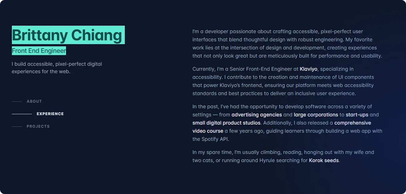
Niche: Front-End Engineer
Brittany Chiang’s personal website is a standout example of how minimalism and strong personal branding can coexist. From the moment you land, the site feels polished, focused, and welcoming. Smooth animations, subtle gradients, and carefully chosen typography all reinforce her expertise in front-end development without being flashy or overwhelming.
Why it works?
- Clean, modern layout highlights both skills and projects without clutter.
- Smart use of animation and interaction makes the browsing experience dynamic yet simple.
- The dark mode aesthetic fits the tech industry vibe without feeling cliché.
Key takeaways:
- Brittany’s site shows that when you’re selling technical skills, clarity is everything. She lets her work speak through clean UI and straightforward case studies instead of jargon-heavy explanations.
- It also shows that personal touches like a friendly intro and well-written project descriptions can make a technical profile feel human and approachable.
Great example for: Front-end engineers, UI developers, and tech professionals building strong personal brands.
6. Rob Jinks
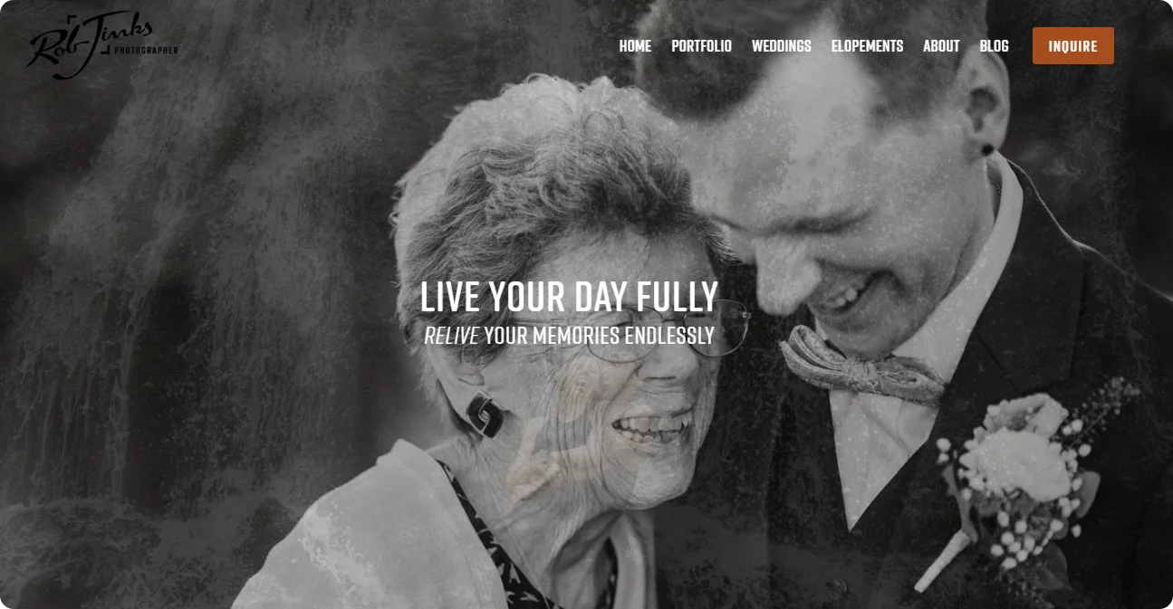
Wedding / Engagement / Family Photographer
Rob Jinks’ website is all about clarity, warmth, and trust. Designed for potential clients in emotionally driven markets (like weddings and family photography), it gets the tone exactly right. The homepage immediately communicates his niche, supported by well-organized galleries, testimonials, and clear calls to action.
Why it works?
- Simple, clean design reflects the calm, professional nature of his service.
- Portfolio galleries are organized by event type, making it easy for clients to see relevant work.
- Client-focused language builds trust from the start.
Key takeaways:
- Service-based creatives often forget the power of user empathy. Rob’s site shows he understands the mindset of someone planning a wedding or family session- and he designs around that.
- It offers a great client journey.
Great example for: Professional photographers in emotionally sensitive markets: weddings, families, lifestyle.
7. Kelsey O’Halloran
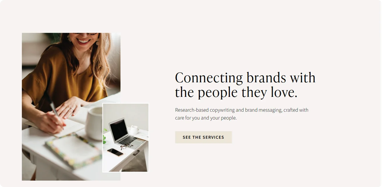
Copywriter / Content Strategist
Kelsey O’Halloran’s site is what every copywriter’s site should be: clear, direct, and well-written. The design is minimal but polished, allowing the content - her real product - to take center stage. With sections for services, case studies, and a blog, it demonstrates her voice, process, and results without overexplaining.
Why it works?
- A strong copy shows her skills instead of just talking about them.
- Clear structure makes it easy to understand what she offers and who it’s for.
- Real testimonials and case studies back up the value proposition.
Key takeaways:
- This is a content-first site done right. No fluff, no filler - just clear, strategic writing with personality.
- It shows that a writer’s site is their audition. Every word matters, and every line builds trust.
Great example for: Freelance copywriters, brand writers, and editorial consultants.
8. Devon Stank
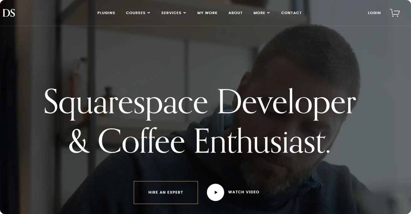
Web Designer / Brand Consultant
Devon Stank positions himself as the go-to expert for sleek, modern Squarespace builds - and his website delivers that message from the first scroll. A looping hero video shows real projects in action, backed by concise copy that explains what he does and who he serves. Everything is smooth, fast, and on-brand.
Why it works?
- Hero video gives an immediate sense of design aesthetic and project quality.
- Clean layout reflects the kind of work he offers - modern, streamlined, no clutter.
- Strategic CTAs guide users through packages, services, and consultations.
Key takeaways:
- Devon knows how to use motion and layout to his advantage without overcomplicating the UX.
- His site is a sales funnel, built to convert inquiries into bookings.
Great example for: High-end website design, especially for consultants, creators, and modern brands.
9. Vytautas Vy
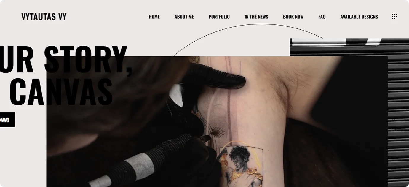
Niche: Tattoo Artist
Vytautas Vy’s website is a perfect example of how personal style and brand identity can drive a creative business. The site is visual-first, showcasing large, high-resolution video showcasing his creative process right from the homepage. It’s clean but edgy, fitting the aesthetic of a high-end tattoo artist who knows how to market artistry and professionalism at the same time.
Why it works?
- Big, bold visuals immediately showcase the quality and style of his tattoos.
- Simple navigation focuses on essential actions: view portfolio, book an appointment, or contact directly.
- Consistent branding across the site creates a strong, memorable identity.
Key takeaways:
- Vytautas’s site shows that for visual artists, the portfolio is the brand. There’s no need for heavy text when the work itself carries the message.
- It proves that clean web design doesn’t have to mean boring. Smart layout choices and confident presentation can deliver a powerful first impression.
Great example for: Tattoo artists, visual artists, and creatives who need their portfolio to do the heavy lifting for client attraction.
10. Carlos Villarreal Kwasek
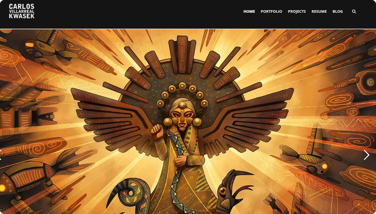
Niche: Game Designer / Developer
Carlos Villarreal Kwasek’s website is built like the best games he works on - intuitive, immersive, and full of personality. Instead of flashy gimmicks, the site uses a strong visual portrayal to guide visitors through his projects. Screenshots, prototypes, and design notes are presented in a way that feels dynamic but still easy to follow.
Why it works?
- Project-based layout highlights final products, the creative process, and development thinking.
- Balanced use of visuals and short descriptions keeps visitors engaged without overwhelming them.
- Interactive elements hint at his game design background without becoming distracting.
Key takeaways:
- Carlos’s site proves that storytelling isn’t just for games—it’s essential in portfolios too. Showing how a project evolved, not just the polished final version, gives real depth and builds credibility.
- It’s blending technical skill and creativity into one seamless online experience.
Great example for: Game designers, interactive developers, creatives working at the intersection of storytelling and technology.
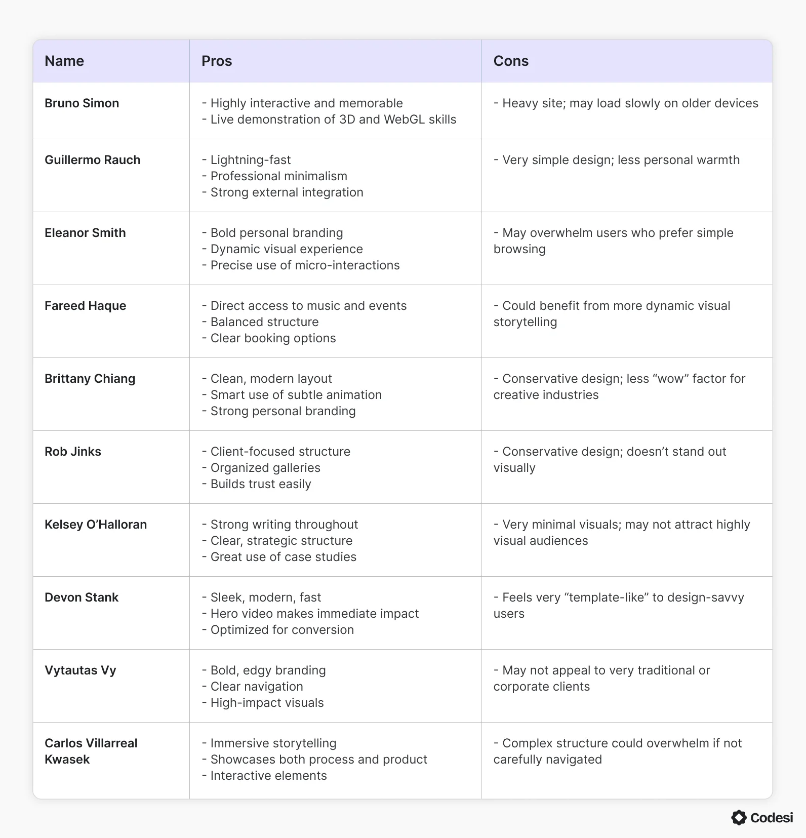
Even though these are the best of the best personal websites, there is always room for improvement. Here’s a table that sums up all their pros and cons:
In a Word
Now that we’ve examined all 10 best personal websites, hopefully, you feel inspired enough to create one yourself. In the end, all you need is:
- A clear strategy and message
- A layout that fits your profession and audience
- Fast, responsive design that works on every device
- Content that builds trust - visuals, words, or both
- Above all, you need consistency. Your site should feel like you from top to bottom.
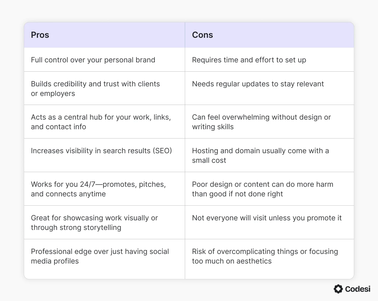
What do you get when owning a personal website? Here’s a clear table that sums up the pros and cons of having one:
But pulling all that together can feel like too much, especially if you’re not a designer or developer. That’s where smart tools come in.
How Can Codesi AI Website Builder Help?
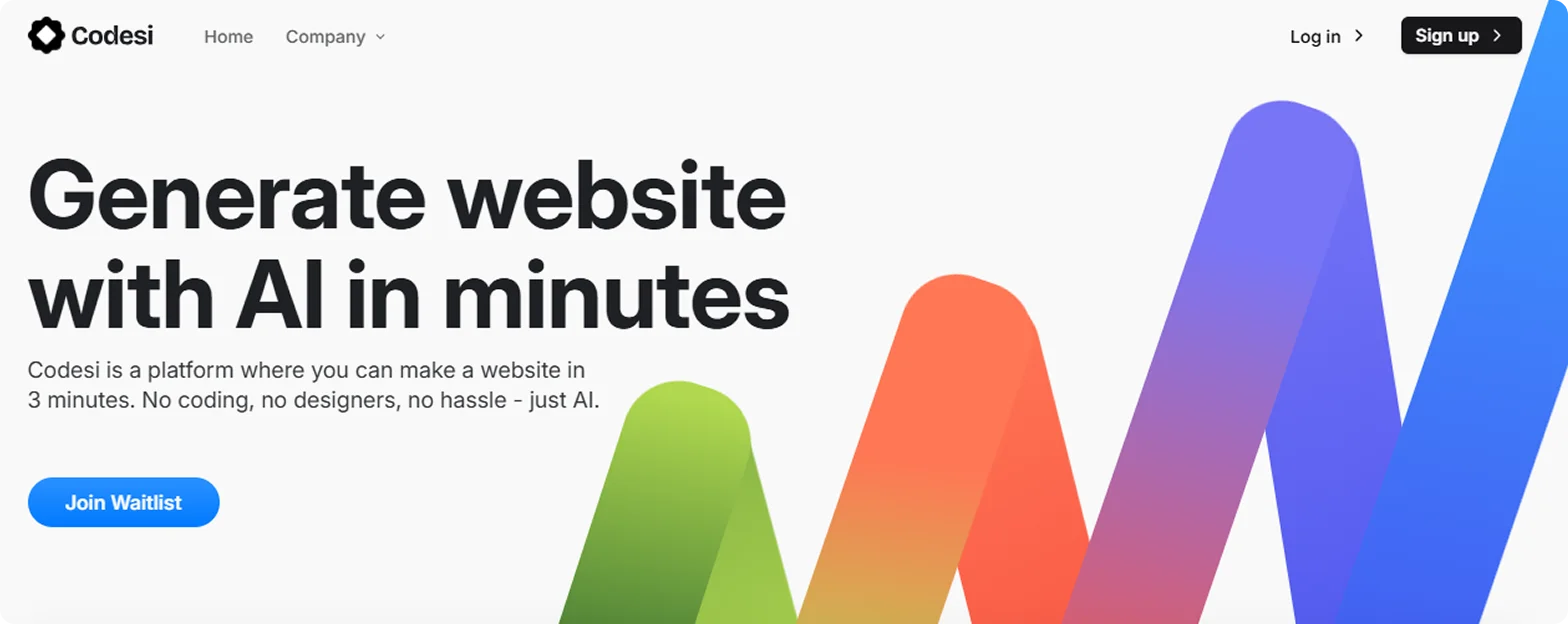
You know what you want to say, but when you try to translate that into a clean, professional site, it’s a whole different challenge. We know how it feels, and we know how to bridge that gap.
Codesi helps you shape your website around your goals, whether you’re showcasing design work, selling services, or building a personal brand. All you have to do is feed it your core information, and it will build a site that reflects all of that, with the kind of polish you'd expect from a professional studio. All of it in minutes.
What sets Codesi apart:
- It doesn’t just generate layouts - it builds with intention.
- It writes copy that sounds like you, not like a robot.
- It adapts to your style, profession, and audience.
- Make edits to content on the fly
- Swap in new images or text without hassle
- Refresh your layout anytime without breaking anything
- Skip the code and complex tools entirely
Whether you’re launching a portfolio, promoting your work, or simply building your online identity, Codesi gives you the power to create the best personal websites and attract more clients.
Ready to build one of the best personal websites online?
Start with Codesi AI and launch with confidence!
Create your website with AI today
Codesi is a platform where you can make a website in 3 minutes.
No coding, no designers, no hassle - just AI.
