Back to blog
5 Best Lead Generation Landing Pages to Inspire You
Discover high-converting lead generation landing pages to inspire your next campaign. See what works in design, copy, and layout to boost signups.
Apr 7 2025
It’s the morning of your big event. You’ve promoted it for weeks, but as you check the sign-up sheet, only a few have actually registered – despite all the likes and comments.
The buzz didn’t convert into action. A lead generation landing page can bridge that gap, turning interest into real commitments.
Below, we’ll explore the best lead generation landing page examples and what makes them so great.
Why a Landing Page Beats a Generic Webpage
Imagine inviting someone to your home, but the moment they step through the door, you show them four different rooms, three corridors, and a staircase – without clear direction on where to go.
They’ll likely wander around confused or head back out the door.
A lead generation landing page acts like a friendly greeter, guiding people straight to the action you want them to take:
- Single Call to Action: Instead of offering a half-dozen links, a landing page points to one goal (sign up, register, RSVP, etc.).
- Eliminating Distractions: No navigation menus, no footers with a zillion links – just a focused path forward.
- Message Match: If your social post or email promises an online workshop, the landing page should open with that same promise – keeping expectations consistent.
4 Lead Generation Landing Pages Benefits to Know
When someone lands on a page that’s designed specifically for capturing their information, it’s more than just a digital handshake.
It’s the beginning of a relationship – one in which each party hopes for a win-win outcome.
But in order to foster that connection, you need to overcome a few modern-day challenges.
1. Attention is Scarce
People are inundated with countless offers and calls to action daily, whether for local events, neighborhood initiatives, volunteer projects, or new products.
A targeted landing page cuts through the noise, zeroing in on a single message: “Here’s why you should sign up, and here’s what’s in it for you.”
2. People Need Assurance
We live in an age of skepticism, with many folks hesitant to share personal details.
A well-crafted lead generation landing page addresses those concerns by highlighting the value you’re offering and clarifying how you’ll respect their privacy (for example, clarifying that you won’t sell or misuse their data).
3. Purpose-Built Engagement
Compared to a regular homepage which is often brimming with links and general info, a landing page directs every design and copy element toward a single outcome: encouraging visitors to fill out a form or perform a specific action.
Removing distractions raises the odds that visitors will sign up or get involved.
4. Flexible Applications
While businesses may use landing pages to capture customers for a new service or product, these pages can also serve nonprofits seeking volunteers, local clubs welcoming new members, or community organizers promoting an upcoming event.
In short, if you need signups for anything, a landing page will focus your potential audience’s attention on why it’s worthwhile to join in.
5 Best Lead Gen Landing Pages That Do It Right
Lead generation landing pages have one primary purpose: to collect a potential customer’s or supporter’s contact information, such as their name, email, phone number, or other relevant details.
These insights allow you to follow up, provide value, and build a stronger relationship with your brand or cause.
Without leads, there are no new customers. No customers mean no revenue – it’s that straightforward.
So, let’s go over some lead generation landing pages that mastered these rules:
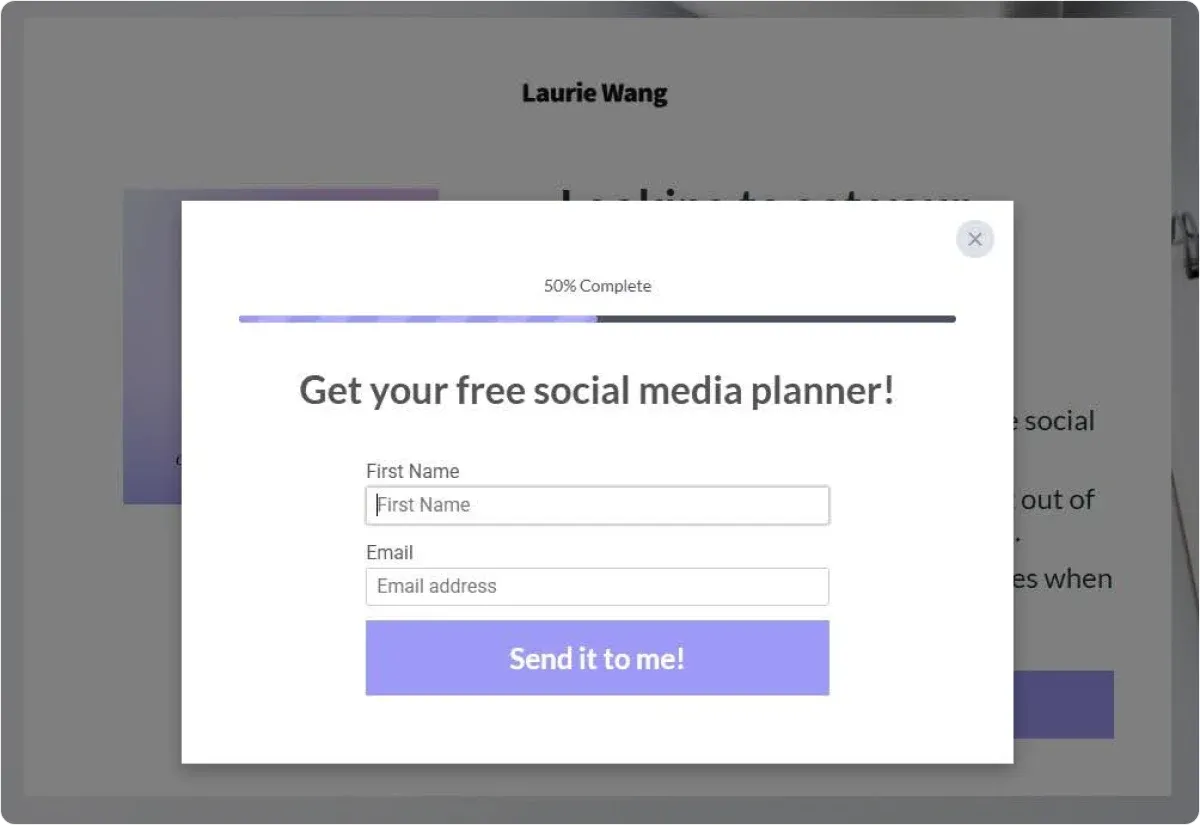
1. Laurie Wang
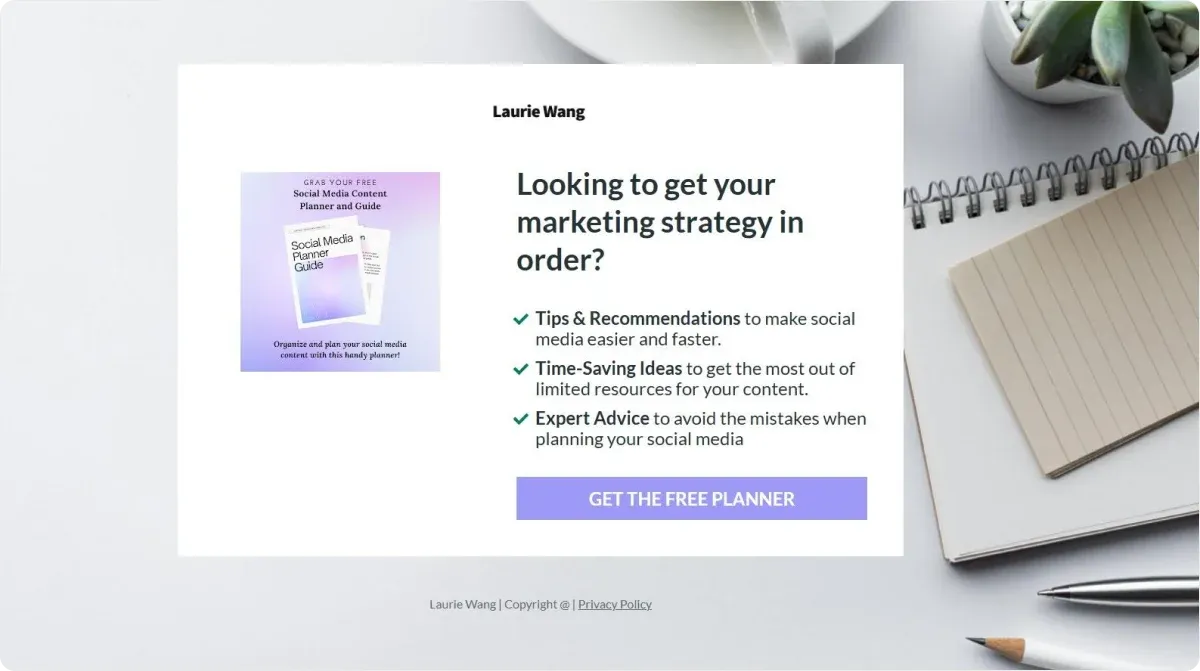
Laurie Wang’s landing page for the “Social Media Planner” is a standout example of effective lead generation.
The page strategically incorporates essential conversion elements, including clear, well-placed calls-to-action (CTAs) that guide users toward downloading valuable resources.
The minimalist layout keeps distractions to a minimum while highlighting a strong lead magnet, complete with a persuasive headline, a concise list of benefits, and engaging visuals.
Additionally, the lead capture form is simple, easy to locate, and quick to fill out, streamlining the user experience and reducing friction.
This thoughtful approach ensures maximum conversions while maintaining a smooth, user-friendly design.
What To Learn From It?
A single call to action is more than enough:
- Make the Button Stand Out: Use a color that contrasts against your background. The eye should naturally be drawn to the CTA button.
- Use Action-Oriented Text: Instead of “Submit,” try “Save My Spot,” “Join the Team,” or “Get My Free Pass.” This small change can have a surprisingly positive effect on sign-up rates.
- Test Responsiveness: Many people visit pages from a phone. Ensure the text is legible, the form is easy to fill out, and images load quickly.
- Minimize Scrolling: If possible, place crucial info and CTAs near the top of the mobile layout.
What Makes It Effective?
✅ Clean and simple design
✅ Compelling, attention-grabbing headline
✅ Clear value proposition
✅ Concise benefits section
✅ Strong visuals that reinforce the message
✅ Well-placed, action-oriented CTAs
✅ Straightforward, easy-to-fill form
✅ Fully optimized for mobile users
Laurie Wang’s landing page succeeds because it eliminates clutter, keeps the focus on value, and makes it effortless for visitors to take action.
2. WordStream
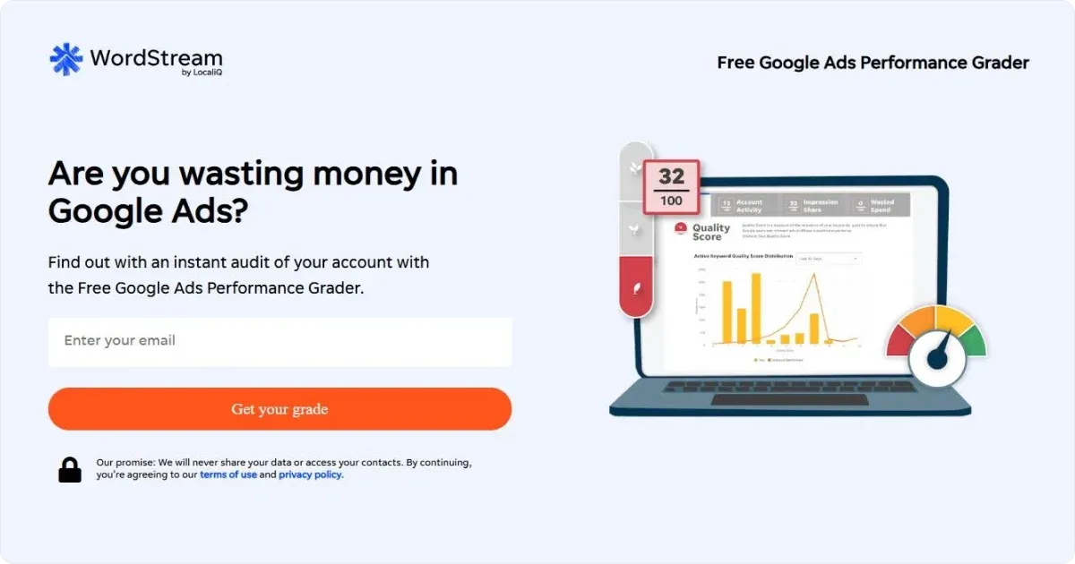
This landing page offers a free Google Ads performance assessment, an irresistible draw for businesses looking to improve their ad strategy.
The simplicity of the design and the single form field make it effortless for users to engage, reducing friction and increasing conversions.
What To Learn From It?
- Short is Sweet: The fewer fields, the more likely people are to complete the form. If you only need a name and email to start, stop there. You can always collect additional info later.
- Privacy Reassurances: A line like “We respect your privacy and never share your information” might seem small, but it significantly reduces hesitation.
What Makes It Effective?
✅ Strong value proposition – A free, instant Google Ads grade captures attention and encourages sign-ups.
✅ Minimal input required – With only one form field, users can access results without hassle.
✅ Speed-driven promise – The headline guarantees a grade in just one minute, making it hard to resist.
✅ Trust signals – The “Safe & Secure” message below the CTA reassures users that their information is protected.
✅ Credibility boosters – The Google AdWords “Premier SMB Partner” badge and media logos establish authority.
✅ Social proof – Testimonials from industry experts position WordStream as a leader in the space.
A combination of simplicity, speed, and trust-building elements for this landing page removes obstacles and maximizes conversions.
3. Gemma Bohnam Carter
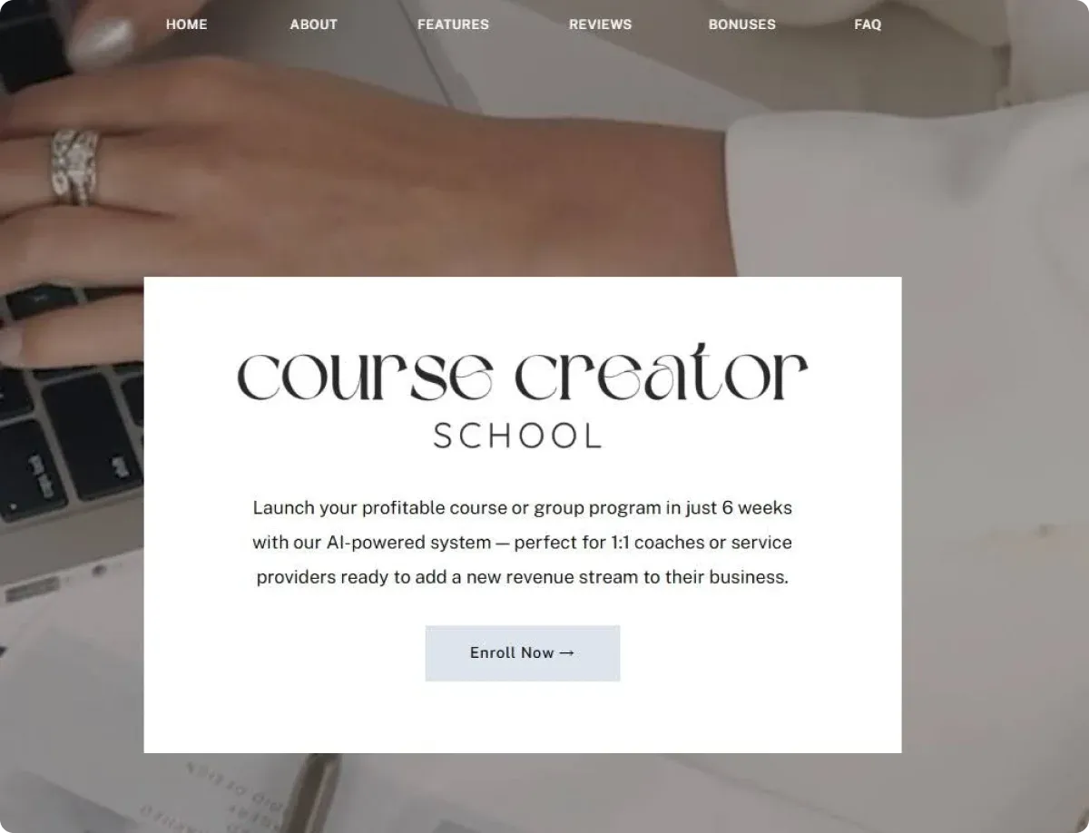
The Course Creator School landing page effectively speaks to its audience – coaches and service providers looking to scale their business without being tied to one-on-one work.
By addressing pain points, highlighting a clear solution, and incorporating strong social proof, the page maximizes engagement and conversions.
What To Learn From It?
- Testimonials, Logos, or Numbers: If your volunteer program has 500 participants or your webinar has featured expert speakers, spotlight that. “Join 1,000+ Community Members” or “As Featured on Local News Channel” builds trust.
- Credentials or Certifications: If you’re a certified coach or a recognized nonprofit, display the relevant badges or paperwork to convey authenticity.
What Makes It Effective?
✅ Pain-point-driven messaging – The page immediately connects with burnt-out professionals who want to scale their income and impact without overwhelming their schedules.
✅ Compelling value proposition – It promises a profitable course launch in just six weeks using an AI-powered system, appealing to those who want speed and efficiency.
✅ Strong social proof – Testimonials from past students showcase real success stories ($10K+ launches, $70K from a first course), reinforcing credibility.
✅ Objection handling – The page proactively addresses common concerns like needing a big audience, complex tech, or a large team to succeed.
✅ Clear transformation framework – A structured “Old Way” vs. “New Way” comparison highlights the benefits of an AI-powered approach.
✅ Module breakdown – Visitors get a detailed look at the course content, outlining the exact skills they will gain.
✅ Personal connection – Founder Gemma Bonham-Carter shares her success story, building trust and relatability.
✅ Well-placed CTA – The “Enroll Now” button is prominent throughout the page, making it easy for users to take action.
This landing page removes hesitation and guides visitors toward enrollment by combining audience-specific messaging, a clear roadmap, and trust-building elements.
4. Niklas Göke
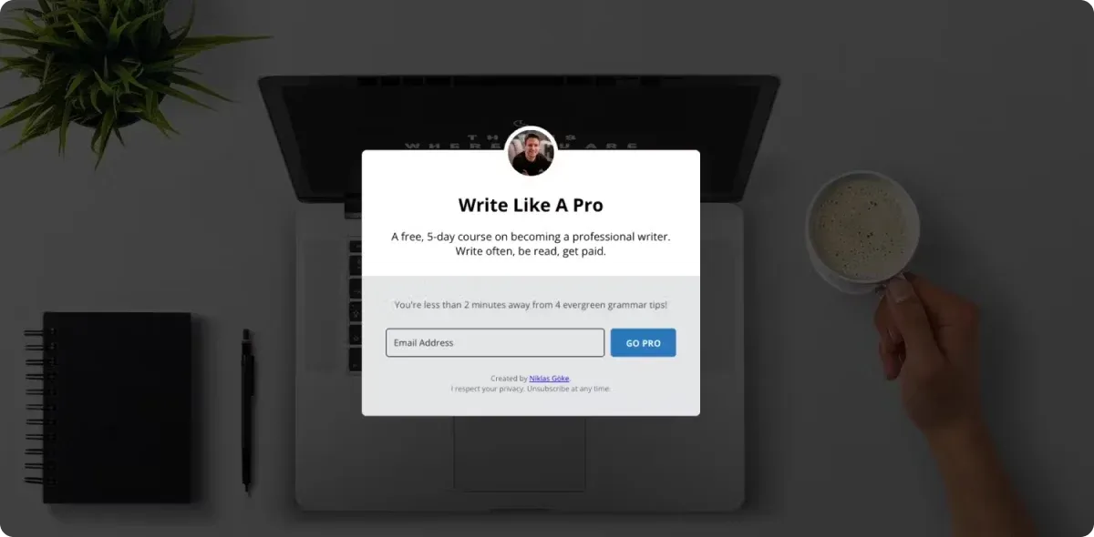
Writer Niklas Göke keeps his lead capture landing page focused and distraction-free, making it easy for visitors to take action.
With one clear CTA button and a simple yet compelling offer, the page effectively encourages sign-ups without unnecessary navigation links that might reduce conversions.
What To Learn From It?
- Explain What’s in It for Them: Don’t just describe your event, cause, or product. Emphasize how it addresses a pain point or fuels a passion. For example, if your local running club is recruiting, highlight benefits like “Improve Your Stamina” or “Meet New Friends Every Weekend.” Or, in this case, “Write often, be read, get paid.”
- Use Subheadings and Bullets: Online readers skim. Break down your content into readable chunks, making it easy to grasp your message in seconds.
Pro Tip
Struggling to find the right words? Codesi makes messaging effortless by instantly turning simple ideas into engaging, high-converting copy. No more blank-page anxiety or second-guessing your phrasing.
🚀 Just type a prompt and let AI handle the heavy lifting.
🎯 No fluff, no filler – just messaging that connects.
⚡ Easily tweak and refine with a few clicks.
See the Difference:
❌ Before: "Join our waitlist for early access."
✅ With Codesi: "Unlock VIP access to exclusive features before anyone else – sign up now!"
With Codesi, writing isn't a chore – it’s a one-click solution to powerful, persuasive messaging.
What Makes It Effective?
✅ Single, focused goal – The page has a clear objective: collecting email sign-ups in exchange for a valuable resource.
✅ Minimal distractions – Apart from a small profile link, the page eliminates navigation and external links to keep visitors engaged.
✅ Clear value proposition – Subscribers receive “4 evergreen grammar tips”, a non-downloadable lead magnet designed to help writers improve immediately.
✅ Engaging headline – The headline directly appeals to writers looking for quick, actionable ways to enhance their skills.
✅ Logical content flow – The structure follows a problem-solution approach, making it easy for visitors to understand the offer’s relevance.
✅ Prominent CTA – The "GO PRO" button is visible, though it could be more compelling by emphasizing specific benefits.
✅ Responsive design – The page is optimized for usability across different devices, ensuring accessibility.
✅ Message alignment – If visitors arrive via ads or emails about improving writing skills, the page delivers exactly what they expect.
Areas for Improvement
This type of lead generation landing page is a bit different than the other we mentioned. So, here are some areas that can be improved:
🔹 Lack of social proof – The page could benefit from testimonials or success stories from past subscribers who have found the tips useful.
🔹 More engaging visuals – A minimalist design is effective, but adding illustrations or graphics related to writing could enhance the experience.
🔹 Deeper persuasion techniques – While the benefits of better writing are mentioned, the page could explore how improved writing impacts careers, confidence, or personal growth.
🔹 Trust-building elements – A brief bio or credentials about Niklas Göke could reinforce his authority in teaching writing.
5. The Tiffany & Co.
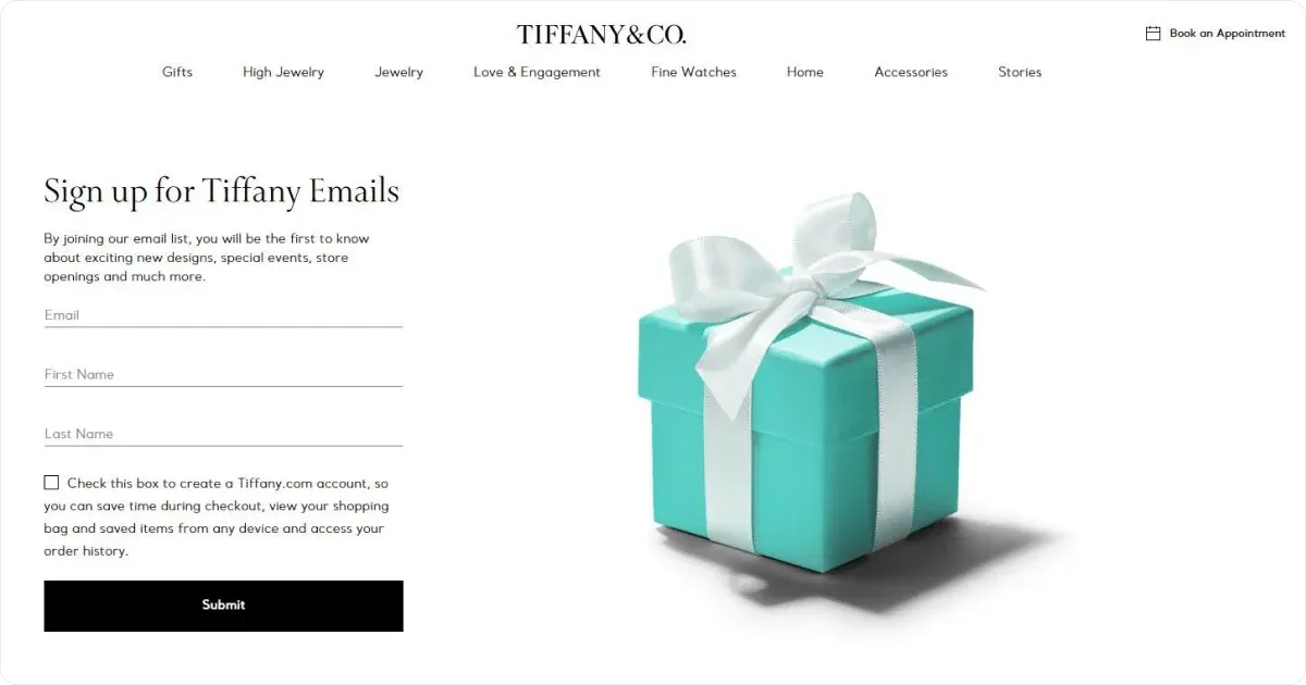
Tiffany & Co.’s email signup page is a great example of luxury brand marketing, using a clean, elegant design that aligns with its reputation for exclusivity.
The on-brand visuals and simple signup process make it easy for visitors to subscribe while maintaining the brand’s refined aesthetic.
What To Learn From It?
- Hero Images or Videos: A large, relevant image (or short video) at the top helps visitors instantly understand your message. If you’re promoting an online class, show a screenshot of the class platform or a photo of smiling participants.
- Consistent Branding and Colors: If you represent a known organization, use logos and color schemes people will recognize – the famous Tifanny Blue.
What Makes It Effective?
✅ Strong brand recognition – Tiffany & Co.’s reputation for luxury and quality is a natural draw for subscribers.
✅ Minimalist, high-end design – The page uses a clean, uncluttered layout that reflects Tiffany’s sophisticated brand identity.
✅ Clear value proposition – Subscribers get exclusive updates on new designs, special events, and store openings, making the signup feel valuable.
✅ Seamless account integration – Visitors have the option to create an account, enhancing personalization without making it mandatory.
✅ Simple signup process – A short form reduces friction, increasing conversion rates.
Areas for Improvement
🔹 Limited visual appeal – While elegant, the page could benefit from high-quality images of Tiffany’s jewelry to further engage visitors.
🔹 Lack of a tangible incentive – While early access to news is appealing, offering a discount, exclusive preview, or member-only content could encourage more signups.
🔹 Generic messaging – Personalization options, such as preferences for product categories (rings, watches, accessories), could make emails more relevant.
How Can Codesi Help You?
No matter if you are a business owner, nonprofit, or community organizer, having a compelling landing page, logo, or custom visuals, can make all the difference in attracting the right audience.
Codesi streamlines this process, allowing you to create professional, customized digital assets in just minutes without the hassle of complicated design tools.
1. Landing Page Generator – Build a Website in Minutes
Tired of spending weeks on website builders like Wix or Squarespace? With Codesi’s AI-powered landing page generator, you can create and deploy a fully functional website in just 2-3 minutes.
✅ No Blank Page Struggles – Simply enter a prompt, and our AI generates text, images, and layout automatically.
✅ Customizable Design – Choose your website blocks, colors, and structure to match your vision.
✅ Easy Editing – Modify text, images, and sections to make it truly yours.
✅ Instant Deployment – Launch your website to your own domain or ours with a single click.
✅ Track Visitors – Add Google Analytics to monitor website performance.
✅ Collect Leads – Receive feedback forms directly via email.
🎁 Try it for free – Generate one website at no cost!
2. Logo Generator – Instant Brand Identity
Need a logo that stands out without spending hours tweaking designs? Our AI-powered logo generator creates unique, professional logos in seconds.
✅ AI-Powered Design – Just describe your brand, and our system generates custom logo concepts.
✅ Full Customization – Pick your color, font, and layout to match your style.
✅ Multiple Variations – Each pack includes 4 logos, with 3 layout options per logo.
🎁 Get 5 logo packs for free!
3. Image Generator – Create Unique Visuals with AI
Need custom images for your website or brand? Codesi’s Image Generator delivers professional-quality visuals in seconds.
✅ AI-Generated – Just enter a prompt, and get 4 unique images instantly.
🎁 Get 5 image packs for free!
Why Choose Codesi?
🚀 Faster: Create a landing page or logo in 1-3 minutes – no design skills required! Traditional website builders take weeks to set up.
🎯 User-Friendly: Simple and intuitive, with no overwhelming options or unnecessary complexity.
🎨 Unique Designs: Unlike templates, each website, logo, or image is uniquely generated for you.
With Codesi, you can launch your brand, grow your audience, and stand out – all with just a few clicks. Try it today!
Create your website with AI today
Codesi is a platform where you can make a website in 3 minutes.
No coding, no designers, no hassle - just AI.
