Back to blog
10 Best Event Landing Pages To Get Inspired by in 2026
Discover the best event landing pages to get inspired and learn how to create engaging, high-converting pages that drive attendance and interest.
May 2 2025
What is the most important thing your event should have?
That’s right, a landing page!
Without it, your event might slip under the radar.
But creating the best landing page might not be the easiest task on Earth.
In this article, we are going to share some inspiring event landing page examples that will inspire you to elevate yours and help you convert better.
What is an event landing page?
Event landing pages are pages used to promote your upcoming events.
Without a landing page, an event cannot show its full potential as their role is crucial in driving conversions.
If done properly, with the right design and right copy, these pages can significantly impact your event’s popularity and attendance.
The good news is that creating one from scratch doesn’t have to be a tough nut to crack, as there are amazing page builders out there that can develop one from scratch in no time.
Why do you need an event landing page?
Before we dive deeper into the topic, let’s see why your event needs a landing page.
Here are three key reasons why it is essential:
- Focus – A dedicated landing page is the key to your event promotion—a clear, focused space where users can quickly find the most important details and take action.
Unlike social media posts or newsletters that get easily buried who-knows-where, a landing page keeps all the crucial information in one place.
- Increased Credibility – A well-designed page with professional photos and videos, reviews and testimonials, reassure visitors that your event is worth their time.
- Faster decision-making – A strong straightforward headline, engaging copy, and a clear CTA are a must when it comes to conversion.
What features should event landing pages have?
From a local pastry workshop to a digital global summit, the principles of a landing page are quite the same: it has to be clear, persuasive, and easy to navigate.
Achieving that means making sure the design and content work hand-in-hand to guide users through the whole conversion process.
Although there are countless ways to design a landing page, the most effective ones should always include the following information:
- Compelling Headline
- Event name
- Date and time
- Location
- Clear CTA
- Value Proposition
- RSVP button
Now let’s check out some great event landing pages that can inspire you to create your own, and which include all of this information. We’ve compiled a list of 10 examples.
Most Inspiring Event Landing Pages By Our Choice
1. Glitch Festival, Malta
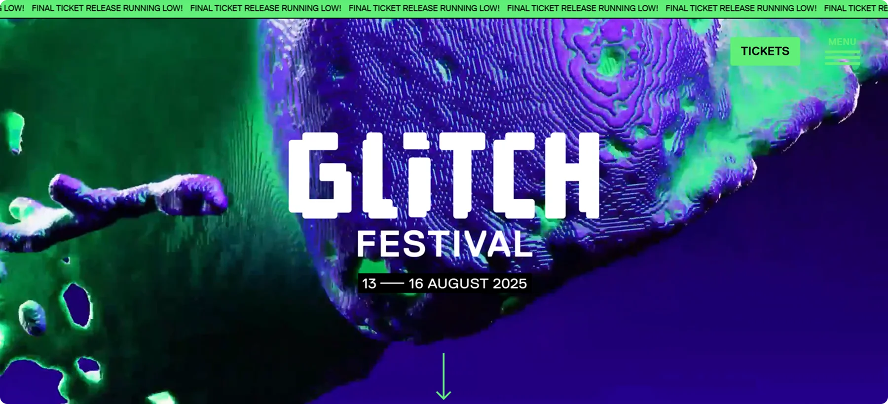
Glitch festival’s landing page is a great example of a catchy and straightforward page, with a compelling design.
It immediately immerses visitors in the event’s atmosphere and provides the key information straight away.
In the hero section, you can spot a futuristic and dynamic video background that captures the main idea of the festival – a mix of digital culture and electronic music.
Navigation is intentionally minimalistic, featuring only the most important links, such as Lineup, Tickets, FAQ and Info section.
With this straightforward approach, the authors are making sure to keep focus on conversion, i.e., buying tickets.
Best Parts:
- Focus on performers
- High contrast
- Intuitive layout
- Triggers like FOMO and urgency.
2. Vinitaly, Italy
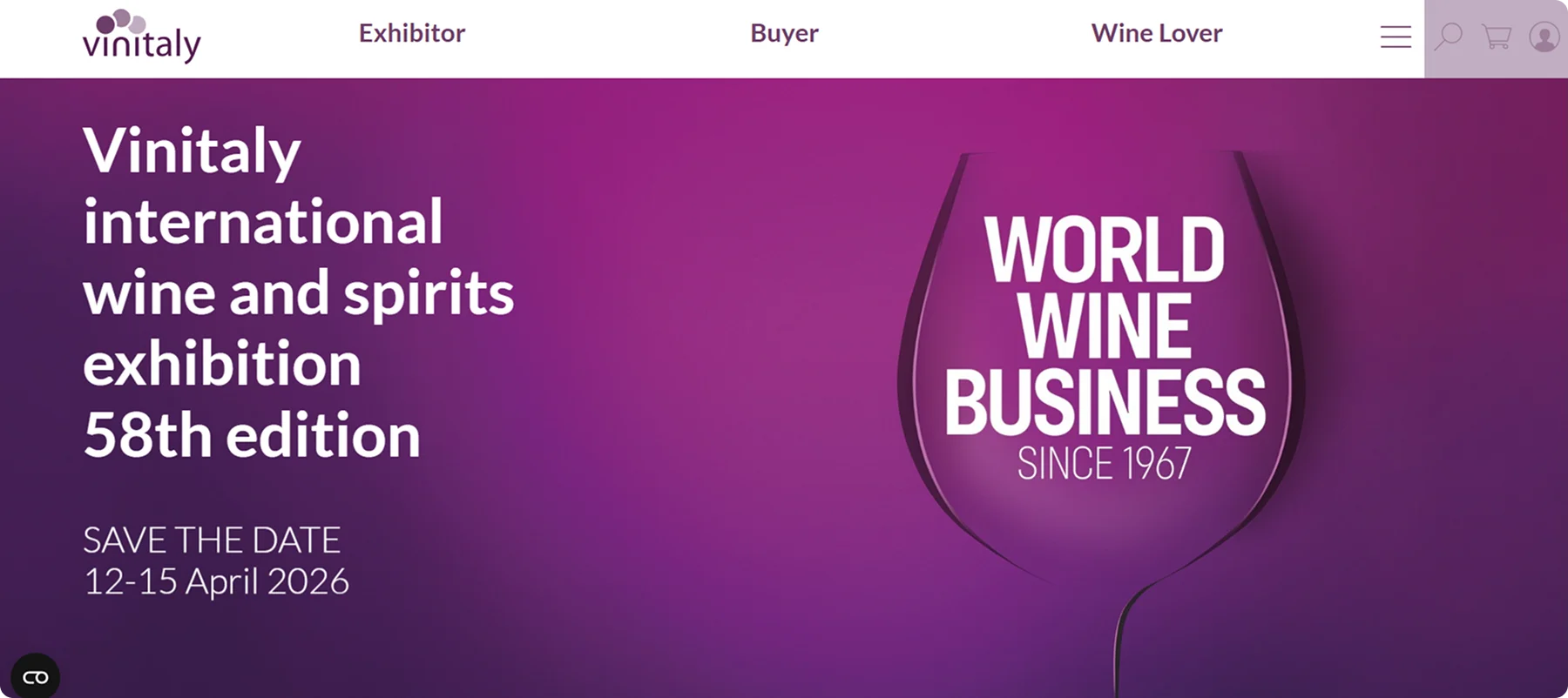
The Vinitaly landing page is clean, well-organized, sophisticated and easy to use.
It quickly guides visitors to key info like event dates, ticket options, and program highlights.
The menu is clear, and the sections are easy to navigate.
High-quality images and a modern color scheme give a modern and expensive look to the whole picture.
The purple color evokes richness and sophistication, which is a great fit for wine-focused events, while white space keeps the layout clean and readable.
Everything works great together to help users find quickly what they need—whether they’re attending the event, exhibiting, or just exploring the website.
Best Parts:
- Clear Navigation
- Strong Visual Hierarchy
- Prominent Information
3. Coachella, California
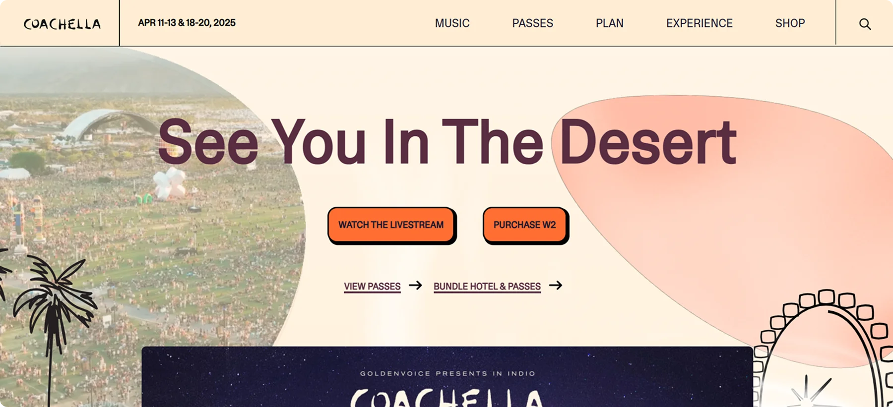
This ultra popular Californian event landing page is vibrant, energetic and effortlessly cool, with a slight hippie vibe!
Navigation is straightforward, with clear sections to passes, schedules, plans and experiences.
Right below the headline, there is a Purchase button and a Watch livestream one — the only two things an attendee needs right away.
The tender, pastel background blends perfectly with the dark brown font, providing just enough contrast for a pleasant experience.
The shop section is right there, just a few clicks away, as well as a search field for easier navigation.
Additionally, Coachella's website highlights new features for 2025, such as expanded VIP areas and upgraded camping options, which helps attendees plan their festival experience easily.
Best Parts:
- Well-Organized Info Sections
- Immersive Visual Design
- Experience Highlights
4. The Esports Travel Summit
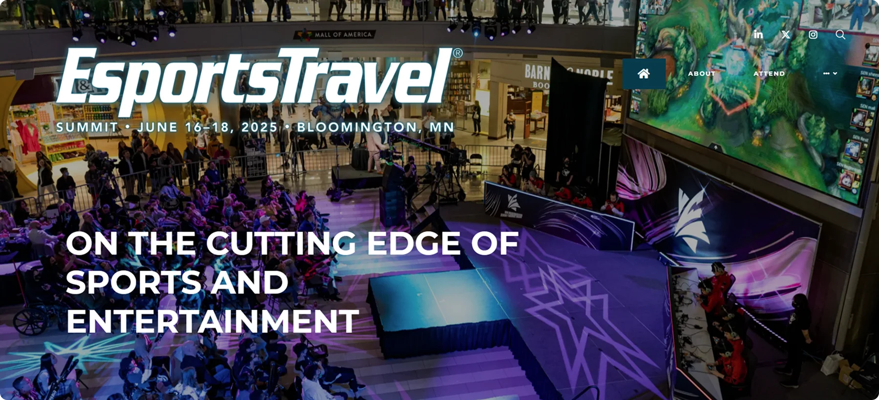
The Esports Travel Summit is one of the world's biggest gatherings of esports tournaments and video-game events.
Their landing page is one of the great examples of how little text can bring great functionality and user experience. The focus is on image and video.
There are no rich interactive elements, but the page delivers the information and it’s easy to get what you are looking for.
The black and white background makes a great contrast with the white font and images rich in color.
Best Parts:
- Business-focused layout
- Actionable Info
- Simple design
5. Tomorrowland, Belgium
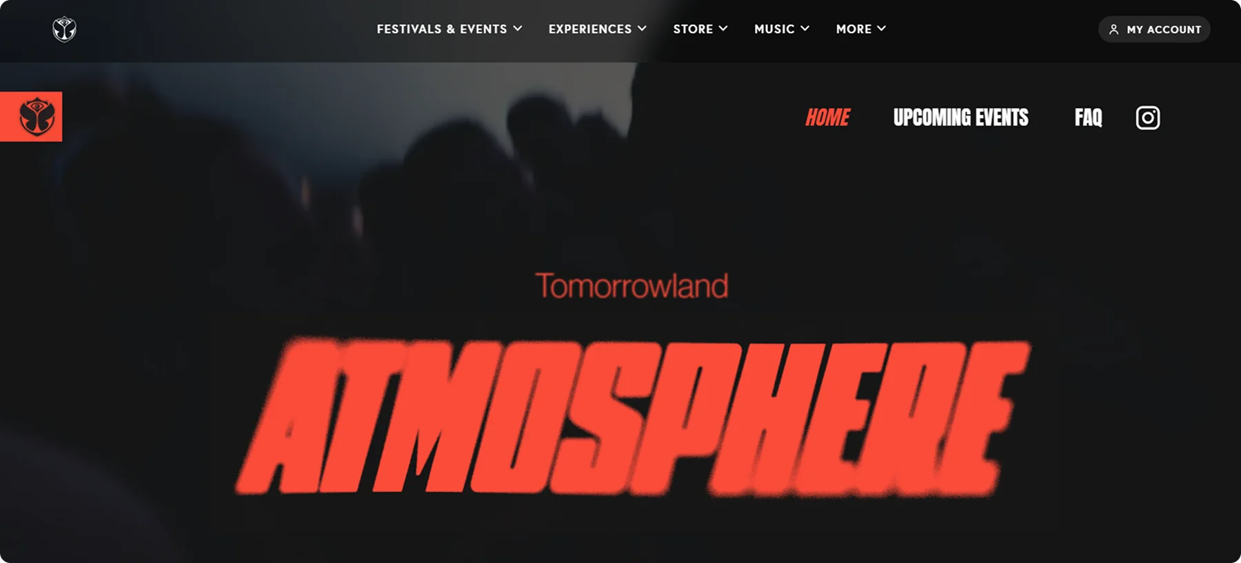
The Tomorrowland landing page feels like stepping into a fantasy world.
With its bold colors, immersive graphics, and fluid animations, it captures the magic and drama this festival is well-known for.
The design uses dramatic typography, immersive background visuals, and smooth scroll effects.
On their page, the ticket purchase process is carefully designed to let you buy without frustration.
Fans can get engaged with Spotify playlists, highlight reels, and immersive history timelines before dividing to buy a ticket.
Overall, the whole page feels more like a digital experience with possibilities for entertainment, than a standard event page.
Despite that, its complexity doesn’t affect the user-centeredness and overall smooth experience.
Best Parts:
- Rich visuals and effects
- Effortless ticket-purchasing experience
- Clear & Accessible Calls to Action
6. Comic-Con, California
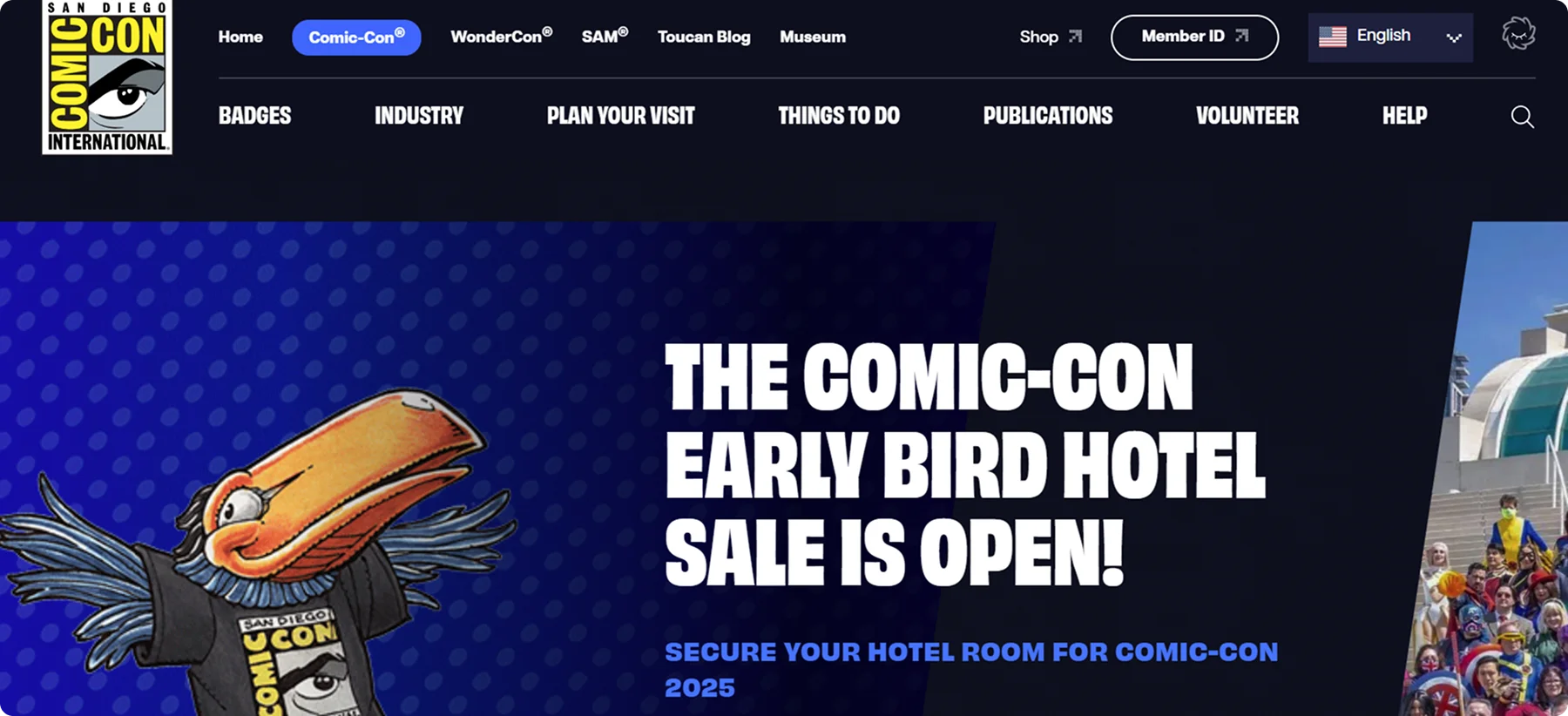
Although Comic-Con’s landing page is packed with information, it is not overwhelming and it’s easy to explore.
Sections for badges, event schedules, exhibitor lists, and panel details are clearly marked and updated regularly.
The layout is straightforward. Simple menus, high contrast sections, and collapsible navigation make it easy to access all those things.
The page offers something to gamers, comic book lovers and cinephiles, all at once.
The design isn’t flashy, but it’s functional and fan-focused, while keeping all the key parts within reach. All that doesn't affect Comic Con’s identity.
Best Parts:
- Functionality
- Rich media content
- Shows its strong identity
7. SXSW, Texas
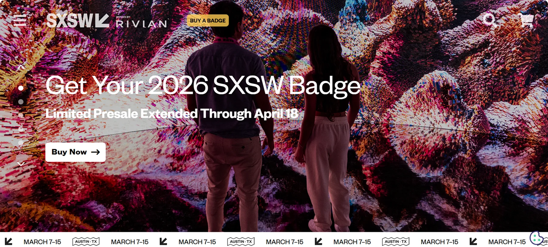
When you check out the SXSW landing page, the first thing you notice is how interactive it is.
The page offers intuitive filters that help users sort through huge amounts of content—whether you're looking for speakers, conference tracks, music showcases, or film screenings, and these filters update in real time.
You can find embedded videos, past talks, or podcast episodes to take a glance at the atmosphere, which is a must for a landing page that promotes such a big event.
The good thing is that SXSW doesn’t just use interactivity for flash, but to engage users and help them discover the content they are looking for easily and intuitively.
Despite the complexity of the event, the UX is smooth, responsive, and clearly built to scale.
Best Parts:
- Smart Navigation
- Rich, Interactive Content
- Personalized Schedule Building
8. Running Remote, Texas
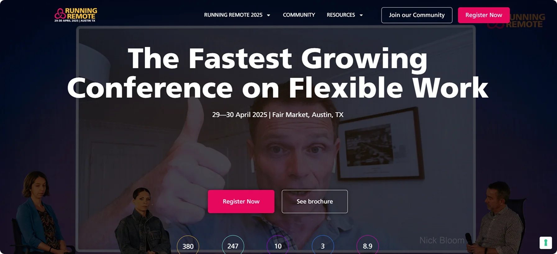
The landing page of the Running Remote Conference in Texas is a great example of what a simple, yet effective page should look like.
The main page gives you all the important information straight away: what, where, when.
The registration button and the joining the newsletter button are placed right below - no time wasting, no roaming around.
There is all you need: a video, numbers, speakers, testimonials, and of course, multiple but clear CTA buttons.
Best Parts:
- Strong visual presence
- Straightforward information delivery
- Simplicity and effectiveness
9. Baltimore Street Food Festival, Baltimore
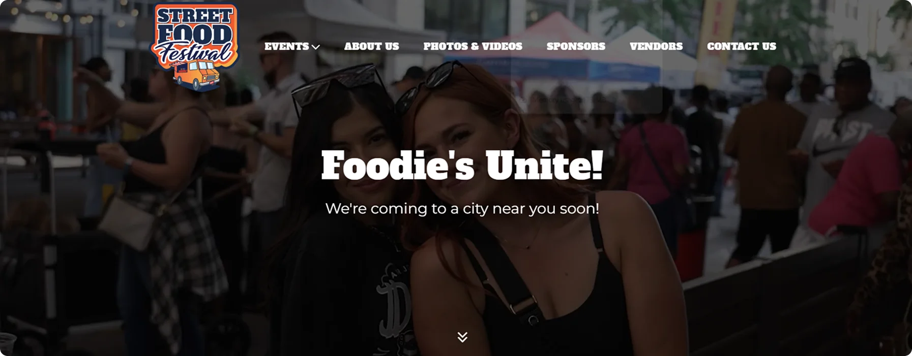
The page of the Baltimore Street Food Festival is simplicity at its finest.
It is simple, yet mouthwatering enough to make you stay longer on the page and even consider quitting the diet! (Well, at least have a cheat day.)
The background is clean and white, with an embedded video that captures the festival’s energetic vibe and shows the real atmosphere.
The festival provides a range of events all across the US, all of which detailed info you can easily find in the menu.
In the tab Photos and videos you can find the gallery of the past events before you decide to buy tickets for the new one.
Best Parts:
- Showcases the street energy
- Photo and video gallery
- Shortcuts to social media
10. Oktoberfest, Germany
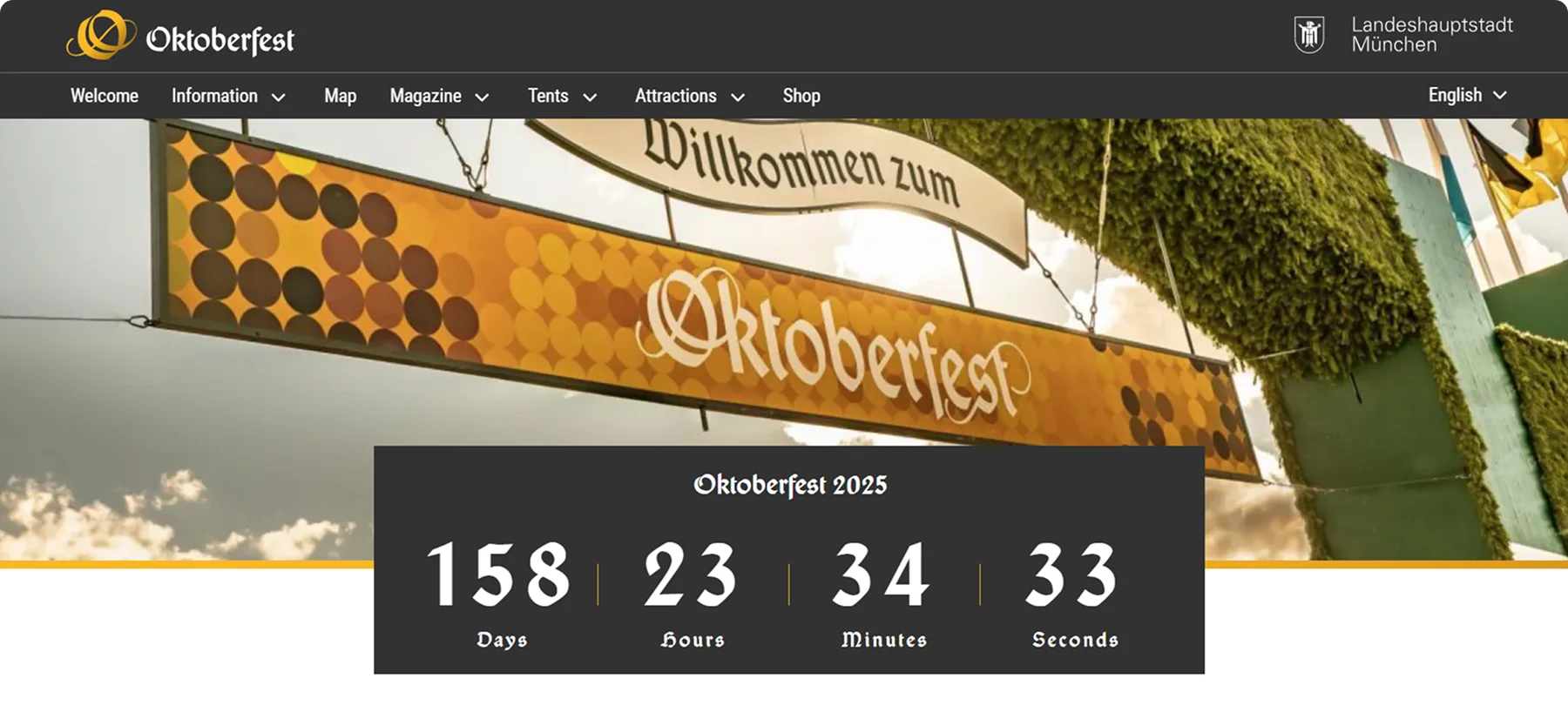
The Oktoberfest landing page captures the fun and excitement of the festival right from the start.
Its vibrant images of beers and traditional Bavarian outfits, instantly gives visitors a taste of the lively atmosphere.
The design is simple yet effective, blending classic Bavarian elements with modern elements.
It’s easy to find all the important info—ticket options, event schedules, and travel tips.
The page clearly outlines different ticket packages, from general admission to VIP, and provides handy details on how to get to Munich, where to stay, and what to expect once you’re there.
There’s also a countdown to the next festival, which is quite exciting, and a news articles section so fans can stay connected and get the latest updates.
Best Parts:
- Blend of tradition and modernity
- Clear and easy navigation
- Packed with useful information
Key Takeaways: How Can Codesi Help You Build a Unique Landing Page?
As we’ve seen in the examples above, the best event landing pages share some common features like user-friendly layouts, detailed information, high-quality graphics, clear CTA, and other things.
You should keep these elements in mind when you’re developing an event landing page for your event to inspire users.
Creating a high-converting page from scratch can be time-consuming and demanding, but here is where Codesi comes into play.
What is Codesi?
Codesi is an AI-powered tool that solves issues of modern businesses while saving your money. It can create your digital presence within minutes and with minimal investment. It requires no coding or advanced design skills, which makes it a great choice for those with little to no such skills.
With Codesi you can:
- Generate unique images and designs in minutes.
- Write a copy from scratch.
- Auto-optimize for speed and mobile devices.
- Include CTA buttons, timers, and registration forms.
- Build a logo for your brand.
Happy to give it a try?
Check it out for free and create a fully functional landing page that can help skyrocket your event.
Create your website with AI today
Codesi is a platform where you can make a website in 3 minutes.
No coding, no designers, no hassle - just AI.
