Back to blog
18 High-Converting Ebook Landing Pages Examples [2026]
Explore the best Ebook landing pages that convert by using clear value, strong visuals, and benefit-driven copy to capture more leads effectively.

Jun 27 2025
![18 High-Converting Ebook Landing Pages Examples [2026]](https://codesi.ai/admin/static/Cover_e8692d51d8.webp)
Marketers continue to rely on the ebook landing pages for leads and authority, with the market projected to reach USD 18 billion in 2025 and grow to USD 22.8 billion by 2030 at a 4.8 - 7.5% CAGR.
Still, some view ebooks as outdated in the age of short-form content and AI tools, and years of low-quality offers have made users increasingly reluctant to exchange their email for another PDF.
It's true that quick content captures attention, but ebooks build trust and long-term engagement when supported by a strong landing page.
This guide showcases 18 top ebook landing pages examples and reveals what makes them convert in 2026.
What Is an Ebook Landing Page?
An ebook landing page is a dedicated web page designed with a single goal: to persuade visitors to download your ebook, often in exchange for their email address or other contact information.
Unlike a typical website page, which often features multiple links, distractions, or competing calls to action, a well-designed ebook landing page is laser-focused.
18 Best Ebook Landing Page Examples for 2026
Let's explore the best ebook landing pages examples – each one highlights key principles with takeaways you can apply to your campaigns:
1. Kellie Lynn Media – "Top Tips to Grow Your Instagram"
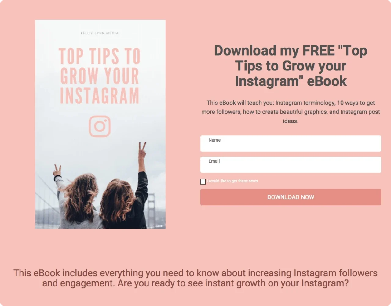
This vibrant landing page features a clear "FREE" headline, a pastel design, a 3D ebook mockup, and a short form that asks only for your name and email. A bullet list outlines what readers will learn, and an author photo accompanied by a brief bio helps establish credibility.
Why it works:
A clean, distraction-free design paired with visual trust elements makes the offer feel personal and valuable.
Takeaway:
Use clear visuals, a focused layout, and author details to boost trust and drive conversions.
2. Hip2Keto – "Keto Diet Cookbook & Recipes"
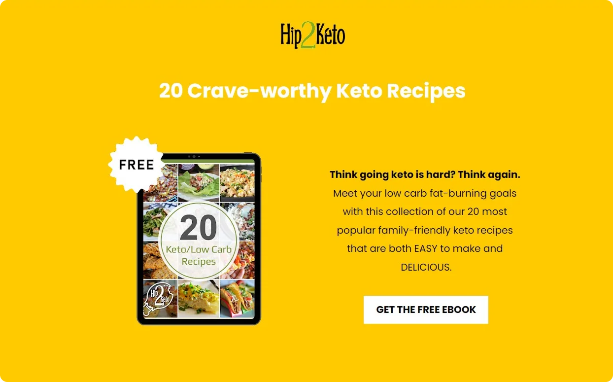
Hip2Keto grabs attention with a bold yellow design, tempting food images, and a promise that keto eating is easier than people think. The CTA button is hard to miss, and the form is placed high for easy access.
Why it works:
The page addresses objections upfront and utilizes visuals to create a sense of desire.
Takeaway:
Address common fears early and use imagery to illustrate the benefits, rather than just stating them.
3. Atomic Reach – "Optimizing Language to Supercharge Your Content: The Definitive Guide"
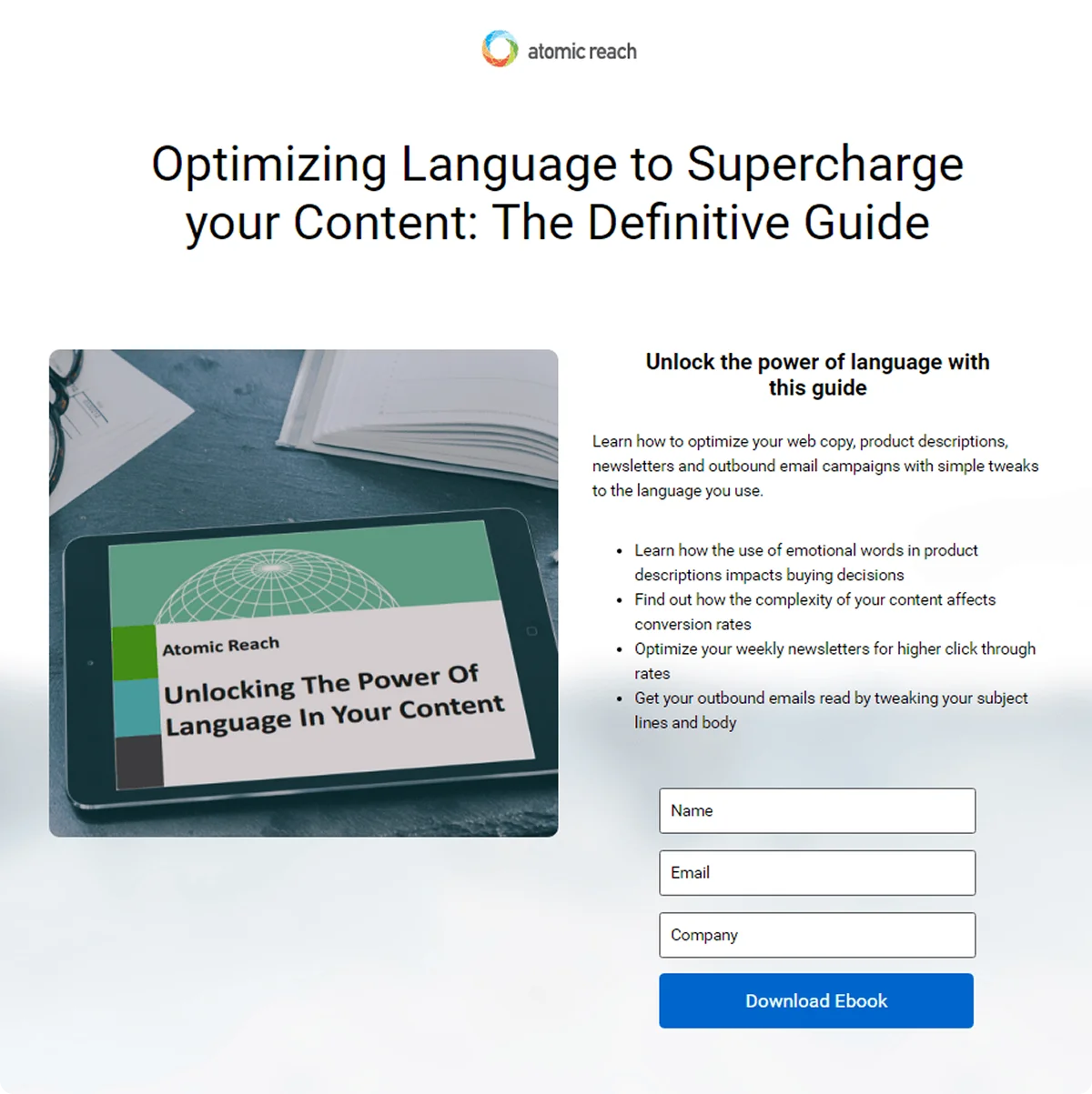
A clear headline spells out the promise, and a short intro frames the value ("unlock the power of language"), followed by four bullets that preview specific gains – better product descriptions, higher conversion rates, stronger newsletters, and more effective email subject lines.
Why it works:
The page balances vivid proof (visual mockup) with a tight, benefit-driven bullet list and a friction-light form, guiding attention straight to the action.
Takeaway:
Pair a focused promise with a quick list of outcomes, keep fields minimal, and let a clear visual anchor the offer.
4. Girls Gone Strong – "Women's Coaching Specialist Certification"
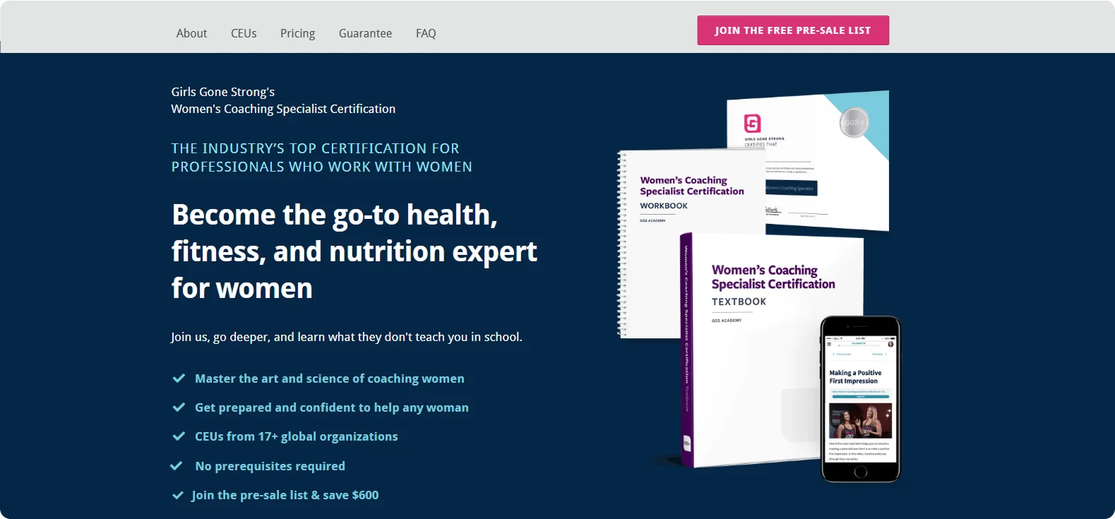
This pre-sale landing page features a bold headline, a benefit-focused subhead, and a clean design, all designed to speak directly to women interested in strength coaching. Key phrases are bolded for emphasis, and the CTA highlights early access and discounts.
Why it works:
The page speaks directly to its audience's values – strength, empowerment, and credibility, while the pre-sale angle adds urgency without pressure.
Takeaway:
Speak to your audience's identity, use bold copy to guide the eye, and offer exclusive perks to boost signups.
5. Kerwin Rae – "High-Impact Business Growth Strategies"
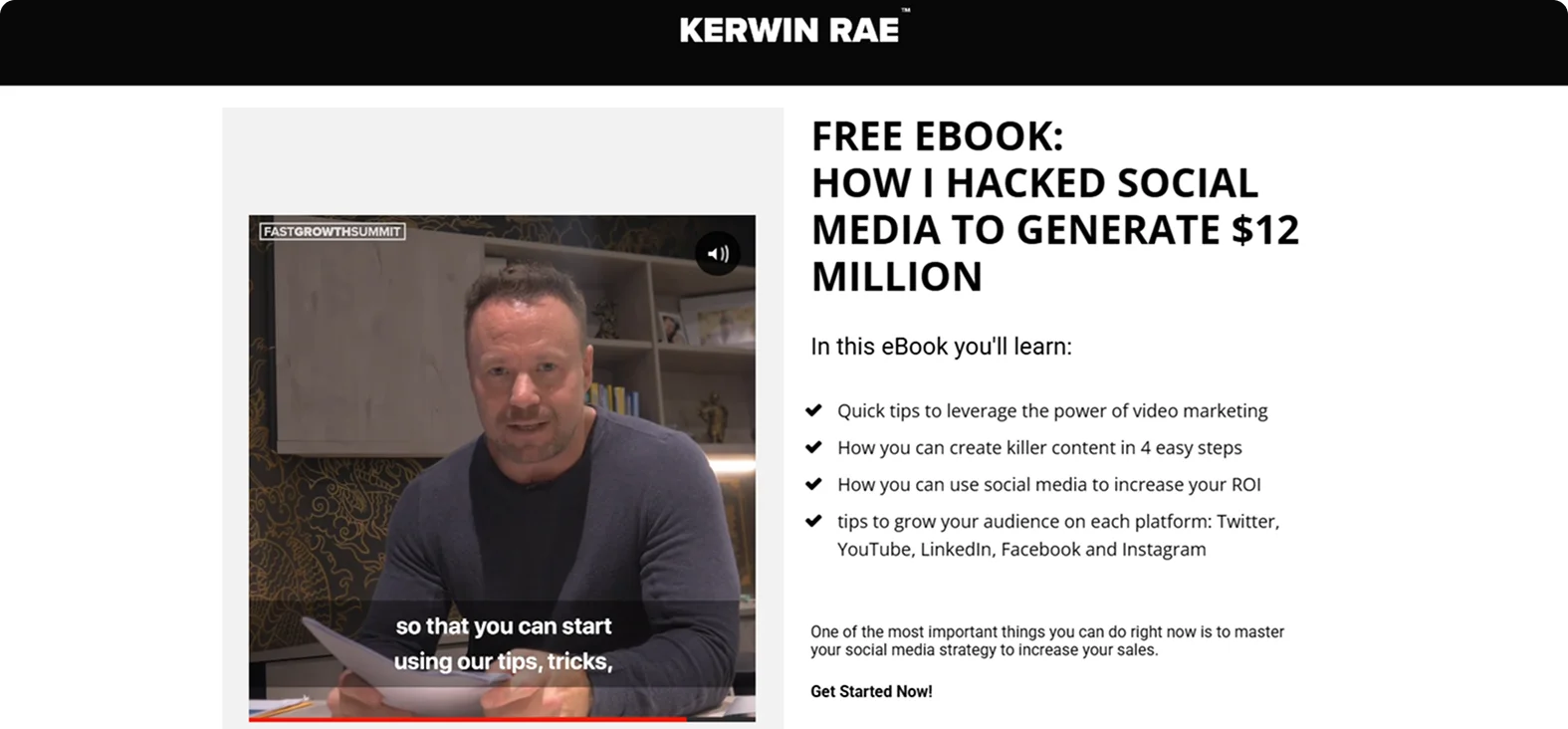
Kerwin opens with a short video pitch that puts his personality and passion front and center. The form is straightforward, just email, and the CTA is energetic and personal.
Why it works:
Video creates an instant connection, and a one-field form removes barriers.
Takeaway:
Use video if you're the face of your brand, and keep forms as short as possible.
6. A Little R & R – "My Quiet Time Journal"
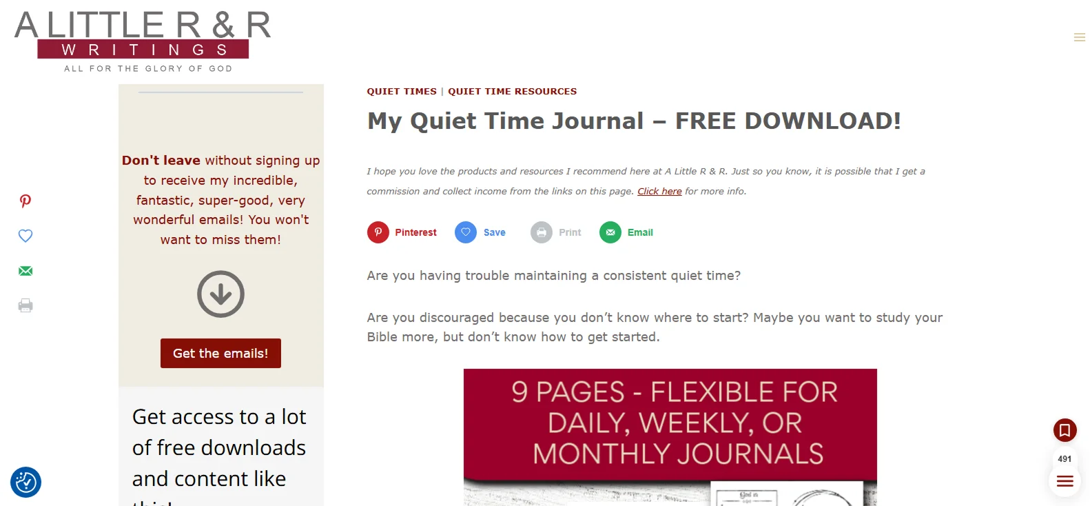
A heartfelt testimonial serves as the headline, while the ebook preview adds warmth. A personal video from the author, further down the page, along with multiple user quotes, builds emotional connection and trust.
Why it works:
Strong social proof and visuals create trust and emotional pull.
Takeaway:
If your content is personal or emotional, lead with testimonials and videos.
7. Renaissance Periodization – "RP eCookbook"
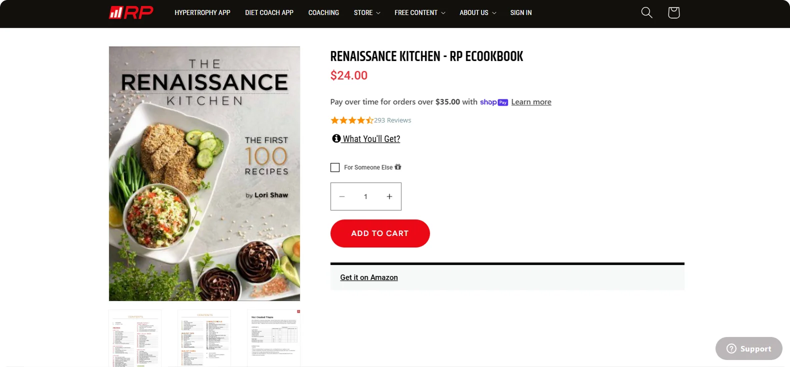
This landing page promotes a "live-in-one digital cookbook" featuring over 100 macro-friendly recipes. It uses clear headings and a clean product image, explaining precisely what you'll get. The CTA ("Add to Cart") is placed prominently near the top.
Why it works:
The page communicates what buyers can expect and ties everything back to RP's science-based approach.
Takeaway:
Emphasize volume and clarity – highlight the immense value packed into the offer and make the next step effortless.
8. The Young Writer – "Writing Tips for Young Authors"
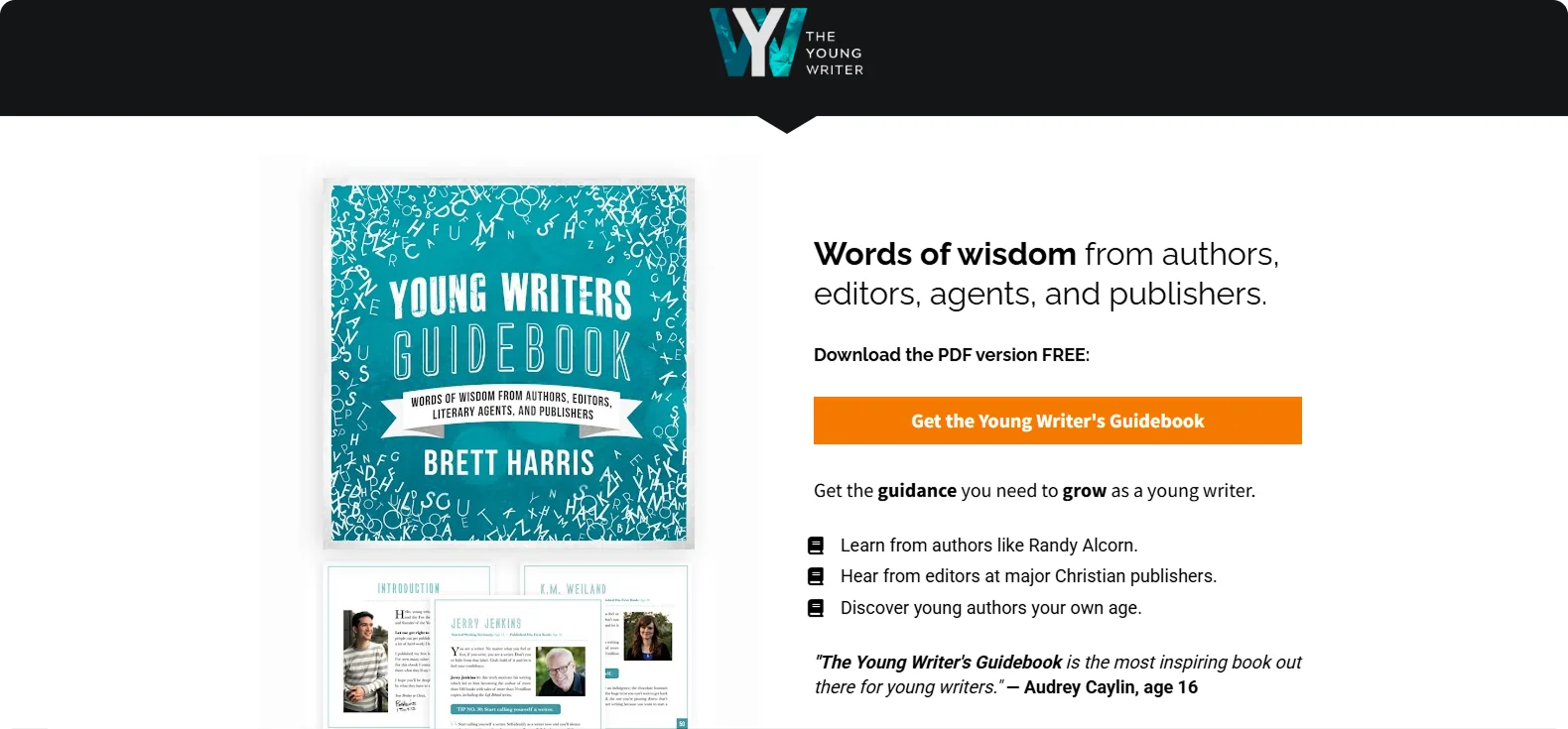
Designed for teens, this playful landing page uses colorful graphics, a motivational headline, and a sneak peek inside the ebook. Peer testimonials reinforce the relevance of the content.
Why it works:
The design, tone, and visuals feel right at home for a younger audience – friendly, relatable, and easy to connect with.
Takeaway:
Speak directly to your niche with language, visuals, and social proof that they relate to.
9. Shake Up Learning – "Google Classroom Cheat Sheet"
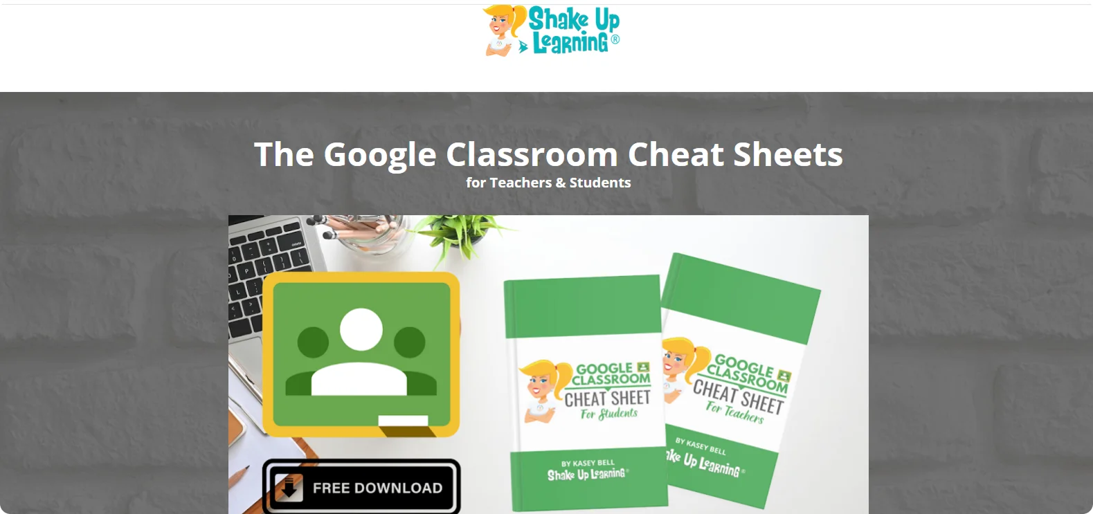
A no-nonsense page with a preview of the one-page PDF and a headline that tells you exactly what you're getting. The subhead promises time-saving value, and the CTA is direct and personal.
Why it works:
It's fast, scannable, and visually confirms the content's usefulness.
Takeaway:
Be clear, visual, and concise – especially when targeting busy professionals.
10. Yesler – "B2B Change Agent Handbook"
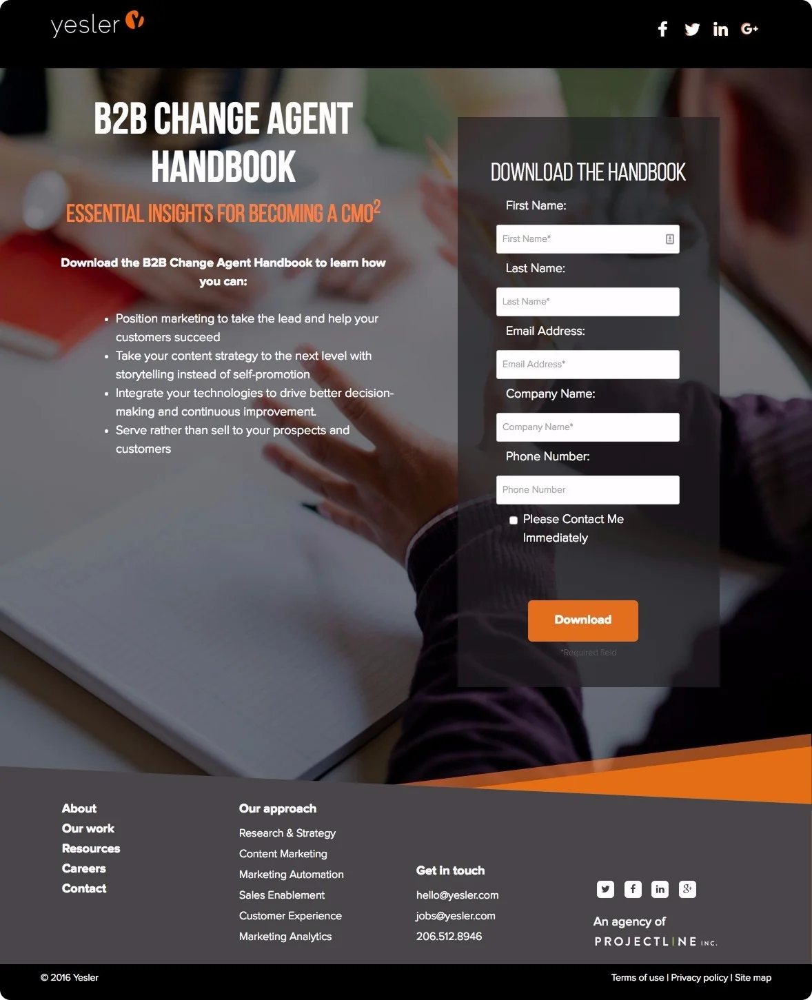
This landing page targets marketing professionals with a clear, benefit-led headline and subhead that frame the ebook as essential for becoming a next-gen CMO. The left side outlines value in bullet points – positioning, storytelling, tech integration, while the right side features a prominent form with five fields and a bold orange "Download" button.
Why it works:
It leads with tangible outcomes, keeps the message focused, and balances form density with visual clarity to appeal to decision-makers.
Takeaway:
Use outcome-driven copy, organize benefits in a scan-friendly list, and present your form clearly without overwhelming the user.
11. SugarCRM – "Five Steps to Manage the Customer Journey"
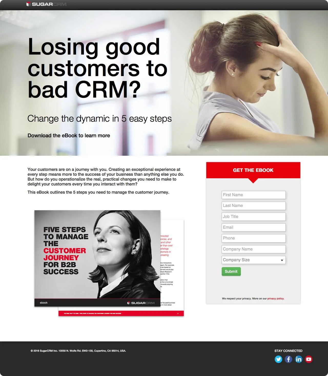
This landing page hooks visitors with a pain-focused headline: "Losing good customers to bad CRM?" – followed by a subheadline promising a fix in five steps. The left side uses a clear value proposition and emotional imagery, while the right side features a clean, structured form with six fields and a strong red "Get the Ebook" banner to draw the eye.
Why it works:
It grabs attention by addressing a real pain point, clearly outlines the solution, and uses visual contrast to drive form engagement.
Takeaway:
Lead with a relatable problem, use strong contrast for your CTA, and preview the ebook to build trust and interest.
12. Procore – "5 Drawing Management Mistakes"
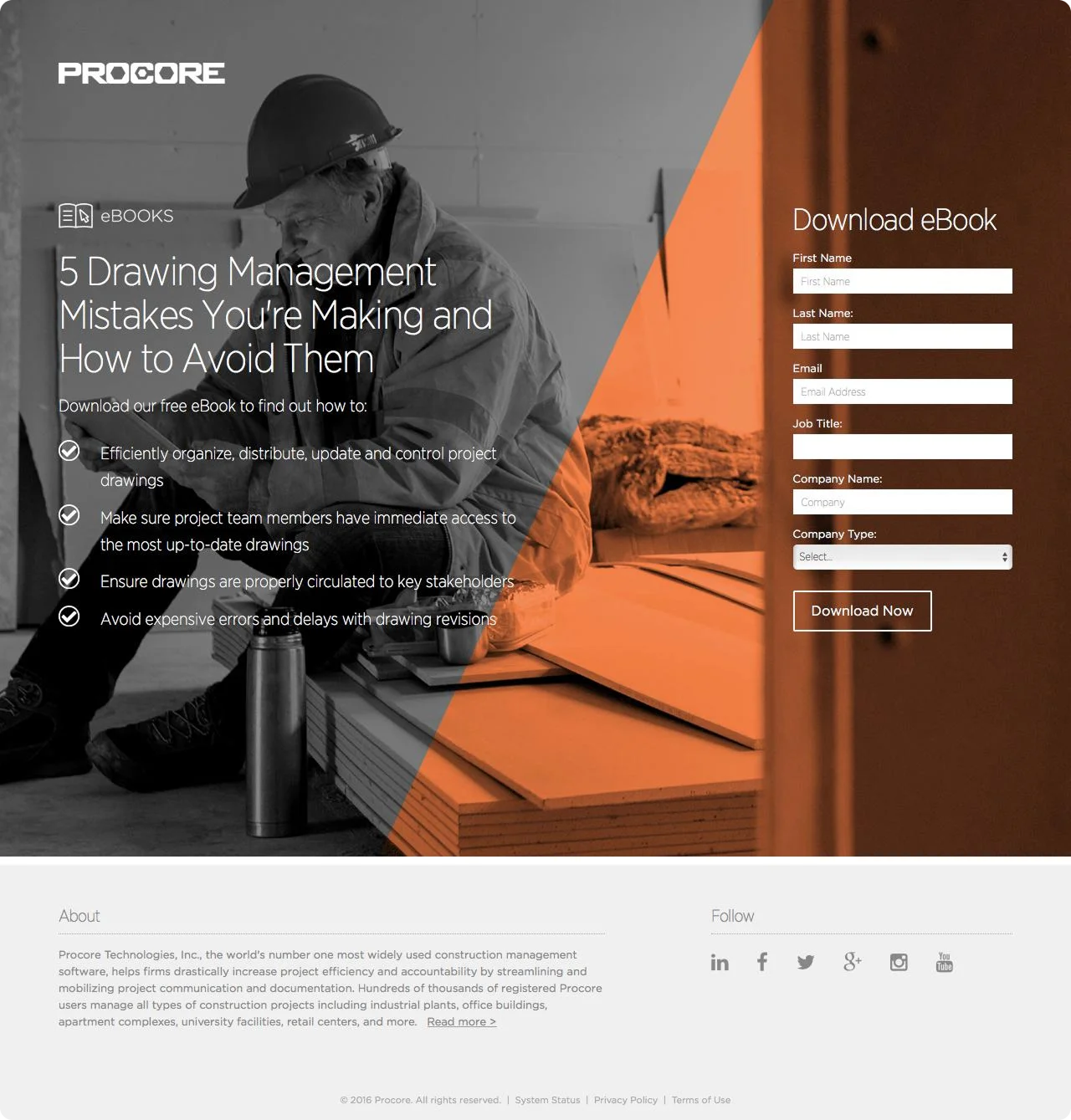
This landing page immediately communicates value with a headline that identifies a common pain point, followed by a short checklist of practical outcomes readers can expect from the ebook. The split-screen design draws attention to the opt-in form on the right, requesting the job title and company type.
Why it works:
It's direct, visually structured, and clearly outlines what the reader will gain, without overwhelming them with text.
Takeaway:
Use a problem-focused headline, a short outcome-driven checklist, and a visually distinct form to drive targeted conversions.
13. Industrial Strength Marketing – "Score More: How to Create a Winning Marketing Game Plan"
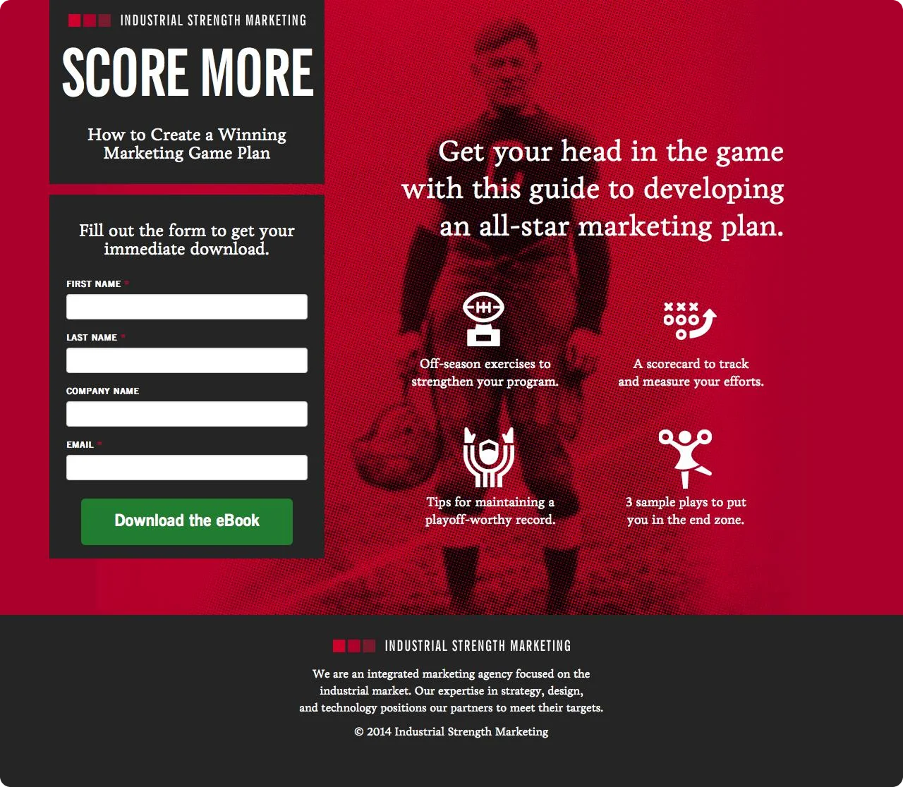
This sports-themed landing page grabs attention with a motivational headline and reinforces the message using football-inspired language and icons. The left panel features a short form with just four fields, a clear prompt ("Fill out the form to get your immediate download"), and a standout green CTA button.
Why it works:
The theme is consistent, memorable, and action-oriented. The value is immediately clear, and the design keeps the form and content easy to digest.
Takeaway:
Use a strong visual concept to unify your message, break benefits into bite-sized points, and keep your form brief to encourage signups.
14. Relayware – "The Ultimate Guide to Channel Management Strategy"
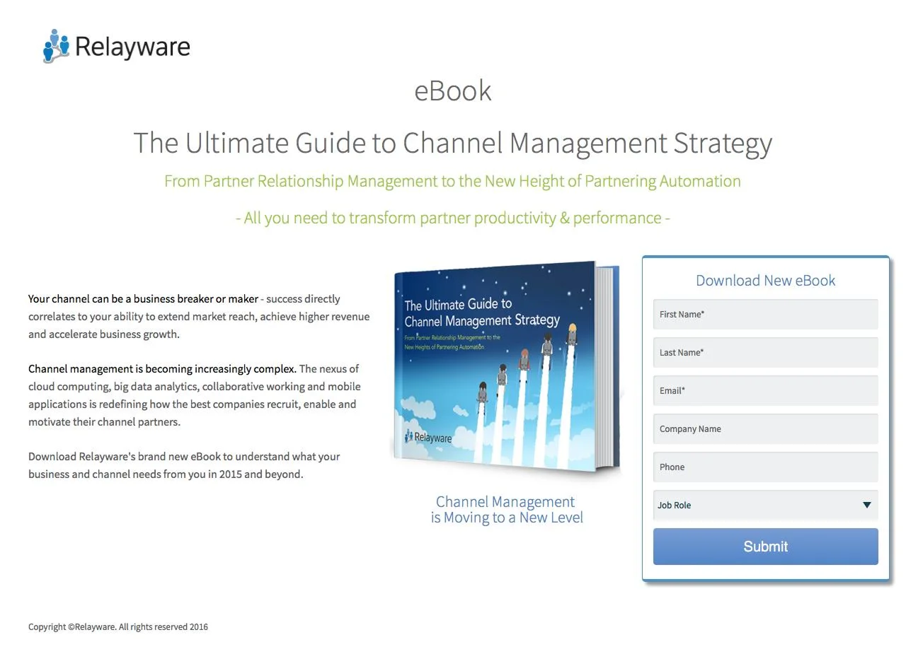
This landing page presents its offer with a clean, professional design that emphasizes clarity and credibility. The headline outlines the ebook's scope, and the product image adds visual interest. Concise, benefit-driven paragraphs explain why channel strategy matters.
Why it works:
It combines authority-building language with a polished layout that supports comprehension and trust without overwhelming the reader.
Takeaway:
Use straightforward messaging, clean visuals, and a professional tone to position your ebook as a credible, high-value resource.
15. Zendesk – "Bright Ideas" Customer Story Ebook
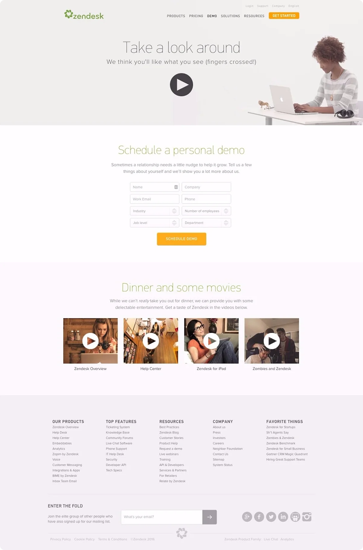
Zendesk's landing page focuses on inspiration over features, utilizing clean typography, ample white space, and a clever visual metaphor to draw readers in. The message centers around empowering people, not tools, and invites users to explore how real businesses innovate through better support.
Why it works:
It uses storytelling and visual calm to position the ebook as thoughtful and human-centered rather than sales-focused.
Takeaway:
Lead with emotion, keep the design minimal, and match your tone to the deeper story you're telling.
16. KlientBoost – "7 Monstrous Ways to Improve Your AdWords Performance"
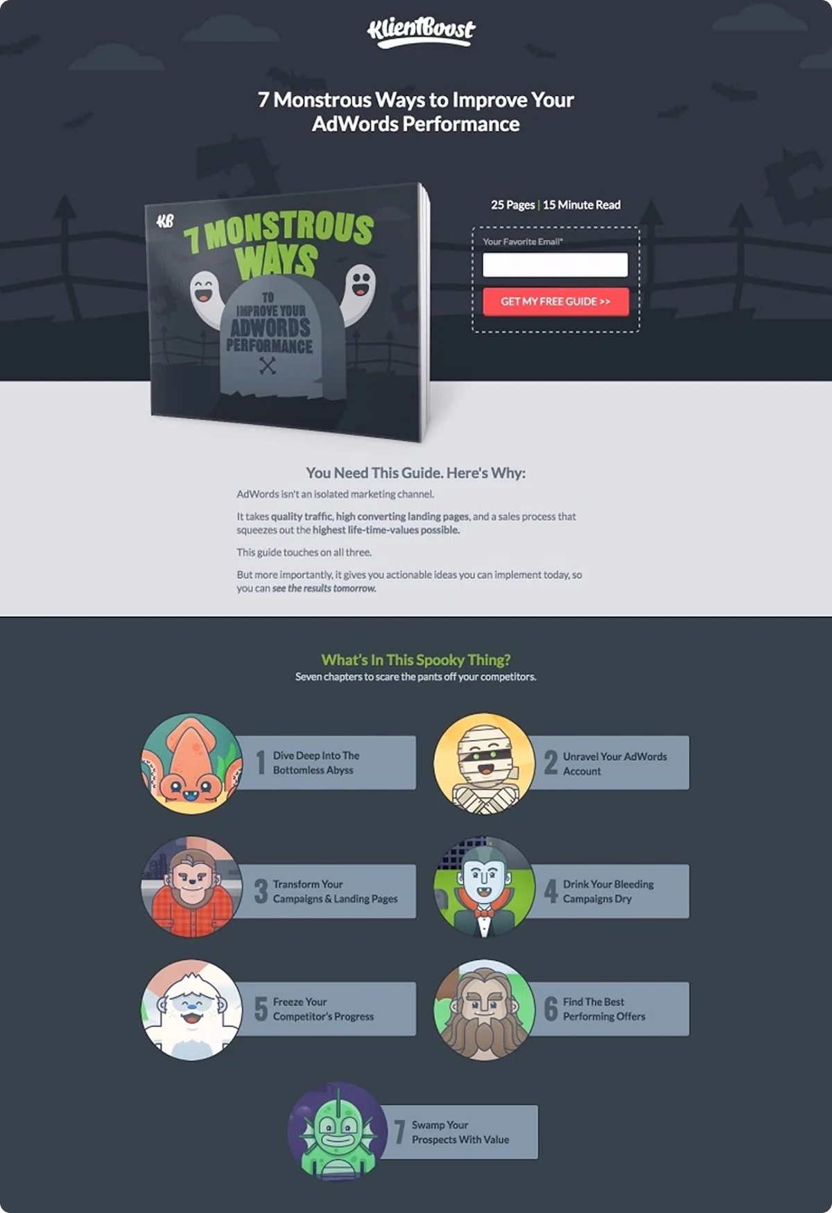
This Halloween-themed landing page grabs attention with playful visuals, bold colors, and a cheeky tone. The headline teases curiosity, while the short form and red CTA button make it easy to convert. Each chapter preview uses cartoon monsters to add humor and clarity, and a testimonial from a known marketer builds further trust.
Why it works:
It's highly memorable and breaks the B2B mold. The strong concept, tight copy, and cohesive visuals work together to entertain and convert.
Takeaway:
Don't be afraid to lean into a creative theme – humor, seasonality, and visual storytelling can make your ebook landing page stand out.
17. Upwork – "The Fast Lane to Great Design"
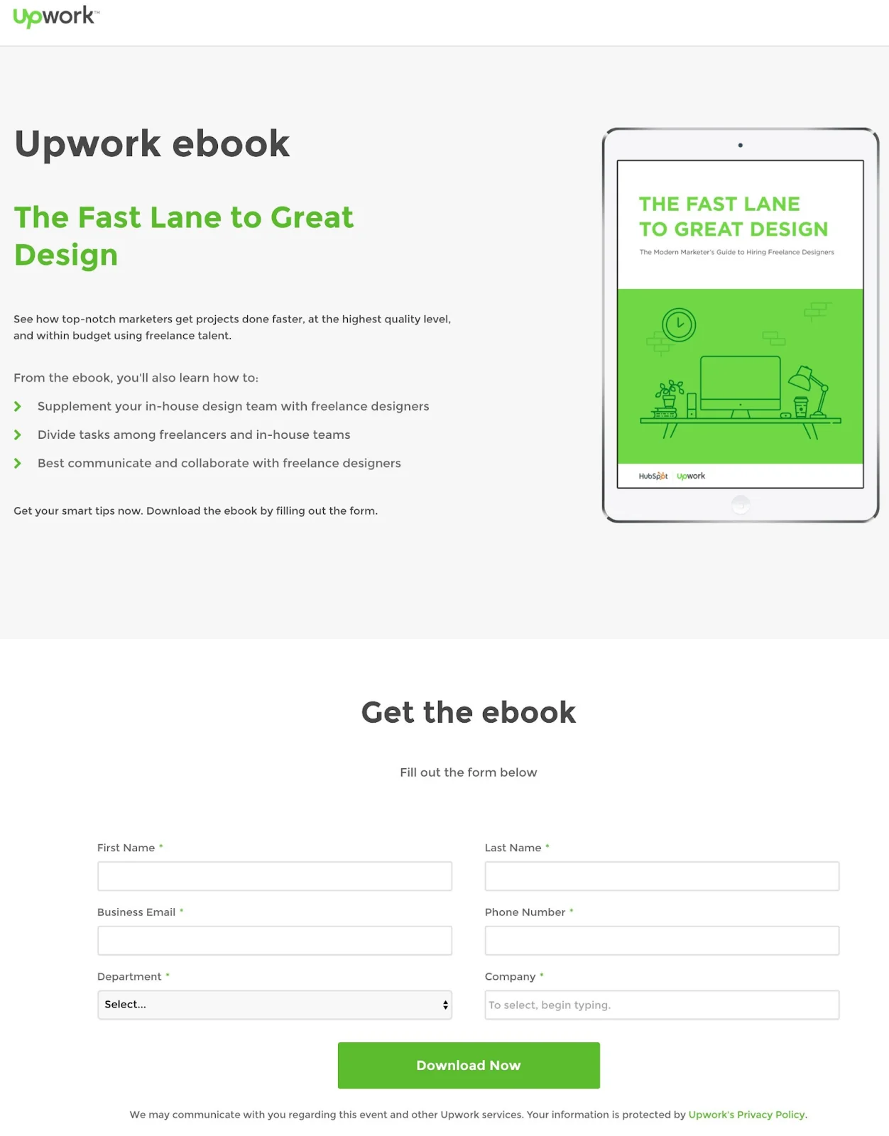
Upwork's ebook landing page focuses on clarity and speed, just like the ebook's topic. The headline sets clear expectations, while a short intro paragraph frames the value. Bullet points below the fold tell you precisely what you'll learn, and the form is simple yet complete.
Why it works:
The page is easy to scan, clear in its offer, and visually consistent with Upwork's brand.
Takeaway:
Use bullet points to communicate value fast, pair them with a strong headline, and don't overcomplicate your form or visuals.
18. JustPositionIt – "Top 10 Sales-Boosting Tips for Your Website"
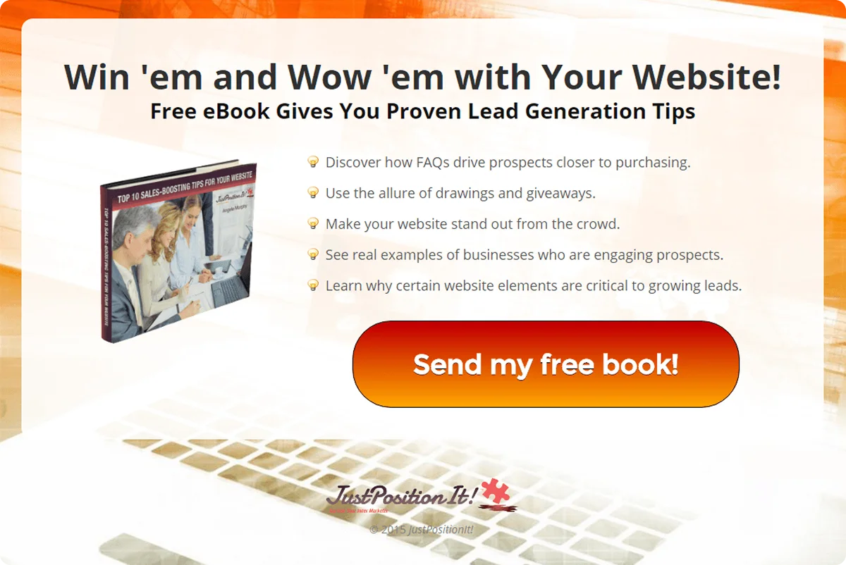
This ebook landing page features conversational copy with a touch of enthusiasm. The headline grabs attention with energy, while a giant CTA button makes it easy to act. A bulleted list highlights the benefits – each point is clear, outcome-driven, and easy to skim.
Why it works:
The copy is confident and casual, while the layout keeps the focus on what you'll gain. The offer feels personal and immediate.
Takeaway:
Don't be afraid to show personality. Use benefit-driven bullets, big, friendly CTAs, and unmistakable promises to drive conversions on your ebook landing pages.
What Makes a Great Ebook Landing Page?
Now that we've seen some of the best ebook landing pages examples, what exactly makes them so effective?
- Clear Value Proposition: Instantly show what the ebook offers and why it matters. Be specific and benefit-oriented.
- Single, Focused Goal: Eliminate distractions. No nav menus or extra links – drive everything toward one action: download.
- Strong, Visible CTA: Use a contrasting button color action-driven text and place it high on the page.
- Benefit-Driven Copy: Focus on outcomes, not features. Use bullets to highlight 3–5 takeaways the reader will gain.
- Clean Visuals: Include a mockup of the ebook or graphic preview. Use whitespace and legible fonts to keep it readable.
- Trust Signals: Add testimonials, download counts, user logos, or quick author bio/photo to build credibility.
- Fast and Mobile-Friendly: Optimize for speed and mobile. Use a single-column layout with tappable buttons and clear, stacked content.
- Minimal Forms: Ask for as little info as possible – often just name and email. Include a privacy reassurance message.
- Smart Intro Framework: Use a quick narrative: Problem (thesis), challenge (antithesis), solution (synthesis via your ebook).
- Promise Fast Value: Emphasize how quick or easy the ebook is to use ("10-minute read," "quickstart tips," etc).
Why Codesi Is Perfect for High-Converting Ebook Landing Pages
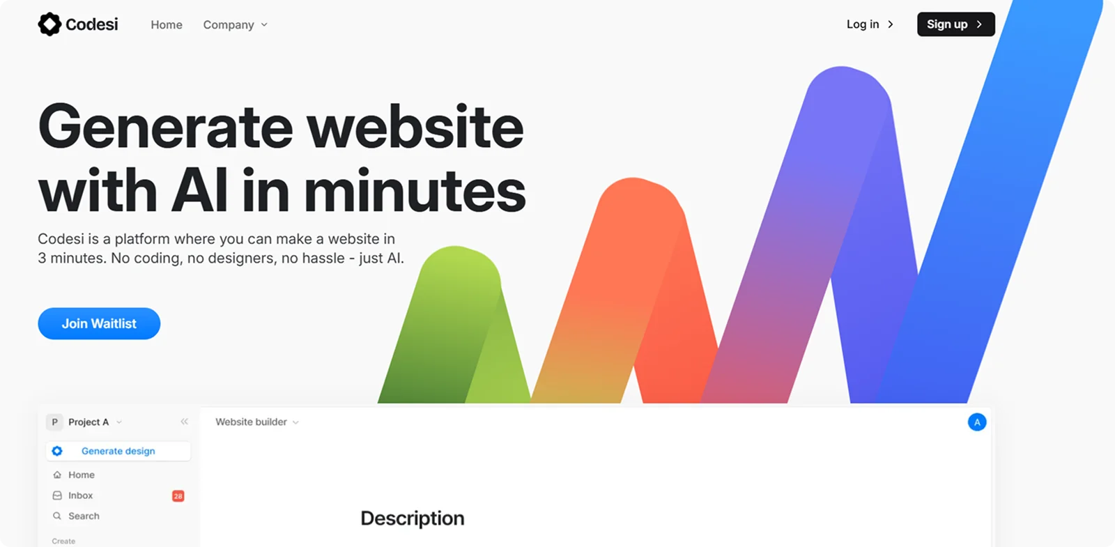
The best ebook landing pages don't just look good – they convert fast, communicate value clearly, and remove every barrier to signup.
That's precisely what Codesi helps you build.
Here's why Codesi stands out:
- AI-built in minutes: Just tell it what your ebook is about and Codesi generates a full landing page optimized for downloads and conversions.
- Clean, conversion-focused layouts: No distractions, just sections that support your message – headlines, mockups, forms, benefits, and CTAs.
- Fully customizable, no code required: Adjust colors, fonts, copy, or layout with drag-and-drop ease.
- Mobile-first and lightning-fast: Your page loads instantly and looks sharp on every device – crucial for capturing leads on the go.
- Analytics-ready: Connect tracking tools in a click to see how your ebook is performing.
Here's how to easily generate ebook landing pages with Codesi - step by step:
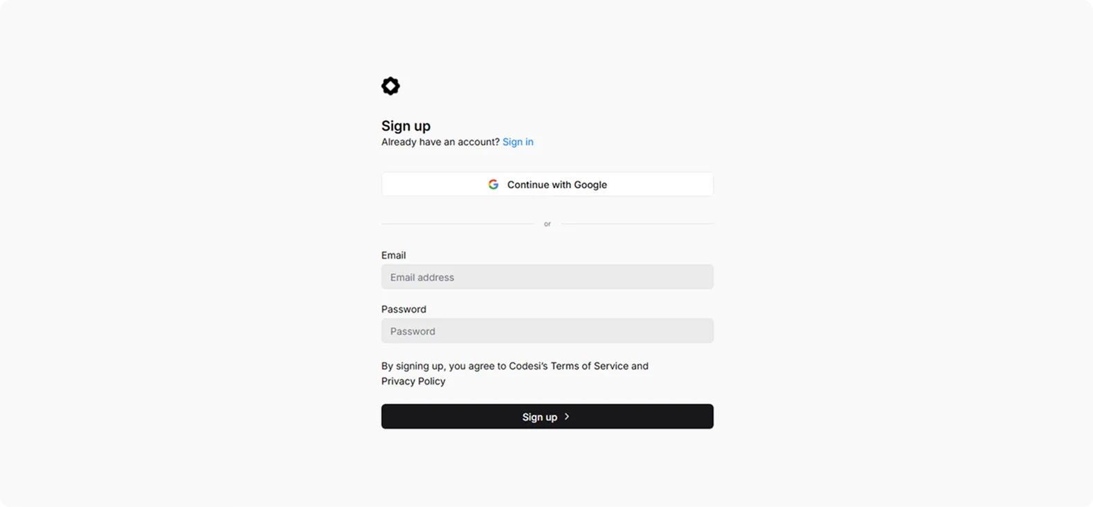
Step 1: Sign up on Codesi (it's free).
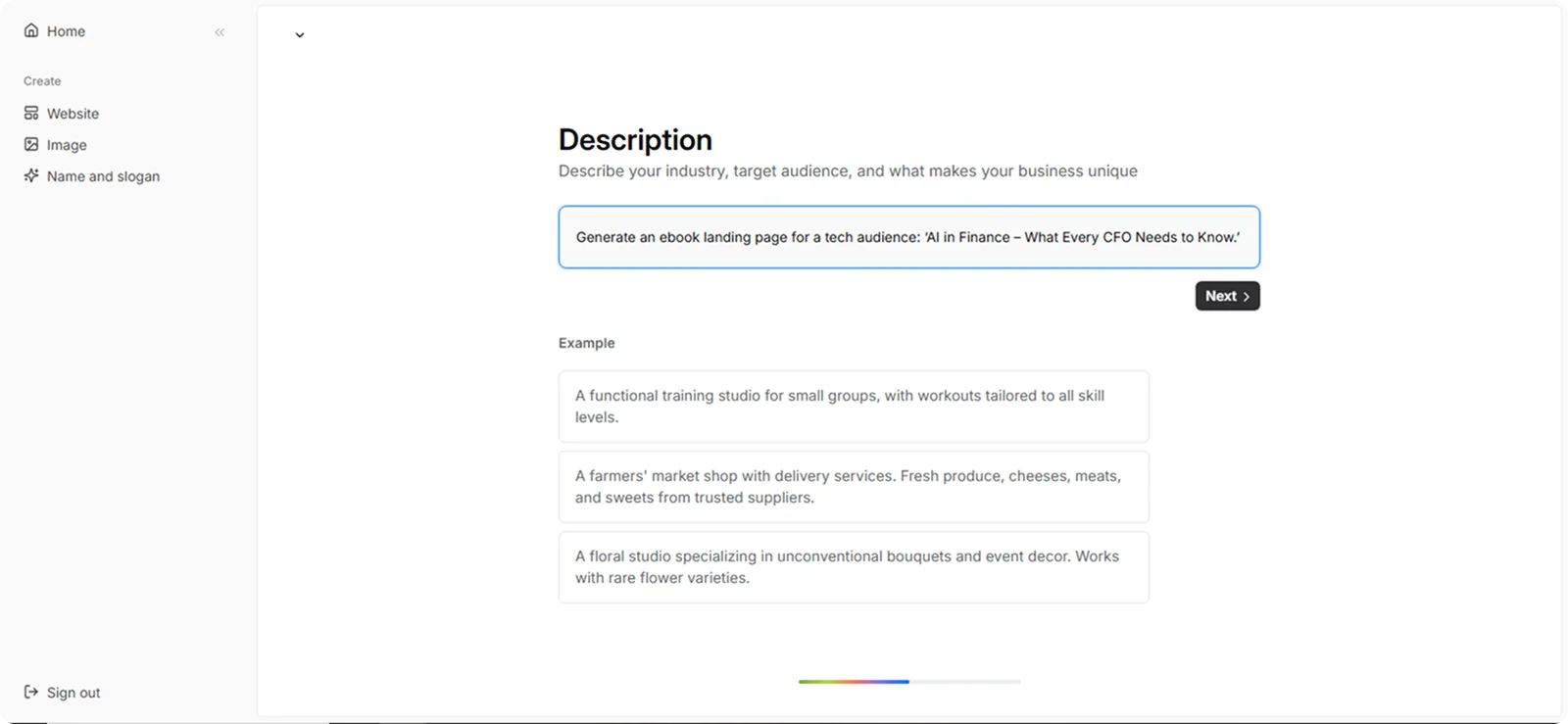
Step 2: In the Website Builder, enter your prompt. For ebook landing page creation, we used the following example:
“Generate an ebook landing page for a tech audience: ‘AI in Finance – What Every CFO Needs to Know.’ Include stats, a benefit-focused layout, and trust-building elements like download counts and testimonials.”
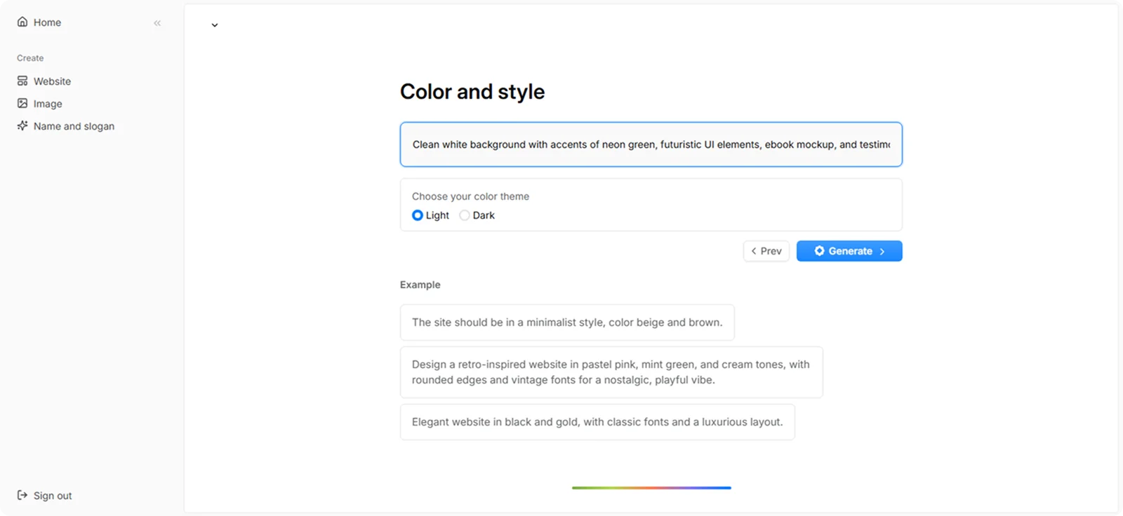
Step 3: Choose your color theme and style. For this example, we used:
“Clean white background with accents of neon green, futuristic UI elements, ebook mockup, and testimonial cards in minimalist style.”
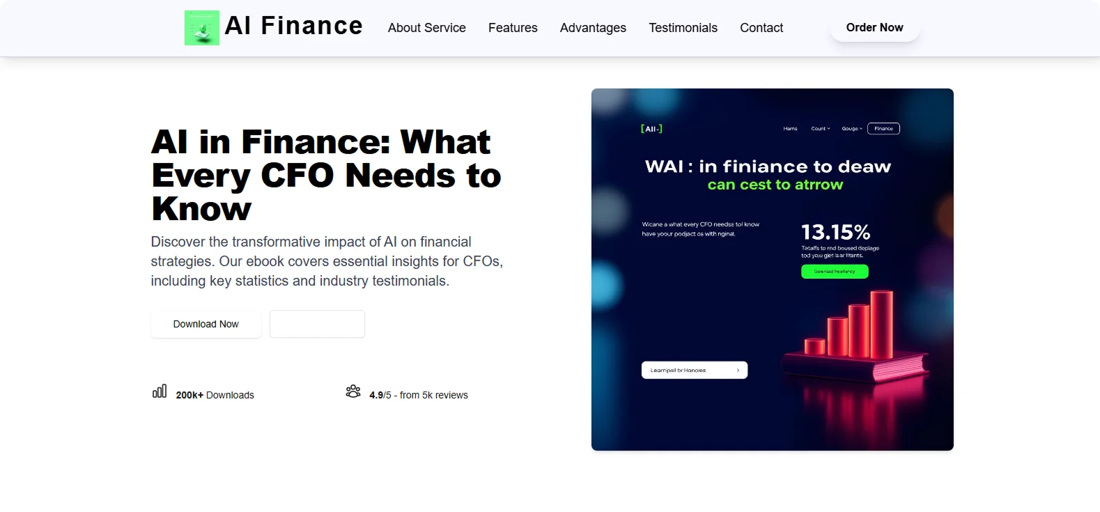
Step 4: Click "Generate" and wait a few minutes while Codesi generates your ebook landing page.
Codesi will instantly generate a refined ebook landing page you can easily customize and optimize to fit your goals.
Ready to build your next ebook landing page?
Try Codesi now and turn your next ebook into a lead magnet that works.
Create your website with AI today
Codesi is a platform where you can make a website in 3 minutes.
No coding, no designers, no hassle - just AI.
