Back to blog
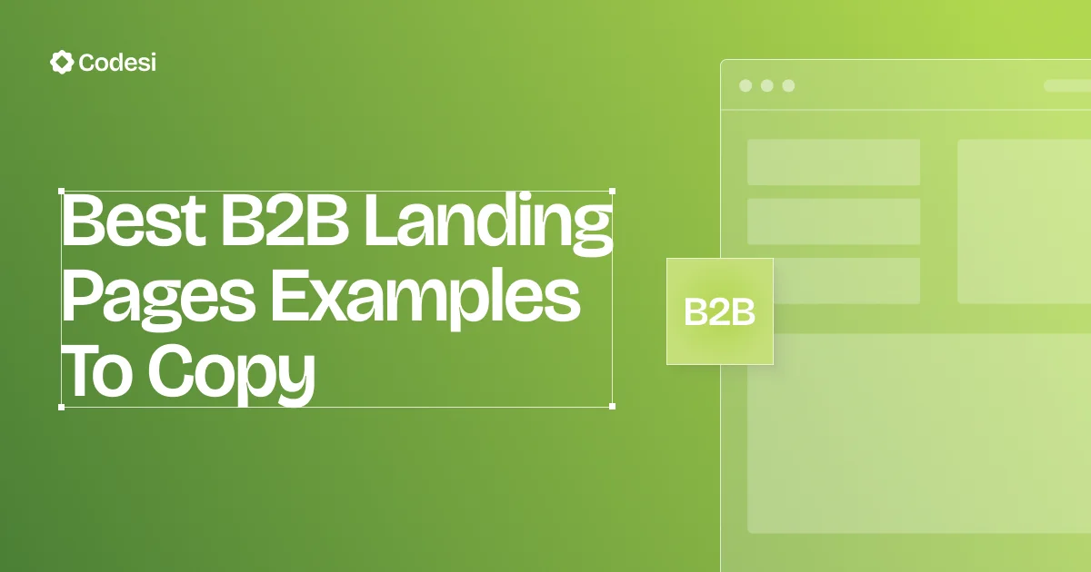
12 Best B2B Landing Pages Examples To Copy in 2026
Explore the best B2B landing pages that build trust, drive leads, and show you how to craft high-converting pages your audience will trust.
May 31 2025
Many marketers believe a good landing page should work for any audience. In the B2C world, that might be true - bold visuals, emotional hooks, and a sense of urgency can drive quick decisions.
But business buyers don't click "buy now" on impulse. They evaluate long-term value, compare solutions, and often make decisions as a group. What they need is clarity, proof, and trust, not flashy design or pushy copy.
The best B2B landing pages aim to inform, not pressure. They highlight specific benefits, back up claims with real data or case studies, and give decision-makers the tools to dig deeper.
This article will analyze 15 of the best B2B landing page examples and explain what makes them work.
What Makes a B2B Landing Page Truly Effective?
The average conversion rate for B2B landing pages is 13.28%.
Therefore, crafting an effective B2B landing page means answering the specific needs of business buyers.
In practice, this involves:
Clear, Benefit-Driven Messaging
The headline and subheader must immediately state the outcome for the customer, not just the product name.
A generic headline like "Next-Gen Business Tools" doesn't grab attention. High-performing B2B pages lead with clear outcomes, such as "Reduce Onboarding Time by 50% with Automated Workflows."
Trust and Social Proof
B2B purchases are often big commitments. Effective pages build credibility immediately.
The key is to answer the buyer's question: "Who else trusts you, and what results did they see?" This means prominent client logos, case studies with recognizable brands, industry awards, or stats.
Relevant Detail and Transparency
Unlike B2C shoppers who want quick gratification, B2B prospects research deeply. Pages should provide enough specifics to inform decision-makers.
In practice, this might mean linking to detailed feature pages, offering downloadable whitepapers, or including FAQ sections.
Strong, Relevant CTAs
The call-to-action on a B2B page reflects the longer buying journey.

Personalized call-to-action features perform 202% better than generic ones.
That's why it's more common to see CTAs instead of "Buy Now," like "Request a Demo," "Start a Free Trial," or "Schedule a Consultation."
Avoid using "Submit" as your CTA, especially since it can reduce conversion rates by 3%.
Clean, Professional Design
A clutter-free, intuitive layout is crucial. Top B2B pages use whitespace, bullet points, and clear sections so busy executives can quickly scan the content.
Consistent branding and corporate imagery build trust. Hero images or videos often show the product or a use case, not just stock photos.
15 Best B2B Landing Page Examples
In this section, we highlight 15 standout B2B landing pages.
For each, we describe the page's purpose, its standout features, and key takeaways you can apply.
1. HubSpot
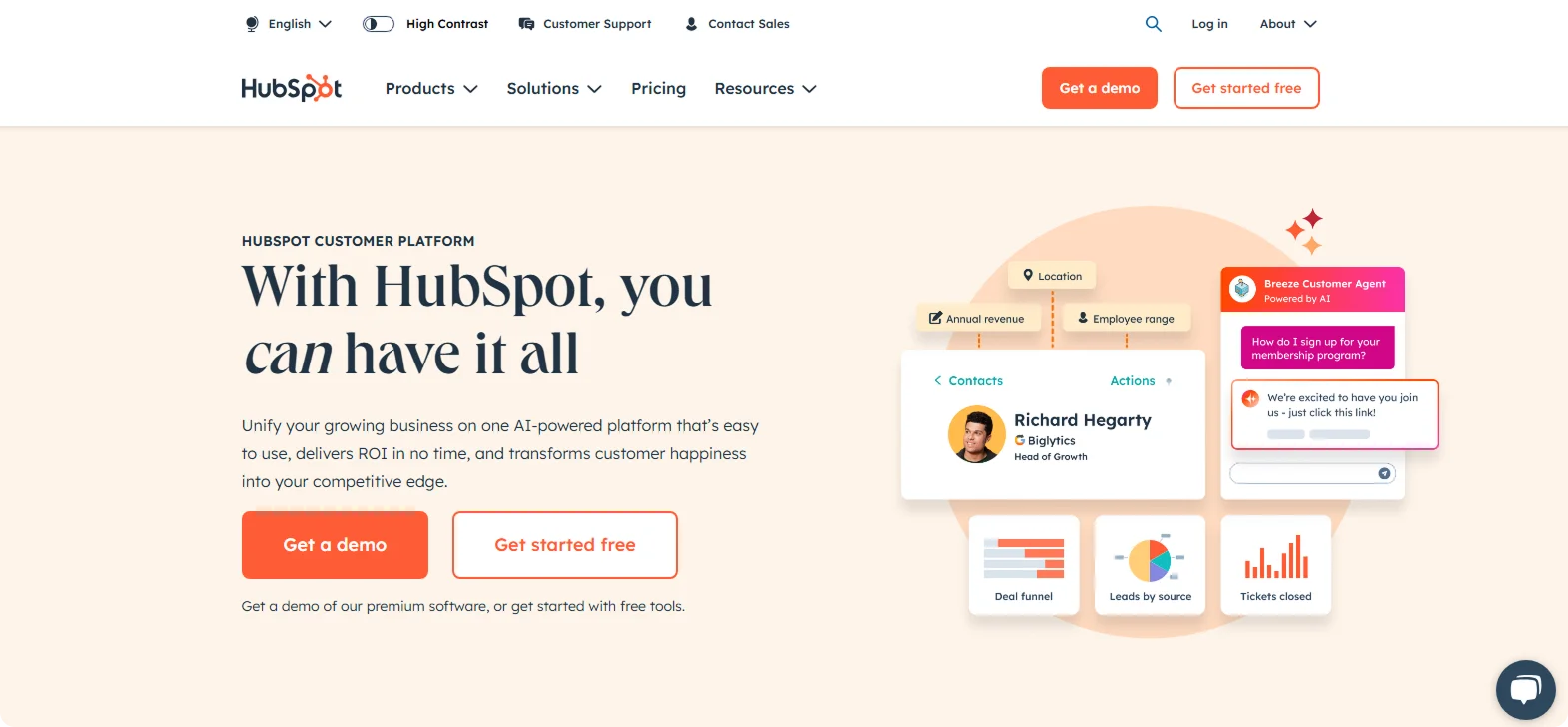
Purpose:
Offer tailored demos based on user role or industry.
Standout Features:
HubSpot's landing pages are often very modular. In one practical example, the page asks visitors to choose their industry or role and then routes them to a tailored demo.
It doesn't try to cram everything on one page. The headline is straightforward, and the main CTA ("Get a Demo" or "Get Started Free") is noticeable.
Takeaway:
Keep it focused. HubSpot demonstrates that when you have diverse audiences, segment them upfront. A multi-step or segmented approach can make the messaging more relevant.
2. Salesforce
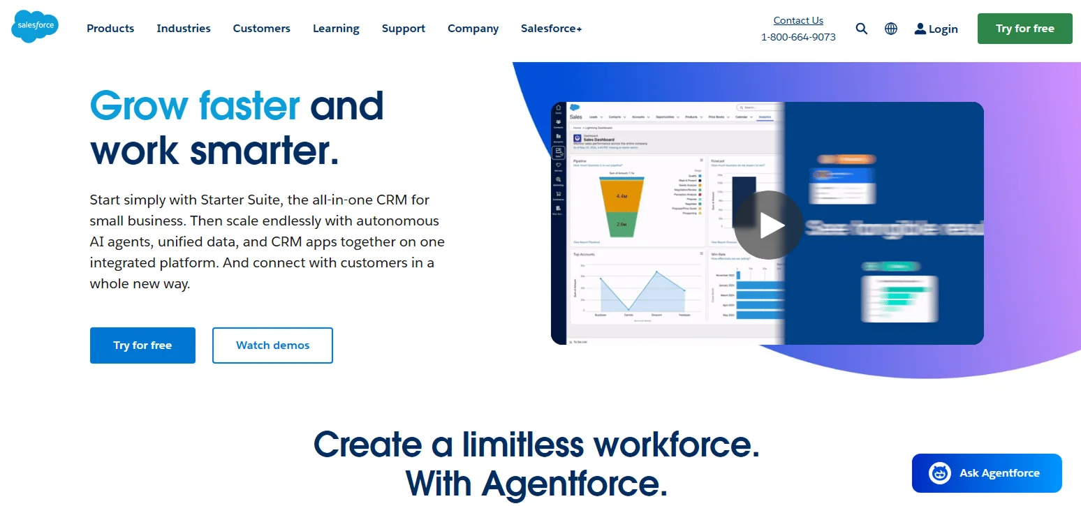
Purpose:
Convince large enterprises to choose Salesforce.
Standout Features:
Salesforce's landing page immediately conveys its value proposition with the headline: "Grow Faster and Work Smarter."
This is reinforced by compelling statistics from real customers. A prominently placed call-to-action, such as "Try for Free" or "Request Demo," encourages immediate engagement. The page also features logos of well-known clients and industry awards, which bolster credibility.
Takeaway:
Use data to persuade. Salesforce's "let the numbers do the talking" strategy shows that decision-makers in B2B want concrete proof. Displaying clear ROI figures and reputable logos immediately answers "What's in it for us?" with evidence.
3. Zendesk
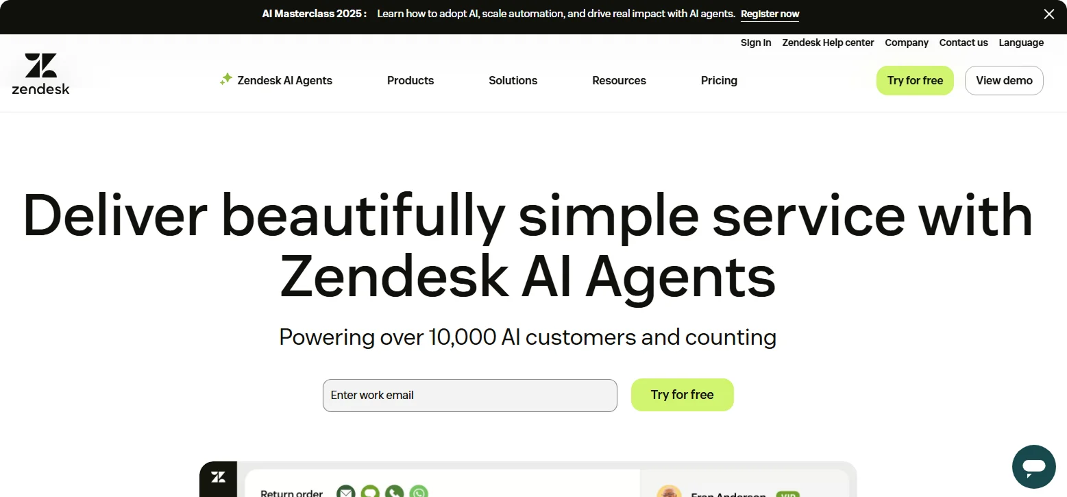
Purpose:
Show how Zendesk improves support operations.
Standout Features:
Zendesk leans into storytelling with visuals - an uncluttered design with animations, walkthroughs, and minimal text. Headlines are clear, and visuals explain complex features like ticket routing. Case studies and success videos add credibility.
Takeaway:
Show, don't just tell. Zendesk's "visual-first approach" makes it easier for prospects to grasp how the software works.
4. Slack
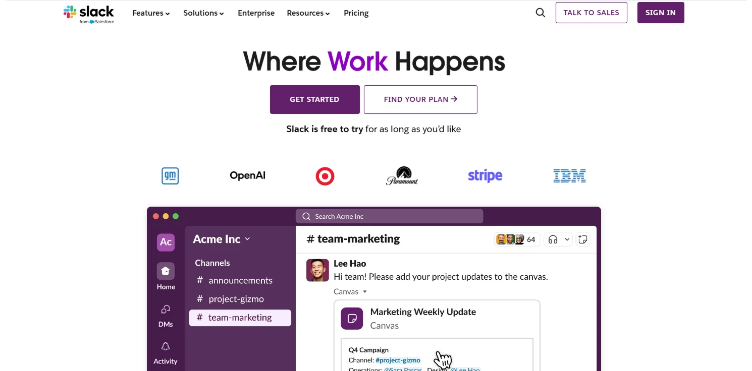
Purpose:
Reposition Slack as a complete digital workspace.
Standout Features:
The headline "Where work happens" sets the tone, supported by messaging like "Bring your people, projects, apps, and AI agents together."
The page combines a clean layout with demo GIFs that show real use cases: team channels, integrated apps, and workflows. A prominent "Get Started" CTA appears early, while logos and testimonials from major clients back up Slack's credibility.
Takeaway:
Smart positioning can redefine a familiar product. Slack uses sharp messaging, live visuals, and social proof to shift perception and instantly clarify its value.
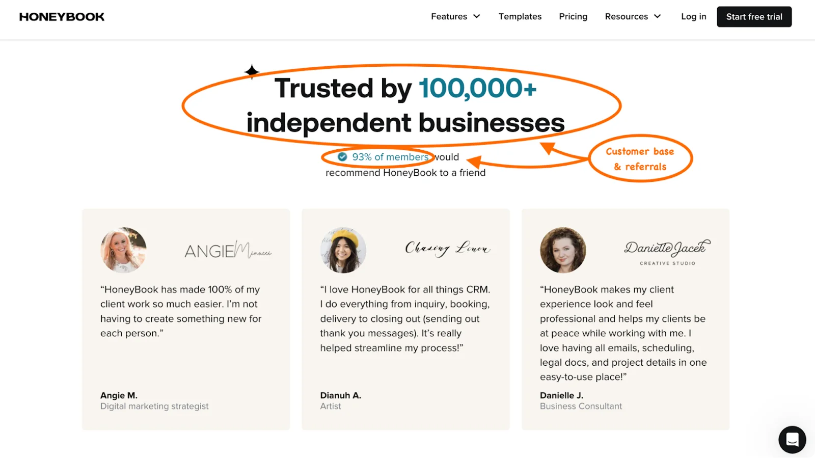
5. Brevo (formerly Sendinblue)
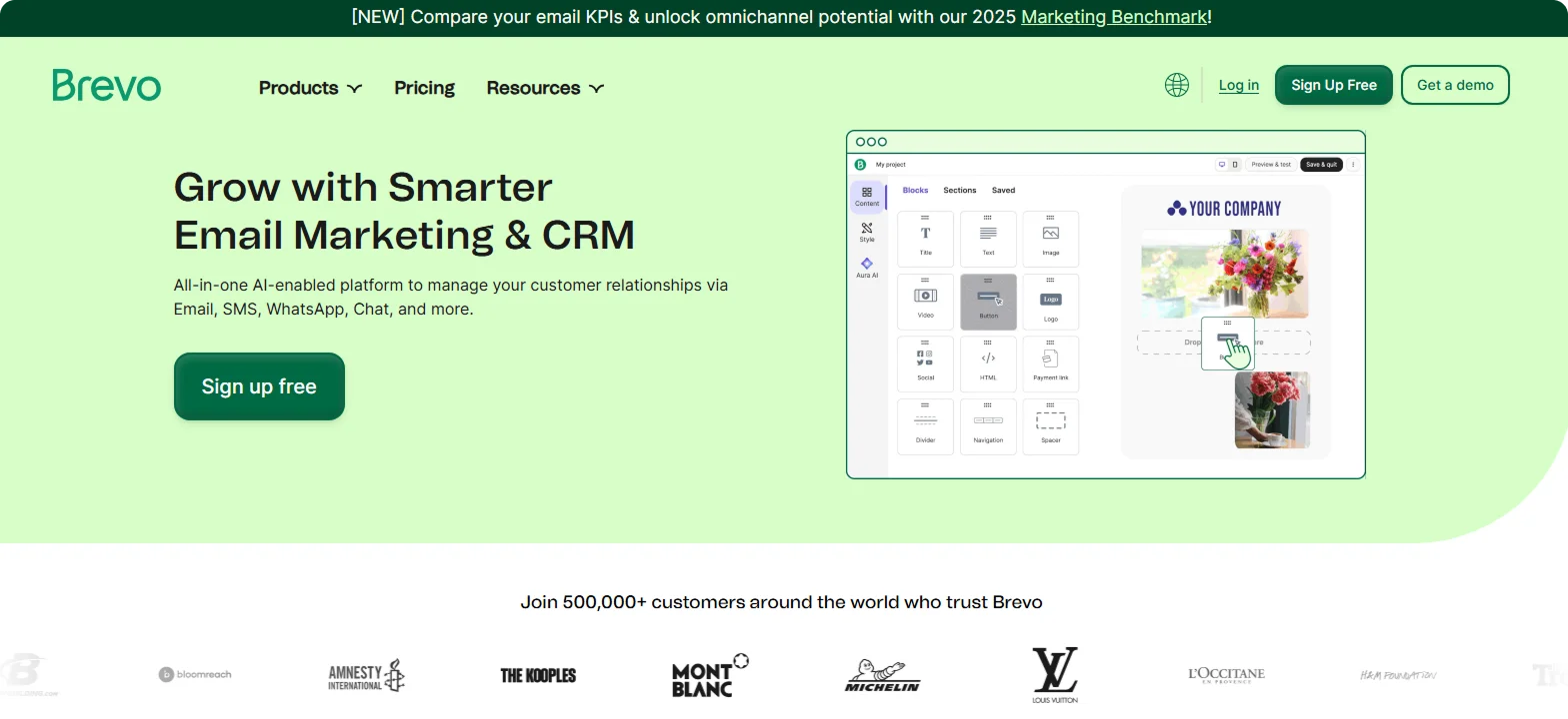
Purpose:
Attract small to mid-sized businesses looking to grow through email and SMS marketing.
Standout Features:
The page opens with a bold, benefit-focused headline and an easy signup form ("Sign up free").
The section titled "Five ways to work smarter, not harder" breaks down practical use cases of the platform, reinforcing Brevo's focus on efficiency. Social proof is strong. The tone is beginner-friendly and ideal for teams without a tech background.
Takeaway:
Brevo keeps things accessible. Its clear structure, low-friction CTA, and straightforward copy help small businesses feel confident about embracing automation.
6. Gong
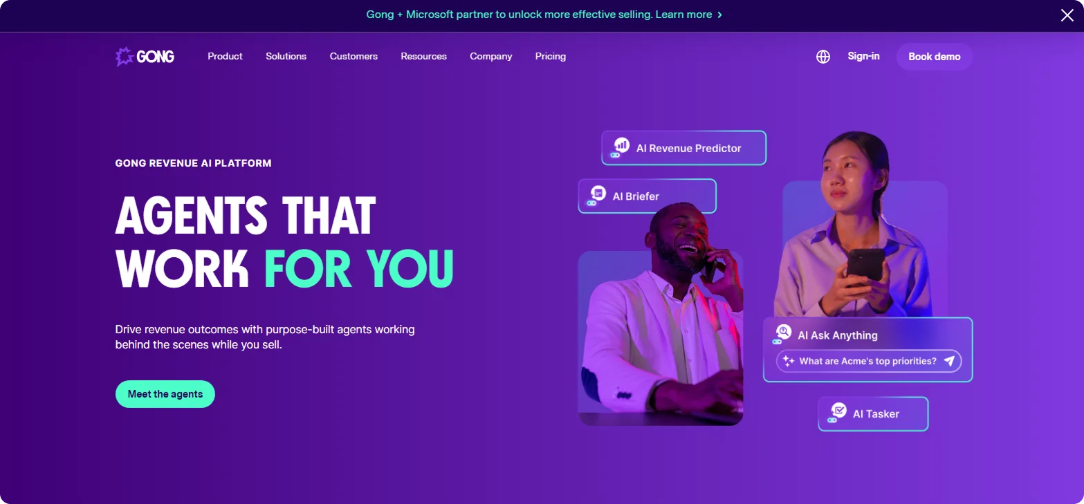
Purpose:
Help sales leaders turn conversations into revenue with AI-powered insights and analytics.
Standout Features:
Gong's landing page wastes no time. The headline reads: "Agents that work for you," followed by promises to drive revenue outcomes with AI tools working behind the scenes while you sell.
Further down, the page showcases Gong's key features, like AI forecasting and conversation analytics, through clean data dashboard visuals.
Takeaway:
Gong speaks the language of revenue. It leads with measurable outcomes, not features, and backs them with proof.
7. Airtable
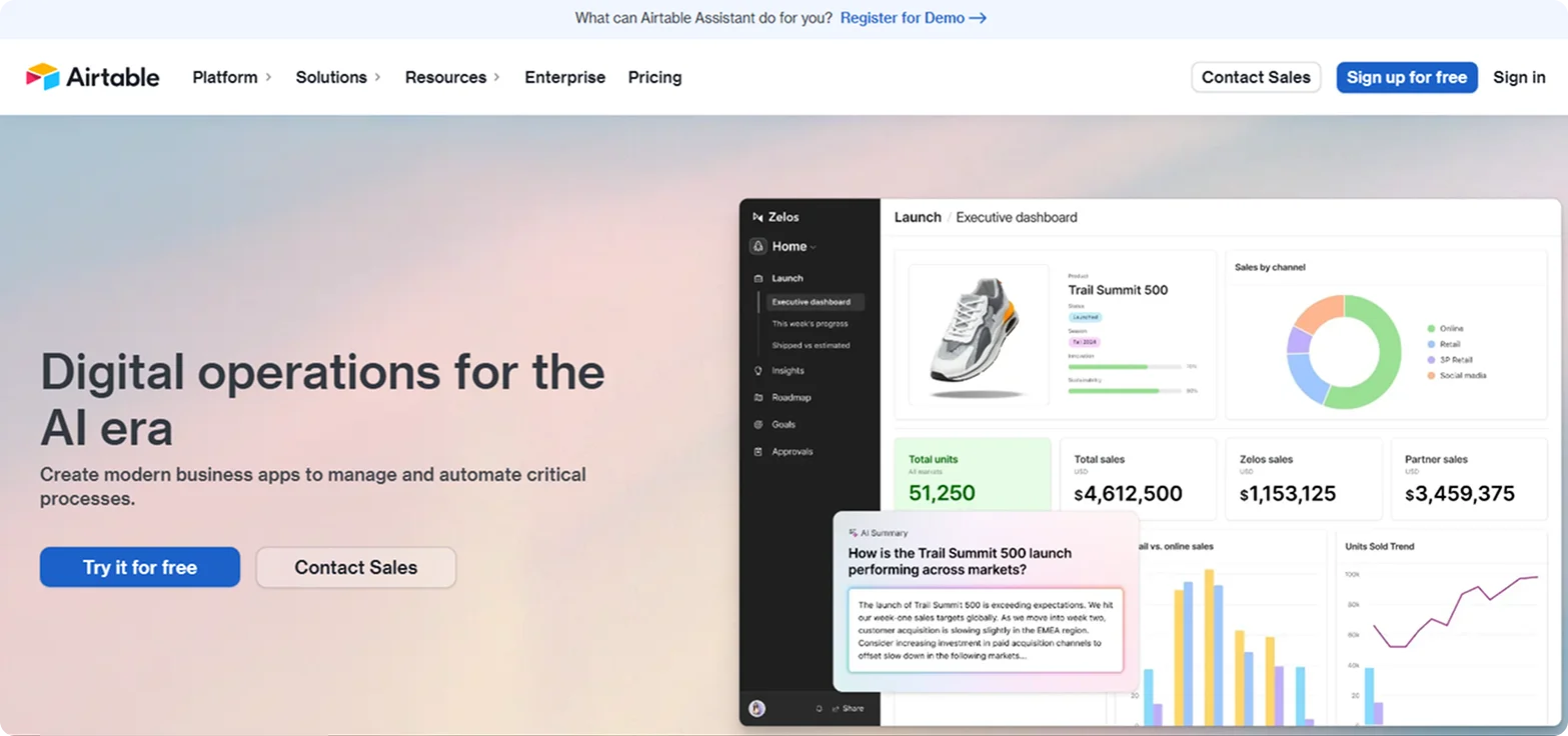
Purpose:
Offer a flexible platform for teams to organize data, build workflows, and create custom apps.
Standout Features:
The headline positions Airtable as "Digital operations for the AI era," with AI workflows and integrations at its core.
The page highlights different use cases, like Marketing, Sales, and Operations, through simple icons and brief descriptions, helping visitors quickly spot their fit.
Takeaway:
Airtable blends versatility with results. Within a few scrolls, visitors can clearly see who it's for, what it can do, and why it matters.
8. Asana
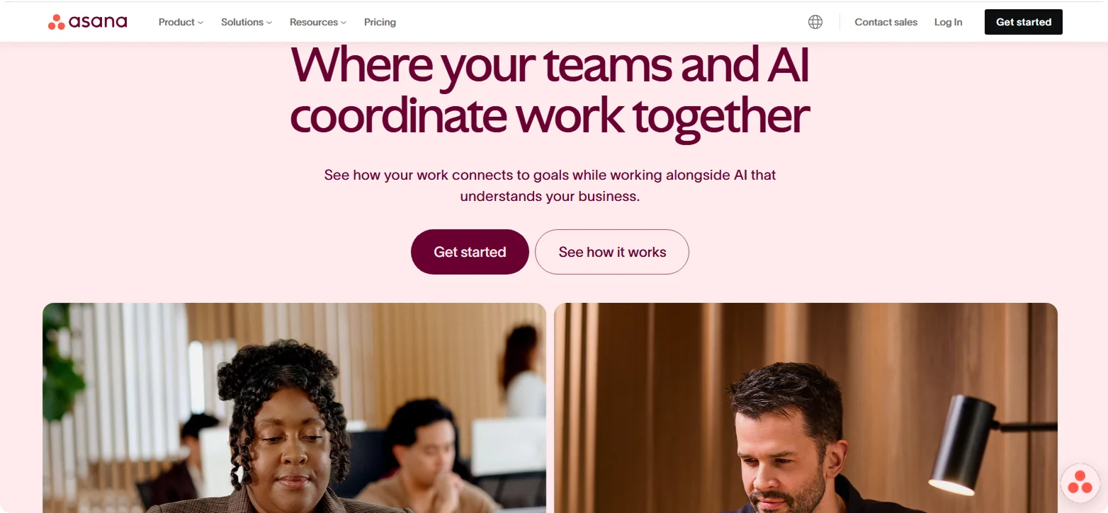
Purpose:
Help teams stay organized by tracking tasks, timelines, and projects in one place.
Standout Features:
Asana's landing page uses a minimalist design to reflect its core promise - clarity and order.
The hero section features the line "Where your teams and AI coordinate work together" alongside bold "Get Started" and "See How it Works" CTAs. Generous white space makes the page easy to scan, while short, plain-language bullet points explain key features like timelines, boards, and automation.
Takeaway:
The design is the message. Asana's simple, spacious layout reinforces its value: helping teams cut through the clutter.
9. Ahrefs
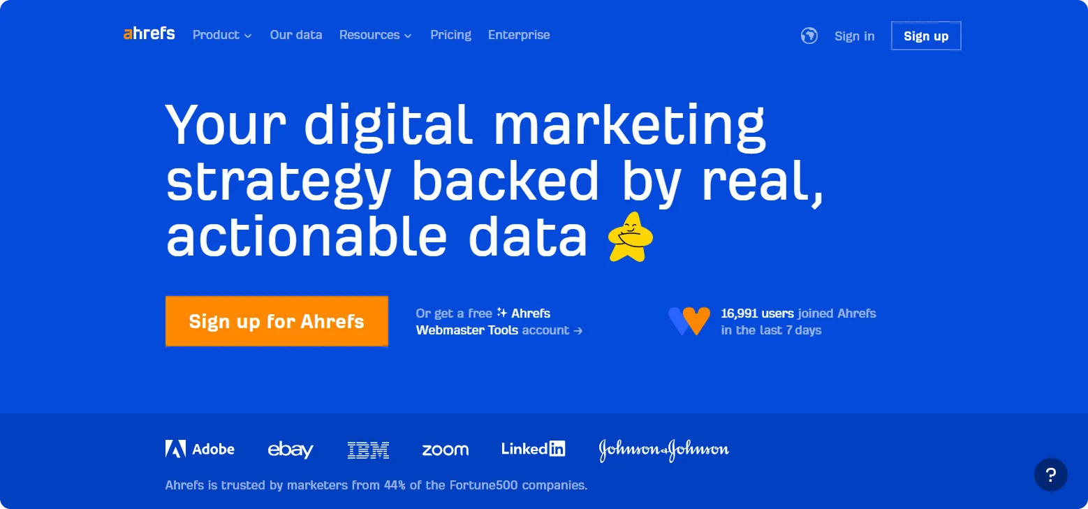
Purpose:
Provide powerful SEO tools for marketers, agencies, and content teams.
Standout Features:
The page opens with a bold headline focused on growing organic traffic, backed by a clear subheadline promising real results.
It presents core features like Keyword Explorer and Site Audit in simple blocks with plenty of white space. It builds trust by showcasing client logos and awards and offering free learning resources without requiring a signup.
Takeaway:
Ahrefs doesn't just sell software - it teaches SEO. By blending clear product benefits with valuable educational content, the page establishes authority and appeals to both curious beginners and data-driven professionals.
10. Shopify Plus
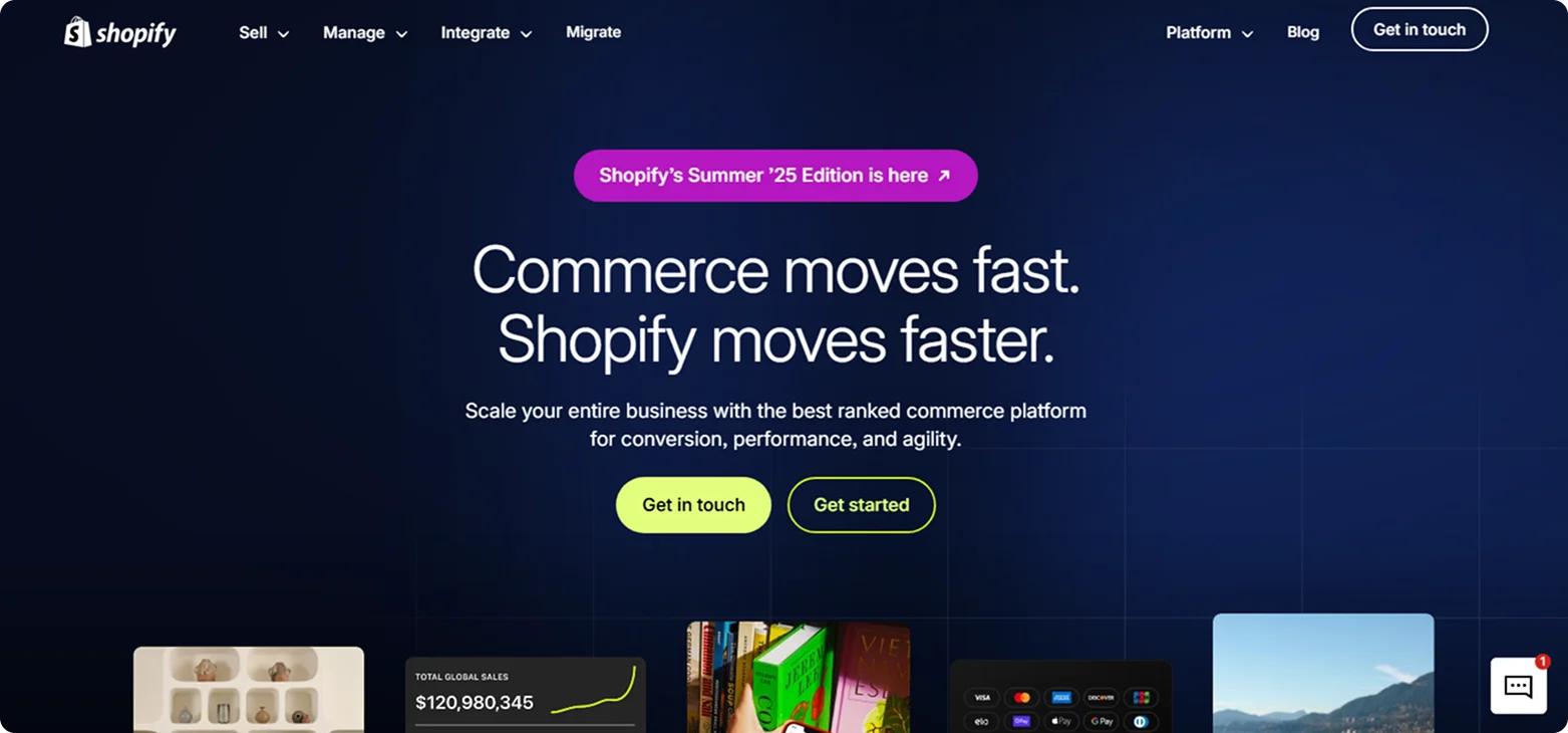
Purpose:
Deliver a flexible, scalable e-commerce platform for high-growth and enterprise-level businesses.
Standout Features:
The landing page immediately positions Shopify Plus as "The commerce platform for the next era of growth."
Enterprise-grade benefits like unlimited staff accounts, multi-store management, and 24/7 priority support are front and center. Real-world credibility comes from case studies and logos of major brands like Glossier, Allbirds, and Staples.
Takeaway:
Speak directly to enterprise needs. Shopify Plus combines personalization, proof, and fast access to sales to create a seamless journey for serious buyers ready to scale.
11. PandaDoc
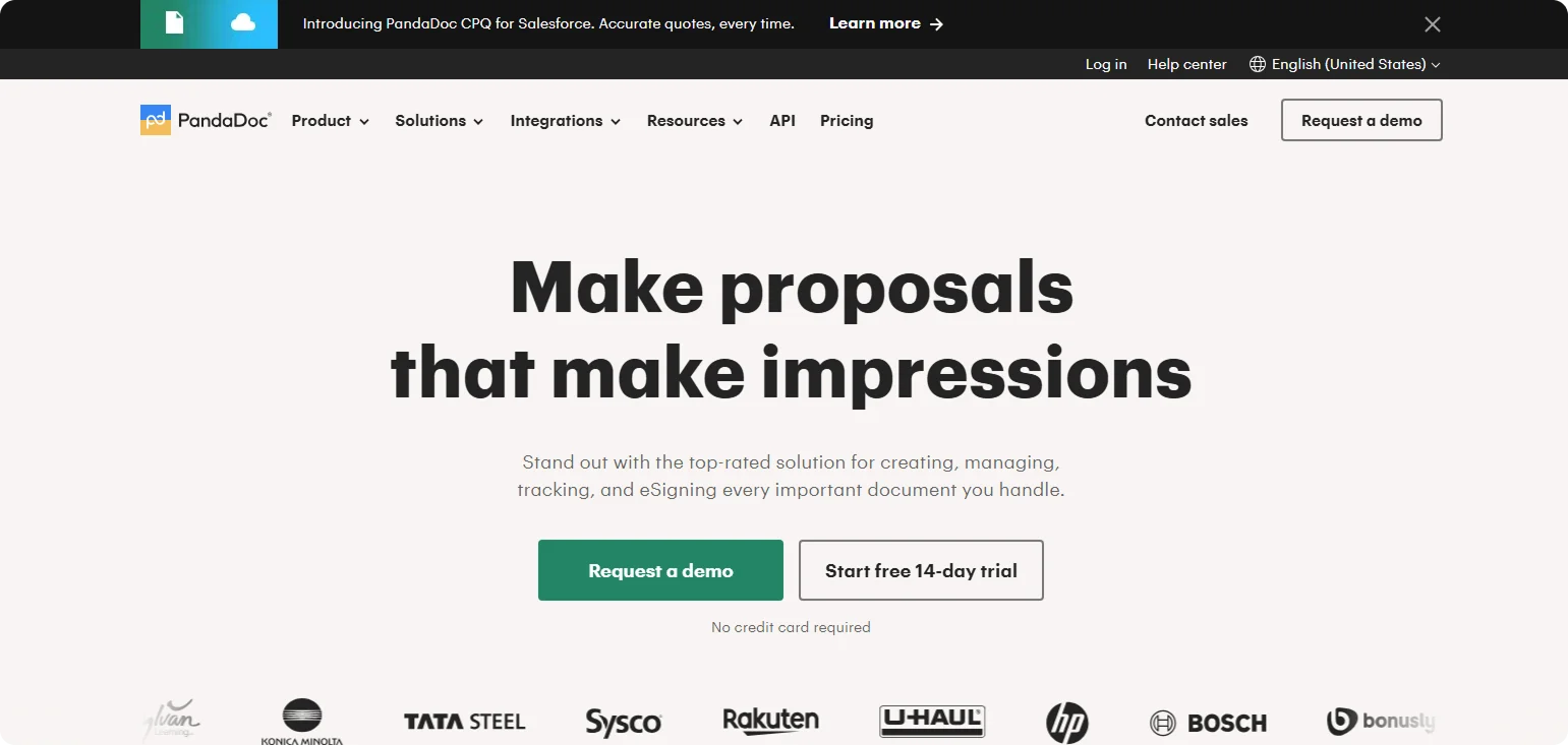
Purpose:
Position PandaDoc as the go-to alternative to DocuSign for eSignatures and document workflows.
Standout Features:
This landing page skips the generic pitch and goes straight for comparison. The standout headline is "Make proposals that make impressions."
It is backed by a side-by-side feature table showing strengths like unlimited document storage and transparent pricing. Two clear CTAs, "Request a Demo" and "Start 14-Day Free Trial," let visitors choose how they want to engage.
Takeaway:
PandaDoc proves that direct comparisons work when done right. By clearly laying out advantages and speaking to real user pain points, the page attracts high-intent buyers looking for better options.
12. Intercom
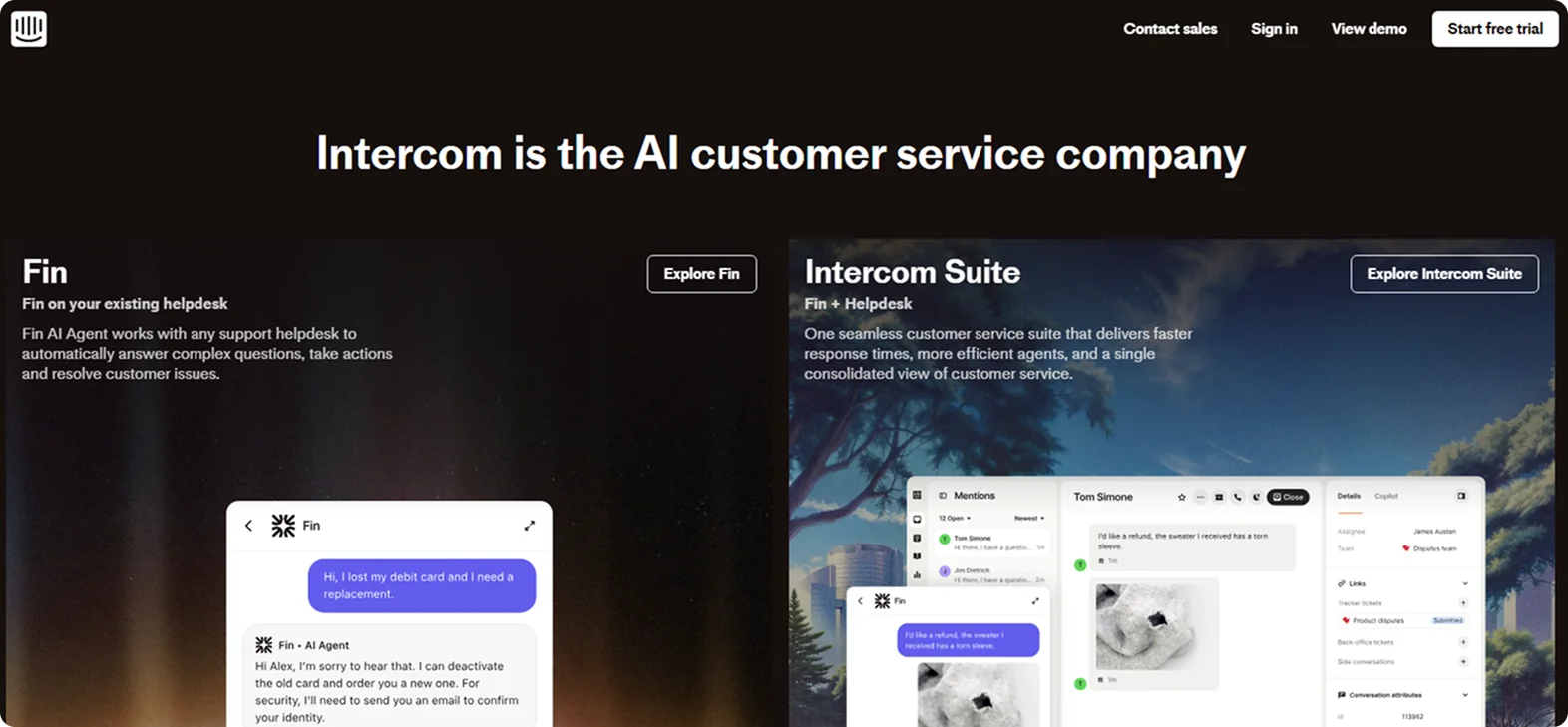
Purpose:
Equip businesses with AI-powered tools to support, engage, and retain customers at scale.
Standout Features:
The landing page opens with a bold positioning statement: "Intercom is the AI customer service company," immediately setting the tone for what follows.
It introduces Fin, Intercom's powerful AI chatbot, alongside the Intercom Suite—a complete platform for customer support, engagement, and automation. The hero section features a prominent "Start free trial" CTA, while just below, segmented links for Acquisition, Engagement, and Support guide visitors to the most relevant solutions.
Takeaway:
Intercom tailors its landing experience for modern B2B buyers. Its combination of a strong AI-led identity with flexible navigation and clear value props speaks to decision-makers looking for innovation and users seeking practical support solutions.
Why Codesi Is a Game-Changer for B2B Landing Pages
If there's one thing the best B2B landing pages have in common, it's this: they don't waste time. They get to the point, speak to the right audience, and make it easy to take the next step.
That's exactly the thinking behind Codesi.
While most tools overwhelm you with rigid templates and unclear settings, Codesi helps you build a professional, high-converting B2B landing page in minutes, not days.
Here's what makes it ideal for B2B marketers:
- Tailored messaging for your audience: Codesi adapts your content to match industry tone and buyer intent, from SaaS leads to enterprise clients to service-based businesses.
- Section-by-section customization: Add or remove blocks like feature grids, case studies, demo CTAs, testimonials, or whatever fits your funnel.
- AI-powered brand visuals: Quickly create logos and images that fit your brand and speak to your audience.
- Mobile-optimized and fast-loading: Every page is built to look great and load fast on any screen size, which is key for busy B2B decision-makers.
- Analytics and preview-ready: See your live page instantly, connect Google Analytics, and make edits in seconds.
Here’s how to easily generate B2B landing pages with Codesi - step by step:
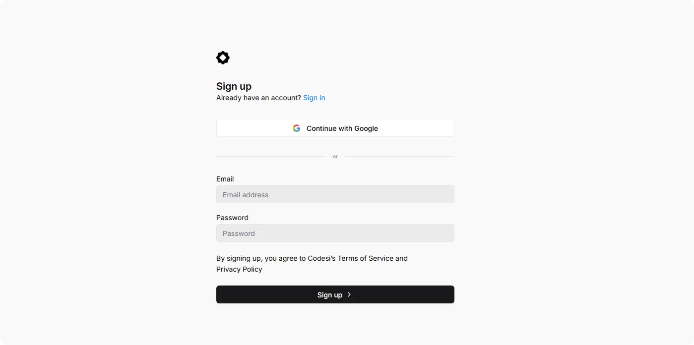
Step 1: Sign up on Codesi (it’s free).
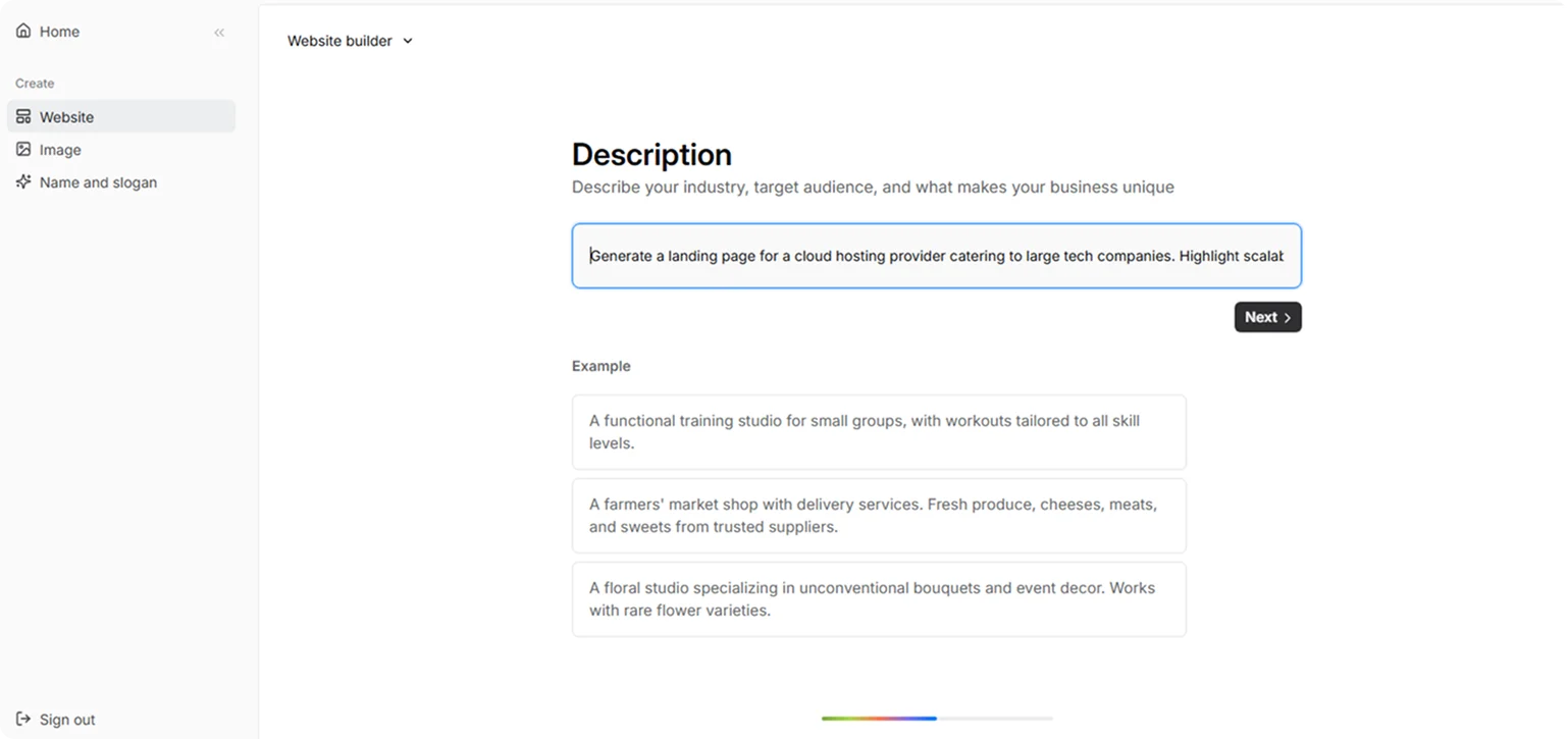
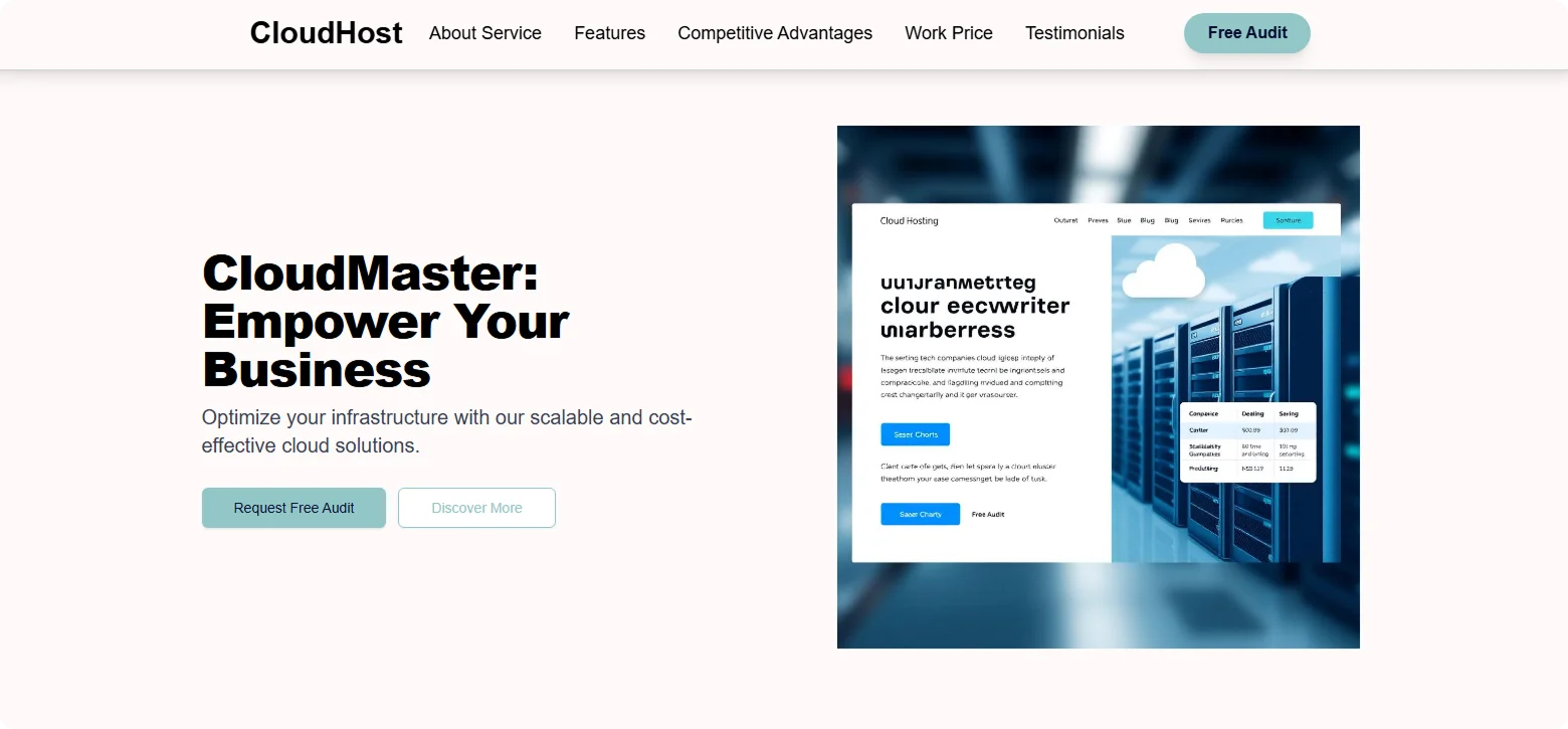
Step 2: In the Website Builder, enter your prompt. For B2B landing page creation, we used the following example:
“Generate a landing page for a cloud hosting provider catering to large tech companies. Highlight scalability, uptime guarantee, and cost-saving architecture. Include a comparison chart, client case studies, and a CTA for a free audit.”
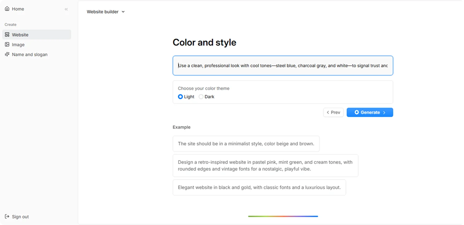
Step 3: Choose your color theme and style. For this example, we used:
“Use a clean, professional look with cool tones - steel blue, charcoal gray, and white, to signal trust and scale. Add bold accents, such as electric blue, to CTAs. Keep the layout minimal and grid-based, with modern sans-serif fonts, subtle gradients, and plenty of whitespace. Prioritize data visuals and client proof in a sleek, enterprise style.”
Step 4: Click “Generate” and wait a few minutes while Codesi generates your B2B landing page.
We’ll deliver a refined B2B landing page you’re free to adjust and optimize.
Ready to launch a B2B landing page without the usual hassle?
Start free with Codesi and build a page that doesn't just look good - it drives leads, builds trust, and gets results.
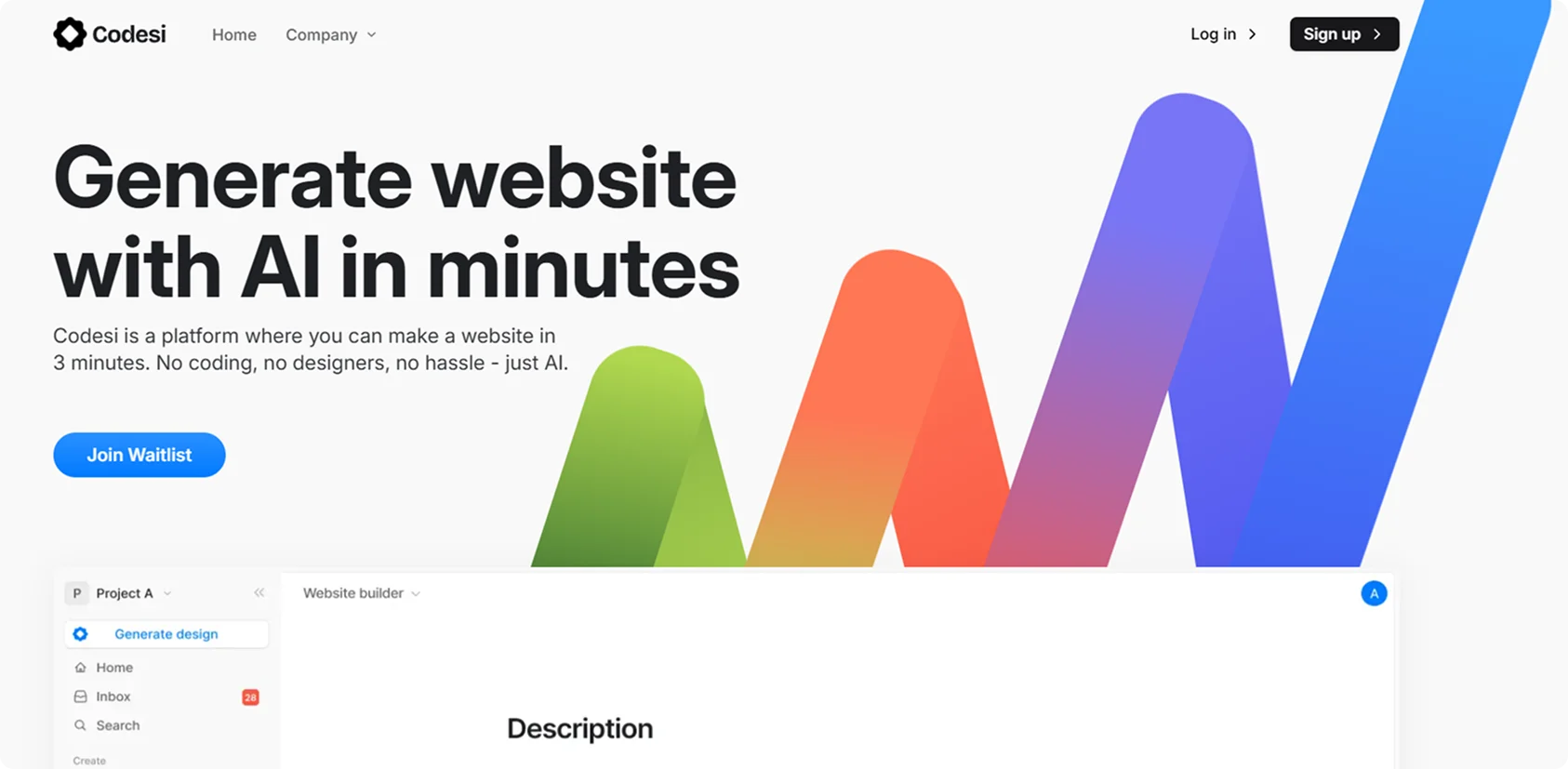
Create your website with AI today
Codesi is a platform where you can make a website in 3 minutes.
No coding, no designers, no hassle - just AI.
