Back to blog
Top 6 Single Product Landing Pages To Get Inspired in 2026
Discover the best single-product landing pages and explore top designs that effectively drive conversions, engage customers, and showcase products.
Feb 7 2025
What makes a single product landing page so powerful?
Instead of presenting countless options and features, this page focuses on one product, one goal, and one clear call-to-action (CTA).
It’s not about cramming in more information – it’s about curating the right details to drive conversions.
In this guide, we’ll break down every aspect of creating a high-performing single product landing page.
We’ll explore why they work, how to design one, and the key strategies for optimizing your page.
Let’s dive in!
Why Do Single Product Landing Pages Work So Well?
If you’ve ever felt paralyzed by too many choices, you’ve experienced what psychologists call the “paradox of choice.”
A single product landing page solves this problem by giving visitors just one clear option. This simplicity leads to higher conversions.
But the benefits go beyond avoiding choice overload.
Single product landing pages are designed to:
- Align with Ads: If someone clicks on an ad promoting your product, a landing page dedicated to that exact product ensures consistency. This seamless experience increases trust.
- Minimize Distractions: Without menus, links, or other products to browse, visitors stay focused on the task at hand.
- Drive Emotional Impact: A well-crafted landing page can connect with your audience on a personal level, highlighting how the product meets their needs or solves a problem.
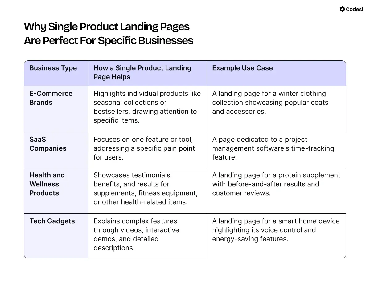
Why Single Product Landing Pages Are Perfect for Specific Businesses
6 Best Examples of Single Product Landing Pages
1. Calm
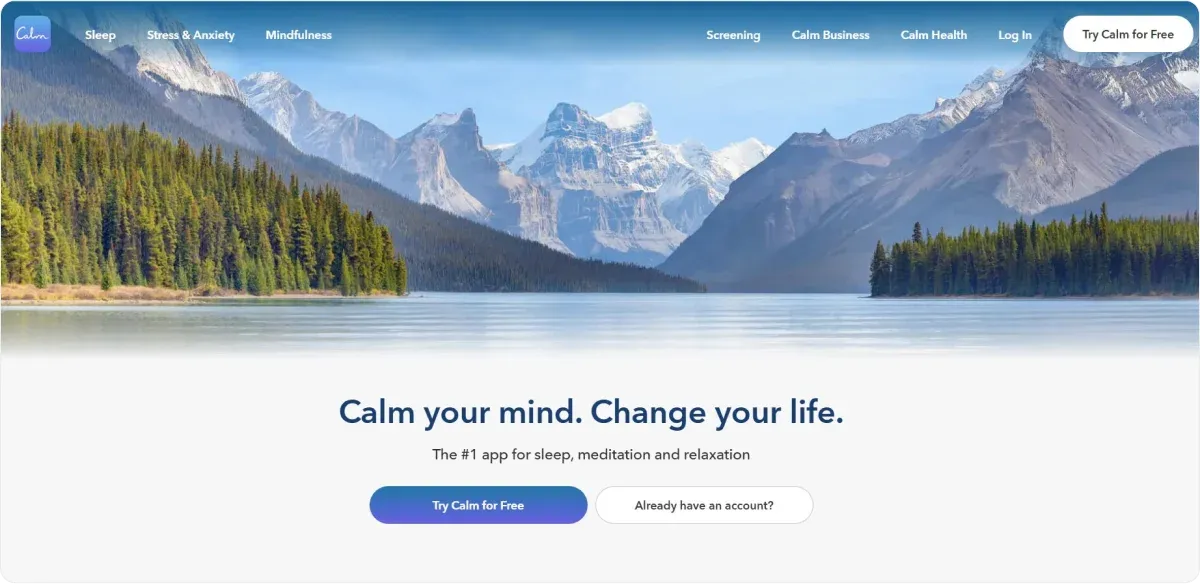
The Calm website exemplifies an effective single product landing page through:
1. Clear and Singular Focus:
Calm's homepage exclusively promotes its meditation and sleep app. This eliminates distractions, guiding visitors directly toward understanding and engaging with what the app offers.
2. Minimalist Design with Intuitive Navigation:
The site has a clean, minimalist design that enhances user experience. Limiting navigation options and avoiding clutter ensures visitors can easily find information about the app without being overwhelmed.
3. Compelling Visuals and Content:
High-quality images and concise, persuasive copy highlight the app's benefits, such as improving sleep quality and reducing stress. This combination effectively communicates the app's value proposition to potential users.
4. Prominent Call-to-Action (CTA):
The "Try Calm for Free" CTA is strategically placed and stands out visually, encouraging visitors to take immediate action.
5. Social Proof and Credibility:
Calm incorporates user testimonials and mentions of awards (e.g., Apple App of the Year) to build trust and credibility.
6. Mobile Optimization:
Recognizing that many users access content via mobile devices, Calm's website is fully optimized for mobile viewing, ensuring a seamless experience across all platforms.
2. Mailbrew
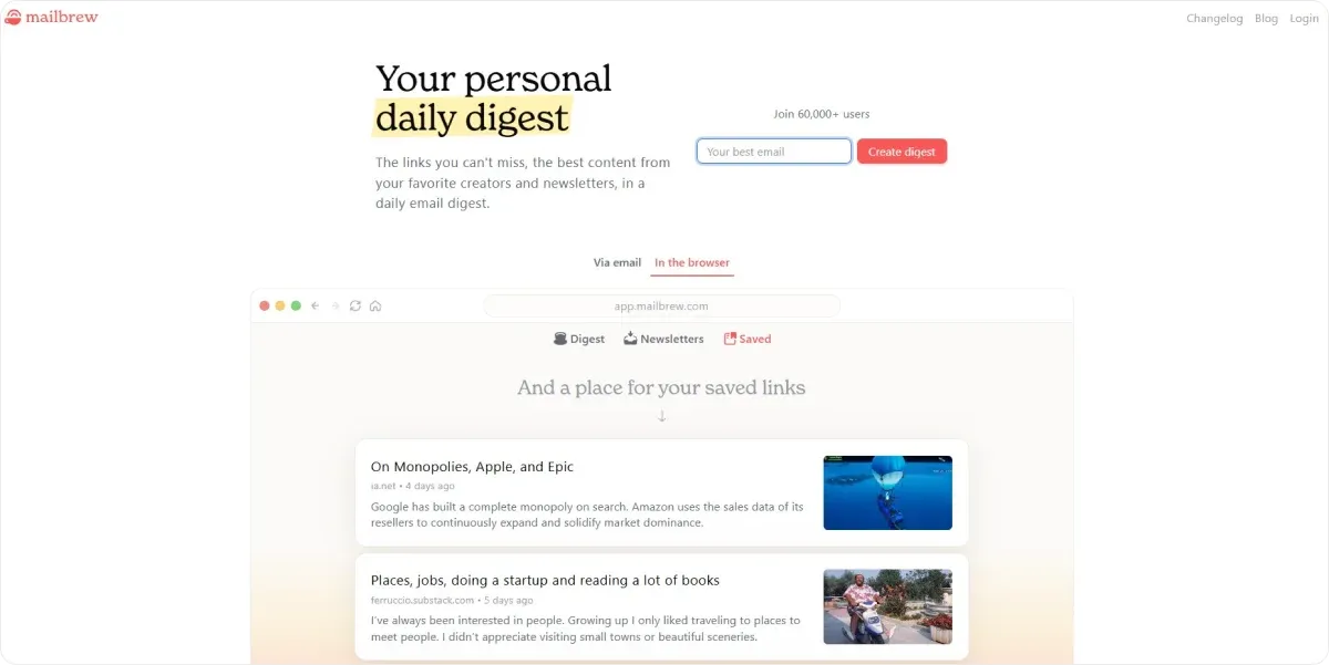
Mailbrew's landing page illustrates an effective single product landing page with:
1. Clear and Compelling Headline:
The headline immediately conveys the product's value proposition: "Your personal email digest." This succinctly informs visitors about the service's primary function: delivering personalized email summaries.
2. Concise and Persuasive Copy:
The page describes how Mailbrew consolidates content from various sources into a single, customizable email. This explanation highlights the convenience and time-saving benefits for users.
3. Engaging Visuals:
High-quality images and animations demonstrate the product's interface and features, allowing potential users to visualize the experience.
4. Prominent Call-to-Action (CTA):
A clear CTA button labeled "Get Started" is strategically placed, encouraging visitors to begin using the service.
5. Social Proof:
Testimonials from satisfied users and mentions of notable clients enhance credibility and trustworthiness.
6. Minimal Navigation:
The page maintains focus by limiting navigation options, reducing potential distractions, and guiding users toward the desired action.
3. Skylight
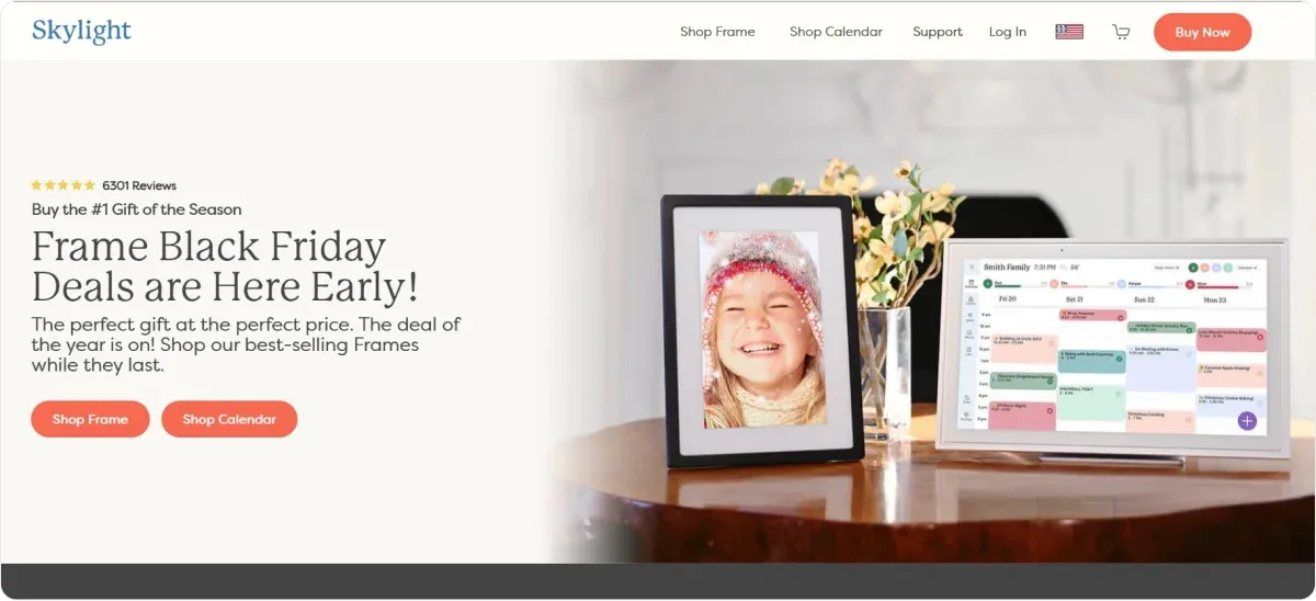
The Skylight Frame landing page displays an effective single product landing page through:
1. Clear and Compelling Headline:
The page immediately captures attention with a prominent headline announcing early Black Friday deals, emphasizing urgency and value.
2. High-Quality Visuals:
Engaging images of the Skylight Frame showcase its design and functionality, helping visitors visualize the product in their own space.
3. Focused Content:
The page concentrates solely on the Skylight Frame, providing detailed information about its features, benefits, and new enhancements like Frame 2.
4. Prominent Call-to-Action (CTA):
Clear CTAs such as "Buy Now" are strategically placed, guiding visitors toward purchasing.
5. Social Proof:
The inclusion of logos from reputable publications like TIME and TechRadar lends credibility and builds trust with potential customers.
6. Limited Navigation:
By minimizing navigation options, the page reduces distractions, keeping the visitor's focus on the product and the intended action.
4. Apple Airpods Max
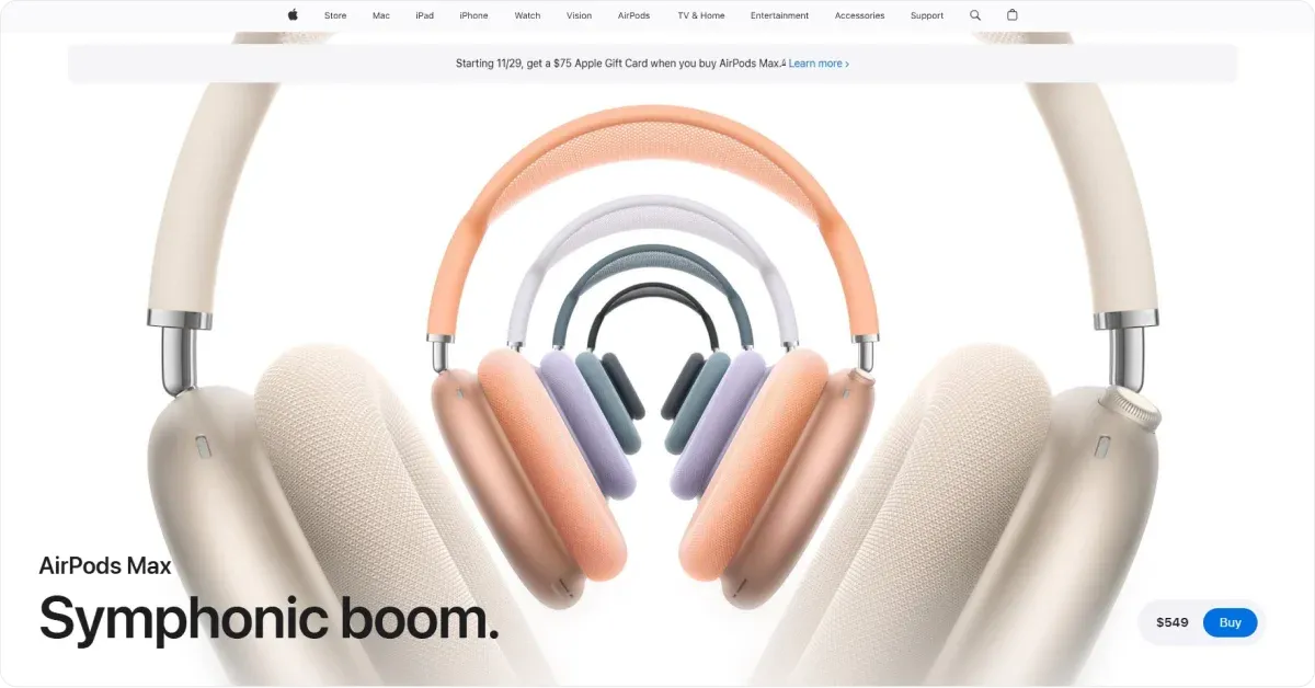
The AirPods Max landing page is an excellent example of a single product landing page because it has:
1. Engaging First Impression:
Upon landing on the page, visitors are greeted with a full-width image of the AirPods Max.
This design choice ensures the product is front and center, immediately capturing attention. The image is sharp, high-quality, and visually striking, allowing potential customers to see the product in detail.
2. Problem-Focused Headline:
Beneath the image, the headline reads something about how AirPods Max can provide the “perfect listening experience.”
Many people want immersive audio, and this headline positions the AirPods Max as the answer.
A problem-focused headline is a hallmark of effective landing pages. It speaks directly to the customer's needs or desires, making them more likely to engage with the rest of the content.
3. Benefit-Driven Descriptions:
Instead of overwhelming the reader with technical jargon, it focuses on what matters most to the user, such as sound quality, comfort, and build.
The text is supported by pixel-perfect product photos that highlight these features visually.
4. Intuitive Design and White Space:
One of the standout features of this page is its use of white space and a neutral color scheme.
The design naturally draws attention to the “Buy Now” CTA buttons by limiting distractions. Thanks to their placement and color contrast, these buttons pop out, ensuring they’re easy to find without overwhelming the user.
5. User-Friendly Features:
The price comparison table allows shoppers to evaluate different AirPods models quickly. This feature enhances the user experience by addressing potential questions and hesitations upfront.
5. Oura Ring
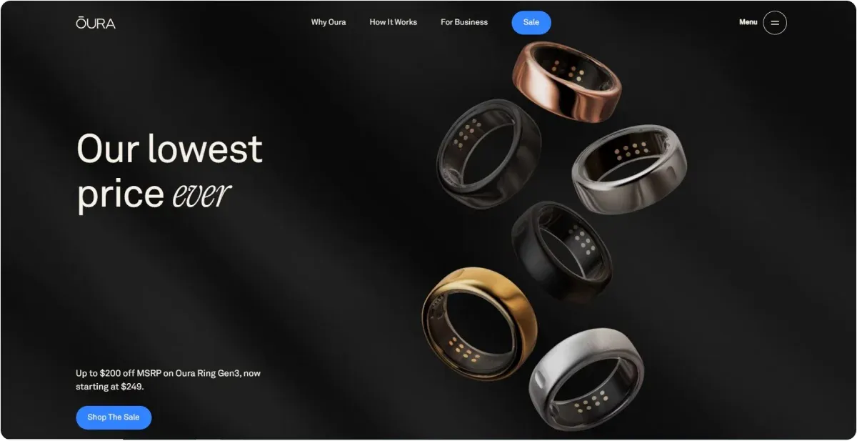
The Oura Ring's official website has a targeted design that caters directly to user needs with:
1. Immediate Visual Engagement:
Upon arrival, visitors encounter a full-width, high-resolution image of the Oura Ring, immediately capturing attention and highlighting the product's sleek design. This visual prominence aligns with best practices for single product landing pages, emphasizing the product without distractions.
2. Clear and Compelling Headline:
Directly beneath the image, a concise headline articulates the Oura Ring's purpose: "The revolutionary smart ring." This statement succinctly conveys the product's innovative nature, engaging visitors to explore further.
3. Benefit-Oriented Descriptions:
The page provides detailed yet accessible descriptions of the Oura Ring's features, focusing on user benefits such as sleep tracking, activity monitoring, and heart health insights. Accompanying visuals illustrate these functionalities, enhancing comprehension and appeal.
4. Strategic Use of White Space and Design Elements:
The design employs ample white space and a neutral color palette, ensuring a clean and organized layout.
5. Prominent Call-to-Action (CTA) Buttons:
The "Shop" and "Learn More" buttons are strategically placed throughout the page, standing out due to their contrasting color and clear labeling. This design encourages user interaction and guides visitors toward purchasing decisions.
6. Social Proof and Trust Indicators:
The inclusion of testimonials from Oura Ring users and mentions of media coverage serve as social proof, building credibility and trust.
7. Responsive and Mobile-Friendly Design:
The website is optimized for various devices, ensuring a seamless experience across desktops, tablets, and smartphones.
8. Informative Footer with Additional Resources:
The footer provides links to support, company information, and social media channels, offering visitors easy access to further resources without cluttering the main page.
6. Birchbox
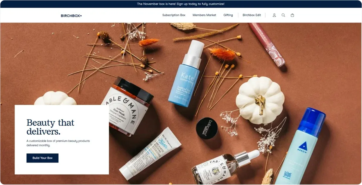
The Birchbox homepage is a central hub for its beauty subscription service, that has:
1. Visual Presentation:
Upon visiting the site, users are greeted with vibrant, high-quality images showcasing various beauty products and subscription boxes. These visuals effectively show the diversity and appeal of the offerings, engaging visitors from the outset.
2. Navigation and User Interface:
The homepage features a clear and intuitive navigation bar, allowing users to explore different sections such as "Subscribe," "Shop," and "Learn." This structure facilitates easy access to information about subscription plans, product categories, and educational content.
3. Call-to-Action (CTA) Elements: Prominent CTA buttons like "Get Started" and "Join Now" are strategically placed to encourage user engagement. These buttons stand out against the background, guiding visitors toward subscription sign-ups or product purchases.
4. Personalization and User Engagement: The homepage invites users to create a beauty profile, enabling the service to tailor product selections to individual tastes and needs. Thus, it enhances user satisfaction and loyalty.
5. Content and Educational Resources: The site offers a variety of content, including beauty tips, tutorials, and product reviews. This educational material adds value for users, positioning Birchbox as a knowledgeable and trustworthy source in the beauty industry.
6. Social Proof and Community Building: Customer testimonials and reviews are featured to build trust and credibility. Additionally, links to social media platforms encourage community engagement and provide avenues for users to share their experiences.
How Do You Create a Successful Single Product Landing Page with Codesi?
Creating a successful single product landing page involves more than just putting together text and images.
The ultimate purpose is to guide your visitors toward a specific goal while highlighting the product’s unique benefits.
This process can be time-consuming and overwhelming – but with Codesi, you can streamline every step.
1. Start with a Strong Hook: Why Should Visitors Care?
Your landing page should begin with a compelling headline and a clear introduction.
For instance, if you’re selling a portable coffee maker, a headline like “Compact Coffee Maker” won’t cut it.
Instead, opt for something like:
"Fresh Coffee Anywhere – Brew the Perfect Cup in Under 3 Minutes."
Follow this with a short introduction that shows why your product is unique and worth the customer’s time.
💡 How Codesi Can Help:
- Landing Page Generator: Codesi helps you craft an engaging introduction by generating headlines and copy tailored to your product. Simply provide a prompt, and within 2-3 minutes, you’ll have a professional draft ready to refine.
- Image Generator: Pair your headline with high-quality visuals generated by Codesi. Create images that align with your brand and highlight the product’s appeal.
2. Focus on a Single Goal
Every element of your landing page should work toward one conversion goal.
Whether buying the product, signing up for a pre-order, or joining a waitlist, make this goal crystal clear.
Avoid including competing CTAs or links that might distract the visitor.
💡 How Codesi Can Help:
- Customizable Blocks: Codesi allows you to choose and arrange website blocks, ensuring the layout supports your goal. For example, you can prioritize the CTA section while minimizing distractions.
- Google Analytics Integration: Track how visitors interact with your page to ensure it aligns with your primary goal.
3. Optimize Your Call-to-Action (CTA)
Your CTA is the gateway to conversion. Make it clear, actionable, and visually distinct.
Use phrases that are simple and direct, such as:
- “Buy Now”
- “Get Yours Today”
- “Start Your Free Trial”
Place the CTA prominently at the top of the page (above the fold) and repeat it throughout.
For example, after explaining the product’s features or benefits, remind the visitor of their next step with a button.
💡 How Codesi Can Help:
- Landing Page Generator: Automatically includes well-positioned CTA buttons tailored to your product’s goal.
- Design Flexibility: Use Codesi’s editor to change CTA wording, colors, or placement to ensure it stands out.
4. Highlight the Product with Engaging Visuals
A picture may be worth a thousand words, but for your landing page, a video might be worth even more.
High-quality images and videos are essential for showing your product in action. Visitors should be able to imagine themselves using and enjoying it.
For example, if you’re selling a fitness product, a video of someone working out in their living room can be more effective than static images.
💡 How Codesi Can Help:
- Image Generator: Generate professional visuals that reflect your product’s value and quality. Create packs of images that showcase the product in different scenarios.
- Video Integration: Easily add videos to your landing page to boost engagement.
5. Use Compelling Copy That Sells
Words matter. Your product description should focus on benefits, not just features. Instead of saying, “This water bottle holds 1 liter,” frame it as “Stay hydrated all day with a bottle that fits perfectly in your bag.”
When writing your copy, ask:
- What problem does the product solve?
- How will it make the customer’s life easier, better, or more enjoyable?
- Why should they buy it right now?
Use short paragraphs, subheadings, and bullet points to make the text easy to read. Avoid technical jargon unless it’s essential for your audience.
💡 How Codesi Can Help:
- Text Generation: Skip the blank page. Codesi generates persuasive, benefit-focused copy based on your inputs.
- Custom Editor: Refine the generated text to fit your brand voice, ensuring the message resonates with your audience.
6. Build Trust with Social Proof
If you’ve ever hesitated to buy something online, chances are you looked for reviews first. Testimonials, ratings, and endorsements reassure visitors that others have tried and loved your product.
Ways to add social proof include:
- Quotes from satisfied customers
- Star ratings
- Case studies or before-and-after photos
- Mentions in trusted publications or endorsements from influencers.
💡 How Codesi Can Help:
- Testimonial Blocks: Codesi provides pre-designed sections for reviews or testimonials, making it easy to showcase social proof.
- Feedback Forms: Collect customer testimonials directly through your landing page with built-in forms.
7. Make Pricing Clear and Transparent
Confusion about pricing is one of the top reasons people abandon purchases. Be upfront about the cost, including shipping or discounts.
If you’re running a promotion, make it obvious – for example, highlight the discount in bold text near the CTA.
💡 How Codesi Can Help:
- Pricing Tables: Automatically generate clear and concise pricing sections that align with your page’s design.
- Editable Blocks: Customize pricing details to include promotions, discounts, or additional offers.
8. Ensure Your Page Is Mobile-Friendly
Most visitors will view your landing page on a mobile device.
If your page isn’t optimized for smaller screens, you’re likely losing conversions.
Use a responsive design, ensure fast load times, and keep buttons large enough to tap easily.
💡 How Codesi Can Help:
- Mobile Optimization: Every landing page generated by Codesi is fully responsive, ensuring a seamless experience on any device.
- Fast Loading Times: The platform optimizes images and code to ensure quick loading, even on mobile.
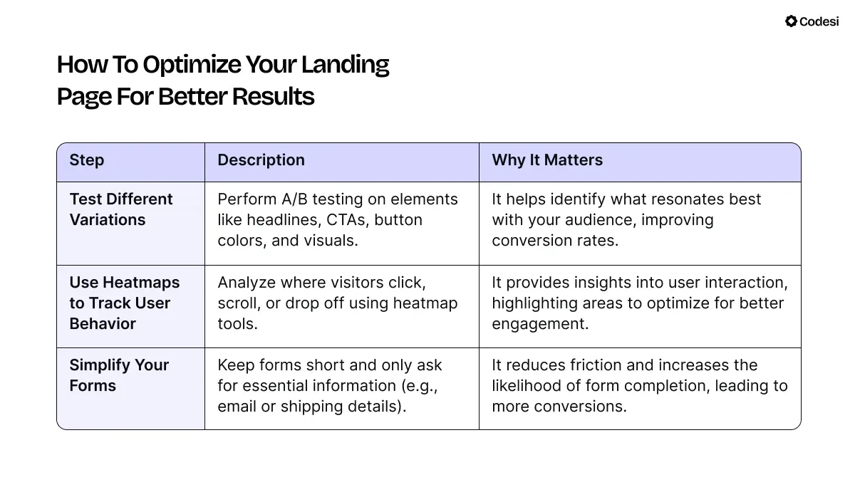
How to Optimize Your Landing Page for Better Results
Conclusion: Simplify, Focus, Convert
A single product landing page is more than just a webpage – it’s a tool designed to drive sales and foster meaningful customer engagement.
Focus on one product and craft compelling copy that speaks directly to your audience’s needs.
Then, guide visitors toward a clear, actionable goal to create a page that grabs attention and drives conversions.
Take the next step and sign up today!
With Codesi, creating a high-converting, visually stunning landing page is simple and fast, turning your product vision into reality in just minutes!
Create your website with AI today
Codesi is a platform where you can make a website in 3 minutes.
No coding, no designers, no hassle - just AI.
