Back to blog
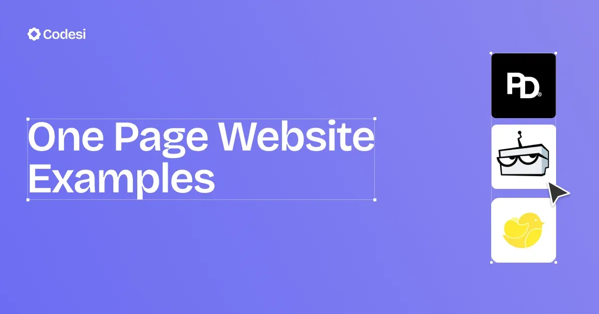
15 One-Page Website Examples To Get Inspiration
Explore inspiring one-page website examples, how they work, and why they're great for portfolios, businesses, and landing pages.
Feb 10 2025
If you’re a bit uncertain about design, feeling uninspired, or wrestling with that first step in creating your online presence, you’ve come to the right place.
With minimalist yet impactful designs, one-page websites are a great starting point.
Today, we share 15 one-page website examples to help you balance aesthetics and functionality effectively.
Let’s dive in!
15 One-Page Website Examples Worth Checking
We’ve curated our list based on some of the key design elements a quality one-page website should have.
1. Partopia Digital
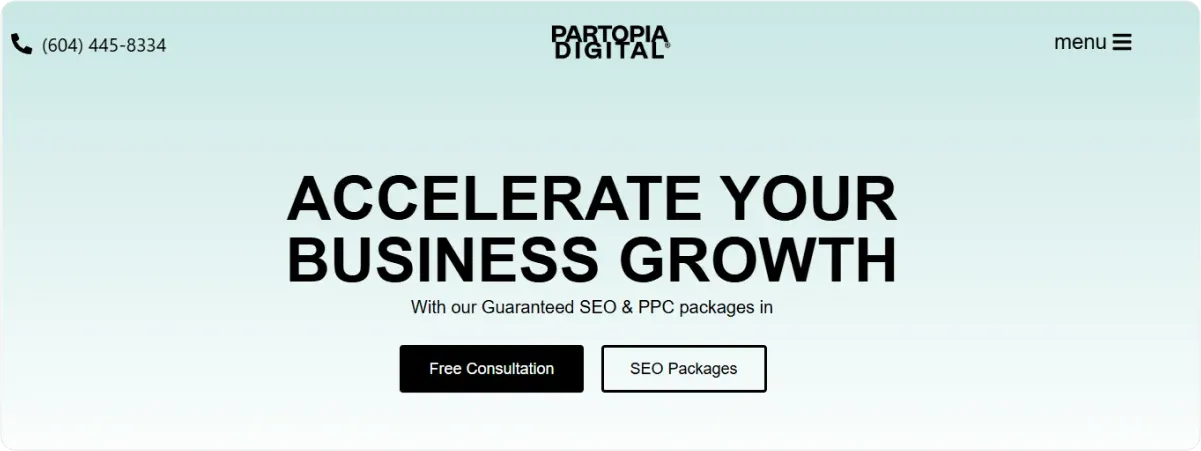
The website has a clean layout with a balanced color scheme that aligns with the brand identity.
In addition, typography is simple yet effective in black color, conveying value proposition immediately.
Smooth scrolling enables a more seamless transition between sections, and prominent CTAs are strategically placed throughout the site, encouraging you to take specific actions.
Why We Chose It?
Although Partopia has a minimalistic layout, it emphasizes the overall clean design, enabling straightforward communication and easy navigation
2. Pixel Lab
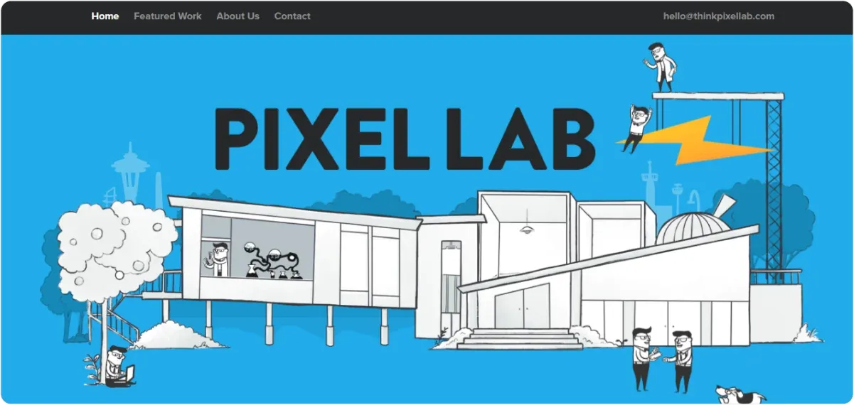
Pixel Lab has a minimalistic design but with a strong neon blue accent color that immediately draws your attention.
What’s more, a cartoon-like animated hero image perfectly captures Pixel Lab’s value proposition — to create simple, fun, and intuitive experiences.
This one-pager focuses on showcasing the company’s portfolio and work to strengthen the brand image.
Why We Chose It?
Pixel Lab cleverly uses slide images to feature their work and projects. In addition, it displays clients’ logos instead of testimonials.
It doesn’t display a CTA, but you can immediately get in touch via the Contact section on the floating navigation bar and an email address.
Besides featured work and the clients’ list, Pixel Lab’s About section is a prime example of how to provide valuable information about your brand to show its success.
3. Video Creator Course
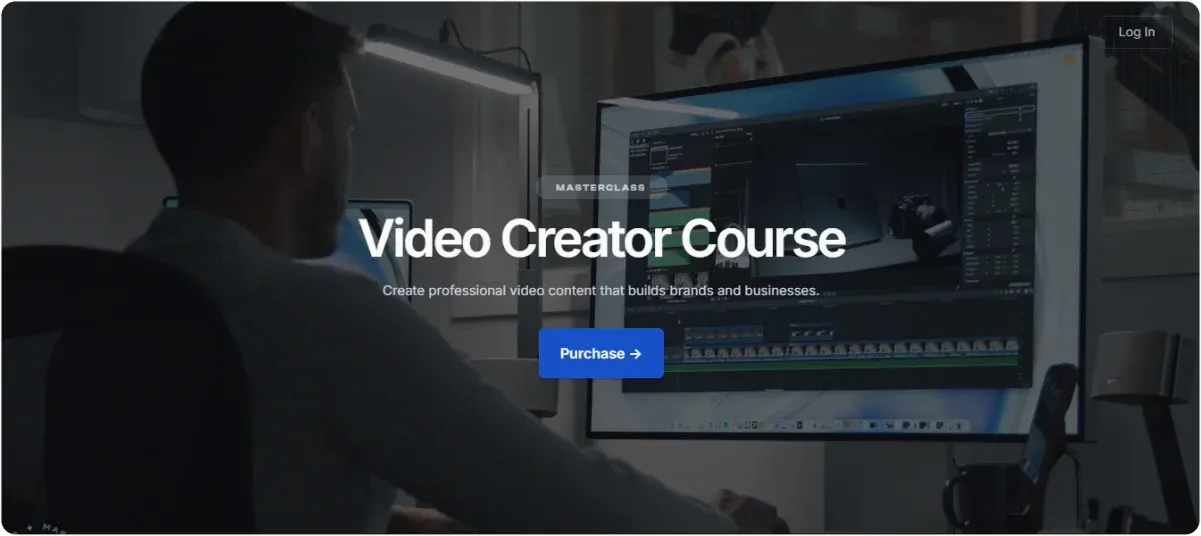
Video Creator Course’s website focuses on what it preaches - video creation. Hence, the main theme of the page is videos.
The colors are nicely aligned with a prominent and clear CTA button. When you scroll down, the layout remains consistently clean and informative, with the same color sets.
Why We Chose It?
In addition to having a great set of colors and layout, the website uses videos as their hero image to showcase the offer and the courses.
Moreover, videos complement the copy rather than overwhelm it.
Overall, visual elements should enhance understanding and engagement with the content, and the VCC’s site does precisely that.
4. Hourly
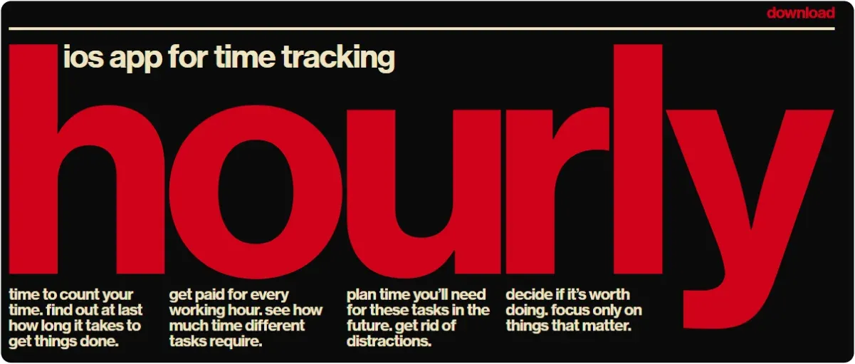
This one-pager isn’t for the faint of heart due to its bold colors and typography.
It has basic animation effects, with the color of the word hourly changing as you hover over it.
The website showcases how you can use bold colors as long as you don’t overdo it. It has the same 3-color pattern throughout the whole page.
Why We Chose It?
Hourly’s use of bold colors and large typography makes an impactful statement, highlighting the message of urgency — plan and track your time.
Furthermore, large typography makes the content quickly and immediately readable. Another interesting aspect is that the CTA button isn’t in the central part, but its’s still visible since it’s the only element on the page.
5. Robot Genius
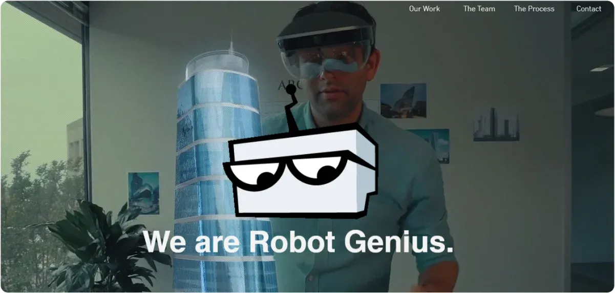
Robot Genius combines a visually striking design with a sleek and modern look.
A full-screen video that serves as a hero image with changing text not only immediately captures the attention but also shows the company’s work in an engaging way.
Thus, you instantly get the feeling of the brand and the line of work. It is emphasized even more with the portfolio section and the testimonial section with their clients' logos.
Why We Chose It?
Robot Genius masters the use of engaging visuals to communicate the brand’s message and focus on the services they provide.
The color palette is predominantly black, grey, and white, allowing the content and visuals to stand out and highlight the product.
In addition, the one-page structure is organized into clearly defined sections that guide you through the content seamlessly.
6. ATMOS
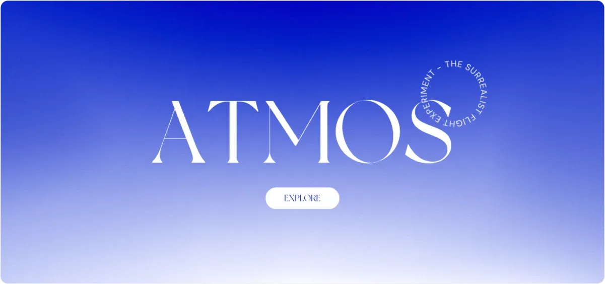
ATMOS showcases a unique, immersive design that effectively combines storytelling and interactive elements.
At first glance, it seems minimalistic, featuring a simple color palette and clean lines. However, this simplicity allows the 3D elements to take center stage without overwhelming you.
A virtual plane takes you on a journey, with each scroll taking you to the following information cloud.
Using dynamic text panels and cloud models adds depth to the storytelling aspect.
Why We Chose It?
The ATMOS website stands out for its innovative 3D design and engaging navigation techniques that create a captivating storytelling experience.
Combining minimalist aesthetics with interactive elements ensures you remain captivated while exploring the content.
7. Plastics Unlimited
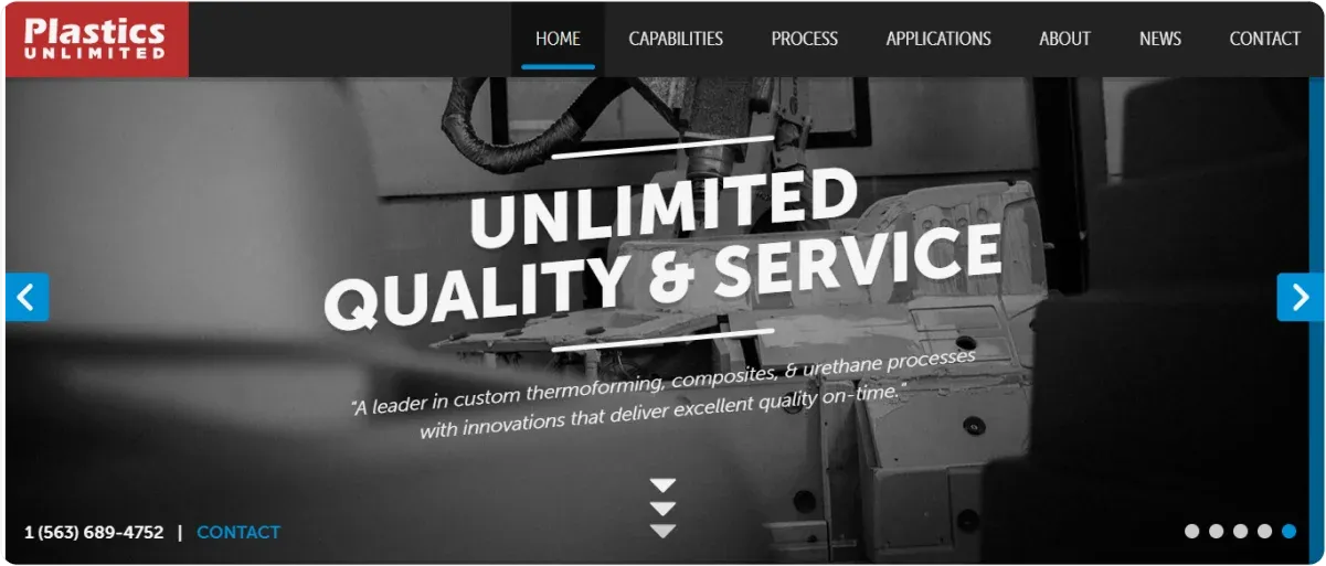
Plastics Unlimited’s website has a clean layout with a professional color palette, with dominant black and white.
It is a good choice of colors to highlight the industrial nature of the business.
In addition, it displays a clear visual hierarchy, using headings, subheadings, and bullet points to organize information effectively.
Regarding visual elements, the brand features high-quality images of products, processes, and real workers, which add credibility.
Why We Chose It?
The website incorporates interactive elements like accordions to display detailed information on capabilities and product applications.
It is a great feature to reduce clutter while allowing you to access more information without overwhelming you.
Moreover, you’ll see slide images, a great way to display multiple products and offers.
8. Andy Hooke
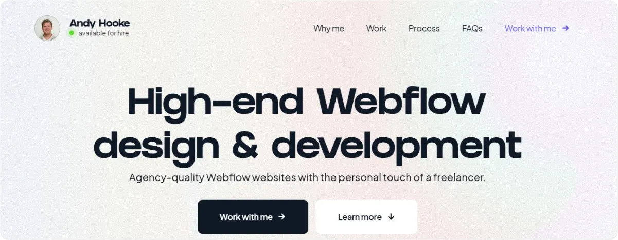
One-page websites often showcase a portfolio. Andy Hooke’s portfolio provides a neat and clean design, with a large heading and complementary colors throughout the page.
It immediately states the benefit you’ll get from working with Andy and has prominent CTAs.
Why We Chose It?
Andy’s portfolio resolved a common problem of one-page websites: How to provide information and more details without “killing “ the space and making it too cluttered?
He used the FAQ section to lay out his work, solutions, pricing, etc. Another great thing is that you can access it directly from the upper navigation bar.
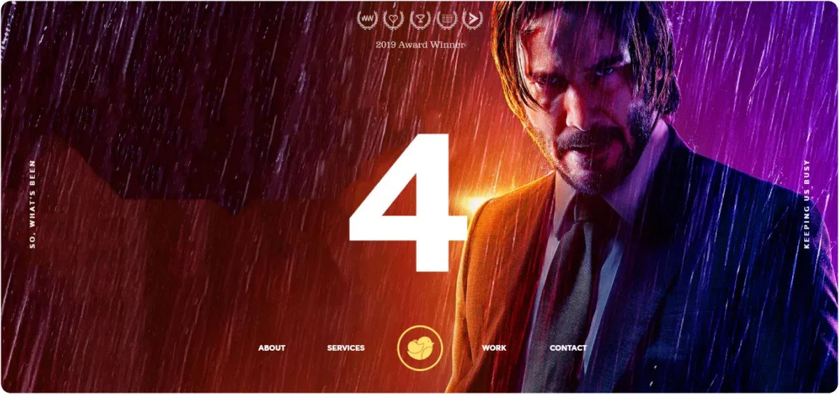
9. Weinbau Strenger
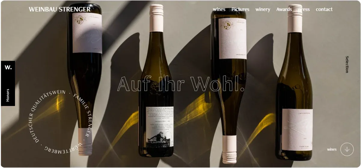
Weinbau Strenger’s website features beautiful, high-quality imagery of different wine types and the region in which the family makes them.
The whole website emphasizes the family tradition and provides insights into how it all started.
Thus, it brings a more human touch to the website and has a more emotional appeal.
Why We Chose It?
Besides a warm family story and great visuals, the website uses interesting navigation elements, such as circles and parallax scrolling.
But what really stands out is that instead of the testimonial section, you have the list of:
- Awards,
- Press mentions, and
- Honors, which you can access directly from the navigation bar.
10. Allies
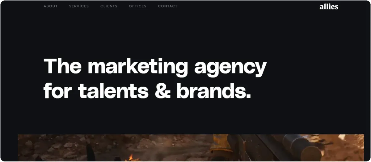
The black-and-white color combo can rarely go wrong.
Although the main colors are black and white, the background consists of vivid and vibrant video-like imagery, adding dynamics to the whole page.
It also has engaging navigation with a parallax scroll and anchor links.
Why We Chose It?
Allies offers great navigation options, helping you seamlessly transition from one section to another.
In addition, Allies has an interesting way of presenting testimonials.
Instead of traditional client testimonials, they provided logos of their clients, thus saving space.
11. The Rafael
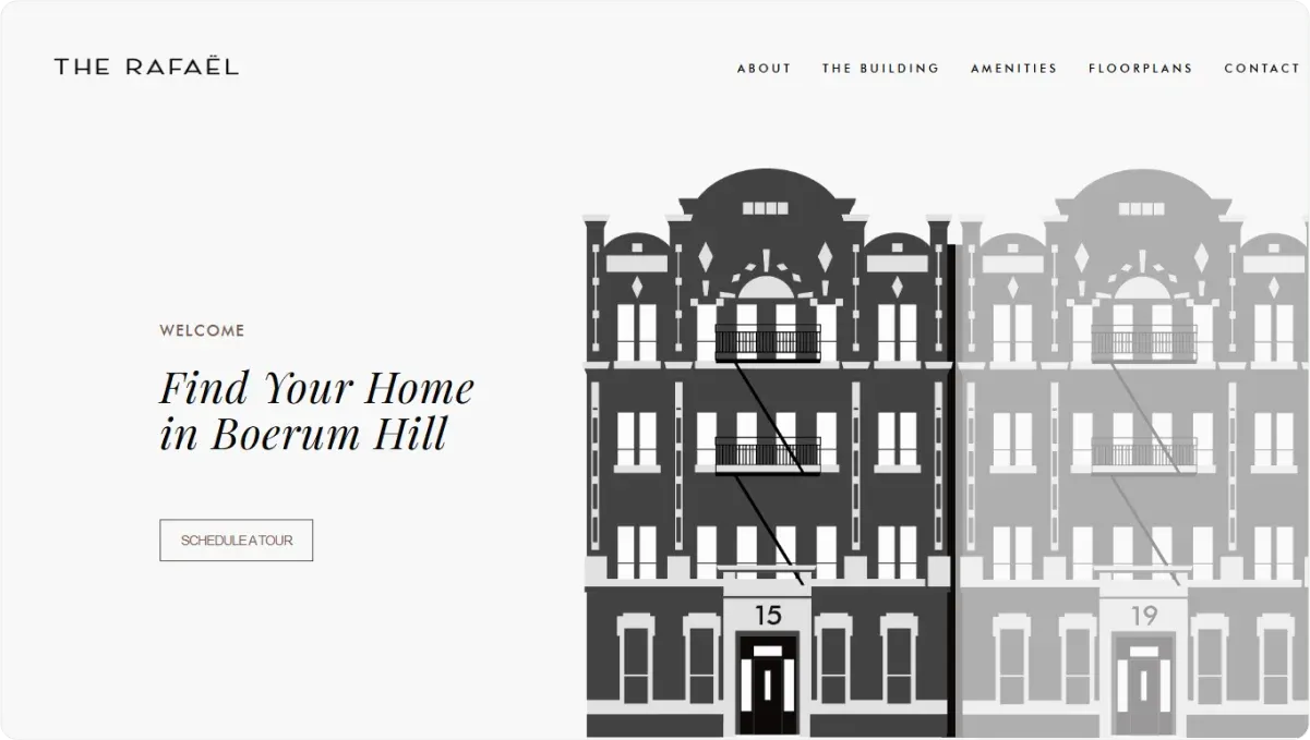
The Rafael is yet another one-page website that uses grayish, black, and white combo effectively.
It has basic interactive elements with the hero images of buildings “lighting up” when you hover over them.
The navigation is smooth and easy with non-prominent but still obvious CTA.
Why We Chose It?
The Rafael is an excellent example of a website that doesn’t need special or dynamic effects to be engaging.
It revolves around the product and includes important product info in a digestible way.
Its greatest strength is a beautiful, clean layout with a comprehensive organization into relevant sections, highlighting the product’s value.
12. Upstate Laundromat
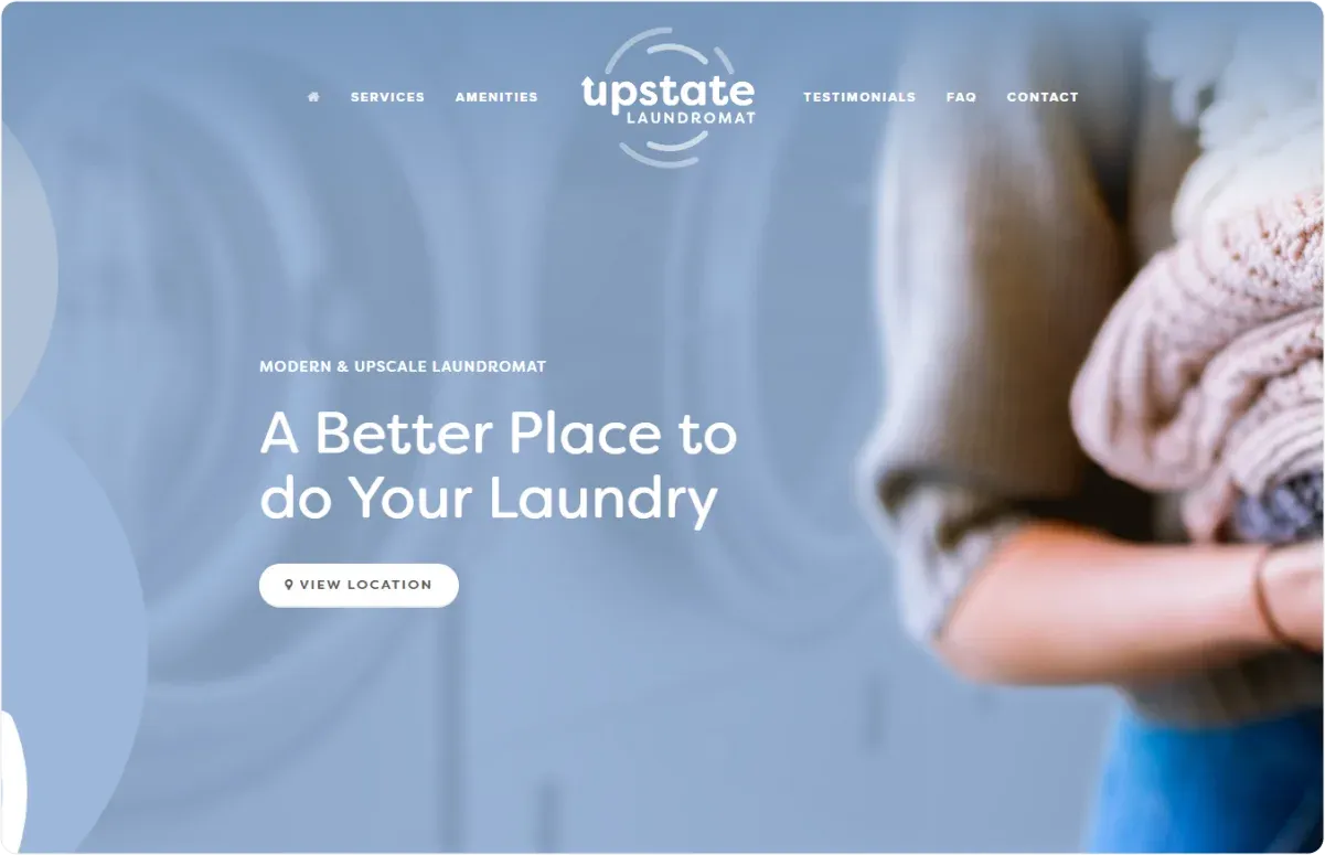
The website’s clever use of bluish, whitish, and pinkish hues emphasizes the feeling of cleanliness, softness, and freshness, the core attributes of this business type.
The colors complement its clean design and match the brand and logo.
The CTA button leads you to an easy-to-navigate map to check the location.
Why We Chose It?
Despite its minimalistic design, the website provides all the key info about its services via the navigation bar with amenities, FAQs, and testimonials.
We’ve already mentioned the benefits of including the FAQ section in your one-pager. Upstate Laundromat has a toggle display of the section, allowing you to expand or collapse the answers.
Thus, in addition to space-saving, it also offers a more dynamic approach.
13. Musab Hassan
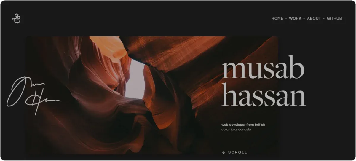
Musab Hassan's portfolio is all about a sophisticated look and elegant design. It has a clean layout and good organization, with 4 easily accessible sections via the navigation bar.
It also has parallax effects, as well as navigational circles instead of classic arrows, making it more engaging.
Why We Chose It?
The personal touch makes this portfolio stand out — Musab’s signature across the hero image and also at the bottom of the page.
Also, the portfolio provides his work selection and awards, and the ways you can get in touch.
Although having a CTA immediately visible is a common practice, Musab let his portfolio and work do the trick.
14. Anyone Events
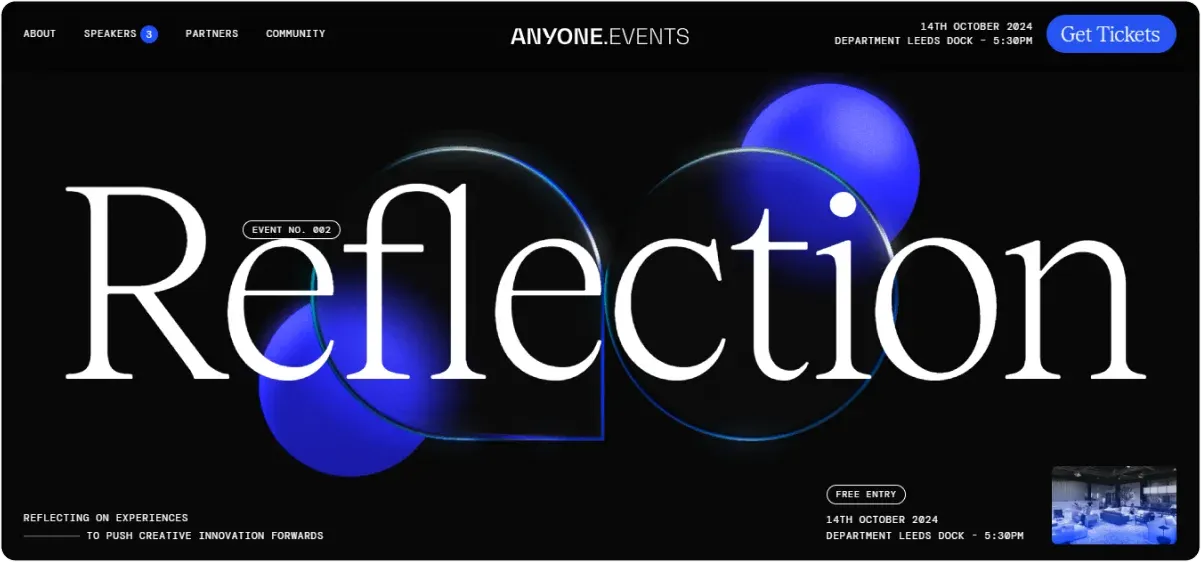
Besides landing pages and portfolios, one-page websites are great for announcing campaigns and events.
The Anyone Events website comprises amazing navigation and engagement tools, from parallax zoom scrolling to great hovering options.
A clever use of contrasting blue and transparent bluish hues against the black background creates an image of water drops, mirroring reflection.
Why We Chose It?
Anyone Events hooked us with engaging tools that made the page dynamic and “scrollable.”
The CTA button in the top right corner is visible without disrupting the hero image layout.
In addition, the sticky navigation bar saves you from having to scroll back to the top of the page when you want to navigate to a different section quickly.
15. Cleverbird
Like Robot Genius, you get an idea about the brand’s value and products the moment you land on Cleverbird’s website.
It uses slide images as the hero images, showcasing their latest projects.
An interesting detail is that the navigation bar with clearly defined sections and a logo is underneath the hero image while the awards section is on the top.
Nonetheless, the navigation bar floats when you scroll down, enabling you to switch sections easily.
Why We Chose It?
The whole page is vibrant and lively, and it has an unusual way of placing its CTA — At the end of a page.
The site guides you through their work portfolio, which also serves as testimonials.
Moreover, certain sections have a toggle display to save space, so you can expand or collapse the sections
One-page Website Examples: Key Takeaways
The above one-page website examples should provide more than enough inspiration to get you started with your own website creation.
By thinking about your target audience and cleverly incorporating design elements and colors, you can turn your website into a converting “machine.”
Website templates can be a good starting point if you are a novice, but they rely on overtly used generic stock images, making it harder to stand out.
Luckily, there is an alternative that can help you avoid this pitfall and easily create compelling websites fully tailored to your audience and needs.
Enter, Codesi!
How Can Codesi Help You Create Converting One-Page Websites?
Codesi is an AI-powered one-page website generator that enables you to create compelling landing pages from scratch with zero coding skills.
✨ What makes Codesi special is that you can create a fully functional website in under 10 minutes.
You just need to enter your text prompt and business description, and our AI tool will handle the rest: the copy, page structure, development, design, and other elements.
All the elements are customizable, so you can change the layout, rearrange elements, choose and delete blocks, apply color changes, etc.
✨ In addition, you can quickly convert text inputs into unique and personalized visuals in the same way and create images that meet your brand requirements.
✨ To seal the deal and make your brand recognizable, our AI Logo generator will turn your text input into a tailored, customizable logo.
Thus, you can edit colors, fonts, slogans, and brand names and get a pack of 4 logos, each with 3 variations:
- With text and slogan on the right side,
- Text and slogan on the bottom, and
- Without text and slogan.
Besides robust creation options, Codesi allows you to connect Yandex and Google Analytics to track traffic and conversions to your landing page.
This way, you can get important insights for improved future strategies.
Curious to take Codesi for a test drive?
Start with Codesi for free and create one-page websites that tell your brand’s story in a single scroll.
Create your website with AI today
Codesi is a platform where you can make a website in 3 minutes.
No coding, no designers, no hassle - just AI.
