Back to blog
The Landing Page Structure Anatomy Elements [+Examples]
Discover the essential elements of a high-converting landing page, how they work together, and see real examples to optimize your design.
Mar 10 2025
![The Landing Page Structure Anatomy Elements [+Examples]](https://codesi.ai/admin/static/Cover_a07de3267f.webp)
A well-structured landing page is essential for converting mere visitors into customers.
But it isn’t just about having any landing page, but about crafting one that strategically guides visitors and encourages action.
Thus, understanding the key elements of an effective landing page and their connection is crucial to maximizing your online presence.
Read on, and we’ll show you how to create and polish a landing page structure that truly converts.
Let’s dive in!
Why a Well-Designed Landing Page Matters
Landing pages are a vital tool to help you boost your online business presence and conversion rates.
Since they are usually designed with one goal, landing pages convert visitors into leads or customers more effectively than general web pages.
Additional benefits include:
- Enhanced user experience — By offering concise and relevant content, landing pages enhance user satisfaction and encourage repeat visits.
- Brand Building and Credibility — Professionally designed landing pages with your logo, brand colors, and consistent look across all the channels help build trust and credibility among potential customers, which are essential for successful conversions.
- A/B Testing Opportunities — You can conduct A/B testing easily, providing insights into what works best for different audience segments.
The Landing Page Structure: 7 Key Elements to Boost Conversions
Although the look of the landing page may differ depending on the type of business, there are certain key elements you should consider if you want to create a high-converting landing page.
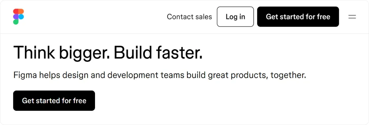
1. Header
The header appears at the top of your landing page, setting the tone for the entire page.
It usually contains your brand logo which not only helps in brand recognition but also reinforces your overall branding strategy.
In addition, using strategic colors and fonts in the header can enhance visual appeal and your brand identity.
Headers can also include minimal navigation elements.
However, limit those elements to prevent overwhelming visitors and maintain their focus on the main content.
The navigation should be intuitive and streamlined, guiding visitors seamlessly through your page without causing distraction.
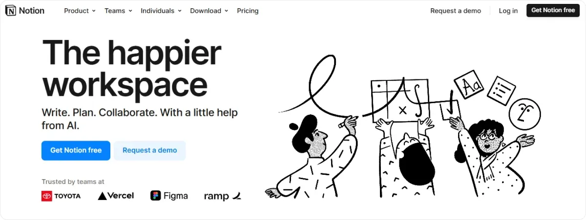
2. Hero Section
The hero section contains multiple elements:
- Headline: Clearly communicates your unique value proposition.
- Description: Briefly summarizes benefits.
- Imagery/Video: Captures attention and supports your message.
Let’s check these elements in more detail.
2.1. Headline
The headline is where you can clearly communicate your unique value proposition — a concise statement outlining what distinguishes your product, service, or brand from competitors.
It not only grabs your visitors’ attention but also resonates with your target audience by addressing their needs or problems.
The headline usually displays a larger font than the rest of your copy to make it more prominent and attract attention immediately.
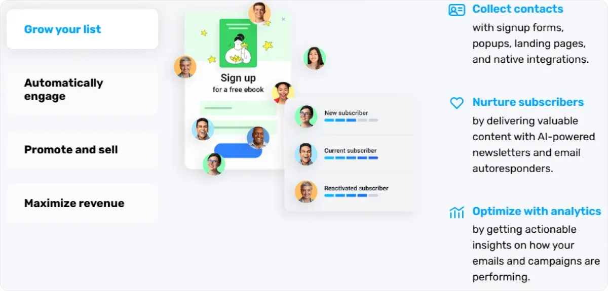
2.2. Benefits
You should save the spot underneath the headline for benefits that show how your product or service can solve your audience’s problems.
It’s great to combine them with their respective features, providing a full scope of your product's capabilities.
2.3. Imagery/Video
The so-called hero image is probably the first visual element your audience will see, so it needs to be captivating.
But it isn’t just about a high-quality image. The visual needs to align with your offer and make sense.
Of course, showcasing your product in action would be best, but if you promote your services and not products, this task is slightly more challenging.
Nonetheless, you can opt for an image that:
- Displays the benefits of using your service,
- Shows statistics graphs, or
- Evokes emotional responses, such as trust, confidence, happiness, etc., related to your service.
3. Copy
Headlines, benefits, and features already form a part of your main copy.
You can, of course, include subheadlines or other additional info you find relevant, but when doing so, bear the following things in mind:
- Write in a conversational tone, using a friendly, approachable voice that resonates with your audience. You should avoid jargon and complicated language.
- Break up large blocks of text with bullet points to make your copy more digestible. Highlight key benefits, features, and selling points in a concise format.
- Keep it concise. Your copy should be informative but not overwhelming. Eliminate unnecessary words and focus on delivering your message as precisely as possible without fluff.
Once your landing page is live, experiment with different headlines, CTAs, and copy variations to see what resonates best with your audience.
You can leverage analytics to track performance and make data-driven decisions.
💡ProTip:
Besides helping you build fully-tailored websites in under 10 minutes with its robust AI capabilities, Codesi enables you to connect Google Analytics to track traffic and conversions to your landing page.
Thus, you can refine your future strategies and make well-informed decisions.
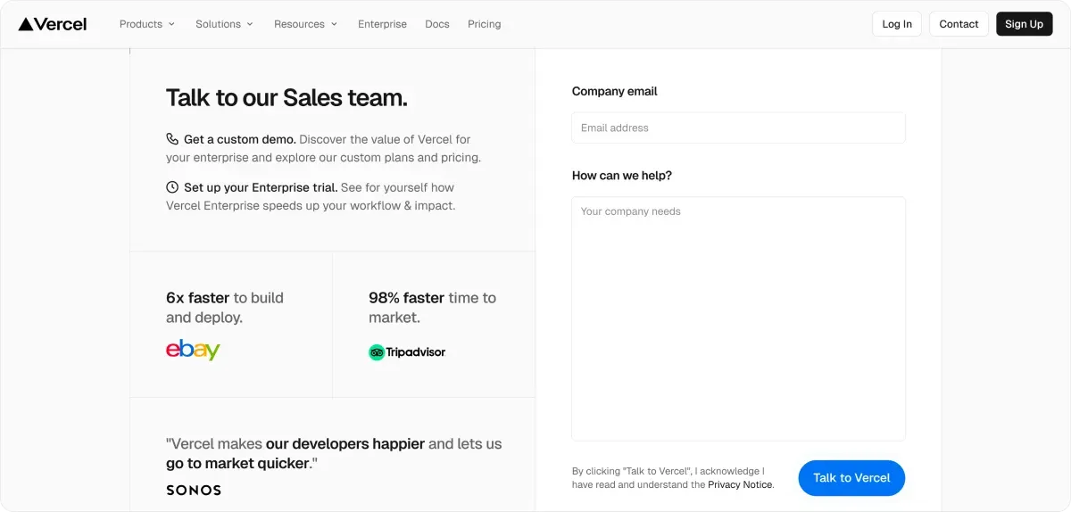
4. CTA Elements
Since the sole aim of a landing page is conversion, it goes without saying that the CTA elements are one of the most important parts of your landing page.
They should be clear, compelling, and action-oriented.
A rule of thumb is to have a single CTA in the header section, but you can include more than one CTA throughout the page and in the footer.
Additional effective places to place your CTA button are:
- Above the fold so it's immediately visible without scrolling.
- Close to relevant content or after you’ve explained the benefits.
- At the end of each section, if you have a longer landing page. This way, visitors who scroll through content can always see the CTA.
- After customer testimonials or social proof elements.
- In hero sections with visuals.
Key Characteristics of Effective CTA Buttons
- Clear and Direct Language: CTAs should use strong action verbs like "Sign Up," "Buy Now," or "Download Now" to communicate the desired action clearly.
- Prominent Placement: CTA buttons are often placed in visible areas of the webpage, such as at the top of landing pages or after compelling content.
- Visual Appeal: They are typically larger and more colorful than other buttons on the page to draw attention.
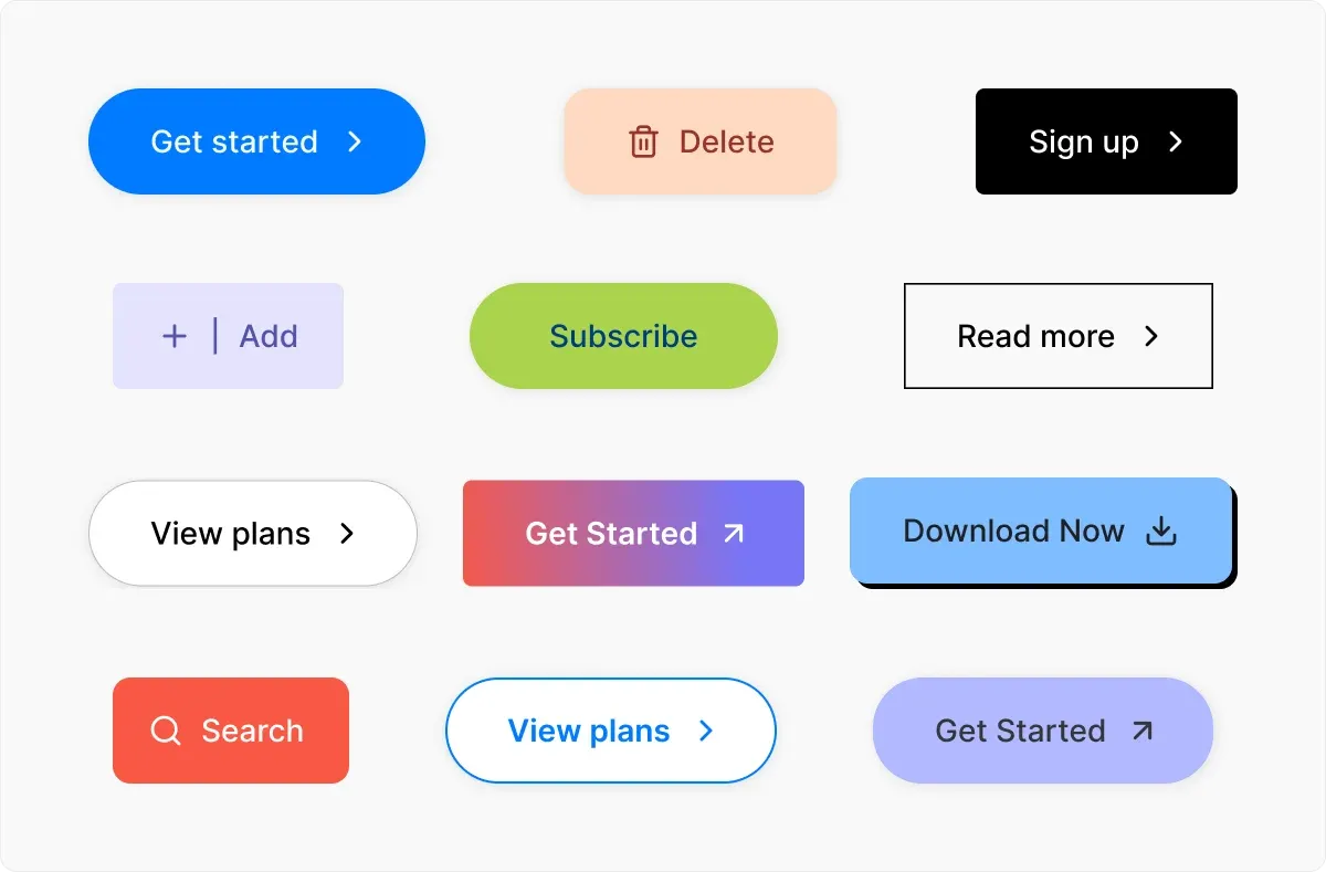
- Sense of Urgency: Adding words like "Now" or “Today” can create urgency and encourage immediate action.
- Personalization: Using first-person language can increase engagement by making the interaction feel more personal since you craft CTAs from the user's perspective. A small change of “my” instead of “your” puts a user in charge. For example, “Start my free 30-day trial” instead of “Start your 30-day free trial,” or “I want it!” instead of “Get it here” makes visitors feel it’s their decision.
5. Lead Forms
If you want your visitors to:
- Access a product or service demo,
- Contact sales or
- Send an inquiry, you should implement lead forms or signup forms on your landing page.
These forms help you collect valuable information from potential customers, enabling you to build a database of leads and understand your target audience better.
Before you begin designing your lead form, it’s essential to have a deep understanding of your target audience.
Consider what information they would be willing to share in exchange for what you’re offering, whether it’s a free e-book, a newsletter subscription, or exclusive discounts.
Tailoring your form fields to meet the preferences and needs of your audience can significantly boost your conversion rates.
Creating effective lead forms for landing pages involves several key strategies to maximize conversions:
Minimize Fields — Only ask for essential information such as name, email address, and possibly one other critical piece of data relevant to your campaign. Too many fields can discourage users from completing the form.
Optimize Form Layout — Use clear headings and concise labels and ensure fields are easy to fill out on both desktop and mobile devices.
Use Strategic Placement — Position the form prominently on your landing page where it is easily visible without being intrusive.
Enhance Trust with Privacy Assurance — If you need sensitive personal data, include privacy statements or assurances near the form to boost trust and conversion rates.
6. Social Proof
Social proof is pivotal for increasing trust and credibility on landing pages. It can take many forms:
- Customer testimonials
- User reviews
- Ratings,
- Endorsements and case studies.
When visitors encounter real-life accounts from satisfied customers, they are more likely to feel reassured about buying your product.
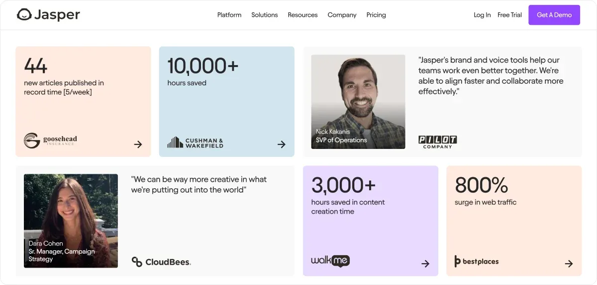
You can easily integrate user reviews through platforms like Google, Yelp, or Trustpilot to provide an authentic overview of the experiences of previous customers.
Furthermore, showcasing the number of reviews can also enhance credibility.
For example, a product with over a thousand positive reviews often seems more reliable than one with just a handful, even if both have similar ratings.
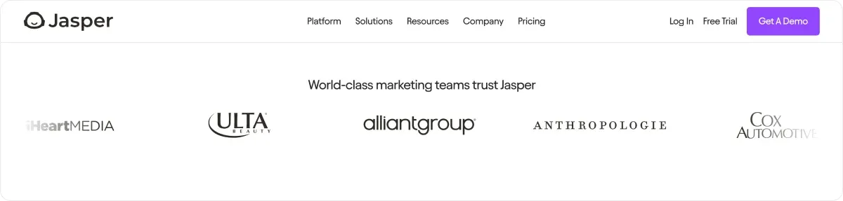
Also, when respected figures in a particular niche vouch for a product or service, it can dramatically shift customers’ perception.
Thus, you can display badges, quotes, or logos prominently on the landing page.
Implementing real-time statistics or using metrics to highlight the number of active users or purchases can create urgency and a sense of belonging among potential customers.
For instance, showcasing that “1,500 people joined in the last month” can motivate visitors to act quickly, fearing they might miss out on a popular trend or offer.
7. Footer
The footer is often overlooked, yet it plays a critical role in enhancing user experience
Same as the header, it should be concise and include necessary information, such as:
- Privacy policy,
- Terms of Service,
- Contact information,
- Social media and navigation links to other relevant pages that aren’t in the navigation bar.
💡 Did You Know?
An FAQ section can significantly improve user experience on a landing page by addressing common customer concerns, enhancing trust, and streamlining information access.
This way, you send a message that you’re listening to your customer’s concerns and needs. In addition, you remove any additional doubts potential customers may have regarding your service or products, thus increasing the chance of purchase.
3 Best Examples of The Landing Page Structure to Get You Inspired
Example 1: A Great Use of Signup Form
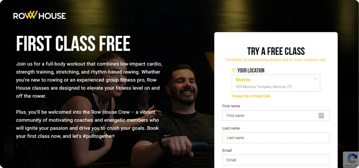
Row House landing page is a prime example of how simplicity can get you a long way.
- The copy may be longer, but it’s not overwhelming.
- The color contrast and sleek design emphasize the message and the image displays what the landing page is all about.
🔥 What we liked: How the signup form acts as a CTA simultaneously, and that the overall design is not cluttered but effective.
Example 2: Great Navigation Options

- A seemingly simple black-and-white design “calms” down all the vivid background images that add vibrancy and dynamics to the landing page.
- Furthermore, Allies showcases logos as their social proof, saving valuable space.
🔥 What we liked: Engaging navigation with a parallax scroll and anchor links, helping you seamlessly transition from one section to another.
Example 3: A Great Showcase of Benefits

- What immediately catches your attention are vibrant and “sunny” colors with high-quality, bright images that create a positive and welcoming vibe.
- Hello FRESH’s landing page also displays testimonials, but what really stands out is the list of benefits throughout the page.
🔥 What we liked: Each section provides benefits you’ll get if you buy the product, from time-saving over full flexibility in meal prep to healthier meals.
In addition, there are lots of special offers and a no-commitment plan, making it all even more appealing.
The Landing Page Structure: Key Takeaways
A successful landing page should include the above essential elements, regardless of your business type.
Many website builders offer user-friendly templates and drag-and-drop editors, perfect for beginners, but often use generic stock images, making it challenging to create genuine and scroll-stopping visuals.
Fortunately, there is a solution that not only helps you create unique visuals but also helps you with all the other design and structure elements.
Enter, Codesi!
How Can Codesi Help You Create Converting Landing Pages?
Codesi is an AI-powered landing page generator that enables you to create compelling landing pages from scratch with zero coding skills.
✨ Our stellar feature is that you can create a fully functional website in under 10 minutes by providing a text prompt and business description.
Our AI wizard will handle the rest:
- The copy,
- Page structure,
- Development,
- Design, and other elements.
What’s more, all the elements are customizable, enabling you to change the layout, rearrange elements, choose and delete blocks, apply color changes, etc.
✨ Since no landing page is complete without logos and visuals, we automate that process, too.
You can quickly convert text inputs into unique, personalized visuals and generate images specific to your audience and brand requirements.
✨ To make your header stand out and increase brand recognition, our AI Logo generator creates a pack of 4 logos, each with 3 variations:
- With text and slogan on the right side,
- Text and slogan on the bottom, and
- Without text and slogan.
Again, the creation is based on your text input, and all elements, such as colors, fonts, slogans, and brand names, are customizable
✨ Besides advanced creation options, you can connect Yandex and Google Analytics to track traffic and conversions to your landing page and refine your future strategies.
Enticed to give Codesi a go?
Start with Codesi for free and create a fully functional landing page to boost your brand and conversions.
Create your website with AI today
Codesi is a platform where you can make a website in 3 minutes.
No coding, no designers, no hassle - just AI.
