Back to blog
10 Landing Page Mistakes to Avoid in 2026
Discover the most common landing page mistakes to avoid and boost conversions by fixing UX, copy, and SEO errors for higher engagement and sales.
Feb 3 2025
The landing page is a critical bridge between potential customers and your business.
It is often the first point of interaction where visitors decide whether to explore further or click away.
Thus, even minor missteps can cost you valuable leads and conversions.
From generic images to vague CTAs, we’ll pinpoint these missteps and provide actionable insights to help you refine your landing pages.
Read on to check the most common 10 landing page mistakes and tips to avoid them.
Let’s dive in!
What is Landing Page Optimization?
Landing page optimization(LPO) is a set of activities to improve specific page elements to enhance performance and increase conversion rates.
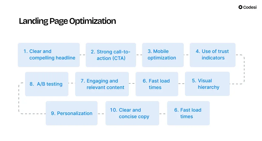
The main purpose of a landing page is to drive specific actions, such as signing up for a newsletter, making a purchase, or requesting more information.
Therefore, effective LPO aims to maximize the number of visitors who complete these desired actions while helping you achieve your revenue goals.
10 Landing Page Mistakes You Should Pay Attention To
1. Neglecting Above-the-Fold Content
Above-the-fold content is the part of a web page you see before scrolling down.
One of the most frequent mistakes is cramming too much information into the above-the-fold area.
This can overwhelm visitors and create a cluttered appearance, making it difficult for them to focus on your value proposition or call-to-action.
Furthermore, using vague or unclear language can confuse visitors about what you offer.
If users can’t immediately understand the purpose of your landing page or the benefits of your product, they are likely to leave quickly.
Not placing a prominent CTA above the fold is another critical error, but we’ll talk about it more in detail shortly.
🔧 How to Solve It?
Prioritize essential information that clearly conveys your value proposition and ensure that your messaging is direct, highlighting the proposition.
1. Moreover, CTA should be visually distinct so visitors can immediately see what action you want them to take.
2. Another good element to include here is trust elements such as genuine testimonials, reviews, or security badges to create a sense of credibility.
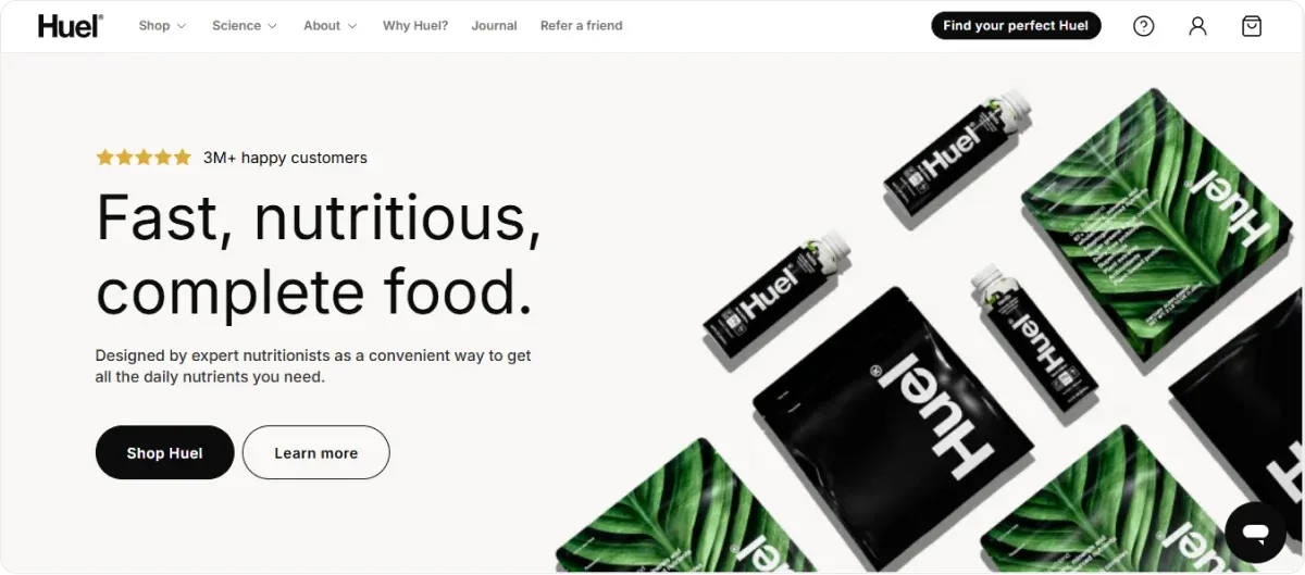
Check the landing page below — It ticks all the boxes.
But it's not all about textual elements.
3. Don’t neglect visual appeal. Use engaging visuals or high-quality images to complement the text and help convey your message quickly.
Note: Did you know that with Codesi’s AI text-to-image tool, you can generate images and visuals based on your input in a matter of minutes?
As a result, you’ll avoid the common pitfall of overtly generic visuals but be able to use highly customized visuals that align with your brand and target audience instead.
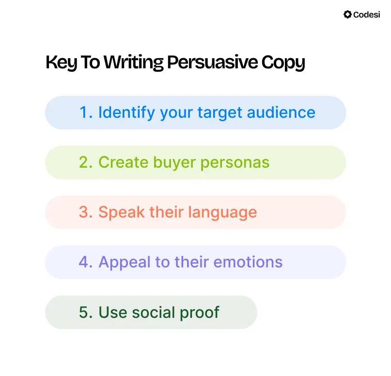
2. Creating a Generic Copy
Same as with visual elements, being too generic can’t yield results.
It is easy to fall into that trap if you are a newbie, thinking you’ll appeal to more potential customers by being generic or broad.
In reality, you won’t because you’ll lack the essential ingredient — Addressing pain points that customers can recognize and associate with.
If you are too generic, whose pain points are you solving, right?
🔧 How to Solve It?
You can easily avoid the above issue by being specific. You need to tailor your messaging to address specific audience needs and pain points.
Even more, it’s not enough to recognize those pain points, but it’s also important to write a copy in such a way that it provides solutions to those points.
In order to do so, try the following tips:
1. Instead of vague statements like "improves efficiency," provide concrete examples such as "cut your project time in half" or "increase sales by 20% in three months."
Naturally, it is implied that you state only what your product or service can actually deliver.
2. Write in an active voice to make your copy more direct and engaging. "The benefits of our product are numerous," vs. "Our product offers numerous benefits." Which one would make a bigger impact on you.
3. Repeat key benefits throughout the landing page to reinforce their importance in visitors' minds.
Consequently, even if users skim or zigzag through the content, they will remember the most significant advantages of your product.
4. Use customer-centric language that makes your copy more personal. Also, focus on benefits rather than features.
Instead of saying, "Our app has a built-in calendar," say, "Stay organized and never miss a deadline again."
💡 ProTip:
Our AI One-Page Website Generator allows you to create a one-page website with a feedback form in under 10 minutes.
You can make a landing page with a simple prompt while we take care of the majority of texts and illustrations.
It’s a great time saver because you don’t need to think about the page structure, development, design, etc. It’s all done for you.
In addition, you don’t need to write big text portions, and you’ll end with a unique output tailored to your taste.
3. Having Multiple CTAs
Bombarding visitors with numerous CTAs can lead to so-called decision paralysis and create the feeling of being overwhelmed.
Having multiple CTAs with different required actions can create confusion — what do you want your visitors to do?
🔧 How to Solve It?
This may be one of the easiest mistakes to fix — Stick to one CTA.
Of course, the first thing to do is identify what action you’d like your visitors to take so you can create a conversion-focused CTA.
1. It should be action-oriented words and not ambiguous or too technical. You want the visitors to know what to do.
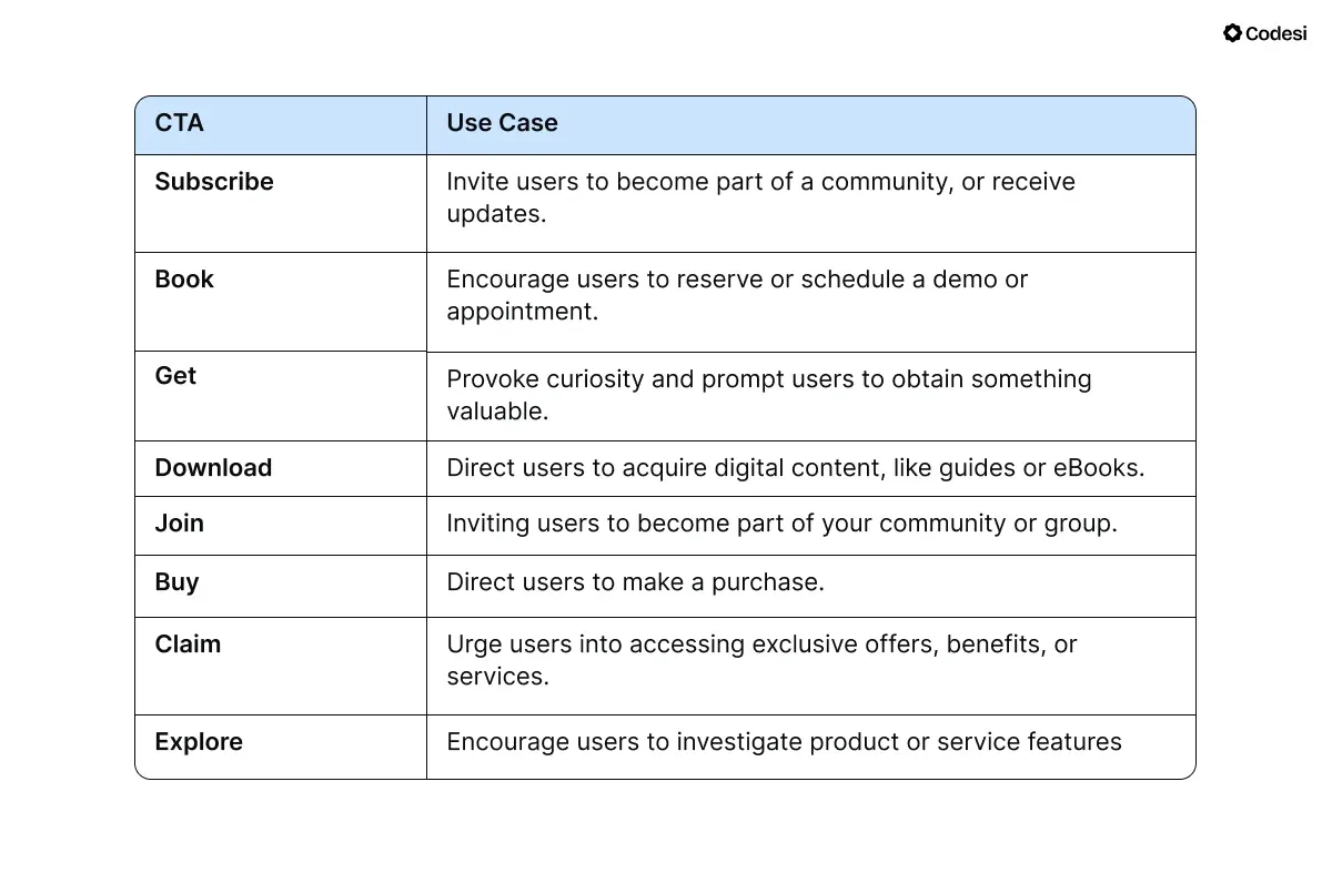
2. Action-oriented words, such as Buy, Subscribe, Get an Offer, etc., are more likely to propel visitors to take action.
3. Also, although Learn More is a CTA you’ll see often, it is vague and not action-oriented.
Note: In addition, the look of your CTA button also matters — Consider your brand’s color, hue, color contrast, etc.
4. Complicated Navigation
A well-structured navigation system can help reduce bounce rates by providing visitors with easy access to additional relevant content.
On the flip side, including navigation can also lead to distractions that detract from the primary goal of the landing page.
Including too many links, graphic elements, etc., makes your page overwhelming and can divert attention away from your main message or CTA.
🔧 How to Solve It?
If users find what they are looking for quickly and intuitively, they are less likely to leave the site immediately.
One way is to apply the visual hierarchy — the arrangement and presentation of elements to prioritize information and guide visitors’ attention.
You can:
1. Create negative space that keeps your landing page clutter-free and helps you build organized blocks of information.
2. Furthermore, you can strategically align and layout elements.
3. Did you know that placing important content in the top right corner can trigger natural reading patterns, as this area is often where visitors expect to find account information or CTAs?
4. You can use bright or bold colors to highlight key elements like CTAs or important messages, making them stand out against a more muted background.
💡 ProTip:
Codesi helps you create clean and clutter-free landing pages by providing a variety of customization options that enable you to:
- Choose which website blocks you want to see,
- Move and delete the ones you don’t want to use
- Pick the color and branding of the website
- Change the wording and images, etc., until you hit that sweet spot.
5. Poor Alignment with Ads
An aspect that often gets overlooked is the alignment between your ads and the landing page.
Poor alignment can lead to confusion and frustration for potential customers, ultimately resulting in a higher bounce rate and diminished conversion rates.
🔧 How to Solve It?
Customers like familiarity and to recognize the brand because it gives them a sense of security and trust.
Therefore, the elements of your ads, such as the language, tone, imagery, and overall aesthetics, must be consistent with what users encounter on your landing page.
If your advertisement boasts a vibrant, eye-catching image along with persuasive, engaging content, then the landing page must reflect this same energy and messaging.
6. Lacking Mobile Optimization
If you know that almost 80% of shoppers made purchases online, not having a responsive landing page can lead to high bounce rates.
It doesn’t mean you shouldn’t optimize it for other devices, but make sure it’s mobile-friendly, too.
🔧 How to Solve It?
Start designing your landing page with mobile users in mind.
1. A mobile-first approach ensures that the layout, content, and functionalities are optimized for smaller screens before adapting to larger desktop displays.
2. Minimize navigation options to reduce distractions and avoid complex menus and unnecessary links.
3. Opt for a single-column layout to ensure that content is easy to read and navigate on mobile devices.
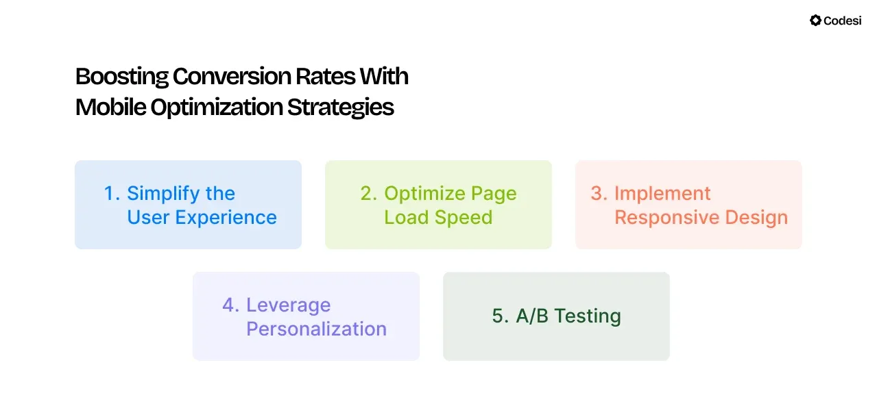
4. Use short paragraphs, bullet points, and subheadings to break up text and enhance readability.
Mobile users often skim content, so presenting information in digestible formats helps maintain their interest.
5. Optimize images and minimize code to ensure quick loading times, as slow pages can lead to high bounce rates.
7. Ignoring Page Load Speed
The average website load time is 2.5 seconds on a desktop. Thus, an optimum conversion rate should be between 0 and 4 seconds.
With every second increase in load times, conversion rates drop by 17%.
Actually, conversion rates drop by an average of 4.42% for each second of additional page load time.
A conclusion? Don’t ignore or overlook page load speed.
🔧 How to Solve It?
Some of the strategies you can apply to optimize load speed are to:
- Compress images and visuals and use the correct formats.
- Reduce the number of elements on your landing page
- Prioritize above-the-fold content and use lazy loading techniques to defer loading images and videos that are not immediately visible on the screen. As a result, the most important content will load first.
- If you have links, make sure they point directly to the final destination whenever possible.
- Analyze your landing page's performance regularly to get insights into load times and make necessary improvements.
8. Neglecting A/B Testing
Failing to test different versions of your landing page will affect optimization that leads to better conversions.
When you overlook A/B testing, you lose valuable insights into what resonates with your audience.
Each element of your landing page, from the headline and images to the call-to-action buttons and overall design, plays a pivotal role in guiding the user’s behavior.
Without thoughtful experimentation, you might rely on assumptions or outdated information, leading to decisions that aren’t data-driven.
This gap in your strategy can make your landing page less effective, as it may not align with the preferences and behaviors of your target audience.
🔧 How to Solve It?
1. Conduct A/B tests with personalized elements to identify what resonates best with different segments of your audience.
Common elements to test include:
- Headlines
- Call-to-action (CTA) buttons (text, color, size)
- Images or videos
- Layout and design
- Form fields (number and type).
2. Also, ensure that only one element differs between the two versions to assess its impact on performance accurately.
3. Run the test for a sufficient period to gather meaningful data and measure key metrics.
As a result, you’ll be able to refine your approach based on actual performance data.
9. Not Measuring Performance
Closely related to the previous mistake, not measuring performance can leave you in the dark.
Without tracking metrics like conversions and visitor behavior, it’s difficult to understand what works and what doesn’t on your landing page.
🔧 How to Solve It?
1. You should pay attention to relevant metrics, including:
- Conversion rates
- Click-through rates (CTR) on CTAs
- Bounce rates
- Average time spent on the page.
2. Metrics allow you to assess how well your landing page performs against your goals.
By tracking key metrics, you can determine if your page effectively converts visitors into leads or customers.
3. Furthermore, you’ll be able to pinpoint specific elements affecting performance, such as high bounce rates or low conversion rates.
💡 Codesi allows you to connect Yandex or Google Analytics and track traffic to your website but also conversions, gaining important insights for better marketing and strategy planning.
10. Lacking Social Proof
Visitors need reassurance before converting.
Providing testimonials, reviews, media features and partnerships, awards, case studies, etc., can help build the trust and credibility of your business and products or services.
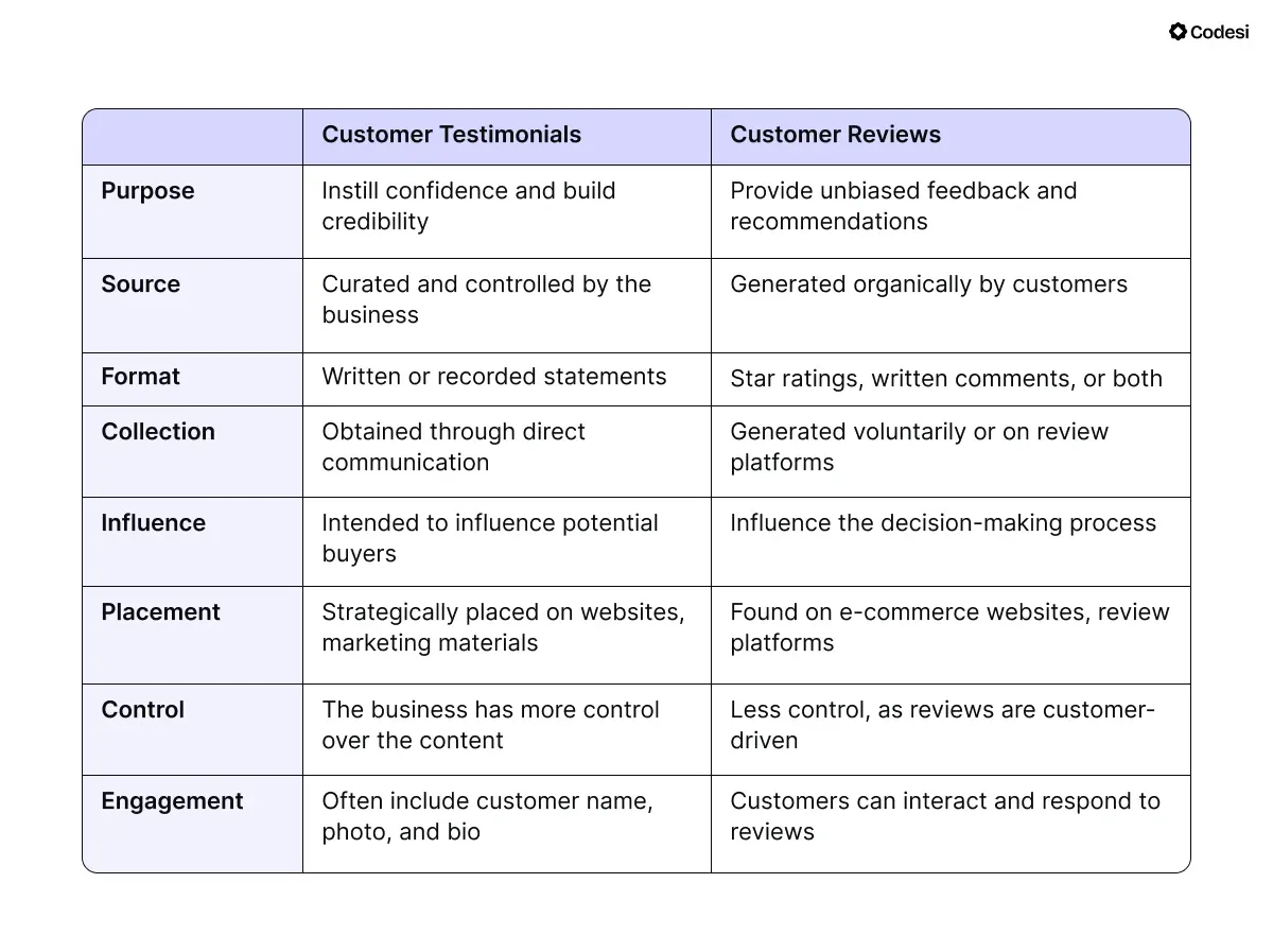
However, many businesses don’t include them or neglect visual elements like customer photos that add to credibility.
Another common mistake is to include only high-profile clients, which may not resonate with all potential clients.
Perhaps the most common mistake is to omit negative reviews or feedback, thinking it will hamper your online presence.
🔧 How to Solve It?
We guess the following goes without saying, but don’t use generic or fabricated testimonials.
Customers are savvy and can often detect insincerity. Here’s what to implement:
- Provide genuine testimonials from real users, ideally including their names, photos, and specific details about their experiences.
- Keep testimonials concise and focused on key benefits or outcomes. You can also highlight impactful quotes or use bullet points to make them more digestible.
- Showcase testimonials from different customer segments to appeal to multiple layers of your audience.
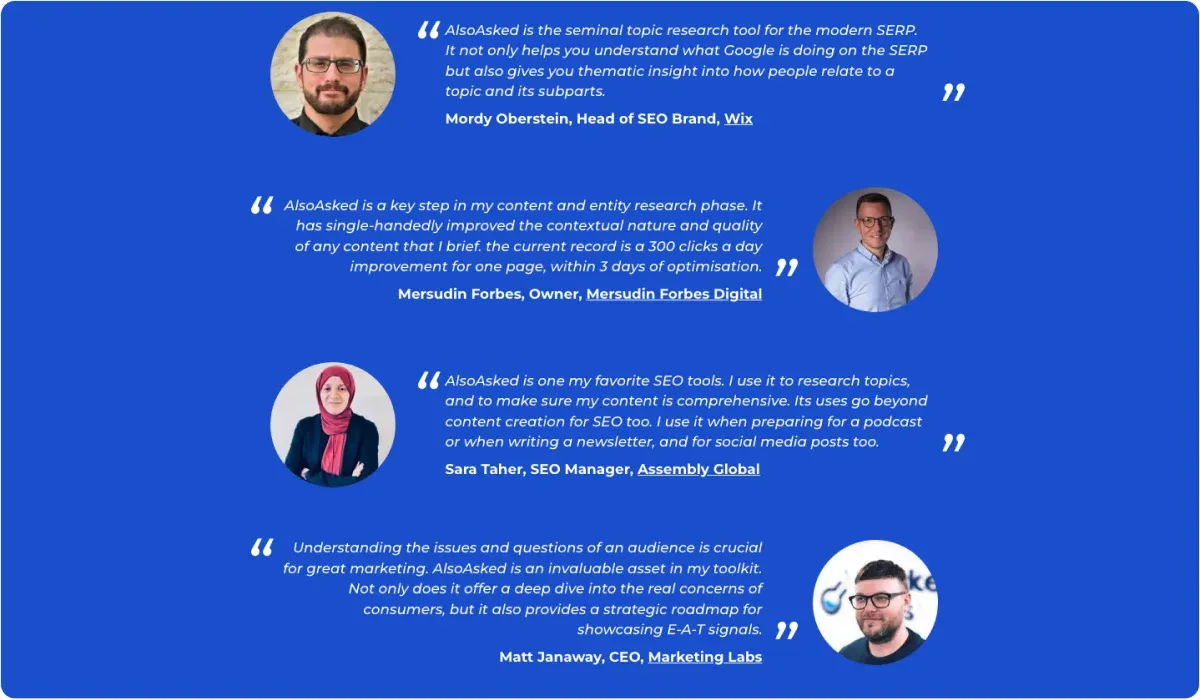
- Regularly update testimonials to ensure they accurately represent recent customer experiences and align with any changes in your offerings.
- While showcasing positive testimonials is important, ignoring negative feedback can backfire.
You’ll demonstrate your commitment to improvement and customer satisfaction by addressing criticism transparently.
Wrapping It Up
Our list of 10 landing page mistakes and tips to fix them should give you more than enough headstart and help you attract visitors and convert them into loyal customers.
To streamline your landing page creation even more, there is a highly customizable solution that combines speed with simplicity to generate landing pages that convert.
Enter, Codesi!
How Can Codesi Enhance Your Landing Page Creation?
Codesi is an AI-powered solution that enables you to create landing pages, logos, and images based on your prompts.
Our AI tool then converts them into personalized solutions tailored to your needs with minimal effort and investment on your side.
Thus, you:
🔥 Don’t need any coding or advanced design skills.
🔥 Can create websites within 10 minutes, including editing.
🔥 Can gain valuable insights into your landing page's performance and user behavior to identify improvement areas.
Ready to try Codesi?
Start with Codesi for free and create a landing page that not only captures attention but also drives measurable results.
Create your website with AI today
Codesi is a platform where you can make a website in 3 minutes.
No coding, no designers, no hassle - just AI.
