Back to blog
10 Landing Page Best Practices To Know About
Discover essential landing page best practices, how they work, and why they’re key to maximizing conversions and sales.
Feb 10 2025
Your landing page is often the first interaction potential customers have with your brand.
With mere seconds to capture attention, the design and content of your landing page can make or break your conversion rates.
Thus, understanding the key elements contributing to an effective landing page is a must.
Not sure where to start?
Check our list of 10 landing page best practices that not only attract visitors but also compel them to take action.
Let’s dive in!
What Are The Key Landing Page Elements?
Understanding the critical elements of a landing page can significantly boost its “performance” and effectiveness.
1. Unique Selling Proposition (USP)
The USP clearly communicates what sets your product or service apart from competitors. It answers the crucial question, "Why should I choose you?"
2. Engaging Hero Image
The hero image is often the first visual element your visitors see.
A compelling image can create an emotional connection and visually represent your services or products, making them more relatable and appealing.
3. Compelling Headline
A strong headline grabs attention and concisely conveys your offer's primary benefit. Furthermore, it sets the tone for the rest of the page and encourages visitors to read on, making it a critical element for engagement.
4. A Clear Call to Action (CTA)
The CTA directs visitors toward the desired action, whether signing up, purchasing, or downloading.
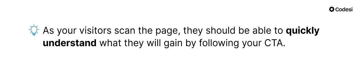
A well-designed CTA should stand out and clearly communicate what your visitors will gain by clicking it.
5. Social Proof
Including testimonials, reviews, or case studies builds trust and credibility with potential customers.
Social proof reassures visitors that others had positive experiences with your product or service.
6. Benefits and Features
Clearly outlining the benefits of your product or service helps visitors understand how it solves their problems or improves their situation.
While features describe what your product does, benefits explain why those features matter.
7. User-Friendly Layout
A clean, intuitive design enhances user experience by making navigation straightforward.
An organized layout guides visitors through the content seamlessly, reducing friction and increasing the chance of conversion.
Being aware of the landing page's key elements will also help you determine what practices you can leverage to boost conversion.
10 Landing Page Best Practices For Better Conversion
Creating effective landing pages is crucial for converting visitors into leads or customers. Knowing what aspects you should focus on can save you a lot of time and effort and help you create a compelling landing page much quicker.
1. Craft a Compelling Headline
The headline of your landing page serves as the first point of contact with your visitors, and it plays a crucial role in grabbing their attention.
It should immediately communicate the core value of your offer, enticing visitors to explore further.
It needs to be not only clear and concise but also engaging enough to spark curiosity and interest.
How to achieve that?
- Aim for impactful language that resonates with your target audience. Thus, use strong action verbs and relevant keywords that highlight the benefits they will receive.
- For example, instead of a generic headline like “Welcome to XYZ,” consider something more specific and benefit-driven, like “Unlock Seamless Productivity with Our All-in-One Marketing Solution.” Not only does the second option state what you offer, but it also hints at the improvement they can expect.
- Furthermore, taking the time to understand your audience’s pain points and needs will allow you to craft a headline that speaks directly to their needs.
- A/B testing different headline variations can help you identify which resonates best with your audience.
💡 ProTip:
In addition to the headline, it’s a good idea to incorporate a subheadline that offers more context or detail about the offer, product, or service.
You can use it to reinforce the value proposition further and provide a seamless transition into the page's main content.
Codesi, an AI landing page builder, allows you to fully customize and tailor all your landing page elements.
Having your target audience in mind, you can prompt the tool to generate a personalized headline, subheadline, or any other element.
Therefore, you don’t have to create large portions of text or visuals or worry about page structure, development, design, etc. — we’ll do it all for you.
2. Use Relevant Visuals
Choose images that illustrate your offer, resonate emotionally with visitors, and convey the benefits of your product or service.
To make your landing page hero image and other visuals more engaging, you should:
- Use images that evoke positive emotions and take into account how the image can trigger the desired action from visitors.
- Opt for original, high-quality images that reflect your brand’s values and resonate with your audience.
- Ensure your hero image aligns closely with the message or theme of your landing page and supports your value proposition.
- Use subtle animations or video backgrounds to create a dynamic experience, making the landing page feel more lively.
- However, don’t “burden” your page with too many video elements or GIFs since they will significantly affect loading time.
- Regarding hero images, use whitespace around them to balance the design and make the text and CTA stand out more prominently.
💡 ProTip:
Did you know that with our AI Image Generator, you can quickly convert text inputs into unique and personalized visuals?
Therefore, it gives you the power to create images that meet your brand requirements, making it simple to produce customized visuals.
3. Choose The Right Color Palette
Choosing the right color palette for your landing page is essential to help your audience instantly associate and recognize your brand.
As a general rule, you should opt for your brand colors or colors that you already have in your logo or across social media platforms or ad campaigns.
What other color design hacks can you implement?
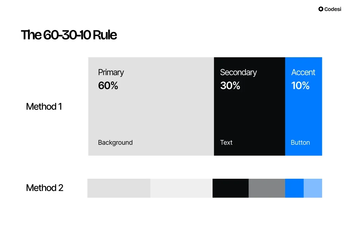
1. Use the 60-30-10 Rule:
- 60%: Dominant color (background)
- 30%: Secondary color (base elements like headers)
- 10%: Accent color (call-to-action buttons) to ensure visual harmony.
2. Choose Complementary Colors — Use colors opposite each other on the color wheel for a vibrant look that makes elements stand out.
This method is particularly effective for CTA buttons, which should grab attention without overwhelming your visitors.
3. Experiment with Monochromatic Schemes — Use different shades and tints of a single color for a clean, elegant design.
However, make sure there is enough contrast for key elements to stand out.
4. Keep It Simple — Limit your palette to two or three primary colors to avoid overwhelming visitors.
A simpler scheme is often more appealing and easier for your visitors to navigate.
💡 ProTip:
Many landing page builders offer logo templates, which help you quickly create logos without advanced design skills.
However, on the downside, this makes it harder to stand out due to more limited template numbers or similar images.
With Codesi’s AI Logo Generator, you can avoid this pitfall by providing a text prompt that our tool will turn into a tailored, more unique logo.
Another perk is that you can edit colors, fonts, as well as slogans, and brand names.
As a result, you’ll end up with a pack of 4 logos, each with 3 variations:
- With text and slogan on the right side,
- Text and slogan on the bottom, and
- Without text and slogan.
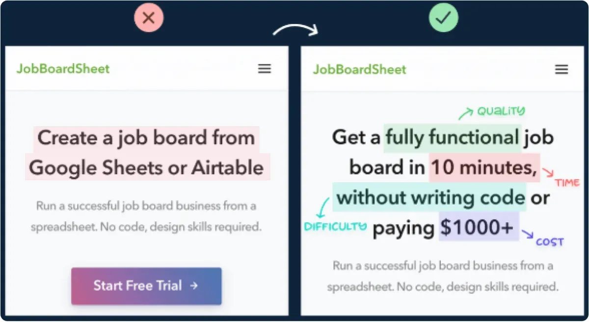
4. Include a Single, Clear Call to Action (CTA)
Your landing page should focus on one primary action you want visitors to take.
Thus, make sure that the CTA is prominent and appears above the fold, making it easy for users to find and engage with it.
If possible, think about the biggest objections visitors may have to clicking on your CTA and provide a “solution” in your CTA.
For example, “I bet they’ll ask for my credit card,” or “It is probably too expensive,” etc.
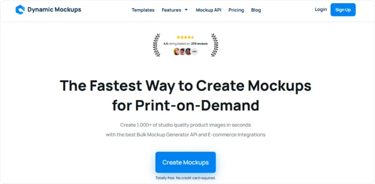
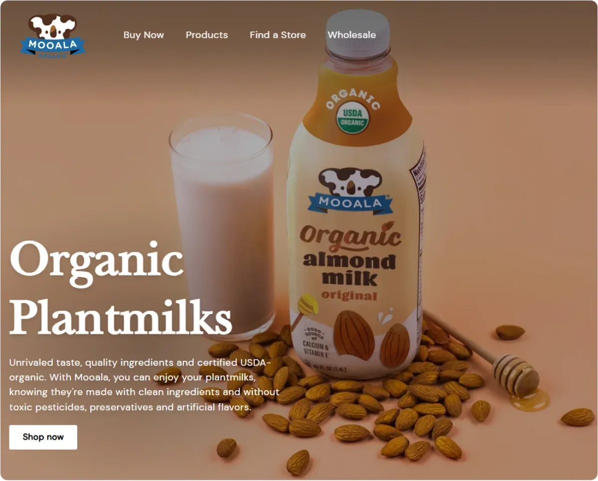
Check the example below to see how they handled possible objections in the CTA.
Consider using contrasting colors and bold fonts to make your CTA stand out and use action-oriented or inviting words and phrases, such as:
- Get Started Now,
- Claim Your Free Trial,
- Try It Risk-Free,
- Claim Your Spot,
- Start Your Free Trial, etc.
You can also use urgency-inducing phrases, such as:
- Limited Time Offer – Act Fast!
- Don’t Miss Out – Sign Up Today!
- Only a Few Left – Grab Yours Now!
- Last Chance to Save!
- Offer Ends Soon – Get It Now!
Depending on your line of business, you can also leverage eCommerce Specific Phrases:
- Add to Cart Now!
- Buy Now and Save!
- Shop the Collection!
📌 Extra Tip:
Beyond placement and design, it’s crucial to align your CTA with your landing page's overall message and purpose.
Ensure that the surrounding content provides clear and compelling reasons for visitors to take the desired action.
You can achieve that with persuasive copy, testimonials, and benefits-oriented messaging that addresses your target audience's needs and pain points.
Why not reinforce its importance by incorporating additional elements such as arrows or buttons pointing towards the CTA and social proof like reviews or trust badges?

We’ll talk about these elements in more detail shortly.
5. Remove Navigation and Distractions
One of the most effective strategies for optimizing your landing page for conversions is removing potential distractions that could divert attention from your primary CTA.
A landing page flooded with links, navigation menus, or unnecessary content can easily overwhelm visitors and lead to decision fatigue.
As a result, it decreases the chance of them taking your desired action.
To avoid this, you can:
- Eliminate navigation bars that lead away from the landing page.
- Apply adequate spacing to prevent your landing page from feeling cluttered.
- Use strategic placement and contrasting colors to make the CTA stand out.
The simpler you make the path to conversion, the more successful your landing page will become.
6. Optimize for Speed
Your landing page should load in under 3 seconds, preferably.
Even a slight delay can increase bounce rates, meaning potential customers may leave your site before engaging with your content or completing desired actions.
1. Optimizing images and minimizing unnecessary elements is the best way to speed up load times, which will reduce bounce rates.
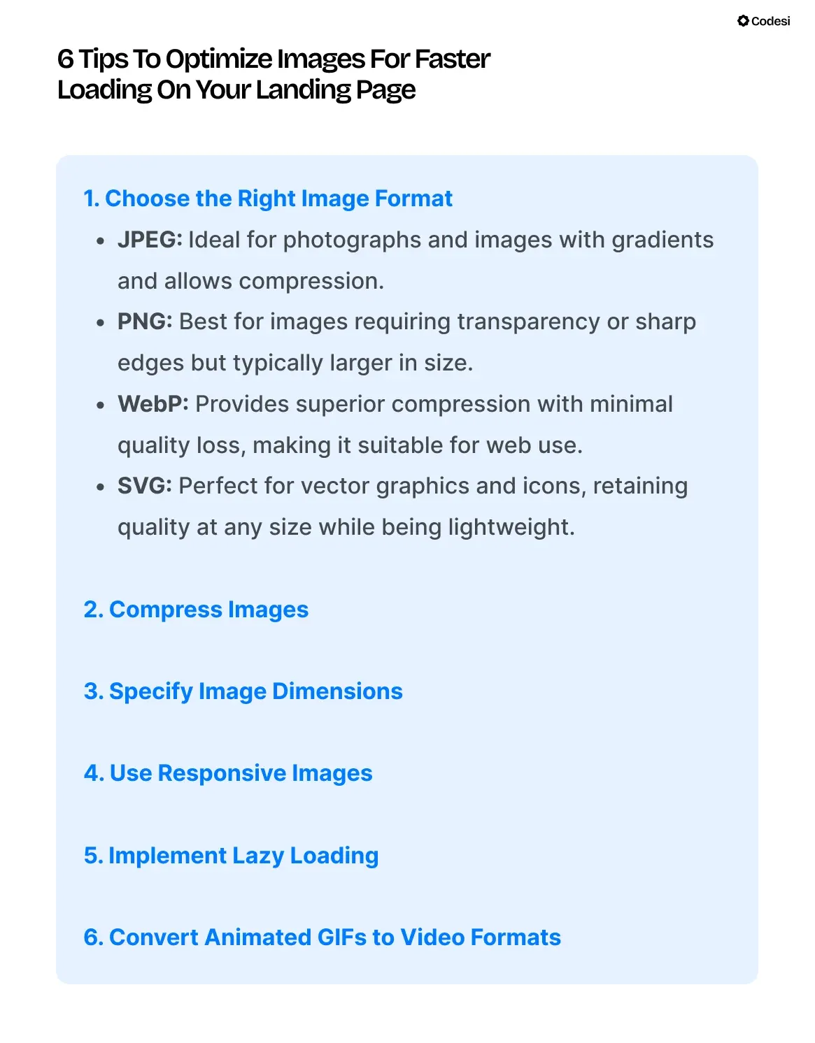
2. Moreover, leveraging a Content Delivery Network (CDN) can further accelerate loading speeds by distributing your site’s content across various servers globally.
This reduces the distance between the server and the user, leading to faster retrieval times.
3. Additionally, browser caching can significantly enhance speed.
It allows users to store previously loaded resources locally in their browsers, minimizing the need for repeated downloads.
7. Write Clear and Persuasive Copy
When crafting the copy for your landing page, you should prioritize the benefits your product or service offers potential customers, placing their needs at the core of the message.
1. Rather than centering your narrative on your company’s achievements or features, you should focus on how your offering can directly improve their life or solve their problems.
Visitors are more likely to engage when they feel the content addresses their specific challenges and aspirations.
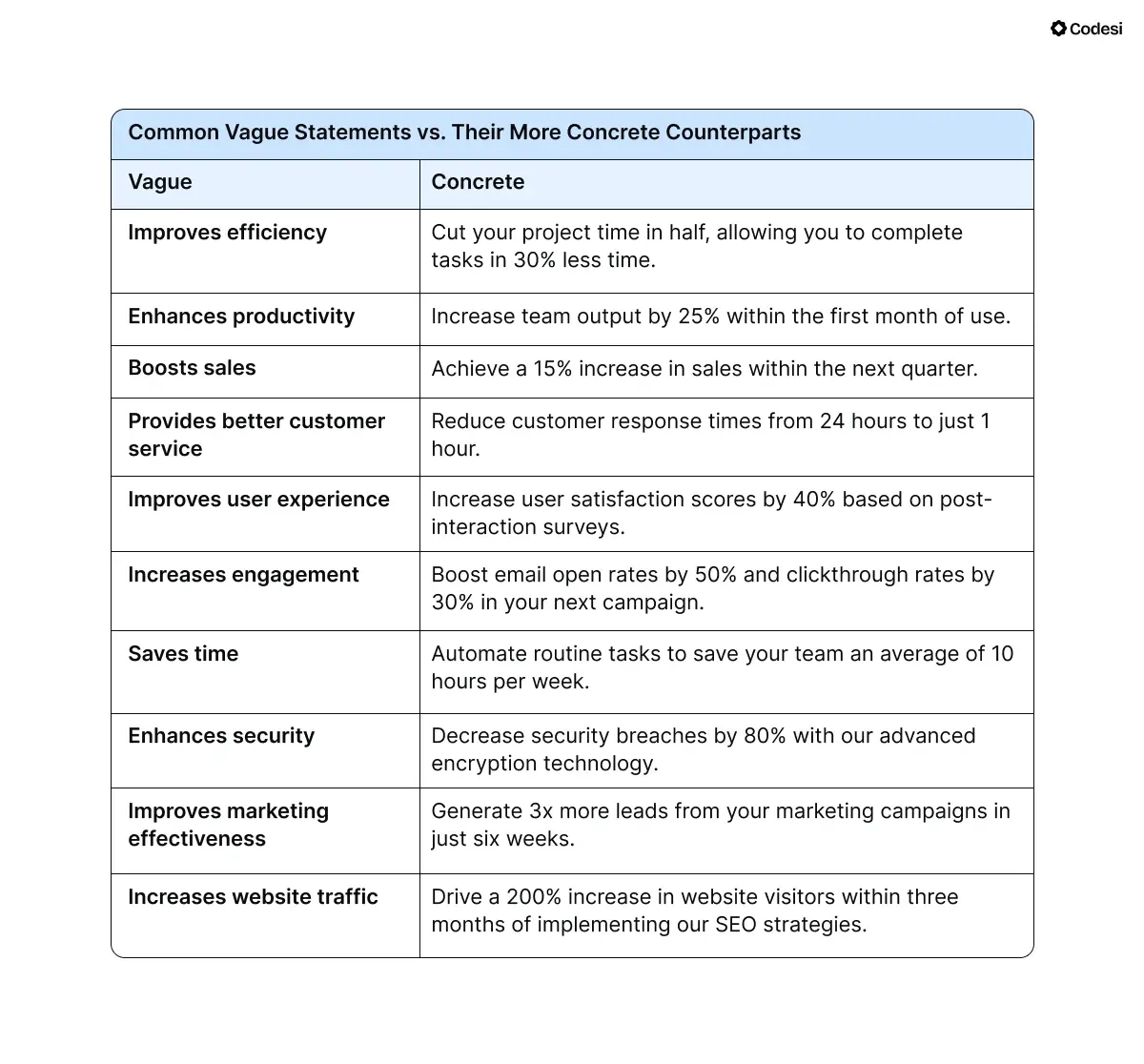
2. Use active and direct language to emphasize your message and avoid vague statements.
Why is that? Concrete examples provide specific metrics or outcomes that help potential customers understand the tangible benefits of your product or service.
3. Regarding the layout, use headlines and bullet points to ensure that key benefits are easily digestible.
Visitors often skim online content, so making your points straightforward and visually accessible can significantly enhance engagement.
💡 ProTip:
Besides tailored copy creation, Codesi enables you to change the layout of your landing page quickly and easily by:
- Playing with the elements, rearranging them, and choosing which website blocks you want to use.
- Deleting the blocks you no longer want.
- Apply color changes to the website.
- Change the wording and images, etc.
8. Leverage Directional Cues
Visual elements like arrows or buttons guide visitors toward important sections on your landing page, especially your CTA.
1. For instance, you can integrate arrows next to key content areas or CTAs to subtly direct attention.
2. Similarly, you can design buttons to stand out through contrasting colors, larger sizes, or unique shapes, signaling users where they should click.
By making these interactive elements prominent, you can effectively highlight important actions you want visitors to take.
3. Furthermore, the placement of these visual elements is equally important to enhance user engagement.
4. For example, placing a well-designed button right after a compelling piece of information provides a seamless transition for users.
Thus, it makes it easier for them to take the desired action.
5. But it isn’t only about guiding your visitors to the CTA — These visual elements also play a crucial role in reducing cognitive load.
By visually signaling the next steps, you help users easily navigate the website, which can lead to longer site visits and increased conversion rates.
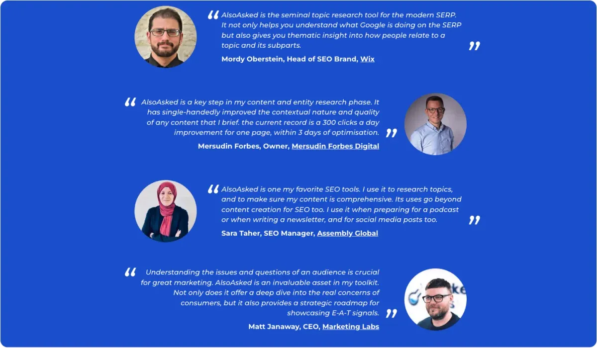
9. Incorporate Social Proof
Including testimonials, reviews, or case studies builds trust and credibility with potential customers.
Social proof reassures visitors that others had positive experiences with your product or service, which can influence their decision-making process.
Elements such as:
- Security badges,
- Industry certifications, or
- Media mentions can put visitors at ease about your business's legitimacy.
Furthermore, trust indicators help reduce concerns about privacy and security, which is especially important for transactions.
📌 Extra Tip:
Displaying a mix of positive and negative reviews signals transparency.
Customers are more likely to trust a brand that acknowledges its shortcomings rather than one that only showcases glowing feedback.
Actually, if they see no negative feedback at all, the majority of consumers suspect censorship or fake reviews.
In addition, more than 50% will most likely avoid purchasing.
At the same time, negative reviews can be positive for your business because they highlight areas for improvement.
If you address these issues, you can enhance your offerings and customer service and show that you care about your customers and their input.
10. Test and Iterate
Regularly A/B test different landing page elements, such as headlines, images, and CTAs, to see what works best for your audience.
- Also, leverage qualitative user feedback through surveys or heatmaps to understand why one version may have performed better.
- Use analytics tools to track performance and make data-driven decisions for improvements.
- Don’t forget to keep detailed records of all tests, including hypotheses, variants tested, results, and insights you’ve gained to refine your approach.
💡 ProTip:
Codesi enables you to connect Yandex and Google Analytics to track traffic and conversions to your landing page, providing important insights for improved future strategies.
Landing Page Best Practices: A Quick Checklist
Before we wrap things up, here’s a quick recap of landing page best practices.
✅ Aim for a clean and not cluttered layout.
✅ Use high-quality visuals and directional cues.
✅ Align landing page colors with your brand.
✅ Generate persuasive copy and succinct CTA.
✅ Eliminate elements that affect load times.
✅ Include social proof and trust elements.
How can Codesi Help You Create Converting Landing Pages?
Codesi is an AI-powered solution that creates landing pages, logos, and images based on your prompts.
This way, you get highly customizable output tailored to your business needs and audience.
Furthermore, leveraging our AI tool means that you:
🔥 Don’t need to have any advanced design or coding skills.
🔥 Can create a website within 10 minutes.
🔥 Can fully customize and tweak the design and textual content.
🔥 Will get valuable insights into your website’s traffic and conversion
Don’t want to take our word for it? No problem. Why not test Codesi for yourself, then?
Start with Codesi for free and create a landing page that converts interest into action.
Create your website with AI today
Codesi is a platform where you can make a website in 3 minutes.
No coding, no designers, no hassle - just AI.
