Back to blog
9 Tips to Make a High-Converting Landing Page
Discover key tips for creating a high-converting landing page, how it works, and why it's essential for maximizing leads and sales.
Feb 10 2025
When someone lands on your page, you have only a few seconds to grab their attention, build interest, and guide them toward taking action.
It sounds simple, but it’s not. A high-converting landing page is a carefully constructed tool that combines psychology, design, and strategy.
Let’s explore how to make it happen with nine clear, actionable tips.
What Is a Landing Page and Why Does It Matter?
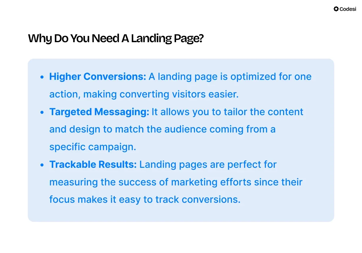
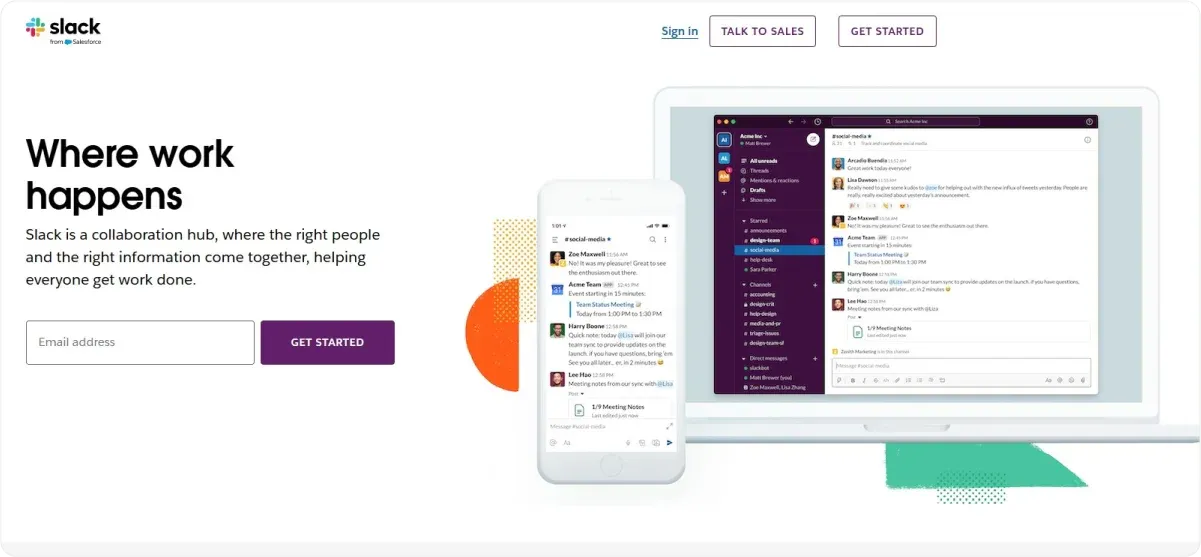
A landing page is a focused webpage with a single purpose: to encourage visitors to take one specific action.
No matter if it’s signing up for a newsletter, downloading a resource, or making a purchase, the power of a landing page lies in its singular focus.
Think of it this way: if you walk into a store and the salesperson bombards you with options, you’ll likely feel overwhelmed.
Now imagine they guide you straight to what you need, explaining why it’s perfect for you.
That’s the role of a great landing page – it eliminates distractions and directs visitors toward conversion.
For instance, if you’re running a Facebook ad for your new online course, the landing page should focus solely on course sign-ups.
No distractions, no extra links – just one clear path.
9 Tips on How to Make A High-Converting Landing Page
Now, let’s move to the concrete steps on what makes a high-converting landing page:
1. Start with One Clear Goal
A landing page with one goal keeps things simple, pulling visitors toward the desired action instead of confusing and pushing them away.
How to define your goal?
1. Pinpoint Your Objective
Decide what action you want your visitors to take. Is your goal to:
- Collect email addresses?
- Encourage sign-ups for a free trial?
- Drive direct sales?
Choose one and make it the sole focus.
2. Remove Distractions
Streamline the page by eliminating elements like navigation bars, external links, or unrelated calls to action (CTAs) that compete for attention.
3. Align Every Element
Ensure that every part of your landing page reinforces the chosen goal, from the headline and visuals to the CTA.
Example: Webinar Landing Page
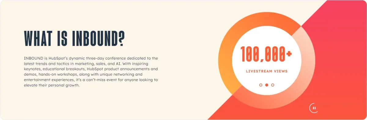
Every year, INBOUND gathers thousands of digital marketers, sales professionals, and customer success specialists from around the globe.
It’s a chance to learn from industry leaders and connect with peers. In recent years, the event has embraced a fully online format, offering a packed schedule of webinars and virtual sessions throughout the week.
Why this landing page stands out:
- Vibrant Use of Color: The bold, eye-catching palette isn’t just visually appealing – it directs attention to the key action button. The addition of subtle animation gives the page a dynamic feel, setting it apart from traditional event pages.
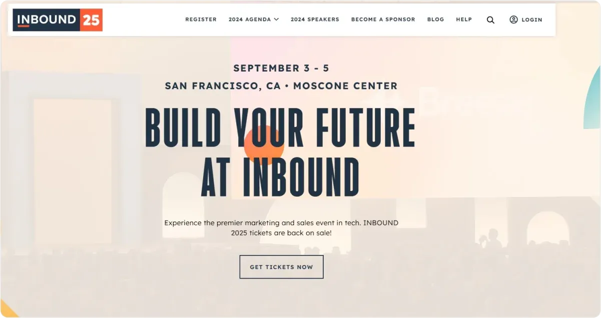
- Strategic Placement of CTAs: With three buttons positioned throughout the page, there’s always a call-to-action within easy reach, no matter where users are on the page.
- Interactive Elements: Further down the page, an interactive slider invites visitors to click and drag, adding a touch of playfulness. When used thoughtfully, interactive features like this can boost engagement and increase the likelihood of conversions.
2. Use the AIDA Framework to Structure Your Page
A landing page must also guide visitors through a logical flow, helping them transition from curiosity to action.
The AIDA framework (Attention, Interest, Desire, Action) is a simple yet effective way to structure this journey, ensuring every element serves a purpose.
How to Apply AIDA in 4 Steps:
1. Attention: Hook Visitors Instantly
The first thing visitors see should grab their attention and make them want to stay.
A bold, benefit-driven headline paired with a striking visual works wonders here.
For example, a headline like “Cut Your Workday in Half – Discover the Tools Top Performers Use” immediately captures interest.
Pair this with an image of a clean, organized workflow or a video teaser showing your solution in action.
2. Interest: Build Their Curiosity
Once you’ve hooked them, you need to sustain their attention by explaining why your offer matters.
Use concise, benefit-focused copy to connect your solution to their pain points or goals.
For example, “Struggling with endless tasks and no time for yourself? Our system helps you prioritize, automate, and get back control of your day.”
3. Desire: Make Them Want It
Desire is about creating an emotional connection. Use testimonials, success stories, or vivid descriptions to show how your offer will improve their lives or solve their problem.
A testimonial like “This tool completely transformed how I manage my tasks. I save 2 hours every day!” builds trust and desire.
Or include a vivid statement: “Imagine a workday where everything feels manageable, with time left for what truly matters.”
4. Action: Seal the Deal
Finish strong with a clear, compelling call-to-action (CTA). Tell visitors exactly what to do and make the action irresistible.
Use a bright, contrasting button with text like “Get Started Today” or “Claim Your Free Trial.” Place it strategically after your headline, benefits section, and testimonials.
3. Write Headlines That Hook Your Audience
Your headline is the first thing visitors see. It’s your chance to grab their attention and keep them on the page.
If your headline doesn’t speak to their needs or curiosity, they’ll leave before you can make your pitch.
What makes a great headline:
- Clarity: Be straightforward about what visitors will gain. Ambiguity won’t grab attention.
- Benefit-focused: Highlight how your offer addresses a problem or fulfills a desire.
- Relatability: Speak directly to their pain points or aspirations.
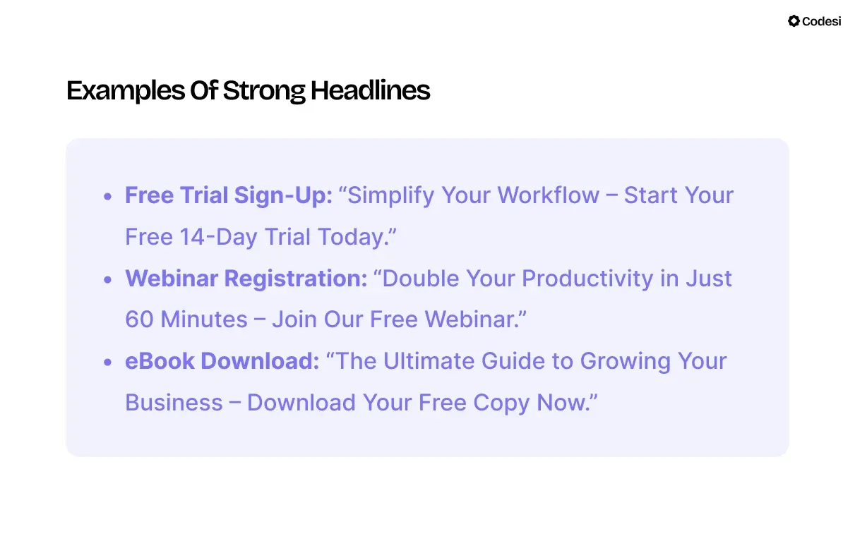
Additionally, your subheadline can provide additional context to strengthen your headline. For example:
- Headline: “Unlock the Secrets to Doubling Your Sales.”
- Subheadline: “Learn proven strategies used by top marketers to close deals faster.”
This combination grabs attention while immediately addressing the audience’s needs.
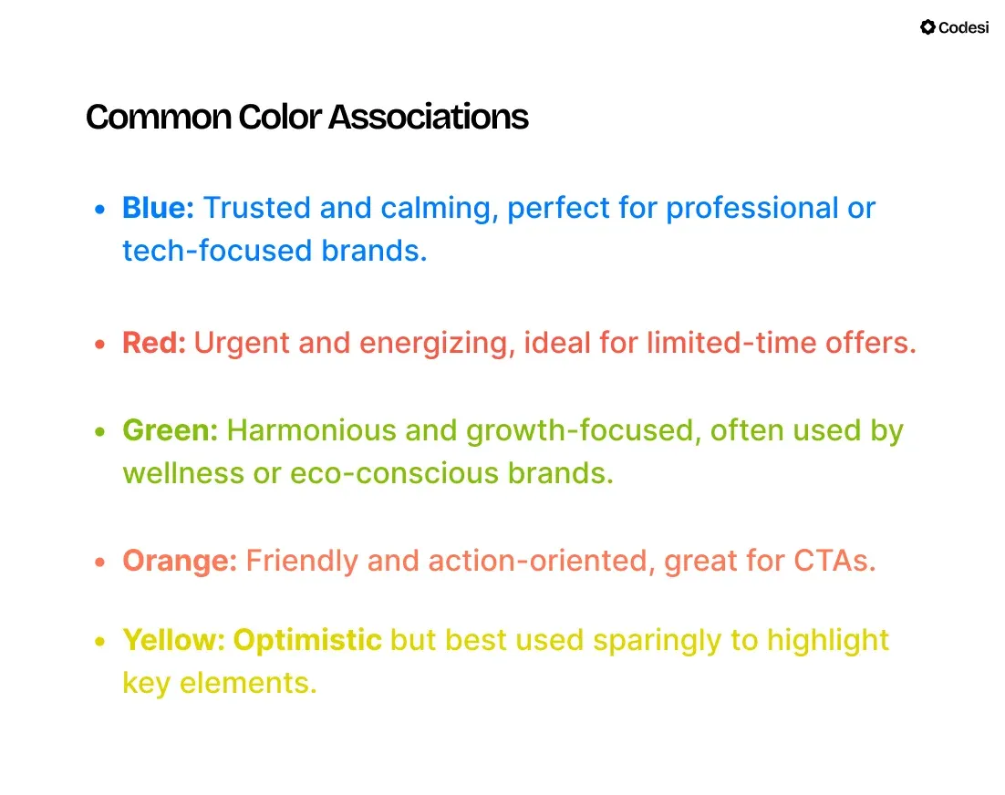
4. Leverage Color Psychology
Colors are more than visual elements – they shape how visitors perceive your landing page and influence their decisions.
Choosing the right colors can build trust, evoke emotion, and subtly guide visitors toward your call-to-action.
How Colors Impact Conversions
The psychology of colors taps into instinctive human responses. The right palette can make your page feel professional, approachable, or exciting.
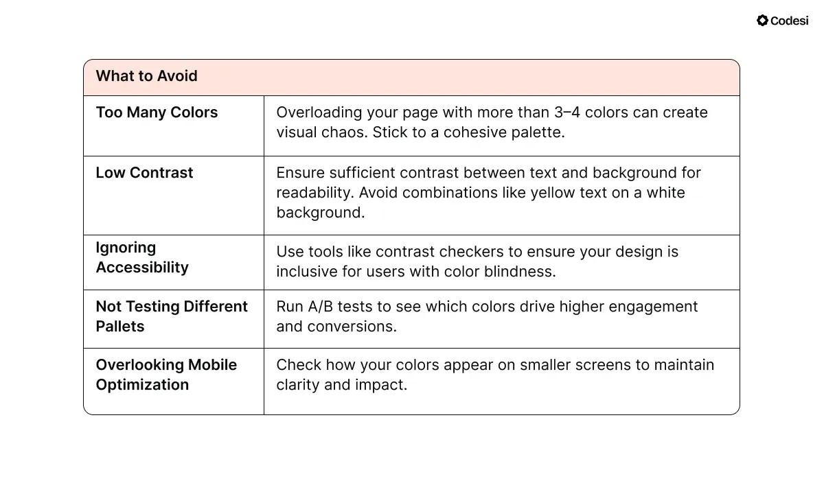
Conversely, poor choices, like clashing tones or low contrast, can distract or alienate visitors.
How to Apply Colors Strategically
1. Keep the Background Neutral
A neutral background creates a clean slate, allowing your message to take center stage. Calming shades like white, light grey, or pastel tones help maintain focus without overwhelming visitors.
2. Use Contrasting CTA Buttons
The CTA is the most important element on your page. To make it stand out, use a color that contrasts with the rest of your design.
3. Accentuate Key Details
Accent colors should guide visitors’ eyes to important details, such as headlines or benefits. These pops of color should reinforce your message without overwhelming the design.
4. Use White Space to Create Focus
White space doesn’t mean wasted space. It helps separate key elements, reduces visual clutter, and makes navigating your page easier. Proper use of white space keeps the visitor’s attention where you want it – on the CTA.
Also, avoid cramming text or images into every corner of your page. Instead, space out sections so they feel clean and digestible.
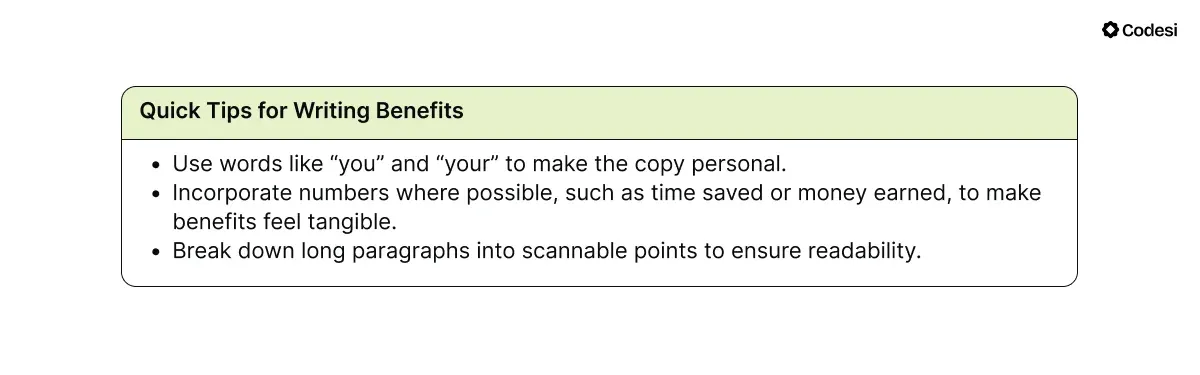
5. Write Copy That Focuses on Benefits
Your audience doesn’t care about features, but they care about how those features improve their lives.
Writing benefit-driven copy shifts the focus from what your product does to what it does for them, making it more persuasive and relatable.
Features vs. Benefits
- Feature: “Our app provides automated reports.”
- Benefit: “Save hours every week by eliminating manual reporting, giving you more time to focus on growing your business.”
Always connect the feature to the value it delivers, answering the question, “What’s in it for me?”
How to Write Benefit-Focused Copy
1. Identify the Problem: Understand your audience’s pain points. What are they struggling with, and how does your product solve it?
“Spending too much time on administrative tasks?”
2. Show the Solution: Explain how your product or service addresses this problem in simple, relatable terms. Avoid technical jargon.
“Our platform automates repetitive tasks, letting you focus on what really matters.”
3. Highlight the Outcome: Paint a clear picture of the results they’ll achieve by using your product. Be specific, measurable, and vivid where possible.
“Cut your workload in half, meet deadlines with ease, and enjoy stress-free evenings.”
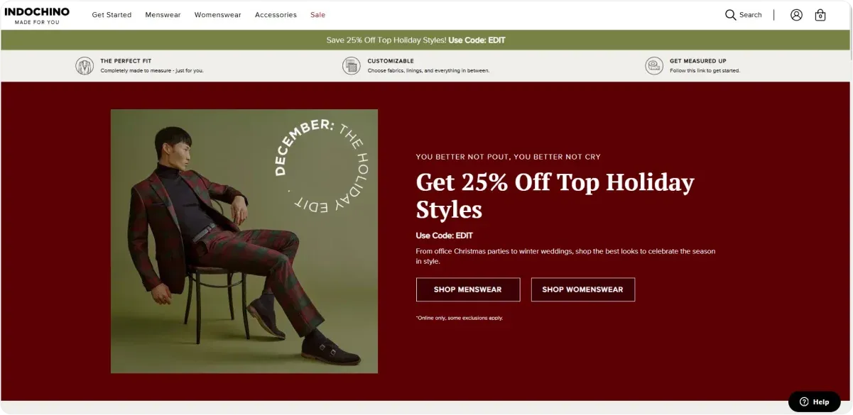
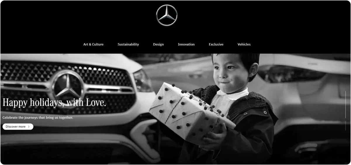
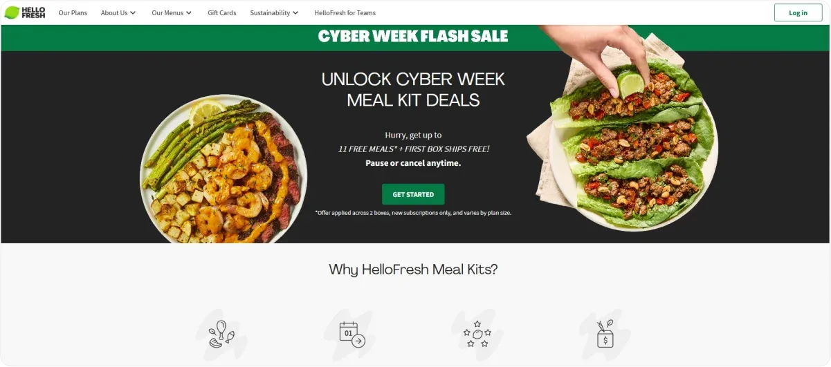
6. Add Visuals That Support Your Message
The right visuals can grab attention, simplify complex ideas, and increase your audience’s confidence in what you are offering.
What Types of Visuals Work Best?
1. Product Demonstrations
A short video showing your product in action is one of the most effective ways to communicate its value. Videos allow visitors to quickly understand how your product works and how it can benefit them.
2. Before-and-After Photos
These are especially useful when the results of using your product or service are visually striking. Before-and-after photos help your audience imagine their own transformation, making your offer more relatable.
3. Customer Photos
Authentic images of real people using your product help build credibility and trust. Visitors are more likely to relate to genuine user experiences than to stock photos, which can feel impersonal.
Pro tip from Codesi
Make your landing pages truly stand out with Codesi's AI Image Generator!
Simply write a prompt describing the image you need, and our tool will deliver a pack of 4 unique visuals tailored to your request.
Best of all, you get 5 image packs for free, so you can create stunning, on-brand visuals without breaking the bank.
These are perfect for elevating your page design and captivating your audience!
7. Include a Strong Call-to-Actions (CTAs)
Your CTA is the critical element that turns interest into action. It guides visitors toward the next step, whether it is signing up, downloading, or purchasing.
A strong CTA is specific, persuasive, and visually distinct, making it easy for visitors to take action.
How to Write an Effective CTA
1. Be Clear and Direct
Visitors should instantly understand what they are expected to do and why. Avoid vague terms like “Click Here” or “Submit.”
Make your CTA action-oriented and outcome-focused. Instead of “Sign Up,” use “Sign Up Today to Start Your Free Trial.”
2. Focus on Value
Highlight the benefits visitors will gain. The more specific and enticing the value, the more likely they are to act. For example, “Download the Free eBook to Double Your Productivity in 30 Days.”
3. Encourage Immediate Action
Adding urgency prompts visitors to act now rather than postponing.
Use words like “Now,” “Today,” or “Limited Time” to create a sense of time sensitivity.
For example, “Get 20% Off – Offer Ends at Midnight.”
Where to Place Your CTA
1. Above the Fold
Place your primary CTA where it is immediately visible without scrolling. Visitors should know what to do as soon as they land on your page.
2. After Key Sections
Include CTAs in logical spots, such as after listing benefits or following a testimonial. These placements reinforce the action when interest is highest.
3. At the End of the Page
For visitors who scroll through all the content, a concluding CTA ensures they have a final opportunity to act.
8. Create Urgency
Procrastination is one of the biggest barriers to conversions. Urgency pushes visitors to act now rather than waiting, ensuring they decide while their interest is high.
When framed effectively, urgency can tap into the fear of missing out (FOMO) or the appeal of limited-time opportunities.
How to Create Urgency
1. Use Time-Sensitive Offers
Highlight deadlines or expiration dates to give visitors a reason to act quickly.
For example: “Sign up by midnight to receive a 20% discount on your first purchase.”
2. Show Limited Availability
Make your offer feel exclusive by indicating scarcity, such as limited spots, products, or time.
Example: “Only 5 spots remaining – reserve yours now.”
3. Incorporate Countdown Timers
Adding a visual timer to your landing page reinforces the urgency and keeps the deadline front of mind.
For example, a webinar registration page could display a timer counting down to the event's start time, urging visitors to sign up before it's too late.
Best Practices for Creating Urgency
- Be Honest: Avoid manufacturing false urgency, such as fake stock levels or deadlines, as it can harm trust.
- Balance Pressure and Clarity: Urgency should motivate action without overwhelming or confusing visitors.
- Tie Urgency to Value: Emphasize what they will miss out on if they don’t act, such as exclusive bonuses or savings.
9. Test, Analyze, and Optimize
The best landing pages are not static but continually refined based on data. Testing and analysis reveal what works and what doesn’t, allowing you to make targeted improvements that boost performance over time.
How to Test and Refine Your Page
1. Start with A/B Testing
A/B testing involves comparing two versions of your page to see which performs better.
Test one variable at a time, such as headlines, CTA placement, or button colors, to determine what drives more conversions.
Example: Test two headlines:
- Version A: “Master Time Management Today.”
- Version B: “Save Two Hours Daily with Proven Productivity Hacks.”
After a week, compare results to identify the more effective option.
2. Use Heatmaps to Analyze Behavior
Tools like Hotjar show where visitors click, scroll, or stop engaging. These insights help you identify problem areas.
If heatmaps reveal that users stop scrolling before reaching your CTA, consider moving it higher on the page.
3. Track Metrics with Google Analytics
Set up conversion goals and monitor key metrics like bounce rates, session durations, and click-through rates. Look for patterns to determine which elements of your page need adjustment.
A high bounce rate might indicate that your headline or visuals are not grabbing attention, prompting you to redesign the hero section.
How Can Codesi Help You Create High-Converting Landing Pages?
Codesi is a powerful AI-driven website builder and design tool that helps you craft personalized websites, logos, and visuals effortlessly.
Why Codesi is Your Go-To Tool for High-Converting Landing Pages
✨ Effortless Page Creation
Describe your vision, and Codesi’s AI will do the rest. In less than 10 minutes, you’ll have a fully responsive, professional landing page ready to go.
🎯 Complete Structure and Content Solution
Forget about worrying over layout, copy, or design – Codesi takes care of everything. From the overall structure to detailed copywriting, the tool ensures your page is both stunning and functional.
🎨 Simple Customization
Want more control? Easily decide which blocks to keep, move, or delete. Adjust colors, wording, images, and other elements to make your landing page uniquely yours.
💡 Brand-Boosting Logos
Generate logos that represent your brand and enhance recognition. Codesi provides 4 fully customizable designs, each with three variations:
- Text and slogan on the right side
- Text and slogan on the bottom
- Without text and slogan
📸 Unique Visuals, Not Generic Stock Photos
Say goodbye to stock photos that fail to convey your value proposition. Use Codesi’s AI Image Generator to create visuals perfectly aligned with your brand voice and aesthetic.
📊 User Insights with Feature Comparisons
Codesi helps you identify what resonates most with your audience. Compare features to adjust your offerings and better meet your target audience’s preferences.
📈 Track and Optimize Performance
You can stay informed about your landing page’s performance through Google Analytics integration. Monitor traffic, conversions, and user behavior to refine your page for maximum impact.
Build, customize, and convert – start with Codesi for free!
Create your website with AI today
Codesi is a platform where you can make a website in 3 minutes.
No coding, no designers, no hassle - just AI.
