Back to blog
10 Tips To Create a Waitlist Landing Page [2026 Guide]
Discover tips to create a waitlist landing page to boost sign-ups, build anticipation, and grow your audience.
Apr 6 2025
![10 Tips To Create a Waitlist Landing Page [2026 Guide]](https://codesi.ai/admin/static/Cover_9b30b5b013.webp)
A waitlist is simply a list of people who want to be the first to know when your product or service becomes available.
Collecting emails and staying in touch can build anticipation and ensure a more organized launch down the road.
Of course, to attract enough early interest, you’ll need a clear, welcoming landing page that encourages visitors to sign up.
Below, we’ll dive into our top tips for crafting a waitlist landing page that draws people in and makes them want to sign up – stat!
1. Open with a Straightforward Purpose
A waitlist landing page exists to attract people who want first dibs on what you’re launching.
The best way to approach potential subscribers is to be up-front about that mission.
If someone lands on your page and is left guessing about the reason for the form, many will leave without signing up.
A page that immediately explains the product or service, plus why it might be worth waiting for, tends to attract more sign-ups.
How to Do It
- Add a short introduction or tagline near the top: For instance, “Sign up to be the first to access our new collaboration software.” This is enough to let visitors know there’s a new product on the horizon and they have a chance to jump in early.
- Describe what they stand to gain: If your product promises an easier method for team communication, say it plainly. Avoid generic lines (“We’re launching something amazing!”) without context.
- Instead, reference an actual benefit: “Our platform cuts meeting times by 50% with organized digital check-ins.”
2. Tailor Your Headline for Immediate Clarity
Landing page headlines often determine whether a visitor reads on or bounces.
They might leave if someone can’t grasp your offer or how the waitlist works.
A headline that aligns with your product and sets the tone can encourage people to stick around and explore.
How to Do It
- Make it specific: “Get Notified When We Launch the Beta for [App Name]” or “Reserve Early Access to [Your Product].” Both are straightforward and let people know exactly what they’re signing up for.
- Tie in a benefit: If your product aims to solve a known pain point, weave that into the headline. For instance, “Join the Waitlist for a Project Management Tool That Eliminates Task Confusion.”
- Stay consistent with brand identity: If your brand voice is playful, a witty or lighthearted headline could engage the right audience. If your voice is more formal, keep the language aligned with that style.
3. Showcase a Genuine Unique Selling Proposition (USP)
Your unique selling proposition (USP) distinguishes your product from the sea of similar options.
On a waitlist page, visitors need to realize what makes your offering stand out.
If your USP is hazy or hidden, people may assume they can find a similar solution elsewhere.
How to Do It
- Highlight a memorable feature: Think of one or two bullet points that showcase what makes you different. Maybe you have a patented process, an innovative technology, or a service approach that the market hasn’t seen.
- Use credible wording: Overblown claims can cause skepticism. Words like “revolutionary” or “game-changing” are overused and can make readers roll their eyes. Instead, point to specific features or examples. For instance, “Powered by real-time analytics that adapts to your workout routine” or “Built around a personalized tutoring model that responds to each learner’s pace.”
- Address a real gap in the market: If you know your audience constantly struggles with scheduling, highlight how your product streamlines appointment booking in a more intuitive way than the current options.
4. Use Concise, Impactful Copy
Landing pages benefit from clarity, not lengthy blocks of text.
People generally scan online content.
If your copy is long-winded, you risk losing their attention.
A waitlist page aims to convey just enough to spark interest and prompt sign-ups.
How to Do It
- Focus on short paragraphs and bullet points: This layout makes your content easy to skim. You can detail your main points in bullet form rather than burying them in paragraphs.
- Write in the second person (“you”): Speak directly to the reader. For instance, “You’ll save time on daily accounting tasks” is more engaging than “Users save time on daily accounting tasks.”
- Cut fluff words: Phrases like “very much,” “really exciting,” or “incredibly useful” rarely add meaning. Instead, specify the exact excitement or utility: “This integration cuts your response time by 30%.”
Pro Tip
Struggling to craft the right message? Instead of listing dull specifications, Codesi’s AI helps you communicate the real value of your offering.
For example, rather than simply stating, “Join our waitlist for early access,” it can transform your message into something more compelling, like:
"Be the first to experience exclusive features, special perks, and insider updates – sign up today!"
This approach makes your landing page more engaging, helping you drive more sign-ups with messaging that truly connects.
5. Ensure Your Visual Design Guides the Eye
Your waitlist page design should direct visitors to the sign-up box.
A cluttered layout or poor color choices can distract from your main call to action (CTA).
By thinking about user experience from the start, you increase the chance that someone will actually sign up instead of clicking away.
How to Do It
- Use ample white space: A minimal look with careful spacing keeps attention on key sections—like your headline and form.
- Pick contrasting colors for CTAs: If your site’s background is mostly white or neutral, a bold accent color for your button can make it pop. You want the “Join Waitlist” or “Sign Me Up” button to be obvious.
- Limit the number of design elements: Avoid multiple pop-ups, flashing banners, or sidebars that lead the visitor astray.
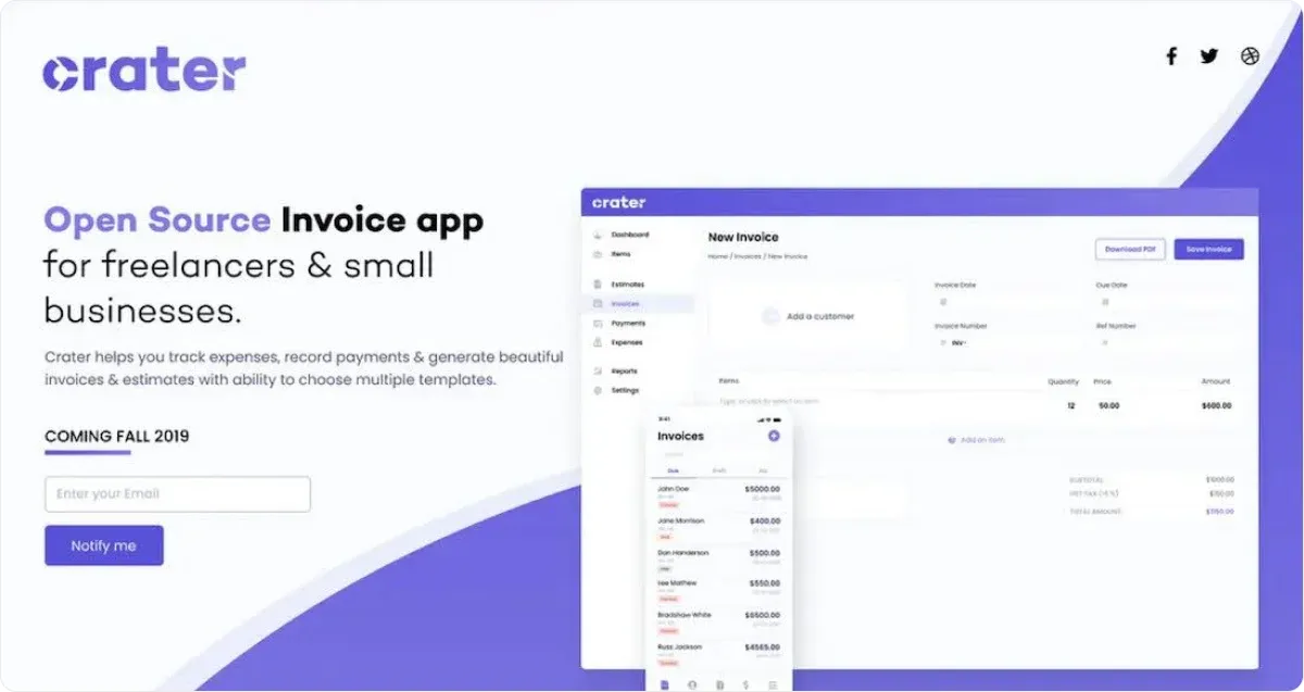
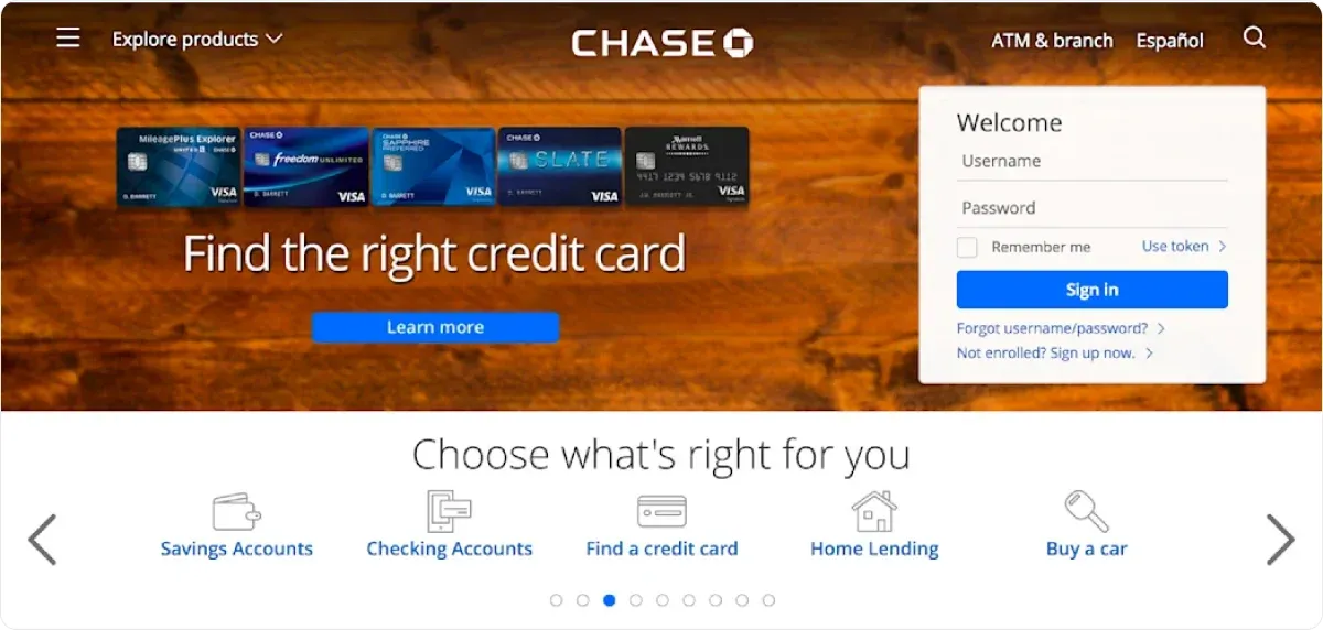
Below is not so good example of a waitlist landing page.
The page is cluttered with multiple CTAs, which can confuse visitors, and the design is a bit overwhelming.
Pro Tip
The internet is flooded with generic, overused images, and the last thing you want is to discover that your business is using the same visuals as countless others.
With Codesi, you can create unique visuals (including logos) in just a few clicks.
Simply enter your preferences, and the platform will generate custom options tailored to your brand guidelines.
No duplicates, no compromises – just original, ready-to-use designs that set your business apart.
6. Keep the Sign-Up Form Simple
When people decide to join a waitlist, they usually won’t stick around if the sign-up form has too many fields.
Long forms can feel intrusive and time-consuming. A short form, on the other hand, encourages people to complete the process.
If you're looking for a hassle-free way to collect information, Tally is a great choice.
Unlike clunky form builders, it offers a clean, intuitive interface that lets you create forms in minutes without coding or design skills required.
You can use it for customer feedback, order forms, surveys, or even event registrations.
Plus, it seamlessly integrates with tools like Notion, Zapier, and Google Sheets, making data collection and organization effortless.
How to Do It
- Limit to one or two fields: Typically, an email address alone is enough. Some businesses might also ask for a first name to personalize future emails. If you truly need more data, be upfront about why.
- Explain how you’ll use the info: If you’re collecting more details, briefly mention how this benefits the user. For example, “We’ll use your location to show you relevant meetups in your area.” Transparency helps build trust.
- Avoid forcing phone numbers: Many individuals are protective of their phone numbers. Unless it’s essential for your product (like sending text-based updates), it’s best to leave it optional or omit it entirely.
7. Provide a Clear Incentive
Even if someone is interested in your upcoming product, an immediate incentive can nudge them to join your list right away.
Incentives show that you value early adopters and want to reward their curiosity.
How to Do It
- Offer a discount or bonus: A small percentage off the first purchase, free credits, or an exclusive feature can be enough to tip the scales. People appreciate a tangible reward for their attention.
- Promise early access: If your platform will have limited slots during the beta phase, let users know that waitlist members get priority. Early adopters often enjoy being part of a test phase.
- Host a referral program: Some companies boost waitlist sign-ups by encouraging members to refer friends. For example, each friend who signs up might unlock additional benefits or skip the line. This strategy can lead to viral growth if executed carefully.
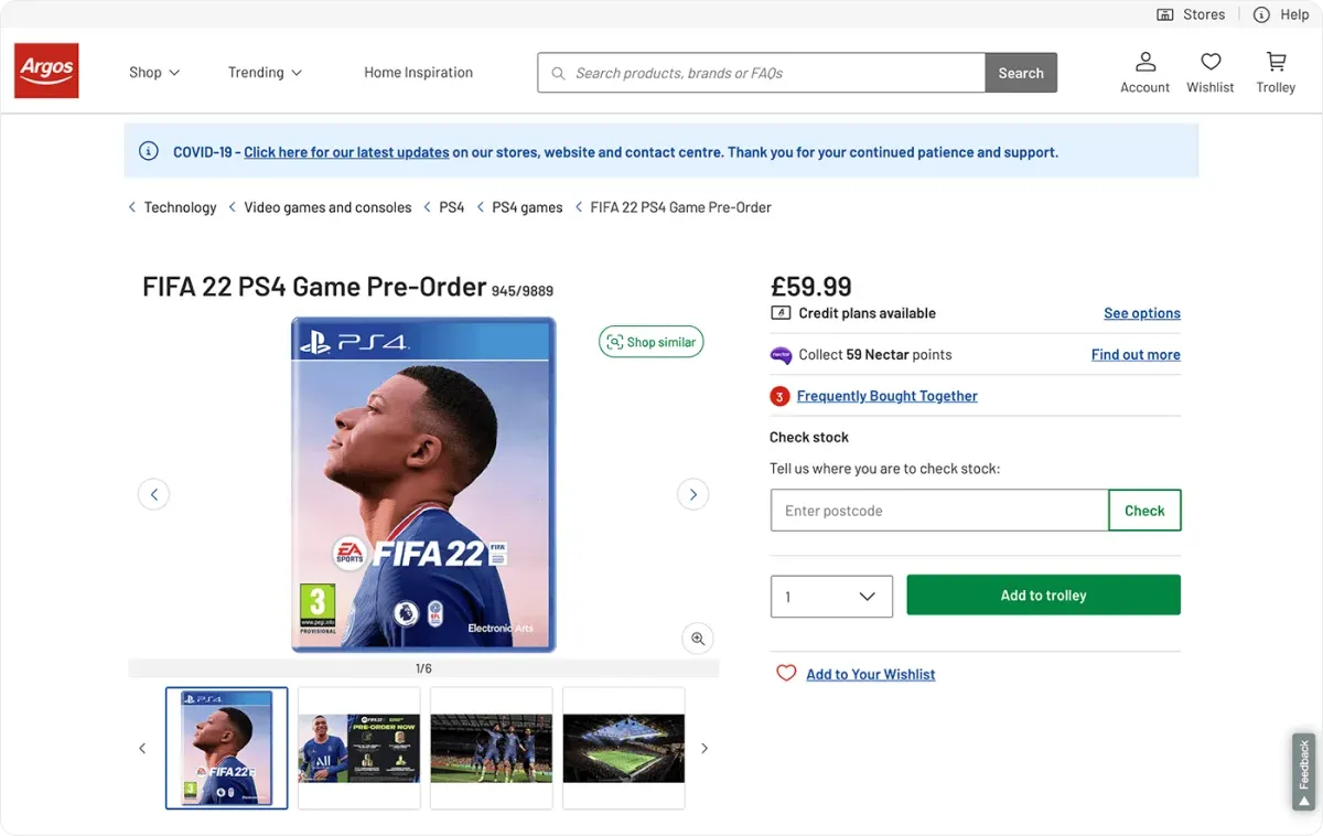
In the example below, it is possible to collect additional points for the game preorder, which is a compelling benefit for some users.
8. Add Social Proof (Without Over-Inflating It)
People like reassurance that they’re not the only ones interested in a new product or service.
A bit of social proof (testimonials, endorsements, or references) can boost credibility. However, hyperbole and fake-sounding quotes can work against you.
How to Do It
- Use real testimonials: If you have beta testers or early users, ask them for specific feedback. Instead of “It was awesome,” highlight a short, meaningful quote: “I saved 2 hours a week by automating my follow-up emails.”
- Cite reputable sources: If your product was featured in a tech blog or recognized by an industry association, mention it. But keep it honest – never fabricate claims.
- Show actual numbers if available: Perhaps 1,000 users tried the pilot version, or your pre-launch email attracted 500 sign-ups daily. Concrete numbers stand out more than vague statements like “We have tons of happy users.”

9. Inject Exclusivity and Transparency
People enjoy feeling like they’re getting special treatment.
At the same time, they want to know what they’re signing up for.
Striking the balance between exclusivity and honesty can raise interest and minimize confusion.
How to Do It
- Position your waitlist as a limited opportunity: If you actually have limited spots for the beta, say so. If everyone will eventually have access, be transparent about that, but note the perks of being first in line.
- Explain the timeline or next steps: Let visitors know what happens once they join. Will they receive a confirmation email? How often can they expect updates? This helps manage expectations and reduces unsubscribe rates down the line.
- Reveal a bit of your roadmap: Offer a glimpse of what you’ll be doing in the coming weeks or months, like “Our alpha testing starts in April, and waitlist members get priority invites. Our public launch is slated for June.”
10. Follow Up and Nurture Beyond the Landing Page
Gathering sign-ups isn’t the end goal but just the start of your relationship with prospective users. People who sign up are obviously interested, but they can lose enthusiasm if they don’t hear from you for weeks or months on end.
A nurture sequence or occasional update can keep them engaged until the actual launch.
How to Do It
- Send a welcome email: Right after they sign up, welcome them warmly, restate the main benefit of your product, and let them know what to expect next. A personal touch can go a long way.
- Provide periodic updates: Keep them in the loop about development milestones, behind-the-scenes insights, or new features. You don’t need to bombard people, but a monthly update or relevant announcement keeps you on their radar.
- Invite feedback or questions: Some waitlist owners send surveys or start discussions to gather input from early supporters. This can help shape your final product in a way that resonates with real users.
Waitlist Landing Page Checklist
A waitlist page doesn’t need to be elaborate, but it does need to be intentional.
Clarity in messaging, thoughtful design, brevity in form fields, and an honest explanation of the benefits all make a difference.
Here’s a quick recap:
⚡ Have a Straightforward Purpose: Let visitors know immediately they’re signing up to get early access or exclusive information.
⚡ Use Effective Headline: Use a headline that grabs attention and clearly states the main value or action.
⚡ Brainstorm Genuine USP: Point out what makes your offering truly different or beneficial.
⚡ Create a Concise Copy: Maintain focus. Keep paragraphs short, use bullet points, and avoid filler words.
⚡ Use Guided Design: Make sure the entire look of the page spotlights the sign-up form.
⚡ Create a Simple Sign-Up Form: Avoid asking for unnecessary details. Make it quick and easy to join.
⚡ Offer Clear Incentive: Provide an early-bird discount, a bonus, or some other perk for waitlist members.
⚡ Include Real Social Proof: Use actual testimonials or verifiable numbers to build trust.
⚡ Be Exclusive and Transparent: Be honest about availability and next steps.
⚡ Don’t Overlook Ongoing Engagement: Communicate regularly with waitlist members to keep the excitement alive.
Additional Considerations When Creating a Waitlist Landing Page
- Technical Setup: Make sure your email collection tool is integrated smoothly with your CRM or mailing service. Test your sign-up form to ensure people are actually being added to the right list.
- Mobile Optimization: Many folks browse on their phones, so ensure your landing page looks just as inviting on a small screen. That may mean single-column layouts, large CTA buttons, and mobile-friendly font sizes.
- Privacy & Compliance: Add a simple note about how you handle personal data, especially if you’re subject to GDPR or other data protection regulations. This helps people feel secure when they hand over their email.
- Optimization & Testing: Over time, split-test various elements – like the headline or CTA button color. Small tweaks can yield better results once you have initial data.
Pro Tip
Your landing page needs to look great and function seamlessly on any device.
Codesi automatically optimizes your design for both desktop and mobile, so you don’t have to worry about adjusting layouts, fonts, or images manually.
Since majority of people join the waitlist landing page through their phone, tablet, or laptop, your page will always deliver a smooth, user-friendly experience.
How Can Codesi Help You Create a Waitlist Landing Page?
Creating an effective waitlist landing page isn’t just about putting up a form – it’s about capturing attention, sparking interest, and convincing visitors to sign up. That’s where Codesi shines:
⚡ Effortless, AI-Powered Page Creation
Building a waitlist landing page with Codesi is fast, intuitive, and requires no design or coding skills.
It automatically generates optimized layouts, compelling copy, and eye-catching visuals that fit your brand.
Unlike traditional page builders that rely on generic templates, Codesi’s AI customizes every element based on your goals and audience.
⚡ Lightning-Fast Setup – No Tech Skills Required
With Codesi, you can launch a fully functional waitlist landing page in less than 10 minutes.
The process is simple and streamlined, making it easy for anyone to create a professional, polished page without technical expertise.
⚡ Performance-Driven for Maximum Sign-Ups
A waitlist landing page is a tool to build anticipation and gather potential customers. Codesi includes built-in tracking and optimization tools that help you refine your page, tweak your messaging, and maximize conversions.
With real-time performance insights, you can make data-driven decisions that improve your sign-up rates.
⚡ Start Free and See the Difference
Forget the frustration of traditional page builders. Codesi makes waitlist landing page creation simple, efficient, and impactful – without the hassle.
Start for free today and watch your waitlist grow effortlessly.
Create your website with AI today
Codesi is a platform where you can make a website in 3 minutes.
No coding, no designers, no hassle - just AI.
