Back to blog
8 Tips to Build a Responsive Landing Page [Complete Guide]
Learn how to build a responsive landing page that looks great on any device and follow best practices for mobile-friendly design and high conversions.
Feb 7 2025
![8 Tips to Build a Responsive Landing Page [Complete Guide]](https://codesi.ai/admin/static/Frame_1000008742_7cfbd5a78c.webp)
Let’s clarify from the start: responsive landing pages are no longer optional if you want to engage users and maximize conversions.
When your page doesn’t adapt well to different devices, you risk losing potential customers due to slow loading times, distorted visuals, and clunky navigation.
These issues can frustrate users, damage your brand’s reputation, and reduce your return on investment (ROI).
So, let’s see how to build a responsive landing page with 8 actionable tips, examples, and dos and don’ts for each key component.
8 Must-Know Tips for Creating an Effective Responsive Landing Page
1. Start with a Mobile-First Design
Designing for mobile devices first forces you to focus on essential content and functionality. Mobile users often have limited time and smaller screens, so your landing page needs to prioritize clarity and simplicity.
Starting with a mobile-first approach also aligns with Google’s mobile-first indexing, which favors pages that perform well on smaller devices.
How to Implement:
- Begin by designing the core elements for the smallest screen size, such as smartphones with widths of 320px.
- Include only the most important features: a clear headline, a concise call-to-action (CTA), and critical content.
- Once the mobile layout is optimized, expand the design for larger screens by adding additional visuals or content sections.
Example:
A fitness app’s landing page starts with a full-width banner image on mobile, a prominent CTA button, and concise text.
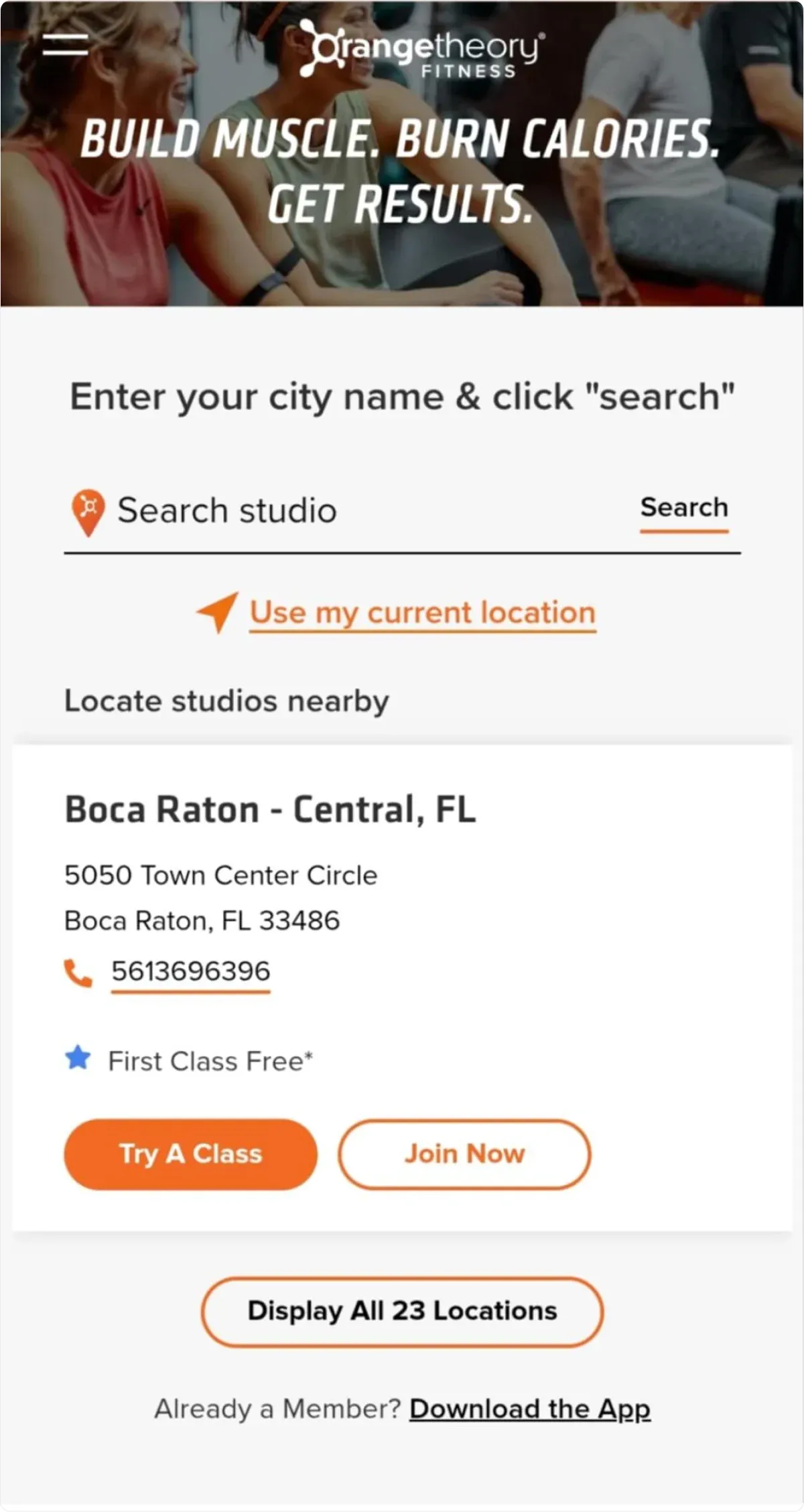
On larger screens, the design introduces additional images and benefits to fill the extra space.
Key benefits:
- Ensures a great user experience for mobile traffic, which accounts for 58.21% of web users.
- Helps keep the page lightweight and fast-loading.
2. Use Flexible Layouts to Ensure Consistency Across Devices
A flexible layout ensures your landing page adapts seamlessly to any screen size and maintains its structure and usability, whether viewed on a desktop, tablet, or smartphone.
How to Implement:
Flexible layouts rely on modern CSS techniques, which create responsive containers and elements that automatically resize and reposition based on the user’s device dimensions.
Instead of using fixed pixel values for columns or images, opt for percentage-based widths to allow content to scale fluidly.
- CSS Grid: Ideal for creating complex, structured layouts. For example, you can define rows and columns that adjust proportionally to fit different screen sizes.
- Flexbox: Perfect for arranging elements in a row or column that can wrap and resize dynamically, ensuring a smooth layout across devices.
- Media Queries: Use CSS media queries to fine-tune your layout at specific breakpoints, ensuring that each device gets an optimized experience.
Or, even better, use the Codesi Landing page generator!
With a simple input, you can get a perfectly mobile-optimized website within minutes – no coding needed!
Example
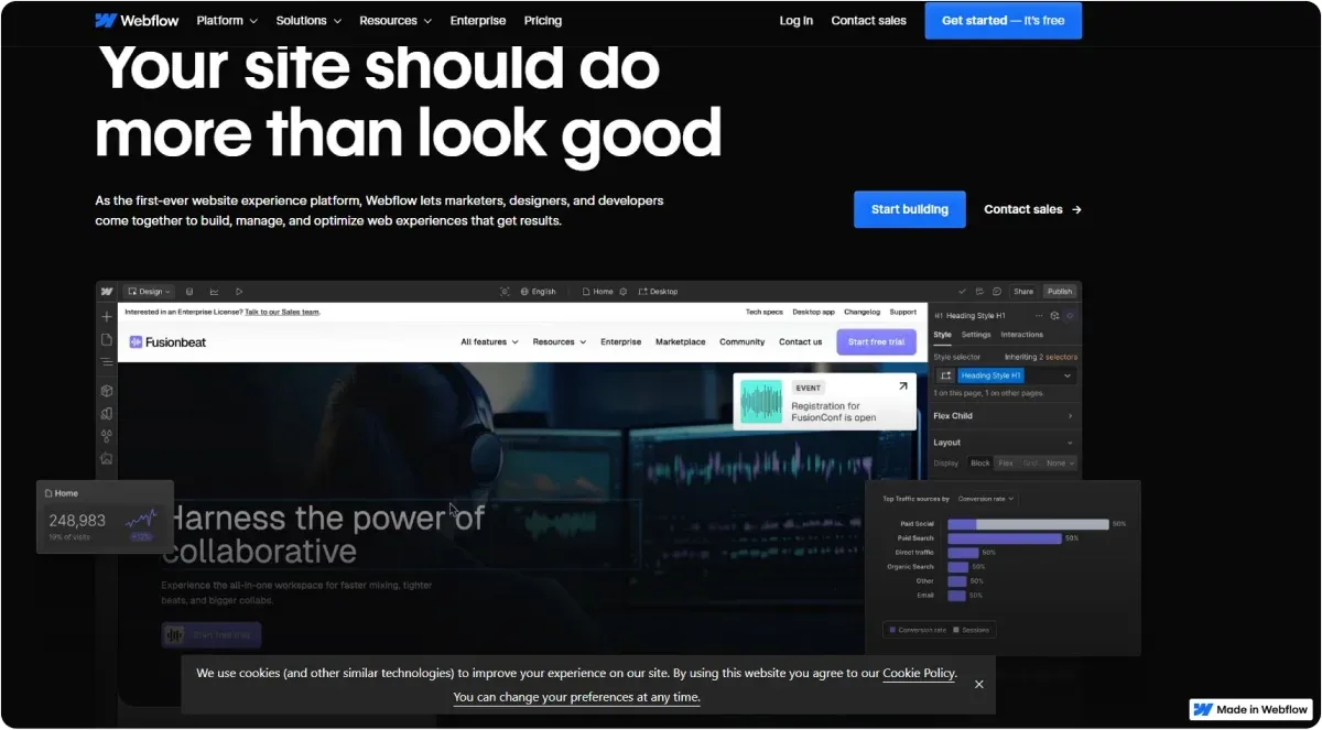
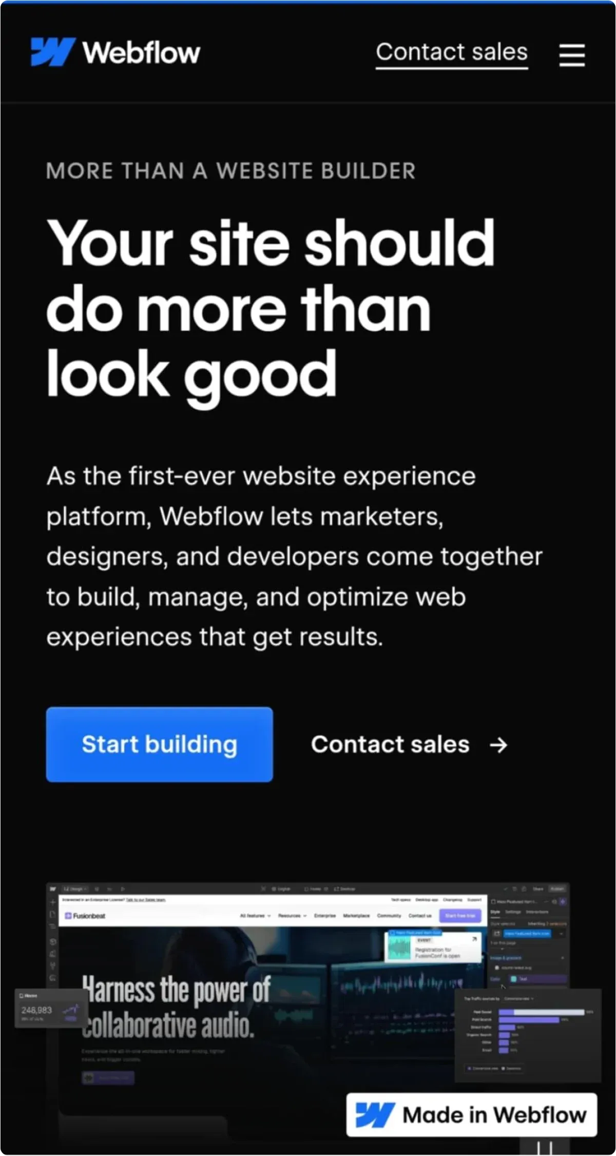
Webflow’s landing page uses a flexible layout to showcase its features:
- On a desktop: Three columns display feature descriptions side by side, taking advantage of the widescreen.
- On a tablet: The layout shifts to two stacked rows with two columns each, preserving readability.
- On a mobile phone: All features stack vertically, ensuring users can scroll through the content without squinting or zooming.
Dos and Don’ts:
✔️ Use a grid system (e.g., a 12-column grid) to organize your layout and maintain consistency.
✔️ Set a max width for your content containers to prevent elements from stretching excessively on large screens.
✔️ Test your layout at multiple screen sizes to catch potential issues early.
❌ Don’t use fixed-width layouts, as these fail to scale properly for smaller screens, causing content to overflow or appear misaligned.
❌ Don’t overlook spacing between elements. Crowded designs can negatively affect readability and usability, especially on small devices.
💡 Pro Tip
Did you know that Google Analytics offers features such as Device Overlap Reports, which visualize how many users access content through multiple devices and help identify patterns in user behavior?
For example, it may reveal that a user searches for a product on their smartphone but completes the purchase on a desktop later in the day.
Why do you need this data?
When you understand how consumers use multiple devices, it can significantly impact marketing strategies and website design.
Using Codesi, you can create a website within minutes by simply describing your wants and needs.
Then, add Google Analytics for further insights and additional tweaks if necessary.
3. Optimize Images and Videos for Responsiveness
Media is one of the most important elements of a landing page, but it can also be a major source of problems if not optimized correctly.
Images that don’t resize properly can appear distorted or oversized on small screens, while uncompressed videos can slow down your page’s loading speed.
How to Implement:
- Use the srcset attribute to provide multiple image resolutions. This ensures users see the best-quality image for their device without overloading bandwidth.
- Use responsive containers to maintain their aspect ratio on different screens for videos.
- Also, compress all media files to reduce their size without losing quality.
Example:
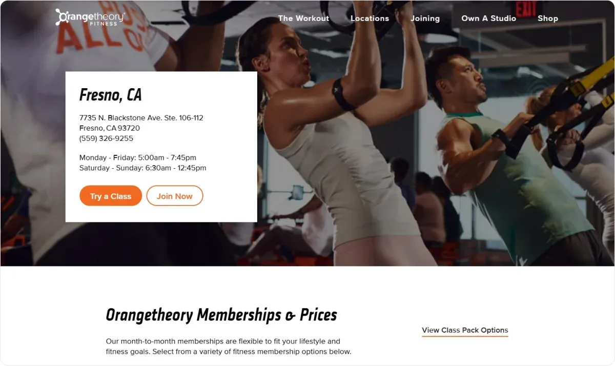
A travel booking page uses high-resolution destination images on a desktop.
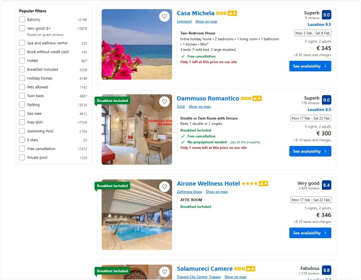
But serves smaller, compressed versions for mobile users.
Videos are displayed in responsive frames that adjust to fit any screen size.
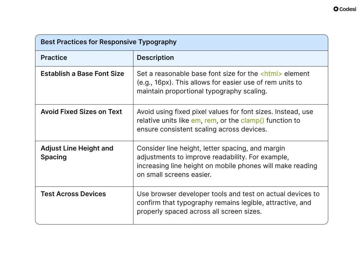
4. Make Typography Readable on All Devices
Text that is too small or poorly spaced on a mobile device can frustrate visitors, while oversized text on desktops can look unprofessional.
To ensure readability, your typography needs to adjust based on the screen size.
How to Implement:
- Use scalable units like em or rem for font sizes rather than fixed pixel values.
- Adjust line heights and letter spacing for different breakpoints to ensure clarity.
- For smaller screens, reduce large headlines to avoid overwhelming users.
- Maintain a clear hierarchy with consistent font sizes for headings, subheadings, and body text.
- Ensure enough contrast between text and background for accessibility.
What to Avoid:
Avoid decorative fonts, which are overly stylized and may include script, ornamental serifs, or quirky characters ( "Comic Sans," "Curlz," or heavily embellished script fonts).
These can be hard to read, especially on small screens, and can make your landing page look unprofessional.
5. Design Buttons and Interactions for Touch Devices
Many users will interact with your landing page on touchscreens.
Elements that are too small or placed too close together can frustrate users and lead to accidental taps.
Optimizing your buttons and interactive elements is crucial to ensure a better user experience on your website, which can positively affect conversions.
How to Implement:
- Make buttons large enough to tap easily, with a minimum size of 48x48 pixels.
- Add sufficient spacing around interactive elements to prevent misclicks.
- If your landing page includes forms, ensure fields are large enough for touch inputs and that mobile-friendly keyboards are triggered where necessary (e.g., numeric keyboards for phone numbers).
6. Focus on Page Speed
Research indicates that 53% of mobile users will leave a website if it takes longer than three seconds to load.
Each second of delay in your website's loading time can result in fewer conversions, whether sales, sign-ups, or other desired actions.
These delays can accumulate into significant revenue losses over time for e-commerce businesses or any site dependent on attracting and retaining customers.
How to Implement:
- Minify CSS, JavaScript, and HTML files to reduce file size.
- Use a content delivery network (CDN) to serve content from servers closer to the user’s location.
- Enable caching for frequently accessed resources so returning visitors experience faster load times.
Example:
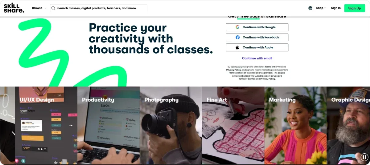
Skillshare, an online course landing page, reduces initial load time by deferring the loading of videos until the user scrolls to that section using lazy loading.
7. Test Your Page on Multiple Devices and Browsers
Even the best-designed landing page can run into problems if it hasn’t been thoroughly tested. Different devices and browsers render content differently, so testing ensures your page performs well for all users.
How to Implement:
- Use tools like BrowserStack or Chrome DevTools to simulate how your landing page appears and functions across various devices (both Android and iOS) and browsers (such as Chrome, Safari, Firefox, etc.).
- Test your landing page on actual devices to identify issues that simulations might miss, such as touch responsiveness, scrolling behavior, and overall user experience.
- Pay close attention to functionality issues such as broken links, forms that don’t submit correctly, or interactive elements that fail to work as intended.
- Look for layout inconsistencies across different platforms. For example, check if text is cut off or if images are distorted on smaller screens.
- A slow-loading page can lead to higher bounce rates, especially on mobile devices where users expect quick access to content. Optimize images and scripts to improve performance.
- Consider conducting user testing sessions where real users interact with your landing page on different devices. Gather feedback regarding their experience, focusing on any difficulties they encounter or suggestions they have for improvement.
8. Use Analytics to Optimize Your Landing Page Continuously
Even the best designs can be improved with insights gained from user data.
User behavior evolves, and what performs well today might not work tomorrow.
Regularly reviewing analytics ensures your landing page remains relevant, efficient, and optimized for its intended audience.
Without this data, you’re essentially guessing at what changes will make your page more effective.
How to Implement:
Before analyzing your page, define what success looks like. Are you trying to reduce bounce rates? Increase form submissions? Drive product purchases? Clear goals will help you interpret analytics data more effectively.
Google Analytics, Hotjar, Microsoft Clarity, or Crazy Egg can provide insights into user behavior. For example, bounce rate, time on page, conversion rates, Click-Through Rates (CTRs), and traffic sources, as well as visual behavior on the website.
Test variations of your landing page to determine what resonates most with users. For instance, you can test different headlines, CTA placements, or layouts to find the most effective combination. With Codesi, you can quickly test your ideas and gather feedback from early users, helping you validate hypotheses and refine your product faster than ever.
Use tools like funnel analysis to identify where users are leaving before completing the desired action. For example, are users abandoning a form halfway through? This insight allows you to address specific pain points.
Dos and Don’ts:
✔️ Regularly review analytics and make incremental changes based on data.
✔️ Use heatmaps to understand which sections of your page get the most attention.
❌ Don’t assume your landing page is “finished.” User preferences and behaviors change over time.
❌ Don’t overanalyze without taking action. Even small, iterative improvements are more effective than sweeping changes.
How Can Codesi Help Yo Create Landing Pages?
Codesi makes creating landing pages fast, simple, and effective.
With AI-driven tools and a user-friendly interface, you can design and launch a professional landing page in just 2-3 minutes, and no technical expertise is needed.
Here’s why you’ll love Codesi:
⚡ Lightning-Fast Page Creation
Generate and deploy a fully functional landing page in minutes. Forget spending weeks on platforms like Wix or Squarespace – Codesi gets you up and running quickly, so you can start collecting feedback or driving conversions immediately.
⚡ Effortless Customization
Choose your website blocks, colors, and content with ease. Use the built-in editor to adjust text, generate unique images and logos, and tweak the layout to fit your needs, all without starting from scratch.
⚡ Powerful Features Made Simple
- Deploy anywhere: Use your domain or Codesi’s subdomain.
- Track performance: Add Google Analytics to monitor traffic.
- Collect feedback: Receive form responses directly in your email.
⚡ Cost-Effective and Accessible
Get your first website for free or choose affordable pricing for additional features.
Codesi is perfect for small businesses, startups, and individuals looking to test ideas quickly without breaking the bank.
Why Codesi Stands Out?
- Faster: Create a page in minutes, not weeks.
- Simpler: Designed for non-technical users.
- Unique: AI-generated content ensures every page stands out.
With Codesi, creating a landing page is no longer a chore. It's quick, intuitive, and designed to help you succeed.
Try Codesi for free and ensure your landing page is perfectly designed and responsive!
Create your website with AI today
Codesi is a platform where you can make a website in 3 minutes.
No coding, no designers, no hassle - just AI.
