Back to blog
5 Best Waitlist Landing Pages (How to + examples)
Explore the best waitlist landing pages, how they work, and why they're essential for building anticipation and capturing leads effectively.
Feb 10 2025
A waitlist landing page is your chance to build excitement and connect with potential users before your product or service launches.
It helps you create buzz, validate your idea, and build a loyal community.
However, designing a successful page requires a thoughtful approach to messaging, visuals, and user experience.
In this guide to the 5 best waitlist landing pages, we will explore what makes them effective and provide tips to create your own winning pages that convert visitors into leads.
What Are the Benefits of the Waitlist Landing Page?
A waitlist landing page has one primary goal – to build an audience and generate excitement before the official release.
Why should you have one?
- Early validation: Understand demand and collect feedback before investing heavily in development or production.
- Building community: Create a group of engaged early adopters who feel personally connected to your brand.
- Generating buzz: Build anticipation by offering exclusive early access to those who sign up.
8 Key Elements of a Successful Waitlist Landing Page
To make your waitlist landing page truly effective, you need more than just good looks.
Each element should have a clear purpose and guide visitors toward signing up.
1. A Clear and Powerful Headline
Your headline needs to grab attention, explain the purpose of your page, and highlight the main benefit of signing up.
Use specific language that answers “What’s in it for me?” instead of being vague.
For example:
❌ Weak: “Join Our Waitlist.”
✔️ Strong: “Get Early Access to the App That Saves You 5 Hours Every Week!”
A headline should excite your audience and instantly communicate why your product or service is worth their time.
2. A Strong Value Proposition
A value proposition explains exactly what users gain by signing up. This should be the core of your landing page and supported by the rest of the content.
Focus on tangible benefits or exclusivity. Think of it as answering the question, “Why should I care?”
This is how to do it:
- Start with the main benefit: “Early access to exclusive features.”
- Add a differentiator: “Designed to solve [specific problem].”
- Highlight urgency: “Limited to the first 1,000 sign-ups.”
3. Engaging Visuals That Tell a Story
Visuals are powerful tools that help your audience understand and feel excited about your product. A demo video, animated walkthrough, or screenshots can make a huge impact.
❌ Don’ts: Avoid generic stock photos or abstract images that don’t connect with your audience.
✔️ Dos: If your product is an app, include a short animation showing how it works or a mockup of the interface. For physical products, show real-life use cases or close-ups of key features.
4. Social Proof to Build Trust
People trust what others trust. Adding social proof reassures visitors that they are making a good decision by joining your waitlist.
Types of social proof you should include:
- Testimonials from early adopters.
- Statistics like the number of sign-ups (“Join 10,000 others already on the list”).
- Logos of publications that featured your product.
📌 Tip: If you do not have testimonials yet, use placeholder social proof like “Be part of our exclusive community of innovators.”
5. A Simple and Intuitive Sign-Up Form
The sign-up form is the most critical part of your page. It should be easy to find, quick to fill out, and free from distractions.
Optimization tips:
- Keep it short. Ask for essential information only, such as name and email.
- Place the form above the fold so users do not have to scroll to find it.
- Include a clear and bold call-to-action button. Use action-oriented language like “Join the Waitlist” (or “I’m in!” ) instead of “Submit.”
6. A Sense of Urgency to Motivate Action
Urgency creates a psychological push for users to act immediately rather than putting it off.
How to create urgency:
- Mention limited availability: “Only 200 spots left.”
- Use time-sensitive language: “Sign up today to guarantee early access.”
- Highlight exclusive benefits for early sign-ups: “Be among the first to unlock VIP features.”
For additional impact, include a countdown timer showing how much time remains to sign up before the waitlist closes.
7. A Consistent and Mobile-Friendly Design
Your page must look polished and work seamlessly across devices. Many users will access your page from their phones, so a mobile-first design is essential.
Design tips:
- Keep the layout clean and clutter-free. Focus on one clear goal: sign-ups.
- Use large, legible fonts and buttons that are easy to tap.
- Test the page on multiple devices to ensure it loads quickly and looks professional.
8. Clear Next Steps for Your Audience
Once users sign up, let them know what happens next. Do not leave them wondering what to expect after joining your waitlist.
What to include:
- A confirmation message or email: “Thanks for signing up! You will hear from us soon.”
- Details about when they can expect updates or access.
- Optional sharing links to spread the word: “Invite your friends and earn exclusive perks!”
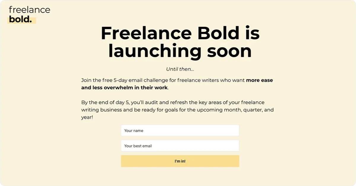
5 Best Waitlist Landing Pages for Inspiration
Let’s explore some top-notch examples of waitlist landing pages that got it right and why they worked so well.
1. Robinhood
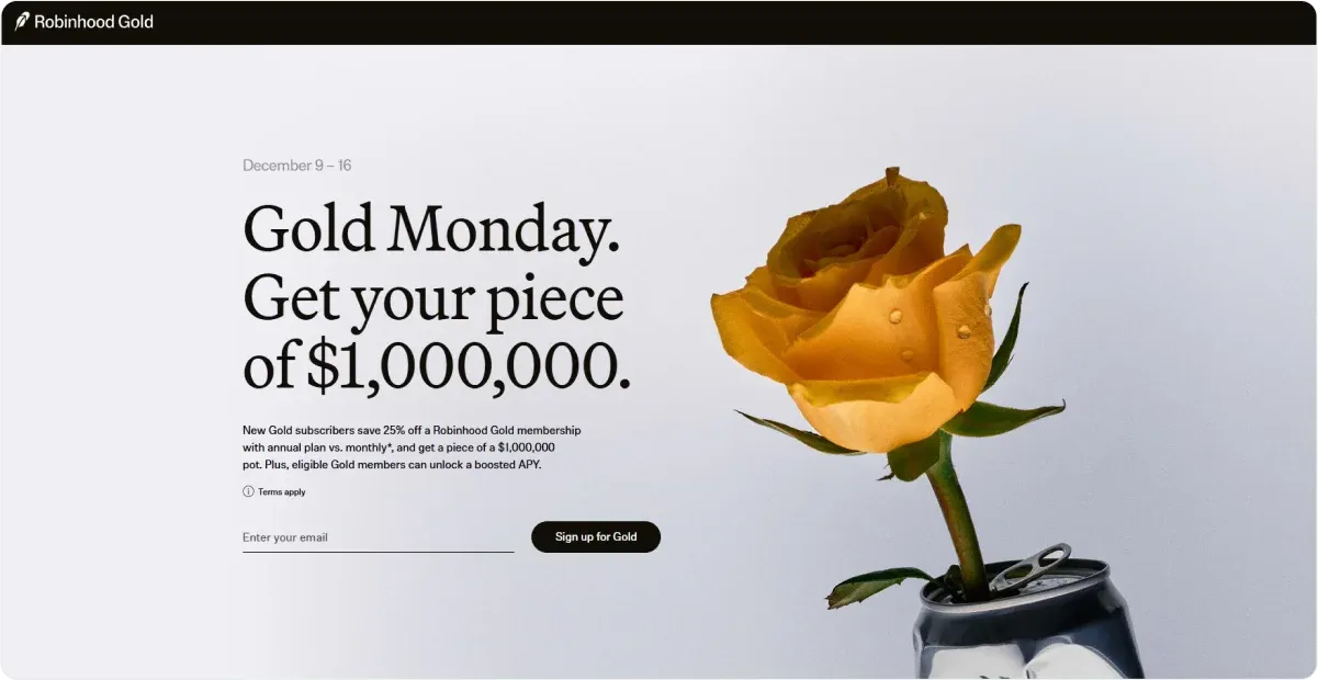
The waitlist landing page for Robinhood Gold presents several compelling features that make it effective for converting visitors into subscribers:
- Clear value proposition: The page highlights a specific offer – boosting the interest rate by 0.5% for 60 days – directly communicating the benefit to potential subscribers. This clarity helps users quickly understand what they gain by signing up.
- Incentives for new subscribers: It emphasizes that all eligible new subscribers will receive a part of a collective pot, which adds an element of excitement and urgency.
- Cost-effective pricing: The landing page mentions a promotional price of $45 for new Gold subscribers, compared to the regular price of $60 per year on the monthly plan. This pricing strategy positions the offer as a limited-time deal, encouraging users to subscribe sooner rather than later.
- Simplicity and focus: The design is likely straightforward, focusing on the essential information without distractions, which helps guide users toward taking action.
2. Depology
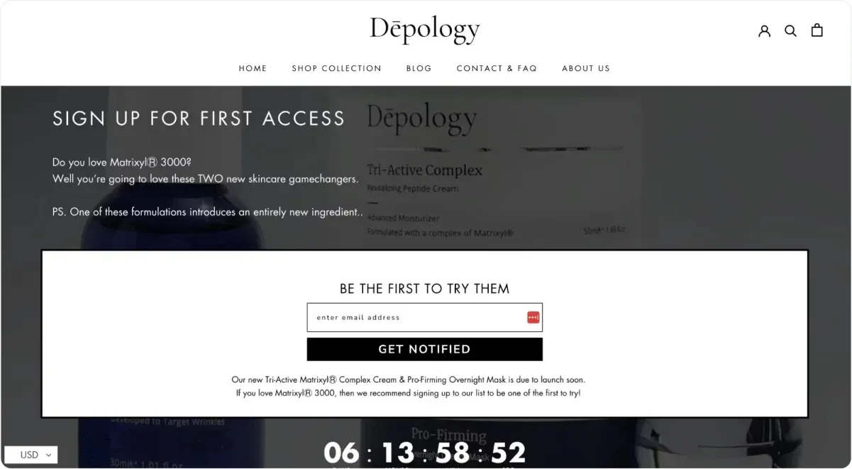
The waitlist landing page for Depology’s new skincare products incorporates several effective features to generate excitement and drive sign-ups:
- Urgency-driven calls to action: The page uses compelling CTAs like “Be the first to try them,” encouraging visitors to act quickly and secure their spot for early access. This sense of exclusivity creates a feeling of importance and FOMO (fear of missing out).
- Countdown timer: A prominent countdown timer builds anticipation for the product launch, reminding visitors of the limited time available to sign up. This visual element reinforces the urgency conveyed by the CTAs.
- Email capture form: The page invites visitors to sign up for launch notifications, enabling the brand to grow its email list and nurture relationships with potential customers ahead of the release. This strategy not only builds excitement but also sets the stage for driving early sales once the products are available.
- Customer engagement insights: By collecting sign-ups, the page allows Depology to gauge interest in its upcoming product line, providing valuable data for planning future marketing efforts.
3. Ellipsus
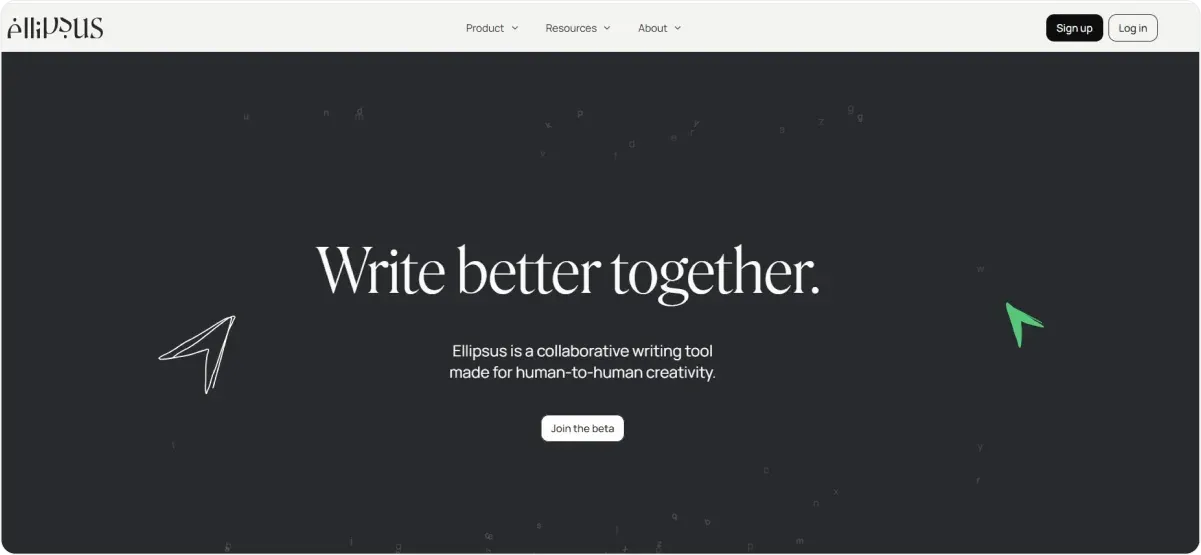
The waitlist landing page for Ellipsus effectively engages visitors and encourages sign-ups through several well-executed elements that showcase its value and build anticipation:
Clear Value Proposition
- Targeted audience messaging: The page explicitly identifies its audience – creative writers – with the phrase “Made for creative writers.” This clarity ensures visitors immediately understand who the tool is for and why it is relevant to them.
- Unique selling points: Ellipsus sets itself apart by focusing on collaborative writing, unlike typical tools designed for memos or notes. Phrases such as “One place for drafts, edits, and discussions” highlight its specific functionality, making the benefits clear to potential users.
Engaging Messaging
- Creative language: The use of evocative phrases like “build worlds,” “wrench hearts,” and “celebrate creativity” appeals directly to the emotions and aspirations of writers, creating a sense of inspiration and connection.
- Community-oriented positioning: The statement “By writers, for writers” fosters a sense of shared values and belonging, resonating with the creative audience.
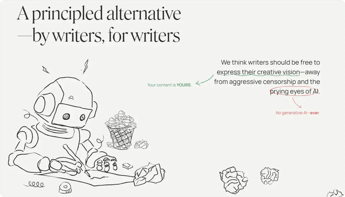
Strong Design Elements
- Trust reinforcement: Messaging around content ownership (“Your content is YOURS”) reassures users about privacy and control, addressing potential concerns about AI interference and encouraging sign-ups.
Compelling Call to Action (CTA)
- Exclusive early access: The CTA “Join the beta” invites users to sign up for early access, creating a sense of exclusivity and motivating immediate action.
4. Backseat.ai
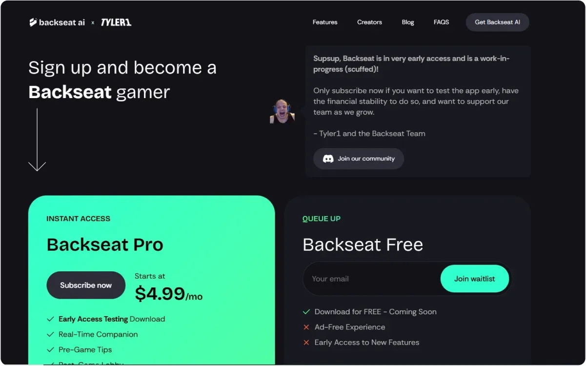
The waitlist landing page for Backseat is a creative example of how to engage visitors by providing multiple pathways for participation, fostering excitement and trust ahead of launch:
Flexible Engagement Options
- Instead of limiting visitors to a single action, Backseat offers two choices: waiting for the free version or opting for early access to premium features. This flexibility ensures the page appeals to both cautious users and those eager to dive in right away.
- Visitors are guided with clear descriptions of each option, helping them make an informed decision. By highlighting benefits rather than upselling, the messaging feels balanced and user-focused.
Intuitive Layout
- Key details, such as the benefits of early access versus waiting, are visually organized for clarity and impact.
Buzz Creation
- With a sneak peek at premium features and the opportunity to secure early access, the page builds anticipation without excluding those who prefer to wait. This dual approach maintains excitement for all visitors.
5. IX Global
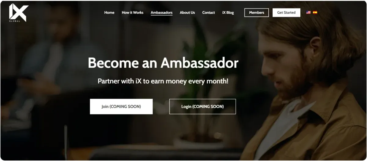
The waitlist landing page for IX Global effectively engages users by focusing on its ambassador program and email updates, setting the foundation for a strong launch.
Clear Value Proposition
- The page promotes the chance to become an ambassador, giving users a direct role in the brand’s growth.
- Signing up for email updates ensures interested users stay informed until the launch.
Straightforward Messaging
- The content highlights the ambassador opportunity as a key benefit, making it clear how users can get involved.
- The focus on updates and involvement builds a connection with potential participants.
Focused Design
- The layout prioritizes the ambassador program and sign-up form, ensuring users immediately see the main action points.
Direct Call to Action (CTA)
- The page encourages users to “Sign Up to Join the Ambassador Program” and stay updated, making the next step simple and clear.
Launch Preparation
- By recruiting ambassadors early, IX Global builds a ready-made community to support the launch.
This approach ensures the landing page is actionable, engaging, and effective at generating interest and participation ahead of launch.
How Can Codesi Help You Make a Waitlist Landing Page?
Creating a waitlist landing page shouldn’t take weeks of effort or a deep dive into web design tools.
Codesi’s Landing Page Generator makes this process fast, efficient, and accessible, allowing you to focus on what matters – connecting with your audience and growing your business.
1. Effortless Page Creation with AI
With Codesi, generating a professional waitlist landing page takes as little as 2–3 minutes. Instead of struggling with blank pages or endless design choices, you simply provide a prompt that describes your needs. The AI handles the heavy lifting, crafting a functional and visually appealing page with the following:
- Pre-Written Content: Say goodbye to writer’s block. The generator creates the majority of your text and chooses illustrations that fit your prompt, saving you hours of brainstorming.
- Customizable Design: Tailor the look and feel of your page to your brand by selecting color schemes and specific blocks (e.g., headers, FAQs, or signup forms). This ensures your page stands out while keeping the process simple.
2. Intuitive Editing Tools
While Codesi manages most of the work, you remain in control. The platform includes an editor that allows you to:
- Change text and images to match your exact messaging.
- Rearrange or delete blocks to adjust the structure of your page.
- Preview changes in real-time to ensure the page meets your expectations.
This level of flexibility means you can adapt the page for any purpose, whether to build excitement for a new product or gather early sign-ups for a service.
3. Instant Deployment
Once your landing page is ready, you can publish it immediately without navigating complicated technical setups. Codesi offers two deployment options:
- Your Domain: Publish the page directly to your own domain (e.g., yourbusiness.com) for a polished, professional appearance.
- Codesi’s Subdomain: For users without a domain, Codesi provides a free subdomain (e.g., example.codesi.ai), ensuring your page is accessible without additional costs.
4. Seamless Feedback Collection
A waitlist landing page is only as good as its ability to capture interest. With Codesi, you can integrate feedback forms directly into your page.
Any submitted responses are automatically sent to your email, so you can keep track of potential customers and their questions or comments without juggling multiple platforms.
5. Built-In Analytics
Understanding how your landing page performs is crucial for improving its effectiveness. Codesi allows you to integrate Google Analytics, enabling you to track:
- Visitor numbers.
- Page interaction patterns.
- Conversion rates (e.g., how many users sign up for your waitlist).
This data helps you make informed decisions about adjustments to your page, ensuring it resonates with your audience.
Why Choose Codesi for Your Waitlist Landing Page?
Codesi stands out by combining speed, ease of use, and customization.
Unlike traditional tools like Wix or Squarespace, which can take weeks to build and finalize a website, Codesi delivers a fully functional landing page in minutes.
It’s designed to be user-friendly, with fewer unnecessary options to overwhelm you, yet powerful enough to deliver a unique and professional result.
Whether launching a new product, gauging interest for a service, or gathering early adopters for a beta program, Codesi empowers you to create a compelling waitlist landing page quickly and with minimal hassle.
Start creating now: Sign up for Codesi and build your landing page in just minutes – no design skills needed!
Keep Learning
Create your website with AI today
Codesi is a platform where you can make a website in 3 minutes.
No coding, no designers, no hassle - just AI.
