Back to blog
10 Best Startup Landing Page Examples & Ideas To Use in 2026
Discover the best startup landing pages that inspire trust, drive action, and show you how to turn your idea into a high-converting experience.
Jul 26 2025

Every startup begins with a pitch, an idea bold enough to challenge the status quo, fragile enough to be overlooked. The landing page is where that idea takes shape.
It's the first moment a stranger sees your ambition, judges its potential, and decides if it's worth their time, money, or belief.
Yet most startup pages miss that moment. They chase trends, flood the screen with jargon, or hide behind designs that say nothing.
This guide showcases the best startup landing page examples and reveals how they create trust, clarity, and momentum beyond just good design.
What Is a Startup Landing Page?
A startup landing page is a dedicated web page designed to introduce a new business, capture interest, and drive a specific action, such as joining a waitlist, booking a demo, or supporting a launch.
It's important not to confuse startup landing pages with lead generation landing pages. While both aim to convert, startup pages focus on introducing a new product, building trust, and driving early traction, not just collecting emails.
10 Best Startup Landing Page Examples and What Makes Them Work
Here are the best startup landing page examples, designed to capture attention, communicate value clearly, and move visitors to act:
1. Stripe
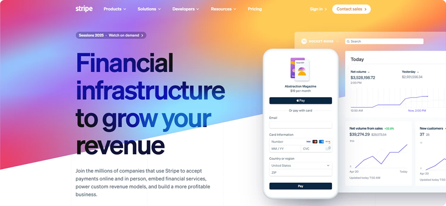
Stripe began as a startup aiming to simplify online payments, and its landing page still reflects that clarity of purpose.
Rather than overwhelming visitors with features, it highlights core benefits and product visuals with restraint, letting the design speak for itself. This minimalist approach mirrors the simplicity Stripe set out to bring to payments.
What Makes It Work:
Stripe uses clean design and strategic whitespace to convey confidence, ease of use, and technical maturity, without saying too much.
Key Takeaway:
A streamlined layout with clear messaging shows that less can be more, especially for startups looking to appear focused, trustworthy, and product-driven.
2. Copy.ai
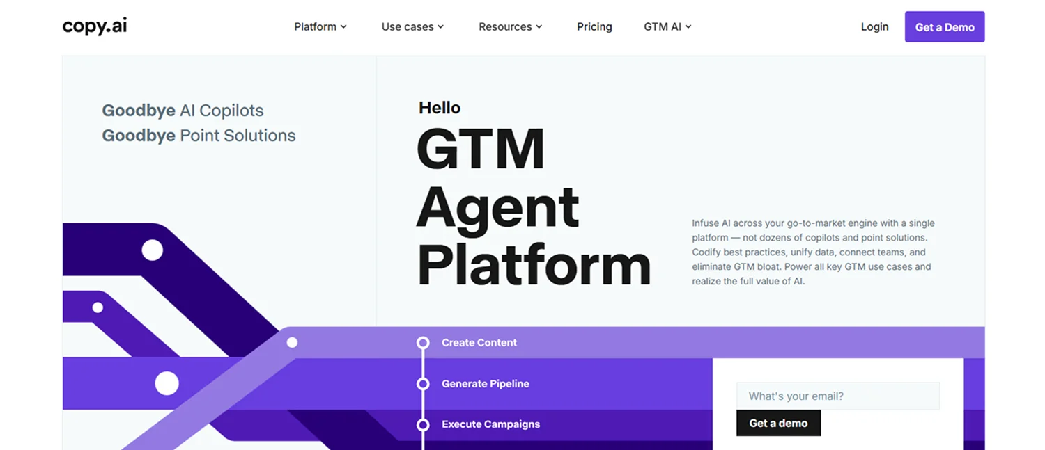
Copy.ai started as a lean startup focused on automating copywriting, and today it positions itself as an enterprise-ready AI platform for marketing and sales teams.
Instead of playful visuals, the design leans into clarity and professionalism, featuring clean typography, enterprise logos for credibility, and structured sections that highlight solutions, integrations, and use cases. The primary CTA is "Get a Demo," signaling a shift from self-serve to high-value, B2B onboarding.
What Makes It Work:
Copy.ai uses enterprise-driven messaging, social proof, and a calm, structured design to appeal to decision-makers looking for scalable AI solutions, not just content tools.
Key Takeaway:
When targeting the enterprise, clarity, trust signals, and solution-oriented structure are key. Use your landing page to reposition from startup utility to serious business platform.
3. Deel
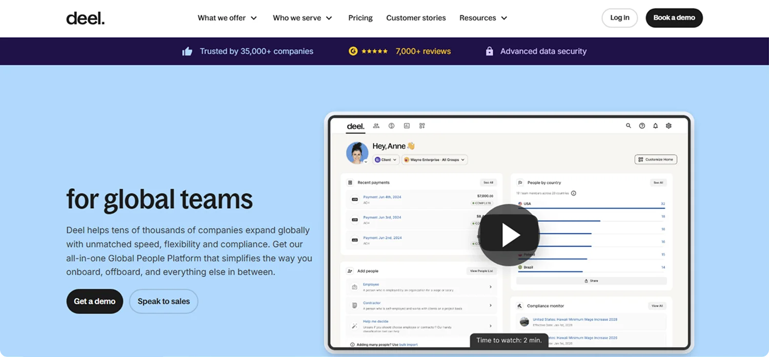
Deel began as a startup simplifying remote hiring in 2019; now it powers global teams for companies of all sizes.
The homepage leads with a confident hero section: "Deel helps tens of thousands of companies expand globally with unmatched speed, flexibility, and compliance."
Scrolling reveals focused sections on hiring, payroll, EOR, and integrations - each supported by data points, product visuals, and global credibility.
What Makes It Work:
Deel combines a sharp, benefit-driven headline with structured content and recognizable brand logos to convey authority in the global employment space immediately.
Key Takeaway:
Lead with scale and trust, use concise messaging to highlight core benefits, and structure the page around enterprise-friendly actions like demo requests.
4. Mercury
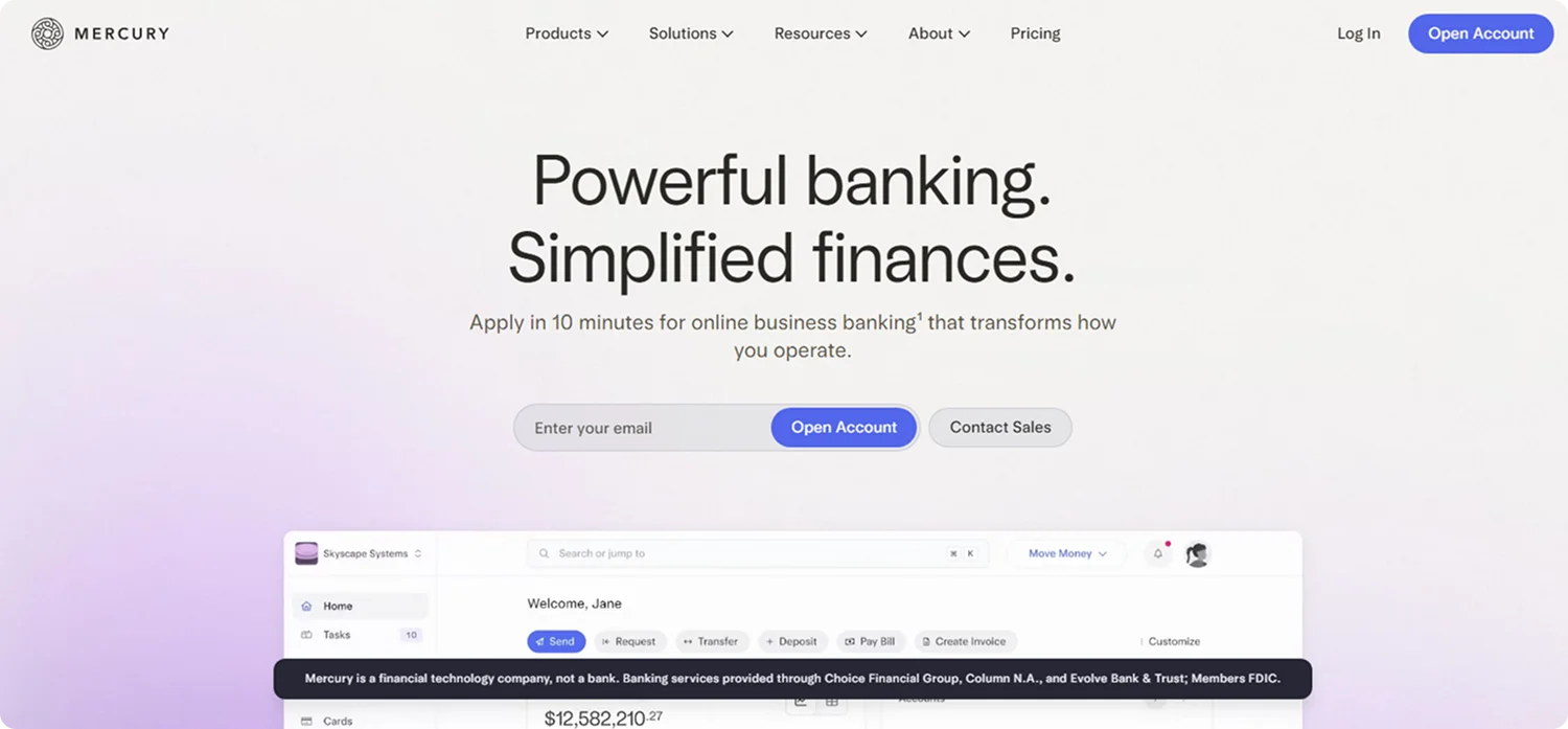
Mercury launched as a startup to modernize banking for startups.
Its landing page hero section leads with a direct headline: "Powerful banking. Simplified finances." The page pairs two clear CTAs, "Open Account" and "Contact Sales," with an email capture field to simplify onboarding.
The design showcases product screens, emphasizes quick setup ("Apply in 10 minutes"), and highlights benefits like free wires, corporate cards, and cash management.
What Makes It Work:
Mercury uses straightforward messaging, minimal friction, and visual transparency to speak directly to tech-savvy startups and growing businesses.
Key Takeaway:
A clear headline, fast access, and proof of trust can make your landing page resonate with users who need speed and reliability from day one.
5. Readwise
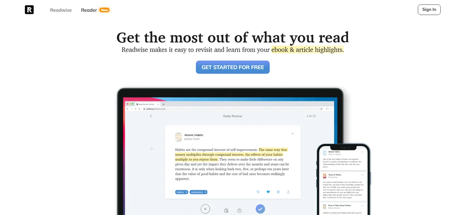
Readwise launched as a startup focused on helping readers retain more of what they read, and its homepage reflects that mission with precision.
The hero headline clearly states the benefit: "Get the most out of what you read."
Beneath that, the main "Get started for free" CTA, paired with a clean email sign-up form, invites quick onboarding. The page guides users through key features like highlight syncing (from Kindle, Pocket, and Instapaper), daily review emails, and spaced-repetition recall – each explained with clear icons and short, helpful descriptions.
What Makes It Work:
The page uses a structured feature walkthrough and credible testimonials to build trust fast, while the single focus CTA minimizes friction and drives sign-ups.
Key Takeaway:
Use clarity and user-focused benefits to explain a startup's value, then back it up with trust signals and a direct, single-action CTA to convert curiosity into action.
6. Arc Browser
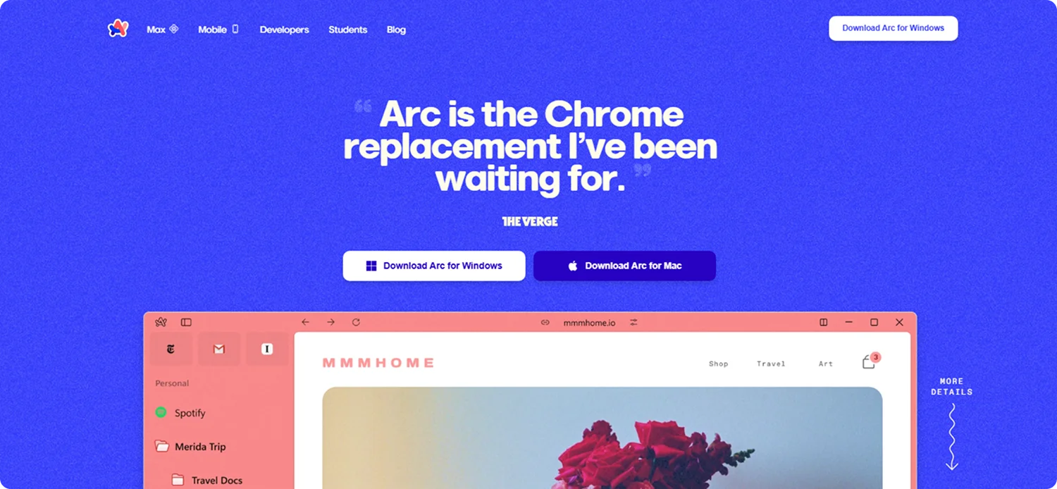
Arc, created by The Browser Company, started as a startup with one goal, to reinvent the browser as a calmer, more personal space.
The homepage opens with a compelling headline: "Arc is the Chrome replacement I've been waiting for." The layout is clean, highlighting Arc's unique sidebar interface, tab organization, and built-in tools like Easels and Arc Max (its AI-powered assistant).
What Makes It Work:
Arc's homepage communicates its positioning as a modern alternative to Chrome, combining focused messaging, visual simplicity, and a direct path to download.
Key Takeaway:
When challenging an industry standard, anchor your landing page in a clear, relatable value statement and reinforce it with an intuitive structure and product-first design.
7. Almanac
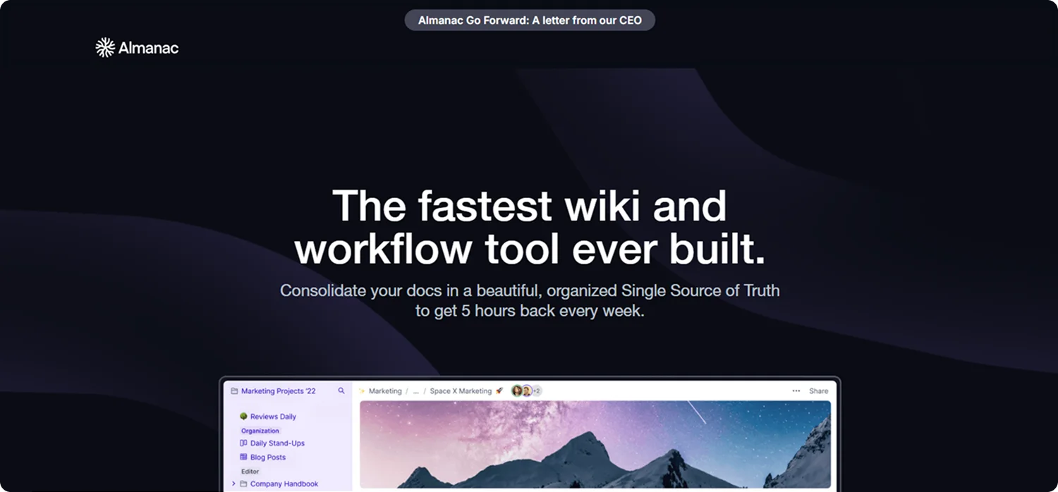
Almanac began as a startup dedicated to streamlining team documentation, and its homepage reflects that mission with sharp clarity.
The hero area leads with a focused headline: "The fastest wiki and workflow tool ever built." A strong subheadline follows: "Consolidate your docs in a beautiful, organized Single Source of Truth to get 5 hours back every week."
Scrolling down, the page clearly outlines key benefits and capabilities with concise sections: real-time collaboration, approvals, version control, templates, databases, kanban boards, and embedded media, supported with clean icons, screenshots, and bold value statements.
What Makes It Work:
Almanac speaks in outcomes, like saving time and reducing tool fatigue, while visually mapping those features in a neat, modular layout.
Key Takeaway:
Position your landing page around a strong outcome-focused headline, support it with concrete metrics and feature snapshots, and funnel users with a single, explicit action to access the product early.
8. Taskade
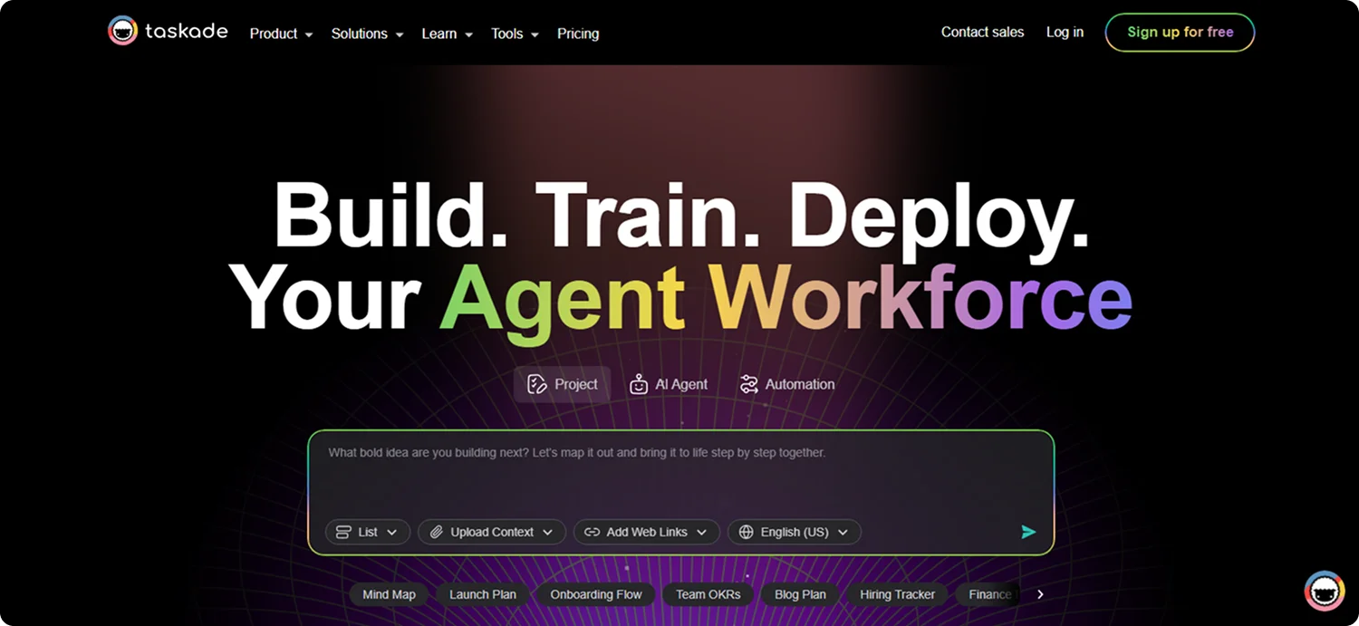
Taskade was born as a startup focused on real‑time collaboration, and its homepage emphasizes that origin with clarity and ambition.
The hero headline reads: "Build, train, and deploy AI agents & automate tasks in one unified workspace." The primary CTA, "Sign up for free," sits alongside platform badges, signaling easy access.
Scrolling down reveals clear sections on AI Agents, Automations, multiple project views (list, board, mind map), and collaboration tools, each with short descriptions and visuals.
What Makes It Work:
Taskade foregrounds its AI-driven collaboration tools while showcasing the breadth of its product, agent teams, templates, and cross-platform support, using user‑focused messaging and social proof.
Key Takeaway:
Position your startup around a compelling AI‑enhanced promise, layer in clear visuals of features, and invite users with a risk‑free CTA backed by social proof and platform credibility.
9. Pika Labs
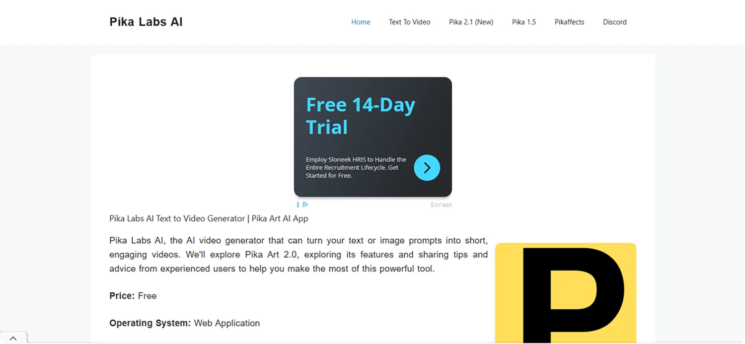
Pika Labs is an "AI video generator that can turn your text or image prompts into short, engaging videos," and its homepage takes a direct, information-first approach to that mission.
Rather than relying on flashy visuals or animations, the page takes a more descriptive route, highlighting features like Pikaframes, PikaTwists, and text-to-video with straightforward text blocks and static previews.
What Makes It Work:
Pika Labs favors an explanation-driven design over visual flair, making it easy for new users to understand what's possible, especially helpful for those less familiar with AI video tools.
Key Takeaway:
When targeting users exploring new tech, a descriptive homepage with exact feature breakdowns can build confidence and encourage deeper engagement.
10. Opal
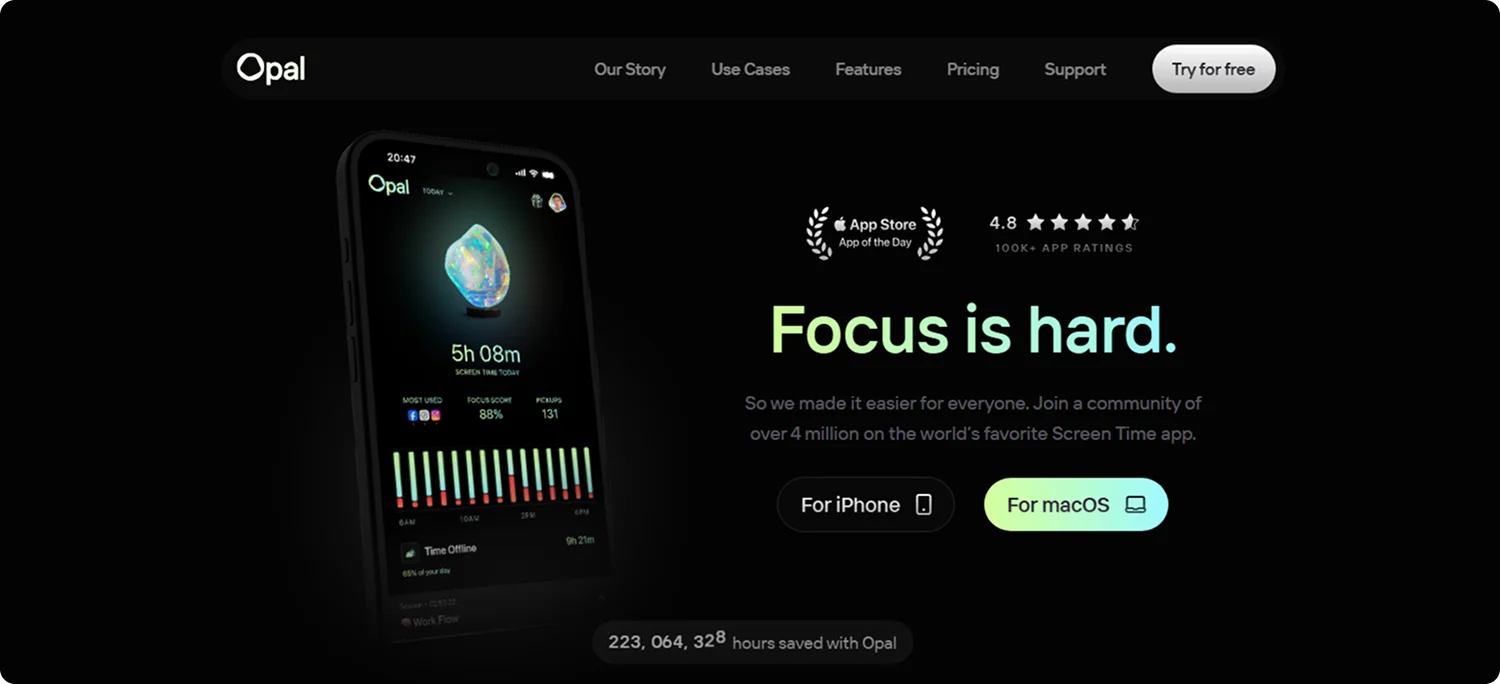
Opal is a startup centered on reclaiming user attention, and its homepage models that mission with clarity and data-driven confidence.
The hero section kicks off with a statement of impact: "Focus is hard. So we made it easier for everyone."
It follows with social proof: over 4 million users and a 4.8 App Store rating, then prompts immediate action with strong CTAs: "Try Opal for free" on both iPhone and Mac.
What Makes It Work:
Opal pairs narrative and impact, a clear mission statement, quantified outcomes, and curated feature presentation, to turn interest into action.
Key Takeaway:
Position your startup with a clear problem statement, back it with data-rich impact metrics, highlight key features visually, and offer frictionless onboarding to convert users quickly.
What We Can Learn from the Best Startup Landing Page Examples
All these best startup landing page examples began as early-stage ventures and built trust, momentum, and traction through landing pages that did more than look good; they performed.
Here's what makes them work:
✅ Captivating Hero Section: This is where visitors decide to scroll or bounce. A high-impact headline, supported by a sharp subheading and a visual (screenshot, animation, or product demo), should immediately communicate what your product does and who it's intended for.
✅ Clear, Concise Value Proposition: Within seconds, visitors should understand how you solve their problem. Skip buzzwords. One focused sentence, written like a promise, should answer: "Why this product, and why now?"
✅ Visual Storytelling That Engages Instantly: Show, don't tell. Use clean product visuals, live demos, or subtle animations to walk users through your experience.
✅ Social Proof That Builds Instant Credibility: Startup users want to know they're not the first to trust you. Display testimonials, recognizable customer logos, user stats, or press features to reduce doubt and boost confidence.
✅ One Strong, Action-Oriented CTA: Your call-to-action should be clear and benefit-driven. Whether it's "Get a Demo," "Start for Free," or "Join the Waitlist," use language that emphasizes what the user gains, not what they need to give.
✅ Smart, Minimal Forms: Forms should never feel like work. Only request essential info, use autofill where possible, and keep it short.
✅ Feature Highlights with Real-World Relevance: Use a visual grid or icon-based layout to convey your most important features quickly. Focus on outcomes, not just functionality.
✅ Built-In Trust Signals: New startups need to earn trust fast. Add subtle but meaningful trust elements: privacy language, security badges (for fintech or SaaS), uptime stats, or compliance indicators.
✅ Mobile-First, Lightning-Fast Design: With over 60% of traffic coming from mobile, your page must load fast, look sharp on every screen, and offer intuitive tap targets.
✅ Simplicity That Prioritizes Conversion: Every element on the page should have a purpose. Remove anything that distracts from your core message.
Turn Your Vision into a High-Performing Startup Landing Page with Codesi
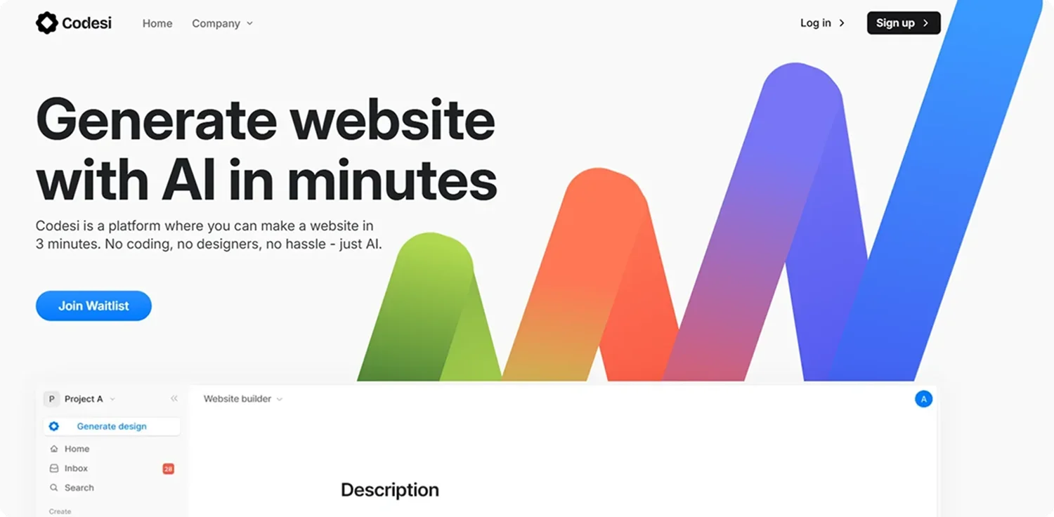
The best startup landing page examples are the result of clear messaging, intentional design, and innovative structure. You've seen what works: sharp headlines, focused benefits, social proof, and CTAs that move people to act.
Now it's your turn to build one.
Codesi helps you launch a startup landing page that's fast, conversion-ready, and fully tailored to your idea, with no coding or design skills required.
Here's why it works:
- AI-generated in minutes – Describe your product and audience, and get a complete landing page layout ready to customize and publish.
- Built for conversion – Each page includes essential sections: value prop, visuals, CTAs, social proof, all strategically placed for results.
- Drag-and-drop editing – Update text, swap visuals, change structure, and fine-tune every block with total ease.
- Optimized for mobile and speed – Your page loads instantly and looks polished on every device, keeping visitors engaged and bounce rates low.
- Analytics-ready – Plug in your favorite tools to track performance, refine messaging, and improve conversion rates over time.
Here's how to easily generate startup landing pages with Codesi - step by step:
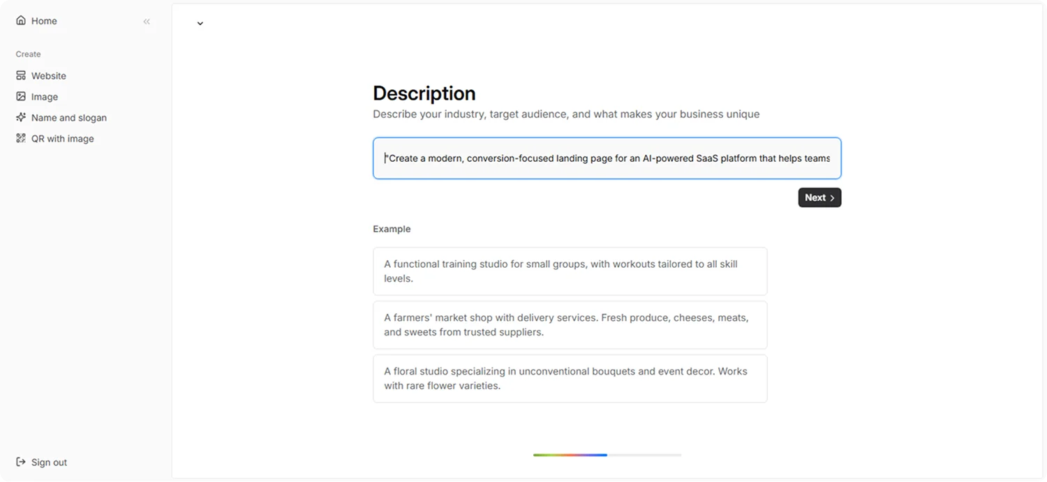
Step 1: Sign up on Codesi (it's free)
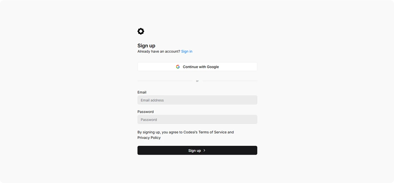
Step 2: In the Website Builder, enter your prompt. For startup landing page creation, we used the following example:
"Create a modern, conversion-focused landing page for an AI-powered SaaS platform that helps teams automate repetitive tasks. The design should be clean and minimal with a strong CTA, testimonials, and product demo sections."
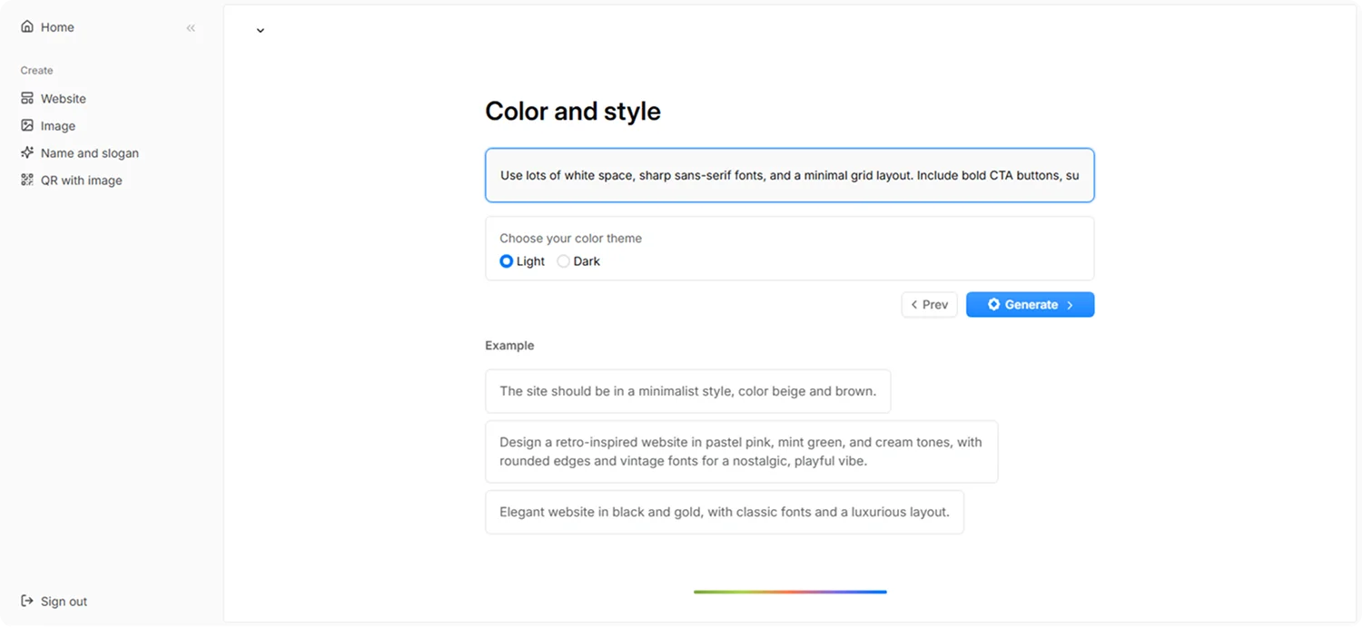
Step 3: Choose your color theme and style. For this example, we used:
“Use lots of white space, sharp sans-serif fonts, and a minimal grid layout. Include bold CTA buttons, subtle icons, and sleek product mockups. The hero section should be simple and focused. Use UI previews, 3-column benefits, and rounded testimonial cards. Style should feel like Linear or Notion – elegant, fast, and conversion-driven.”
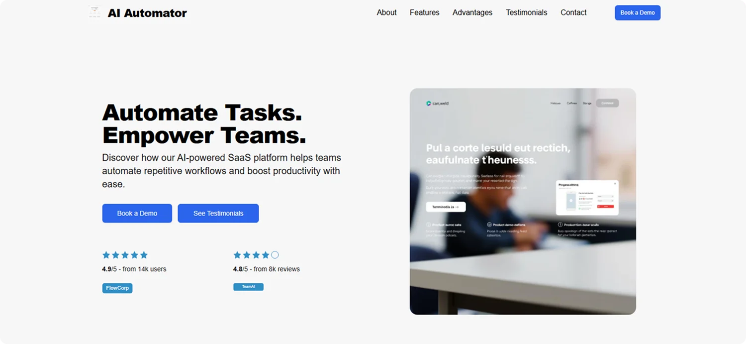
Step 4: Click "Generate" and wait a few minutes while Codesi generates your startup landing page.
Codesi will generate a startup landing page you can easily customize and optimize to fit your goals.
Want to make your startup look credible from day one?
Launch your idea with Codesi in minutes and make your startup page your strongest first impression.
Create your website with AI today
Codesi is a platform where you can make a website in 3 minutes.
No coding, no designers, no hassle - just AI.
