Back to blog
15 Best SaaS Landing Pages [What Makes Them So Effective]
Explore the best SaaS landing pages that inspire higher conversions by showing you how clarity, trust, and smart design turn visitors into customers.
Sep 10 2025
![15 Best SaaS Landing Pages [What Makes Them So Effective]](https://codesi.ai/admin/static/Cover_6f2f81f218.webp)
For SaaS companies, the landing page often is the showroom. Benchmarks show the median conversion rate across industries is about 6.6%, while SaaS pages lag behind at roughly 3.8%.
If you can push that number closer to 7-10% with sharper messaging and better UX, you’re not just improving a stat, you’re changing the revenue math.
In 2008, Barack Obama’s campaign team ran a simple A/B test on its splash page. They swapped out the hero image and tweaked the button copy.
The winning version boosted the signup rate from 8.26% to 11.6%, a 40.6% jump. That single test added an estimated 2.88 million email subscribers and $60 million in donations.
Same lesson today: small changes on a landing page can compound into huge results.
This guide breaks down what makes SaaS landing pages perform, shows 15 best SaaS landing page examples, and gives you practical ways to apply the same tactics.
Let’s dive in.
What makes SaaS landing pages perform
SaaS products aren’t physical. You’re selling an outcome and a workflow, so clarity and trust matter more than flashy design.
1. Clarity over complexity
SaaS tools solve complicated problems, but too many features on the page can overwhelm visitors. The best pages answer three things quickly:
- what it does,
- who it’s for, and
- the main benefit.
Pages written at a 5th-7th-grade reading level consistently outperform harder-to-read ones. If you don’t know how to achieve that, we suggest using tools such as Grammarly and the Hemingway app.
2. Trust and risk reduction
Buying software feels risky: time, cost, migration, security. Strong pages reduce that risk with targeted proof such as customer logos that match the audience, results-driven testimonials, short case studies, transparent pricing or trial terms, and visible security signals. With attention spans shrinking, clarity and credibility carry extra weight.
3. Multiple decision-makers
In SaaS sales, the buyer isn’t just one person. A marketer, team lead, and CFO all care about different things. Great landing pages stick to one core promise but give role-specific paths like “See ROI,” “See integrations,” or “See security.”
4. Longer buying cycles, more nurturing
B2B SaaS purchases rarely happen on the first visit. That’s why strong landing pages layer multiple CTAs: “Book a demo,” “Start free trial,” “Download the guide.” Capture interest now, then nurture it. SaaS data also shows that email is one of the top-converting channels, with a median conversion rate of approximately 16.9%, which supports this approach.
5. Mobile traffic is huge, so the page has to work there
Around 79% of SaaS landing page visits now come from mobile. While conversion rates are about the same as desktop, the experience has to be smooth: fast loading, scannable copy, and thumb-friendly CTAs.
The anatomy of a high-converting SaaS landing page
Six elements show up consistently on SaaS pages that convert well.
1. A hero section that answers three questions fast
What it is. Who it’s for. Why it helps. Your headline and subhead should make this clear in seconds. Use simple language and pair it with a visual that reinforces the promise, such as a short loop of the product in action or a screenshot that supports the claim.
Quick checks:
- Can a new visitor repeat your value prop after five seconds?
- Does the visual show the promised outcome (not just an abstract graphic)?
- Is there one clear primary CTA above the fold?
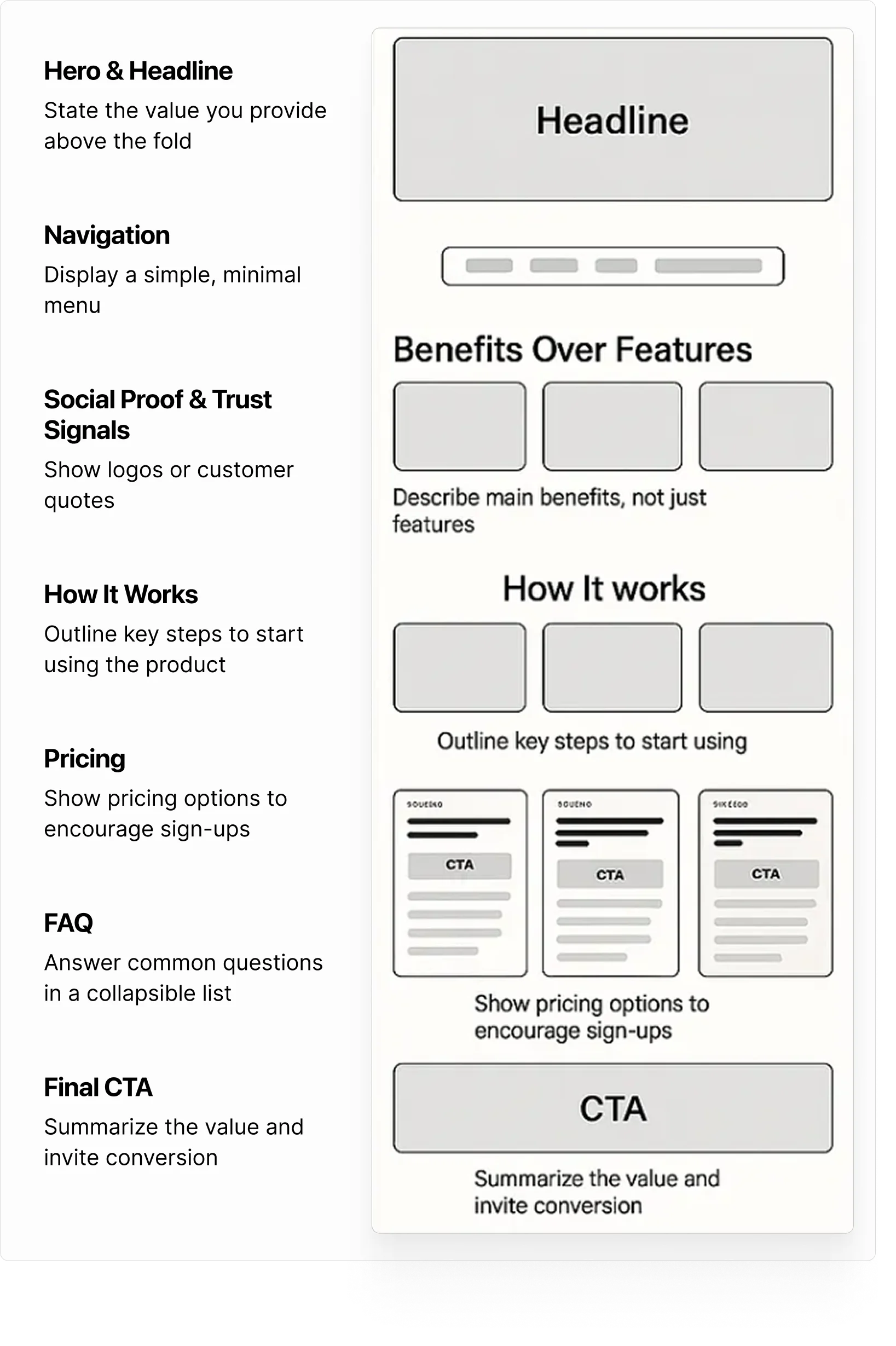
2. Social proof that matches your buyer
Proof only works if it feels relevant. A startup page overloaded with Fortune 500 logos can backfire. Small teams want to see “companies like mine.” Keep testimonials concrete, such as “Cut onboarding time by 43%” and place proof where doubts usually arise: near pricing, integrations, or right under the hero.
3. Benefits tied directly to features
Use a tight structure: pain → feature → outcome.
👉Example:
Problem: “Manual reporting slows launches.”
Feature: “Auto-sync dashboards.”
Outcome: “Save 6–8 hours a week and ship with confidence.”
Short, familiar sentences help more people grasp value faster.
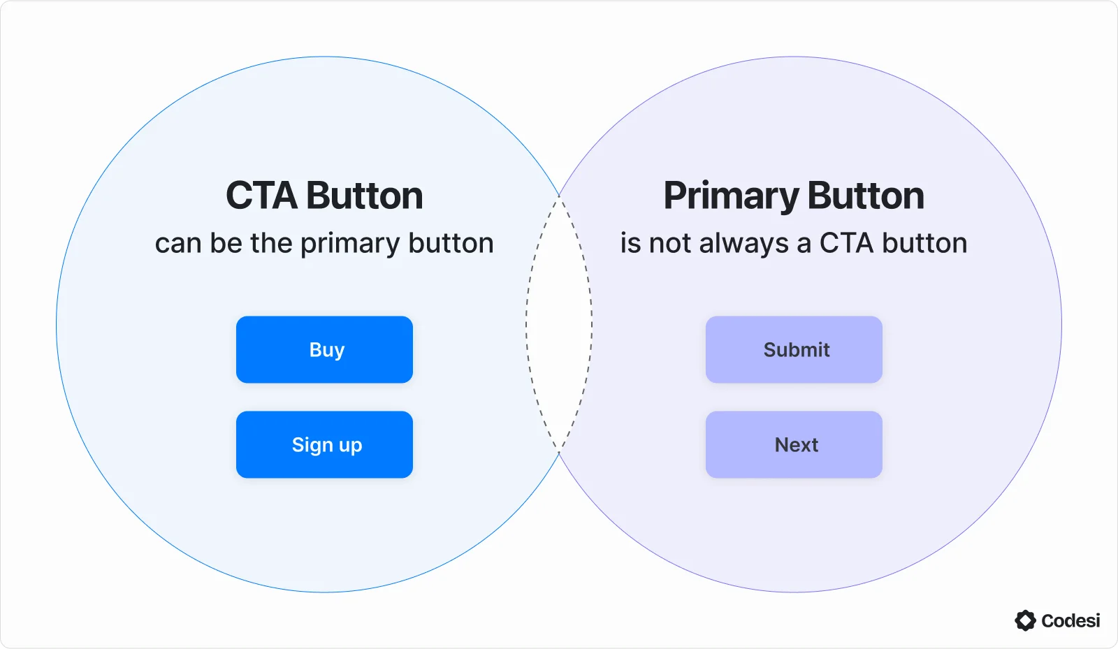
4. Focused calls-to-action
Pick one main action, either “Start free trial” or “Book a demo.” Repeat it, but keep it consistent. When it comes to design, contrast and whitespace beat gimmicks. Testing shows it’s not about the button color, it’s about clarity and visibility.
Where to place CTAs:
- Above the fold
- After the first proof point (logos/testimonials)
- After your main benefits section
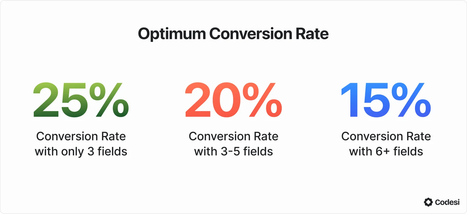
5. Forms that feel light
Shorter forms reduce friction. Start with just the essentials, such as work email and company. Collect extra info later with onboarding emails or in-product prompts. Multiple CRO studies confirm that fewer fields almost always improve completion rates, though you should test your threshold.
6. UX that builds confidence on every device
With most traffic coming from mobile, speed and usability are critical. Prioritize fast load times, clear text, spacious layouts, tap-friendly buttons, and easy access to pricing, integrations, and support.
15 Best SaaS Landing Pages (and What to Steal From Each One)
1. HubSpot - Multi-audience done right
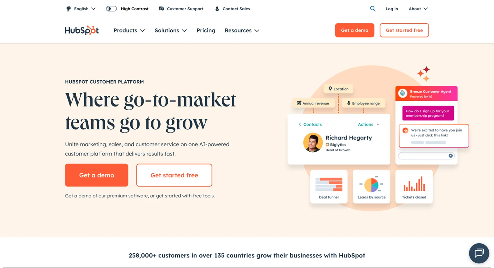
HubSpot’s homepage gives different buyer types a clear path: free tools, a product demo, or talking to sales. The promise stays simple (“AI-powered customer platform”), while proof sits close by with customer stories and product tours. With more than 248,000 customers worldwide, credibility is built in.
Steal this: Offer two or three clear paths such as “Start free,” “Watch a short tour,” or “Talk to sales.” Keep the same core value proposition across them.
2. Asana - Clarity through progressive disclosure
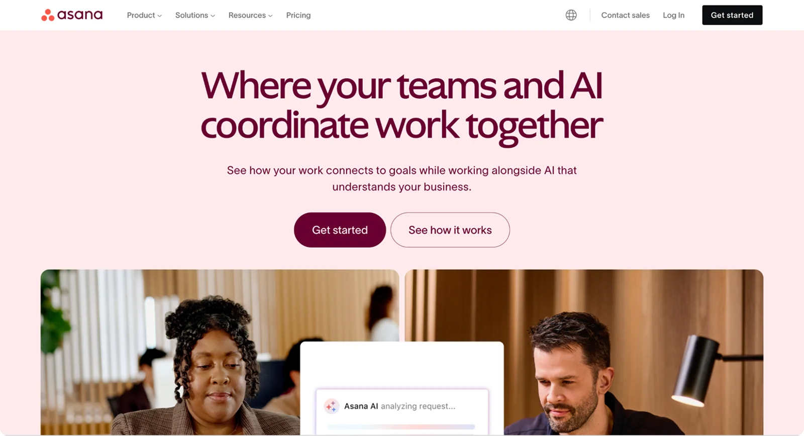
Asana’s hero focuses on the outcome (teams coordinate with AI), then lets visitors expand details only if they want them. This progressive disclosure keeps the page scannable while still serving power users who need depth.
Steal this: Lead with the outcome in one sentence, then reveal more through expandable sections or short “See how it works” flows.
3. Slack - Show the collaboration, then remove friction
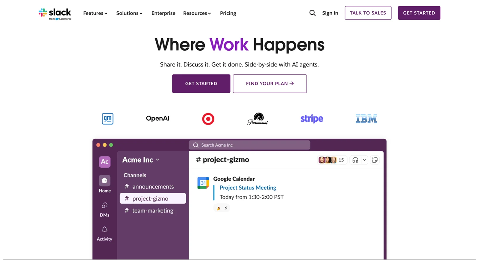
Slack sells the transformation in how teams communicate, then reinforces it with enterprise proof and a clear “get started” path. Pricing highlights the free option for smaller teams.
Steal this: Pair a collaboration promise with a single, repeated CTA (“Try for free”). Place proof such as logos or usage stats within one scroll of the hero.
4. Dropbox - Minimal copy, maximum clarity
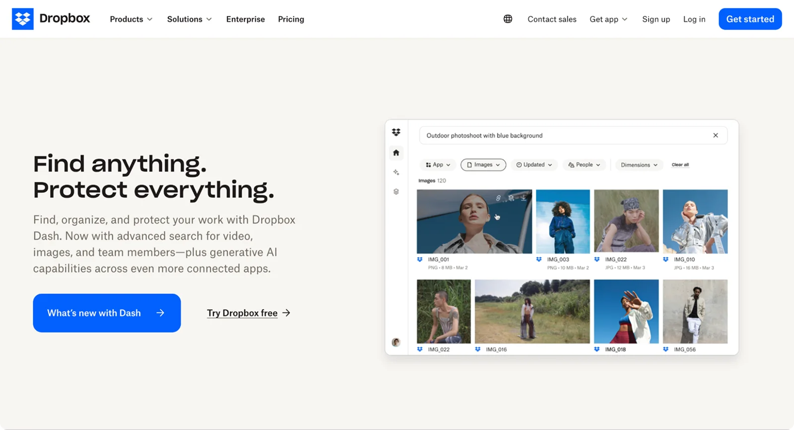
Dropbox keeps the message tight (“Find, organize, and protect your work”) and pairs it with plan comparisons and clear “Try free” entry points. The short copy and quick action make sense for a broad-use product.
Steal this: If your tool solves a universal problem, keep the hero line short and push one low-friction action.
5. Stripe - Credibility for technical buyers
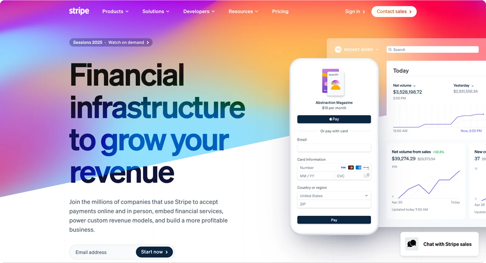
Stripe speaks directly to developers with live demos, fast paths to API docs, and real engineering stories. It respects the technical buyer’s process while still driving conversion.
Steal this: If developers are your audience, add a small code or demo block near the hero and place a “Try the demo” CTA above the fold.
6. Zoom - Use-case segmentation that actually helps
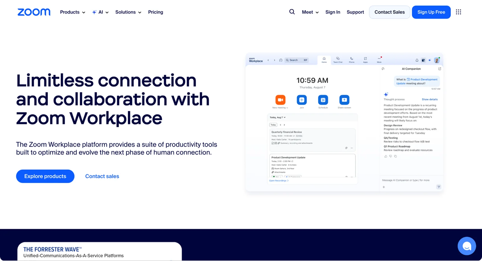
Zoom breaks out industry-specific pages, such as healthcare, so teams can jump to tailored outcomes, features, and compliance details. This approach serves multiple personas without overcrowding one page.
Steal this: If you serve different industries, build focused landing pages for each one with proof specific to that segment.
7. Airtable - Prove flexibility with templates
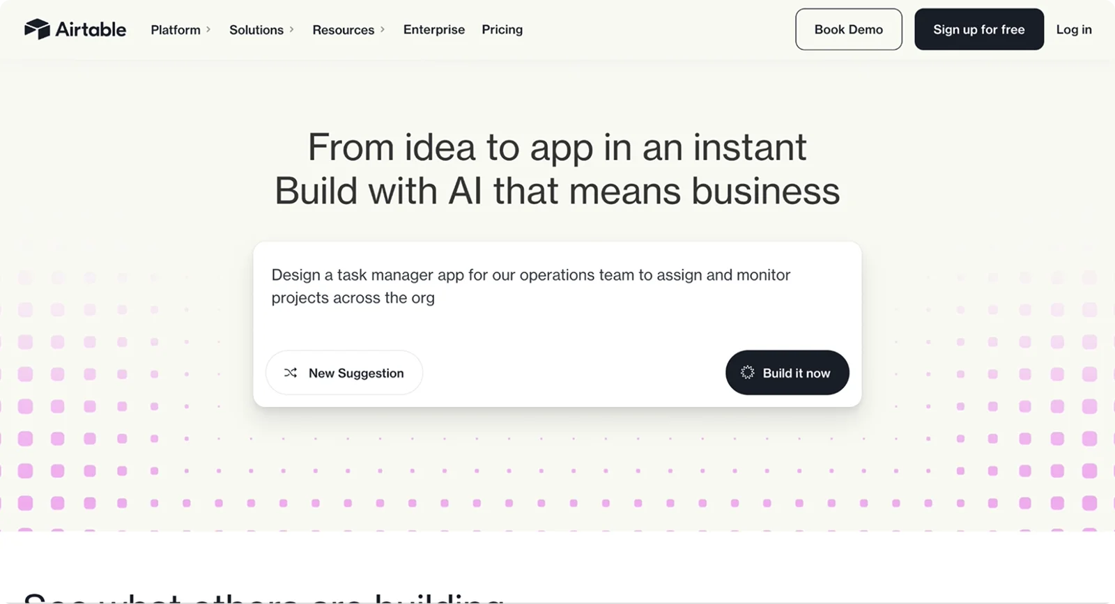
Airtable shows its versatility through a rich template gallery, letting visitors see real use cases instantly.
Steal this: If your product is flexible, highlight 6–10 templates tied to common jobs-to-be-done and surface them near the hero.
8. Mailchimp - Personality that lowers the barrier
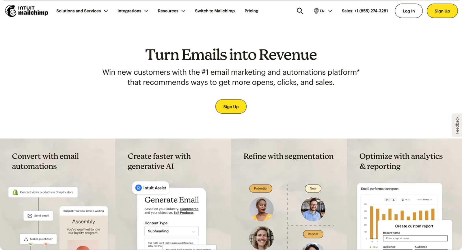
Mailchimp’s approachable voice and illustrations make marketing less intimidating, while resources explain best practices in plain language. It strikes a balance between fun and functional.
Steal this: Use a friendly voice and simple visuals, then add a short explainer or checklist to show how your page works.
9. Figma - Demonstrate collaboration, don’t just claim it
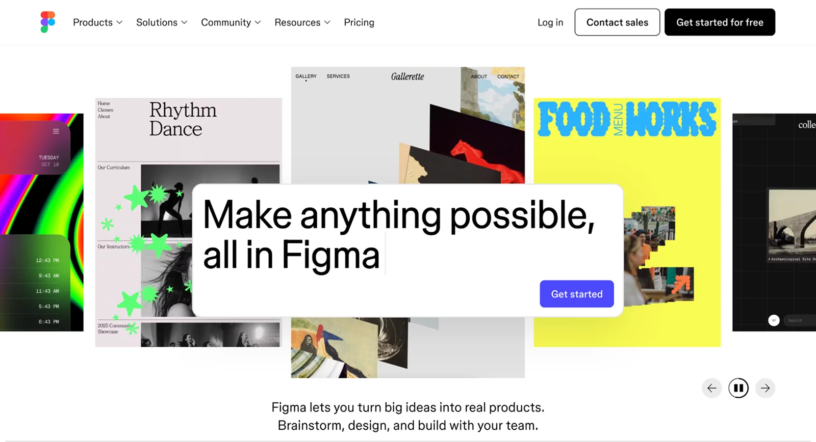
Figma proves its collaboration promise with real product visuals, dev-mode callouts, and community momentum. Visitors can immediately picture the workflow.
Steal this: If collaboration is your key selling point, show it with a short loop of people editing together, plus links to community resources.
10. Calendly - Remove the scheduling pain in one glance
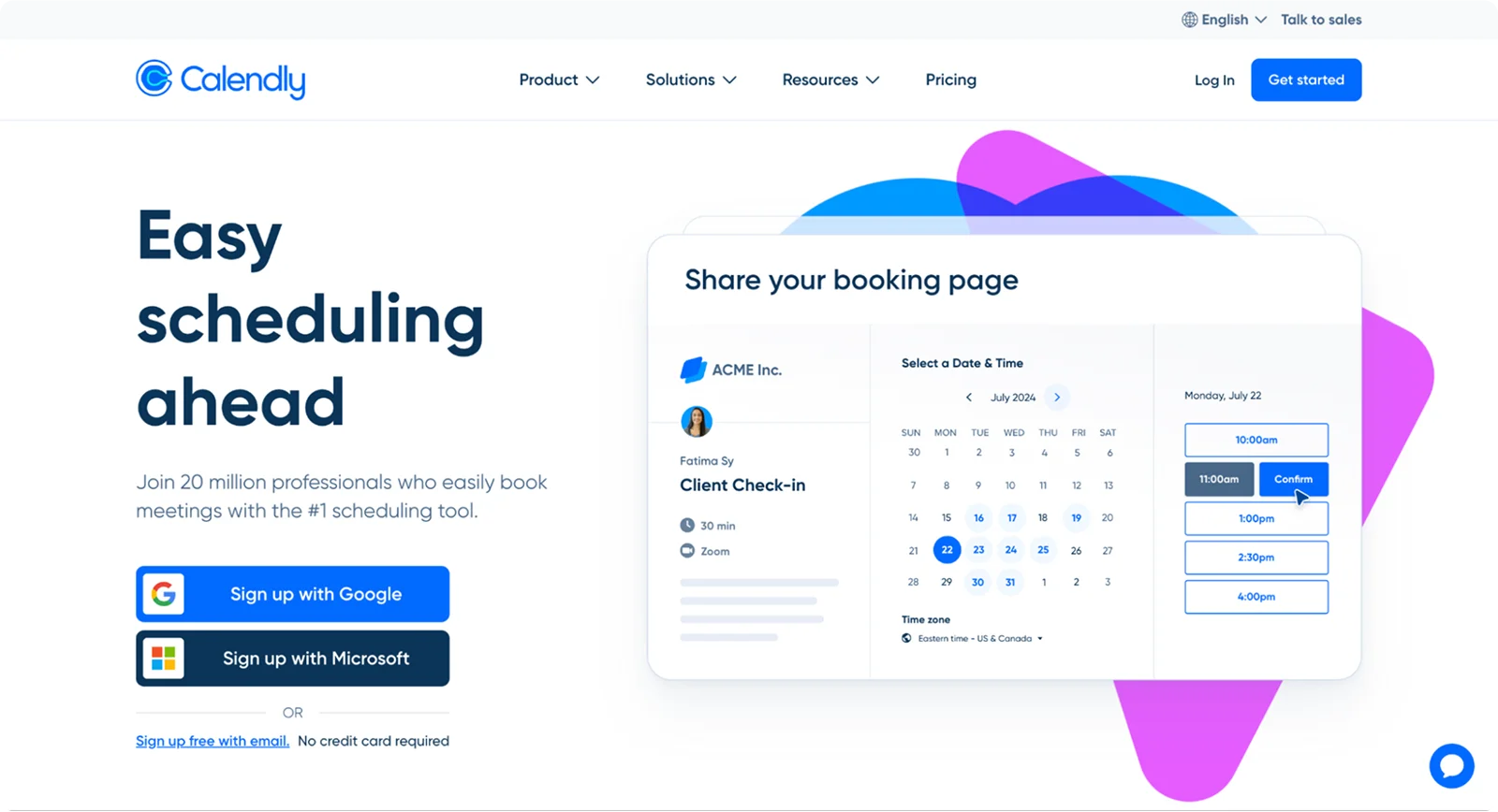
Calendly makes the benefit obvious: share a link, get meetings, done. Product pages and help docs reinforce how quick setup is.
Steal this: Use a simple three-step “How it works” with visuals, then add twin CTAs like “Sign up free” and “Get a demo.”
11. Trello - Fast path to value
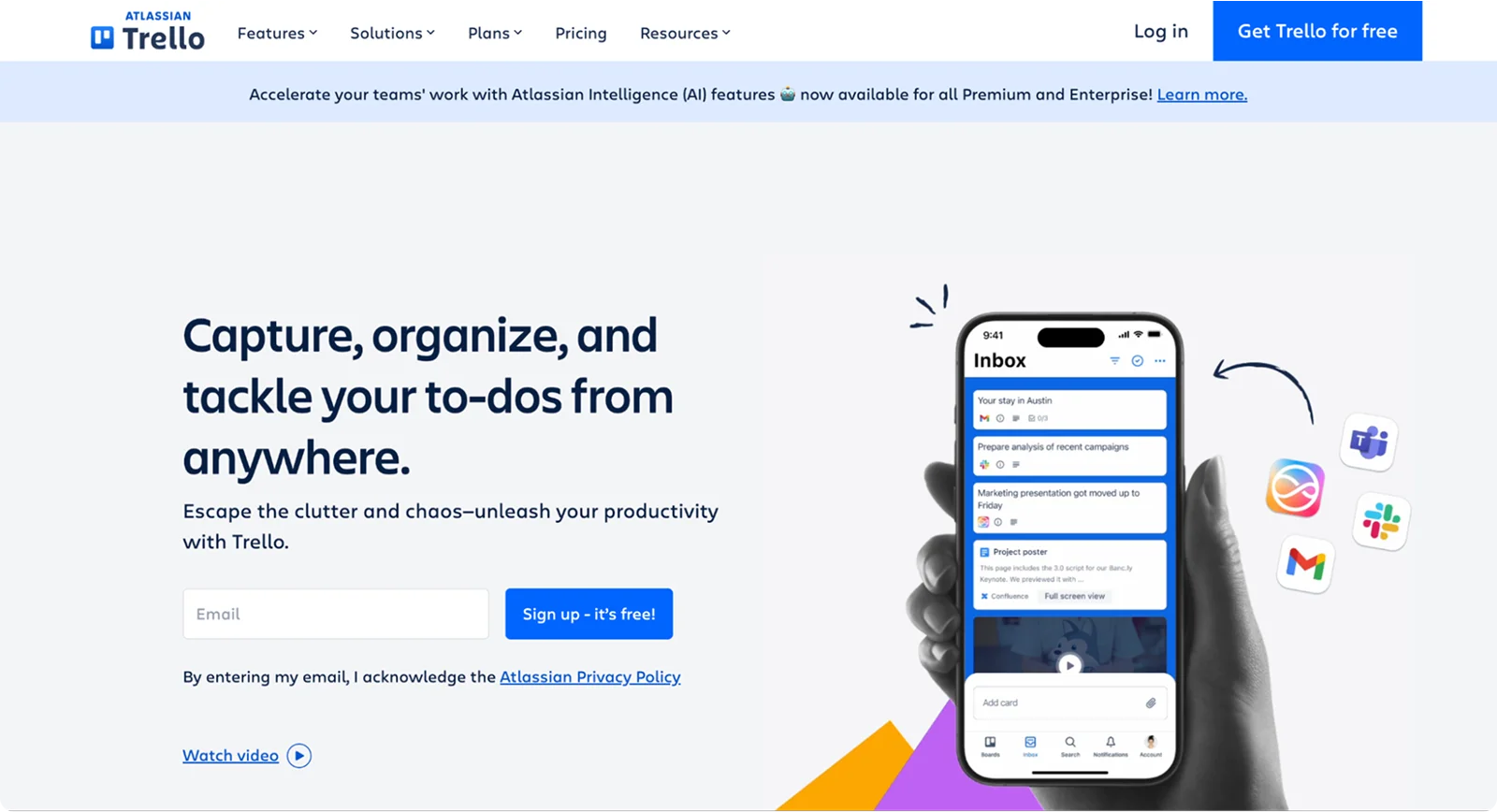
Trello emphasizes visual clarity and quick signup. Even though an account is required, the clean visuals and focused copy make the perceived time-to-value very short.
Steal this: Promise value in one line (“Organize anything with boards, lists, and cards”) and guide new users straight to an easy first action.
12. GitLab - “One platform” narrative for complex products
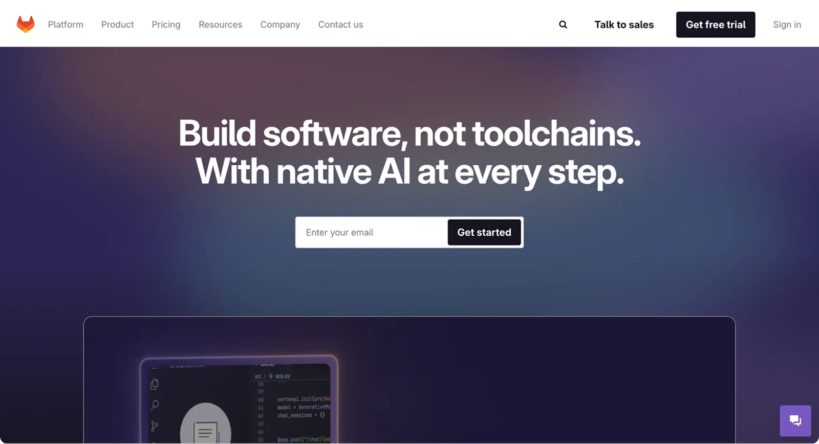
GitLab sells an all-in-one DevSecOps platform with a consistent “single platform” message supported by lifecycle visuals. This helps prospects understand scope without drowning in details.
Steal this: If your product replaces a toolchain, create a simple before-and-after map and keep your “one platform” message near the hero.
13. Freshworks - Tie features to outcomes
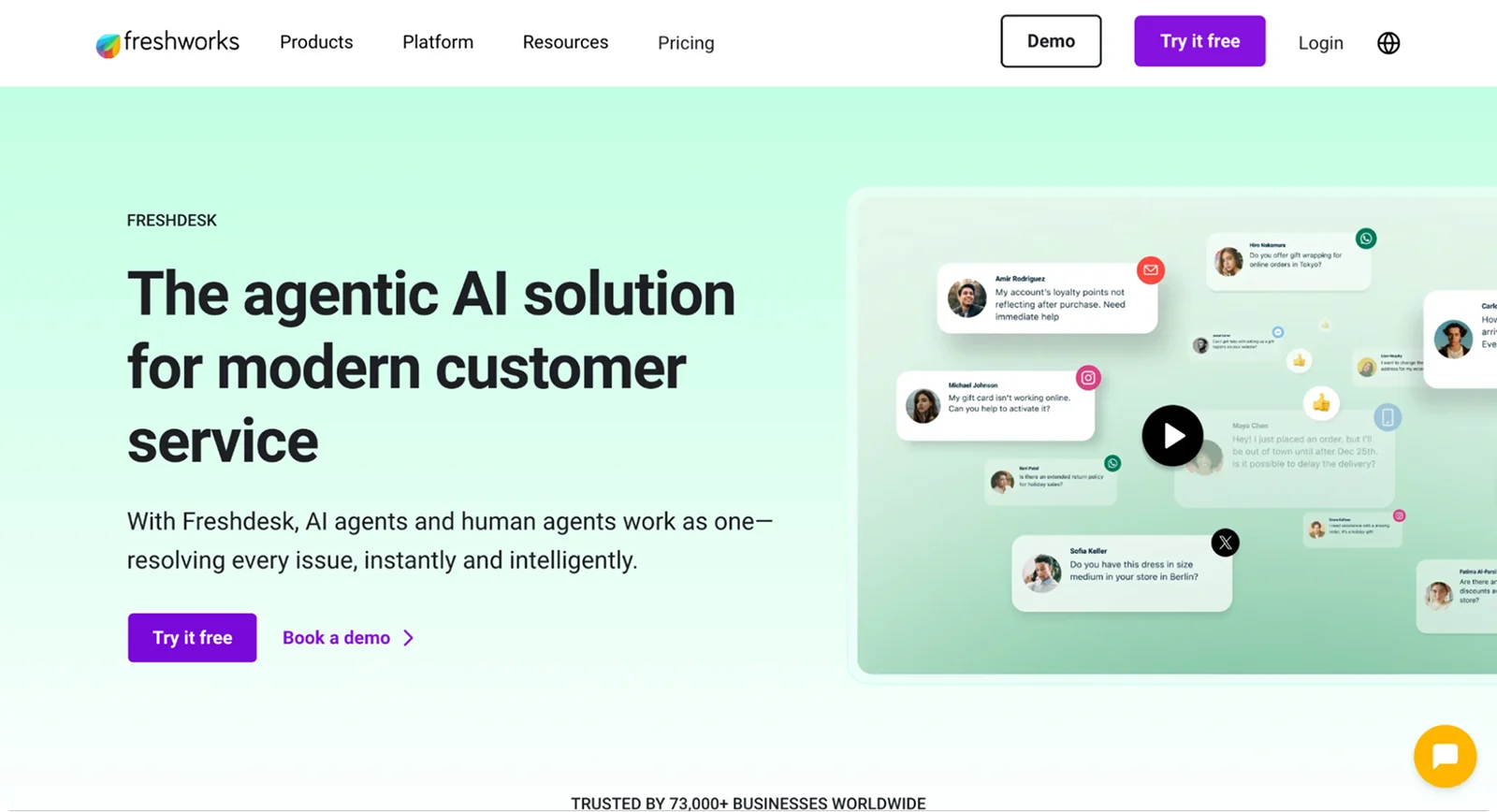
Originally known as Freshdesk, the company rebranded to Freshworks to reflect a wider suite of products. Their landing pages highlight customer support, IT management, and CRM all under one umbrella, making the value clear for different business sizes. Recent updates, including a leadership change and product acquisitions, show a brand that’s evolving and scaling with its audience.
Lesson: Rebrands can strengthen clarity, especially when your product line grows. Keep your landing page messaging unified and forward-looking, so visitors see not just what you do today, but how you’re building for tomorrow.
14. WeTransfer - Frictionless first use
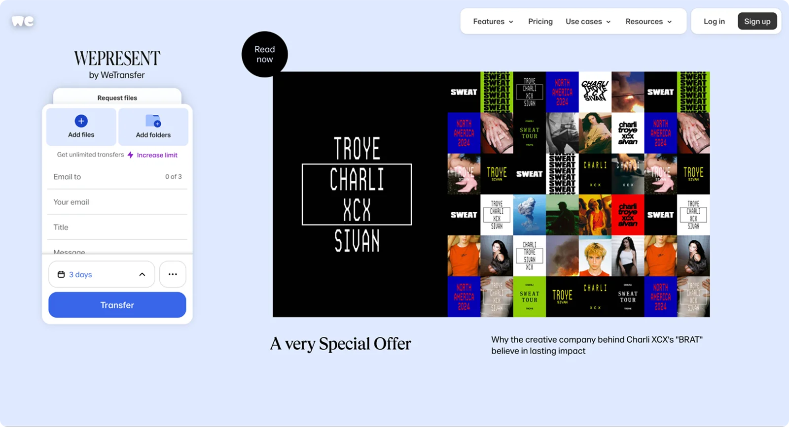
WeTransfer delivers instant value: send big files fast, no account required. The homepage lets you act immediately, which makes the product unforgettable.
Steal this: If possible, let users try a core action without signing up. If not, simulate the effect with a short interactive demo.
15. Miro - Templates that sell the “Aha!” moment
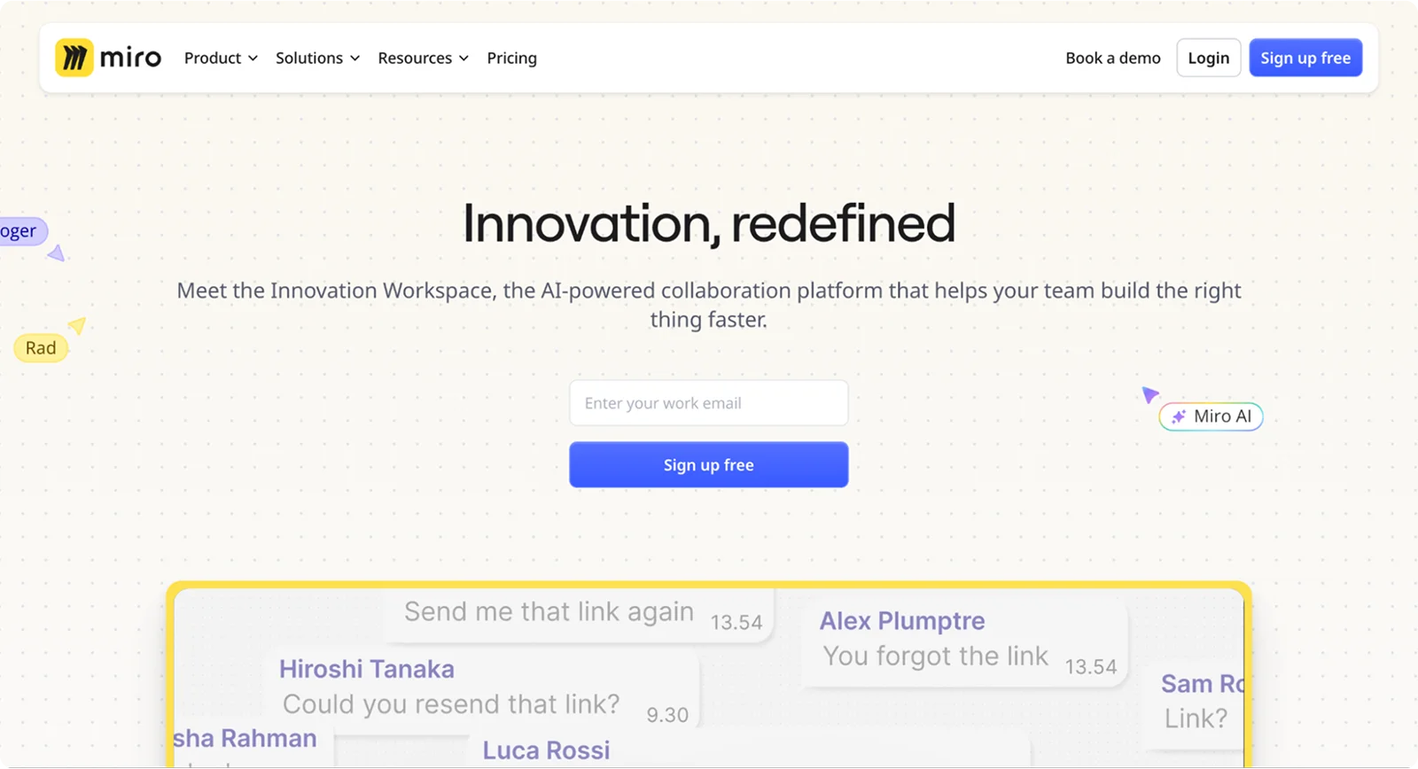
Miro lowers the “where do I start?” barrier by showcasing templates and its community-driven Miroverse. Teams can picture real work on day one.
Steal this: Curate a small template library and surface it near the hero. Label each one with the outcome, like “Run a retro” or “Plan a launch.”
Patterns you can copy today (from the 15 above)
- One promise, many paths: Keep a single value prop but create tailored paths for roles or industries. (Zoom, GitLab)
- Show, don’t tell: Short product demos or loops beat abstract illustrations. (Stripe, Calendly, Figma)
- Template galleries drive adoption: They make value tangible in seconds. (Airtable, Miro)
- Friction-light first step: Free trials or a simple first action reduce drop-off. (Dropbox, Slack)
Key trends shaping SaaS landing page success
1. Top performers convert at 10–25%
Recent 2025 data shows SaaS landing pages average about 9.5% conversion with a median closer to 3.0%. That wide gap means some pages perform far better than others. The best pages consistently convert at 10–25%, well above the average.
2. Mobile conversions lag desktop significantly
Mobile drives nearly 79% of SaaS traffic, yet mobile conversion rates still trail desktop by 40–60%. This gap represents a major opportunity, especially since mobile continues to dominate browsing behavior.
3. Free trial types matter
Benchmarks highlight a big difference between trial types. Opt-in free trials (no credit card required) see about 8.5% visitor-to-trial conversion, while opt-out trials (credit card required) convert only around 2.5%. But opt-out trials have much higher trial-to-paid rates, close to 50%, because intent is stronger.
What to Do Next: Your Action Plan
1. Benchmark yourself
- Track your page’s visitor → trial → paid rates.
2. Trim friction
- Use simple, clear headlines.
- Offer a single clear CTA (e.g., “Start Free Trial”).
- Minimize form fields, especially on mobile.
3. Use proof smartly
- Place logos, one-sentence testimonials, or outcome stats near CTAs.
- Keep your social proof authentic and relatable.
4. Optimize mobile first
- Aim for fast loads (2–3 seconds), large touch targets, and scannable layouts.
5. Experiment with trial types wisely
- Test opt-in vs. opt-out depending on your ideal balance between volume and quality.
6. Match messaging to source
- Tailor the hero line and offer to each traffic channel-email, PPC, search.
7. Track, test, iterate
- Use A/B tests to refine headlines, CTAs, visuals, and trial flows.
- Set weekly or monthly goals and test one element at a time.
Ready to launch your next landing page?
The best SaaS teams treat landing pages as ongoing experiments, not one-time projects. Success comes from constant testing and refinement. That doesn’t mean you need to wait weeks for an agency every time you want to try something new.
With an AI website builder like Codesi, you can create landing pages in minutes. If you can write a clear prompt, you can generate professional, conversion-focused designs on demand. It’s faster, more affordable, and gives you full control over testing what resonates with your audience.
👉 Try Codesi today and see how simple it is to launch and iterate on landing pages that convert.
Create your website with AI today
Codesi is a platform where you can make a website in 3 minutes.
No coding, no designers, no hassle - just AI.
