Back to blog
12 Best Mobile Landing Page Examples & Ideas To Inspire You
Discover the best mobile landing pages that load fast, look great on any screen, and help you turn quick taps into real customer conversions.
Jul 12 2025
Most people browse, decide, and buy on their phones, and 83% of landing page visits now come from mobile. Yet despite the traffic, mobile conversions still lag 8% behind desktop, exposing a gap between attention and action.
Some say a responsive site is enough. But resizing a desktop page isn't the same as designing for mobile.
The best mobile landing pages prioritize speed, clarity, and tap-first navigation, with every element reflecting how users scroll and engage.
In this guide, we explore best mobile landing page examples, break down what makes them work, and share ideas to help you build pages that convert.
What Is a Mobile Landing Page?
A mobile landing page is a single-purpose webpage specifically designed for users browsing on mobile devices, such as phones or tablets. Everything about it, from layout to content, is trimmed down to drive one action, like making a purchase, signing up, or downloading something. There's no extra noise, just a clear path forward.
Why Mobile Landing Pages Matter
In 2025, over 64% of global web traffic comes from mobile devices. For most brands, this is the first point of contact and often the only chance to convert.
The impact is clear:
- A 1-second delay in load time can cut conversions by up to 8%, while pages that load in under 2 seconds can convert up to 30% better.
- More than half of mobile users will abandon a page that takes longer than 3 seconds to load, highlighting the critical importance of speed.
Slow load times, clunky layouts, and difficult-to-navigate content frustrate users, sending your bounce rate skyrocketing and taking potential conversions with it.
Essential Elements of Best Mobile Landing Pages
Here are the key elements that top-performing mobile landing pages consistently get right:
- Mobile-Optimized Template: Select a layout specifically designed for mobile screens. The best templates prioritize vertical flow, fast rendering, and easy navigation.
- Single, Clear Goal: Whether it's email signups, product sales, or app installs, everything on the page should support that one objective. Ask yourself: "What action do I want users to take right now?"
- Concise, Benefit-Driven Headline: On mobile, attention is limited. Lead with a strong, direct headline that tells users what they'll get fast.
- One Thumb-Friendly CTA: Avoid overwhelming the user with too many options. A single, prominent button keeps the focus where it belongs. Make it large, tappable, and specific: "Start Free," "Join Now," "Download App."
- Responsive Visuals: Use imagery or short videos that explain or support your offer. Showcase your product, app, or real users in action.
- Social Proof and Trust Signals: Highlight testimonials, ratings, brand logos, or security badges to quickly establish credibility.
- Sticky Elements (Optional): Add floating buttons or fixed bars to keep the main action visible while scrolling.
- Fast Load Speed: Page performance directly affects conversions. Use PageSpeed Insights or GTmetrix and aim for sub-3-second mobile loads.
- Multi-Device Testing: Don't just rely on "responsive" tags. Manually test your page on different phones to ensure proper spacing, alignment, and tap targets.
12 High-Converting Mobile Landing Page Examples to Inspire You
Now that we've covered what makes a great mobile landing page, let's look at real examples that put those principles into action:
1. Shopify
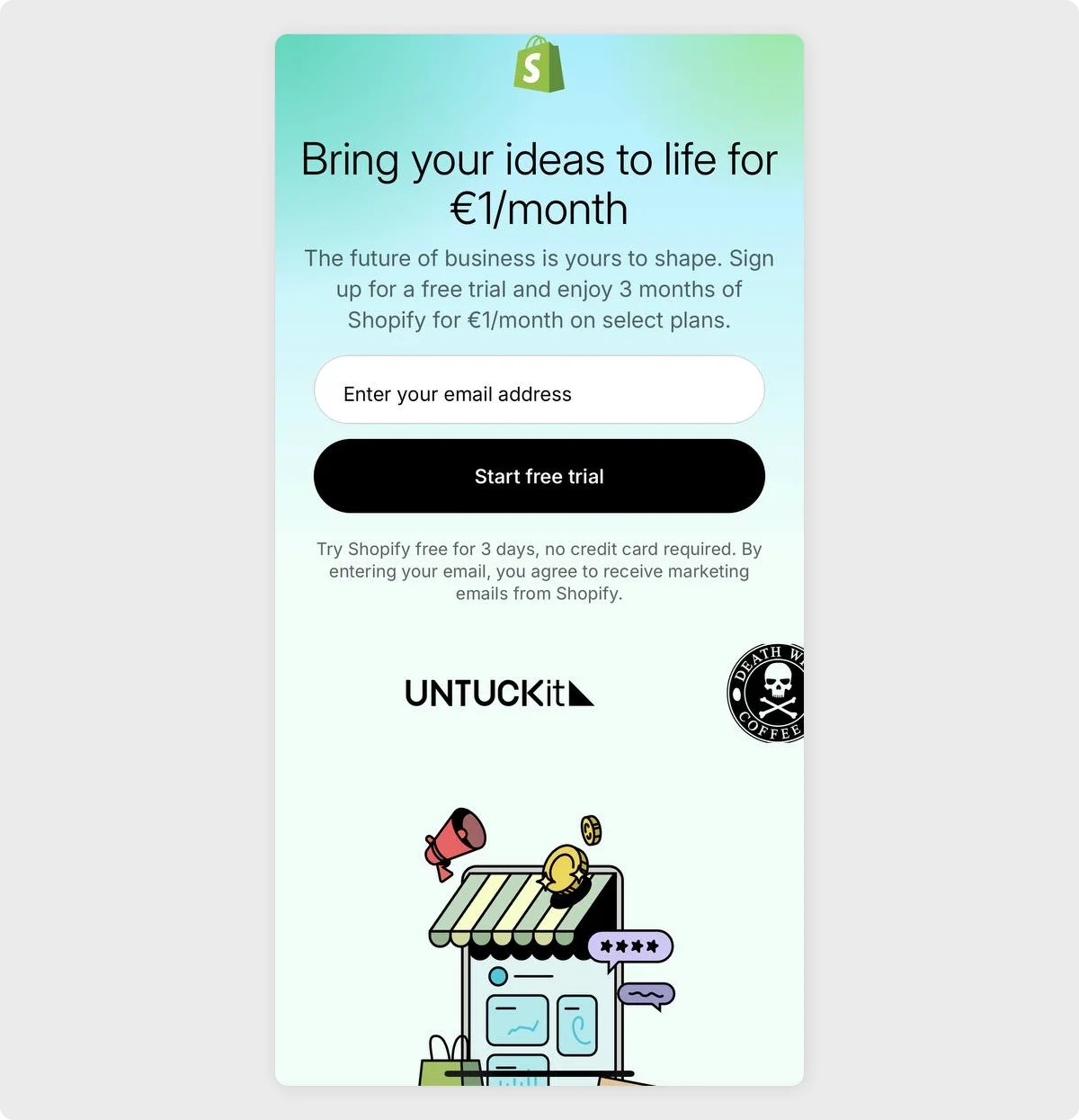
This minimalist mobile landing page puts action front and center. A large headline conveys the offer immediately, and the email form is short and inviting.
Black-on-white CTA button stands out against the soft gradient background. Below, logos from brands like Gymshark, Allbirds, and Kylie Cosmetics instantly build trust through social proof.
Why it works:
The headline, offer, form, and CTA are all positioned above the fold. There's zero clutter, zero hesitation, and zero credit card required, just a clear path to conversion.
Takeaway:
Lead with an irresistible offer, back it up with recognizable logos, and make sign-up as simple as typing an email.
2. Duolingo
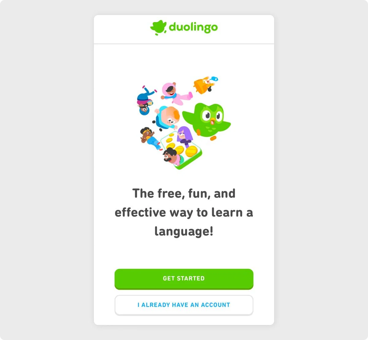
Duolingo keeps it playful and punchy. A colorful illustration instantly draws attention, while the friendly owl mascot reinforces brand familiarity. Duolingo delivers its core value proposition in a single, memorable line, positioned above a bright green "Get Started" button and a clear option for returning users.
Why it works:
Everything here is intuitive and welcoming. The headline is benefit-driven, the design feels alive, and the CTA stands out without overwhelming the page.
Takeaway:
Use vivid visuals and concise, uplifting content to make users smile and tap. Let your design reflect your product's personality.
3. Headspace
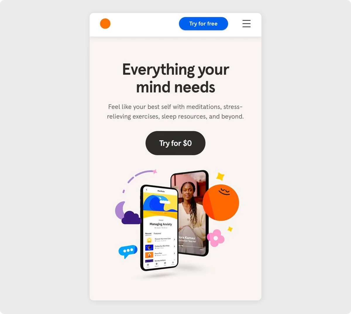
Headspace opens with a calming message that speaks directly to the user's emotional state.
The minimalist design spotlights a bold value proposition, reinforced by a "Try for $0" CTA and visuals that preview the product's meditation tools and human connection. Bright, friendly illustrations add warmth without overwhelming the layout.
Why it works:
The messaging strikes a balance between utility and emotion, while the CTA alleviates financial hesitation. The visuals create a sense of ease and accessibility within seconds.
Takeaway:
Lead with emotional clarity. Pair a feel-good promise with zero-risk entry and soft, welcoming visuals to lower barriers and invite exploration.
4. Notion
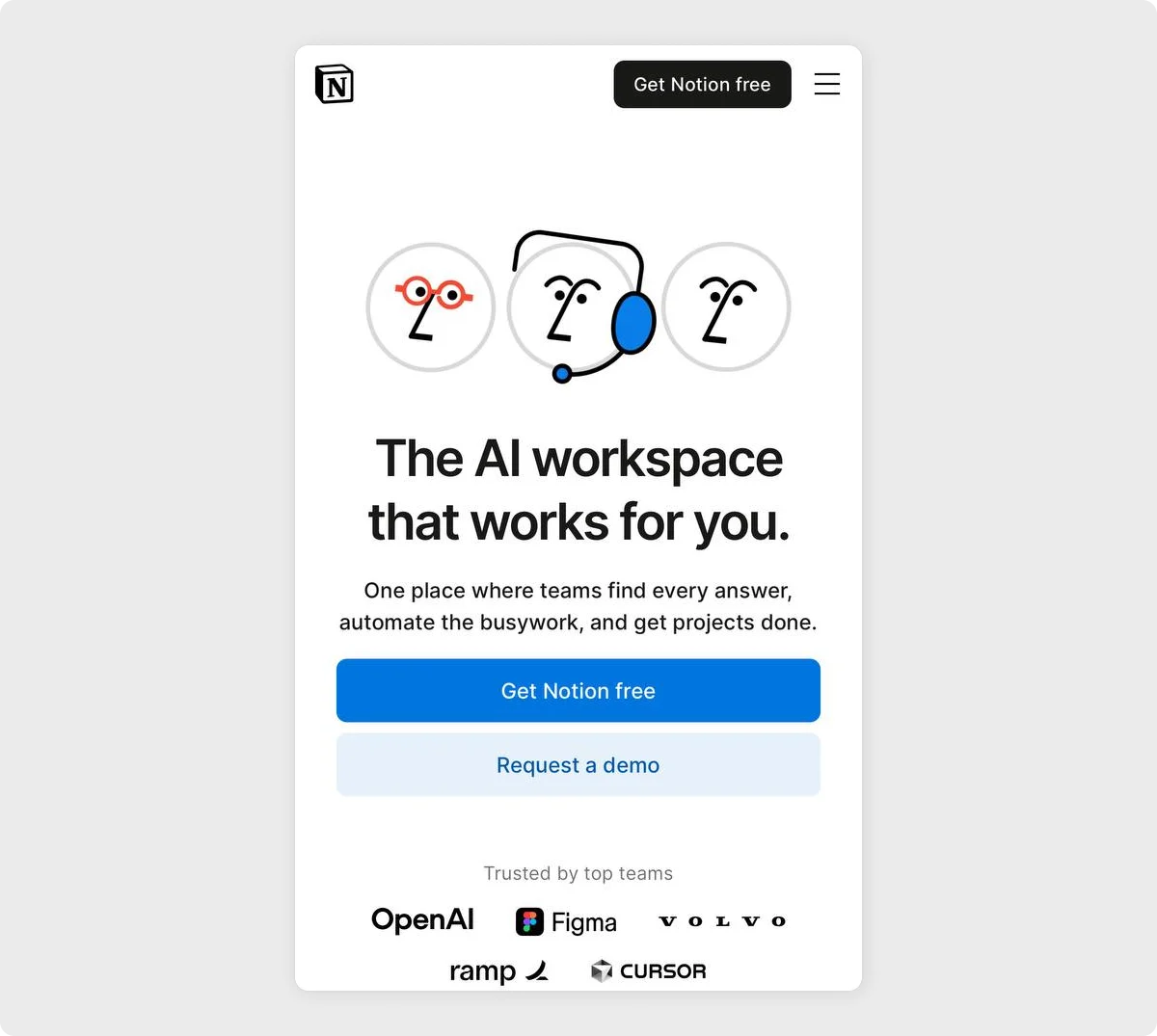
Notion's mobile page speaks directly to busy teams. The headline promises utility, the subtext outlines exactly what users gain (answers, automation, and results).
Two clear CTAs, 'Get Notion free' and 'Request a demo,' cater to both individual users and enterprise buyers.
Why it works:
The copy focuses on solving real pain points while maintaining an approachable tone. Dual CTAs and a recognizable client list create instant credibility and flexibility.
Takeaway:
Speak to your user's workload. Pair benefit-driven messaging with flexible CTA options and real-world proof to convert both individuals and teams.
5. Calm
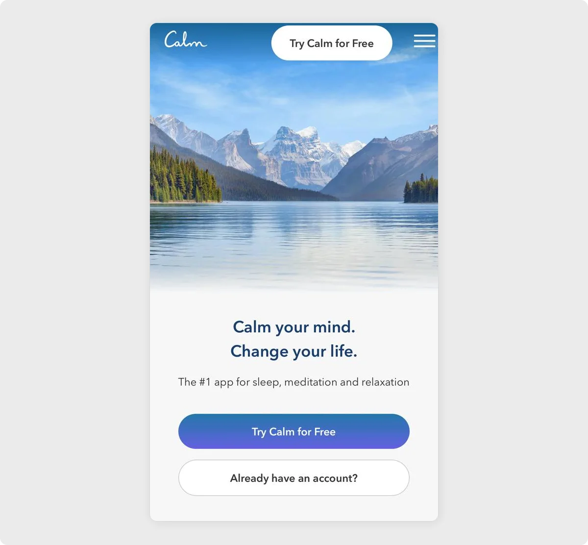
Calm sets the mood instantly with a peaceful mountain lake scene and gentle typography.
The message is simple but powerful, positioning the app as a path to better sleep, less stress, and a more centered life. The layout is clean, with nothing to distract from the promise of ease and relief.
Why it works:
The visual and verbal elements work in harmony to create a sense of trust and emotional connection. It feels more like an invitation than a pitch.
Takeaway:
Use visual stillness and soft, confident language to mirror the experience your product offers, especially when it's designed to reduce anxiety and overwhelm.
6. Grammarly
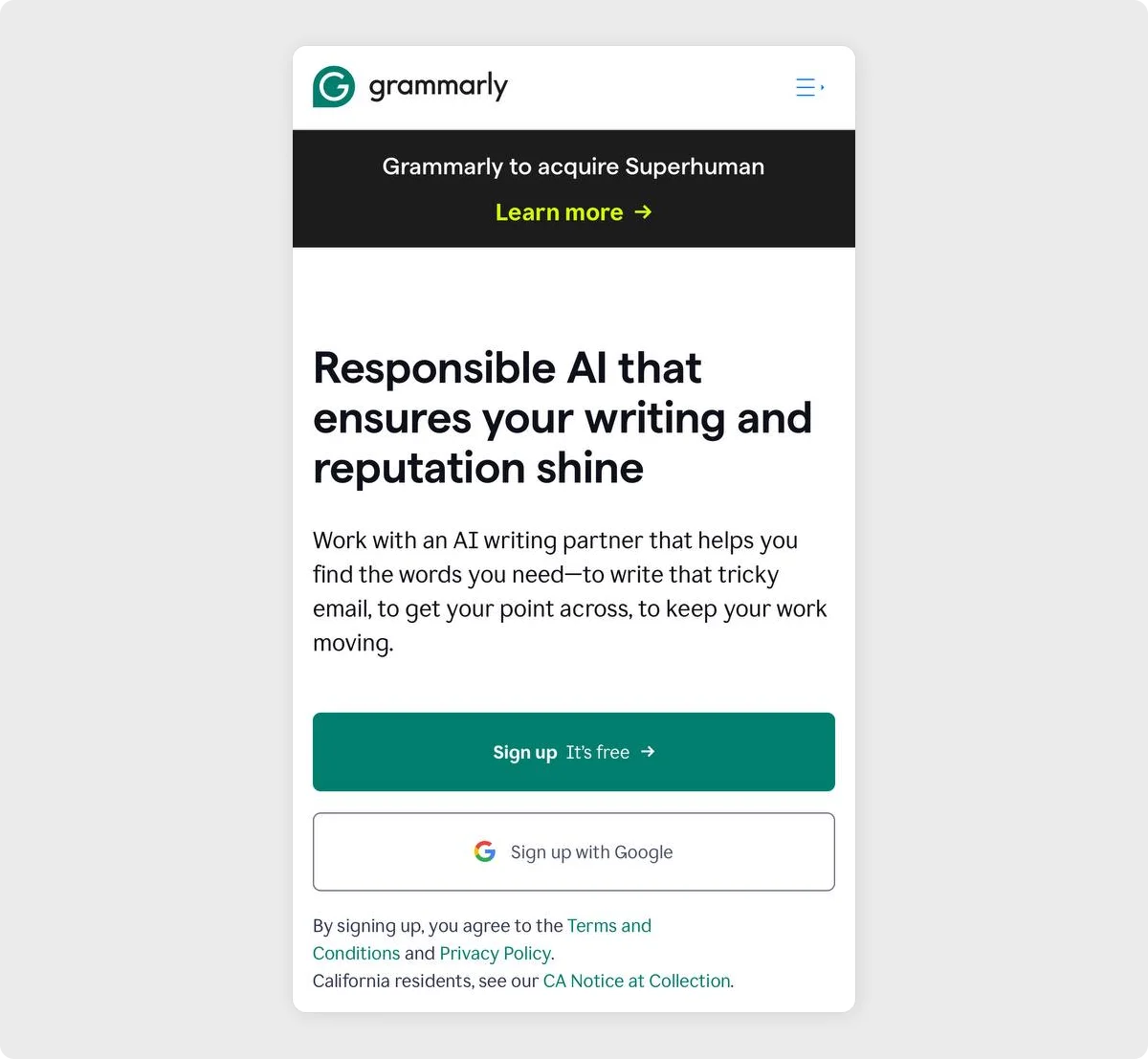
Grammarly leads with clarity and confidence.
The headline emphasizes trust and professionalism, while the subtext explains precisely how the tool helps: by offering just-in-time suggestions that keep communication sharp and polished.
Why it works:
It speaks to professionals who care about tone and accuracy. The promise is practical and credible, supported by a trustworthy and minimalist layout.
Takeaway:
When your product helps users communicate better, let the messaging reflect that. Use plain, confident language to demonstrate your understanding of what's at stake.
7. Typeform
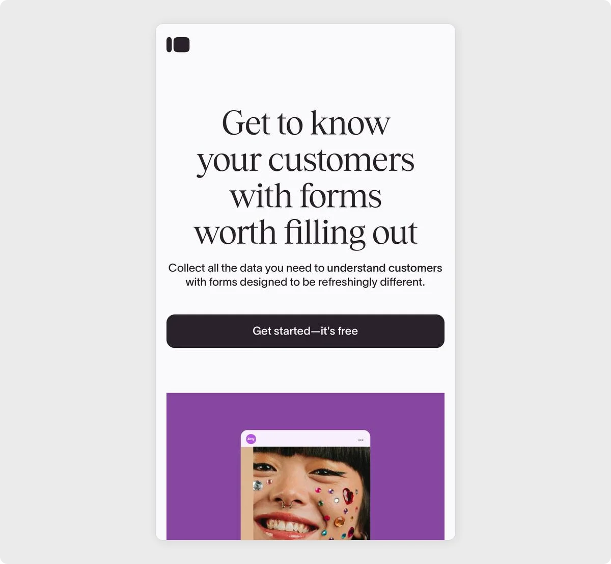
Typeform flips the script on boring data collection. The bold serif headline catches attention, while the supporting text promises a more human approach to understanding users.
Clean spacing, elegant typography, and a vibrant image preview hint at the product's visual personality and ease of use.
Why it works:
It immediately communicates a pain point and counters it with a promise of design-driven engagement and thoughtful user experience.
Takeaway:
When your product reinvents a common tool, lead with contrast. Emphasize what makes your approach unique, and let your design visually reinforce that message.
8. Squarespace
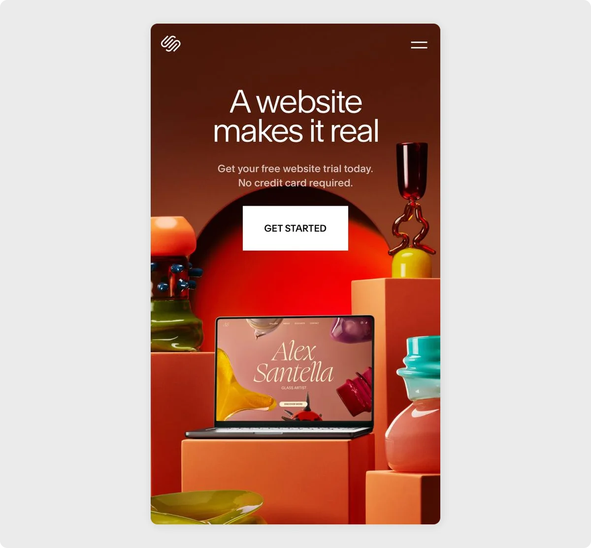
Squarespace taps into the emotional moment when an idea becomes something tangible.
The short, impactful headline pairs perfectly with the bold visuals: vibrant glass art, warm tones, and a smart mockup that shows off the product in action. The message is direct: it's time to make your project official.
Why it works:
It appeals to creators and entrepreneurs by linking identity with visibility. The design displays polish without distraction, allowing the visual storytelling to take center stage.
Takeaway:
Use a design that reflects your audience's aspirations, and anchor your message in the shift from concept to reality. Don't just sell features. Sell transformation.
9. Blinkist
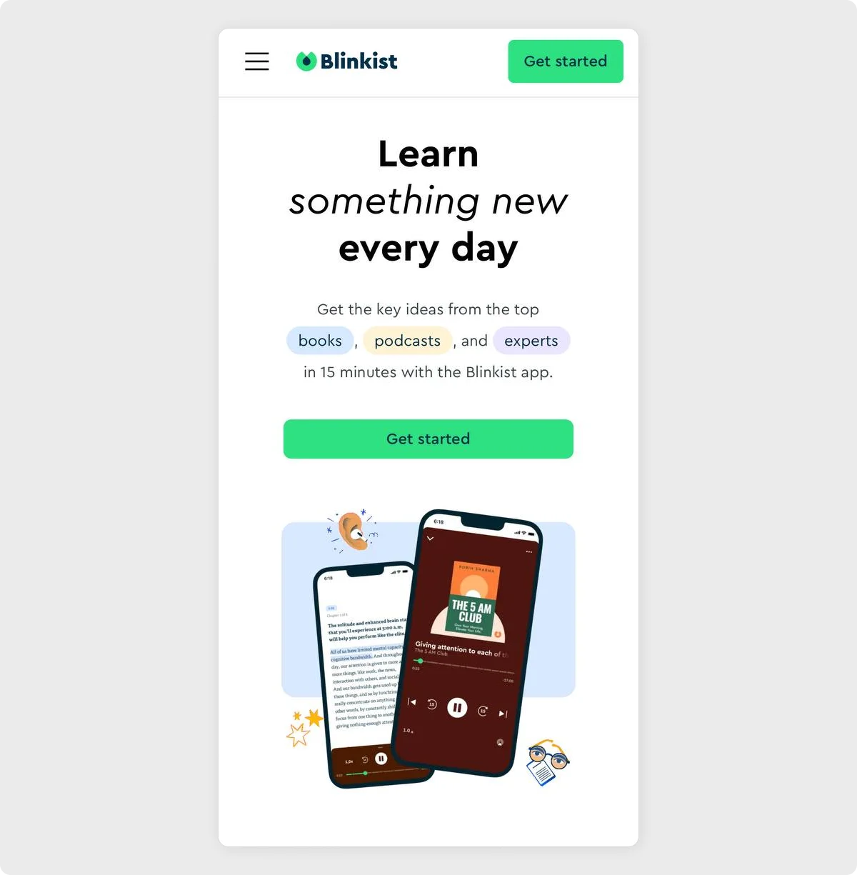
Blinkist presents a clear value proposition in just six words, complemented by a fresh, minimalist design and friendly visuals.
The copy explains precisely how it works – get insights from books, podcasts, and expert talks in just 15 minutes.
Why it works:
It speaks directly to curious minds with limited time to spare. The layout strikes a balance between clarity and personality, providing users with a quick sense of what they'll gain and how quickly.
Takeaway:
When speed is your strength, state it early.
10. Loom
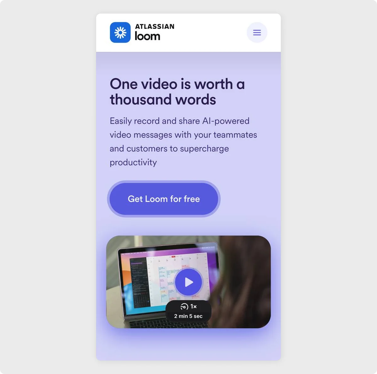
Loom leans into a familiar phrase and gives it a new purpose.
The headline instantly conveys the product's core benefit: clarity through video, while the supporting text highlights AI assistance and team productivity. A brief demo preview effectively demonstrates its real-world utility without adding cognitive load.
Why it works:
It makes a strong promise quickly, supported by a visual example that's both intuitive and relatable.
Takeaway:
When your product explains itself better than words ever could, let the experience speak for itself. Combine a memorable phrase with video proof to connect fast and convert faster.
11. Codecademy
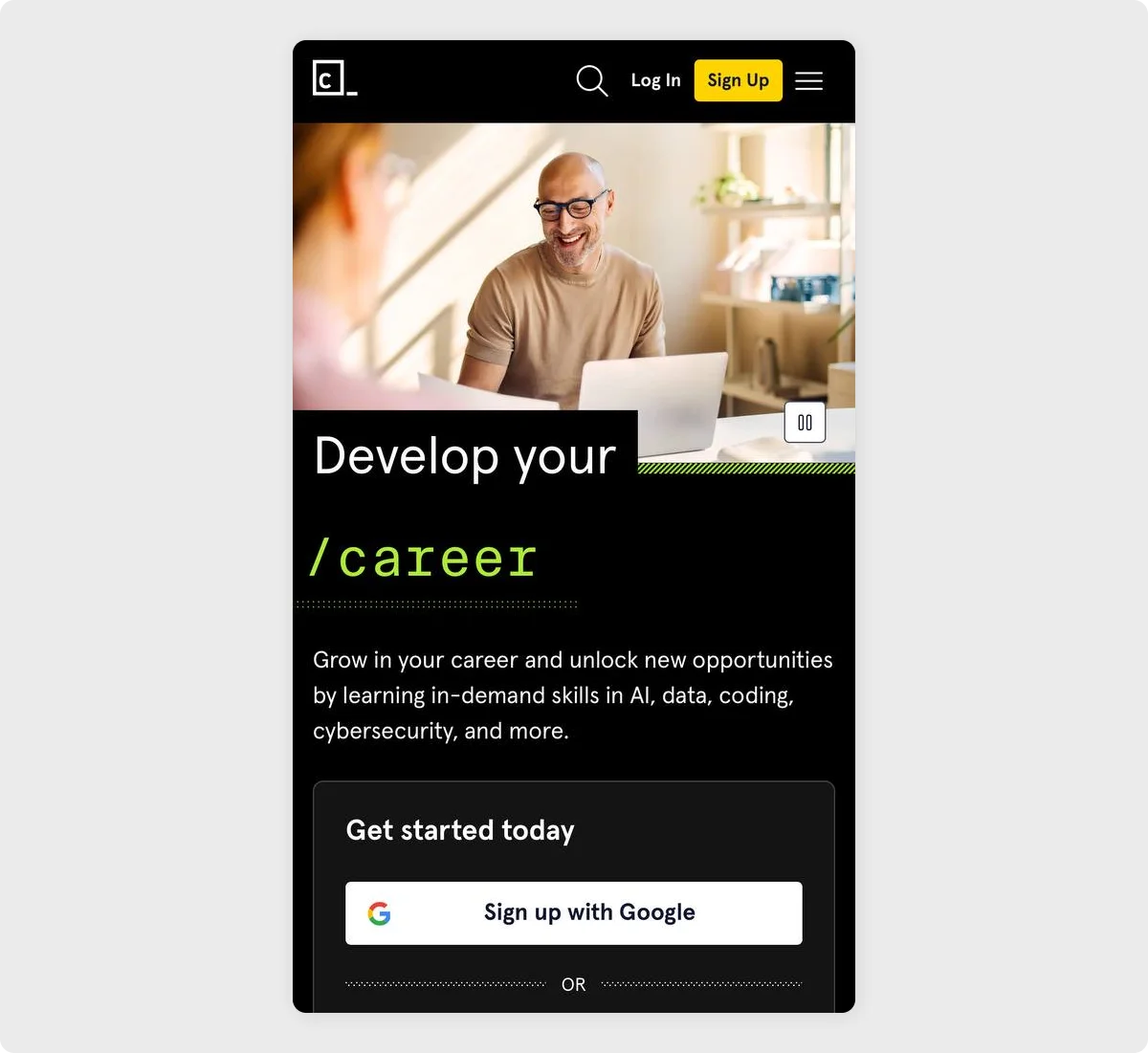
Codecademy brings a tech-savvy twist to professional growth with a headline that reads like a command line.
The layout is sharp and focused, with black-and-neon visuals and a message that highlights real-world outcomes – learning AI, data, coding, and cybersecurity to unlock new job opportunities.
Why it works:
It speaks directly to goal-oriented learners in the digital space. The design mirrors the coding environment itself, reinforcing relevance through both style and content.
Takeaway:
When your audience lives in code, meet them there. Use design and language that reflect their world, making your value proposition feel like the next logical step.
12. MasterClass
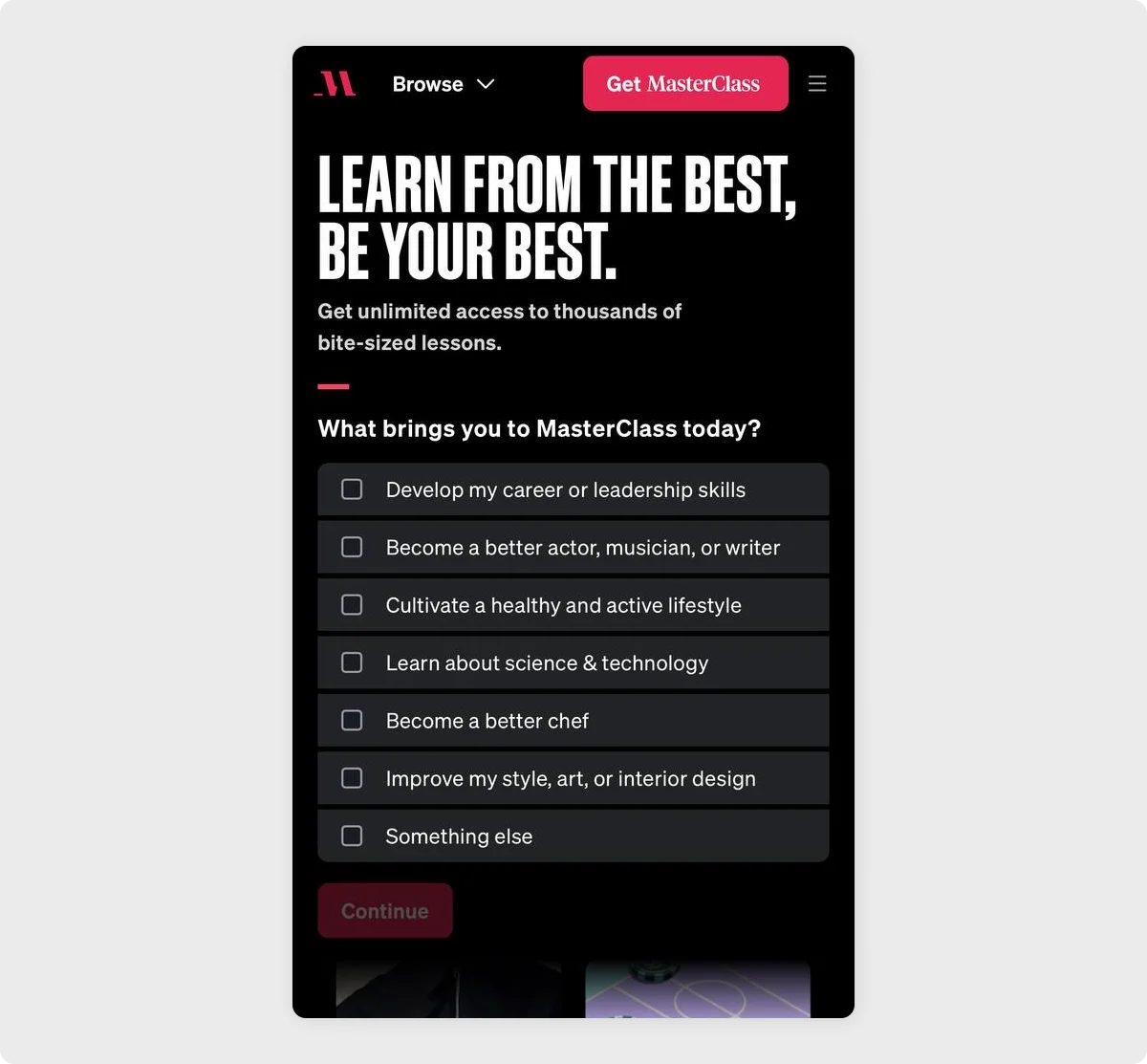
MasterClass opens with typography that instantly conveys both aspiration and authority.
Below, a short list invites users to personalize their learning journey, from leadership and creativity to cooking and tech. The dark background, high contrast, and minimal distractions make every word feel purposeful.
Why it works:
It positions the product as a gateway to excellence while making onboarding feel personal and tailored. The structure encourages quick engagement and aligns learning goals with world-class expertise.
Takeaway:
When your value lies in star-powered teaching, lead with confidence.
Why Codesi Is Perfect for High-Converting Mobile Landing Pages
Mobile traffic now leads the way, but with smaller screens and quick-scrolling users, your landing pages need to be faster, cleaner, and more focused to keep people from bouncing.
That's where Codesi comes in.
Codesi lets you create landing pages that aren't just mobile-friendly, they're designed specifically to work great on phones from the very start.
Here's why Codesi stands out for mobile landing page creation:
- Built for mobile-first from the start: Codesi designs every page layout to look and feel perfect on phones. Think vertical flow, thumb-friendly buttons, and single-action sections that keep users focused.
- AI-generated in minutes: Just describe your goal (e.g., email signup, app download, product preorder), and Codesi instantly builds a full mobile-ready landing page tailored to convert.
- Speed-optimized to reduce bounce: Codesi pages load in under 2 seconds on mobile, so you never lose users to lag or delay.
- Tap-friendly and clutter-free layouts: Codesi designs each element with mobile users in mind, utilizing large tap targets, concise copy, responsive visuals, and a clean layout with minimal distractions.
- No-code, drag-and-drop editing: Quickly adjust anything: fonts, colors, spacing, CTA placement, right from your browser, no coding skills needed.
- Analytics-ready for mobile behavior: Easily track mobile-specific performance like taps, form completions, and scroll depth.
Here's how to easily generate mobile landing pages with Codesi - step by step:
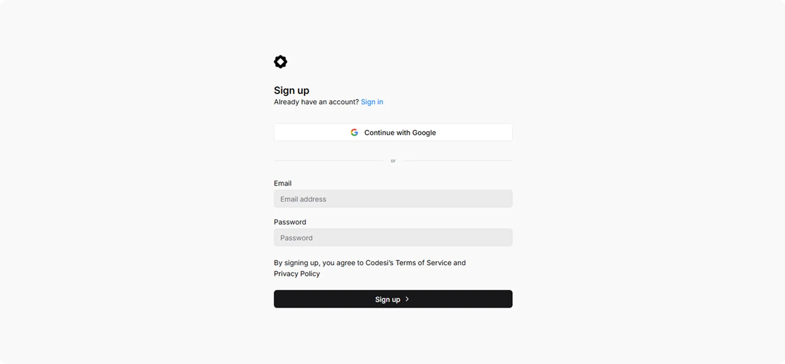
Step 1: Sign up on Codesi (it's free).
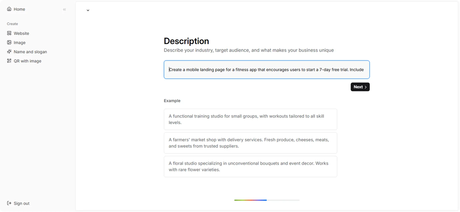
Step 2: In the Website Builder, enter your prompt. For mobile landing page creation, we used the following example:
“Create a mobile landing page for a fitness app that encourages users to start a 7-day free trial. Include a strong benefit-driven headline, social proof from real users, and a single CTA.”
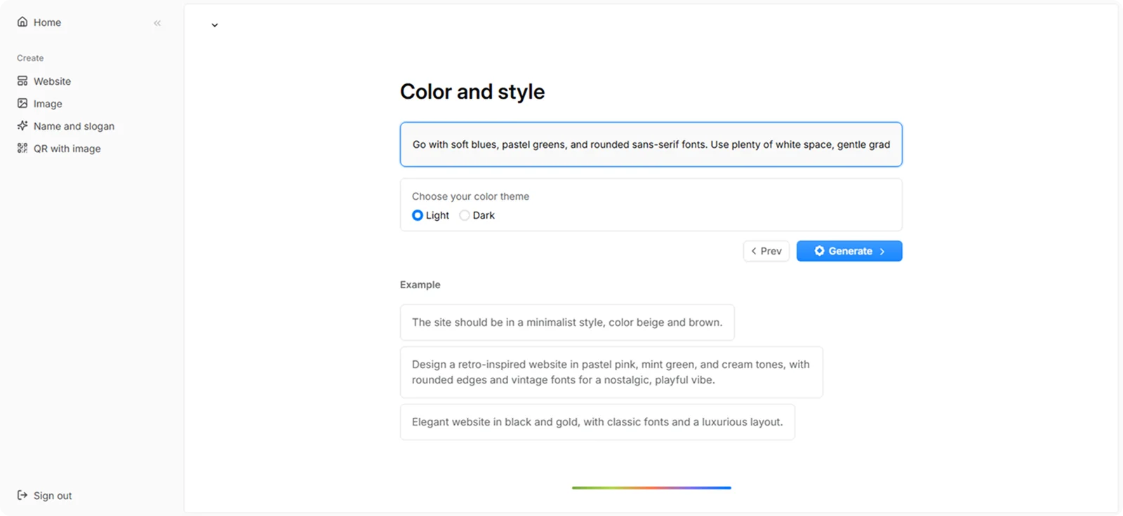
Step 3: Choose your color theme and style. For this example, we used:
“Go with soft blues, pastel greens, and rounded sans-serif fonts. Use plenty of white space, gentle gradients, and calming imagery (e.g., people stretching in sunlight). Create a peaceful, non-intimidating vibe for beginners.”
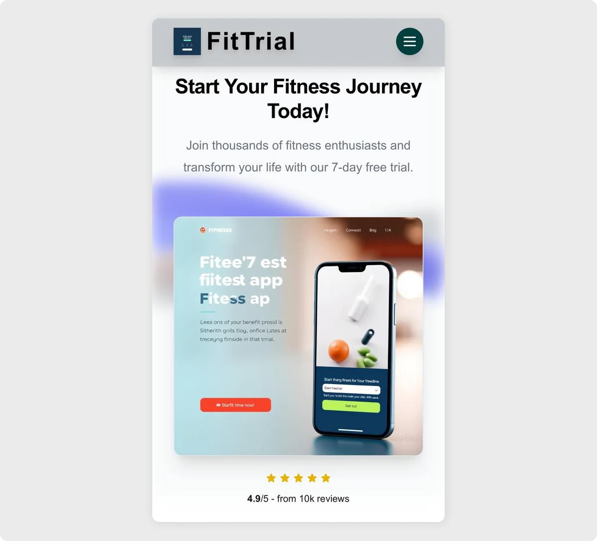
Step 4: Click "Generate" and wait a few minutes while Codesi generates your mobile landing page.
Codesi will quickly generate a mobile landing page you can easily customize and optimize to fit your goals.
Ready to turn mobile visitors into customers with a page that loads fast, looks great, and drives action?
Try Codesi for free and launch your high-converting mobile landing page in minutes.
Create your website with AI today
Codesi is a platform where you can make a website in 3 minutes.
No coding, no designers, no hassle - just AI.
