Back to blog
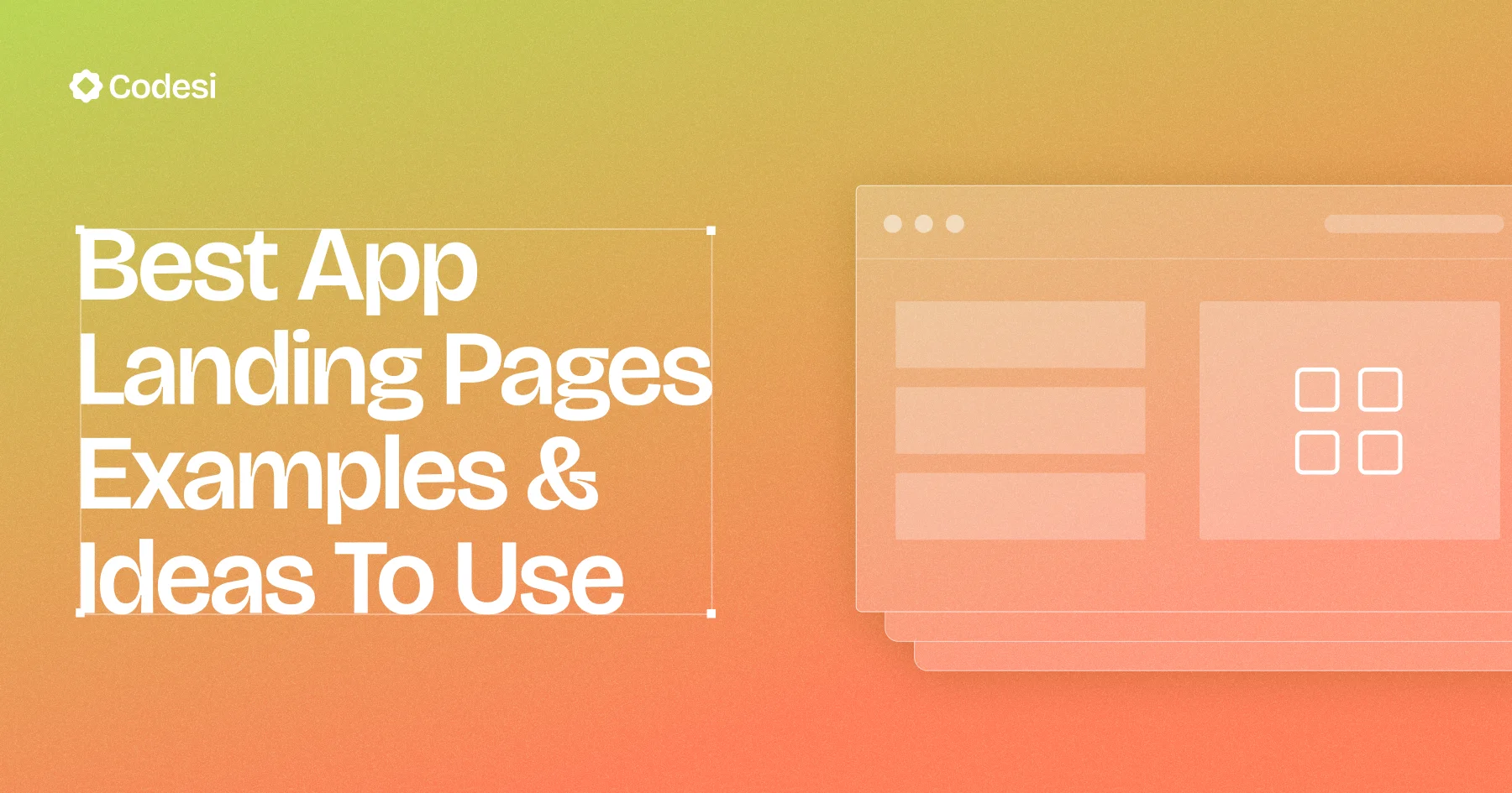
14 Best App Landing Pages Examples & Ideas To Use
Discover the best app landing pages that inspire action, build trust fast, and help you create high-converting designs that truly connect.
Jul 12 2025
The best app landing pages do more than just introduce your product. It sets the tone, builds trust, and drives action from the moment someone lands on it.
Many pages may look polished but fall short where it counts: clarity, structure, and conversion.
In a space where users make decisions in seconds, every element on the page needs to earn its place.
In this article, we'll explore top app landing pages examples that get real results. Each one offers practical ideas on layout, copy, and flow, so you can create a landing page that connects, convinces, and converts.
What Exactly Is an App Landing Page?
An app landing page is a single-purpose webpage designed around a specific product and a single action. Its entire layout – headline, copy, visuals, social proof, and call-to-action – funnels the visitor toward a clear next step, such as Start free trial, Sign up, or Buy now.
Unlike a broad homepage that juggles multiple audiences and links, an app landing page is a conversion tunnel for a specific SaaS, web, or mobile application.
Why a High-Converting App Landing Page Is Essential
App-focused landing pages, such as App Store or Google Play product pages, typically convert at a rate of 25–27% (i.e., page-view-to-install rate). If you're aiming higher, here's why your page matters:
- Your 24/7 Conversion Engine: A high-performing landing page is capturing interest, answering objections, and converting visitors into users or customers around the clock – no sales calls required.
- A Trust-Building Showcase: First impressions count. Highlight logos, testimonials, reviews, security badges, and compliance certifications to build instant credibility and lower visitors' risk.
- A Central Hub for Marketing Campaigns: Whether you're running PPC ads, sending emails, or launching social campaigns, this page is your one-stop destination for testing headlines, tracking metrics, and optimizing without overhauling your entire site.
- An Organic Traffic Workhorse: With targeted keywords, fast load times, and mobile-optimized design, your landing page can rank on Google, capturing qualified, intent-driven users – no extra ad spend needed.
Top 14 App Landing Pages (Examples That Convert)
Here are 14 of the best app landing pages examples that set the standard for clarity, structure, and conversion:
1. Linear
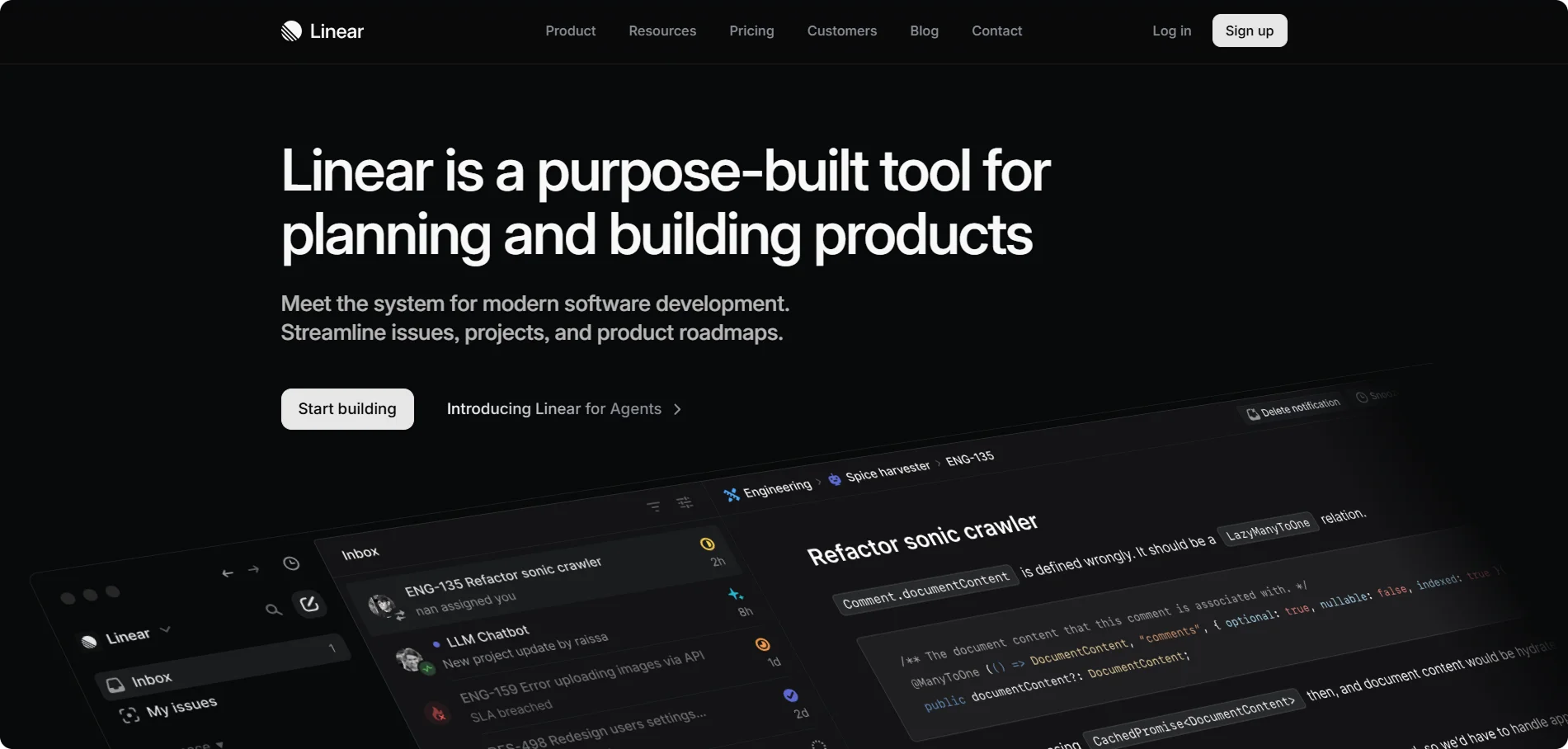
Linear is a modern project management tool for software teams, emphasizing speed and focus.
Its landing page leads with a concise headline ("Linear is a purpose-built tool for planning and building products") and a clean, dark-themed interface. The design uses minimal copy and high-impact visuals (e.g., screenshots of the product) to convey its value to developers quickly.
What Makes It Work: Linear's site features a clear headline and an elegant, high-contrast design that immediately communicates its purpose.
Key Takeaway: Use a strong headline and focused UI to highlight your app's core value and build trust through visuals and logos.
2. Notion
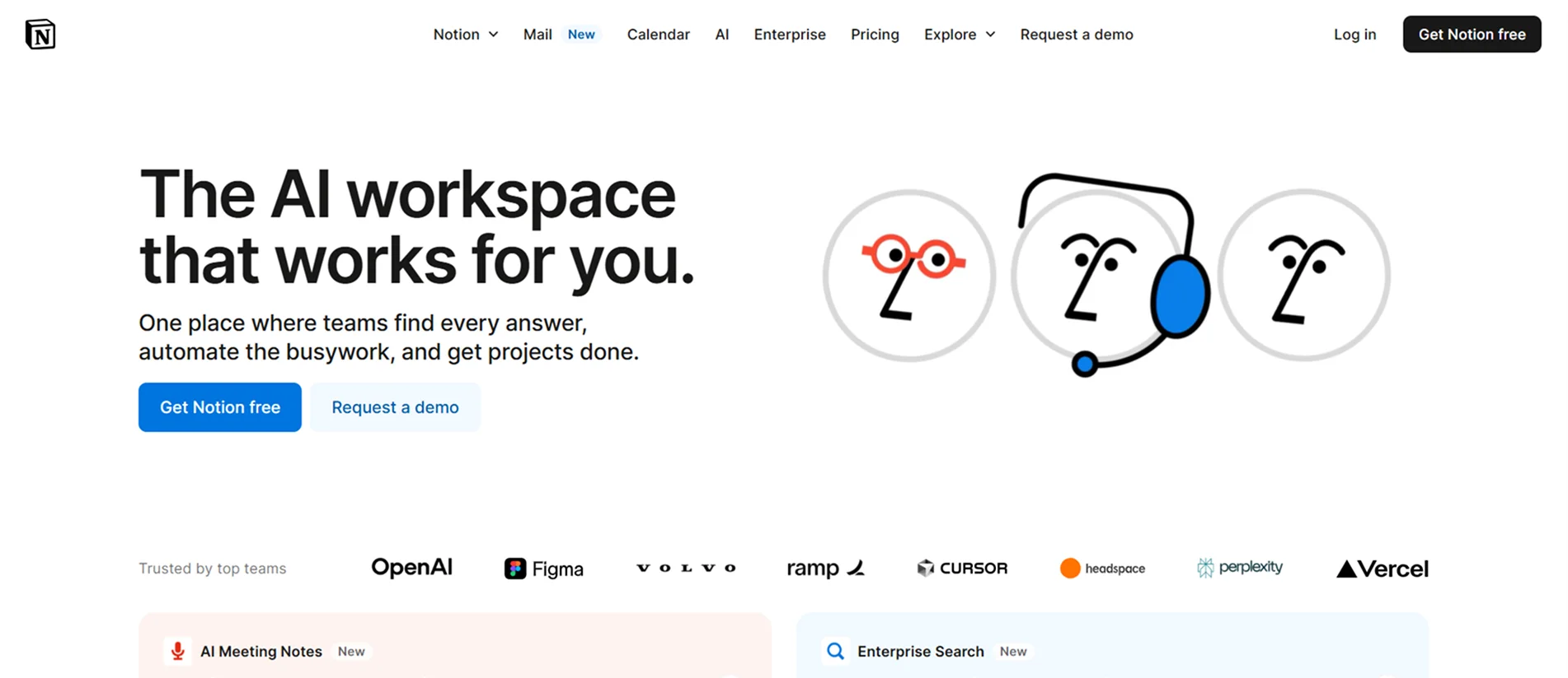
Notion is an all-in-one workspace (notes, docs, databases) for teams and individuals.
Its homepage showcases the multi-purpose nature of the tool with simple copy and app screenshots. The page uses scrolling sections to explain workspaces, templates, and integrations.
What Makes It Work: Notion's landing page combines a playful, benefit-driven headline with dynamic visuals of the app on desktop and mobile. The copy highlights productivity (e.g., consolidating tools to save time) and community (integrations, templates).
Key Takeaway: Emphasize broad use-cases with simple language and strong visuals, and reinforce credibility with customer logos.
3. Slack
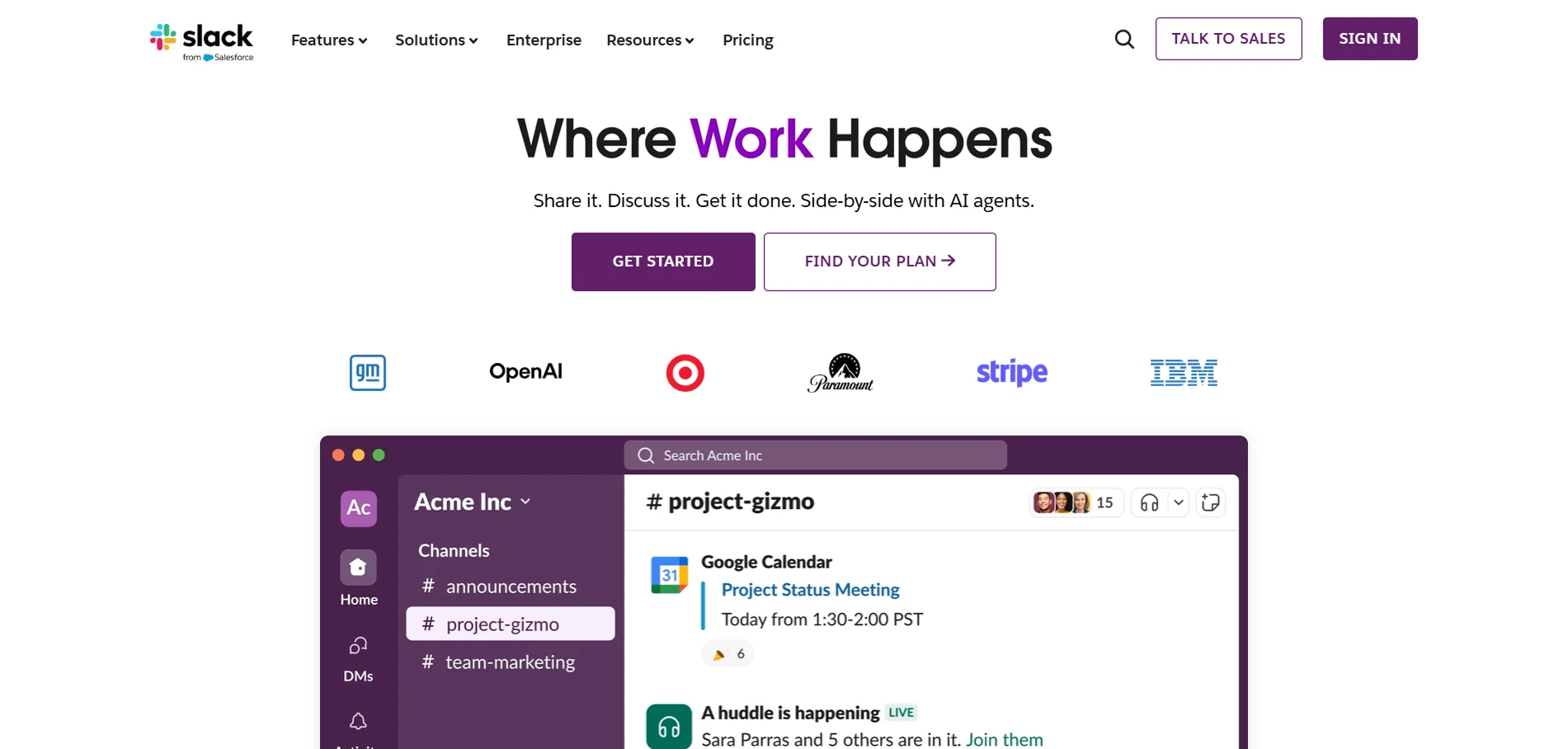
Slack is a team collaboration and chat platform. Its landing page is clean and minimalist, mirroring the product's focus on clear communication.
A large headline and subhead quickly convey the value ("Share it. Discuss it. Get it done. Side-by-side with AI agents.").
The design uses ample whitespace and a structured layout, allowing visitors to focus on the core benefits of improved communication.
What Makes It Work: Slack's page uses a clean, uncluttered UI with lots of white space to highlight its value proposition (better team communication).
Key Takeaway: Focus on minimalist design and a single, compelling benefit, and utilize clear CTAs and social proof to establish trust.
4. Superhuman
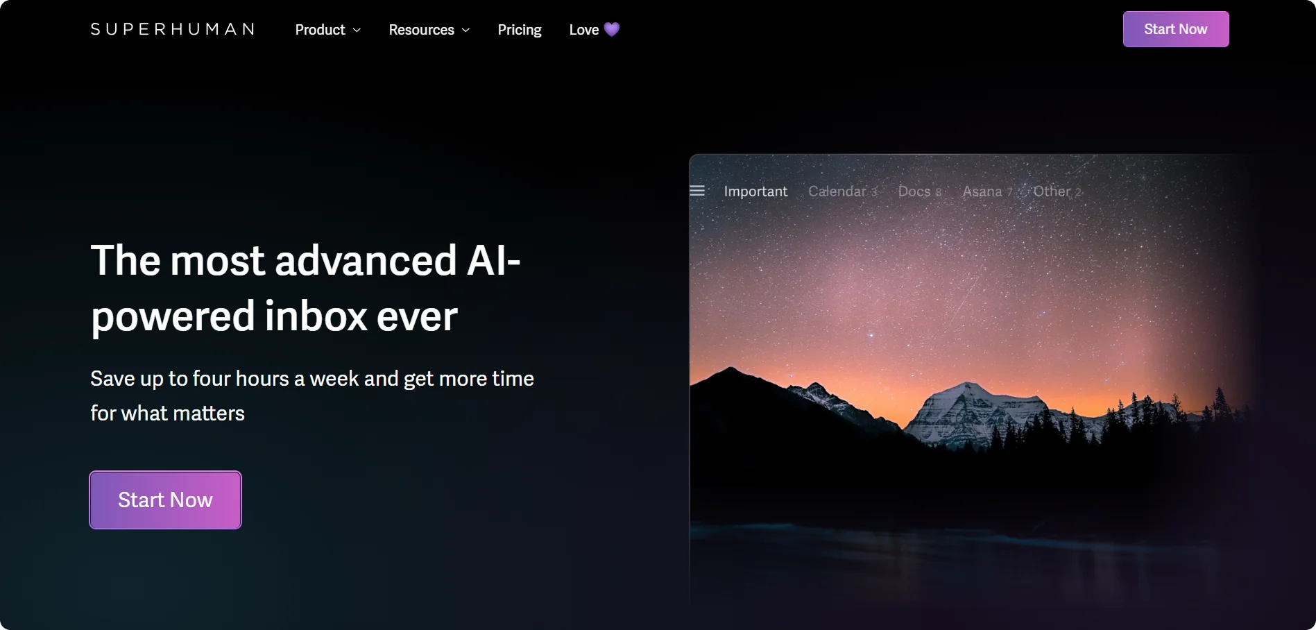
Superhuman is a premium email app that promises productivity ("Save up to four hours a week and get more time for what matters.").
The page uses engaging copywriting to set an exclusive, aspirational tone. Visuals show the elegant app UI.
What Makes It Work: Superhuman's site uses confident, benefit-oriented copy ("The most productive email app ever made") that taps into users' desire for efficiency.
Key Takeaway: Highlight the most compelling benefit upfront and reinforce it with simple, high-impact design and social proof.
5. Framer
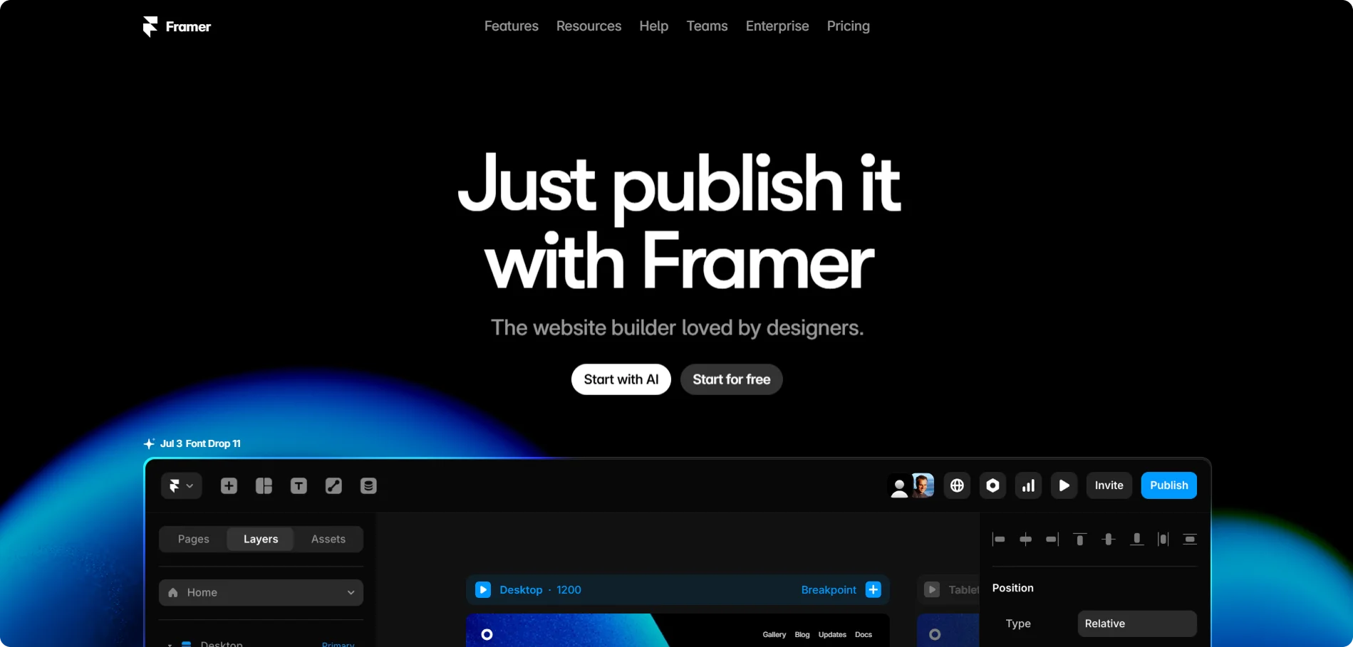
Framer is a website builder and design tool for creators. Its landing page opens with "The website builder loved by designers" and a stylish hero image. The copy emphasizes creativity and ease ("Simple to learn, easy to master") and invites users to "Start for free."
What Makes It Work: Framer's page combines a bold hero statement with a clean, modern UI. The design is highly visual, featuring a "Made in Framer" showcase gallery that highlights real-world examples of sites built with Framer.
Key Takeaway: Inspire visitors with creative examples and imagery, and make signing up easy with a clear CTA.
6. Grammarly
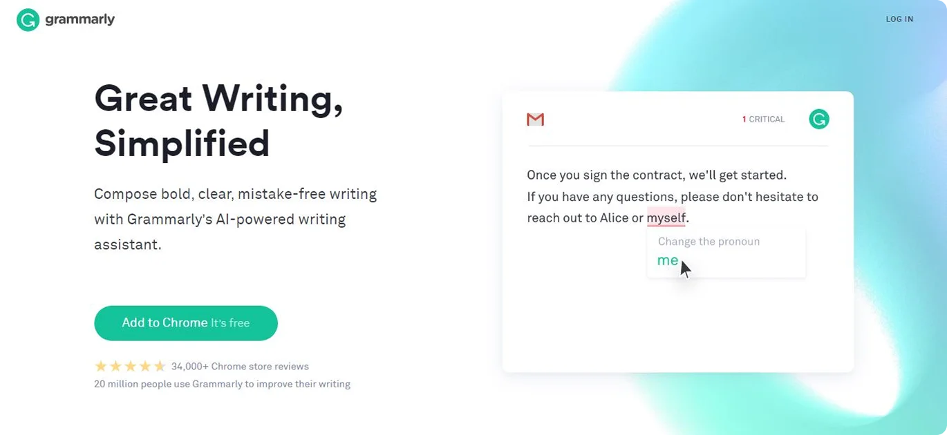
Grammarly is an AI-powered writing assistant. Its homepage headline directly addresses user goals: better writing and confidence.
The page highlights how Grammarly helps craft messages, emphasizing convenience and productivity. A strong "Sign up (free)" CTA is front and center.
What Makes It Work: Grammarly's site features clear, empathetic copy that addresses common writing needs ("help you find the words you need"). The design effectively balances text and visuals, with the headline focusing on the key outcomes (writing and reputation).
Key Takeaway: Frame the value in terms of personal success (e.g., improved communication) and leverage large user numbers and prominent logos for credibility.
7. Miro
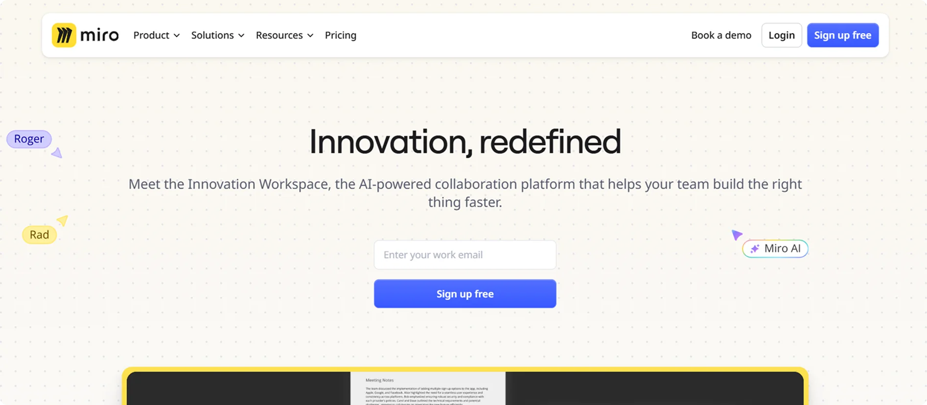
Miro is an online collaborative whiteboard. Its landing page is colorful and engaging.
A headline conveys the core idea, and custom illustrations lend the site a fun and creative feel. The page quickly highlights Miro's six main features (brainstorming, planning, etc.) so visitors know what it does.
What Makes It Work: Miro's page uses playful design and illustrations to make the experience inviting. The visuals make the product feel engaging, while clear text effectively explains its value.
Key Takeaway: Combine friendly visuals with clear feature highlights, and include customer stories and calls-to-action to engage and convert.
8. Figma
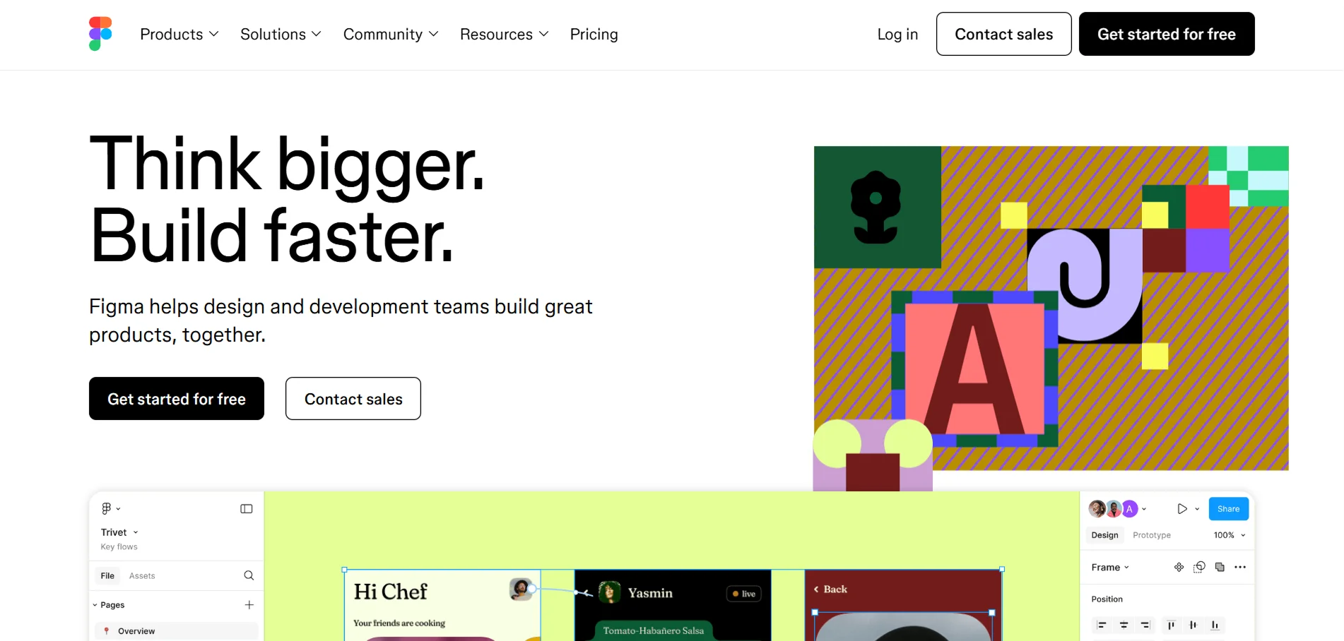
Figma is a collaborative UI design tool. Its homepage centers on teamwork and accessibility, with slogans like "Think bigger. Build faster." The layout demonstrates how easily team members can be invited and work together in real-time.
What Makes It Work: Figma's site emphasizes collaboration and simplicity. It highlights key benefits (sharing designs easily, no downloads needed) through concise copy and clean UI mockups.
Key Takeaway: Highlight your app's collaborative strengths with clear language and real-world validation from users.
9. Arc Browser
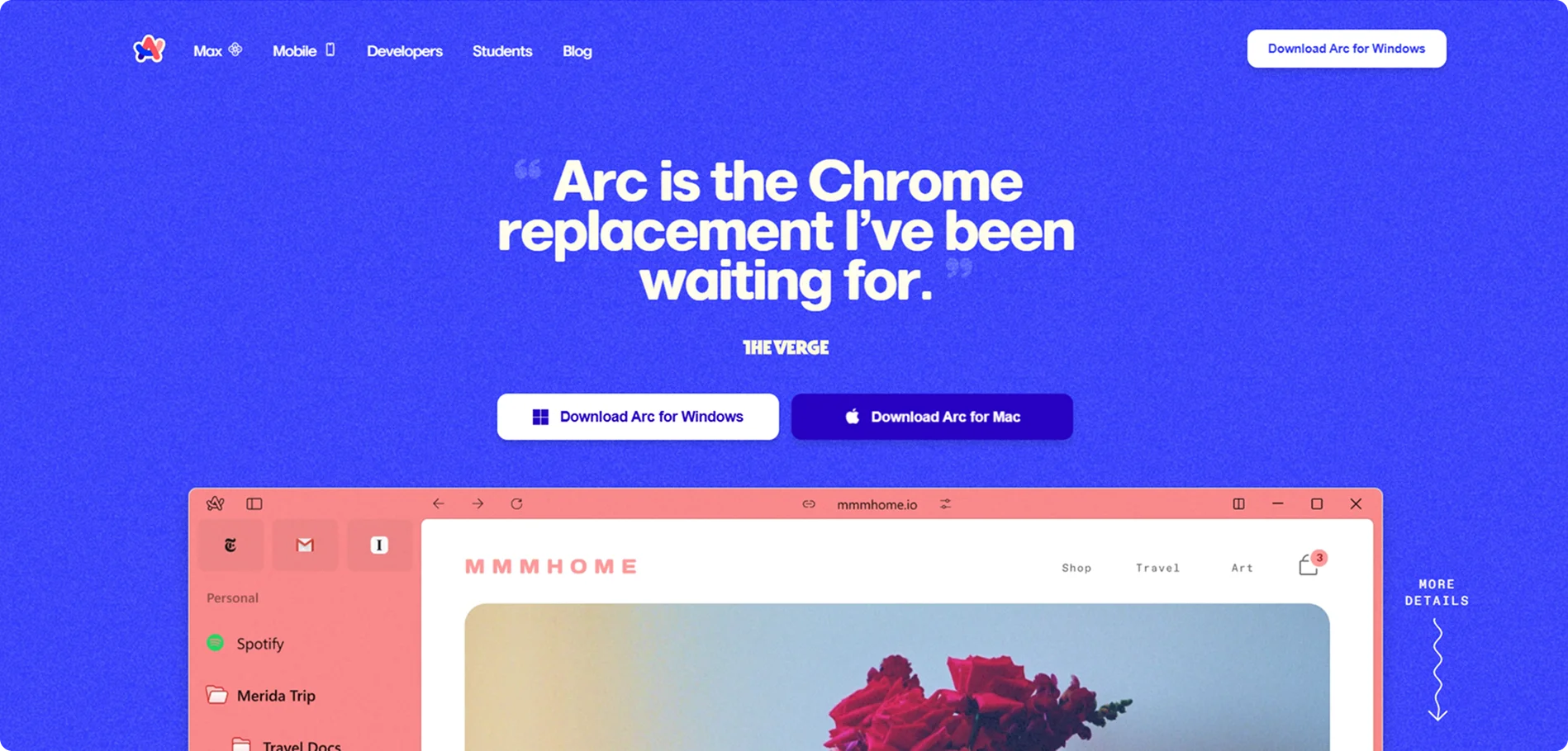
Arc is a web browser designed for modern users. Its landing page has a calm, minimalist aesthetic. The hero section calls it "Arc is the Chrome replacement I've been waiting for," setting user expectations. The copy emphasizes Arc's unique features ("clean and calm," privacy, intuitive design). As you scroll, short sections explain Arc's Spaces, profiles, split view, and other tools, each with a crisp screenshot.
What Makes It Work: Arc's page uses benefit-driven language ("Clean and calm, Arc shapes itself to how you use the internet"). The design is understated but elegant, matching the product's vibe.
Key Takeaway: Align the site's visual style with the product's brand (calm and minimal) and use user praise and clear headlines to showcase unique features effectively.
10. Loom
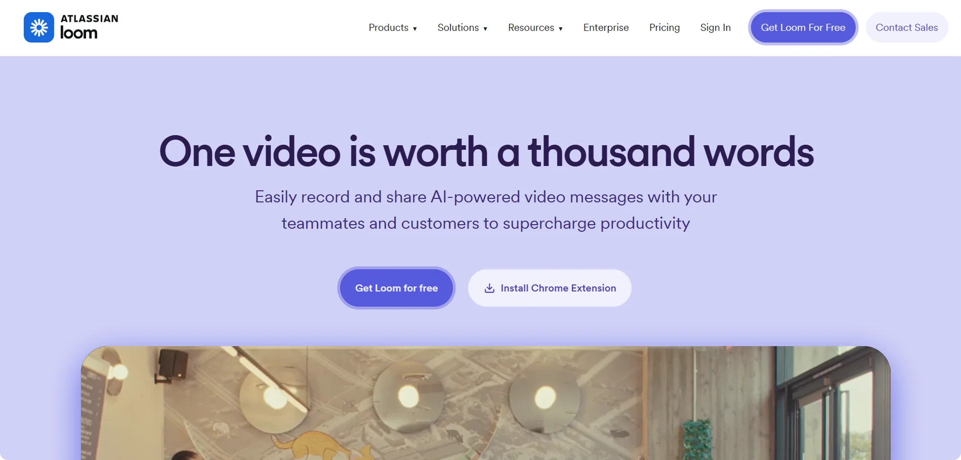
Loom is a video messaging and screen-recording tool. Its homepage grabs attention with the bold headline "One video is worth a thousand words," immediately communicating the app's core value.
A short subheadline and animated preview show how Loom works. The CTA ("Get Loom for free") and logos of well-known users (e.g., Atlassian, HubSpot) are prominently featured to establish trust and credibility.
What Makes It Work: A brief video demo illustrates the product in action. The layout is simple, conveying the point directly.
Key Takeaway: Use a memorable, benefit-driven headline and strong social proof to engage visitors quickly, then make the signup easy.
11. Descript
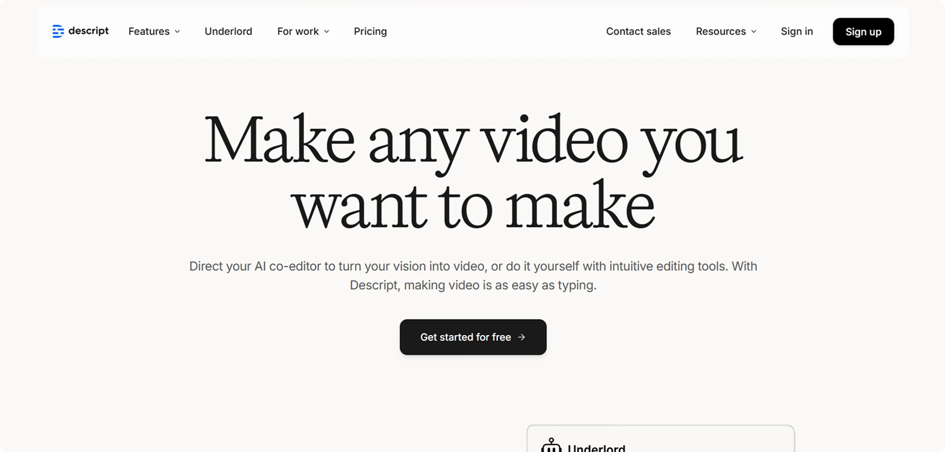
Descript is a media creation platform for video and audio editing. Its landing page opens with the punchy heading "Make any video you want to make," followed by a short explanation of AI tools and editing features. The site highlights that Descript makes video production as easy as typing, appealing to creators. The "Get started for free" CTA is prominent.
What Makes It Work: Descript's hero text promises productivity and quality. The copy introduces AI-driven tools and intuitive editing in simple terms, making the tech sound accessible.
Key Takeaway: Use a short, benefit-led headline and straightforward language. Emphasize ease (AI co-editor) and give a clear free trial option to entice users.
12. Akiflow
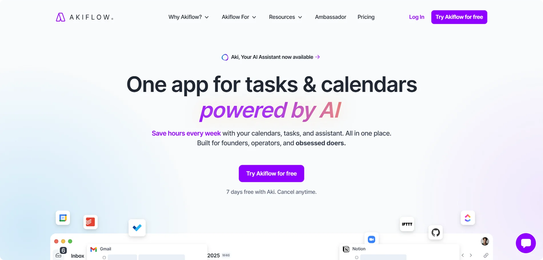
Akiflow is a productivity app that combines tasks, calendar, and AI. Its homepage says "One app for tasks & calendars powered by AI", clearly stating the core idea. The design is clean and modern, featuring large headlines like "Save hours every week" and showcasing the app's interface.
What Makes It Work: Akiflow's tagline and subheading focus on time savings and simplicity. The hero text and images convey that it solves scheduling clutter by unifying tasks and calendars.
Key Takeaway: Clearly state the combined benefits (tasks, calendar, and AI) and support them with statistics or icons of integration partners.
13. Calendly
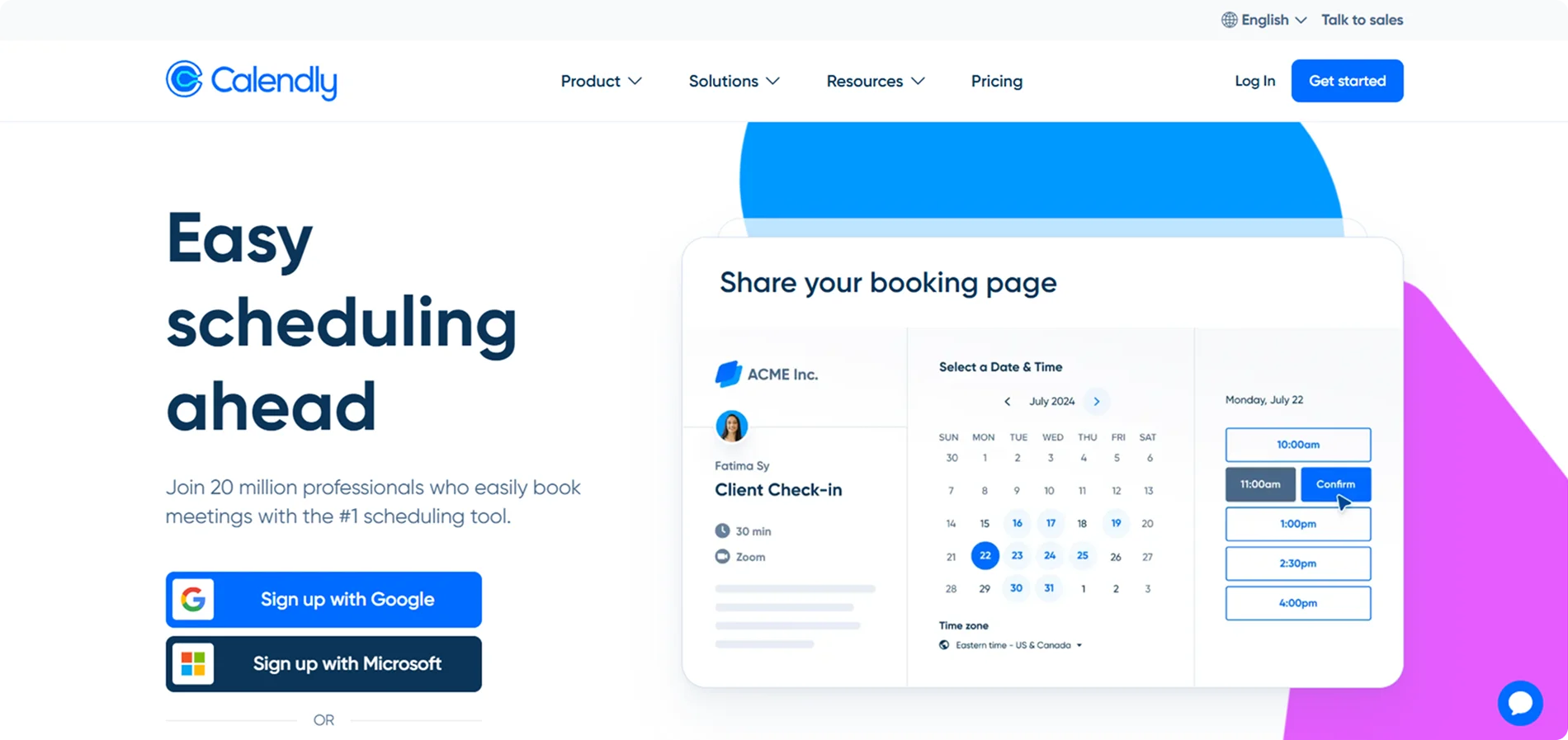
Calendly is a scheduling tool that makes meeting booking easy.
Its landing page opens with "Easy scheduling ahead" and highlights that "20 million professionals" use it. The main headline emphasizes simplicity and popularity.
Below are sections that show how to connect calendars and share links, accompanied by illustrative images of the interface.
What Makes It Work: The hero section leads with an explicit promise and a strong social proof line. The CTA "Sign up free – no credit card" is repeated. The page breaks down key features (connecting calendars, setting availability, and integrations) in a step-by-step manner, accompanied by icons.
Key Takeaway: Emphasize how many people trust your tool and make sign-up frictionless.
14. Zapier
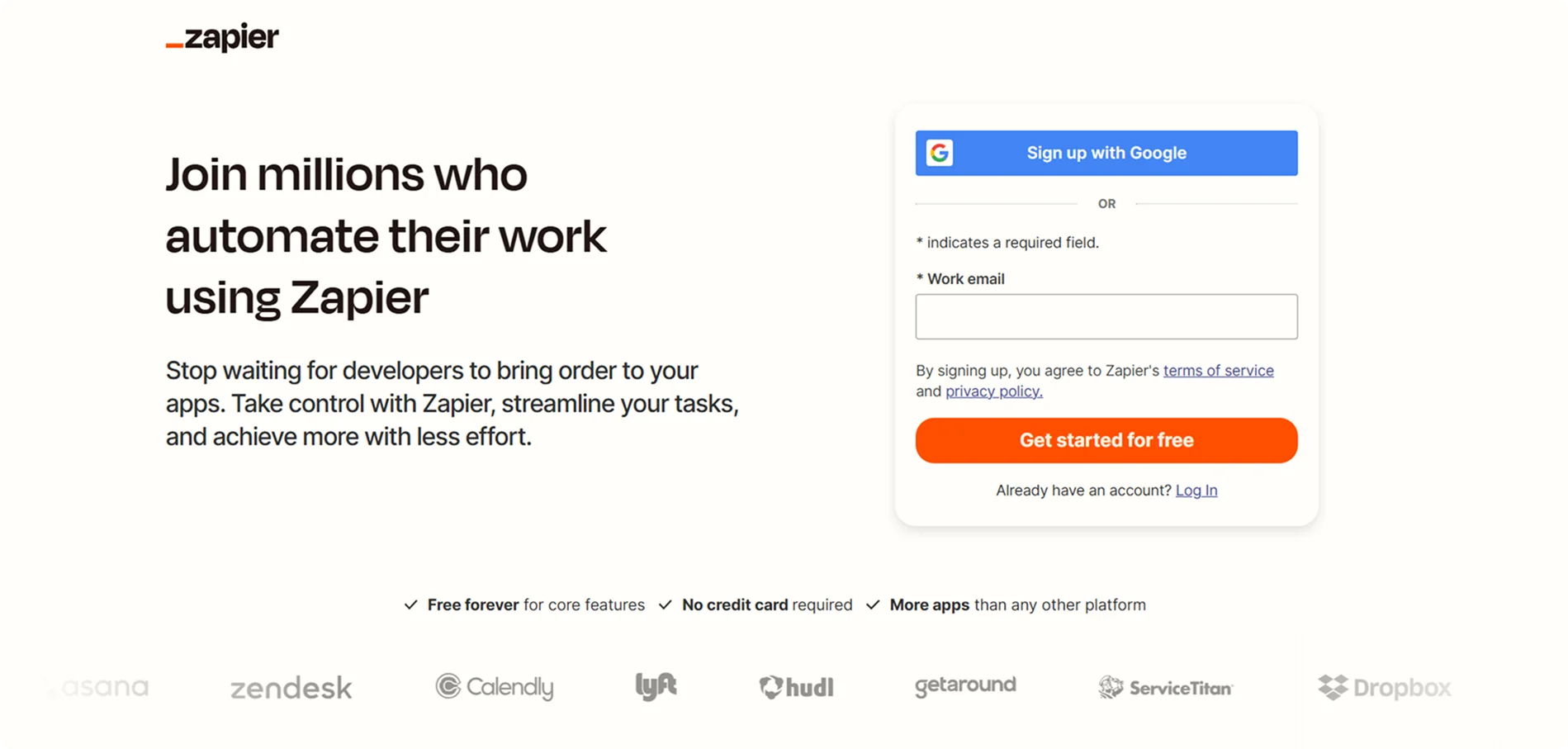
Zapier is a platform for integrating and automating tasks.
Its homepage emphasizes automation with taglines like "Join millions who automate their work using Zapier." It highlights that you can connect hundreds of apps without code. The page uses animated counters (Zaps created per day) and lists popular automation examples.
What Makes It Work: Zapier focuses on the ease and power of automation. The layout is dynamic but uncluttered.
Key Takeaway: Show industry stats or counters to demonstrate scale, and lead with how the user's work will improve.
Key Elements of a Successful App Landing Page
From these examples, we can conclude that high-performing app landing pages consistently include:
✅ A clear headline that immediately communicates the app's value.
✅ Strong visuals such as screenshots or demo videos to show the product in action.
✅ A prominent CTA placed early and guides users to take action.
✅ Benefit-focused copy that highlights user gains and solves real problems.
✅ Social proof, such as testimonials, user ratings, or client logos, to build trust.
✅ Trust signals, including security badges and transparent privacy messaging.
✅ Fast loading and mobile optimization for a seamless experience on any device.
✅ Minimal navigation to eliminate distractions and keep the focus on conversion.
From Idea to Conversion: Build App Landing Pages That Perform with Codesi
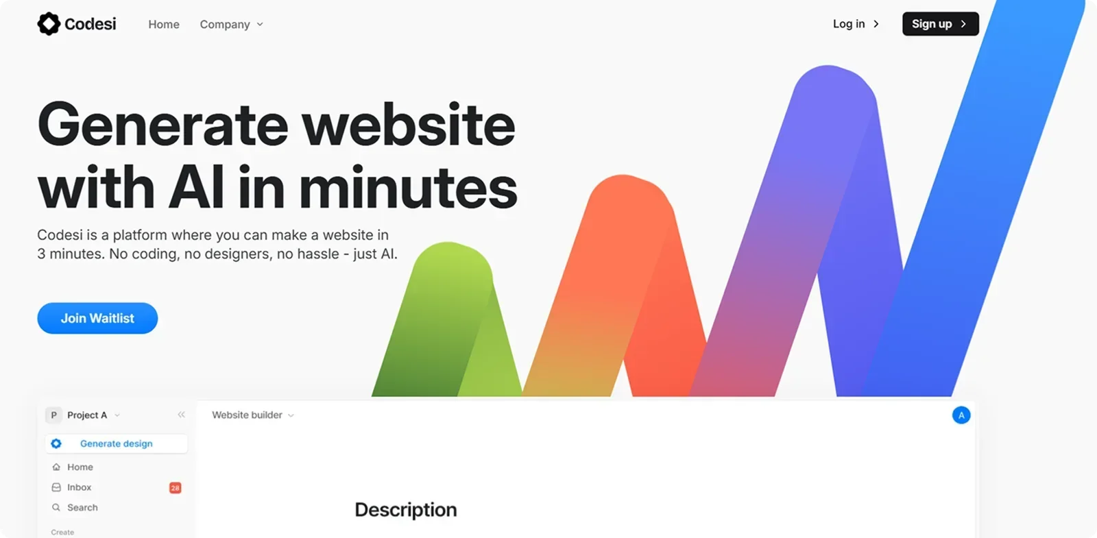
If you're ready to turn inspiration into action, Codesi gives you everything you need to create a high-converting app landing page – quickly, easily, and without touching a line of code.
Here's why Codesi is the ideal platform for building app landing pages that perform:
- AI-built in minutes: Just describe your app – its core features, target users, and goals, and Codesi generates a tailored landing page designed to drive installs, signups, or trials.
- Layouts designed for conversion: Every section is purpose-built, featuring compelling headlines, focused benefit blocks, strong CTAs, and social proof placed exactly where users need it to take action.
- Fully customizable, no code required: Adjust layout, text, visuals, and colors with simple drag-and-drop tools. You stay in control without relying on a developer or designer.
- Mobile-first and lightning-fast: Your landing page loads instantly and looks polished on every device, essential for capturing mobile-first traffic and reducing bounce rates.
- Analytics-ready from the start: Easily connect your favorite tools to track user behavior, monitor conversions, and continuously optimize performance.
Here's how to easily generate app landing pages with Codesi - step by step:
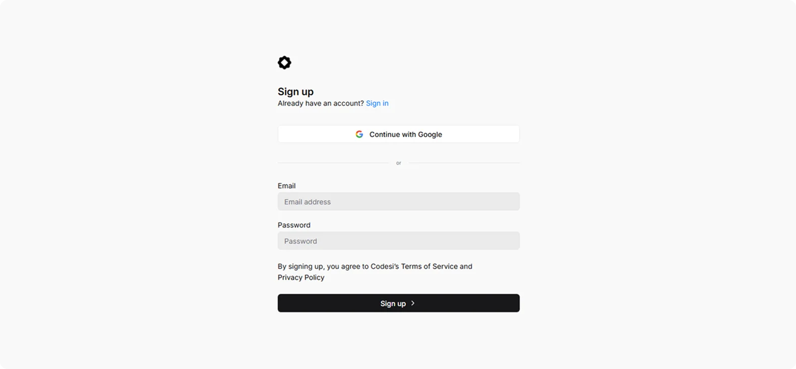
Step 1: Sign up on Codesi (it's free)
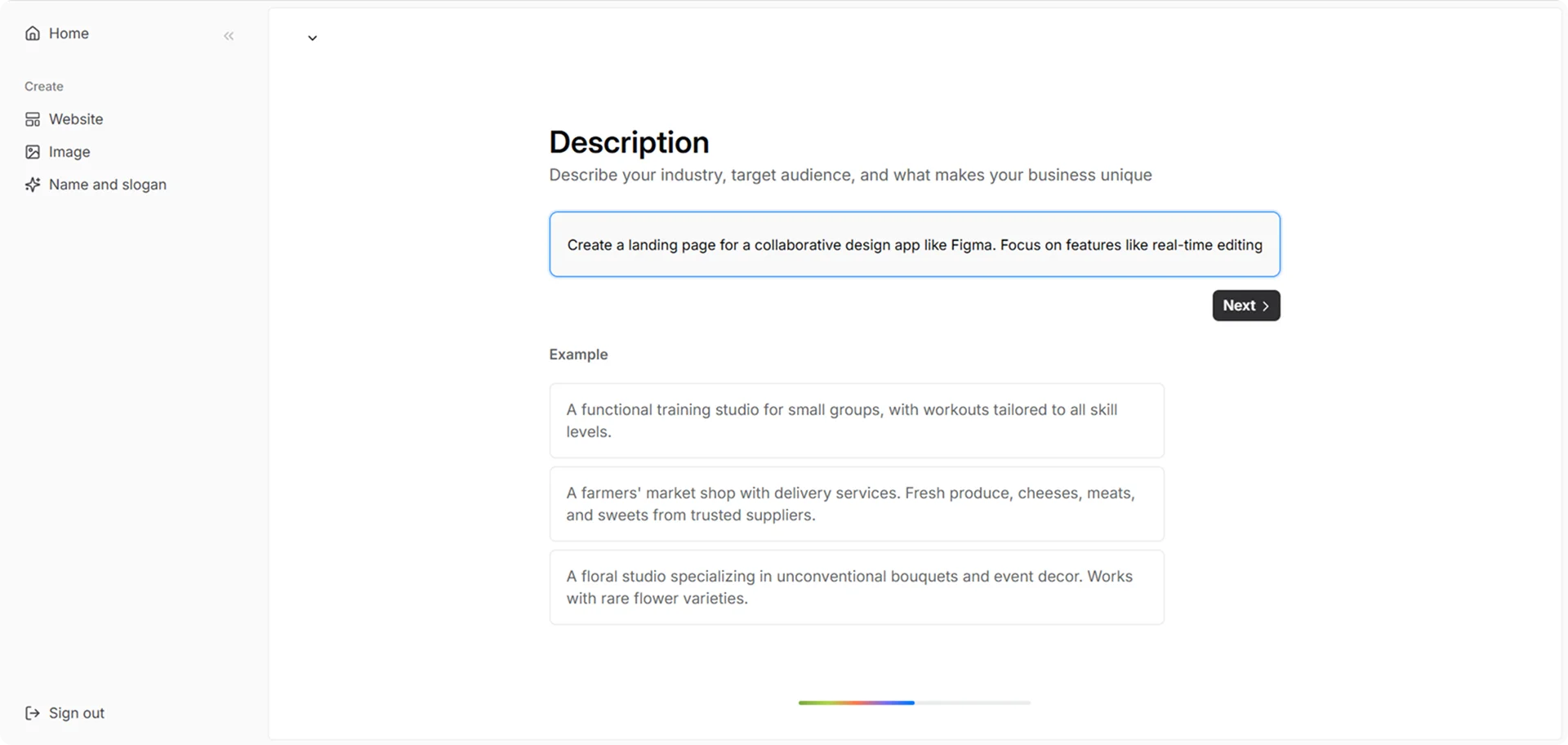
Step 2: In the Website Builder, enter your prompt. For app landing page creation, we used the following example:
“Create a landing page for a collaborative design app like Figma. Focus on features like real-time editing, team libraries, and browser-based access. Use sleek visuals, minimal navigation, and a prominent “Get started for free” button.”
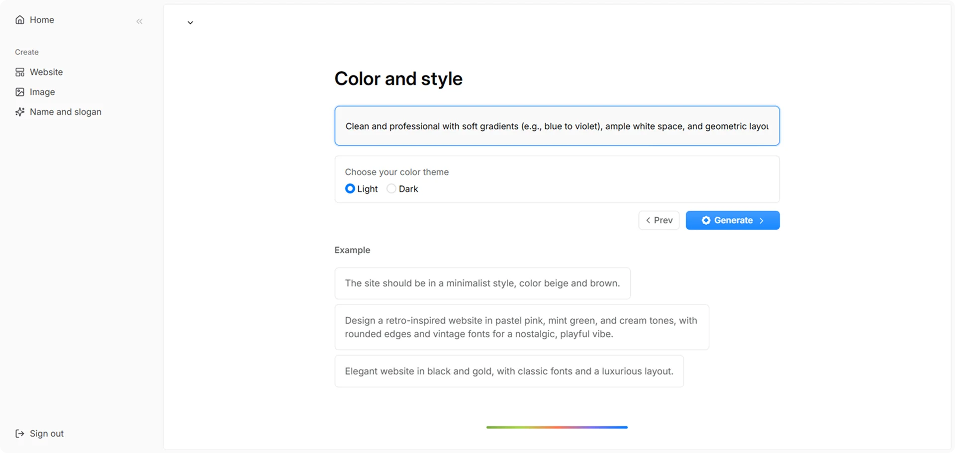
Step 3: Choose your color theme and style. For this example, we used:
“Clean and professional with soft gradients (e.g., blue to violet), ample white space, and geometric layouts. Use a modern sans-serif font like Inter or Satoshi, paired with smooth hover animations for buttons and cards.”
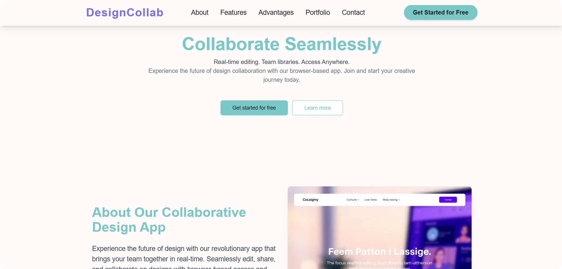
Step 4: Click "Generate" and wait a few minutes while Codesi generates your app landing page.
Codesi will generate an app landing page you can easily customize and optimize to fit your goals.
Want to build a landing page that not only looks good but also converts?
Go from idea to live page with Codesi in minutes and start turning clicks into customers.
Keep Learning
Create your website with AI today
Codesi is a platform where you can make a website in 3 minutes.
No coding, no designers, no hassle - just AI.
